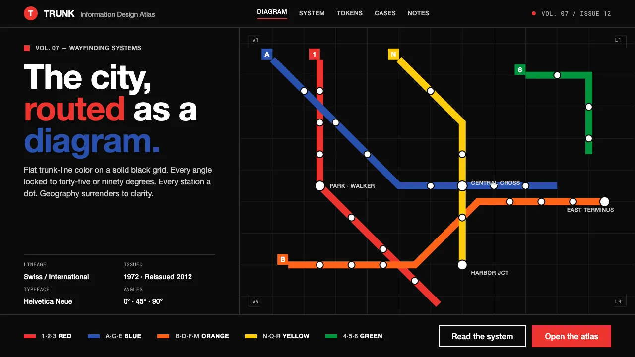
About NYC Subway Vignelli (1972)
In 1972 Massimo Vignelli and Unimark International redrew the New York City subway as a pure diagram: every line a flat saturated color, every angle locked to 45° or 90°, every station a round dot on a strict black grid. It treats the city as an abstract circuit board rather than a literal map.
This system distills that landmark of information design — solid black field, trunk-line colors verified against the 2012 MTA reissue, uniform-weight strokes, and white Helvetica labels — into a digital design language of clarity, alignment, and uncompromising flatness.
- Origin
- New York City, United States
- Era
- 1950–1990 (1972 Vignelli diagram; 2012 MTA reissue confirms the palette)
- Key figures
- Massimo Vignelli · Unimark International · Bob Noorda · MTA
- Movements
- Swiss / International Typographic Style · Modernist information design
NYC Subway Vignelli (1972) design spec
Colors
Typography
The other 11 sections — buttons, cards, spacing, motion, techniques and more — open once you unlock. Download the DESIGN.md or send it to your AI in one click. Unlock once, yours forever.
Sign up nowStyles similar to NYC Subway Vignelli (1972)
Also inspired by architecture & places, with a close feel.
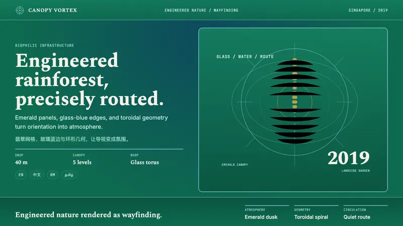 Changi Jewel AirportEngineered rainforest, precisely routed. Emerald gridlines and glass-blue rings steer sight.
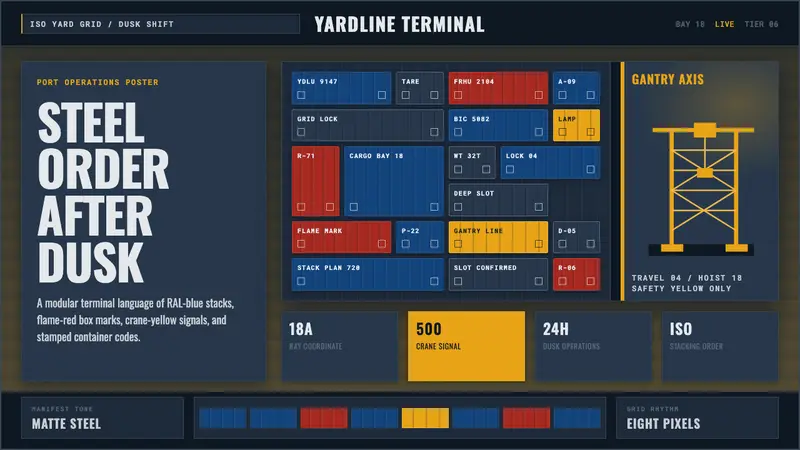 Container PortIndustrial dusk, standardized. Slate grid, RAL-blue stacks, and crane-yellow geometry.
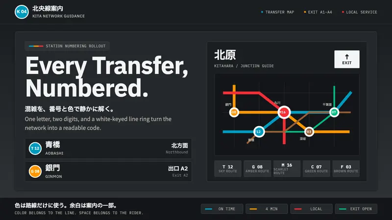 Tokyo Metro SignageChaos becomes code. Charcoal panels, white-keyed rings, and bilingual grids stay calm.
 Astana Baiterek TowerCivic optimism in chrome and gold. A mirrored sphere crowns a white lattice trunk on night-blue sky.