What is Helsinki Metro Orange?
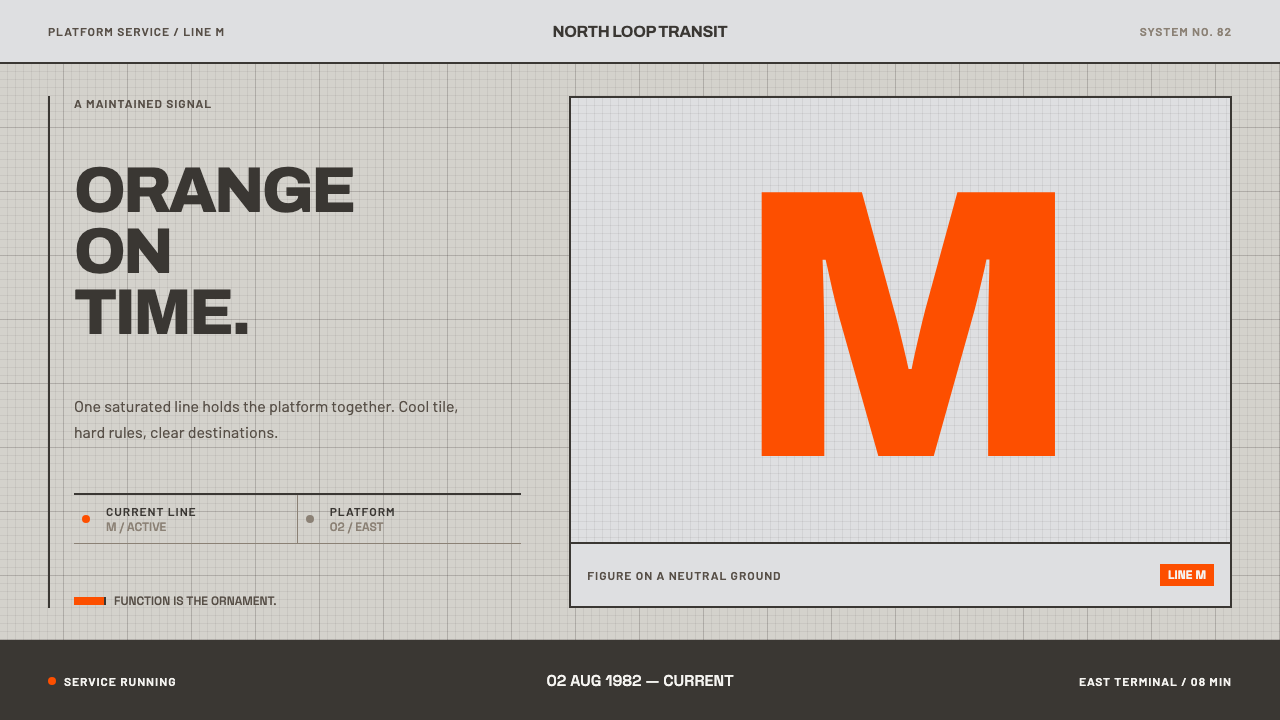
Helsinki Metro Orange reduces a city's transit identity to one rule: a single orange against cool concrete and tile, with everything else stepping back so that the orange can mean something.
Helsinki Metro Orange in brief
Helsinki Metro Orange draws on the visual identity of the Helsinki metro, which opened on 2 August 1982 with one decision that has held ever since: every train is the same orange. The M100 cars, built by Valmet and Strömberg, run through platform halls finished in pale tile and concrete and through caverns blasted directly out of granite. Against that cool, mineral background the orange is always the figure and the ground is always neutral.
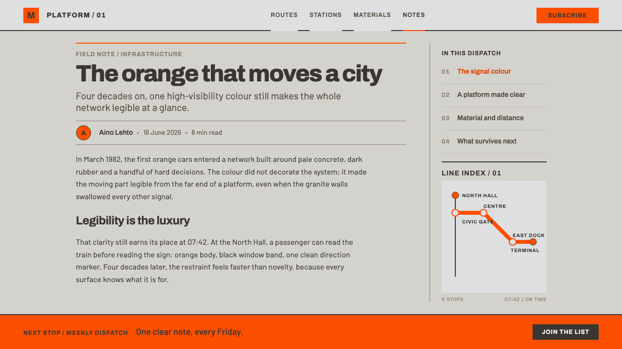
The orange appears on the car, on the seat moquette and on the signs. It is one colour doing three jobs, and the repetition is the point: whoever sees the orange knows where they are. Around it everything else is quiet. The lettering is neo-grotesque, set flush left with tight line spacing and no italics; route diagrams use only diagonals and right angles, with station dots drawn as solid discs; fills are flat, and corners are barely rounded.
As a design system, the page becomes the platform hall: pale, orderly and modular, divided as if by tile. The orange is the only colour allowed to carry meaning, and every other element retreats into neutral. The source material is blunt that nothing here is nostalgic. It is a working system that has simply been maintained, and the appeal of the style is the dignity of function kept in good order for four decades.
Where does Helsinki Metro Orange come from?
The record sets the style in Helsinki, Finland, within an era it gives as 1950 to 1990, and fixes the system's opening on 2 August 1982. The M100 rolling stock dates from that same year. Two Finnish industrial firms, Valmet and Strömberg, are named as builders of the cars, which means that the orange is attached to an industrial product of its moment rather than to an advertising campaign. That origin explains the style's seriousness: it comes from engineering, not from marketing.
The setting did much of the design work. The stations are of two kinds: platform halls finished in pale tile and concrete, and caverns blasted straight out of granite. Both are cool and neutral, and neither is decorated. In such a setting a strong single colour reads at once from a distance, and it does not compete with a busy background. The decision to paint every train the same orange makes sense as a response to that environment: the orange is figure, the architecture is ground.
Three movements are listed as the context: Finnish functionalism, Nordic transit modernism and neo-grotesque wayfinding. In design terms, functionalism supplies the conviction that form should answer use; Nordic transit modernism names the wider family of regional transport identities from which this one comes; and neo-grotesque wayfinding supplies the lettering, plain, even and unmannered, readable at a glance by a person in motion. Together they explain a look that is rigorous without being severe.
The orange has had a second life as a civic emblem. In 2017 the design studio Werklig reworked the identity of the City of Helsinki and named the orange 'Metro', placing it among the city's brand colours. The record also lists Camelot Typefaces among the key names, a reminder that the typographic side of wayfinding is its own craft. That a colour chosen for trains in 1982 could be adopted as a municipal colour in 2017 is the best evidence of the system's durability.
What defines the Helsinki Metro Orange look?
One Orange
A single, saturated orange is the only colour permitted to mean something. It marks the vehicle, the seat fabric, the sign and, in the design system, the one thing on the page that matters most: the active state, the key figure, the call to action. Because there is only one, its meaning is never diluted. Use of a second accent would cost the system its clarity.
Cool Neutral Ground
The background is the platform hall: pale grey tile, concrete and granite, all cool, mineral and quiet. This ground is never white and never warm; it has the slight cold of stone. It exists so that the orange will always be figure. Everything else in the system, from rules to secondary text, belongs to this neutral family and avoids competing with the orange.
Flush-Left Neo-Grotesque Type
Lettering belongs to the neo-grotesque tradition of wayfinding: plain, even, unmannered sans-serif forms, set flush left, with tight line spacing and no italics. Names are short and clear, and the text is built to be read by someone walking. Hierarchy comes from size and weight changes within one family, not from decorative variety. The type should feel installed, like a sign, rather than designed.
Diagonals and Right Angles
Route diagrams and graphic shapes are built from only two kinds of line: horizontals and verticals, and diagonals at a single consistent angle. Stations are solid discs. There are no freehand curves and no arbitrary angles. This limited geometry is what makes a route map readable at a glance, and it gives every graphic in the system the same family resemblance.
Flat Fills, Barely Rounded
Surfaces are filled flat. There are no gradients, no glows and no soft shadows, because a painted car, a printed sign and a tile wall do not have them. Corners are barely softened, enough to avoid sharpness but never enough to read as a pill or bubble. The result is a crisp, matter-of-fact surface that looks manufactured and is meant to.
The Tile Grid
Everything snaps to a small, regular module, like the grid of tiles on a platform wall. Sizes, margins and gaps are multiples of the same unit, so elements line up without effort and the layout feels built from components rather than composed by feel. The grid is not decorative; it is the system's way of staying consistent across many pages and many hands.
Maintained, Not Nostalgic
The system is not a retro costume. It is a working identity that has been kept clean for four decades, and the design language reflects that: nothing is distressed, faded or styled to look old. The tone is calm, current and slightly austere. A project in this style should look as though someone looks after it every day.
Who shaped Helsinki Metro Orange?
The two Finnish industrial firms named in the record as the builders of the M100 cars, which entered service in 1982. They matter to the style because they anchor it in manufacturing: the orange is a finish on engineered rolling stock, not a decorative idea. That grounding is why the design language values consistency, durability and plain surfaces over expressiveness.
The design studio that reworked the identity of the City of Helsinki in 2017 and named the metro's orange 'Metro', bringing it into the city's brand colours. This is the moment the colour stepped out of the stations and became civic. For the style it is proof of the idea: a colour used with enough discipline for long enough can become a shared symbol for a whole city.
Listed in the record among the key names, representing the typographic side of the system. Wayfinding depends on letterforms that can be read by someone in motion, and the neo-grotesque tradition provides them. The mention is a reminder that a transit identity is not only colour and geometry; its lettering is a designed part of how the whole system speaks, and deserves the same discipline.
How do you use Helsinki Metro Orange today?
Helsinki Metro Orange is one of the most transferable references for functional, wayfinding-minded design. It suits products where people need to find things quickly and trust what they find. Its rule is simple enough to apply anywhere: choose one colour to carry meaning, push everything else into neutral, and keep the geometry plain.
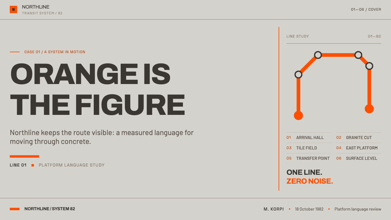
On presentation slides, a cover can be a pale, cool grey field with a flush-left title in a neo-grotesque face and a single orange element, such as a bar or a disc, placed on the grid. Content slides should keep to a strict modular layout with short headings and no italics. Data slides are a natural fit: charts in neutral greys, with orange used only for the series or number the audience must remember, and line charts drawn like route maps with solid dots at the data points.
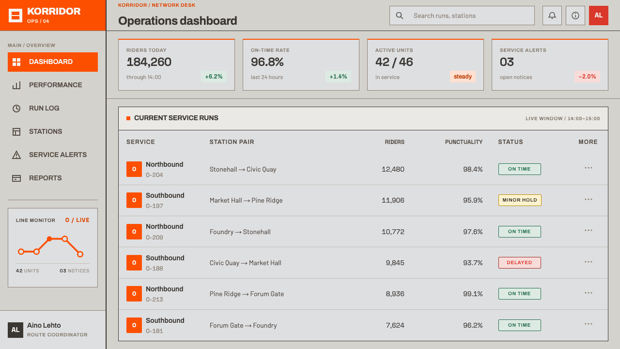
For web interfaces, the style fits dashboards, admin tools, transport and logistics products, documentation and any interface in which state must be unmistakable. Reserve the orange for the active item, the primary action or the current location. On a pricing page, use orange only on the recommended plan and leave the other tiers in grey. Navigation can borrow route-map logic, with a line of solid dots joined by straight or diagonal segments, and with components set flat on a regular module.
In editorial and marketing work, the style supports stories about cities, infrastructure, public services, architecture and design systems themselves. Flush-left layouts, short blocks of text and signage-like captions carry the tone. Photography works best when it is documentary, such as platforms, trains and tile walls, in cool, even light. The single orange can mark pull quotes, section numbers or the one call to action, and nothing else.
The common mistake is spending the orange. When it appears as a background, a decoration and an accent at once, it stops meaning anything, and the cool ground loses the contrast it exists to give. The second mistake is adding nostalgia: faux-vintage textures, rounded retro badges or italics to seem friendly. The third is breaking the geometry with soft gradients, large rounded pills or freehand curves. Keep the orange rare, keep the surface flat and keep the grid honest.
Helsinki Metro Orange — FAQ
Why does the style use only one colour?
Because the Helsinki metro itself made one decision and kept to it: every train is the same orange. On a cool tile-and-concrete ground, a single colour is enough to identify the system, and it keeps its meaning because nothing else competes with it. In a layout, a single meaningful colour is the quickest way to tell users where to look and what is active.
Is Helsinki Metro Orange a retro style?
No. The record dates the system to 1982, but the style is described as a working system that has been kept in good order, not as nostalgia. Nothing in it is faded, distressed or styled to look old, and the orange was adopted into Helsinki's city brand colours in 2017. A design in this style should look current, calm and maintained.
What kind of typography does the style use?
A neo-grotesque approach, drawn from wayfinding practice: plain, even sans-serif letterforms, set flush left, with tight line spacing and no italics. Hierarchy comes from size and weight within one family. The aim is signage legibility, text that can be read at a glance by a person who is moving, not typographic personality.
How should I design charts and diagrams in this style?
Draw them like route maps. Use only horizontal, vertical and consistent diagonal lines, solid discs for stations or data points, flat fills and neutral greys, with the orange reserved for the one line or value that matters. Avoid curves, gradients and decorative gridlines; a diagram should be readable at a glance, like the system it comes from.
Can I change the orange to another colour?
You can, but you will be making a different identity. In the Helsinki system the orange is a historical fact, attached to the trains since 1982 and later to the city's brand. The structure of the style, one meaningful colour on a cool neutral ground, survives a change of hue, but the character does not. If you swap it, keep the same discipline: one accent, used rarely and on purpose.
Related design styles
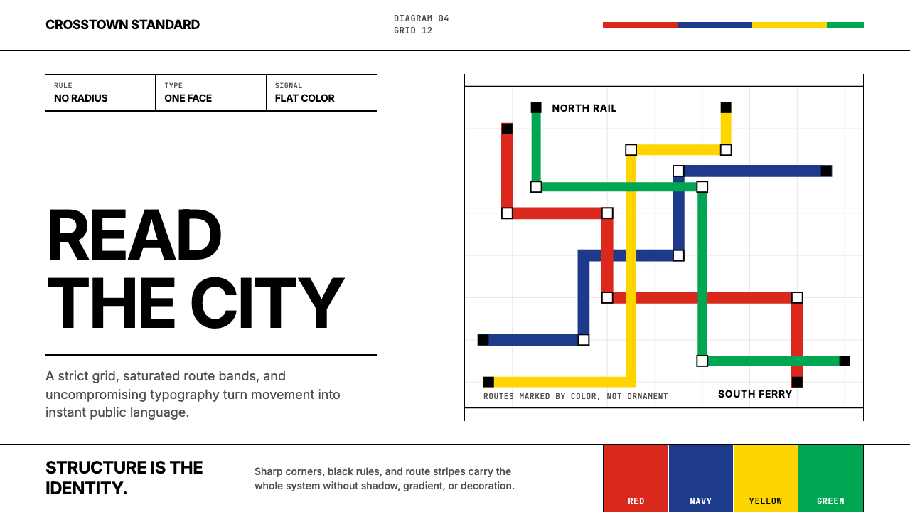 Massimo Vignelli NYCClarity becomes infrastructure. Black rules and route stripes lock the white…
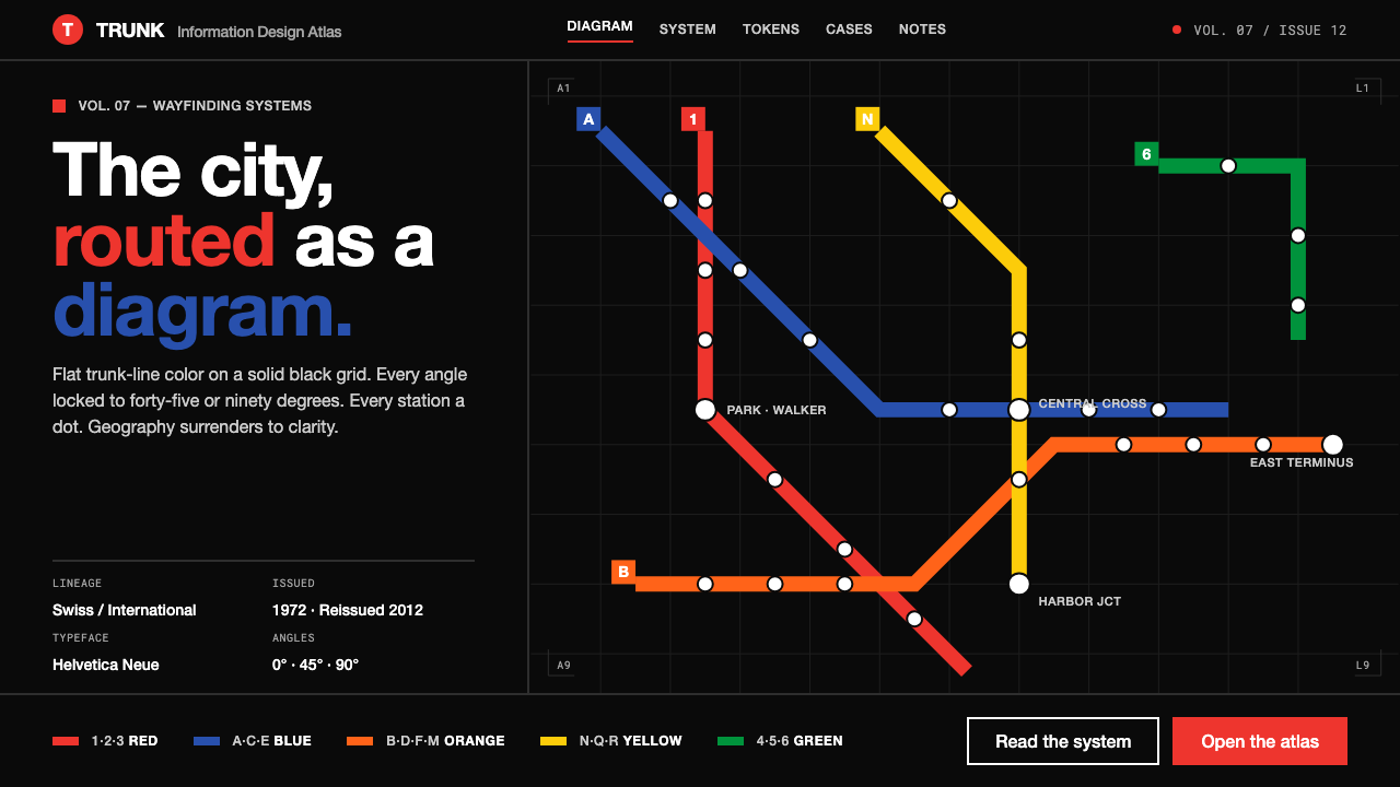 NYC Subway VignelliThe city as a circuit diagram. Flat trunk-line color on black, angles locked…
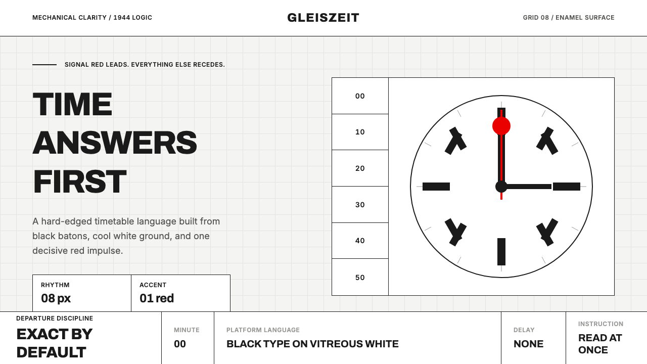 Swiss Railway ClockPrecision refuses decoration. Black batons and one red hand cut through ename…
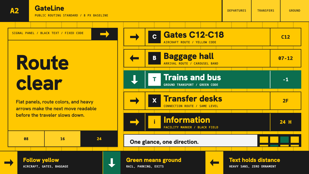 Airport Wayfinding GeometricLegibility becomes command. Signal yellow, black sans, and green route bands…
 Anton Stankowski ConstructiveProcess becomes visible. Flat blue diagonals and hard square rules make chang…
 Frutiger CDG AirportLegibility at runway scale. Navy panels, white humanist sans, arrow-led grids.