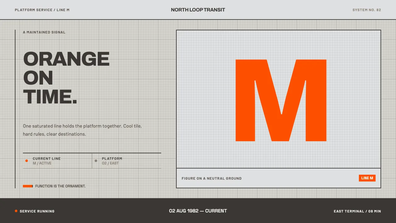
About Helsinki Metro Orange
The Helsinki metro opened in 1982 with a single decision that still holds: every train is the same orange. M100 cars run through pale tile-and-concrete platform halls and through caverns blasted straight out of granite, so the orange is always figure on a cool neutral ground — on the car, on the seat moquette, on the sign.
This system keeps that arrangement. The page is the platform hall. Type is neo-grotesque and flush left, geometry is 45° and 90° only, fills are flat, and the orange is the one colour permitted to mean something. Nothing here is nostalgic; it is a working system that has simply been maintained.
- Origin
- Helsinki, Finland
- Era
- 1950–1990 (system opened 2 August 1982; M100 stock from 1982)
- Key figures
- Valmet · Strömberg · Werklig · Camelot Typefaces
- Movements
- Finnish functionalism · Nordic transit modernism · neo-grotesque wayfinding
Helsinki Metro Orange design spec
Colors
Typography
The other 11 sections — buttons, cards, spacing, motion, techniques and more — open once you unlock. Download the DESIGN.md or send it to your AI in one click. Unlock once, yours forever.
Sign up nowStyles similar to Helsinki Metro Orange
Also inspired by architecture & places, with a close feel.
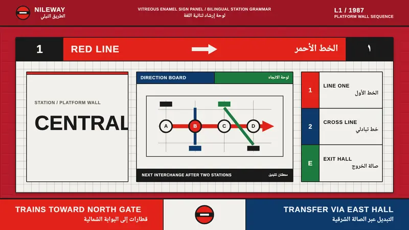 Cairo Metro WayfindingAuthority at speed. Enamel red, Arimo grids, and co-equal Arabic signage.
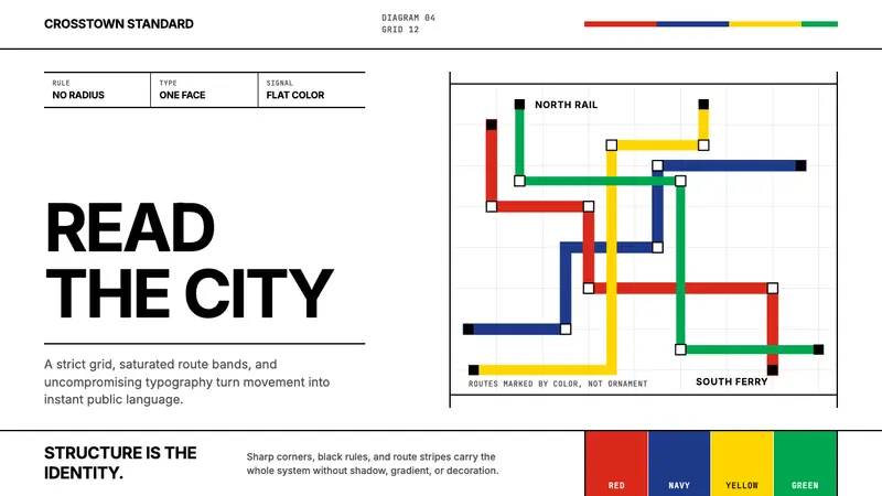 Massimo Vignelli NYCClarity becomes infrastructure. Black rules and route stripes lock the white grid.
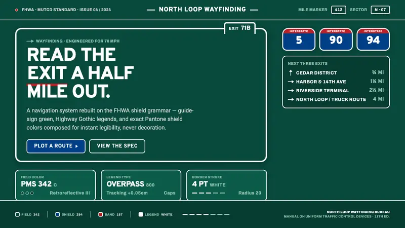 Interstate Highway ShieldEngineered for 70 mph. Guide-sign green, Pantone shield blue and red, Highway Gothic in all caps.
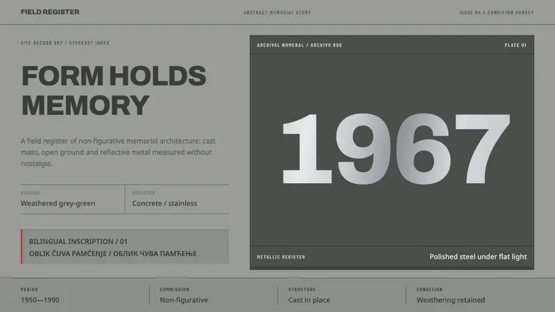 Yugoslav SpomenikMonumentality without figures. Concrete grey-green meets stainless geometry at a hard horizon.