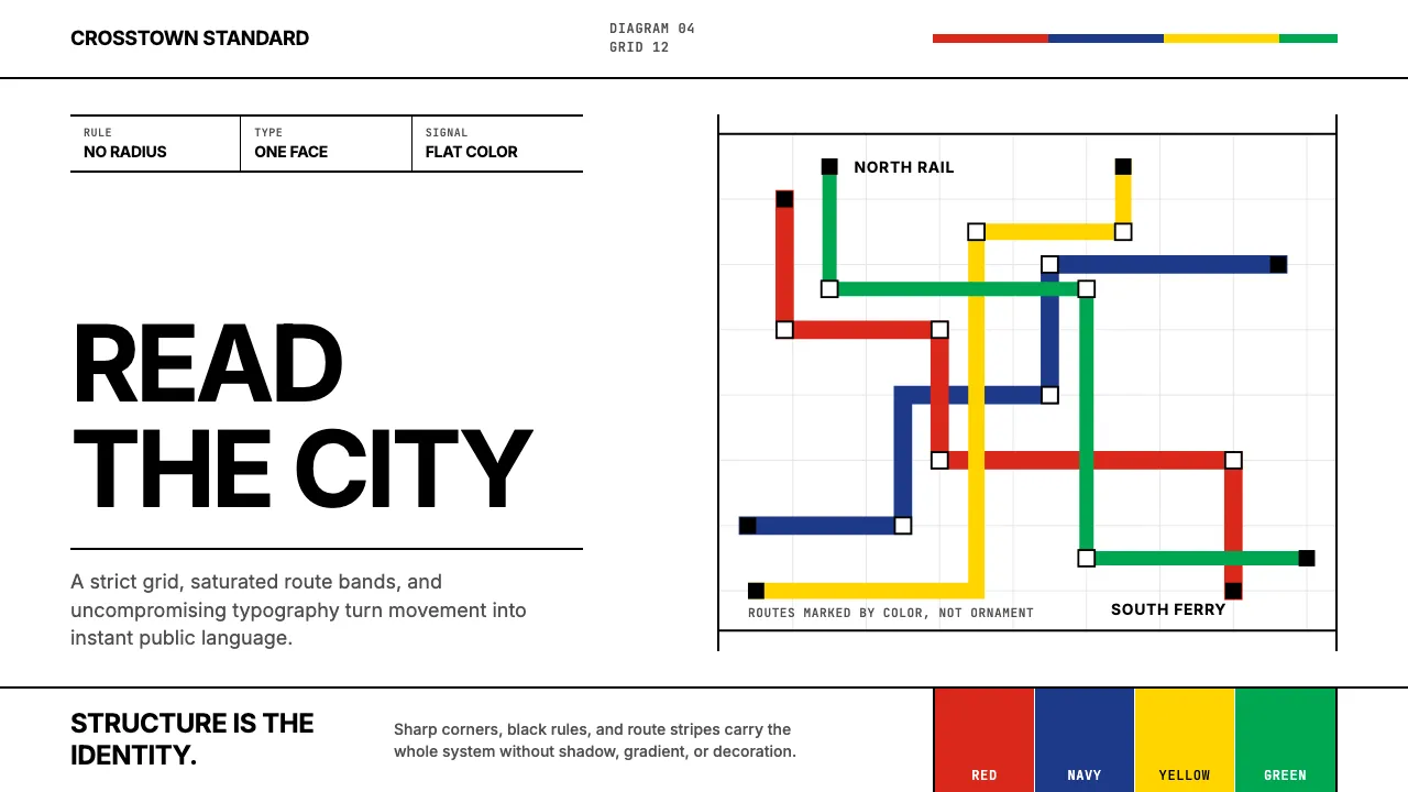
About Massimo Vignelli NYC
Massimo Vignelli Helvetica-ized New York. From the 1970 Subway map to the American Airlines eagle, his work proved that one typeface, a handful of saturated colors, and an unshakeable grid could unify an entire metropolis. This system distills that conviction into a digital toolkit — sharp corners, bold route-stripe accents, and relentless typographic clarity.
Everything here descends from the Vignelli Canon: semantic clarity, visual power, intellectual elegance. No decoration, no radius, no shadow. Just structure and color doing all the work.
- Origin
- Milan and New York City, USA
- Era
- Active 1957–2014; NYC Subway map 1970; AA identity 1967–2013
- Key figures
- Massimo Vignelli · Lella Vignelli · Bob Noorda
- Movements
- Modernist orthodoxy · Swiss-Italian crossover · The Vignelli Canon
Massimo Vignelli NYC design spec
Colors
Typography
The other 11 sections — buttons, cards, spacing, motion, techniques and more — open once you unlock. Download the DESIGN.md or send it to your AI in one click. Unlock once, yours forever.
Sign up nowStyles similar to Massimo Vignelli NYC
Also inspired by architecture & places, with a close feel.
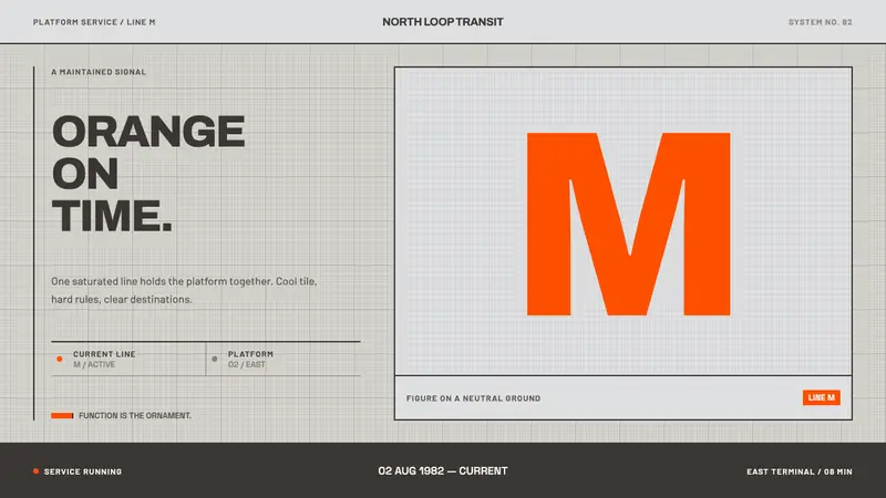 Helsinki Metro OrangeOne orange does the work. Archivo signage cuts across an 8px concrete tile grid.
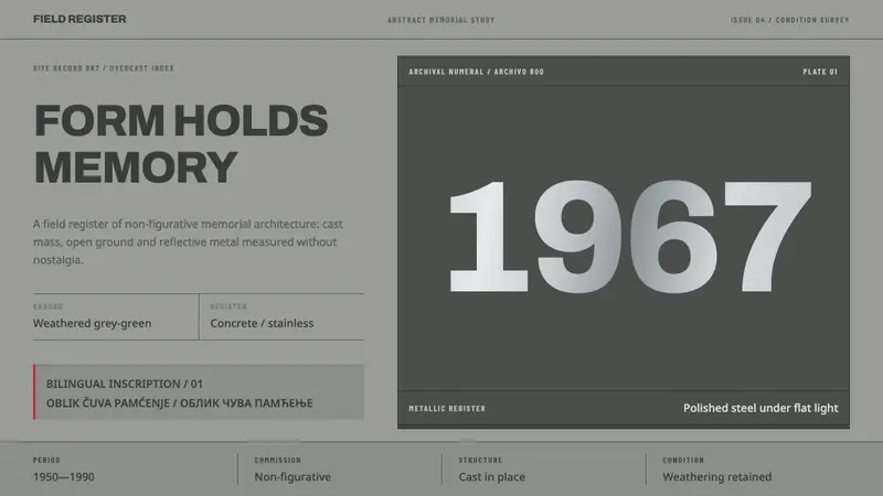 Yugoslav SpomenikMonumentality without figures. Concrete grey-green meets stainless geometry at a hard horizon.
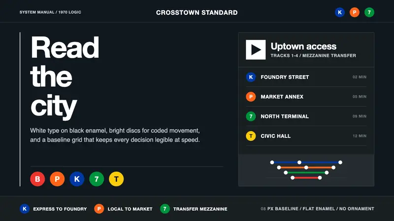 NYC Transit HelveticaOrder made visible. White type, black enamel, route discs, and a grid that never bends.
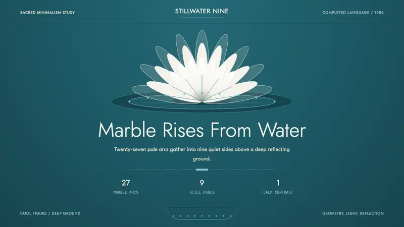 Baháʼí Lotus TempleSacred calm, made geometric. Marble white floats over deep turquoise in ninefold symmetry.