What is Airport Wayfinding Geometric?
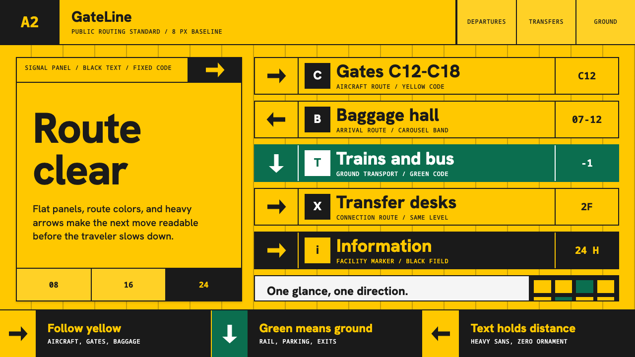
Airport Wayfinding Geometric turns legibility into command — signal yellow, black humanist type, green route bands, and arrows locked into an uncompromising grid.
Airport Wayfinding Geometric in brief
Airport Wayfinding Geometric is the information-design language associated with Amsterdam Schiphol and rebuilt by Paul Mijksenaar’s bureau from 1990. Its saturated yellow panels, black lettering, standardized pictograms, and forceful arrows form a visual system designed to be understood in a glance, from a distance, and while the viewer is moving through an unfamiliar environment.
The system separates routes through color. Yellow identifies journeys connected with aircraft and baggage, while white information on green directs travelers toward ground transport and parking. Color is therefore not atmosphere or branding applied after the fact; it is an operational code. Each panel answers a practical question: where to go, what lies ahead, or which route belongs to the traveler’s next task.
Its geometry comes from disciplined organization rather than decorative shapes. Text, arrows, pictograms, and color fields align as parts of one modular grid. Frutiger supplies an open, approachable humanist voice, while flat panels and firm hierarchy remove visual hesitation. The result is authoritative without becoming ceremonial: an architecture of instructions built for speed, distance, and immediate recognition.
Where does Airport Wayfinding Geometric come from?
The style’s defining setting is Amsterdam Schiphol in the Netherlands, a transport environment where information must compete with movement, noise, architectural scale, and travelers’ limited attention. From 1990, Bureau Mijksenaar rebuilt the airport’s wayfinding language around a strict hierarchy of color, text, arrows, and standardized pictograms. The project treated orientation as a complete system rather than a collection of isolated signs.
Its conceptual roots lie in information design and wayfinding: disciplines concerned not merely with displaying facts, but with guiding decisions through space. The system also draws on the ordering habits of Swiss and International grid signage. Alignment, repetition, restrained typography, and consistent visual categories make separate panels behave like parts of one continuous public language.
Paul Mijksenaar and his bureau made color the central routing mechanism. Signal yellow carried black information for paths associated with aircraft and baggage. Green carried white information for ground transport and parking. This division allowed travelers to recognize a route family before reading every word, turning the surrounding field of color into an early stage of comprehension.
Typography completed the system. Frutiger, the humanist sans designed by Adrian Frutiger for airport signage, combined functional clarity with forms less mechanical than rigid geometric lettering. Within the Schiphol language, it supported reading at a glance and at distance without competing with arrows or pictograms. Across the 1990–2010 era associated with the system, these elements established a canonical model of airport information design.
What defines the Airport Wayfinding Geometric look?
Operational Color
Color assigns destinations rather than moods. Saturated signal yellow carries black guidance for aircraft and baggage routes; green carries white guidance for ground transport and parking. The distinction must remain immediate and consistent, because recognition of the color field precedes detailed reading. Additional hues would weaken the code by creating categories the system does not need.
Humanist Typography
Frutiger provides the system’s typographic voice. Its humanist sans forms feel open and readable without becoming ornamental, supporting recognition at distance and under hurried viewing. Hierarchy comes from clear changes in prominence and placement, not from mixing type families. Lettering behaves as directional information first and visual identity second.
Grid Discipline
Every panel is organized as a compact grid in which text, pictograms, arrows, and color bands occupy predictable roles. Alignment lets the eye compare several instructions rapidly, while repetition makes a newly encountered sign feel familiar. Geometry emerges from this structural consistency: rectangular fields and directional marks appear inevitable rather than composed for effect.
Directional Arrows
Arrows are commands, not illustrations. They must retain a stable visual form and sit close enough to their destinations to eliminate doubt about association. Their orientation creates movement inside an otherwise flat composition, making the panel function as a decision point. Decorative variations would introduce hesitation precisely where certainty is required.
Standardized Pictograms
Pictograms compress facilities and actions into repeatable visual signs. Their value lies in standardization: related symbols share weight, simplification, and scale so that no single icon appears expressive or branded. Paired with text and arrows, they provide an additional recognition channel without turning the sign into an illustrated scene.
Flat Hierarchy
Panels are flat blocks with no simulated material, atmospheric depth, or decorative surface treatment. Hierarchy is created through contrast, grouping, and ordered bands. This flatness keeps every element optically available and prevents visual effects from competing with the instruction. The sign looks assembled from information itself, not wrapped in a style afterward.
Who shaped Airport Wayfinding Geometric?
Mijksenaar is the central figure associated with the Schiphol system rebuilt from 1990. His approach positioned wayfinding as an integrated act of information design: color categories, typography, pictograms, arrows, and spatial decisions had to reinforce one another. The resulting language demonstrates how visual identity can emerge from operational consistency rather than decorative branding.
Bureau Mijksenaar translated the system’s principles into a coherent airport-wide language. Its role was not limited to designing individual panels; the bureau coordinated recurring decisions about route color, hierarchy, symbol use, and directional clarity. That systemic perspective is what makes separate signs read as one navigational environment rather than a series of graphic objects.
Adrian Frutiger designed the humanist sans used by the Schiphol system for airport signage. The typeface contributes legibility without the impersonal rigidity of purely geometric lettering. Its clear, open character supports rapid recognition while leaving arrows, pictograms, and color fields free to perform their own roles within the hierarchy.
How do you use Airport Wayfinding Geometric today?
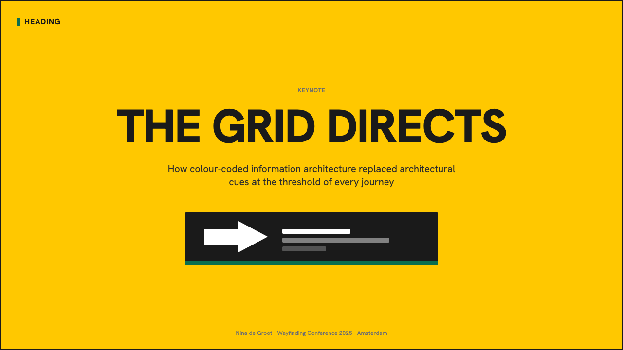
For presentation covers, use the visual force of a destination panel: one dominant yellow field, compact black titling, and a single arrow or pictogram that establishes direction. Content slides should adopt the same grid logic, with headings, labels, and supporting text aligned into stable bands. The style succeeds when the audience understands the slide’s route before reading its details.
Data slides benefit from the system’s categorical discipline. Treat charts as navigational information rather than decoration: use yellow and green to distinguish meaningful route families, keep labels close to the values they explain, and let arrows or ordered bands show progression. Avoid ornamental chart effects, since depth and texture weaken the direct relationship between category, label, and destination.
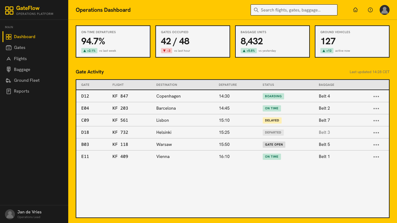
For dashboards and pricing pages, assign color according to function and preserve that assignment across the interface. Yellow can identify the primary workflow or urgent route, while green can gather supporting routes such as account, transport, or completion states. Cards should behave like information panels, with decisive grouping, strong contrast, standardized icons, and no surface effects that reduce scanning speed.
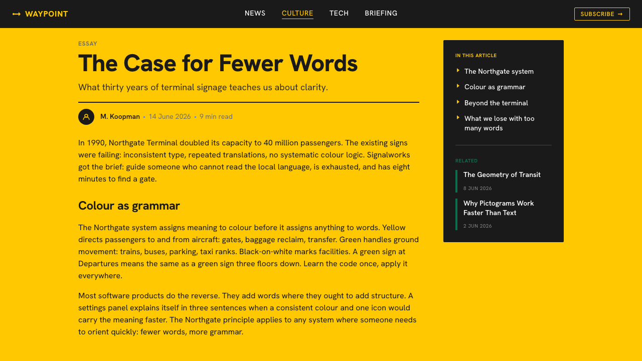
Editorial and marketing layouts can borrow the style’s public authority without imitating an airport literally. Use broad color bands to mark sections, compact typographic blocks for headlines, and pictograms only when they clarify a category. A campaign page can turn its call to action into a destination marker, while an article can use directional bands to guide readers through a sequence of sections.
The common mistake is to treat yellow, black, green, arrows, and airport icons as a decorative theme. Authentic use begins with an information problem: categories must be defined, routes must remain consistent, and every directional sign must resolve a decision. Random arrows, excessive pictograms, or interchangeable color fields create the appearance of wayfinding while destroying its logic.
Airport Wayfinding Geometric — FAQ
Why is yellow the dominant color?
In the Schiphol system, yellow is an operational category for routes associated with aircraft and baggage, not merely a high-visibility brand color. Its saturated field creates an immediate background against which black text and pictograms read clearly. Repetition across related destinations teaches travelers that encountering yellow means entering the same family of airport tasks.
Is this style simply Swiss signage in airport colors?
No. It shares the alignment, repetition, and grid discipline associated with Swiss and International signage, but Schiphol’s identity depends on a specific routing code. Yellow and green divide different journey families, while Frutiger, arrows, and standardized pictograms work together as an airport-wide decision system. The colors cannot be separated from what they instruct.
Can the yellow and green roles be exchanged?
Not without changing the system’s meaning. Yellow identifies routes connected with aircraft and baggage, while green directs ground transport and parking. Once travelers learn that distinction, consistency becomes part of legibility. Exchanging the colors for visual variety would force people to reread information that the color field was designed to communicate before words.
Must every application use airport pictograms?
No. The transferable principle is standardized visual vocabulary, not literal aviation imagery. A dashboard may use a consistent family of interface symbols, while an editorial layout may need only arrows and section markers. Pictograms should appear when they accelerate recognition of a real category; using luggage or aircraft symbols without relevant meaning reduces the style to costume.
What makes Frutiger appropriate for this system?
Frutiger was designed for airport signage and brings a humanist structure to a highly regulated environment. Its forms support rapid reading at distance while remaining less mechanical than strictly geometric sans lettering. That balance matters at Schiphol: the type must be authoritative enough to direct movement, yet open enough to remain approachable within a stressful public setting.
Related design styles
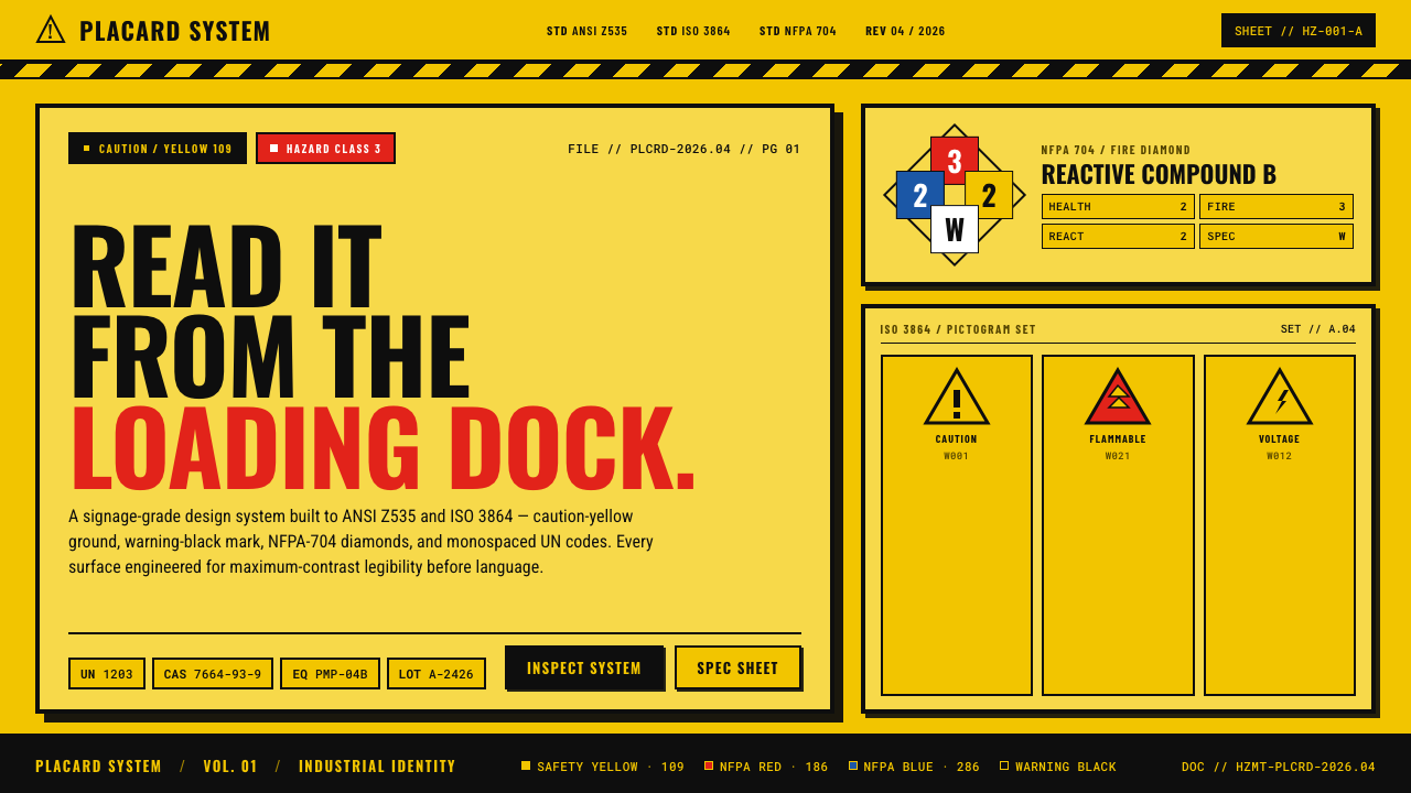 Hazmat SignageRead it from the loading dock. Caution-yellow ground, NFPA diamonds, monospac…
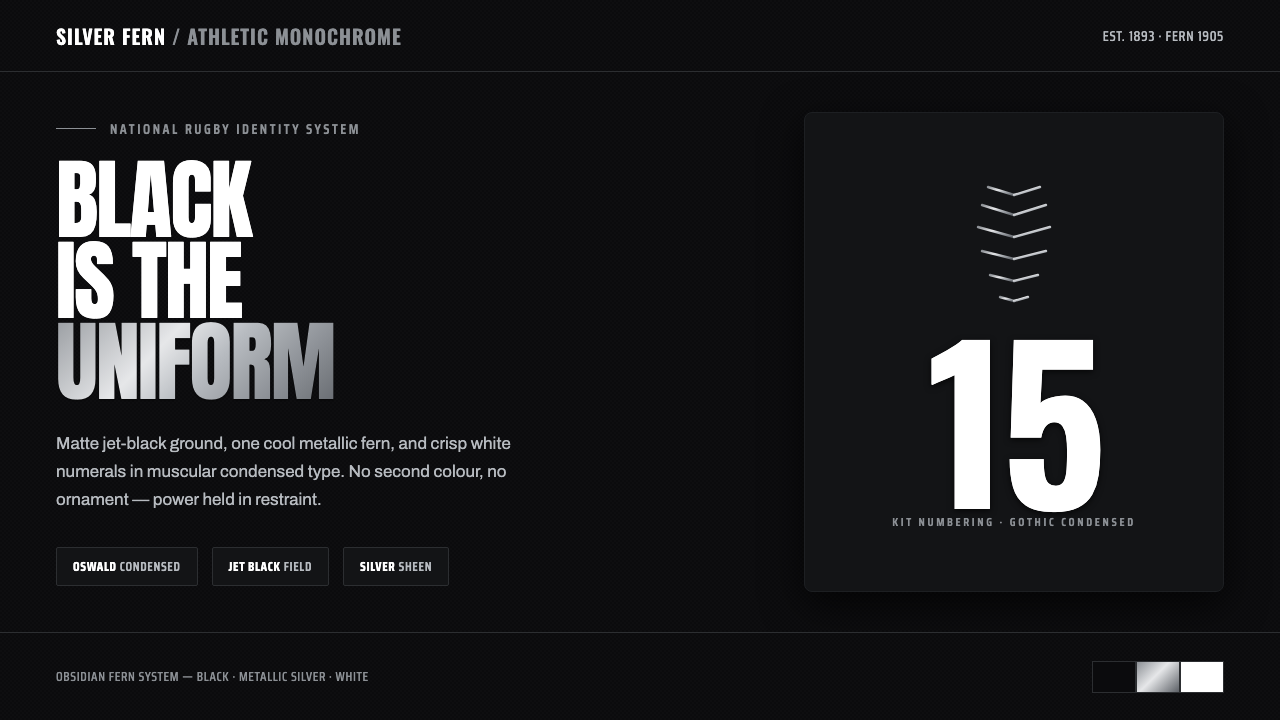 All Blacks Silver FernOne colour, total force. Jet-black field, a single metallic-silver fern, whit…
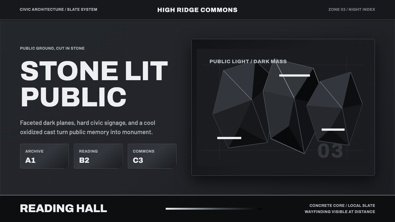 Medellín Library ParkCivic gravity in slate. Near-black planes, cool grey hairlines, and bold wayf…
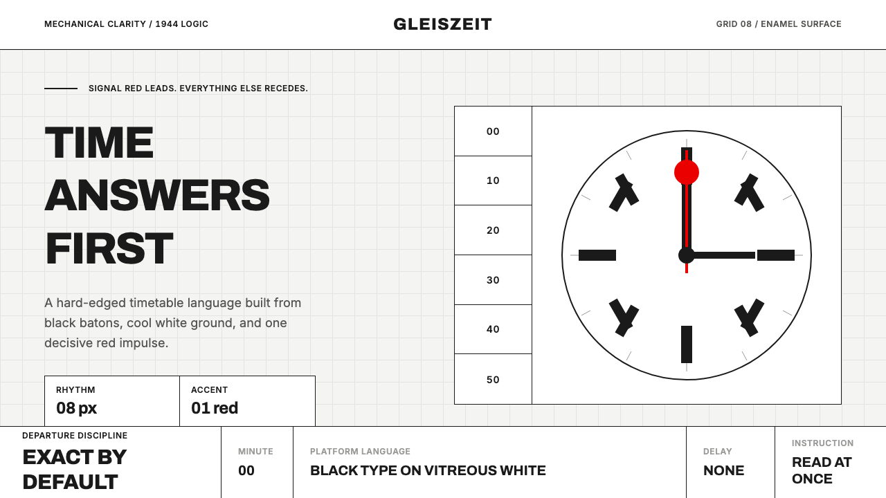 Swiss Railway ClockPrecision refuses decoration. Black batons and one red hand cut through ename…
 Calatrava White RibsArchitecture becomes blueprint. Bone-white ribs cut through deep Valencian sk…
 Hi-Vis Safety VestEngineered to be seen. Fluorescent lime on blacktop, silver reflective bands,…