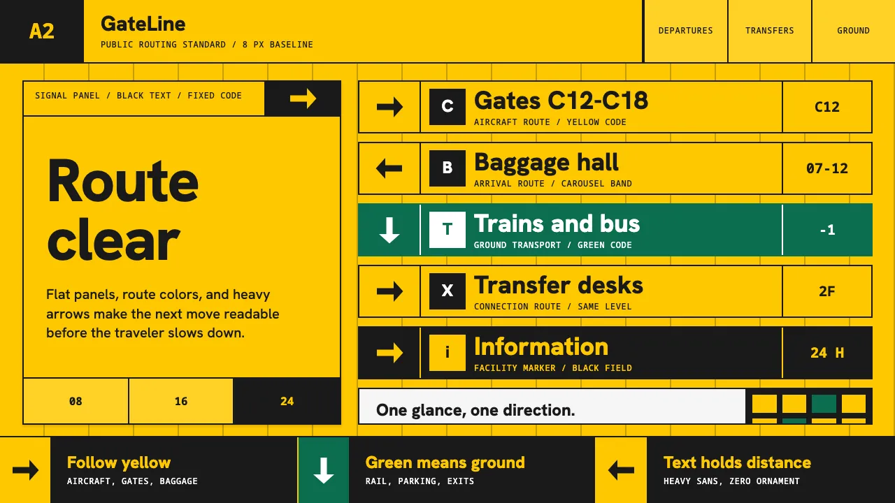
About Airport Wayfinding Geometric
This is the canonical airport information-design language of Amsterdam Schiphol, rebuilt by Paul Mijksenaar's bureau from 1990: saturated signal-yellow panels carrying black text and pictograms. Yellow routes you to and from the aircraft and baggage, white-on-green directs ground transport and parking — a strict colour-coded grid of arrows and standardized pictograms.
Set in Frutiger, the humanist sans Adrian Frutiger designed for airport signage, the system trades decoration for legibility at a glance and at distance. Every panel is a flat colour block, a clear hierarchy band, and an unambiguous direction.
- Origin
- Amsterdam Schiphol, Netherlands
- Era
- 1990–2010 (Mijksenaar Schiphol system, from 1990)
- Key figures
- Paul Mijksenaar · Bureau Mijksenaar · Adrian Frutiger
- Movements
- Information design · Wayfinding systems · Swiss / International grid signage
Airport Wayfinding Geometric design spec
Colors
Typography
The other 11 sections — buttons, cards, spacing, motion, techniques and more — open once you unlock. Download the DESIGN.md or send it to your AI in one click. Unlock once, yours forever.
Sign up nowStyles similar to Airport Wayfinding Geometric
Also inspired by architecture & places, with a close feel.
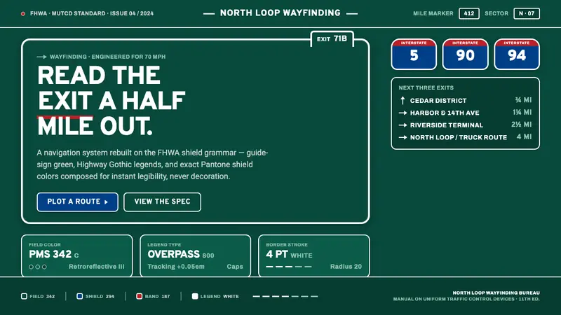 Interstate Highway ShieldEngineered for 70 mph. Guide-sign green, Pantone shield blue and red, Highway Gothic in all caps.
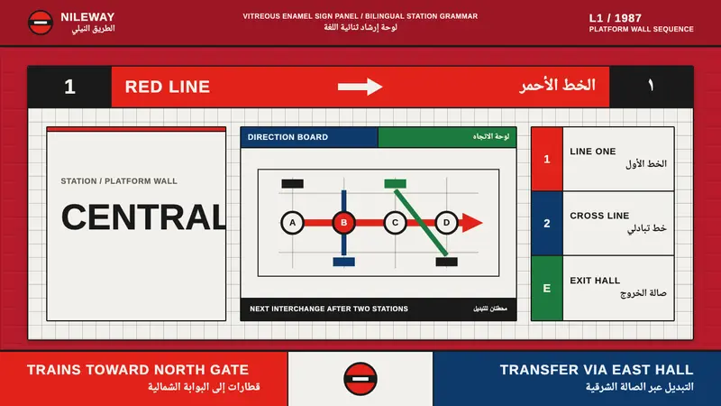 Cairo Metro WayfindingAuthority at speed. Enamel red, Arimo grids, and co-equal Arabic signage.
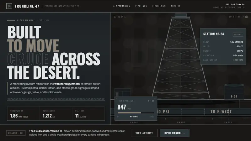 Gulf Oil Derrick IndustrialEngineered, not decorative. Soot-darkened gunmetal, derrick lattice, condensed Oswald stencils.
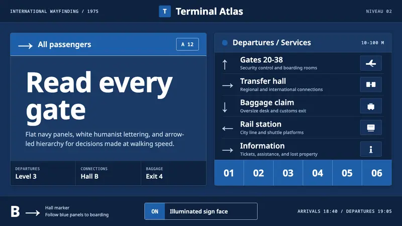 Frutiger CDG AirportLegibility at runway scale. Navy panels, white humanist sans, arrow-led grids.