What is Calatrava White Ribs?
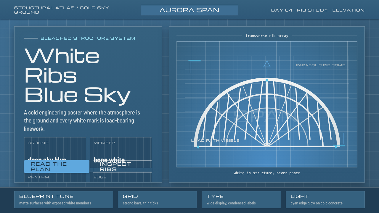
Calatrava White Ribs turns architecture into a drawing: bone-white structural ribs suspended in deep Valencian sky blue, with every edge reading as engineered linework.
Calatrava White Ribs in brief
Calatrava White Ribs is a dark architectural system drawn from Santiago Calatrava’s City of Arts & Sciences in Valencia, Spain. Its central image is not a building as a solid mass, but a skeletal construction: white concrete and white steel read as rib cages, whale skeletons, and bleached bone, suspended against a saturated Valencian sky.
The visual language depends on a strict relationship between ground and structure. Deep sky blue supplies the atmospheric field; bone-white members supply the architecture; bright sky blue appears as a controlled highlight that keeps the system luminous without softening its engineered character. The white is structural, never creamy, and the blue is expansive rather than decorative.
Everything is treated as blueprint logic. Radiating horizontal ribs become organizing lines, white forms become diagrammatic marks, and negative space becomes part of the construction. The result is futuristic without becoming metallic, skeletal without becoming macabre, and expressive without losing the sense that every line has been placed for a reason.

Where does Calatrava White Ribs come from?
The reference belongs to the era from 1990 to 2010 and is rooted in Valencia, Spain, in Western Europe. The City of Arts & Sciences was built between 1991 and 2004, and its public image is inseparable from the brilliant sky against which its white architecture is seen. The source material presents the project as a meeting of structure, atmosphere, and visual drawing.
Santiago Calatrava is the central named figure in this reference. His City of Arts & Sciences gives the system its defining forms: white concrete and white steel organized into skeletal silhouettes and linked by radiating horizontal ribs. The architecture is therefore read through its visible construction, not through applied decoration or surface color.
The source places the work within structural expressionism and Calatravan neofuturism. Those terms describe a language in which engineering becomes visual expression and the future is imagined through articulated structure. In this system, the expressive force comes from the tension between heavy architectural material and the lightness of a drawn outline.
The Valencian sky completes the origin story of the style. Against deep blue, the white building becomes almost weightless, like a technical drawing lifted from paper and placed in open air. Calatrava White Ribs takes that photographic and architectural reading literally: deep blue becomes the field, white becomes the skeleton, and bright blue becomes the glint of sky caught between structural members.
What defines the Calatrava White Ribs look?
Sky-Blue Ground
The ground is deep Valencian sky blue rather than black, navy, or cream. It carries the atmosphere of an open sky and gives the white structural marks room to appear suspended. The blue should feel saturated and spacious, with enough depth to support strong contrast but not so much darkness that the architecture disappears.
Bone-White Structure
White is reserved for the architectural body: ribs, frames, skeletal members, and the visible logic that holds the composition together. It is a hard, clean white with the emotional association of bleached bone. Cream, ivory, and warm paper tones weaken the reference because they turn structure into softness.
Radiating Ribs
Radiating horizontal ribs are the signature organizing device. They create repetition without becoming a pattern, tying separate forms into a single architectural body. In graphic use, ribs can divide content, frame a title, or guide the eye across a page, but they should always feel structural rather than ornamental.
Blueprint Linework
The system treats architecture as a drawing. Lines are declarative, edges are exposed, and forms are presented as if they could be read in an engineered plan. This does not mean adding technical labels everywhere. It means allowing the underlying construction to organize the visual field instead of hiding it beneath decorative effects.
Skeletal Silhouette
The forms should suggest rib cages, whale skeletons, and bleached bone without becoming literal illustrations of anatomy. The power lies in recognition through silhouette: a viewer senses an organic skeleton, but the visible language remains architectural and engineered. Large areas of open blue are essential to this effect.
Controlled Luminance
Brightness is concentrated rather than spread evenly. The white skeleton carries the strongest visual force, while bright sky blue acts as a selective glint or atmospheric lift. This keeps the composition vivid without introducing gradients, glow, or soft lighting. Contrast should clarify construction, not simulate a polished interface.

Who shaped Calatrava White Ribs?
Santiago Calatrava is the central named figure behind the reference. His City of Arts & Sciences supplies the white concrete, white steel, skeletal silhouettes, and radiating horizontal ribs that define the system. In this article, Calatrava represents the point where structural expression becomes an immediately legible visual language.
Félix Candela is listed in the source as a key figure within the reference. The approved material does not provide a separate biographical account or assign a specific contribution, so his inclusion should be understood as part of the named architectural lineage surrounding the style rather than as a cue to invent additional history.
The City of Arts & Sciences is the project anchor rather than a decorative reference. Its white architectural members, skeletal reading, and relationship with the Valencian sky establish the complete visual grammar: deep atmospheric ground, bone-white structure, radiating ribs, and the sense that a building can behave like a blueprint.
How do you use Calatrava White Ribs today?
Calatrava White Ribs works best when the visual hierarchy follows construction. Let the deep sky-blue field establish the atmosphere, let bone-white forms carry the primary information, and use bright sky blue only where a moment of emphasis or orientation is needed. The system becomes weaker when the palette is treated as a general blue-and-white theme without a structural relationship between the colors.
For presentation slides, the cover should feel like a building emerging from a field of sky: a bold white skeletal mark, ribbed frame, or architectural silhouette against the deep blue ground. Content slides should let ribs act as organizing lines between title, body text, and image. Data slides can turn charts into structural diagrams, using white for the main construction and bright blue for a focused signal rather than coloring every element equally.
For web interfaces, the style suits dashboards, technical tools, and pricing pages that need to feel engineered but not cold. Deep blue can hold the main environment, while white panels, outlines, and structural dividers create the readable framework. Bright sky blue can indicate active states, selected plans, or important transitions. Avoid turning every card into a floating object; the page should read as one connected structure.
For editorial and marketing work, the system supports dramatic covers, architectural case studies, technology campaigns, and announcements that need a sense of scale. Use wide blue fields, white skeletal lettering or framing, and section breaks that behave like ribs passing through the page. Imagery should reinforce architecture, sky, structure, or exposed construction rather than introduce warm paper textures or unrelated ornament.
The common mistake is to imitate the motif without preserving its logic. Random white lines over a dark blue background become decoration, cream backgrounds dissolve the bone-white contrast, and excessive highlights make the page feel luminous instead of engineered. Another mistake is filling every area with ribs. The strongest application leaves enough blue open for the structure to appear suspended and allows a few decisive members to organize the whole composition.

Calatrava White Ribs — FAQ
Is Calatrava White Ribs simply a blue-and-white palette?
No. The palette is only the visible starting point. The defining relationship is between a deep Valencian sky-blue field and bone-white structural members that behave like ribs, frames, or skeletal linework. Bright sky blue provides a selective lift. Without that hierarchy, the result becomes a generic dark interface rather than an architectural blueprint.
Why must the white remain white rather than cream?
Because the white represents bone, concrete, steel, and exposed structure. A warm cream tone introduces paper, softness, and domestic warmth, all of which move the system away from the reference. The contrast should feel like white architectural matter suspended against blue sky, not like an aged print on warm stock.
Can the style use a dark background?
Yes, and the deep sky-blue ground is fundamental to the system. The important distinction is that the background should feel like saturated atmosphere rather than featureless blackness. White structural elements must remain the brightest and clearest forms, while bright blue should be used selectively so the composition retains engineered clarity.
What separates this style from a generic blueprint aesthetic?
A generic blueprint may rely on technical lines as surface pattern. Calatrava White Ribs begins with architecture itself: white concrete and steel, rib cages, whale skeletons, bleached bone, and radiating horizontal ribs seen against the Valencian sky. Its linework is therefore bodily and structural at the same time. The drawing does not merely describe a building; it makes the building’s skeleton the visual subject.
Related design styles
 Swiss Franc NoteCurrency-grade calm. Oxblood grid, Inter numerals, amber-teal prism lines.
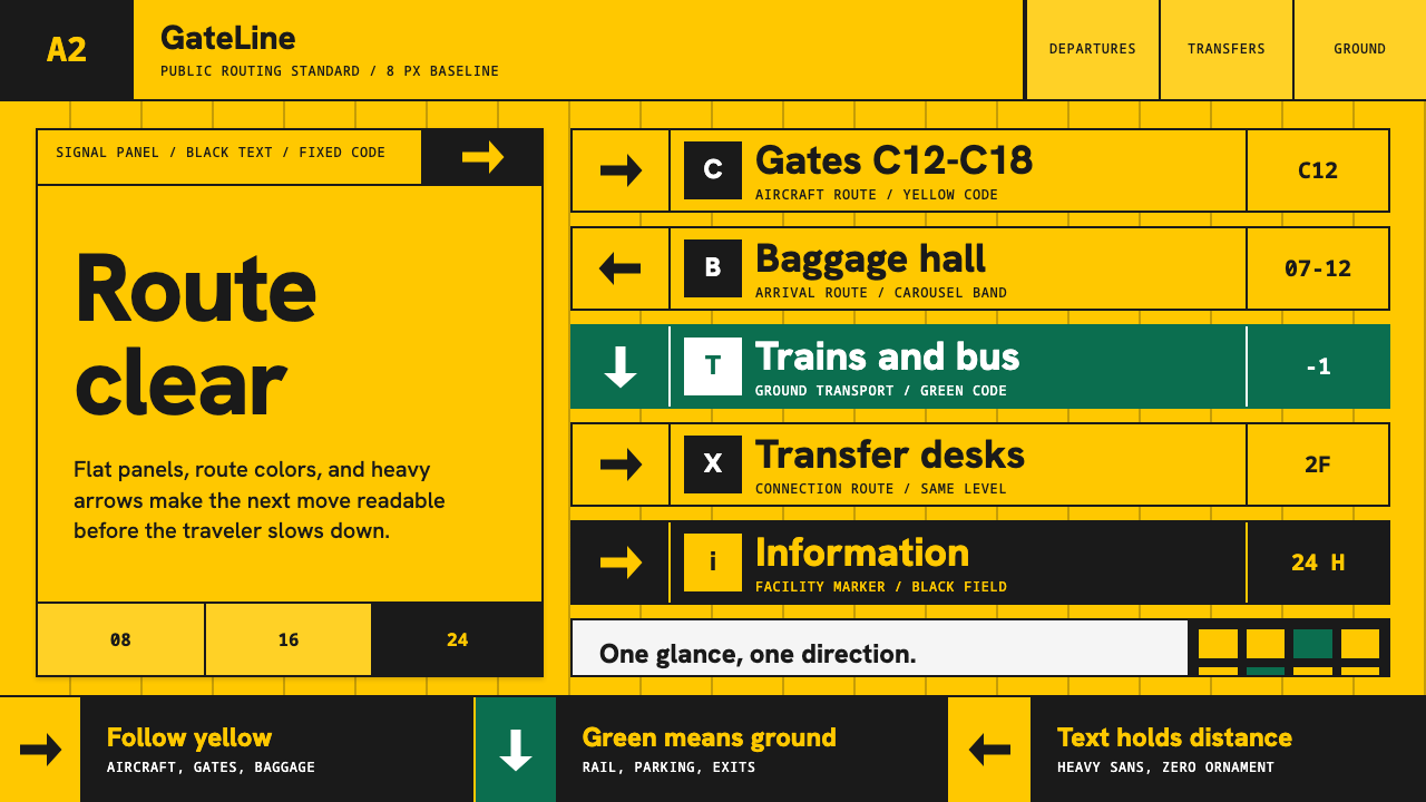 Airport Wayfinding GeometricLegibility becomes command. Signal yellow, black sans, and green route bands…
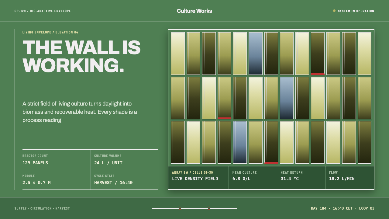 Algae Bioreactor FacadeThe wall is alive and working. Chartreuse-to-olive panels make every process…
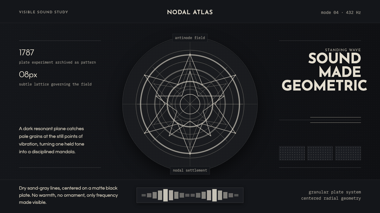 Cymatics Standing WaveSound becomes geometry. Sand-gray nodal rings settle on a dark resonant plate.
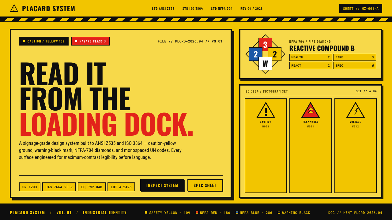 Hazmat SignageRead it from the loading dock. Caution-yellow ground, NFPA diamonds, monospac…
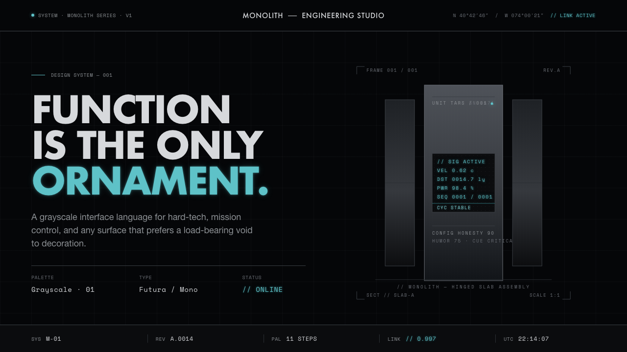 Interstellar TARSIf Mies built a robot. Brushed-aluminum grays on deep-space black, lit by one…