What is Interstellar TARS?
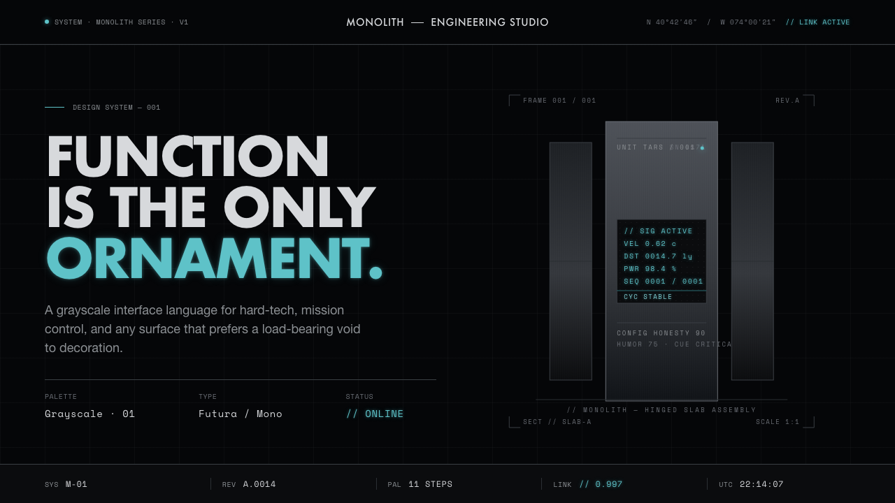
Interstellar TARS treats the interface as deep-space machinery: matte-black silence, brushed-aluminum slabs, and one cold cyan signal.
Interstellar TARS in brief
Interstellar TARS is the matte-black slab robot from Christopher Nolan’s film, imagined as what might result if Ludwig Mies van der Rohe designed a machine. Its visual language is deliberately non-human: rectangular brushed-aluminum slabs, hard right angles, and no face, gesture, or familiar anatomy to soften the object.
The style draws on the black monolith of *2001* and on post-war minimalist sculpture, but it is not a quotation of either. Its central idea is absolute restraint. Form is reduced until the machine reads as a composed object rather than a character, and every visible surface contributes to mass, alignment, or function.
Translated into an interface, that restraint becomes near-pure space black, cool metallic gray, sparse monospaced data readouts, and a single cold cyan-white screen tint. Vast negative space carries the visual weight. The result should feel like a quiet instrument operating in darkness, not a decorative science-fiction skin.
Where does Interstellar TARS come from?
The style belongs to the world of *Interstellar*, released in 2014, and to a near-future hard-sci-fi imagination shaped by North American, NASA-adjacent references and deep-space isolation. Its darkness is therefore not simply a preference for dramatic presentation. It establishes an environment in which information appears as a controlled signal against an almost limitless field.
Its formal ancestry is deliberately monolithic. The *2001* monolith contributes the sense of an opaque, self-contained object whose meaning comes from presence and proportion rather than decoration. Post-war minimalist sculpture contributes the discipline of reduced form, while Bauhaus and Miesian restraint provide a design attitude in which structure, surface, and utility are kept visibly close together.
The source material names Christopher Nolan, Nathan Crowley, and Hans Zimmer as key figures associated with the reference. Together, those names place TARS within a complete cinematic world of object, image, and atmosphere. For the design system, that means the visual identity cannot be separated from its mood: the interface must be built as a coherent environment of blackness, metal, silence, and isolated information.
What defines the Interstellar TARS look?
Space-Black Ground
The background approaches pure black, creating the impression of deep space rather than a conventional dark interface. Black is not an accent or a panel color; it is the surrounding condition in which every other element exists. Large uninterrupted fields are essential because they make metallic surfaces and cyan readouts feel like signals emerging from distance.
Metallic Gray
Cool grays stand in for brushed aluminum and the hard physical presence of a machine. They should remain restrained and mineral, with subdued tonal variation rather than decorative shine. Gray separates planes, establishes hierarchy, and gives panels a sense of construction without turning the interface into a glossy dashboard.
Monolithic Geometry
Rectangles, slabs, seams, and hard right angles form the primary vocabulary. Geometry should feel structural and weight-bearing, even when it is used for a simple card or navigation area. Curves, playful illustrations, and ornamental silhouettes weaken the reference because TARS is recognized through its severe objecthood.
Cold Cyan Signal
Cyan-white is reserved for the readout, alert, or active state that must cut through the black field. Its power comes from scarcity. Used across every control, it becomes ordinary decoration; isolated at moments of meaning, it behaves like a screen coming alive inside an otherwise dormant machine.
Sparse Monospaced Type
Typography behaves like instrumentation. Monospaced characters suggest measured data, machine logs, and controlled transmission rather than editorial conversation. Text should be concise, widely separated where necessary, and organized through scale and position. Dense copy, expressive display faces, and casual labels introduce a human warmth that the system is designed to withhold.
Negative-Space Weight
Empty space is an active material, not leftover room. It gives the black ground scale, separates the machine-like panels, and prevents the gray surfaces from becoming a continuous wall of information. Composition should often feel sparse to the point of tension, as though the interface is waiting for a signal rather than trying to fill the screen.
Who shaped Interstellar TARS?
Nolan is the named creator whose *Interstellar* supplies the TARS reference and its 2014 near-future setting. His importance to this design language is the commitment to a machine that remains austere and non-anthropomorphic. The interface should preserve that seriousness, allowing silhouette, darkness, and controlled information to carry recognition.
Nathan Crowley is identified as a key figure in the TARS reference. His inclusion reinforces the importance of constructed form: slabs, joints, surfaces, and clear physical relationships. In application, the lesson is to treat the interface as an assembled instrument whose panels align and whose materials remain quiet.
Hans Zimmer is listed among the key figures associated with the reference, representing its atmospheric dimension. That dimension should appear through quiet, scale, and contrast rather than visual noise. A dark field with a solitary cyan readout can create more presence than a screen crowded with effects.
How do you use Interstellar TARS today?
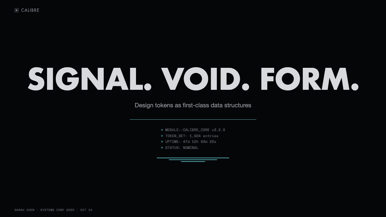
For presentation slides, use the cover as an object in darkness. A near-black field can hold a restrained metallic title block, a severe slab-like shape, and a cold cyan indicator that suggests system status. Content slides should behave like instrument panels: concise headings, sparse monospaced labels, clear alignment, and large areas of rest. Data slides benefit from quiet diagrams and isolated signals, with cyan reserved for the value or condition that deserves attention.
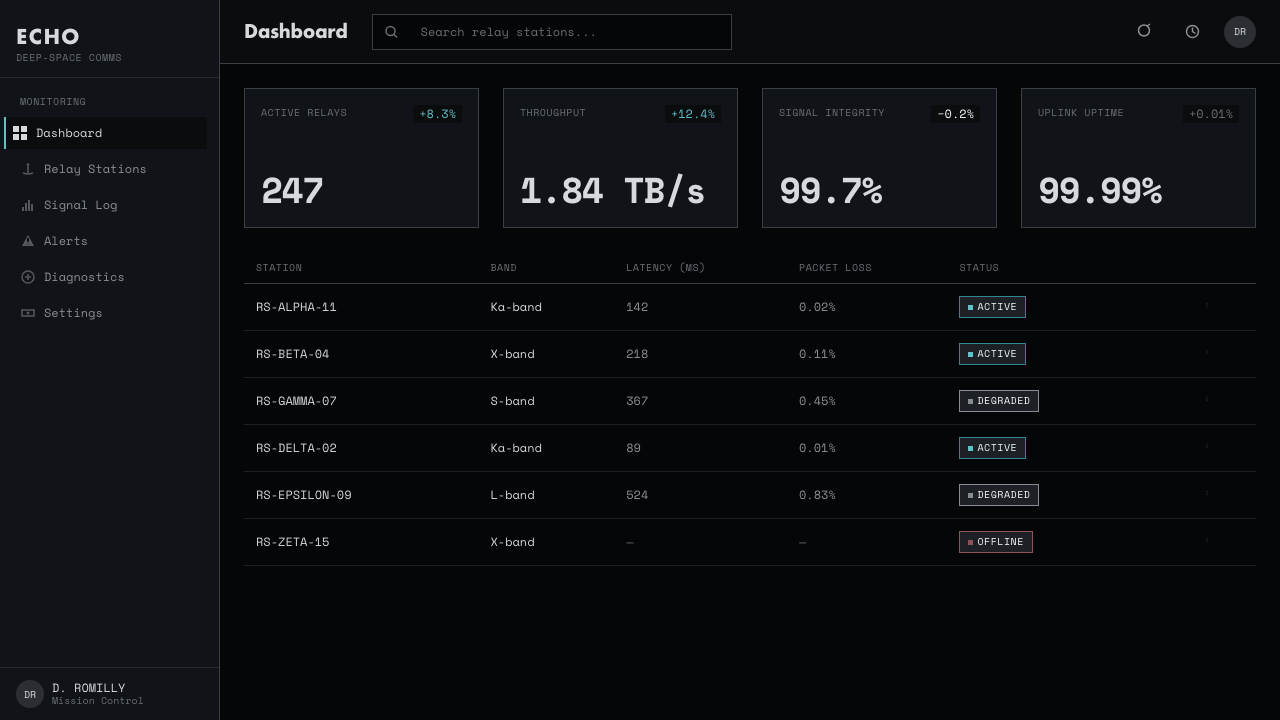
For web interfaces, the style is especially strong for dashboards, monitoring tools, analytical products, and pricing pages that want to communicate precision and technical seriousness. Use black as the environment, cool gray to distinguish surfaces, and cyan for active states, selected plans, or critical readouts. Panels should feel assembled rather than floating, with crisp edges and restrained depth. Navigation should be compact and legible, using text and simple structural indicators instead of decorative icon systems.
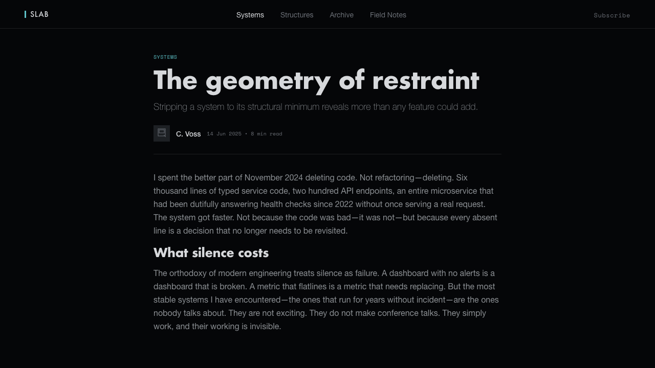
For editorial and marketing work, TARS creates a stark contrast between information and emptiness. An article can place a narrow column of measured text inside a broad black field, with metallic-gray metadata and a cyan rule or status marker introducing each section. Marketing pages can use large, declarative statements, object-like product crops, and quiet transitions between black and gray surfaces. The style is most persuasive when the message feels engineered and deliberate, not when it imitates a movie poster.
The common mistake is treating the style as generic dark mode with blue accents. Too much cyan destroys its signal value; too many gradients turn metal into glossy decoration; excessive cards eliminate the deep-space field; rounded controls and expressive illustrations make the machine feel friendly. Another frequent error is adding technical labels everywhere. The system depends on restraint, so every readout should earn its place through hierarchy, function, or atmosphere.
Interstellar TARS — FAQ
Is Interstellar TARS simply a dark-mode interface?
No. Darkness is only the environment. The identity comes from the relationship between near-black space, cool metallic surfaces, monospaced readouts, hard geometry, and a scarce cyan signal. Remove the material discipline and the negative space, and the result becomes a generic futuristic dashboard rather than TARS-inspired design.
How much cyan should the system use?
Very little. Cyan should identify a readout, active state, alert, or selected condition that needs to emerge from the black field. It should not become a general brand color applied to every button, border, and label. The less frequently it appears, the more convincingly it behaves as a signal.
Can the style work on a light background?
A light variation is possible, but it gives up the central experience of deep-space isolation. The strongest version keeps the near-black ground and lets gray planes and cyan information emerge from it. If a lighter field is required for accessibility or context, retain the rectangular geometry, restrained metallic palette, sparse type, and strict signal hierarchy so the system does not lose its monolithic character.
What makes the style feel cinematic without becoming decorative?
Cinematic presence comes from scale, silence, contrast, and controlled emergence. Give the black field room, let a slab or readout appear with purpose, and keep transitions measured and unobtrusive. Avoid adding stars, glowing effects, elaborate HUD graphics, or ornamental sci-fi symbols. The reference feels cinematic because it is confident enough to leave most of the frame unresolved.
Related design styles
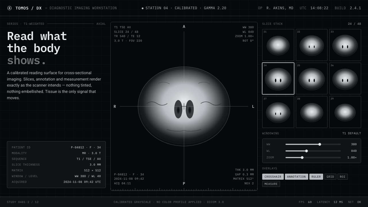 MRI ScanReads like a radiology viewport. Tissue-gray tomograms on pure black, IBM Ple…
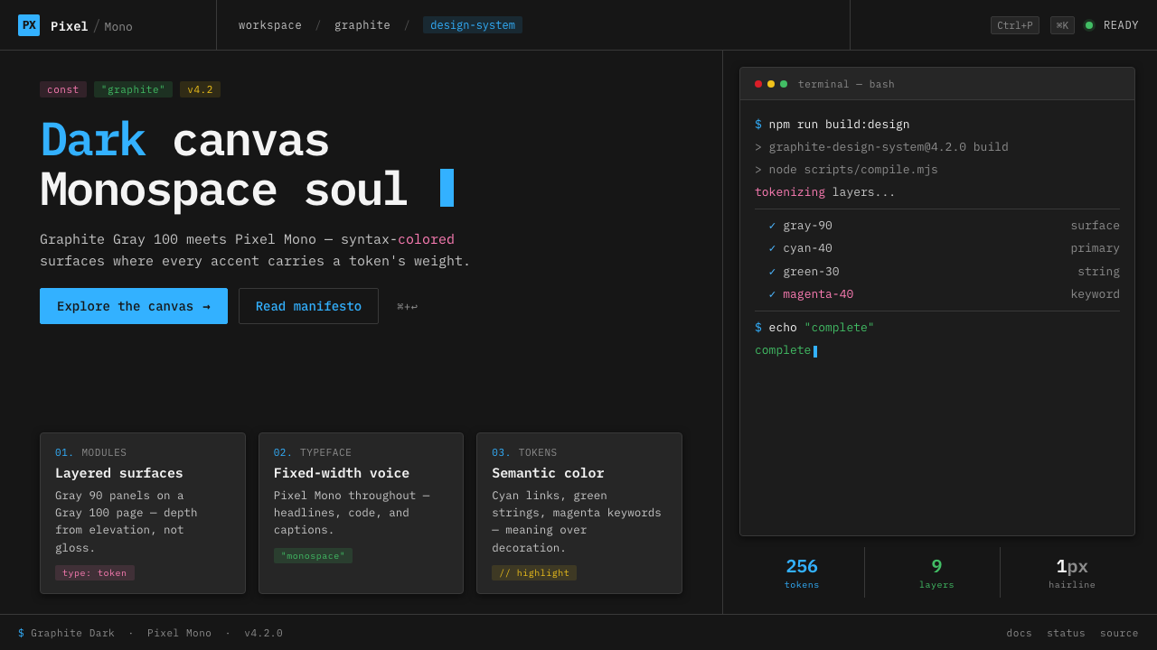 IBM Plex Mono DevColor used like syntax highlighting. Carbon Gray 100 canvas, IBM Plex Mono th…
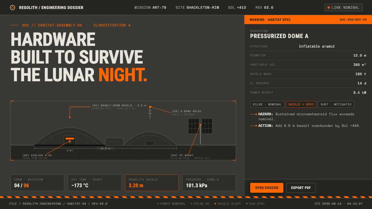 Lunar Base 2030Hardware built to survive the lunar night. Regolith gray, ANSI hazard orange,…
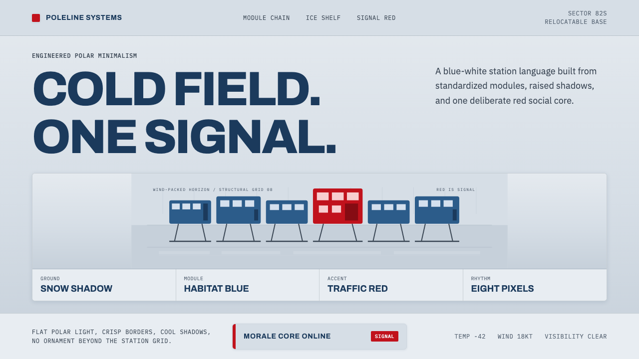 Antarctic StationCold precision, one red signal. Archivo modules ride a blue-white horizon gri…
 Aperture ScienceSterile authority. Cool panel seams, Archivo signage, and sparse orange-blue…
 Cassini Saturn ImagingDeep space feels exact. Butterscotch Saturn floats in black with fine tan rin…