What is Lunar Base 2030?
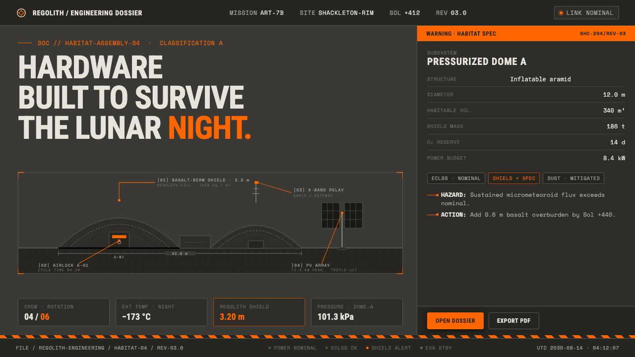
Lunar Base 2030 treats the Moon as a worksite rather than a fantasy landscape — dark regolith, hazard orange, and NASA-style callouts wrapped around hardware built to endure the lunar night.
Lunar Base 2030 in brief
Lunar Base 2030 is a near-future engineering render language for an Artemis-era habitat at the lunar south pole. Its imagined architecture is compacted basaltic regolith banked over inflatable domes, with every surface darkened by space weathering and every mark justified by operation, inspection, or survival. The result is not a glossy space-opera aesthetic. It is a visual system for infrastructure under extreme conditions.
The palette begins with lunar soil rather than received science-fiction imagery. Apollo Munsell readings place regolith in a very low-value neutral gray, so the ground is deep, dusty, and faintly basaltic instead of bright moon-white. Against that darkness, ANSI hazard orange functions as an operational signal: it marks danger, access, equipment, or attention without turning the entire composition into spectacle.
Typography completes the register. Monospace technical annotations, compact labels, diagrammatic lines, and specification-sheet spacing make the interface feel documented rather than decorated. Lunar Base 2030 belongs to the intersection of space-settlement engineering, NASA technical illustration, aerospace HMI, and near-future infrastructure design. Its mood is disciplined, provisional, and materially credible.
Where does Lunar Base 2030 come from?
The style belongs to a projected era of lunar surface operations around 2030, when an Artemis south-pole habitat is imagined as an active engineering environment rather than a distant symbol. Its visual world is global and internet-born, assembled from NASA and ESA mission concept art, aerospace illustration, and the visual habits of technical documentation. It therefore feels both institutional and speculative: a future assembled from recognizable operational languages.
Its most important historical anchor is the Apollo regolith research summarized through Munsell readings. Those readings establish a crucial correction to popular imagery: lunar soil is a very low-value neutral gray, not a luminous white surface. That observation gives the style its darkened foundation and prevents the usual polished, silver, or pristine treatment of the Moon. Dust, basalt, and space weathering become visual evidence rather than atmospheric decoration.
The system also draws from several connected design movements: space-settlement engineering, NASA technical illustration, aerospace HMI, and near-future infrastructure design. From engineering it takes the priority of function and survivability. From technical illustration it takes sectional clarity, callouts, and diagrammatic explanation. From aerospace HMI it takes alert hierarchy and restrained signaling. From infrastructure design it takes the sense that every object belongs to a larger operating system.
The credited figures and groups reflect this distributed origin. NASA Artemis Base Camp concept teams supply the habitat context; Pierre Carril represents a named reference within the style's visual field; ESA render illustrators extend the language across international aerospace imagery; and Apollo regolith Munsell researchers ground the palette in lunar material observation. Together they point to a style shaped by research, visualization, and systems thinking rather than by a single authorial signature.
What defines the Lunar Base 2030 look?
Regolith Gray
The base palette is a deep neutral gray drawn from the actual visual character of lunar regolith. It should feel dusty, compacted, and mineral rather than sleek or metallic. A faint olive-brown cast can suggest basaltic matter and space weathering, but the overall field remains restrained. The ground carries most of the atmosphere, so it must stay quiet enough for orange signals and pale technical marks to remain legible.
Hazard Orange
ANSI hazard orange is a signal color, not a general accent. It belongs on warnings, access points, equipment identifiers, active controls, and other moments that demand attention. Used sparingly against regolith gray, it creates immediate hierarchy. Used everywhere, it loses its operational authority and turns the habitat into a themed illustration. Orange should announce a condition, not simply brighten a surface.
Basaltic Darkness
Darkness in this system is physical rather than merely atmospheric. Surfaces appear coated with dust, weathered by exposure, and shaped by the weight of compacted material. Black is therefore not a decorative luxury but a deeper register within the same material world. Contrast should come from shifts between dusty gray, near-black structure, pale annotation, and orange warning marks.
Monospace Callouts
Monospace type gives every annotation the authority of a mission document. It suits coordinates, equipment names, process notes, warnings, and labels that must appear measured and machine-readable. The typography should be compact and evenly paced, with hierarchy created through size, spacing, casing, and placement rather than expressive display lettering. Text behaves like instrumentation attached to the hardware.
Engineering Geometry
Forms are compact, modular, and visibly assembled. Inflatable domes, regolith banks, panels, ducts, frames, and equipment bays read as parts of a habitat system. Geometry should communicate load, enclosure, access, and maintenance. Rounded forms belong to pressure-bearing or inflatable structures; rigid planes and bars belong to protection, support, and equipment. The visual language is practical even when it is stylized.
Specification-Sheet Composition
Layouts feel annotated, inspected, and ready for handoff. Strong alignment, ruled guides, cropped diagrams, label clusters, and clear zones for warnings create an orderly technical field. Empty space is not luxurious; it separates operating information from material mass. Every line should clarify a relationship between habitat, hardware, and instruction. The composition should look capable of being consulted during a procedure.
Who shaped Lunar Base 2030?
These concept teams provide the central habitat scenario: an Artemis-era lunar south-pole base where compacted regolith, inflatable domes, and survival-oriented hardware form one visual and operational environment. Their importance lies in making settlement infrastructure the subject of the image rather than treating the Moon as a decorative backdrop.
Pierre Carril is identified in the source material as a key figure within the style's reference field. His inclusion signals the importance of named aerospace visual practitioners alongside institutional concept teams, linking the language of lunar infrastructure to authored render and illustration practice.
ESA render illustrators extend the visual conversation beyond a single national program. Their role in the reference field supports the style's global character, where mission concept imagery, engineering clarity, and near-future settlement design circulate through an international visual culture.
These researchers provide the material grounding for the palette. Their readings establish lunar soil as a low-value neutral gray and give the system permission to reject the familiar moon-white cliché. In this style, color begins with observation before it becomes atmosphere.
How do you use Lunar Base 2030 today?
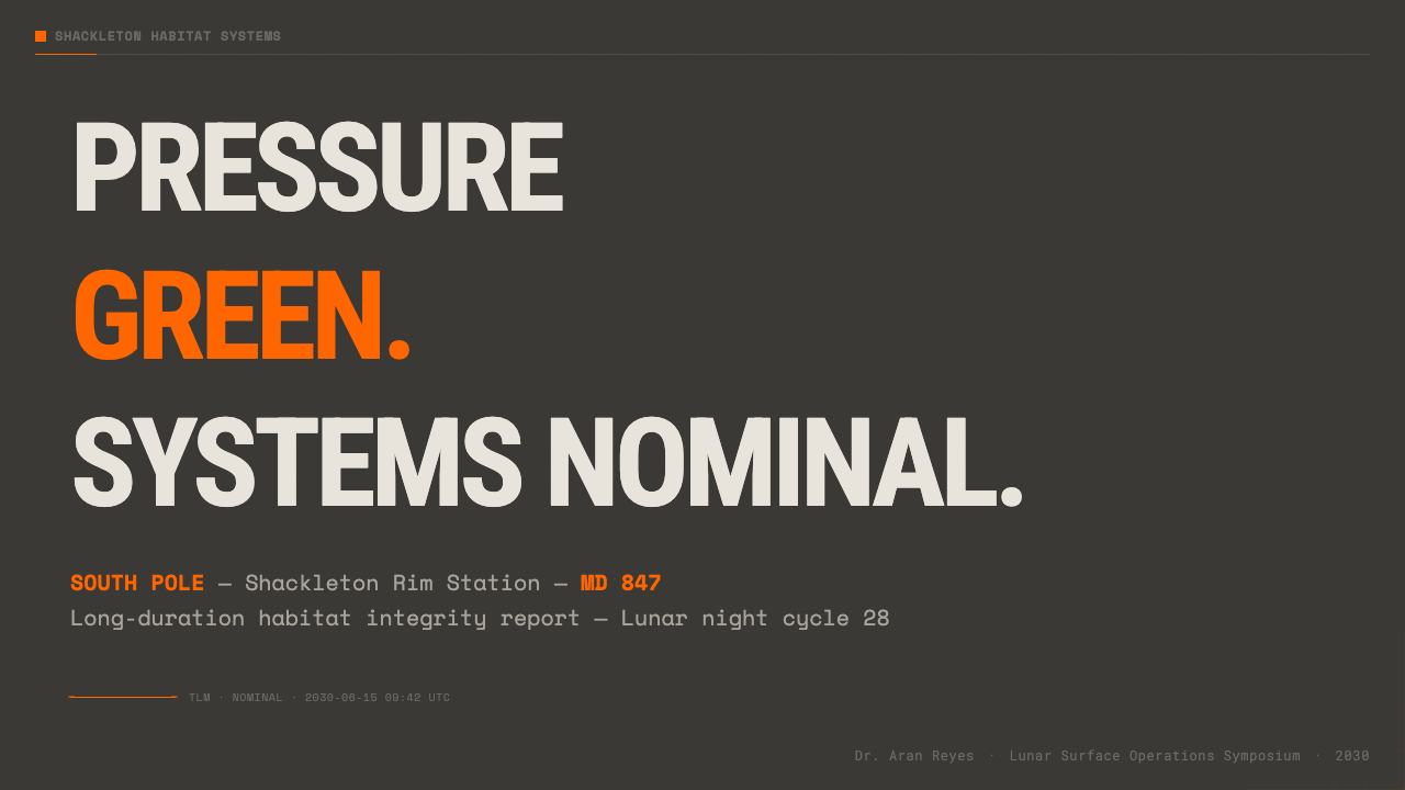
For presentation slides, use the dark regolith field as the organizing ground. A cover can place a compact habitat silhouette, dome, or equipment form against open darkness, with a restrained orange marker establishing the operational focus. Content slides should read like mission boards: clear section labels, monospace notes, diagrammatic lines, and one dominant hardware or habitat relationship. Data slides should turn information into infrastructure logic, using orange only for warnings, active states, or the most consequential comparison.
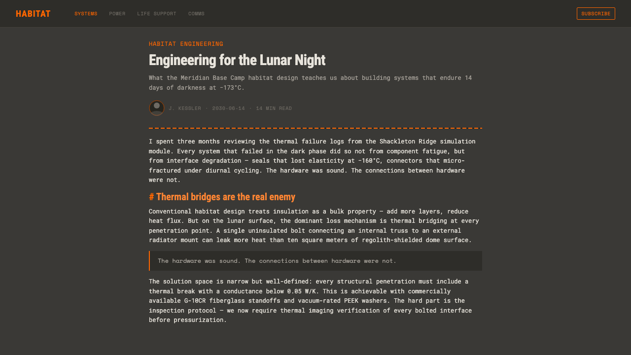
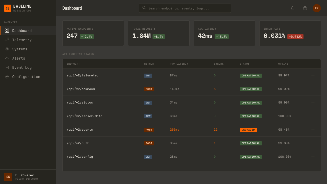
For web interfaces, Lunar Base 2030 suits dashboards, control panels, maintenance tools, and pricing pages that want to communicate capability under constraint. Keep the interface dark and material, use pale text for operational reading, and let orange distinguish actions, alerts, selected states, or tier differences. Cards should feel like equipment modules rather than soft containers. A pricing page can treat each plan as a support package, with labels and specifications carrying more visual weight than decorative illustration.
For editorial and marketing work, the style supports a strong technical narrative. Articles can pair broad dark fields with narrow columns of monospace metadata, habitat diagrams, and callout lines that explain how a component belongs to the larger base. Marketing pages can frame a product as dependable infrastructure: show the object in a dusty, basaltic environment, surround it with restrained annotations, and reserve hazard orange for the promise, warning, or action that matters most.
The common mistake is making the design look like generic science fiction by adding bright white surfaces, metallic shine, excessive orange, or decorative futuristic graphics. Lunar Base 2030 depends on material restraint and operational hierarchy. If every label is loud, every surface is pristine, and every component glows, the system loses its engineering credibility. Start with regolith darkness, establish the hardware structure, and add orange only where the imagined procedure requires attention.
Lunar Base 2030 — FAQ
Is Lunar Base 2030 supposed to look moon-white?
No. Its defining correction is that lunar regolith is treated as a very low-value neutral gray according to Apollo Munsell readings. The intended atmosphere is dark, dusty, and basaltic, with surfaces marked by space weathering. White may appear as a restrained annotation or contrast note, but it should not become the environmental ground. The style rejects the polished moon-white cliché because it weakens the material and engineering character.
Is hazard orange the main brand color?
It is the principal signal color, not the principal field color. Orange should identify warnings, equipment, access, active controls, or other high-attention conditions. The dark regolith ground carries the identity, while orange creates operational hierarchy against it. When orange becomes a broad decorative wash, it stops behaving like a hazard signal and the interface loses the disciplined logic that makes the style credible.
Why does the style rely so heavily on monospace annotations?
Monospace type places the design in the register of NASA mission diagrams and engineering specifications. It makes labels, warnings, equipment names, and process notes feel measured, inspectable, and machine-readable. The type is not meant to create retro computer nostalgia. It acts as an information instrument attached to the hardware, helping the viewer understand what is being identified, monitored, or operated.
Can this style work for products that are not related to space?
Yes, if the product benefits from associations with reliability, technical clarity, constrained environments, or infrastructure. Industrial tools, monitoring dashboards, research platforms, and advanced equipment can borrow the system naturally. The transfer should preserve the principles rather than copy lunar props: dark material grounding, disciplined annotations, modular geometry, and signal color used with purpose. Products that depend on softness, luxury, or organic warmth may find the style too severe.
What makes a Lunar Base 2030 render feel credible?
Credibility comes from relationships between material, hardware, and instruction. Regolith should read as compacted and weathered; inflatable domes should feel distinct from rigid protective structures; labels should explain or identify rather than decorate; and orange should correspond to a meaningful operational condition. The image becomes convincing when it appears capable of being consulted during work on the habitat, not merely admired as a futuristic scene.
Related design styles
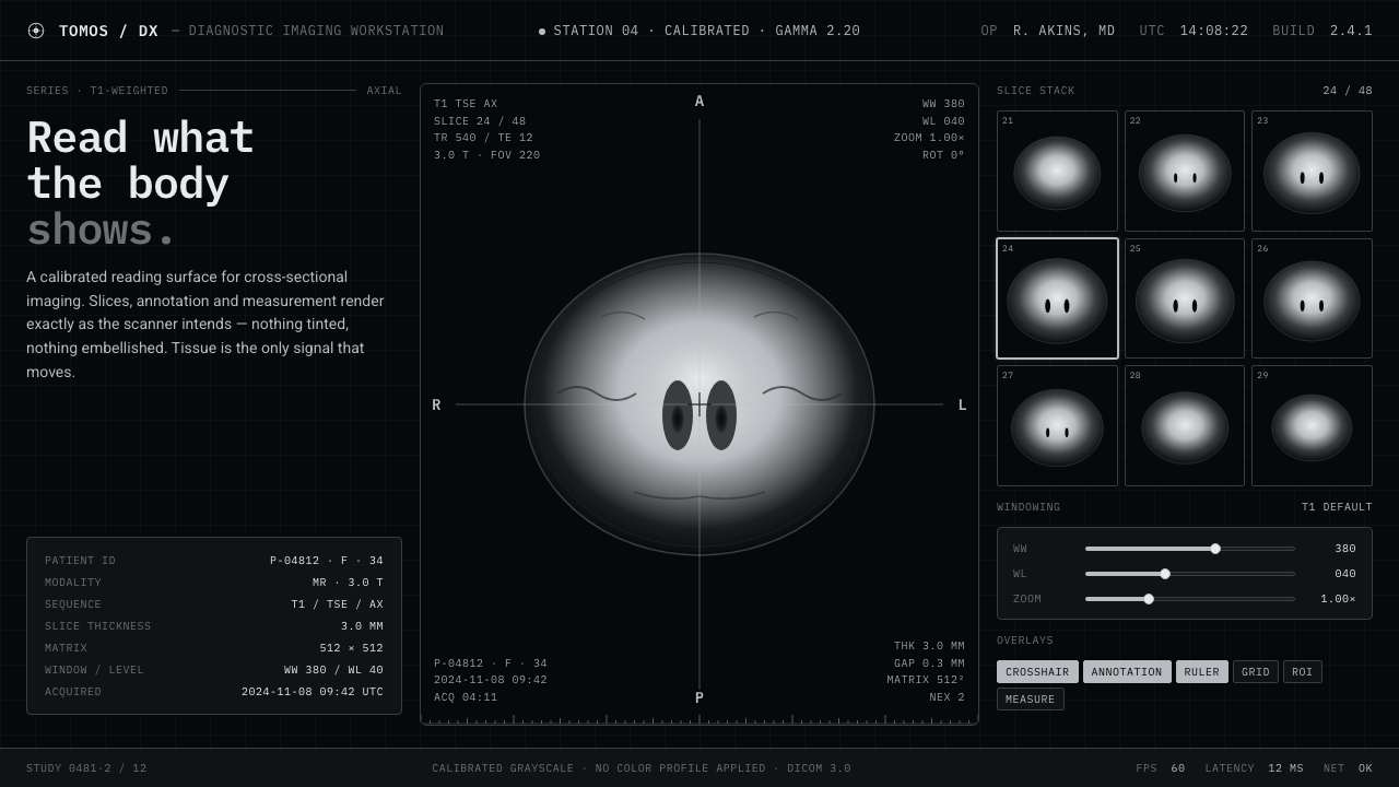 MRI ScanReads like a radiology viewport. Tissue-gray tomograms on pure black, IBM Ple…
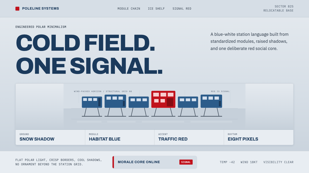 Antarctic StationCold precision, one red signal. Archivo modules ride a blue-white horizon gri…
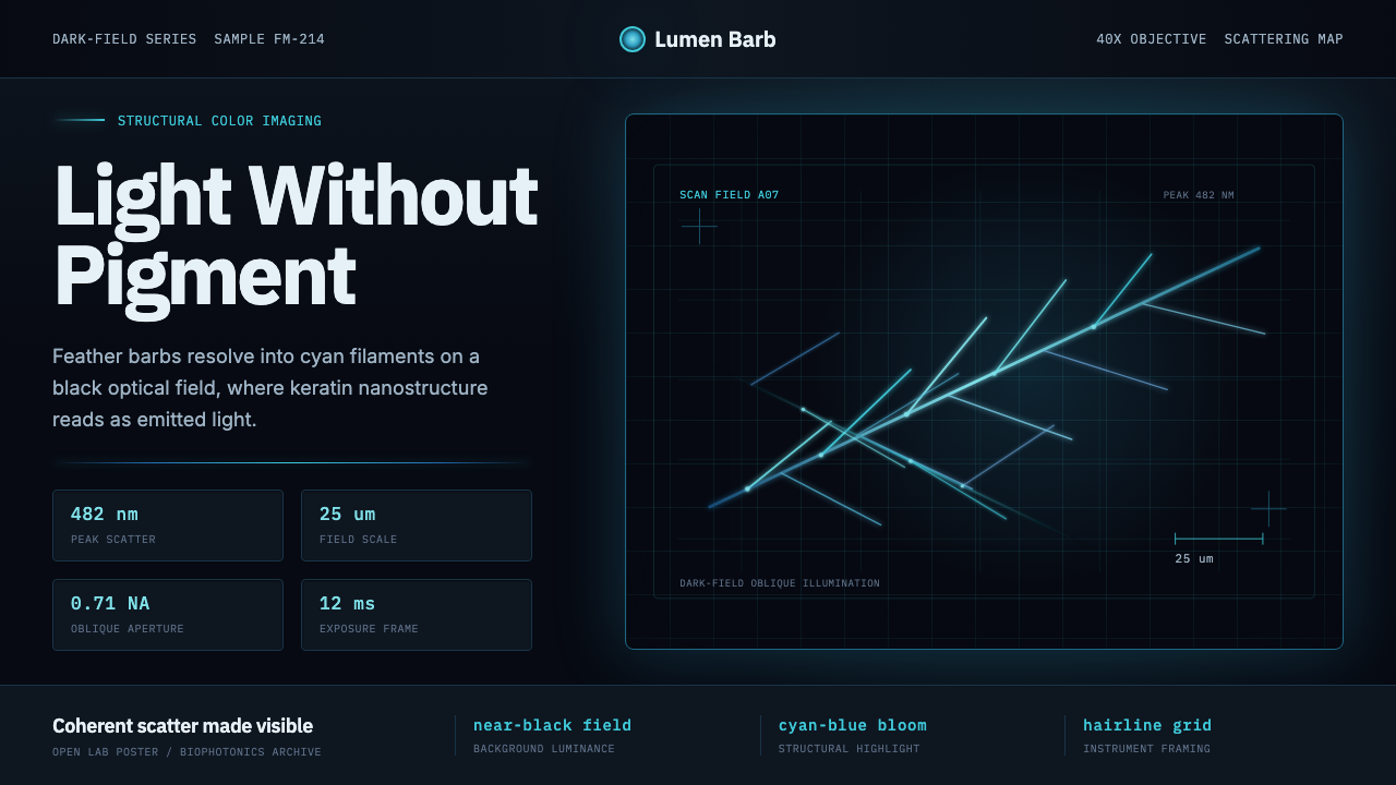 Feather MicroscopyPhysics glows in the dark. Cyan filaments and mono scale bars cut a black ima…
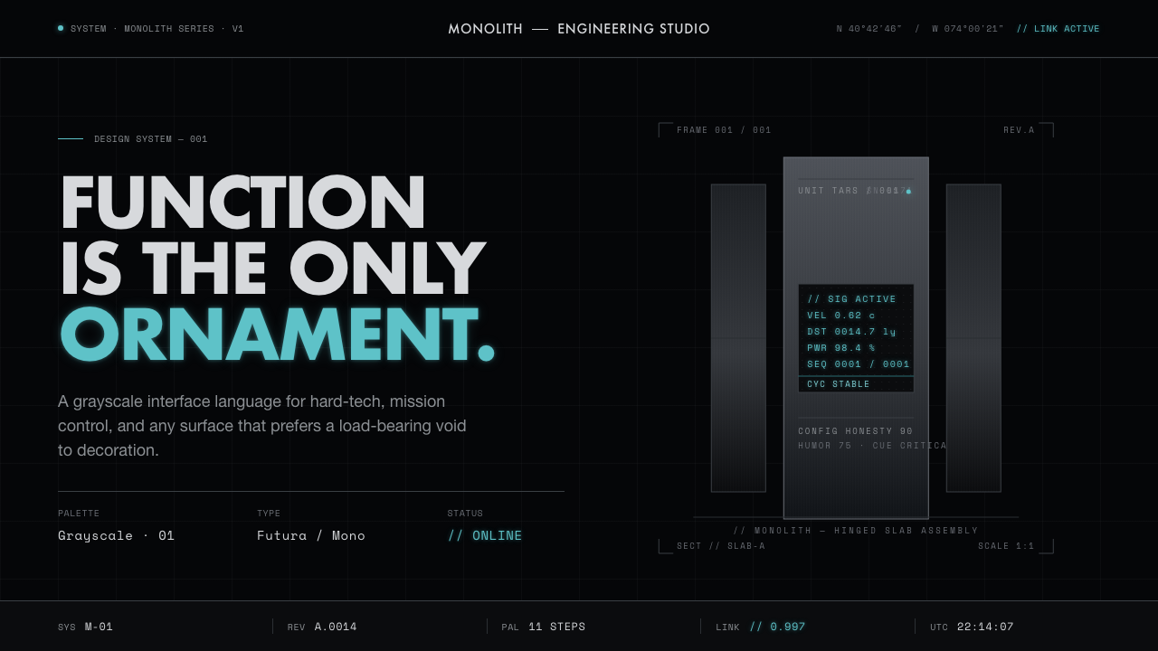 Interstellar TARSIf Mies built a robot. Brushed-aluminum grays on deep-space black, lit by one…
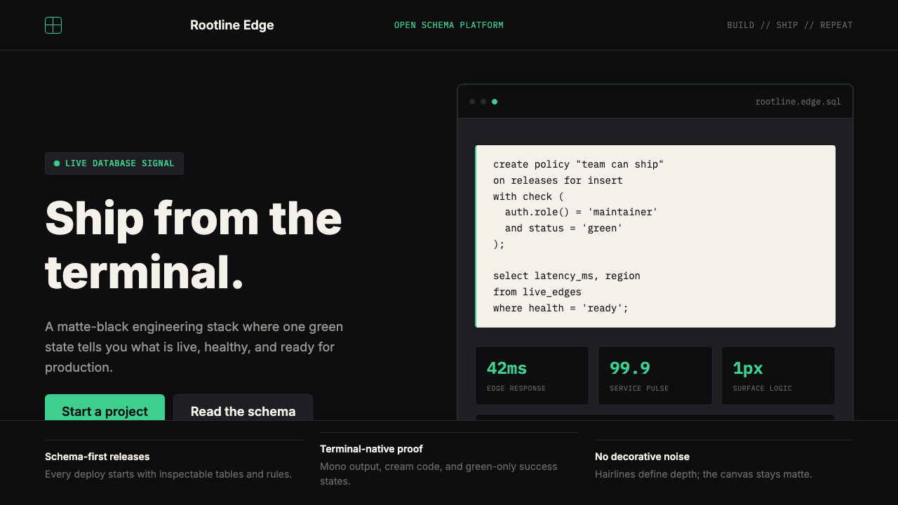 Supabase Postgres Green (2024)Midnight-terminal confidence. Matte black, Inter, mono code, and one electric…
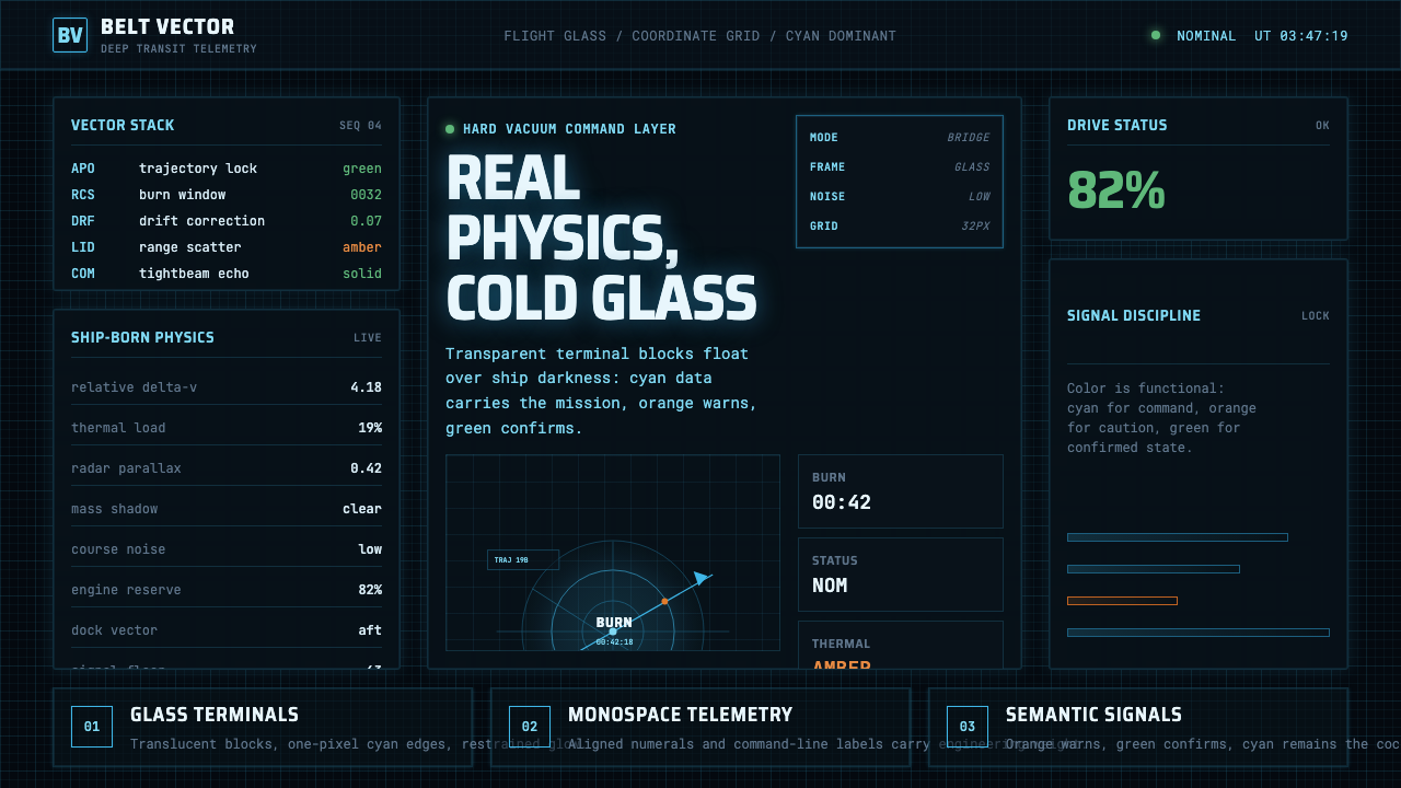 The Expanse Belter UIEngineering, not neon. Cyan glass panels, mono data, orange warnings on ship-…