What is Venus Cloud Habitat?
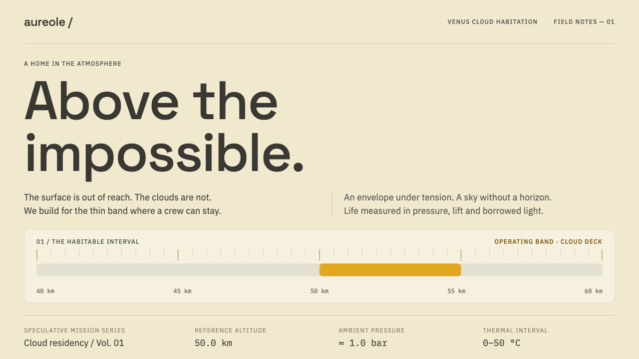
Fifty kilometres above Venus the air is mild and the light never sets; the interface of a floating habitat reads like an instrument panel laid across a bright cloud deck.
Venus Cloud Habitat in brief
Venus Cloud Habitat is a speculative design language for a crewed aerostat, a lighter-than-air vehicle floating in the Venusian atmosphere about fifty kilometres above the surface. At that height the pressure is roughly one bar and the temperature sits between zero and fifty degrees Celsius, the most Earth-like band found anywhere beyond Earth. Far below, the ground is hot enough to melt lead; around the altitude itself, clouds of sulphuric acid fill the sky. In between, for a narrow band, a crew could in principle live inside a gas envelope.
The altitude is not arbitrary. It is the one chosen by NASA Langley’s HAVOC study, the High Altitude Venus Operational Concept, for a crewed aerostat, and this design language belongs to the envelope that floats there. Everything is read against a bright, opaque yellow-white haze with no horizon and no night. The visual world is therefore unusually even and almost shadowless: light arrives from everywhere, and instruments are legible because they are calm.
The palette is sulphuric for a reason. The same acid that gives the cloud deck its colour is what eats the habitat’s solar panels. Type is instrument type, used for readings of pressure, acidity and buoyancy, and the layout favours long horizontal gauge strips instead of cards. Corners are rounded because pressure vessels and fabric envelopes have no right angles, and light is diffuse. It is the look of a place that is generous but unforgiving, where things are measured constantly.

Where does Venus Cloud Habitat come from?
The design draws on three layers of evidence about Venus. In 1974, Mariner 10 returned images of the planet’s clouds as it passed, establishing how the cloud deck looks from outside. In 1982, the Soviet Venera 13 lander sent back panoramas from the surface, showing an orange-yellow light over flat, basalt-grey ground. And in 2015, NASA Langley’s HAVOC study put forward the idea that makes the whole concept sensible: do not try to endure the surface, float above it where the conditions are mild.
HAVOC stands for High Altitude Venus Operational Concept. Dale Arney and Chris Jones set out how a crewed airship could operate in the cloud layer, at an altitude where the air is cool enough and the pressure gentle enough that a habitat does not have to resist crushing heat or pressure. Part of the logic is buoyancy: because Venus’s atmosphere is mostly carbon dioxide, ordinary breathable air is a lifting gas there, so a crew’s own atmosphere helps hold the envelope aloft. The work is a concept study, not an approved mission.
Behind it stands the long engineering tradition of lighter-than-air flight: balloons, airships and aerostats that hold a payload aloft by displacing a heavier gas. Applying that tradition to another planet also means borrowing from planetary instrumentation, the sensors for pressure, temperature and acidity, and from mission-operations interface design, the screens that let a crew monitor them. These interfaces are built to be read quickly, calmly and without ambiguity, since a misread number on a floating habitat is not an inconvenience but a hazard.
Curio’s style translates these sources into a coherent visual world. The deep amber is the optical thickness one would see looking down through the cloud. The orange-yellow and basalt grey are borrowed from the Venera 13 panoramas, and the instrument housings take a warm grey. The time frame is near-future and speculative: nothing here claims to document flight-proven hardware, which is exactly why it is useful as a design language rather than a technical record.
What defines the Venus Cloud Habitat look?
Cloud-Deck Ground
The ground is a bright, opaque yellow-white haze, the lightest field in the system. There is no horizon line, no gradient towards a night sky and no star field. Everything is read against this even, shadowless brightness, so the page feels lit from all directions at once, and legibility depends on calm contrast rather than drama.
Sulphur-Yellow Gauge Strips
The signature accent is a sulphur yellow, the colour of the acid that shapes the whole environment. It appears as long horizontal strips that behave like gauges: a band for a level, a band for a threshold, a band for a limit. It is used for measurement, not for decoration, so that colour always points at a reading.
Amber, Basalt and Warm Grey
Supporting colours come from real observations. Deep amber suggests the optical thickness of cloud seen from above, orange-yellow and basalt grey recall the Venera 13 surface panoramas, and instrument housings take a warm grey. Together they give depth to a pale field without introducing any cool, sci-fi blues.
Instrument Typography
Type works in three clear roles. A clean, legible sans carries the interface, a monospaced face sets pressure, acidity and buoyancy readings so that digits align, and a geometric grotesque sets mission titles and large numerals. The pairing signals precision, and it stays restrained: three roles, no more, with no decorative letterforms.
Horizontal Gauge Bands
The layout favours long horizontal bands over square cards. A band carries a label, a value and a status, and bands stack into a panel the way instruments run in a row on a console. This turns a page into something that can be scanned left to right and top to bottom like a monitoring station.
Pressure-Vessel Corners
Corners are rounded, in a moderate range, because pressure vessels and fabric envelopes do not have right angles. The rounding is functional and consistent, never bubbly. Controls, bands and panels all share the same family of curves, so the interface feels like parts of one sealed system.
Diffuse Light, Almost No Shadow
Because light comes from every direction through the haze, shadows nearly disappear. Depth is shown through tone and thin separations, not through drop shadows or glows. Elevation is minimal and surfaces are matte, which keeps the interface sober, reads well under bright conditions and avoids anything that looks like a decorative effect.

Who shaped Venus Cloud Habitat?
Dale Arney is one of the two names attached to the HAVOC study at NASA Langley. The study’s value for designers is that it takes a vivid idea, living in the clouds of Venus, and turns it into a sequence of engineering arguments about altitude, buoyancy, power and protection, which gives the interface language a believable reason for every choice.
Chris Jones is the other name linked to HAVOC. Together with Dale Arney, he shows how a concept study works: it defines a plausible operating point, fills it with constraints and lets a world emerge from them. Those constraints are what this style turns into gauge strips, readouts and calm, legible panels.
The Soviet Venera 13 lander returned panoramas from the Venusian surface in 1982. Its pictures gave the style its orange-yellow light and basalt-grey ground, and they are a reminder that the palette here is anchored in what a spacecraft actually saw, not in a stock idea of what an alien world should look like.
The engineers of balloons, airships and aerostats stand behind the concept. Their long practice of holding weight aloft with gas, and of managing envelopes, ballast and buoyancy, is the foundation on which a floating habitat can be imagined at all, and it shapes the style’s rounded forms and its emphasis on measurement.
How do you use Venus Cloud Habitat today?
The Venus Cloud Habitat style suits anything that monitors, measures or reports: telemetry and operations dashboards, environmental and climate data, energy and infrastructure tools, laboratory and health-monitoring products, and technical briefings about space, aviation or deep tech. Its great advantage is calm. It makes dense information look orderly, in a bright light that does not tire the eye.
On slides, a cover can use the pale cloud ground with a single long sulphur strip and a large mission numeral in the grotesque face, with the title set in the interface sans. Content slides stack horizontal bands, each holding a label, a value and a status. Data slides are natural territory: bar charts become gauge strips with thresholds marked, and key metrics become large numerals with a monospaced unit beside them.
In web interfaces, the style is built for dashboards, status pages and settings screens. Use full-width bands rather than a grid of cards, set readings in the monospaced face, keep corners consistently rounded and use the sulphur yellow only for measured values and thresholds. Elevation should be minimal. Because the ground is bright, check contrast of text and gauge colours carefully, and always pair colour with text, since readings should never be understood by colour alone.
In editorial and marketing work, the style supports mission reports, whitepapers, science features, product pages for sensors and instruments, and launch material for ambitious technical projects. The tone of copy should match the visuals: precise, calm and specific, with real numbers and clear units. Imagery can show instruments and measured landscapes, but the layout itself should stay light, flat and orderly.
The most common mistake is to assume that space means darkness: a black ground, a star field and neon glows are the opposite of this style, which is bright, even and nearly shadowless. A second mistake is to use the sulphur yellow as a warning colour, so that a normal reading looks like an alarm. A third is to build the layout out of cards, shadows and several competing typefaces, which loses the gauge-strip logic that gives the style its clarity.

Venus Cloud Habitat — FAQ
Why is this style bright when most space interfaces are dark?
Because the setting is a cloud deck, not deep space. Inside the cloud layer, light is diffused by an opaque yellow-white haze, so there is no horizon, no night and no star field. A bright field is the honest visual expression of that environment, and it also suits instruments that must be read at a glance. Dark interfaces belong to a different place and a different mood.
Is the Venus habitat a real mission?
It is a concept study. NASA Langley’s HAVOC work, by Dale Arney and Chris Jones, explored how a crewed aerostat might operate in the Venusian cloud layer, but it is not an approved flight mission, and this style describes a near-future speculative setting. The imaginative side is deliberate: the design language borrows real observations and real engineering ideas, then extends them into a coherent interface world.
How do I keep the sulphur yellow from reading as a warning?
Give it a clear role and keep it consistent. Use sulphur yellow for measured values, gauge strips and thresholds, and reserve a distinct, separate treatment, such as an icon, a text label and a different colour, for real warnings and errors. If a normal state and an alarm state could be confused at a glance, the design has failed, so test with the labels hidden and make sure the structure still reads.
Why gauge strips instead of cards?
A card is a square container that says nothing about what it holds, while a gauge strip is built to show a value in relation to a range. In an environment where everything is monitored, long horizontal strips make comparison and scanning easy, and they echo the instrument rows on a mission console. Cards can still appear occasionally, but the default unit of this style is the band.
Does the style only work for space-themed products?
No. Its core ideas are bright diffuse light, calm instrument typography and gauge-like layout, and they work for any product that reports measurements: climate tools, energy dashboards, medical monitoring, logistics and operations software. The Venus story provides the reasons and the colour palette, but a user does not need to know about Venus to benefit from an interface that is orderly, bright and precise.
Related design styles
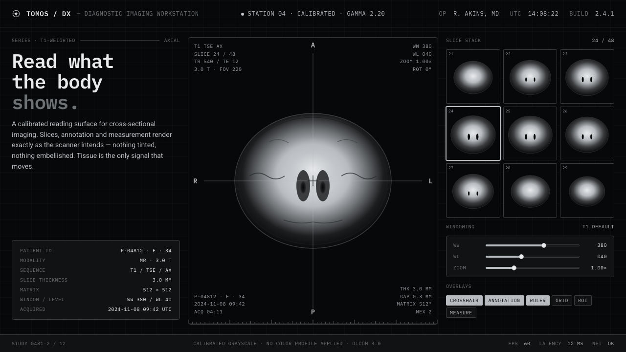 MRI ScanReads like a radiology viewport. Tissue-gray tomograms on pure black, IBM Ple…
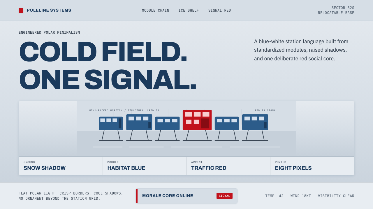 Antarctic StationCold precision, one red signal. Archivo modules ride a blue-white horizon gri…
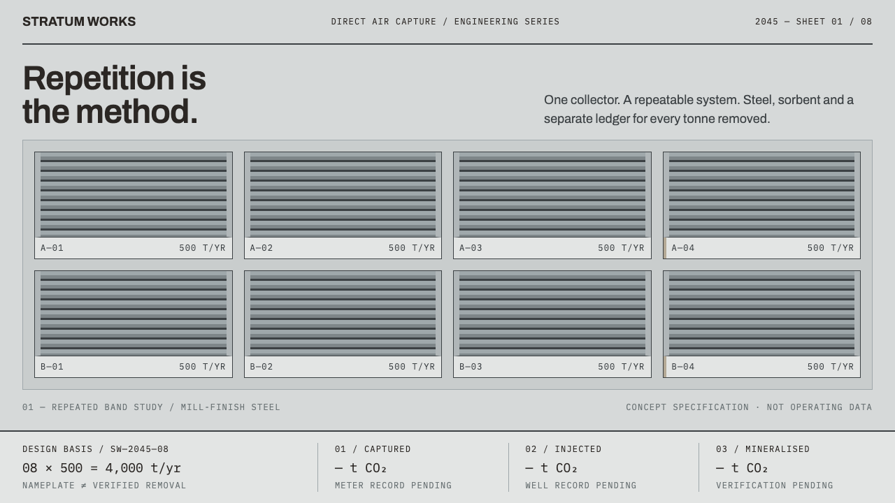 Direct Air Capture PlantRepetition, not rhetoric. Steel-grey louvre bands and monospaced ledgers make…
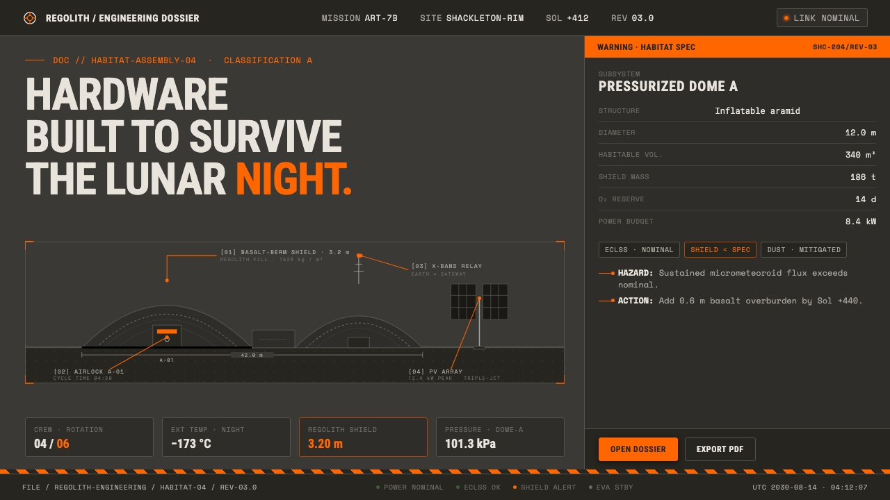 Lunar Base 2030Hardware built to survive the lunar night. Regolith gray, ANSI hazard orange,…
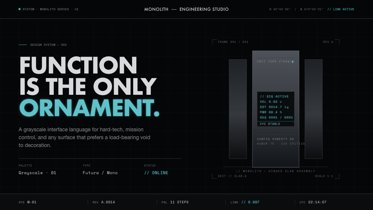 Interstellar TARSIf Mies built a robot. Brushed-aluminum grays on deep-space black, lit by one…
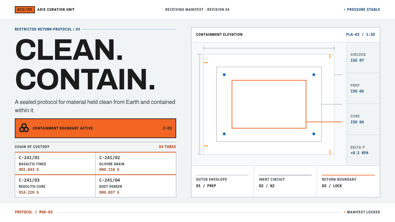 Mars Sample Curation LabPrecision holds the contradiction. Cleanroom grids meet blaze-orange containm…