What is Mars Sample Curation Lab?
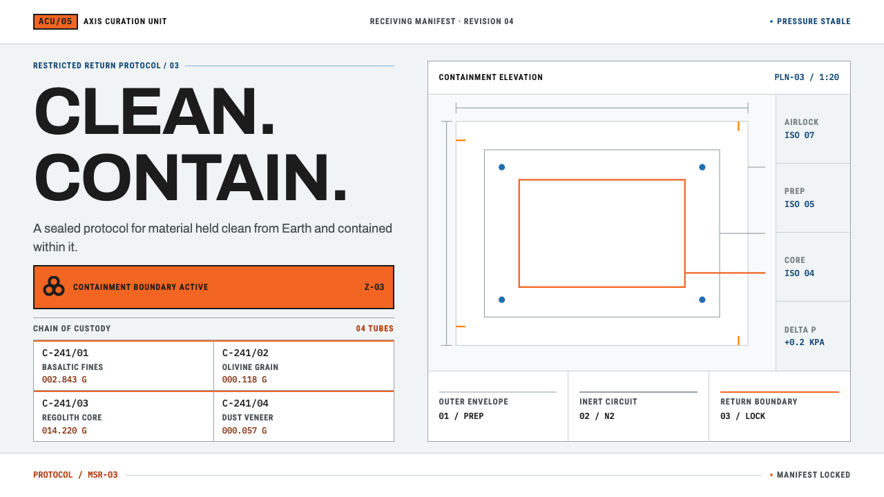
Mars Sample Curation Lab holds two registers in one design: the white, gridded order of a cleanroom manifest and the blaze-orange plate that marks where containment begins.
Mars Sample Curation Lab in brief
Mars Sample Curation Lab is a design style modelled on the facilities that receive and look after rock from other worlds. It has two registers that never blend. The first is a clean, ordered manifest: a white ground, fine lines, monospaced numerals, one cell for each sample tube and one geological number for each cell. The second is the hazard plate: a blaze-orange panel carrying a black trefoil symbol, used to mark the point where containment begins. Visitors read it the way staff read a facility: first by what is clean and ordered, then by what has been fenced off.
The tension between those two registers is the whole idea. A curation cleanroom has to keep Earth out of the sample and keep the sample out of Earth at the same time, and the design is built to carry that contradiction without resolving it. Order is the default state; orange is the exception, and it always means something. Black sits on top of orange and never the other way round.
Everything else is held back. There is no decoration, no gradient, no illustration, and nothing that would look at home in a consumer app. Precision, labelling and signage do the work, and the result feels like walking into a facility: bright, clinical, and aware of its own risks. This restraint is the style's main source of authority.

Where does Mars Sample Curation Lab come from?
The look begins with a very physical environment. A curation cleanroom is not a laboratory set. It has white epoxy floor coving, gloveboxes of 316L stainless steel purged with high-purity nitrogen, polycarbonate windows, Viton seals, and three layers of glove between a hand and a rock. Nothing in it is there for appearance, and that is exactly why it looks the way it does: every surface is chosen to be clean, inert and easy to inspect. Even the arrangement of the gloves is a design decision, because the aim is to put distance between people and material without ever losing the ability to see and handle it.
NASA's Johnson Space Center in Houston has run this kind of curation since 1969, when lunar material first arrived, across seven rooms graded from ISO 7 down to ISO 4. Dozens of nitrogen gloveboxes are each numbered and each assigned a place. That habit of one number for one location and one label for one object is what turns the facility into a visual system: it is a place where everything has an address. Over decades the result is a culture in which documentation is part of the architecture.
Mars Sample Return adds a twist. Under COSPAR's Category V Restricted Earth Return, a returned sample must be protected from Earth contamination, and Earth must be protected from the sample, the latter to a standard comparable to biosafety level 4. Assessment teams studying the proposed receiving facility have to hold both demands in a single building, and the design inherits that double requirement as its two registers. The orange of the hazard plate is therefore not a flourish but the visible edge of a real procedural boundary.
The visual vocabulary of the hazard side comes from signage. Charles L. Baldwin is associated with the biohazard symbol and with the blaze orange, set in 1966 and taken from the most conspicuous orange of polar exploration. The agency's own graphics standards, with their strict signage discipline, supply the other half: rigorous type, rigorous spacing and nothing unnecessary. Curio's system joins the two traditions and adds no decoration of its own.
What defines the Mars Sample Curation Lab look?
Two registers
The system speaks in two voices and keeps them apart. The manifest voice is white, gridded and numerical; the hazard voice is orange, blocky and rare. They sit next to each other but never blend, so a reader always knows whether a thing is routine or a boundary. In practice this means a page never mixes the two voices inside a single component.
Clean white ground
The ground is clean white, like epoxy floor coving under cleanroom light: bright and clinical rather than creamy or warm. It is a surface meant to show contamination, so there are no textures, no tints and no shadows to hide anything. When something does mark it, such as an orange plate, the eye goes straight there.
Manifest grid
Content is arranged in a grid of cells divided by fine lines. Each cell holds one thing, such as a sample tube, and each is labelled with a number. The grid is not a layout convenience but the logic of the place: everything has exactly one address. Empty cells are kept as visible empty cells, because an absence is also a record.
Blaze orange
A saturated, highly conspicuous orange is reserved for hazard and containment. It is flat, never a gradient, and never a brand accent. Because it appears so rarely, its presence is itself a message: stop, look, and read what the plate says. It is the only colour in the system that is allowed to be loud.
Black on orange, never the reverse
The trefoil symbol and the text on a hazard plate are always black set on orange. The rule is absolute, and reversing it, with orange on black, is treated as a different message altogether. Holding to it keeps the signal legible at a glance, in the way a real warning sign must be.
Monospaced identifiers
Sample numbers, room codes and measurements are set in monospaced type so that characters line up in columns and a misread digit is easy to spot. Identifiers are not styled for beauty. They are styled for being checked, which is what a manifest is for.
Signage discipline
Labels are short, aligned and plain, in the manner of an agency's graphics standards: one weight for headings, strict spacing, no ornament. If a label cannot be read from across a room, it is rewritten rather than decorated.

Who shaped Mars Sample Curation Lab?
Baldwin is the name linked to the biohazard symbol and to the blaze orange fixed in 1966. His contribution is the rule at the centre of the style's hazard side: a colour chosen to be seen first, with a black symbol set on it. The rule that black sits on orange follows the logic of signage: contrast first, symbol second.
This office at NASA's Johnson Space Center is the group responsible for receiving, storing and handing out extraterrestrial samples. It represents the quiet, procedural culture of the facility: numbered rooms, numbered gloveboxes and documented handling. The office's long record with lunar material is why the style treats labelling as a form of care.
The assessment teams studied how a building could satisfy the Category V requirements for Mars Sample Return. They represent the forward-looking half of the style: not a historic facility but a future one still on paper, where the design problem is how to show containment honestly. Their work is a reminder that this style is a design for a problem, not a decoration for a theme.
How do you use Mars Sample Curation Lab today?
Mars Sample Curation Lab is at its best when a design has a large body of ordered information and a small number of things that must not be missed. Its principles are structural: one clean ground, one grid, one rare warning colour with a fixed rule. Apply those, rather than adding an orange button to a white page and calling it a lab.
For presentation slides, the cover can be white with a fine grid of small cells, the title set plainly in black and a single orange tab carrying the project or status label. Content slides use cells like a manifest, one item per cell, each with a number. Data slides are tables with row identifiers and aligned columns; orange appears once per slide at most, to mark the exception, the risk or the caveat that the audience must not miss. A closing slide can repeat the cover grid with every cell filled, as a quiet sign that the work is complete.
For web interfaces, the style fits inventory and lab-management tools, compliance and audit products, logistics tracking, status pages, clinical and safety software, and anything with strict permissions. Cards become labelled cells. Orange is reserved for boundaries: irreversible actions, restricted access, quota limits. A pricing page can run as a spec manifest, with the plan limits that truly matter set on small orange plates. Empty states should show the empty cell itself, not an illustration.
In editorial and marketing work, it suits scientific reports, safety and regulatory documents, museum and specimen catalogues, and brand pages for laboratory equipment, biotech and space. Captions work as identifiers, with a number and a short plain description, and photography is best cropped to the object on a white field. Marketing copy should stay factual, because the visual language promises that every claim could be checked.
The most common mistake is spreading orange around as a general accent or brand colour, which turns a warning into wallpaper. The second is reversing the rule and putting orange text on black. The third is using the biohazard symbol as pure decoration: it signals real danger, and using it lightly cheapens the signal. Finally, avoid sci-fi gloss. Glows, gradients and futuristic textures contradict a place whose beauty is that nothing is unnecessary.

Mars Sample Curation Lab — FAQ
What is a curation cleanroom?
A controlled facility where precious samples, such as lunar rock, are received, stored and handled without being contaminated. At NASA's Johnson Space Center it consists of graded rooms and nitrogen-purged gloveboxes, with every sample and every location numbered. The style borrows its order, its labelling and its cleanliness. It is a workplace, not a stage set.
What does COSPAR Category V mean?
It is a planetary-protection category for Restricted Earth Return, where a sample coming back from another world must be protected in both directions: Earth must not contaminate the sample, and the sample must not escape into Earth's environment. The style takes that two-way requirement as its central design tension.
Why is orange the only warning colour?
Because the blaze orange was set as the most conspicuous orange, taken from polar exploration, so that a warning is seen first. Using one colour for one job keeps the signal reliable. If orange also became a decorative accent, readers would stop treating it as a boundary.
Is the orange a brand colour?
No. It is a functional colour with a fixed meaning, closer to a safety standard than a brand identity. It should appear on warnings, restrictions and boundaries only, and always with black set on top. A brand that wants its own accent should keep it out of the orange family.
Does the style require the biohazard symbol?
No. The symbol is the clearest expression of the hazard register, but a plain orange plate with black text follows the same rule. If the symbol is used, it should be reserved for real hazards and always set in black on orange, so that it keeps its seriousness.
Related design styles
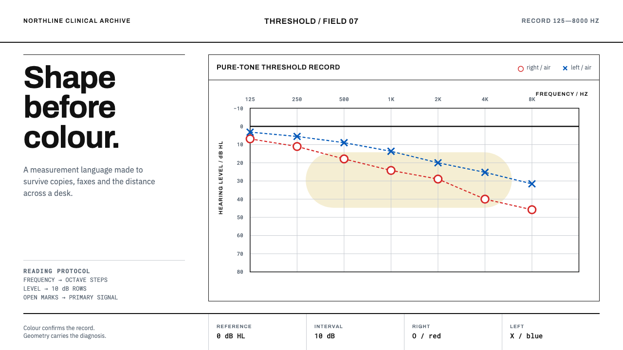 Audiogram ChartShape carries the diagnosis. Open red and blue marks cross a disciplined clin…
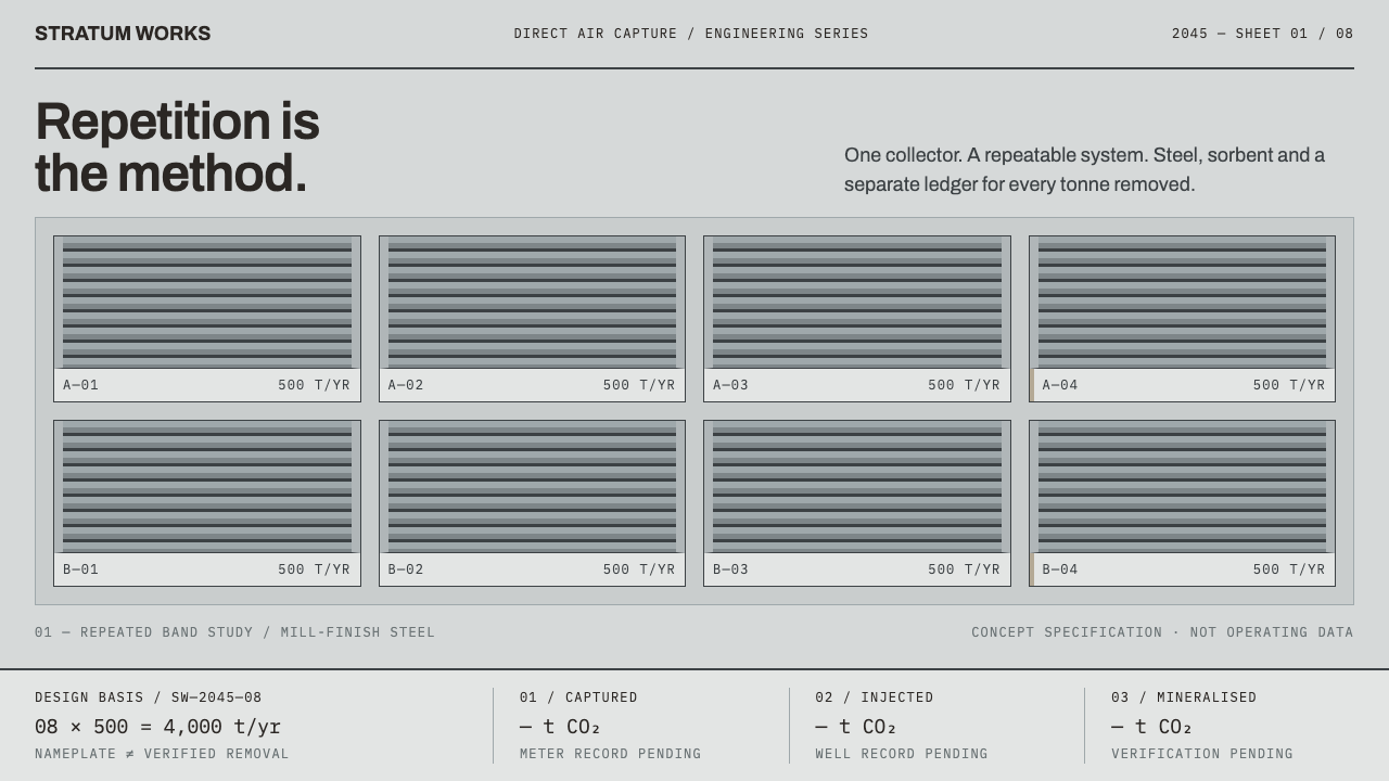 Direct Air Capture PlantRepetition, not rhetoric. Steel-grey louvre bands and monospaced ledgers make…
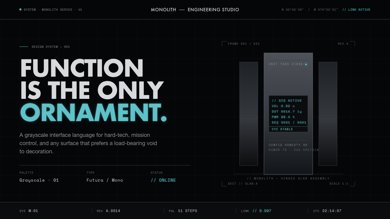 Interstellar TARSIf Mies built a robot. Brushed-aluminum grays on deep-space black, lit by one…
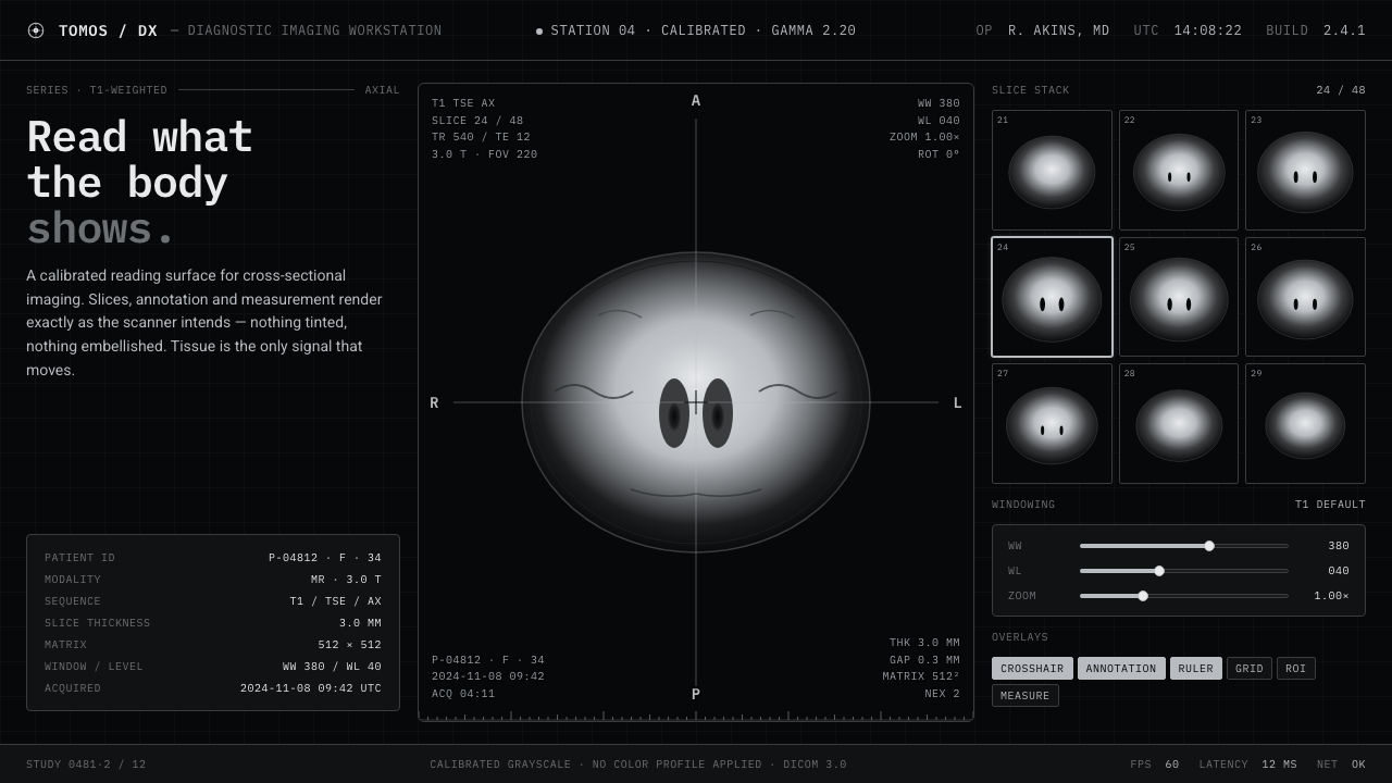 MRI ScanReads like a radiology viewport. Tissue-gray tomograms on pure black, IBM Ple…
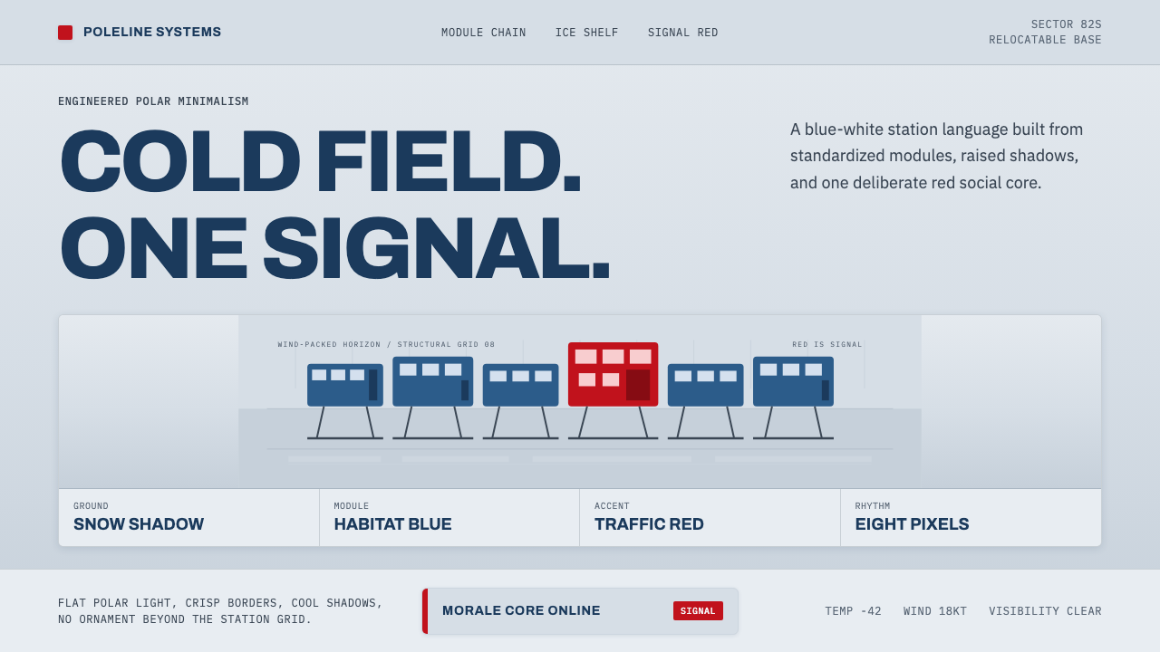 Antarctic StationCold precision, one red signal. Archivo modules ride a blue-white horizon gri…
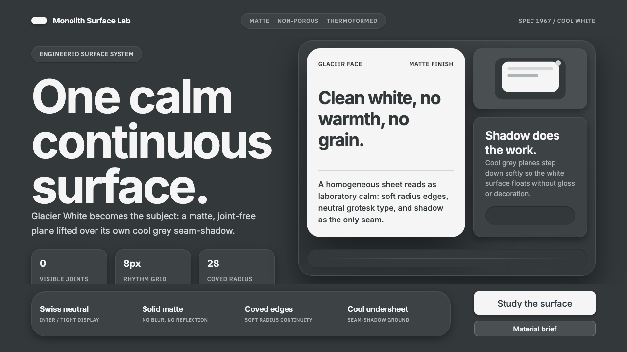 Corian Solid SurfaceSeamless matte calm. Glacier White floats over cool grey shadow with neutral…