What is MRI Scan?
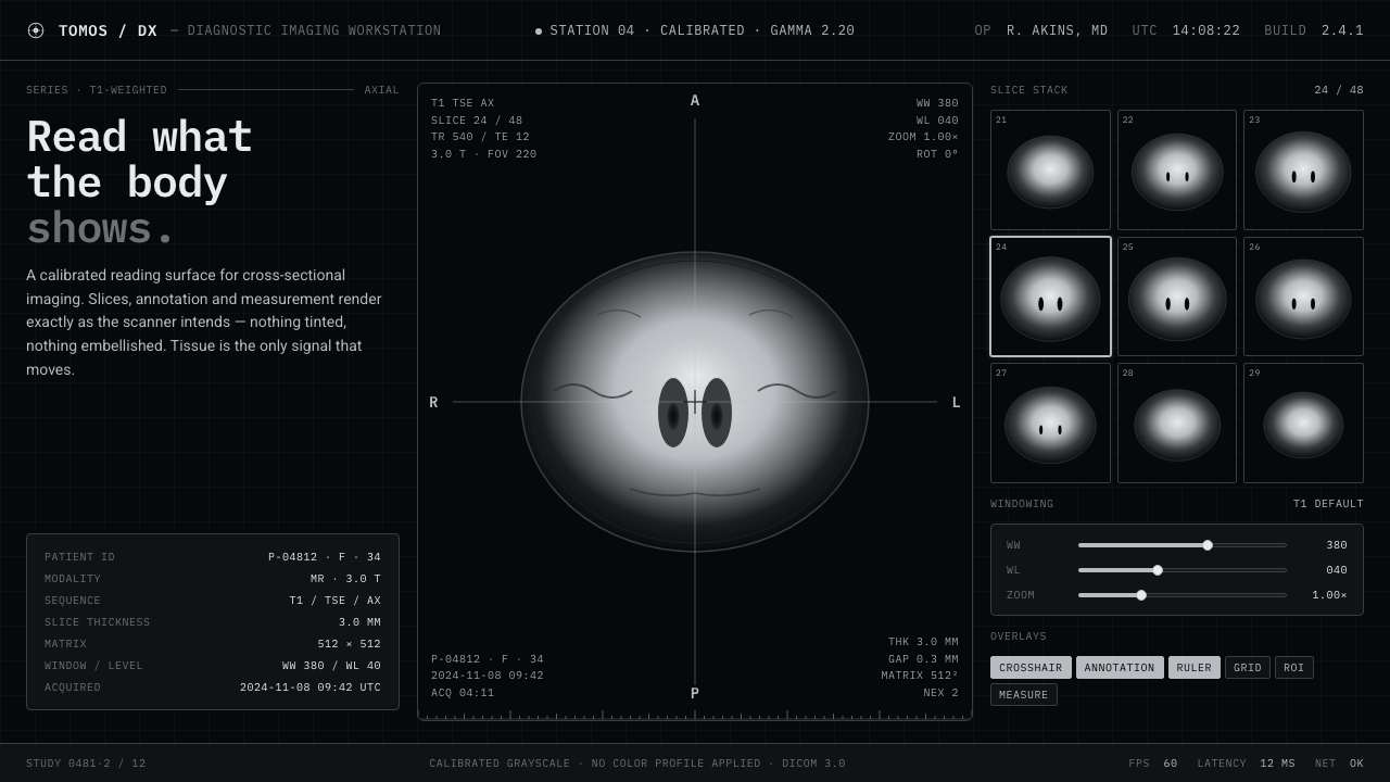
MRI Scan turns the radiology viewport into a design language: tissue-gray tomography suspended in pure black, with every annotation and crosshair carrying the authority of a calibrated instrument.
MRI Scan in brief
MRI Scan distills the visual language of contemporary clinical radiology into a dark, instrument-led design system. Its central image is a grayscale brain tomogram floating in the total black of a scanner viewport. Bright white matter, mid-gray cortex, and black cerebrospinal fluid form a controlled tonal ladder rather than an illustrative palette. The result feels diagnostic, quiet, and exact.
The system treats every visible detail as part of an imaging instrument. IBM Plex Mono appears as etched DICOM annotation; crosshairs establish a point of reference; ruler ticks imply measurement; R/L/A/P markers establish orientation. These elements are not decorative overlays. They make the interface feel calibrated, procedural, and accountable to the image beneath it.
MRI Scan is defined as much by exclusion as by presence. There are no color tints, warm whites, ornamental textures, or expressive accents competing with the scan. The screen is not softened into a general-purpose dark interface; it remains the pure black of a radiology viewport, where grayscale information and clinical notation are allowed to carry the entire visual argument.
Where does MRI Scan come from?
MRI Scan belongs to the modern DICOM viewer convention associated with clinical radiology from 2010 to now. Its stated regional source is North America, where the visual language of medical imaging is shaped by the demands of reading, orienting, and comparing diagnostic material on screen. This is not a nostalgic recreation of an older medical interface. It is a contemporary abstraction of the radiology viewport as a working environment.
Its visual lineage draws from modern medical visualization, scientific grayscale tomography, and clinical radiology interface design. These movements converge around a shared priority: the image must remain legible under scrutiny, while the interface must supply orientation and measurement without becoming visually theatrical. MRI Scan translates that priority into a coherent surface language of black ground, grayscale tissue, monospace annotation, and instrument marks.
Hospital MRI scanner vendors and DICOM viewer software makers are the practical forces behind the convention. The former establish the sense of a specialized imaging instrument; the latter give the viewport its annotation logic, crosshairs, rulers, and orientation markers. MRI Scan does not imitate one named product. It compresses the shared vocabulary of these systems into a recognizable design style whose authority comes from procedure, calibration, and restraint.
What defines the MRI Scan look?
Strict Grayscale
Color is removed from the system so tonal difference can carry the meaning. White matter appears bright, cortex occupies a middle gray, and cerebrospinal fluid recedes into black. The palette is not merely monochrome for atmosphere; it behaves like an ordered diagnostic scale. No hue is introduced to make the interface friendlier or more expressive.
Pure Black Viewport
The background is the total black of a radiology viewport, not a softened near-black or a paper-like white. This black creates a field in which the tomogram appears suspended, allowing the scan to become the brightest and most consequential object on screen. Empty space feels operational rather than decorative: it protects the image from visual interference.
Monospace Annotation
IBM Plex Mono gives the DICOM layer an etched, technical voice. Its regular rhythm makes labels feel recorded rather than composed, closer to instrument output than editorial typography. Annotation should remain subordinate to the tomogram while staying immediately legible, with a disciplined relationship between text, crosshair, ruler, and image.
Tonal Ladder
MRI Scan relies on distinct tonal zones rather than decorative contrast effects. Bright, middle, and dark values describe different tissue conditions and spatial relationships within the brain tomogram. The tonal structure should feel calibrated and continuous, but never muddy. Every shift in gray must preserve the sense that the image is being read, not merely viewed.
Crosshair and Measurement
Crosshairs and ruler ticks turn the image into a measured field. They establish reference, position, and scale without adding illustration. Their presence should be sparse and exact, following the visual logic of a viewer used for examination. When these marks become ornamental, the design loses its clinical credibility.
Orientation Markers
R/L/A/P markers provide a compact orientation system around the scan. They are small in visual presence but large in functional responsibility, reminding the viewer that the image belongs to a spatially organized examination. Their value comes from consistency: they should read as part of the viewport's operating language, never as branding.
Instrument Precision
The overall surface should feel calibrated, procedural, and resistant to casual interpretation. Alignment, notation, and tonal boundaries need to appear intentional. MRI Scan gains its personality from the discipline of a diagnostic display: every element seems to have a reason for being present, and every omission protects the reading of the image.
Who shaped MRI Scan?
Hospital MRI scanner vendors supply the instrumental context behind the style. Their presence is felt through the black viewport, the suspended tomogram, and the sense that the screen belongs to a specialized imaging environment rather than a general digital product.
DICOM viewer software makers shape the operational vocabulary: etched annotations, crosshairs, ruler ticks, and R/L/A/P orientation markers. They give the visual language its procedural grammar and distinguish it from a generic grayscale interface.
Modern medical visualization provides the broader movement behind MRI Scan. It treats complex internal information as something that must be made legible through controlled imaging, disciplined contrast, and a surface designed for sustained examination.
Scientific grayscale tomography supplies the style's tonal logic. Its bright, middle, and dark tissue values create an image that reads as structured evidence, allowing MRI Scan to communicate seriousness without relying on color, ornament, or expressive illustration.
How do you use MRI Scan today?
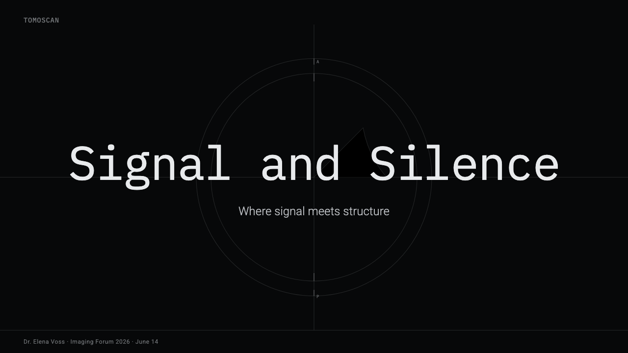
For presentation slides, the cover should treat the brain tomogram as the primary event: a grayscale scan suspended in a pure-black field, with a restrained DICOM label or orientation marker establishing the instrument context. Content slides should preserve that viewport logic, using annotation-like labels and crosshair relationships to organize information. Data slides can turn charts, measurements, and evidence into grayscale diagnostic panels, where hierarchy comes from tonal contrast and placement rather than colorful category coding.
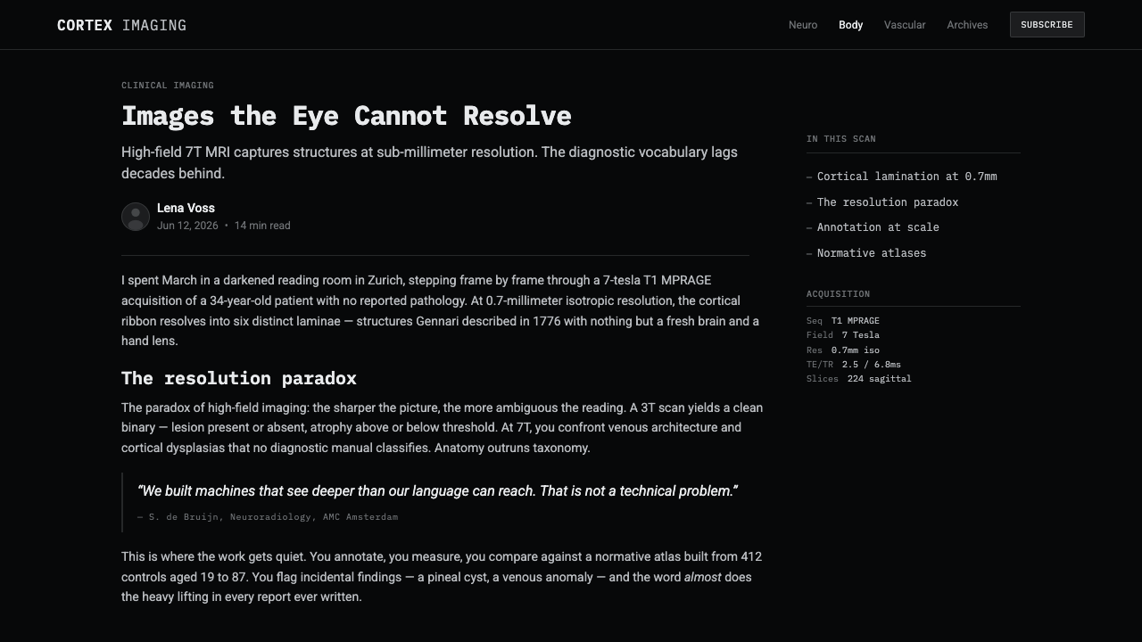
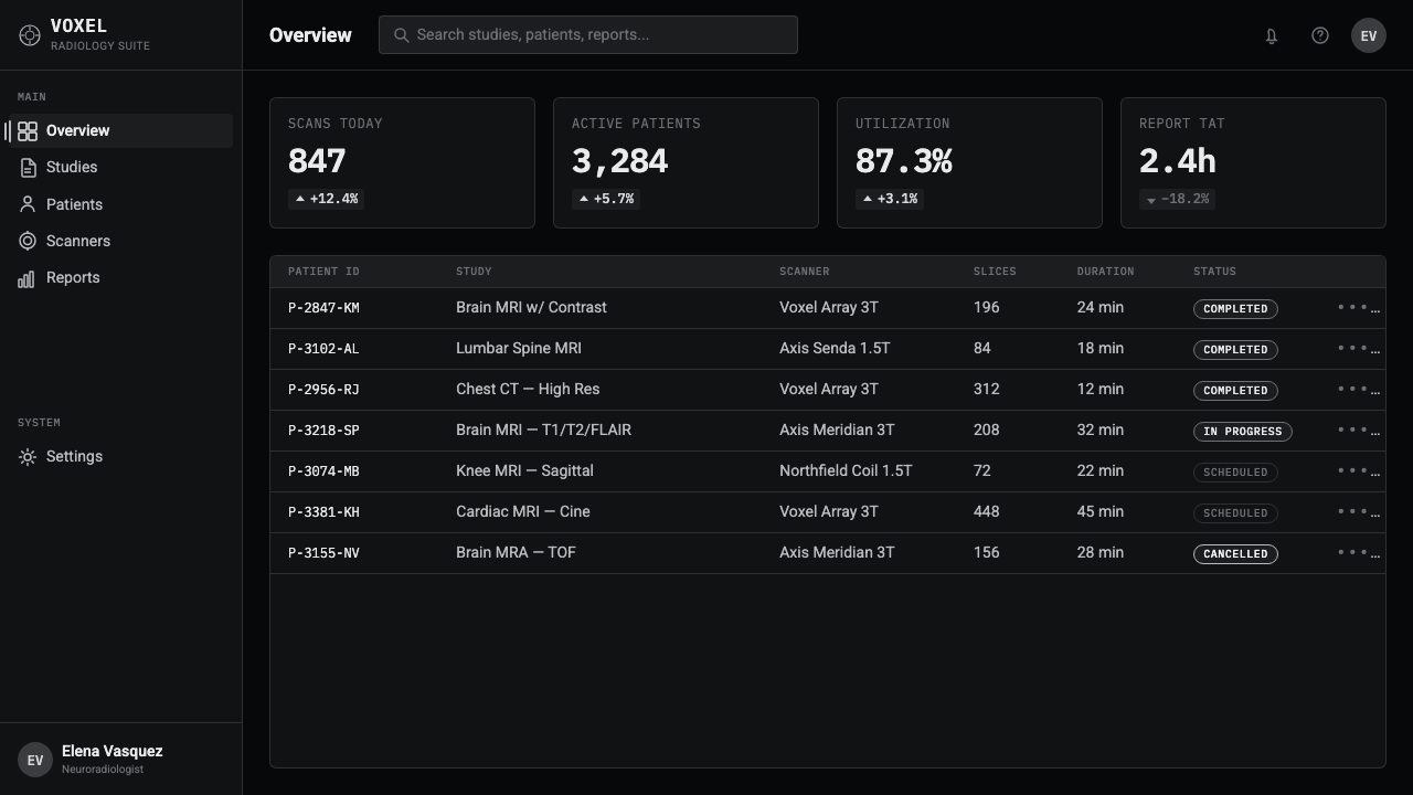
For web interfaces, MRI Scan suits dashboards and pricing pages that need to feel analytical, controlled, and technically credible. A dashboard can use the black viewport as its persistent field, with grayscale cards or imaging panels separated by clear tonal boundaries. Pricing tiers should rely on structure, labels, and measured emphasis instead of bright promotional color. Crosshairs, ruler ticks, and orientation markers can guide attention, but only when they clarify a task or establish a relationship.
For editorial and marketing work, the style supports a strong scientific voice. Articles can place a large grayscale image beside compact monospace metadata, letting the black field create a sense of focused examination. Marketing pages can frame a product or research claim as a scan-like observation: one dominant image, sparse annotation, and a clear reading path. The visual language works best when the copy feels precise and the image is treated as evidence rather than atmosphere.
The common mistake is turning MRI Scan into a generic dark theme with gray text. Darkness alone does not create the style. The system depends on the specific relationship between pure black, tissue-like grayscale, DICOM annotation, crosshairs, ruler ticks, and orientation markers. Adding colored status accents, soft decorative surfaces, or unrelated futuristic graphics weakens the diagnostic logic. Every visible element should either describe the image, orient the viewer, or support measurement.
MRI Scan — FAQ
Is MRI Scan meant to look like a real diagnostic interface?
It draws from the convention of a modern DICOM viewer and radiology viewport, but functions as a design system rather than a clinical instrument. Its value is in translating the visual logic of tomography, annotation, orientation, and measurement into a coherent aesthetic. It should communicate precision and examination without claiming to replace specialized medical software.
Why must the background be pure black?
Pure black is part of the radiology viewport convention described by the style. It allows the grayscale tomogram to appear suspended and keeps the surrounding field from competing with tissue information. A softened dark gray may still be usable in an adaptation, but it changes the reference from an imaging viewport to a more general dark interface and reduces the system's diagnostic character.
Can MRI Scan use color for alerts or interaction states?
The approved visual language is strict grayscale with no color tints, so color should not be introduced casually. If an application requires color for a functional reason, it should be treated as an explicit adaptation and kept outside the core visual identity. The essential rule is that color must never compete with the grayscale tissue ladder or turn clinical notation into decoration.
What makes the style different from an ordinary monochrome interface?
An ordinary monochrome interface may use gray simply to create a restrained mood. MRI Scan uses grayscale as an imaging logic. The black field, tissue-like tonal ladder, IBM Plex Mono annotation, crosshairs, ruler ticks, and R/L/A/P markers all point toward reading, orientation, and measurement. Remove that instrument vocabulary and the result may remain dark and monochrome, but it is no longer MRI Scan.
Related design styles
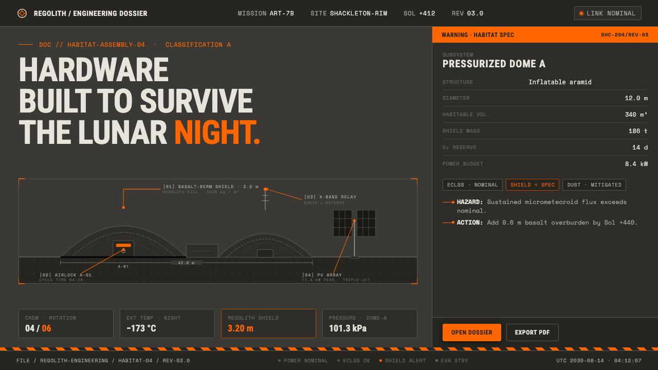 Lunar Base 2030Hardware built to survive the lunar night. Regolith gray, ANSI hazard orange,…
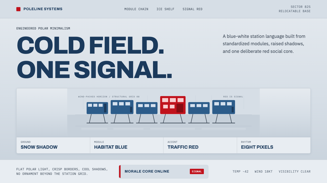 Antarctic StationCold precision, one red signal. Archivo modules ride a blue-white horizon gri…
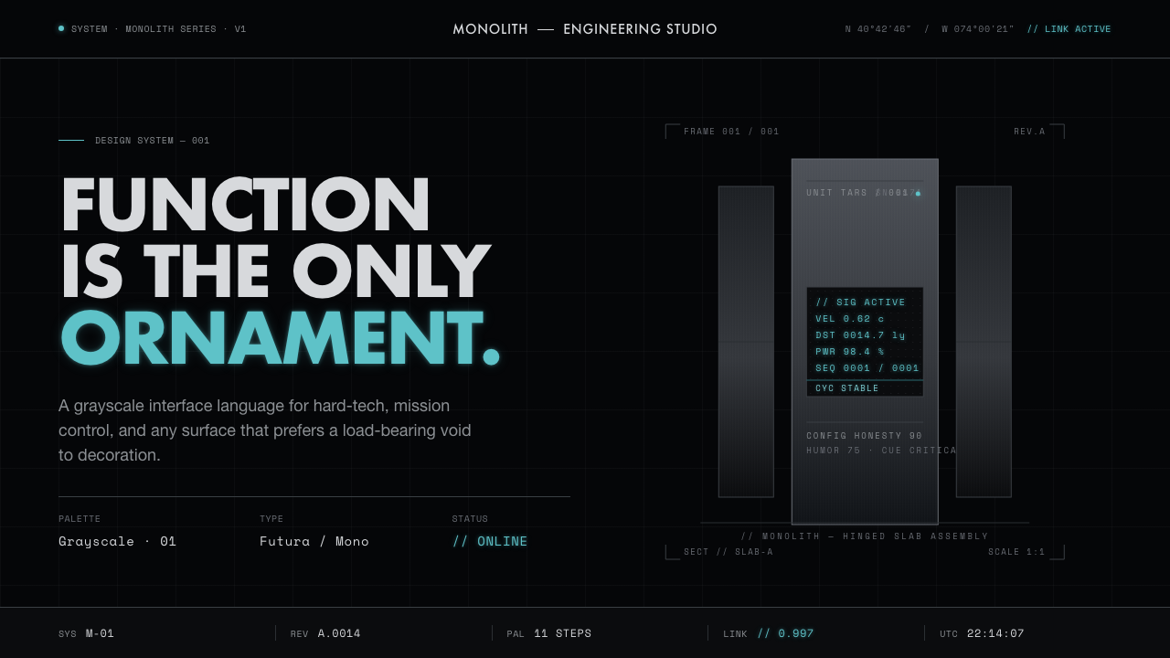 Interstellar TARSIf Mies built a robot. Brushed-aluminum grays on deep-space black, lit by one…
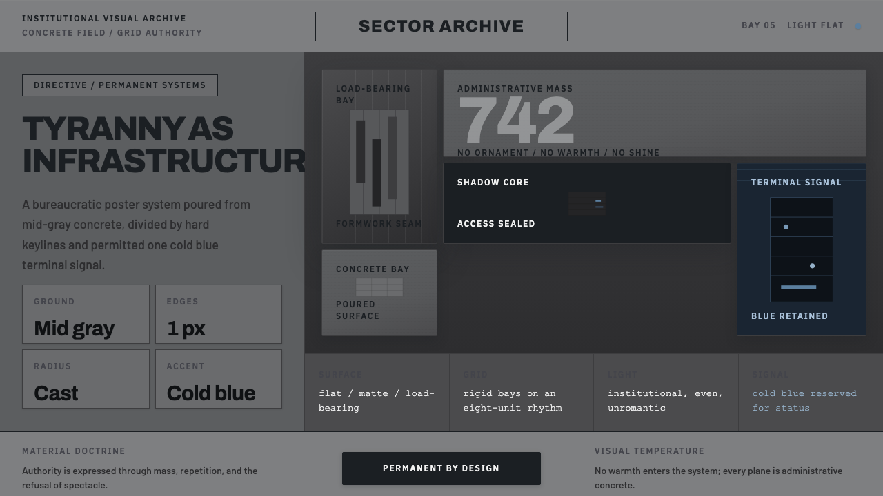 Andor Imperial GrayOppression made ordinary. Mid-gray concrete slabs, hard keylines, one cold bl…
 GitHub DarkCode-first darkness. Cool-blue canvas, 1px borders, green/red diff lines.
 Linear 2024Precision down to the millisecond. Near-black, indigo-violet accents, Inter D…