What is Andor Imperial Gray?
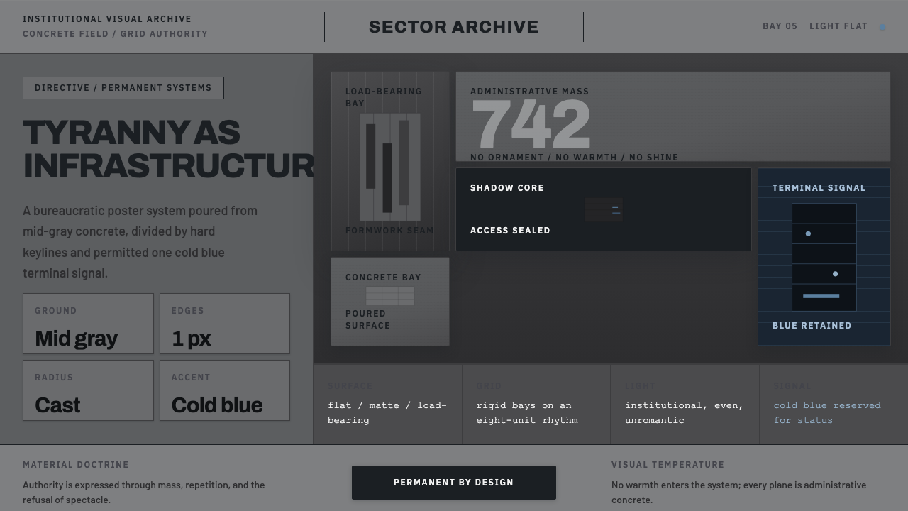
Andor Imperial Gray makes authoritarian power feel less like spectacle than infrastructure: ordinary concrete, hard divisions, and one cold blue signal inside a system built to endure.
Andor Imperial Gray in brief
Andor Imperial Gray is the visual language developed for the Empire in Andor, the Disney+ series that began in 2022 and is set in the Star Wars pre-Rebellion period from 5 BBY onward. Rather than presenting imperial authority through gleaming chrome, theatrical darkness, or comic-book menace, it treats power as an administrative environment. Vast gray forms sit beneath flat institutional light. The oppression comes not from extravagance, but from how routine, durable, and unremarkable everything appears.
Its defining field is mid-gray concrete: monolithic slabs, broad planes, rigid partitions, and sharp architectural keylines. Near-black shadow cuts into that field without becoming expressive or atmospheric, while cold blue-gray accents act as the rare visible signal of hierarchy, technology, or controlled circulation. The palette is desaturated and restrained, making every blue interruption feel procedural rather than decorative.
The style belongs to a realist political-thriller reading of science fiction. It borrows the material seriousness associated with Brutalism, then removes the usual heroic or utopian framing. Surfaces read as cast in place, load-bearing, and difficult to alter. The result is anti-decorative minimalism with institutional weight: every wall seems designed to regulate movement, every line to establish a boundary, and every empty area to make the individual feel temporary.
Where does Andor Imperial Gray come from?
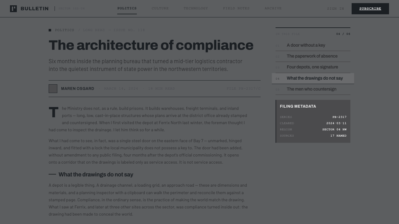
The style originated with Andor, a Lucasfilm and Disney production made across the United States and United Kingdom for Disney+. Its production design was developed around 2021 and 2022 for a series set before the Rebellion, when imperial authority is not yet framed as a distant myth or a fully theatrical military image. The design therefore needed to make the Empire feel embedded in daily systems: present in offices, corridors, walls, procedures, and built environments rather than only in moments of overt intimidation.
Creator Tony Gilroy and production designer Luke Hull deliberately moved away from two established visual expectations in earlier Star Wars media: the bright, polished palette associated with the prequel films and the black-and-gray comic sensibility of other franchise imagery. Their alternative was bureaucratic materiality. Instead of making the Empire look glamorous, technologically pristine, or merely sinister, the production grounds it in the visual logic of real-world authoritarian architecture.
Brutalism supplies the crucial architectural attitude: mass, repetition, exposed material character, and forms that appear to have been built for permanence. Yet Andor Imperial Gray is not simply a period reproduction of Brutalism. It filters that language through a realist political thriller, emphasizing institutional light, muted surfaces, sharp divisions, and the banality of controlled space. The authority of the setting lies in its apparent normality.
This origin also explains the style's refusal of ornament. Decorative richness would imply leisure, personal taste, or emotional welcome; the imperial environment instead presents itself as necessary, standardized, and indifferent. Cold blue-gray accents become powerful precisely because they interrupt an otherwise concrete-dominated system. They do not soften the architecture. They make its operational logic more visible.
What defines the Andor Imperial Gray look?
Concrete Field
Mid-gray concrete is not a background finish but the governing material idea. Large slabs and uninterrupted planes make the environment feel poured, structural, and resistant to individual intervention. The visual effect depends on weight and continuity: surfaces should appear to belong to one larger system rather than to a collection of styled rooms or components.
Hard Keylines
Sharp keylines divide planes, establish thresholds, and give the composition administrative discipline. They are architectural decisions, not illustration outlines. A line should imply a seam, a boundary, a panel edge, or a controlled route; when used without that structural role, it becomes decoration and weakens the style's severity.
Institutional Light
Light is flat, desaturated, and impersonal. It does not romanticize surfaces or create cinematic softness; it makes the architecture legible with the neutrality of a regulated workplace. This lack of expressive lighting is central to the unease. The environment feels oppressive because it never appears to be performing oppression.
Cold Blue Signal
Cold blue-gray is the deliberate exception to the gray field. Because it is scarce, it reads as a signal rather than a palette expansion: an indication of system status, technological order, or official control. It should remain detached from warmth and celebration. Its role is to sharpen the surrounding gray, not to provide visual relief.
Near-Black Cut
Near-black shadow is used as a cut through mass, not as soft atmospheric depth. It separates slabs, creates recesses, and makes volume feel more absolute. The contrast should remain controlled: darkness is not a theatrical void, but evidence that one structural plane has ended and another has begun.
Anti-Decorative Order
Nothing should look added for charm. Repetition, emptiness, and severe proportion are useful because they suggest a system that has no need to persuade its occupants. The style becomes less convincing when softened by playful motifs, polished luxury cues, or expressive visual clutter. Its restraint is political in effect: authority is communicated as infrastructure rather than personality.

Who shaped Andor Imperial Gray?
As Andor's creator, Tony Gilroy helped define the series' departure from polished prequel imagery and comic-book darkness. The resulting imperial language treats domination as bureaucratic materiality: a built system that feels routine enough to disappear into everyday life while continuing to organize it.
Production designer Luke Hull translated that direction into a physical visual system of concrete mass, rigid partitions, sharp keylines, subdued light, and rare cold blue-gray accents. His contribution makes the Empire feel built rather than merely styled, with every surface carrying the implication of structural permanence.
In this style, the Galactic Empire functions as the central design subject rather than a decorative fictional backdrop. It is represented through architecture and procedure: heavy fields, controlled divisions, and an environment whose material indifference communicates authority more effectively than overt menace.
How do you use Andor Imperial Gray today?
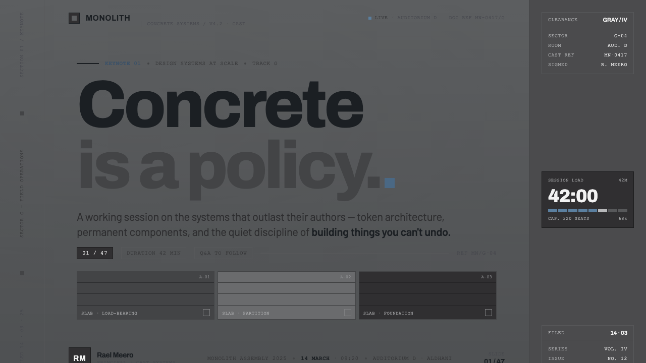
For presentation covers, use a broad gray field as the primary setting and let a single severe architectural division organize the page. A near-black cut can establish direction or frame the title, while one cold blue-gray signal marks the point of attention. The title should feel institutional and direct, with no decorative imagery competing against the structure.
Content slides should work as controlled partitions rather than as floating cards. Use gray planes to create distinct zones for argument, evidence, and annotation; use hard lines to make hierarchy explicit. On data slides, charts should inherit the same discipline: the gray field carries the baseline, near-black establishes separation, and the cold accent identifies the one reading that matters.
For web interfaces, the style fits dashboards, operational tools, pricing pages, and administrative products whose value rests on clarity, consequence, or systemic control. Navigation, panels, alerts, and tables should feel integrated into a shared built environment. The cold blue signal is most effective for state, focus, or a single active decision, not as a general-purpose accent applied everywhere.
For editorial and marketing work, Andor Imperial Gray supports investigations, policy-oriented stories, technical launches, and campaigns that need to communicate seriousness without luxury. Use broad quiet margins and structural image crops rather than decorative flourishes. Marketing copy benefits from blunt hierarchy and restrained emphasis, allowing the material language to establish mood before the text asks for attention.
The common mistake is turning the style into generic dark futurism or fashionable concrete minimalism. That loses the source's essential contrast: Andor Imperial Gray is mostly ordinary, evenly lit, and bureaucratically calm. Excessive black, glossy metal, abundant blue illumination, cinematic haze, or ornamental texture will make it feel theatrical. The cold blue accent must remain exceptional, and every division must appear to serve an institutional purpose.
Andor Imperial Gray — FAQ
Is Andor Imperial Gray simply Brutalism?
No. Brutalism is one of its stated influences, supplying concrete mass, structural gravity, and an anti-decorative attitude. Andor Imperial Gray adds the realist political-thriller frame: flat institutional light, bureaucratic normality, near-black cuts, and sparse cold blue-gray signals. It is less an architectural category than a screen-design language for authority made ordinary.
Why is the blue accent so restrained?
Because the cold blue-gray accent works as a signal against a largely concrete-gray world. If it becomes common, it stops reading as controlled information and becomes decoration or mood lighting. Its scarcity gives it institutional force: it can suggest status, technology, or official order without interrupting the system's material severity.
Can the style use warm materials or expressive imagery?
They should be used with extreme caution. The source language depends on desaturated gray mass, institutional neutrality, and surfaces that feel structural rather than welcoming. Warmth or expressive imagery may be useful only when a design intentionally needs to show contrast with the imperial system. If introduced without that role, it dissolves the atmosphere of ordinary oppression.
Where does this style work poorly?
It works poorly where reassurance, intimacy, playfulness, or sensory abundance are the central product values. A hospitality brand, celebratory campaign, or emotionally supportive consumer experience may find its gray mass and bureaucratic calm too remote. The style is strongest when the subject genuinely benefits from themes of systems, governance, scrutiny, endurance, or controlled information.
Related design styles
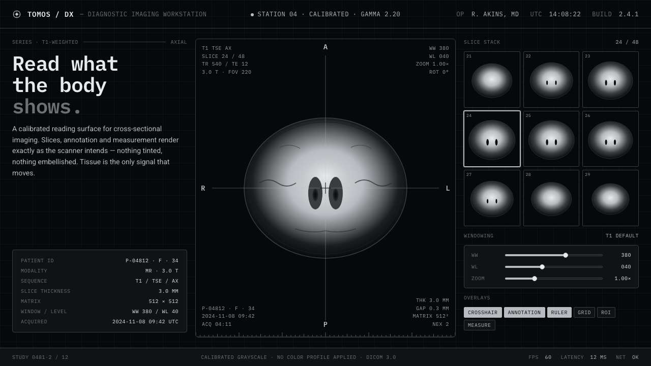 MRI ScanReads like a radiology viewport. Tissue-gray tomograms on pure black, IBM Ple…
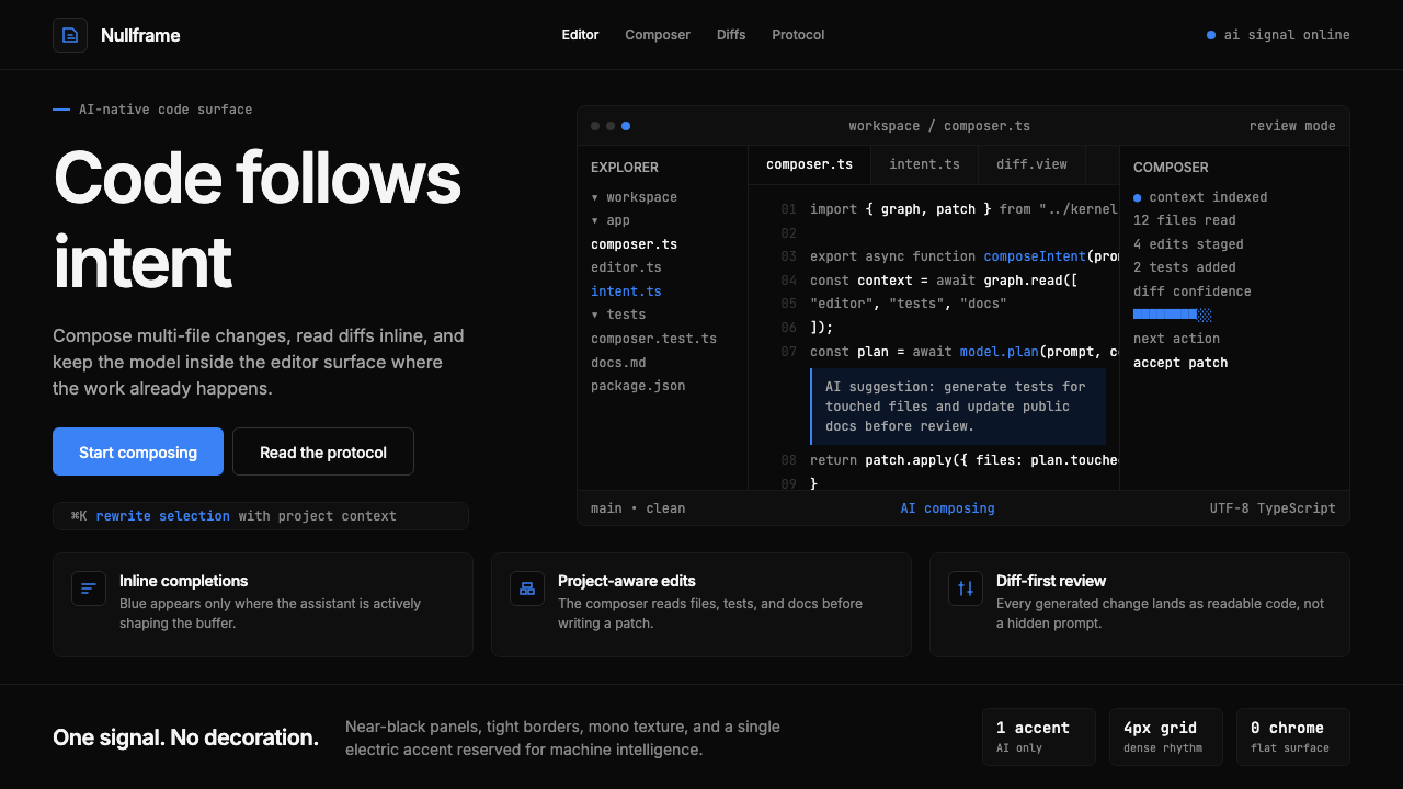 Cursor IDEAI-first code editor. Pure dark surfaces, off-white text, electric blue reser…
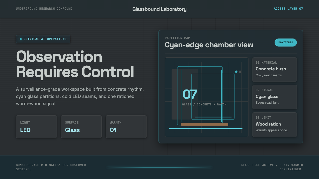 Ex MachinaClinical control, made visible. Concrete gray, cyan glass, LED seams, one woo…
 Lunar Base 2030Hardware built to survive the lunar night. Regolith gray, ANSI hazard orange,…
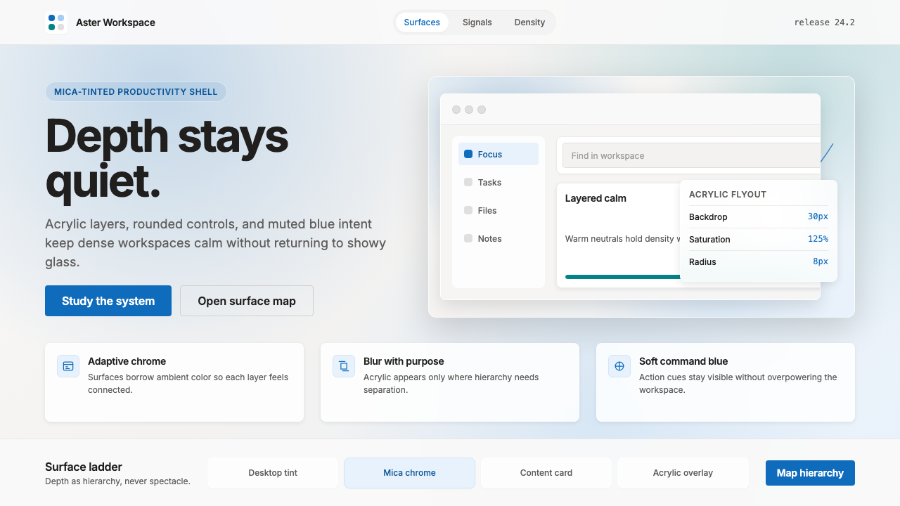 Microsoft Fluent 2Disciplined translucency. Warm Mica neutrals, acrylic blur, and muted blue cr…
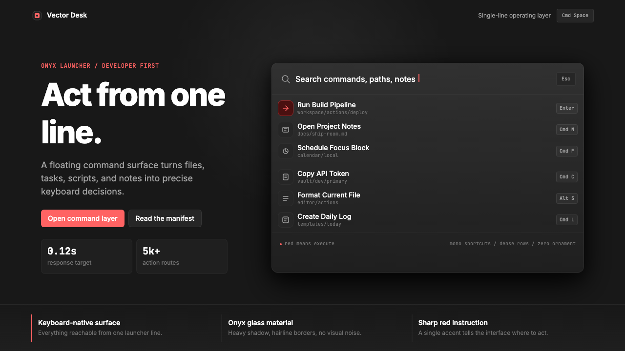 Raycast Spotlight Launcher (2023)Obsidian confidence. Sharp red cuts through Inter rows and mono shortcut chip…