What is Hazmat Signage?
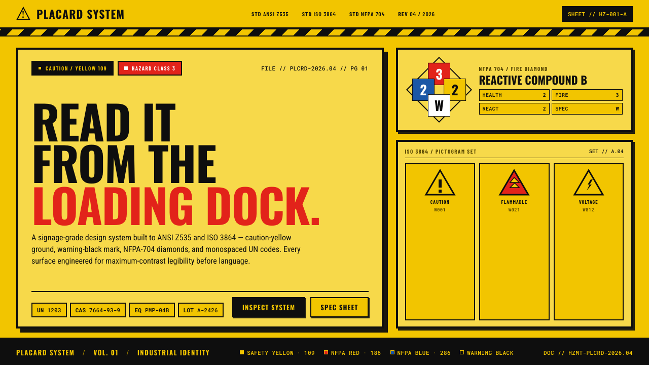
Hazmat Signage turns industrial danger into an uncompromising visual command — caution yellow, warning black, coded diamonds, and identifiers designed to be read before anything can be misunderstood.
Hazmat Signage in brief
Hazmat Signage is the visual language of industrial warning, shaped by the safety-color, symbol, and information-design lineage represented by ANSI Z535, ISO 3864, and NFPA 704. Its purpose is not to create atmosphere or express personality. It must seize attention, separate danger from surrounding information, and remain legible at the scale of a loading dock, equipment enclosure, transport placard, or control display. Every element is judged by whether it makes a warning faster to notice and harder to misread.
The style is built around a severe hierarchy. Caution yellow establishes the field; warning black carries borders, words, pictograms, codes, and directional marks. Red and blue enter through the NFPA-704 vocabulary as restricted signals rather than decorative accents. Thick outlines contain information, diagonal stripes mark hazardous boundaries, and four-quadrant diamonds divide different categories into a single compact emblem. Monospaced UN and equipment codes reinforce the sense that the message belongs to an operational system rather than an advertising campaign.
Applied to a digital surface, Hazmat Signage makes the screen behave like a physical placard. Panels are bounded, labels are blunt, and status blocks resemble posted instructions or equipment markings. Soft color, ornamental serif type, gentle curvature, atmospheric gradients, and decorative texture weaken the language because they suggest comfort or ambiguity. The authentic effect comes from controlled visual pressure: sharp geometry, limited color, repeated coding structures, and enough contrast to remain assertive amid industrial clutter.
Where does Hazmat Signage come from?
Hazmat Signage does not originate with a single designer, studio, or manifesto. It emerges from the institutional lineage of industrial safety standards in North America and internationally. Its named sources — ANSI Z535, ISO 3864, and NFPA 704 — represent a shared effort to make warnings consistent enough to be recognized across workplaces, equipment, facilities, and operational contexts. The resulting aesthetic is therefore collective and procedural: its authority comes from standardization, not authorship.
The theme is situated principally in the 1990–2010 era, when established safety-color systems, industrial information design, and pictogram standardization formed an especially recognizable common visual vocabulary. Within that lineage, the warning surface became increasingly systematic. Color was assigned a signaling role; pictograms reduced dependence on prose; borders separated instructions from their surroundings; and coded identifiers allowed materials or equipment to be referenced compactly. These devices were not assembled to look industrial. They look industrial because they were developed for industrial communication.
The North American contribution is particularly visible in the NFPA-704 diamond, whose four-quadrant structure condenses several warning categories into a single geometric unit. ANSI Z535 contributes to the broader lineage of organized safety communication, including forceful signal colors and clearly bounded messages. ISO 3864 places the language within an international framework of safety colors and standardized graphical signs. Hazmat Signage draws these strands together as a design style, while preserving their central principle: the visual hierarchy must clarify the warning rather than compete with it.
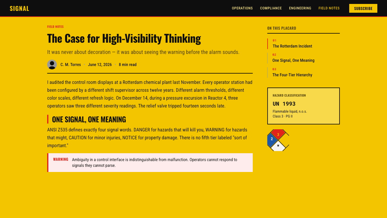
Its transition from physical signage to contemporary interface design does not require abandoning the standards-derived vocabulary. A dashboard can use the same bounded panels, coded labels, restricted signal colors, and hazard-strip separators that make a posted placard legible. A presentation can borrow the geometry of warning diamonds and the directness of equipment markings. The medium changes, but the governing idea remains stable: information about risk should appear deliberate, classified, and operationally urgent.
What defines the Hazmat Signage look?
Safety Color
Caution yellow is the dominant field and warning black is the primary mark. Their relationship must feel immediate, stark, and highly visible rather than tasteful or atmospheric. Red and blue are reserved for the NFPA-704 vocabulary, where they operate as classified signals. Expanding the palette with soft neutrals or fashionable accents dilutes the hierarchy and makes critical information resemble ordinary interface decoration.
Warning Geometry
Diamonds, rectangles, diagonal bands, and thick rules form the core geometry. The four-quadrant warning diamond concentrates several categories in one unmistakable silhouette, while rectangular placards provide stable containers for instructions and codes. Corners should read as decisive and engineered. Excessive rounding makes the composition friendlier, but also weakens the visual association with posted warnings and industrial control.
Hazard Stripes
Alternating yellow and black diagonal stripes mark edges, transitions, restricted regions, and moments of exceptional attention. Their rhythm creates urgency even before any wording is read. They work best as boundary devices rather than general-purpose patterns. When stripes cover every available surface, they cease to distinguish danger and become visual noise; scarcity preserves their authority.
Typography and Codes
Typography is blunt, compact, and functional. Strong sans-serif forms carry warnings and section labels, while monospaced characters distinguish UN identifiers, equipment codes, and operational references. The even rhythm of monospacing makes strings easier to compare and gives them the character of registered data. Decorative serifs, delicate contrast, and conversational display lettering conflict with the expectation of technical certainty.
Borders and Containment
Thick black borders make each message feel posted, classified, and physically contained. They prevent warning content from dissolving into adjacent controls or editorial material. Internal divisions should be equally explicit: separate status from instruction, identifier from description, and general caution from the most urgent condition. The border is not ornamental framing; it is part of the information architecture.
Maximum-Contrast Hierarchy
Hierarchy is created through contrast, scale, enclosure, and repetition rather than subtle tonal differences. The eye should encounter the warning class first, the operational statement second, and supporting codes or details afterward. Quiet secondary information may exist, but it must never resemble the primary alarm. A successful layout remains understandable when viewed quickly, from a distance, or amid competing industrial information.
Who shaped Hazmat Signage?
ANSI represents the North American standards lineage identified in Hazmat Signage through ANSI Z535. Its role in the theme is institutional rather than stylistic authorship: it stands for organized safety communication in which signal color, message hierarchy, and bounded presentation are treated as parts of a repeatable system. This procedural authority gives the visual language its formal, posted, and non-negotiable character.
ISO represents the international dimension of the theme through ISO 3864 and its association with safety colors and standardized graphical signs. Within Hazmat Signage, that contribution encourages visual communication that does not depend entirely on lengthy prose or local stylistic convention. Color, shape, pictogram, and placement work together so that a warning can be recognized as a warning before every detail is read.
NFPA supplies the most distinctive emblem in the source vocabulary: the NFPA-704 four-quadrant diamond. Its divided geometry and restricted red-and-blue signals turn several categories of hazard information into one compact, highly recognizable unit. In derivative design work, the diamond demonstrates how classification can become composition without becoming decoration: every region exists because it carries a separate informational role.
How do you use Hazmat Signage today?
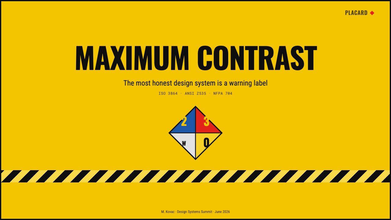
For presentation slides, Hazmat Signage creates covers that feel like posted operational notices. Use a broad caution-yellow field, a heavy black title, one bounded code block, and a controlled strip or diamond to establish the theme immediately. Content slides should preserve that authority with clearly separated modules: a signal heading, a direct statement, and supporting evidence or procedure. Avoid turning every slide into a collage of competing warnings; the strongest signal must remain singular.
Data slides benefit from the style's classificatory logic. Charts can be organized as equipment-readout panels, with black structural lines and restricted signal colors identifying exceptional states. Tables work especially well when identifiers occupy a monospaced column and critical rows receive an explicit border or warning field. Color should indicate category or urgency, never merely alternate rows. The audience must be able to distinguish ordinary operating information from a hazardous exception without studying a legend at length.
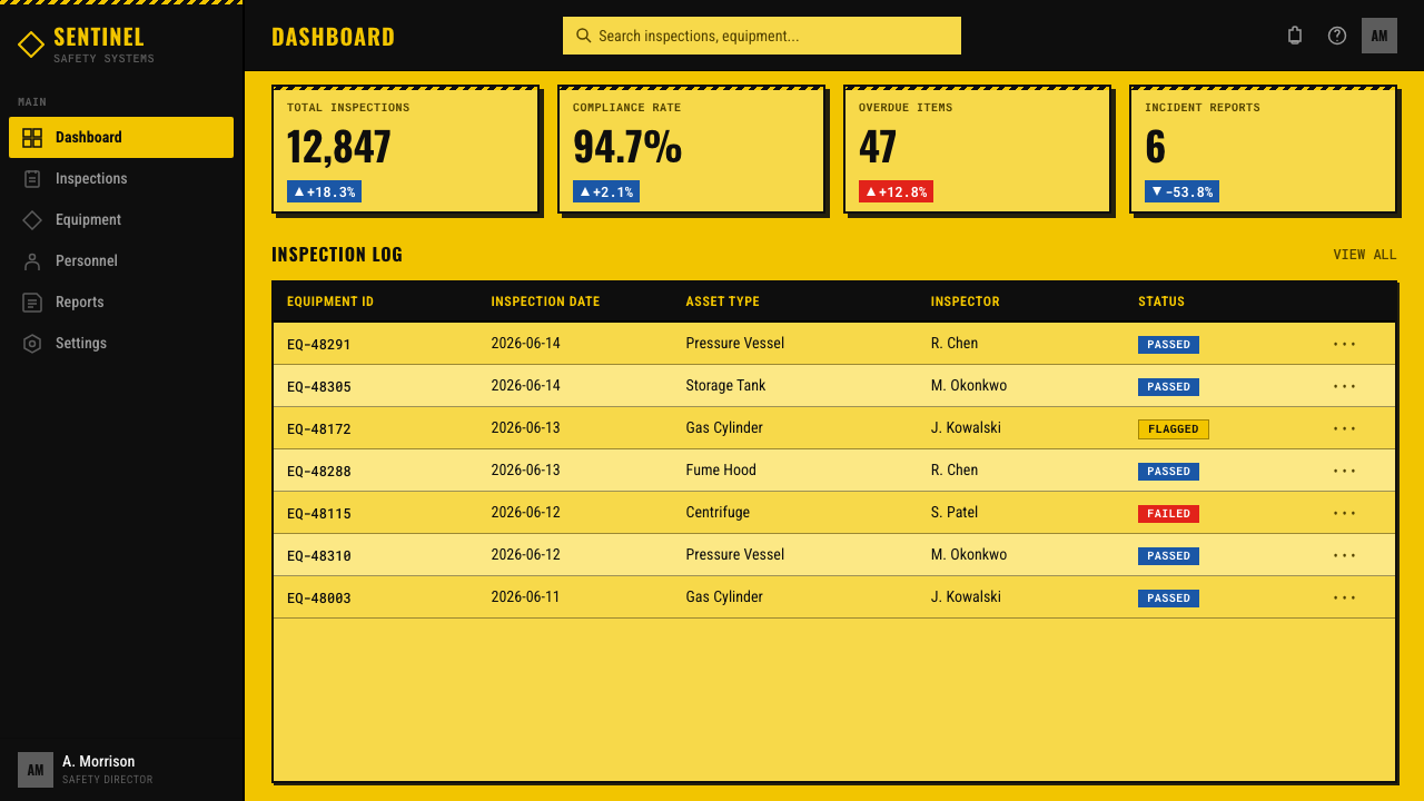
For web dashboards and pricing interfaces, the language supports strong scanning and decisive status communication. Dashboards can use placard-like cards for alerts, equipment states, or compliance tasks, reserving diagonal stripes for blocked actions and boundary conditions. Pricing pages can adapt the system by treating plans as classified operational packages, with one clearly marked recommended or restricted tier. Because the style already carries a sense of danger, ordinary navigation and neutral account information should remain quieter so that every interaction does not feel like an emergency.
Editorial and marketing applications work best when the subject already involves industry, transport, safety, equipment, or procedural urgency. An article can pair a forceful signal heading with narrow explanatory text, code-like metadata, and thick dividers. A campaign page can use a placard-inspired hero followed by calmer instructional sections, allowing the initial warning language to attract attention without exhausting the reader. Repetition of codes, diamonds, and stripes should create a coherent system of evidence and classification, not a theatrical imitation of a hazardous site.
The most common mistake is treating industrial warning language as a collection of edgy decorations. Filling every panel with stripes, assigning yellow to all surfaces, scattering arbitrary red and blue shapes, or using fabricated-looking codes destroys the hierarchy that gives the style meaning. Another error is softening the system with friendly rounding, muted pastels, ornamental typography, or diffuse depth effects. Hazmat Signage succeeds when each device has a job: yellow establishes caution, black commands and contains, restricted colors classify, codes identify, and geometry directs attention.
Hazmat Signage — FAQ
Is Hazmat Signage simply an industrial yellow-and-black theme?
No. Yellow and black provide the most visible surface vocabulary, but the style depends on a larger information system: standardized-looking pictograms, explicit borders, classified diamonds, monospaced identifiers, and a hierarchy that separates general caution from specific operational detail. A yellow interface with black decoration may look industrial, yet it is not convincing Hazmat Signage unless the elements behave like warnings, labels, boundaries, and codes.
How should NFPA-704 red and blue be used in the style?
They should be treated as restricted classified signals, not as general accent colors. Their power comes from appearing within an already disciplined yellow-and-black system and from occupying defined regions or states. If red and blue are scattered through navigation, illustrations, and decorative backgrounds, they stop behaving like coded information. Keep them subordinate to the warning hierarchy and connect each appearance to a clear category.
Can Hazmat Signage be used for ordinary consumer products?
It can, but its emotional meaning must be considered carefully. The visual language implies risk, restriction, equipment, and procedural authority. That makes it effective for products connected to industrial operations, security, monitoring, logistics, or high-stakes status information. In a casual lifestyle product, the same severity may feel hostile or misleading. A lighter adaptation should retain classification and clarity while reducing the number of explicit danger devices.
Why use monospaced type for UN and equipment codes?
Monospaced characters give each identifier a regular rhythm, making adjacent strings easier to scan and compare. They also distinguish operational references from explanatory prose, so the viewer can immediately recognize which text is a code and which text is an instruction. The choice reinforces the procedural character of the style, but it should not automatically govern every paragraph; longer explanatory text still needs comfortable reading.
How can hazard stripes remain effective instead of becoming visual clutter?
Use them to mark a boundary, blocked state, transition, or exceptional warning, and keep surrounding surfaces comparatively plain. Their diagonal rhythm is inherently loud, so they need contrast not only in color but also in frequency: a rare striped band commands attention, while many striped panels cancel one another out. The stripe should tell the viewer where caution begins, not merely announce that the designer knows the industrial motif.
Related design styles
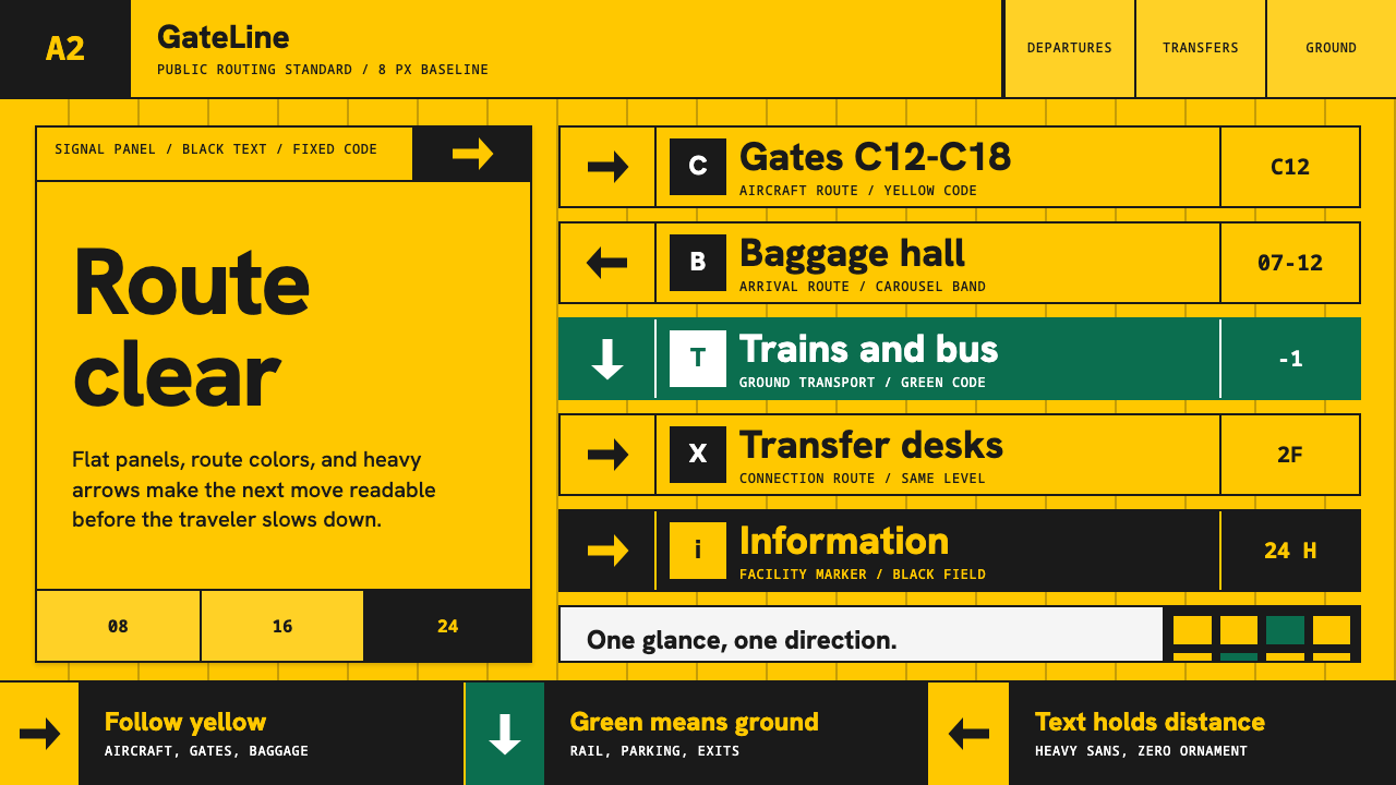 Airport Wayfinding GeometricLegibility becomes command. Signal yellow, black sans, and green route bands…
 All Blacks Silver FernOne colour, total force. Jet-black field, a single metallic-silver fern, whit…
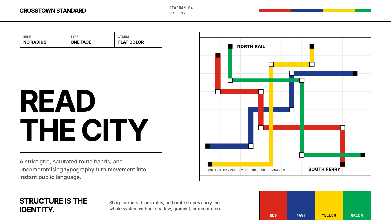 Massimo Vignelli NYCClarity becomes infrastructure. Black rules and route stripes lock the white…
 Medellín Library ParkCivic gravity in slate. Near-black planes, cool grey hairlines, and bold wayf…
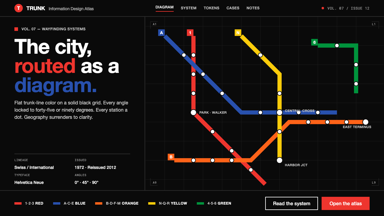 NYC Subway VignelliThe city as a circuit diagram. Flat trunk-line color on black, angles locked…
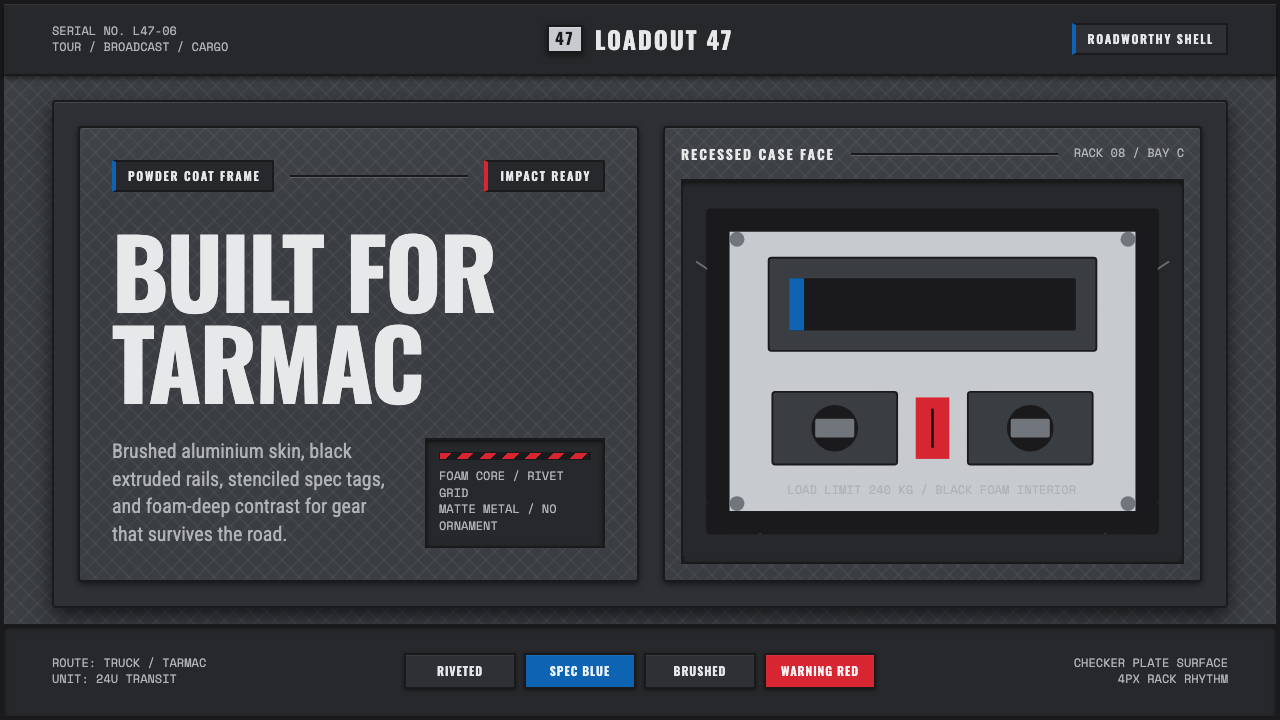 Aluminium Flight CaseRoadproof and exact. Diamond-plate gray, stencil type, black frames, blue-red…