What is Medellín Library Park?
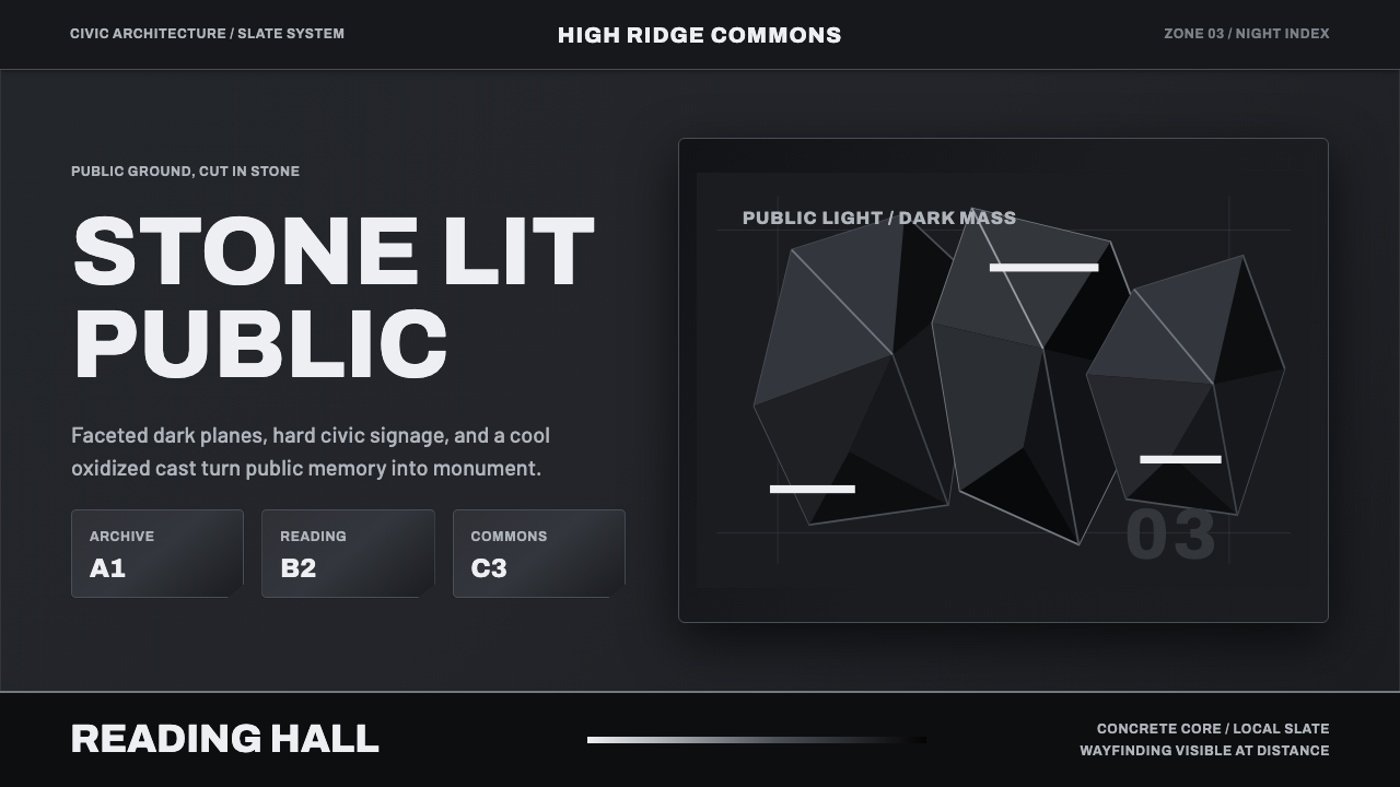
Medellín Library Park translates a monumental civic building — three faceted volumes of oxidized black slate rising above a once-marginalized hillside — into an interface of near-black planes, cool grey hairlines, and bold wayfinding.
Medellín Library Park in brief
Medellín Library Park is a civic-monumentality style modeled on Parque Biblioteca España, a public library complex completed in 2007 on the Santo Domingo hillside above Medellín, Colombia. The building itself is the source of the entire visual logic: three boulder-like, faceted volumes clad in dark, oxidized slate, deliberately designed to read as monumental 'black stones' rising out of the hillside rather than as a conventional flat-walled civic building.
The system translates that architecture directly into interface terms — a near-black ground carrying a cool, blue-grey oxidation cast rather than a warm or neutral dark tone, sharp faceted planes standing in for the building's angular massing, and bold, high-contrast wayfinding typography that reads clearly against the dark surface the way real signage has to read clearly against dark stone cladding. Nothing here is soft: corners are sharp, planes are flat, and contrast does the work that ornament would do in a lesser system.
The overall register is restrained and dignified rather than decorative — a building conceived not as a showpiece for outsiders but as an instrument of civic pride for the community it serves, and the interface style carries that same intention: authority and gravity expressed through material honesty and hard-edged geometry rather than through applied decoration or symbolic color.
Where does Medellín Library Park come from?
Parque Biblioteca España sits on the hillside of Comuna 2, Santo Domingo Savio, a district on the northeastern edge of Medellín that, through the 1980s and 1990s, was one of the areas most affected by the violence associated with the city's drug-trafficking era. By the early 2000s, Medellín's city government pursued a deliberate strategy — often described as 'social urbanism' — of placing significant public architecture, transit infrastructure, and cultural institutions directly into the city's poorest and most marginalized comunas, rather than concentrating civic investment downtown. The reasoning was that dignified, ambitious public buildings could function as instruments of social transformation, not just service delivery.
Parque Biblioteca España, completed in 2007, was among the most visible results of that strategy. Designed by Colombian architect Giancarlo Mazzanti, the complex consists of three separate, faceted volumes — described in the building's own reception as resembling 'black stones illuminated at night' — connected by outdoor plazas that step down the hillside. Concrete-and-steel structural cores are wrapped in locally sourced dark rock cladding, a material choice that grounds the building's monumental, almost geological presence directly in the region's own landscape rather than importing an unrelated material language.
The building's siting was as deliberate as its form: placing a major cultural institution on a hillside long associated with conflict and neglect was itself an argument, made in concrete and stone, that the community deserved architecture as ambitious as anything built downtown. This is the civic logic behind the movement named in the style's origin as 'civic-pride library-park architecture' — public buildings explicitly designed to restore dignity to a place, not merely to house books.
Giancarlo Mazzanti became one of the best-known architects associated with Medellín's library-park program, and Parque Biblioteca España remains one of the most photographed and discussed examples of the broader Medellín social urbanism movement — an approach that paired architecture with transit investment, such as cable-car lines connecting hillside comunas to the metro system, as part of a coordinated effort to physically and symbolically reconnect marginalized neighborhoods to the rest of the city.
What defines the Medellín Library Park look?
Color
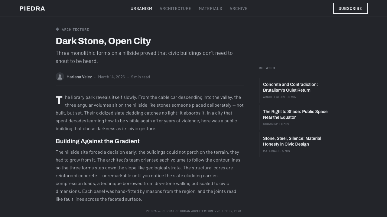
The ground is near-black, but never neutral black — it carries a distinct cool, blue-grey oxidation cast, the way weathered dark stone reads differently under daylight than a flat printed black would. This cool undertone is what separates the style from generic 'dark mode' and ties it back to a specific, real material.
Material Honesty
Surfaces are treated as if they were the actual stone cladding they reference — flat, planar, and slightly rough rather than glossy or reflective. Nothing pretends to be a material it isn't; the discipline mirrors the building's own commitment to letting concrete, steel, and stone each read honestly as themselves.
Geometry
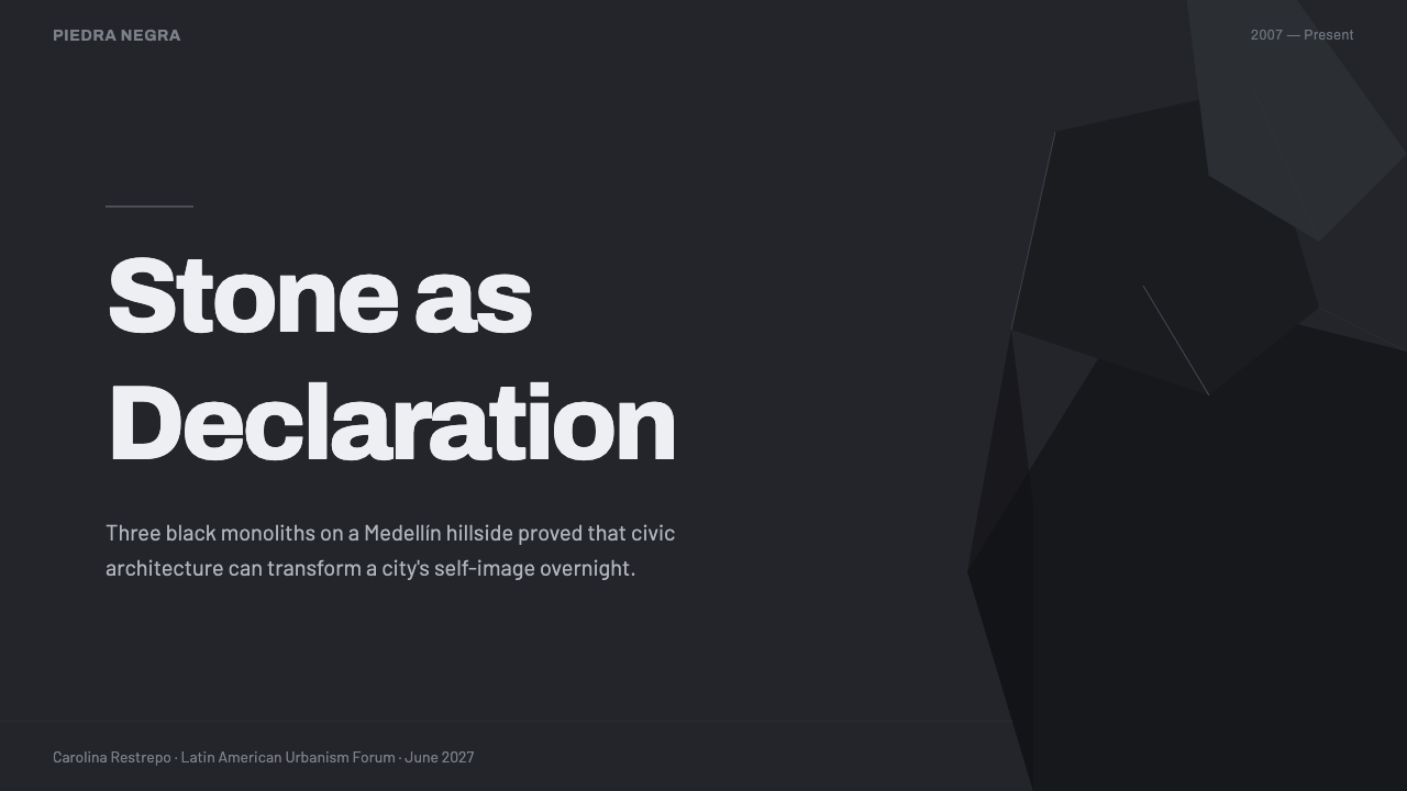
Forms are faceted and angular rather than curved — sharp planes meeting at deliberate angles, echoing the building's three monolithic, multi-sided volumes. Compositions favor a small number of large, decisive geometric shapes over many small ornamental details.
Typography & Wayfinding
Lettering is bold and grotesque in character — plain, high-contrast, and built for legibility against a dark ground rather than for expressive flourish, in the spirit of real architectural signage that has to guide people through a large public building. Hierarchy comes from size and weight rather than color or decoration.
Composition & Monumentality
Layouts favor large, decisive blocks of dark tone over busy detail, the same way the building itself reads as a small number of massive volumes rather than a facade broken into many small elements. Scale and confidence, not intricacy, communicate authority.
Line Work
Where fine lines appear, they stay cool grey and hairline-thin, functioning as quiet structural dividers rather than decorative rules — a restrained counterpoint to the large dark planes, the way a real building might use a thin reveal or joint line between massive stone panels.
Restraint
The system avoids ornament, gradient, and soft shadow almost entirely, favoring hard edges and flat planes throughout. This restraint is not coldness for its own sake — it is meant to project dignity and civic seriousness, the same intention behind placing monumental architecture in a community long denied it.

Who shaped Medellín Library Park?
The Colombian architect who designed Parque Biblioteca España, completed in 2007. His decision to clad three separate, faceted volumes in dark, locally sourced stone — rather than a conventional flat civic facade — produced the monumental, boulder-like presence that defines this entire style.
The building itself, whose own description of its form as 'black stones illuminated at night' is the direct source of this style's near-black, oxidized-cast palette. As a landmark, it stands as one of the most recognized symbols of Medellín's public-architecture transformation.
The broader municipal strategy, pursued from the early 2000s onward, of placing ambitious public architecture and transit infrastructure directly into the city's poorest comunas rather than concentrating investment downtown. Parque Biblioteca España is one of the movement's most visible built results.
A building typology explicitly designed to restore dignity to a marginalized place, not merely to provide a service — the library-park model treats the building itself as a civic statement, with monumental form and honest materials doing as much communicative work as the books inside.
How do you use Medellín Library Park today?
Medellín Library Park suits any product that needs to project institutional authority, seriousness, and civic-scale dignity rather than warmth or playfulness — applying it well means committing to large, decisive dark planes and honest, unornamented geometry rather than softening the palette or adding decorative flourish.
On presentation slides, a cover works well as a single large, faceted dark shape occupying most of the frame, with the title set in bold, wayfinding-style lettering along one clean edge — the same confidence a real building facade projects from a distance. Content slides should keep large dark blocks as the primary structural device, using cool grey hairlines only to divide sections rather than as decoration. Data slides suit the style particularly well when charts are rendered as solid faceted blocks rather than thin lines, echoing the building's own preference for a small number of massive, decisive forms over many small details.
For web interfaces, this style is well suited to civic, institutional, cultural, and public-sector platforms — museum sites, government portals, library systems, and any dashboard where authority and trustworthiness matter more than warmth. Panels and cards should keep sharp, unrounded corners and flat dark surfaces; cool grey hairlines should do the work of dividing content that a lesser system would use color or shadow to achieve. On a pricing or tier page, differentiation should come from typographic weight and scale rather than introducing new color, keeping the disciplined near-monochrome palette intact.
In editorial and marketing contexts, the style suits long-form journalism, architecture and urbanism writing, and institutional storytelling where gravity and credibility are assets. Article layouts benefit from generous dark negative space around a small number of large faceted images, while marketing pages can use the same monumental logic as the building itself — one commanding dark form dominating the frame rather than a busy composite of smaller elements.
A common mistake is treating the near-black ground as a neutral 'dark mode' default and losing the cool, blue-grey oxidation cast that ties the palette back to real stone — a warm or purely neutral dark undermines the specific material reference the style depends on. It is equally a mistake to soften corners into rounded shapes or introduce drop shadows and gradients; the entire visual argument rests on hard, faceted, unornamented planes, and rounding any of it collapses the monumentality the style is built to project.
Medellín Library Park — FAQ
Why does the style insist on a cool blue-grey undertone rather than a neutral black?
Because the near-black ground is meant to represent a specific real material — oxidized dark slate — rather than an abstract 'dark mode' choice. Real oxidized stone carries a cool cast under light, and losing that undertone in favor of a neutral or warm black would sever the direct connection between the interface and the building it is modeled on.
Is this style just a generic 'institutional dark mode,' or is it more specific than that?
It is more specific. Generic institutional dark modes are typically neutral and interchangeable across brands. This style is tied to one particular building's material logic — oxidized slate cladding, faceted monolithic volumes, and wayfinding built for a real public space — and that specificity, especially the cool oxidation cast, is what keeps it from collapsing into a generic dark theme.
Does this style work for a playful, consumer-facing brand?
Not comfortably. Its entire visual argument is built around gravity, restraint, and institutional authority — qualities that work against a playful or casual brand voice. A brand seeking warmth, fun, or approachability would find the style's severity works against its intent rather than for it.
Where does the wayfinding-style typography come from, and why does it matter?
It comes from the practical need of real architectural signage, which has to remain legible to people navigating a large public building, often from a distance and against dark stone cladding. Carrying that same plain, high-contrast, weight-driven hierarchy into the interface keeps the connection between the digital system and the physical building's own communicative logic intact.
What is the difference between this style's monumentality and simple visual heaviness?
Simple heaviness comes from filling a layout with large, dark elements indiscriminately. Monumentality here comes specifically from restraint — a small number of large, decisive, faceted forms with generous space around them, echoing how the building itself reads as three commanding volumes rather than a solid dark mass. Overcrowding a layout with dark shapes produces heaviness without the dignity the style is meant to project.
Related design styles
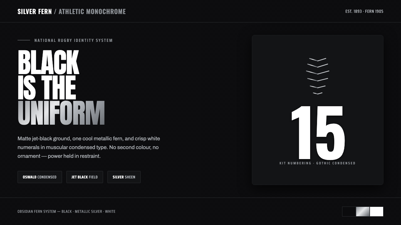 All Blacks Silver FernOne colour, total force. Jet-black field, a single metallic-silver fern, whit…
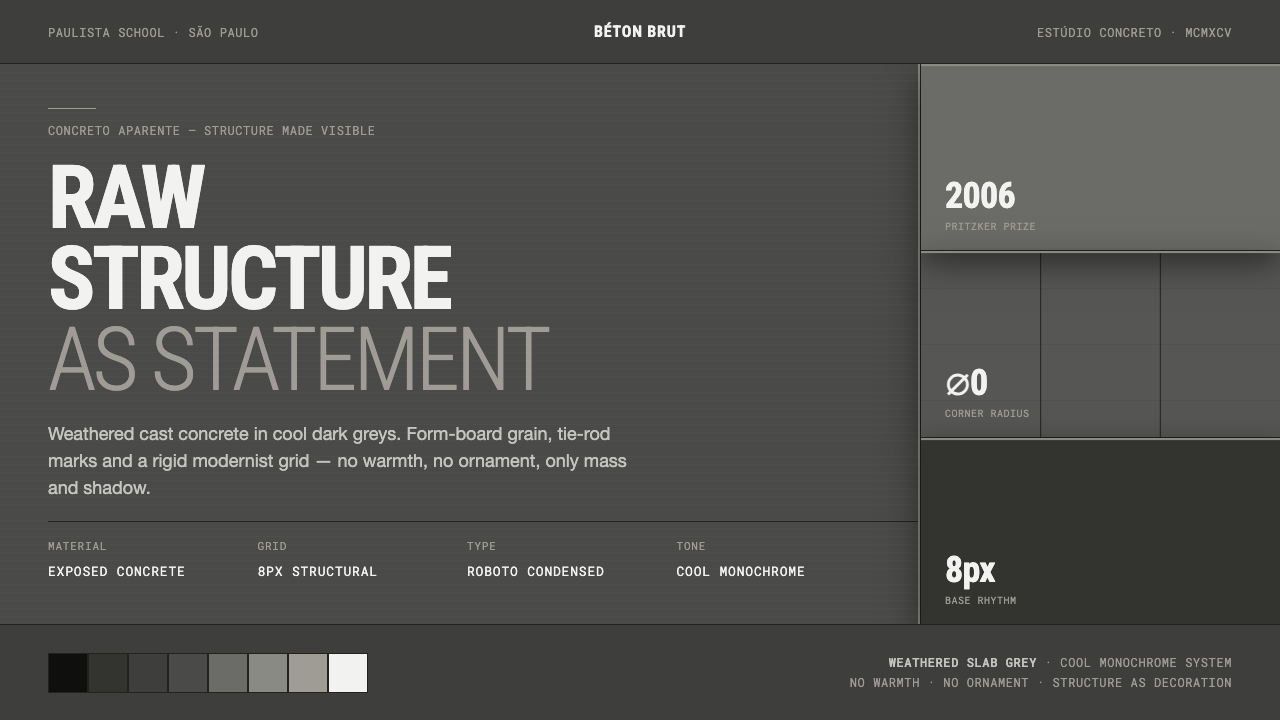 Brazilian Paulista ConcreteStructure made visible. Weathered béton-brut greys, hard cast shadows, conden…
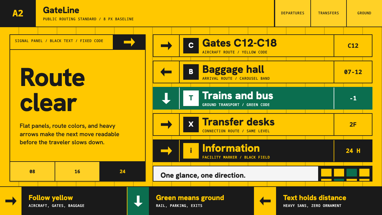 Airport Wayfinding GeometricLegibility becomes command. Signal yellow, black sans, and green route bands…
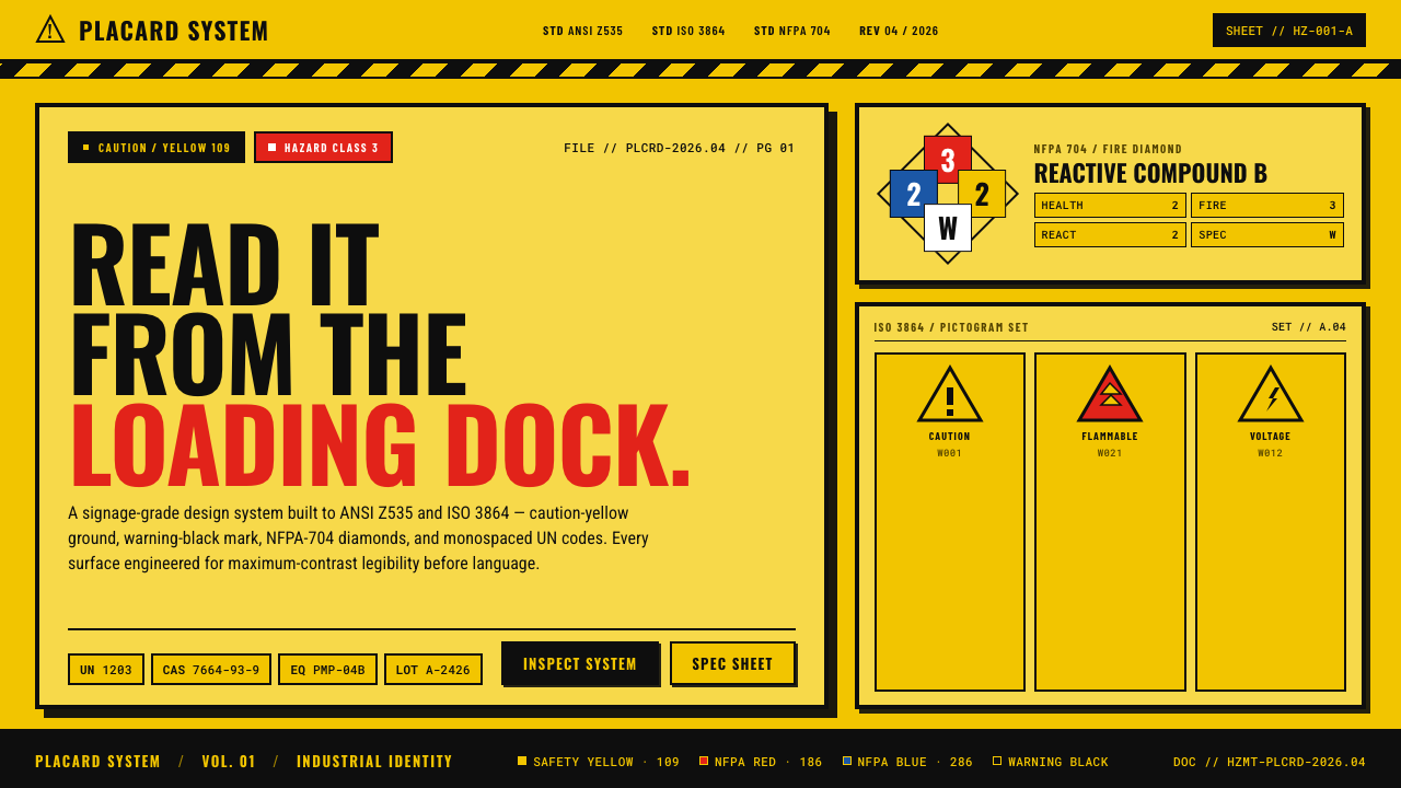 Hazmat SignageRead it from the loading dock. Caution-yellow ground, NFPA diamonds, monospac…
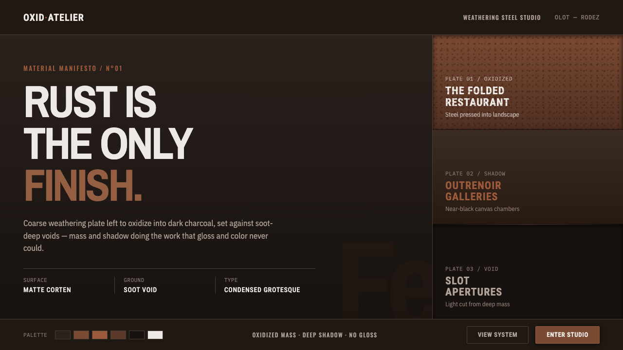 RCR Weathering SteelRust is the only finish. Matte weathering steel emerges from soot-dark voids…
 Elemental Social HousingBuild half a good house, well. Dusty cement-grey panels, hatched bare-frame g…