What is RCR Weathering Steel?
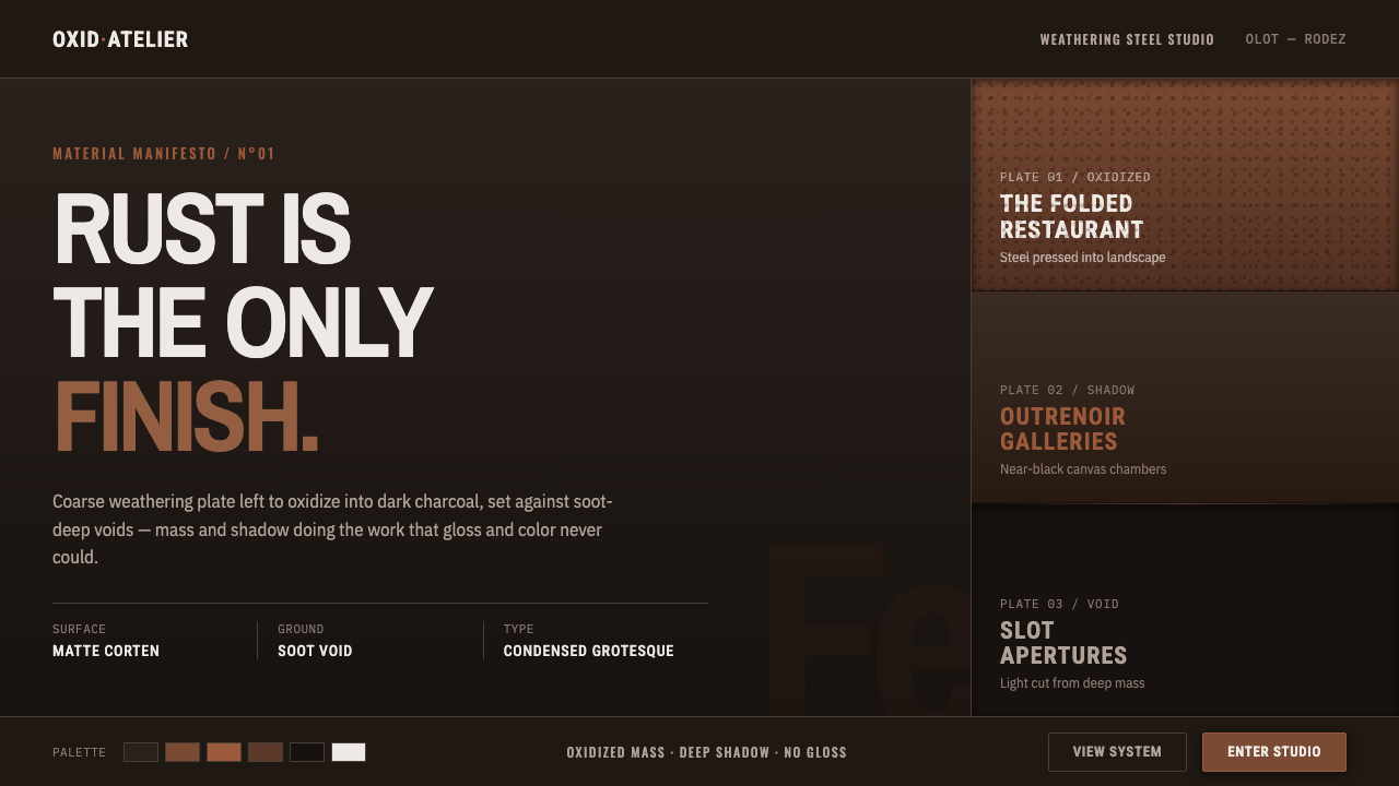
RCR Weathering Steel turns oxidation, darkness, and compressed structure into an architecture of deliberate weight.
RCR Weathering Steel in brief
RCR Weathering Steel is a design language derived from the material world associated with RCR Arquitectes: coarse weathering steel used as both enclosure and atmosphere. Its defining image is not polished metal but steel that has oxidized into a dark rust-charcoal presence, emerging from voids that feel soot-black, deep, and almost unlit. Surfaces appear aged rather than finished; mass matters more than shine.
The style treats weathering steel as an active visual medium. Oxidation supplies the only necessary richness, while folded plates, hard seams, and sharply contained openings give the composition order. Black is not a neutral backdrop or a decorative contrast. It is spatial depth: a recess, an interior cut, a threshold, or the shadow that makes the rusted plane feel physically dense.
In graphic and digital applications, this language translates into a dark steel-void ground, restrained aged-rust accents, matte surfaces, and spare condensed technical sans-serif typography. It avoids gloss, bright highlights, soft atmospheric effects, and ornamental texture. The result should feel architectural rather than industrial-themed: less like a factory surface and more like a sequence of heavy planes set into landscape and shadow.
Where does RCR Weathering Steel come from?
The reference point is RCR Arquitectes, the Catalan practice from Olot formed by Rafael Aranda, Carme Pigem, and Ramon Vilalta. Their work belongs to a contemporary architectural context in which material, landscape, and enclosure are inseparable. Weathering steel became central because it could register time visibly: its oxidized surface deepens without requiring a separate decorative finish.
The period most closely associated with this language runs from the 1990s into the 2010s. Les Cols, developed from 2002 to 2005, belongs to the approved architectural frame for the style, while the Soulages Museum entered competition in 2008 and opened in 2014. These references establish a vocabulary of dark mass, oxidized plate, and voids that are experienced as much through shadow as through form.
The link to Pierre Soulages is especially important for understanding the darkness. At the Rodez museum, the near-black force of Soulages’ outrenoir provides an artistic parallel rather than a decorative reference. Black is understood as a field with depth and variation, capable of making adjacent material appear more tactile, more severe, and more present.
RCR received the Pritzker Prize in 2017, placing the practice within a wider architectural conversation. Yet the style should not be reduced to an award-era signature. Its force comes from a sustained relationship between Catalan contemporary architecture, weathering-steel monumentality, and landscape-integrated minimalism: architecture does not sit on a site as an object, but becomes a dark, weathered interruption within it.
What defines the RCR Weathering Steel look?
Oxidized Matte Surface
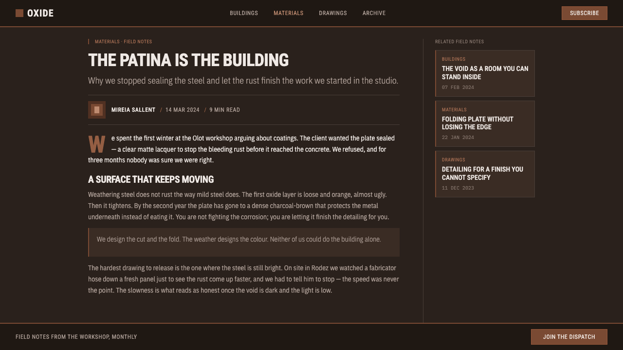
Aged rust-charcoal is the primary material expression. The surface should feel dry, dense, and naturally altered, never lacquered or freshly polished. Variation comes from weathering and darkness, not from decorative patterning.
Steel-Void Contrast
Rusted planes become legible because they meet nearly black recesses. The contrast is spatial rather than flashy: a steel face advances, while the soot-dark void absorbs detail and creates depth.
Folded Hard Edges
Edges read as cut, folded, or sharply joined. Corners and seams organize the composition like architectural joints, giving even a flat layout the sense of fabricated plate and deliberate assembly.
Condensed Technical Type
Typography is spare, condensed, and technical in character. It should feel stamped into a material system, with strong hierarchy and controlled spacing, rather than expressive, literary, or decorative.
Deep Black
Black functions as a void with physical consequence. It is not merely a background color; it withholds information, isolates mass, and makes rusted material appear heavier and more tactile.
No Gloss, No Brightness
The system excludes glossy finish and cheerful brightness. Its restraint preserves the seriousness of oxidized mass and deep shadow; visual drama comes from material contrast, not luminous decoration.
Who shaped RCR Weathering Steel?
Aranda is one of the three architects of RCR Arquitectes. Within the style’s approved context, his name represents the Olot-based practice whose architecture made coarse weathering steel, shadow, and landscape relationship into a coherent material language.
Pigem is one of the three architects of RCR Arquitectes. Her place in this account is inseparable from the collaborative practice that developed an architecture of oxidized plate, enclosed darkness, and minimal forms integrated with their surroundings.
Vilalta completes the RCR Arquitectes trio with Aranda and Pigem. The practice’s importance lies in treating weathering steel as more than cladding: it is a mass-bearing, time-marked material that establishes atmosphere both inside and outside.
Soulages provides the decisive artistic parallel through his near-black outrenoir. In relation to the Rodez museum, this idea clarifies why darkness in the RCR Weathering Steel system should remain active and layered, not empty or merely theatrical.
How do you use RCR Weathering Steel today?
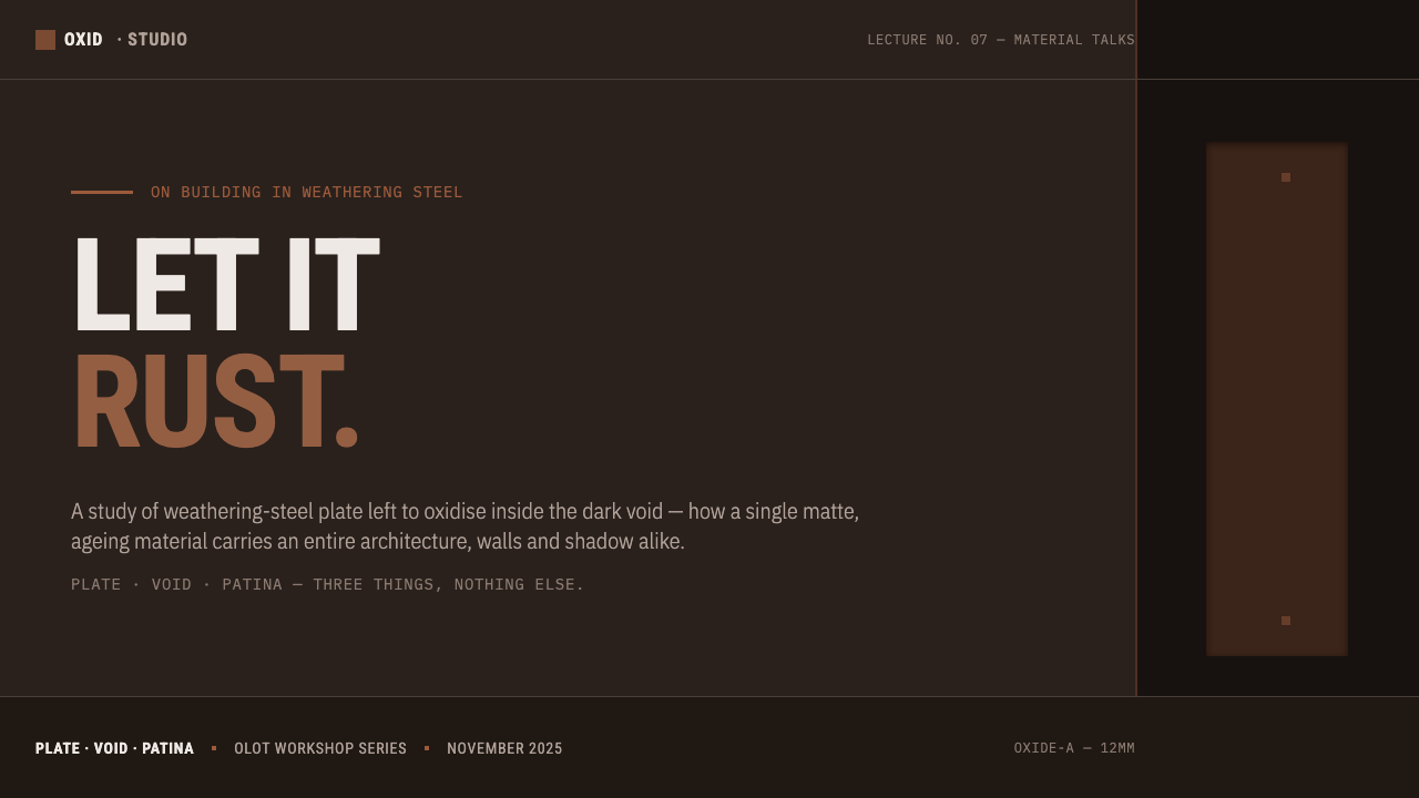
For presentation covers, use darkness as the setting and a single rusted, folded, or plate-like form as the anchor. The title should be condensed and disciplined, positioned as though it belongs to the structure rather than floating above it. Avoid bright decorative accents; the cover should establish mass, silence, and a clear threshold into the content.
Content and data slides should preserve the same architectural hierarchy. Let black fields define sections, use weathered steel tones for key values or dividers, and give tables and charts the directness of fabricated components. Data should remain highly readable: labels are technical markings, rules are seams, and empty dark space is allowed to carry structural weight.
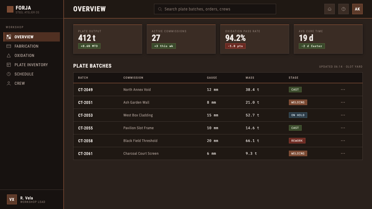
For web interfaces, the style is strongest in dashboards, analytical tools, portfolios, and pricing pages that benefit from seriousness and material authority. Panels should feel like plates set into a dark cavity, with concise labels and sharply separated zones. Interactive emphasis can borrow the rusted surface language, but feedback must remain legible rather than disappearing into atmosphere.
For editorial and marketing work, RCR Weathering Steel suits cultural institutions, architecture practices, exhibitions, and products with a durable, contemplative position. Use wide dark passages, close material crops, and technical metadata to create a sense of sequence. Marketing copy should be restrained and physical, describing structure, process, threshold, and place rather than resorting to generic luxury language.
The common mistake is to turn the style into a generic rusty-industrial mood board. Random corrosion textures, shiny metal effects, hazard-like decoration, and excessive distressed type break the architectural logic. The style depends on controlled mass, deliberate voids, and matte weathering. Rust is not an effect applied afterward; it is the visual evidence of material and time.
RCR Weathering Steel — FAQ
Is RCR Weathering Steel simply an industrial style?
No. Industrial styling often emphasizes machinery, exposed utility, bright metal, or decorative distress. RCR Weathering Steel is more architectural and more restrained. Its focus is on oxidized mass, deep void, folded enclosure, and the way material enters a relationship with landscape and shadow. It should feel contemplative rather than mechanical.
Can the style use a light background?
A light background can support supporting pages or reading-intensive content, but it is not the defining condition of the system. The central contrast is weathered steel against soot-dark depth. If light grounds are introduced, they should function as a deliberate interruption or document-like field, not erase the role of black voids.
How should photography be handled?
Photography should reinforce material, threshold, scale, or shadow. Close views of steel, dark openings, folded surfaces, and landscape adjacency are more appropriate than glossy product imagery. Images should retain gravity and restraint; they are evidence of architecture and atmosphere, not decorative wallpaper.
What makes the typography feel authentic to the system?
Use a spare condensed technical sans-serif voice with clear hierarchy and measured spacing. Typography should behave like an inscription, a label, or a structural notation. Expressive display faces, soft editorial scripts, and overly distressed lettering compete with the material language instead of supporting it.
Where does this style struggle?
It struggles where warmth, playfulness, visual abundance, or instant emotional reassurance are central requirements. The language is intentionally severe and can make lightweight consumer messaging feel overburdened. It works best when a product or institution can credibly speak through permanence, material intelligence, reflection, and spatial depth.
Related design styles
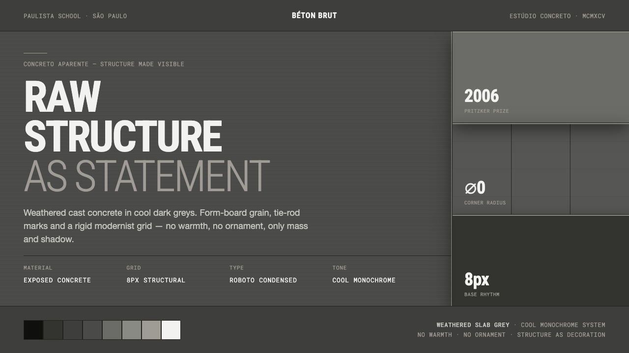 Brazilian Paulista ConcreteStructure made visible. Weathered béton-brut greys, hard cast shadows, conden…
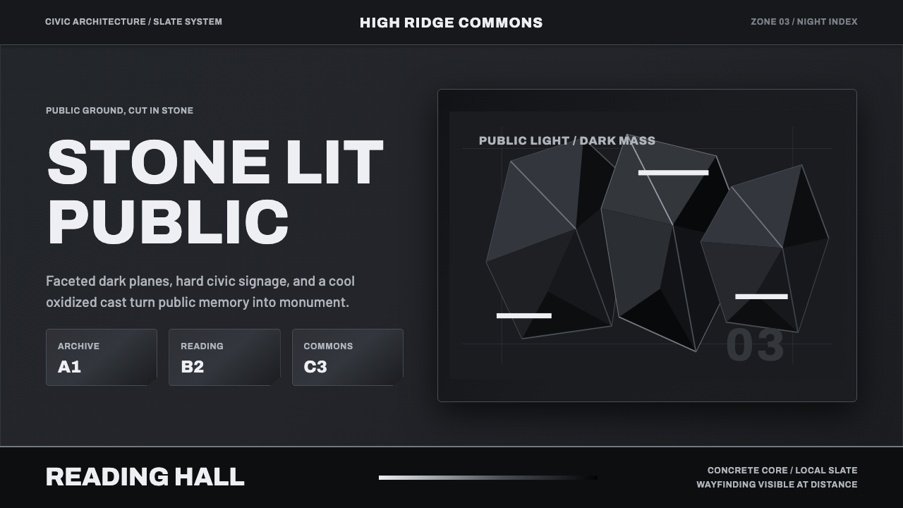 Medellín Library ParkCivic gravity in slate. Near-black planes, cool grey hairlines, and bold wayf…
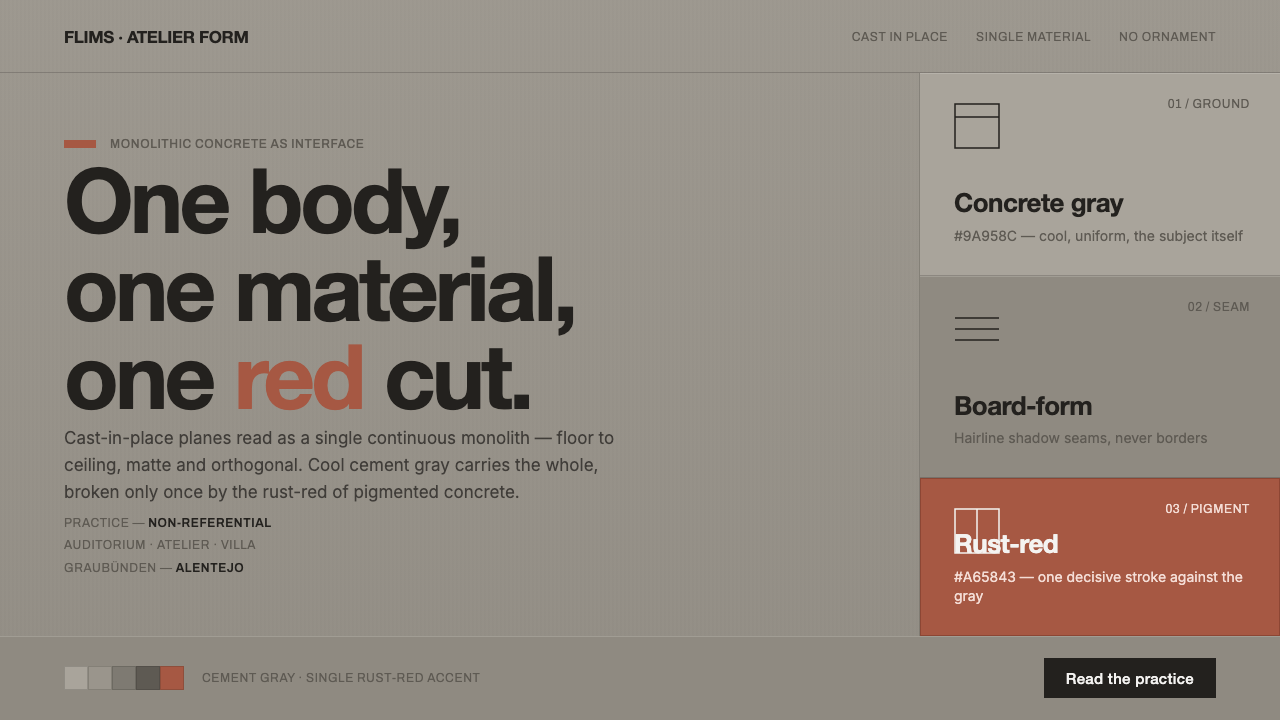 Olgiati Monolithic ConcreteThe concrete is the subject. Cool monolithic gray broken once by a deliberate…
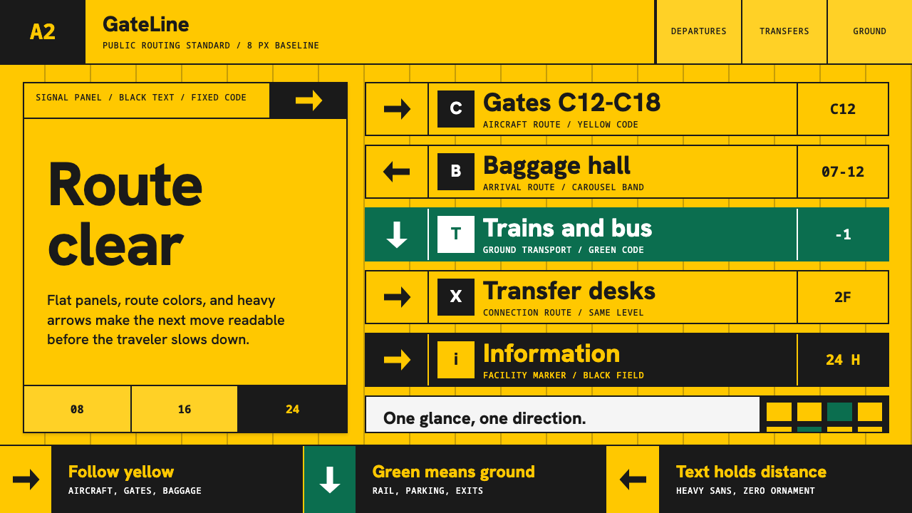 Airport Wayfinding GeometricLegibility becomes command. Signal yellow, black sans, and green route bands…
 All Blacks Silver FernOne colour, total force. Jet-black field, a single metallic-silver fern, whit…
 Icelandic Basalt VolcanoCold geology, engineered. Basalt black, Sora type, and one magma fissure hold…