What is Brazilian Paulista Concrete?
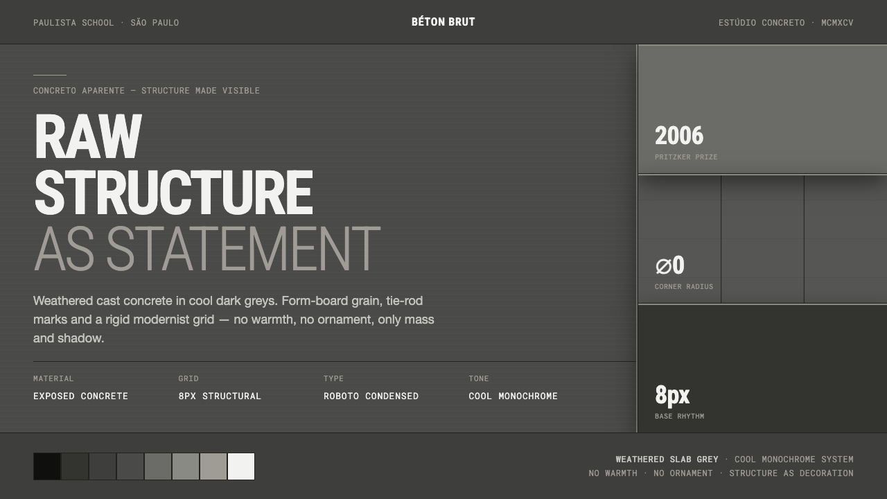
Brazilian Paulista Concrete turns raw structure into atmosphere: dark weathered concrete, cast shadow, compressed type, and the calm authority of a building that refuses to explain itself.
Brazilian Paulista Concrete in brief
Brazilian Paulista Concrete is an interface language distilled from the Paulista school of São Paulo and its mature brutalist concrete modernism. Its visual center is concreto aparente: exposed concrete left visibly unfinished, with structural mass and the grain left by form boards allowed to remain present rather than concealed. The result is not decorative roughness. It is an insistence that a surface can show how it was made, what it carries, and how time has acted upon it.
The atmosphere is dark, cool, and unsentimental. Weathered béton-brut greys establish the dominant field, while hard cast shadows make panels, rules, and blocks feel physically assembled. A rigid modernist grid holds the composition together. Condensed grotesque typography appears with the control of engineering notation: clear, dense, direct, and never expressive for its own sake. Steel-detail accents supply small moments of precision against the weight of concrete.
Applied to digital work, the style does not imitate a concrete wall with textures or theatrical ruin. It translates the logic of exposed construction into hierarchy. Large planes should read as load-bearing masses; seams, dividers, and labels should clarify alignment; shadow should establish physical separation without softness. There is no borrowed warmth, ornamental flourish, or nostalgic patina. Structure itself becomes the visual event.
Where does Brazilian Paulista Concrete come from?
The source of this style is São Paulo, Brazil, and the Paulista school: a current of Brazilian brutalism associated with béton-brut concrete modernism. Its defining material language is concreto aparente, exposed concrete whose mass and form-board grain remain available to the eye. The approach treats construction as a public fact. Instead of covering the building’s body with a refined finish, it lets the body remain legible.
Paulo Mendes da Rocha is the central named figure in this lineage and the reference point for its mature period from 1990 to 2010. A Pritzker laureate, he is associated here with architecture built in raw exposed concrete, where structural weight is neither softened nor disguised. The material is allowed to weather toward a cool, dark grey, producing an austerity that is direct rather than theatrical.
This weathering matters to the visual vocabulary. Paulista Concrete is not the polished industrial neutral often associated with generic modernism. It is darker, more atmospheric, and more affected by exposure. The grey field suggests a structure that has endured rather than a surface freshly manufactured for display. It can feel empty, overcast, and severe, but that severity is part of its clarity: nothing competes with mass, proportion, and shadow.
When translated into a design system, the architectural proposition becomes a discipline of visible construction. Modernist grids become the organizing frame; grotesque typography gains the role of measured signage; steel-like accents clarify joints and controls; cast shadows establish the relationship between planes. The resulting interface belongs to the same family of ideas as the source architecture: no warmth added to reassure, no ornament added to distract, only the order of the thing itself.
What defines the Brazilian Paulista Concrete look?
Weathered Concrete Grey
The palette begins with heavy monochrome greys associated with exposed concrete that has remained outdoors and aged into a cool darkness. These tones should feel mineral and structural, not glossy or luxurious. Variation is restrained: adjacent surfaces may differ enough to show separate mass, depth, or weathering, but the composition should remain governed by one austere concrete atmosphere. Any lighter area reads as exposed face or reflected plane, never as an attempt to introduce comfort.
Exposed Structure
Structure is the primary ornament. Panels, frames, rails, dividers, and information regions should make their alignment and role evident. A component should look assembled from planes with purpose, rather than floated into place by generic decoration. The design gains force when it allows seams, borders, and changes of plane to carry meaning: they indicate containment, load, sequence, or access.
Hard Cast Shadow
Shadow is cast, not diffused. Its edge is decisive and its role is architectural: one slab projects over another, a control plate sits proud of a field, a label occupies a mounted strip. The shadow should preserve the discipline of the grid and reinforce direction. It is not atmospheric blur, visual cushioning, or a substitute for hierarchy. If a shadow does not clarify a plane relationship, it has no reason to remain.
Rigid Modernist Grid
A rigid grid gives the style its composure. Edges should align with conviction, columns should feel measured, and empty space should be treated as an interval between structural members. The system can hold a dense dashboard as effectively as a sparse poster because order comes from repeated alignment rather than symmetrical decoration. Breaking the grid is possible only when the interruption clearly signals priority, movement, or a deliberate structural exception.
Condensed Grotesque Type
Typography is grotesque, condensed, and placed with engineering precision. It should feel capable of labeling a span, a room, a drawing, or a piece of infrastructure. Large headlines create mass; compact labels create calibration; body copy remains direct and legible. The distinction comes from scale, density, placement, and contrast against the concrete field, not from decorative letterforms or a parade of unrelated type families.
Steel-Detail Accent
Steel-detail accents provide the style’s fine-grained precision. They are best used as narrow rules, brackets, small markers, edge treatments, or restrained control details that make the larger concrete masses feel joined and measured. Their value comes from contrast in character: the concrete is broad, weathered, and heavy; the steel-like detail is exact, spare, and deliberate. It should never become jewelry.
No Warmth, No Ornament
The style’s refusal is as important as its visual inventory. It avoids friendly softness, decorative patterns, sentimental material effects, and surface gestures added only to make a layout feel more pleasant. This does not mean the work must be hostile or unreadable. It means usability is achieved through order, contrast, and plainly stated structure. The emotional register is austere confidence, not comfort.
Who shaped Brazilian Paulista Concrete?
Paulo Mendes da Rocha is the central named figure of this reference system and a Pritzker laureate. His mature Paulista period, from 1990 to 2010, anchors the style’s architectural memory: raw exposed concrete, structural mass held in full view, and an austere material character allowed to weather rather than be cosmetically corrected. In a digital translation, his significance is not a set of motifs to copy but a standard of visible construction.
The Paulista school supplies the geographic and intellectual frame: São Paulo, Brazil, and an approach to modernism in which construction remains visible. In this style guide, the school stands for disciplined mass, legible structure, and an urban dark-grey atmosphere rather than for generic brutalist spectacle. Its relevance is organizational as much as visual: every element should appear located, aligned, and necessary.
Brazilian brutalism names the movement through which the system inherits its severity. Here brutality is not visual noise or deliberate discomfort. It is the refusal to hide material mass behind ornamental reassurance. Dark concrete fields, sharp plane changes, hard shadows, and terse typography all work because they preserve that refusal and make the underlying framework more legible.
Béton-brut concrete modernism contributes the material principle behind the interface language. Concrete is not presented as a neutral background waiting for decoration; it is the visible record of form, assembly, and weathering. The digital equivalent is a surface system that lets borders, planes, shadows, and typographic alignment reveal how information is organized rather than disguising that organization with polish.
How do you use Brazilian Paulista Concrete today?
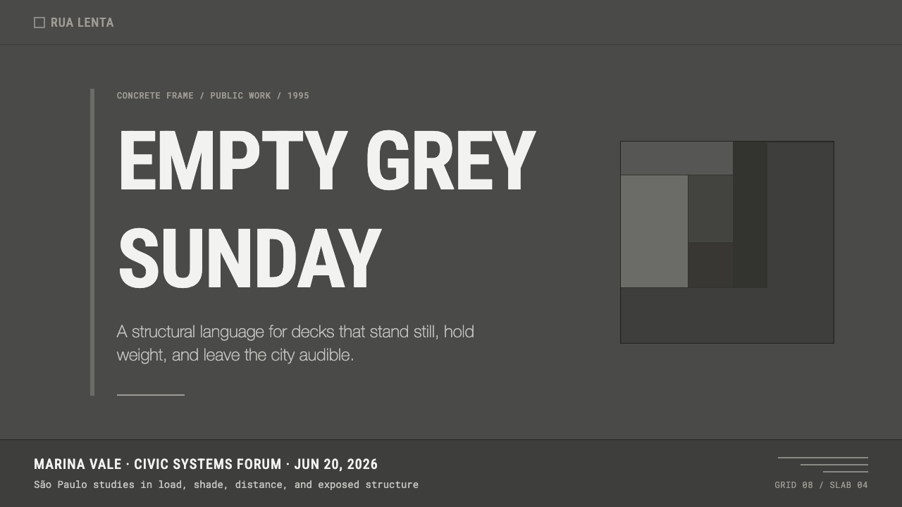
For presentation covers, Paulista Concrete works best when the title is treated as an architectural inscription. Set it against a dark weathered-grey field, give it a firm relationship to one edge or grid line, and let a broad offset plane or hard cast shadow establish mass. A steel-like rule or compact metadata strip can provide precision. Do not soften the cover with decorative imagery. The cover should feel less like a campaign graphic and more like the measured face of a structure.
Content slides should use the grid as their primary narrative device. Place headings, body text, numbers, and references in visibly related zones, allowing generous unoccupied areas to function as structural intervals rather than empty decoration. Keep the information hierarchy direct: a strong compressed headline, a disciplined text block, and clear dividers where the argument changes. For data slides, charts should read as engineered assemblies. Use tonal contrast and hard boundaries to distinguish series, and let labels behave like technical markings rather than floating annotations.
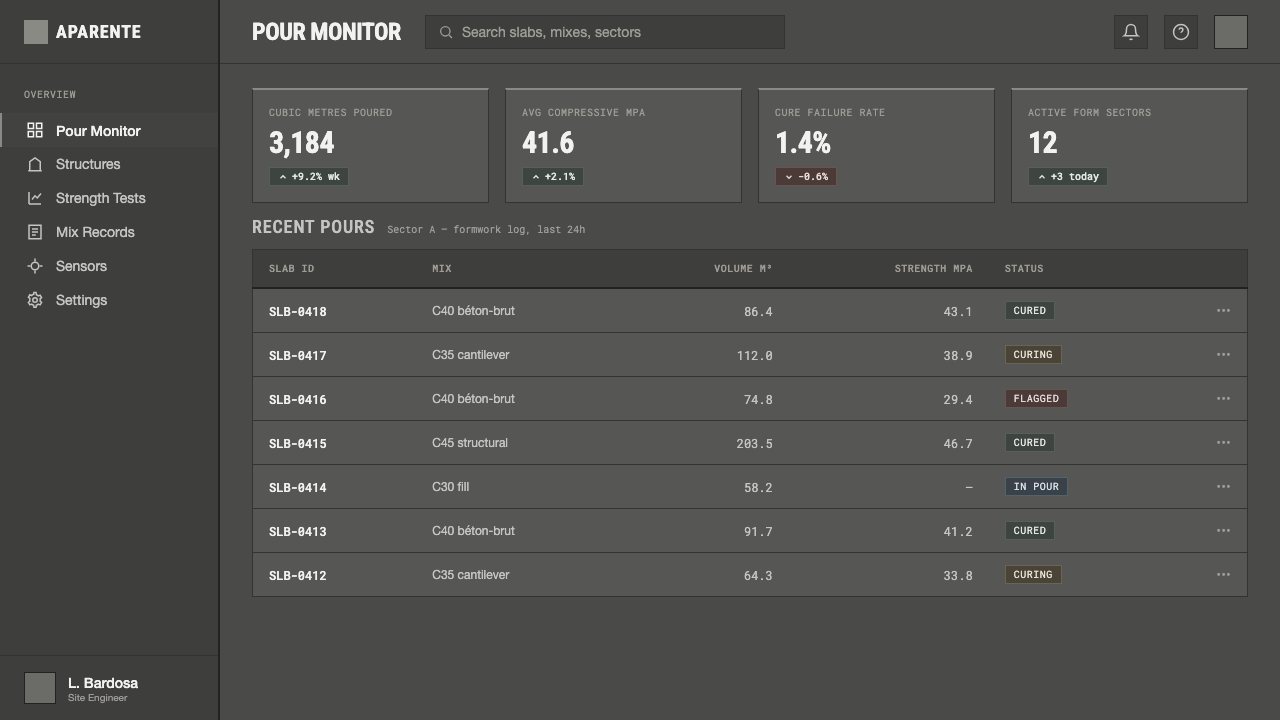
For web interfaces, the style is particularly effective for dashboards, operational tools, analytical products, and pricing pages where authority and scanning matter. Navigation can become a mounted band of concise labels; modules can appear as concrete slabs separated by exact seams; active states can use a restrained steel-like accent instead of cheerful color. Pricing tiers should be distinguished by structural prominence and information order, not by theatrical badges. The interface must remain legible under density, because its severity has value only when it clarifies decisions.
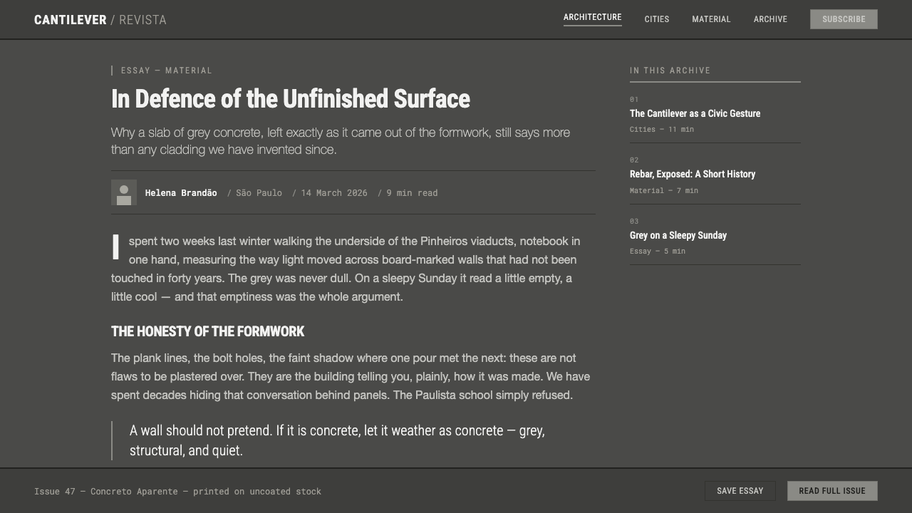
Editorial and marketing work can use the style’s sense of mass to give information unusual gravity. An article page benefits from a strong title field, compact metadata, firm sectional rules, and images treated as planes within the composition rather than atmospheric decoration. Marketing pages can alternate large dark fields with lighter concrete-facing panels, but each transition should feel like a change of material or load-bearing condition. Copy should be declarative and specific. Calls to action should read as designated access points, not as friendly interruptions.
The most common mistake is confusing Paulista Concrete with a generic dark brutalist mood board. Random rough textures, oversized warnings, arbitrary broken grids, soft glow, or ornamental industrial icons all weaken the system because they obscure construction rather than reveal it. Another mistake is making every element heavy: if every card, label, border, and headline competes for structural authority, nothing reads as structure. Build hierarchy through measured contrast, alignment, and purposeful shadow, then leave enough restraint for the mass to speak.
Brazilian Paulista Concrete — FAQ
Is Brazilian Paulista Concrete simply another name for brutalism?
It belongs to Brazilian brutalism, but it is more specific than a generic brutalist label. Its source is the Paulista school of São Paulo and its exposed-concrete modernism, especially the mature Paulista reference period associated with Paulo Mendes da Rocha. The distinction matters because the style is not defined by visual aggression alone. It depends on weathered concrete mass, legible construction, disciplined grids, hard cast shadow, and controlled typographic precision.
Should an interface literally use concrete textures?
Not necessarily. The source material is exposed concrete, including visible form-board grain, but a faithful interface translation is usually structural before it is textural. Use tonal weight, planar separation, seams, shadow, and alignment to convey the material logic. Literal texture can help when it remains restrained and does not interfere with reading, but it becomes a mistake when it turns the interface into a theatrical surface treatment.
Can this style work for a pricing page?
Yes, particularly when the product needs to project operational confidence, clarity, or technical seriousness. Treat tiers as structural modules rather than promotional cards. Make differences in access, scope, and priority plainly visible through placement and hierarchy, while keeping labels concise and controls exact. The style is less suitable when the page must communicate softness, indulgence, or intimate reassurance as its primary value.
Why are hard shadows important here?
Hard shadows make relationships between planes explicit. In a Paulista Concrete composition, they can indicate that a panel projects, a strip is mounted, or one information region sits above another. This preserves the architectural premise that structure should be visible. Soft shadows tend to turn depth into ambient decoration, while hard shadows remain measured, directional, and connected to the grid.
What makes an application feel inauthentic?
It feels inauthentic when concrete, darkness, or industrial references are added as costume while the layout remains ornamental and unstructured. Friendly glow, decorative distress, arbitrary asymmetry, excessive badges, and unrelated expressive typefaces all contradict the system. A more convincing result may use fewer visible references but makes every border, plane, label, and shadow answer a structural question. The aim is not to look severe; it is to make construction legible.
Related design styles
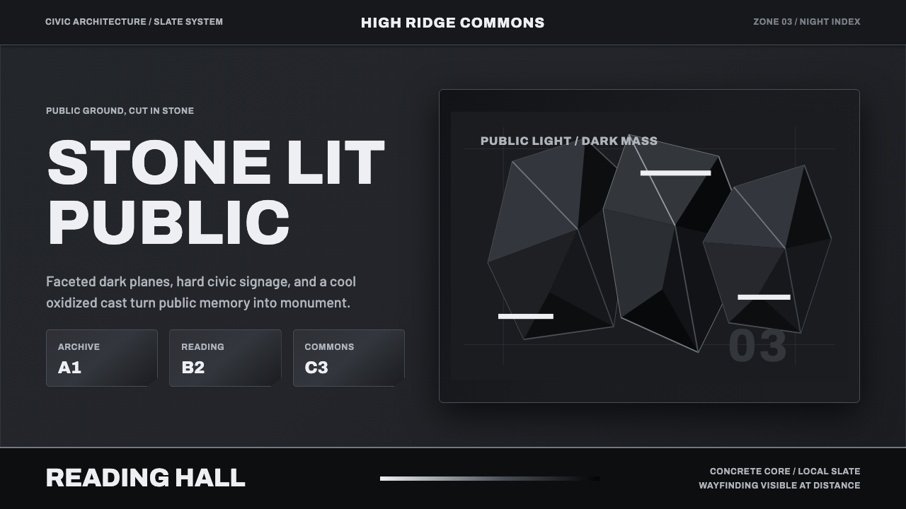 Medellín Library ParkCivic gravity in slate. Near-black planes, cool grey hairlines, and bold wayf…
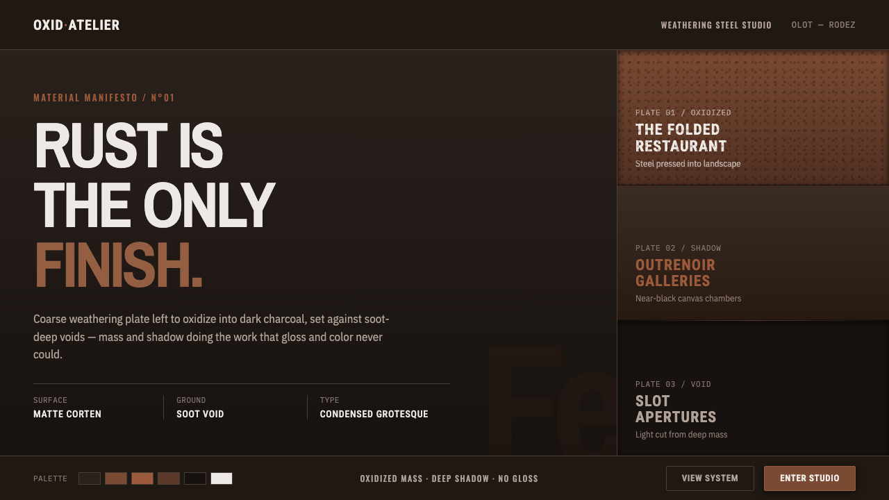 RCR Weathering SteelRust is the only finish. Matte weathering steel emerges from soot-dark voids…
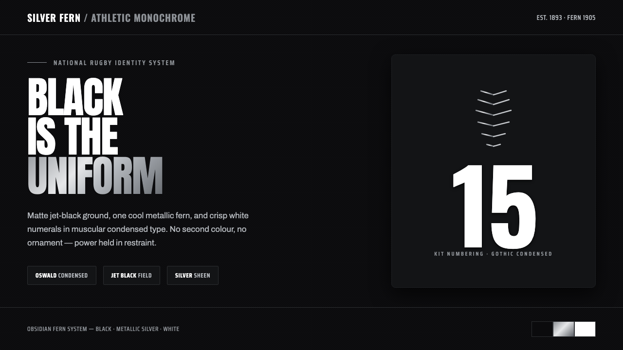 All Blacks Silver FernOne colour, total force. Jet-black field, a single metallic-silver fern, whit…
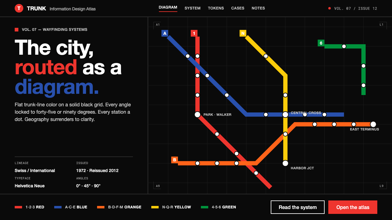 NYC Subway VignelliThe city as a circuit diagram. Flat trunk-line color on black, angles locked…
 Peter Märkli Concrete ReliefsSilence cast in stone. Luminous mid-gray concrete, hairline formwork seams, t…
 Tadao Ando ConcreteSilence as material. Cool board-formed grey, tie-hole grid, one sliver of lig…