What is Tadao Ando Concrete?
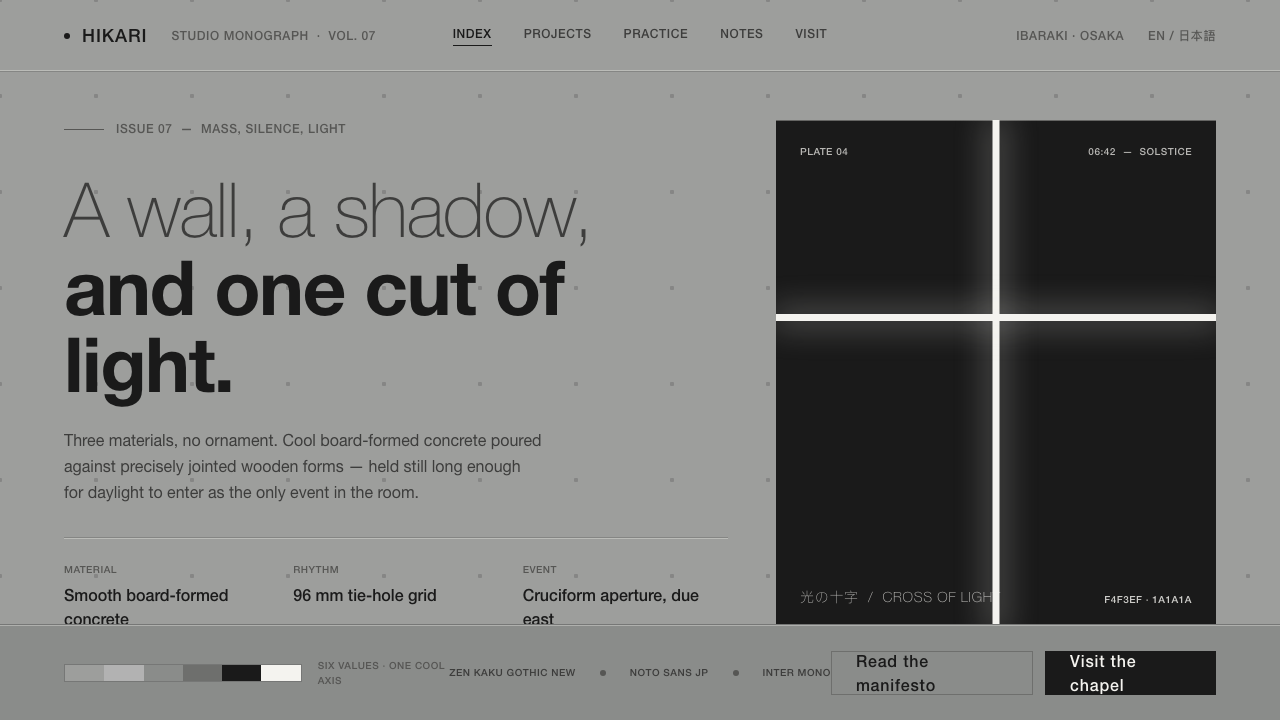
Tadao Ando turns concrete into silence — a cool grey shell, a measured grid of construction marks, and one narrow opening where light becomes the only ornament.
Tadao Ando Concrete in brief
Tadao Ando Concrete is a design language drawn from the Japanese architect Tadao Ando: smooth board-formed concrete, cool grey surfaces, deep shadow, glass, and sharply controlled natural light. Its emotional register is quiet rather than austere. The material feels massive, but the composition remains open, contemplative, and intensely precise.
The system treats concrete not as a rough industrial texture but as a disciplined field. Tie-holes and form-seams introduce a restrained rhythm across otherwise homogeneous surfaces, while negative space prevents the mass from becoming oppressive. A bright slot of light, isolated against shadow, provides the central moment of contrast.
In digital work, the style becomes a surface of cool mid-light grey, hairline seams, broad quiet margins, and carefully staged light. There are no ornamental flourishes, decorative textures, or expressive color accents. The visual vocabulary is limited to mass, rhythm, void, and illumination.
Where does Tadao Ando Concrete come from?
The style belongs to a Japanese architectural context centered on Osaka and Ibaraki, with its strongest signature works emerging from the late 1980s onward and continuing through the period from 1990 to 2010. Its identity comes from reduction: a building is understood through concrete, glass, and light rather than through an accumulation of decorative finishes.
Its intellectual background combines Japanese minimalism, critical regionalism, and a reinterpretation of concrete brutalism as Zen restraint. The result is neither a simple celebration of raw industrial force nor a soft, naturalistic minimalism. Concrete remains visibly structural and weighty, but silence, proportion, and controlled illumination transform that weight into contemplation.
The Church of the Light in Ibaraki, completed in 1989, is the clearest reference point in the source material. Its cool concrete shell, deep interior shadow, and sharply defined opening express the central idea of the style: light is not an ambient effect added to architecture, but an active material that gives the mass its meaning.
The digital design system carries this architectural logic into interfaces and editorial surfaces. Grey establishes the field, seams establish rhythm, shadow establishes depth, and the light slot establishes attention. Every element must justify its presence through structure or perception; anything that behaves as decoration weakens the silence.
What defines the Tadao Ando Concrete look?
Concrete Grey
The dominant ground is a cool, homogeneous grey derived from smooth board-formed concrete. It should feel mineral and quiet, never warm, glossy, or mottled. Variation comes from light and shadow rather than from a decorative color range.
Board-Form Rhythm
Tie-holes and form-seams provide the surface with a measured architectural rhythm. They are subtle enough to remain secondary, yet regular enough to make the material feel constructed rather than digitally flat. The pattern should never become a wallpaper motif.
Light Slot
A narrow, high-contrast opening carries the composition. It may define a focal action, a title edge, or a transition between sections, but it should appear deliberately and sparingly. Its power comes from isolation against a darker field.
Deep Shadow
Shadow is structural, not atmospheric. Dark recesses create the sense that surfaces have depth and weight, while their edges remain controlled and architectural. Avoid soft, decorative shading that turns concrete into a generic interface effect.
Quiet Negative Space
Large unoccupied areas are essential. They separate heavy masses, slow the reading pace, and give the light element room to register. Empty space is not leftover room around content; it is one of the system's primary materials.
Mass and Void
Every composition should balance a sense of solid mass with a carefully cut void. Panels, cards, and content blocks should feel placed within a larger shell, while openings, margins, and light interruptions keep the arrangement breathable. The tension between enclosure and release defines the style.
Who shaped Tadao Ando Concrete?
Tadao Ando is the central figure behind this design language. His architecture is represented here through the disciplined relationship among concrete, glass, and light: a limited material vocabulary made expressive through mass, silence, and controlled openings. The system takes his name because its visual character depends on that exacting restraint.
The Church of the Light in Ibaraki, completed in 1989, is the defining reference work for the style. Its concrete shell, deep shadow, and singular bright opening demonstrate how a restrained architectural vocabulary can produce intense visual focus without ornament.
These three materials form the system's conceptual cast. Concrete supplies mass and continuity, glass introduces controlled permeability, and light reveals the relationship between them. Their interaction is more important than any isolated surface treatment.
How do you use Tadao Ando Concrete today?
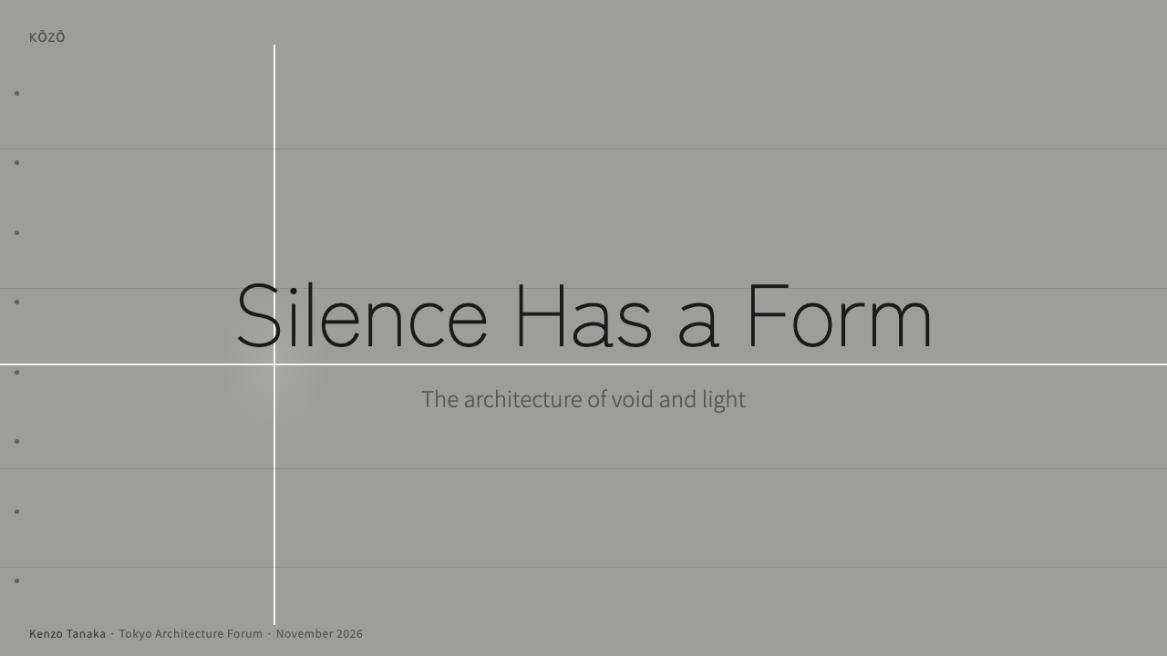
For presentation slides, use the cover as a quiet architectural threshold: a broad concrete-grey field, a restrained title, and one narrow light slot that establishes direction. Content slides should preserve generous breathing room and use seams or tie-hole rhythm to separate information groups. Data slides benefit from mass-and-void logic: let one chart or figure occupy the main field while secondary annotations remain recessed in shadow.
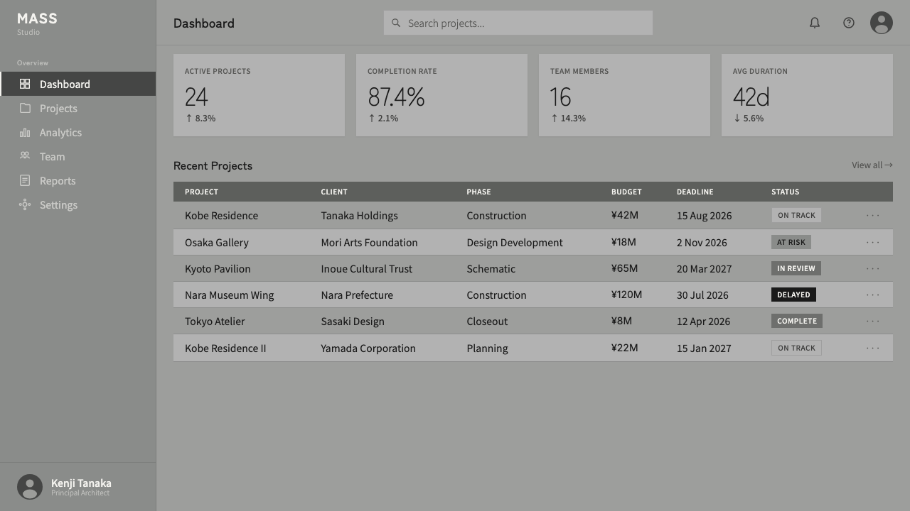
For web interfaces, the style suits dashboards and pricing pages that need authority, focus, and calm. Use cool grey grounds for the main shell, deeper shadow fields for secondary states, and the light slot as a consistent signal for selection, progress, or action. Cards should feel like solid architectural pieces, while glass-like surfaces should be used sparingly so they remain meaningful rather than becoming generic translucency.
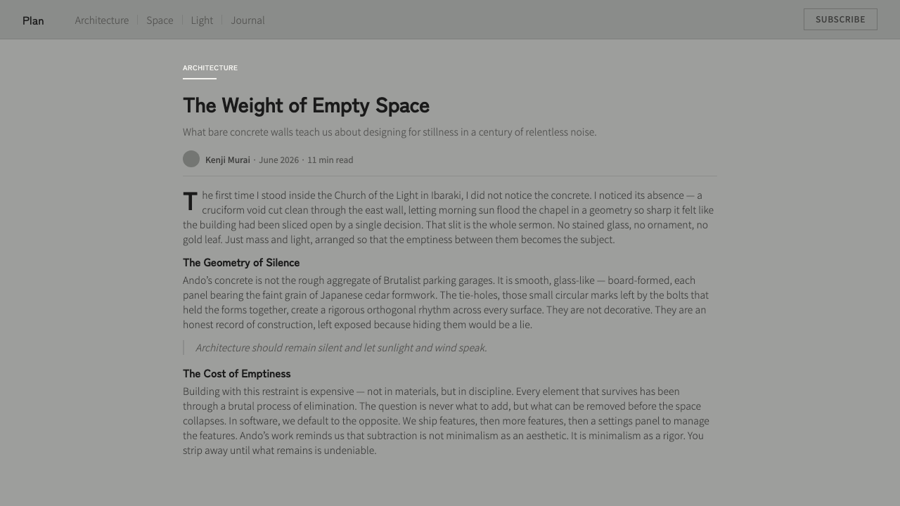
For editorial and marketing work, the system supports a slow, premium reading experience. Articles can place a narrow text measure inside a much larger quiet field, with section changes marked by form-seams or changes in light rather than decorative rules. Marketing pages can turn a product statement into a monolithic block, then create emphasis through a single illuminated opening or a sharply contrasted passage.
The common mistake is treating the style as a concrete texture applied over an otherwise ordinary layout. Real fidelity comes from composition: reduce the palette, control the rhythm, protect the empty space, and let one light element carry attention. Adding many shadows, visible textures, bright accents, or competing focal points destroys the sense of mass and silence.
Tadao Ando Concrete — FAQ
Is Tadao Ando Concrete simply a form of brutalism?
It is related to concrete brutalism, but it is a reinterpretation rather than a direct continuation. The material remains massive and visibly structural, yet the system emphasizes Japanese minimalism, critical regionalism, and Zen restraint. Its defining mood comes from silence, proportion, and light rather than from rawness alone.
Can the style use a dark interface?
Yes, but darkness should behave as a recessed architectural space rather than as the global identity of the system. The primary field remains cool and concrete-like, while deep shadow creates local contrast around a light slot or focal opening. If every surface is equally dark, the relationship between mass and illumination disappears.
What makes the tie-hole grid important?
It proves that the surface has been formed and constructed. Against a homogeneous concrete field, the repeated marks introduce rhythm without becoming illustration or ornament. In digital work, they can organize sections or establish scale, but they must remain subordinate to the larger composition.
How should glass be used in this design system?
Glass should introduce controlled permeability, not constant transparency. Use it to create a measured sense of separation, reflection, or passage between solid fields. When every panel becomes translucent, glass loses its role as a deliberate counterpoint to concrete and light.
Which products benefit most from this style?
It works best for products that value focus, authority, contemplation, and material discipline: architectural portfolios, cultural platforms, premium tools, calm dashboards, and editorial experiences. It is less suitable when the product depends on playful decoration, abundant color, or immediate sensory excitement. The style succeeds when restraint is part of the product's meaning.
Related design styles
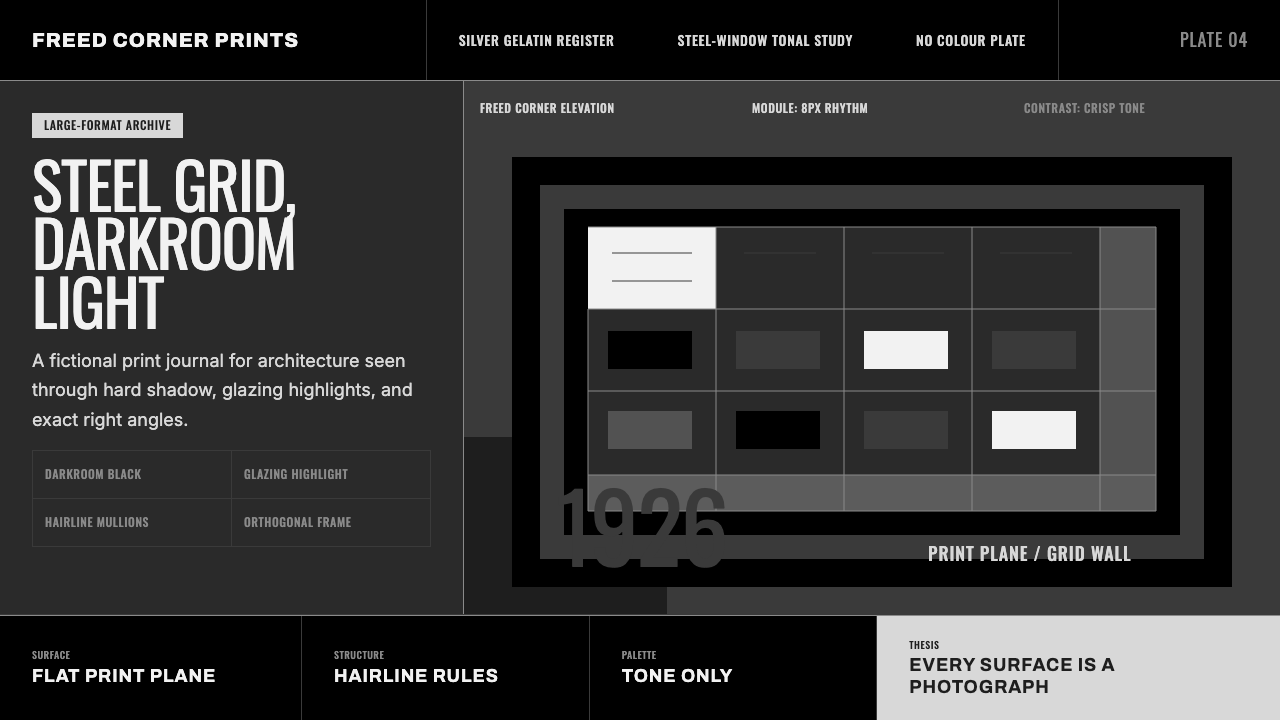 Dessau GrayscaleAustere monochrome authority. Darkroom black, glazing gray, and a steel-windo…
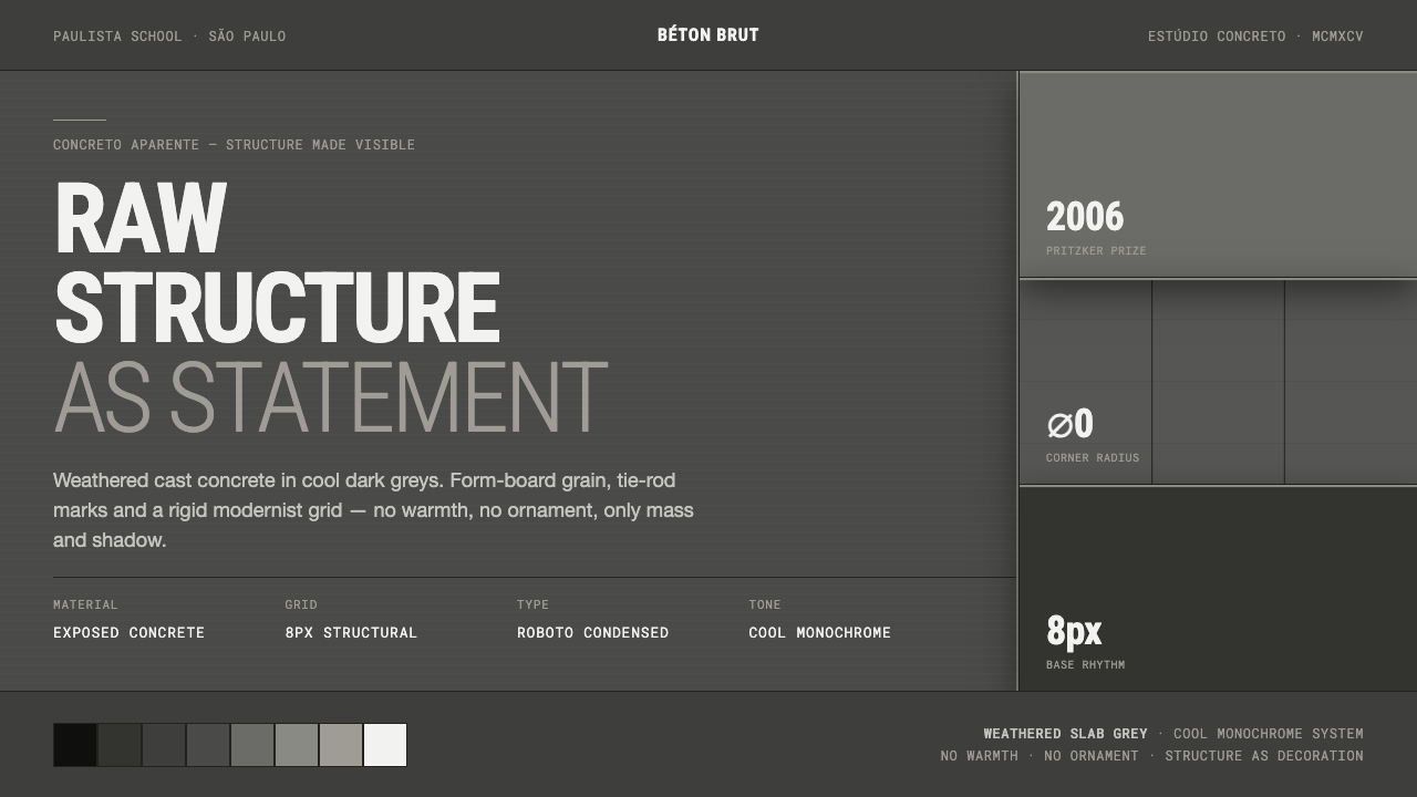 Brazilian Paulista ConcreteStructure made visible. Weathered béton-brut greys, hard cast shadows, conden…
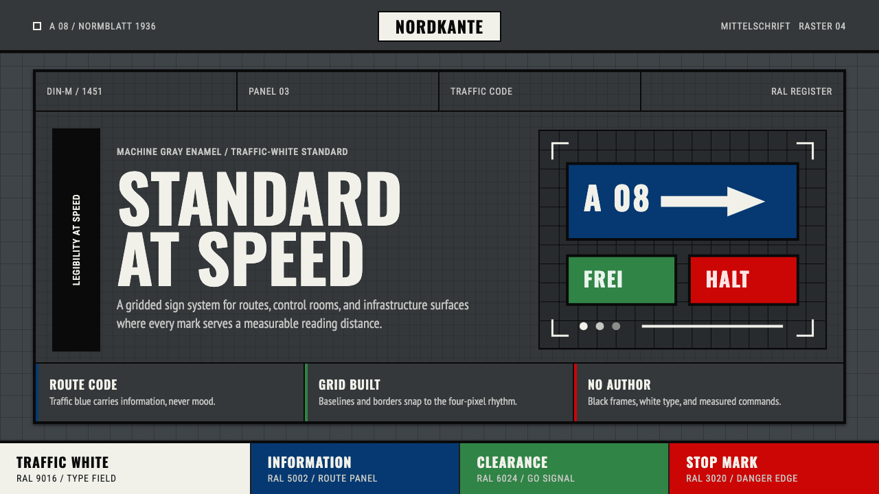 DIN 1451 SignageAuthorless and exact. Enamel gray grid, traffic-white DIN type, and RAL signa…
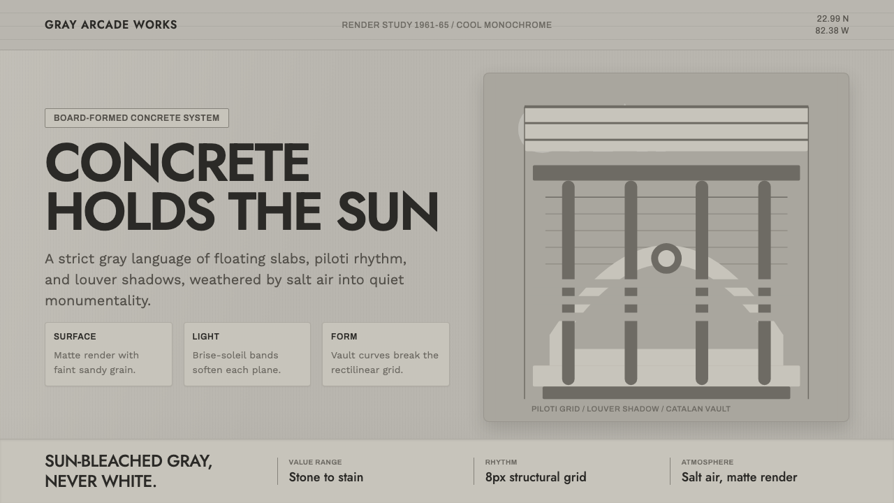 Havana Modernist GrayQuiet monumentality. Jost type, louver bands, and concrete grays hold tropica…
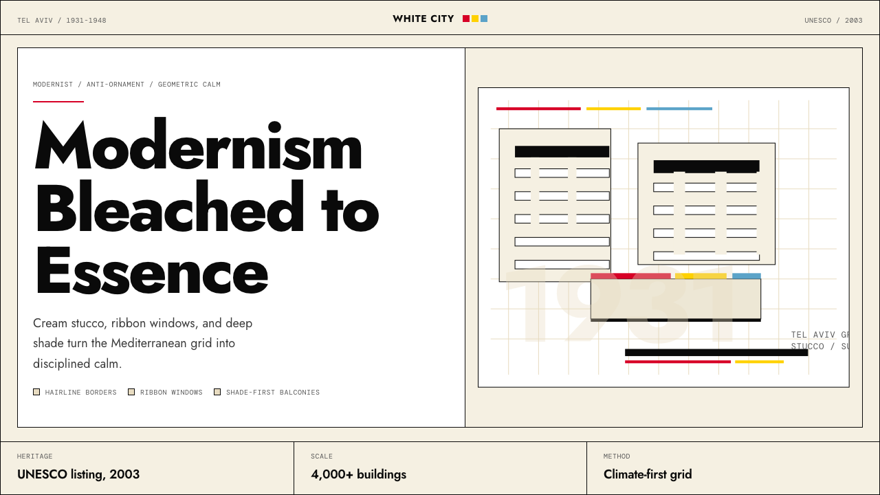 Israeli Bauhaus Tel Aviv (White City)Austere urban modernism. Stucco-white grid, Jost type, hairline borders, and…
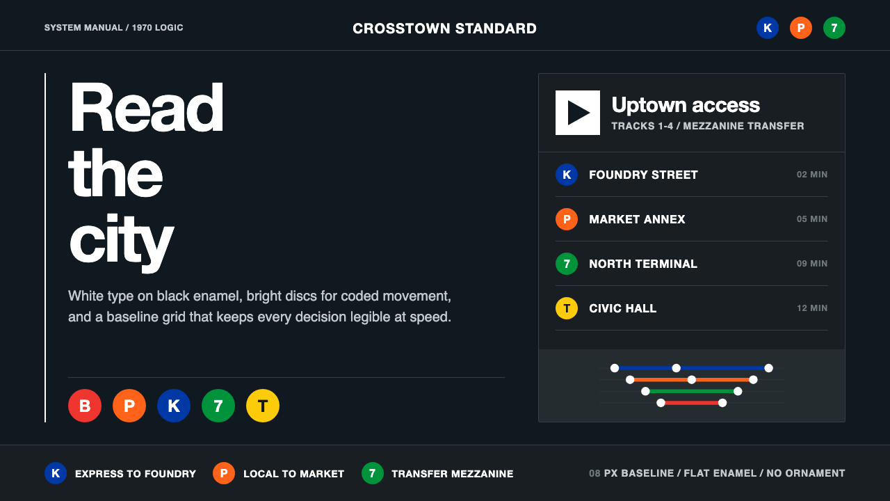 NYC Transit HelveticaOrder made visible. White type, black enamel, route discs, and a grid that ne…