What is Havana Modernist Gray?
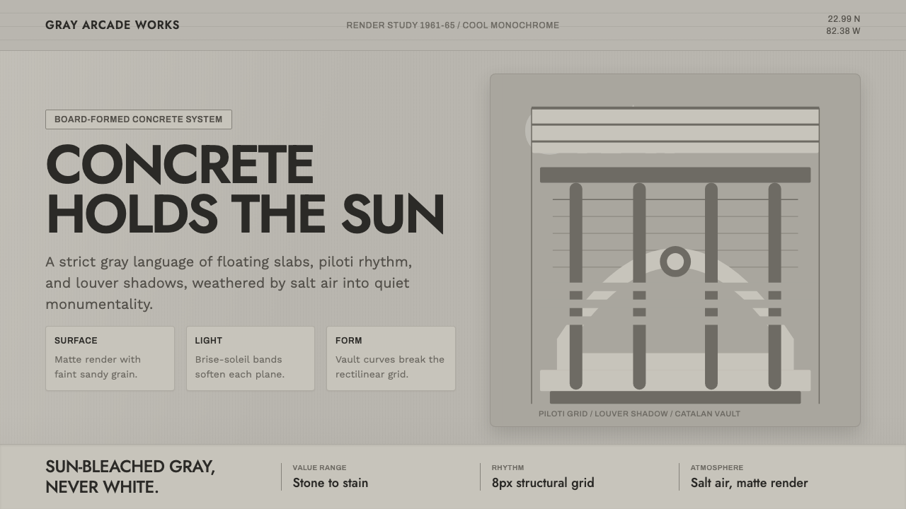
Havana Modernist Gray takes Cuba's most extraordinary unfinished buildings — the curving brick vaults of the National Art Schools — and renders them as a strict, sun-bleached monochrome, all weathered concrete and banded shade, never a single tropical color.
Havana Modernist Gray in brief
Havana Modernist Gray distills the tropical modernism of Cuba's National Art Schools — the extraordinary, largely unfinished campus built in Havana after the 1959 revolution — into a strict cool-gray monochrome design system. The read is architectural before it is decorative: floating concrete slabs raised on columns, curving brick vaults, and louvered sun-breakers casting soft banded shadow across every surface they touch.
The palette is deliberately narrow and deliberately cool. Surfaces read as sun-bleached, grime-streaked, board-formed concrete — matte, faintly sandy from decades of exposure to tropical sun and rain, never cream and never white. This is not the warm, saturated palette that 'tropical' usually implies in design; it is the color of a specific kind of concrete that has spent sixty years outdoors in the Caribbean, and the system holds to that discipline without exception.
The overall effect is quiet monumentality — architecture with the scale and gravity of a civic institution, but none of the applied ornament that word usually implies. Structural rhythm does the work that decoration would do elsewhere: repeating vault forms, repeating column bays, and the soft banding of louvered shadow give the system order and pattern, while a restrained geometric sans handles type with a plain, institutional confidence rather than any decorative flourish.
Where does Havana Modernist Gray come from?
The National Art Schools of Cuba began in 1961, two years after the revolution, when the new government set out to build cultural institutions befitting its ambitions. As the story is often told in architectural histories — though the exact details vary between accounts — Fidel Castro and Che Guevara, playing a round of golf on the grounds of the newly nationalized Havana Country Club, decided on the spot that the club's rolling former golf course, in the Cubanacán district west of the city, should become the site of what they wanted to be the greatest art school in the world. Whatever the literal truth of that afternoon, the commission that followed was real: a young Cuban architect named Ricardo Porro, recently returned from study and practice abroad, was asked to design it, and he brought in two architect friends then living in Cuba, the Italians Vittorio Garatti and Roberto Gottardi.
The three divided the project into five schools, each architect designing in his own voice while sharing a common material logic. Porro designed the Schools of Plastic Arts and of Modern Dance, Garatti the Schools of Ballet and Music, and Gottardi the School of Dramatic Arts. Their shared technique was Catalan vaulting — an old Mediterranean masonry method, built from thin layers of terracotta tile laid in overlapping courses to form a self-supporting curved vault or dome without steel reinforcement or imported structural material. The technique had been carried to the Americas decades earlier largely through the work of the Guastavino family workshop, whose vaults appear in buildings across the United States; in Havana, Porro and his collaborators adapted it with local brick masons, producing curving, sensuous forms that Porro himself described in organic and bodily terms, a marked departure from the rectilinear glass boxes associated with orthodox modernism.
The vaulted galleries, the columns raising each building's mass off the ground, and the louvered sun-breakers shading window openings were not simply aesthetic choices — they were direct answers to Havana's climate, allowing air to move through the buildings and shade to fall across them in a hot, humid setting, part of a broader mid-century movement often called tropical modernism that adapted European modernist vocabulary to conditions across Latin America, the Caribbean, South Asia, and Africa. But the schools' fortunes shifted quickly. By around 1965, the Cuban government's architectural priorities had moved toward faster, Soviet-influenced prefabricated concrete construction; the schools' curving, labor-intensive, individually crafted forms drew ideological criticism as insufficiently aligned with the new doctrine, and material shortages worsened by the United States embargo made the brick-and-tile construction harder to sustain. Work stopped before any of the five schools was fully finished.
Decades of neglect followed. The buildings sat unfinished, deteriorating in the tropical climate, some sections used informally and others left to the vegetation, largely absent from official architectural history for over thirty years. Renewed international attention from the 1990s onward — including the research and advocacy that produced the architectural historian John Loomis's book-length account of the schools — brought the site back into view, leading to partial restoration and to its recognition as one of the most significant surviving works of Cuban revolutionary-era architecture, since placed on UNESCO's tentative World Heritage list.
What defines the Havana Modernist Gray look?
Color
The palette is a strict cool-gray monochrome, never warmed toward cream or pushed toward pure white. Every surface reads as concrete that has spent decades outdoors in a tropical climate — sun-bleached, faintly sandy, streaked in places with grime. Nothing in the system is permitted to read as postcard-tropical brightness; the color discipline is the whole point.
Board-Formed Surface
Surfaces carry the faint, uneven texture of board-formed concrete — the subtle imprint of the wooden formwork boards the concrete was poured against, still faintly legible in the finished surface. This texture is matte and slightly irregular rather than smooth or polished, giving every flat plane a quiet material honesty instead of a manufactured gloss.
Louvered Shadow
Brise-soleil louvers — sun-breaking screens set in front of openings — cast soft, evenly banded shadow across floating slabs and columns. The banding is rhythmic and structural rather than decorative: it exists because the building needed shade in a hot climate, and the pattern it produces is a byproduct of that necessity rather than an applied graphic.
Piloti / Floating Mass
Buildings are raised on columns so that their mass appears to float above the ground plane, letting landscape and air move freely underneath. In the system this reads as weightlessness applied to something monumental — heavy concrete forms treated as if they hover rather than sit, a tension between mass and lightness that runs through the whole aesthetic.
Catalan Vault Geometry
Where orthodox modernism favors the rectilinear glass box, this system favors curving, self-supporting vault and dome forms built up from thin layered brick. The resulting geometry is organic and body-like rather than mechanical, giving even a strictly monochrome, structurally rigorous system a sensuous, almost sculptural quality.
Quiet Institutional Type
Type is geometric and plain, handled with the confidence of civic signage rather than decorative branding — no flourish, no display personality competing with the architecture. It behaves the way lettering on a public institution's facade behaves: present, legible, and entirely subordinate to the structure it labels.

Who shaped Havana Modernist Gray?
The Cuban architect who received the original commission and designed the Schools of Plastic Arts and Modern Dance, working the Catalan vault into curving, organic forms he described in bodily and natural terms. He brought in two architect friends to complete the wider campus and remains the figure most closely associated with the project's vision.
The Italian architect, living in Cuba at the time of the commission, who designed the Schools of Ballet and Music. His buildings share the campus's vaulted vocabulary while developing their own rhythm of enclosed and open volumes.
The Italian architect who designed the School of Dramatic Arts, the last of the five schools and, by some accounts, the one closest to full completion. Gottardi remained based in Cuba for much of his later career, continuing to work and teach in Havana.
The revolutionary government leaders credited, by the frequently repeated founding story, with deciding on the spot to commission the art schools on the grounds of the former Havana Country Club. Whatever the precise accuracy of that anecdote, the political will behind the commission — and the political shifts that later halted construction — shaped the project's entire arc.
The centuries-old Mediterranean masonry technique of building self-supporting curved vaults from thin layered tile, historically associated with Spanish and Catalan builders and carried to the Americas largely through the Guastavino family's workshop. Porro's team adapted this tradition with Cuban brick and craftsmen, making it the structural and visual backbone of the entire campus.
How do you use Havana Modernist Gray today?
On a presentation cover slide, this style projects quiet monumentality: a cool-gray field carries a single strong architectural graphic — a banded shadow motif, a curving vault silhouette, or a simple composition of floating rectangles suggesting raised slabs — with the title set in a plain geometric sans that reads as institutional confidence rather than decoration.
Content slides can borrow the louvered-shadow motif as a structural rhythm — a repeating band pattern used sparingly to separate sections, the way sunlight through a brise-soleil separates a wall into stripes. Data slides suit the system's architectural logic well: bars or columns rendered in muted grays with a raised, piloti-like quality read as considered rather than generic, and the strict monochrome keeps a dense chart legible without needing color to carry meaning.
For web interfaces, the style suits architecture and real-estate platforms, hospitality and cultural institutions, and premium B2B products that want to project institutional gravity and permanence rather than trend-driven energy. Dashboards built on cool gray with banded shadow accents read as considered and structural; pricing pages benefit from the same restraint, using the muted palette and quiet type to suggest durability rather than urgency.
Editorial and marketing work suits the style especially well for architecture, travel, heritage, and design journalism, where a long-read can open with a hero image treated in the same sun-bleached monochrome and use banded shadow as a recurring section divider. Marketing pages for hospitality or civic brands can use the floating-mass, raised-column motif as a recurring visual signature that communicates weight and permanence without needing a single line of copy to say so.
The most common mistake is warming the palette toward cream, beige, or any bright saturated color in an attempt to signal 'tropical' — this breaks the system's central discipline, which is precisely that it withholds the postcard warmth the word usually implies. A second mistake is turning the louvered-shadow banding into a purely decorative stripe pattern disconnected from any implied structure, which drains it of the logic that makes it feel earned. A third is defaulting to a rectilinear glass-box modernist layout instead of curving, vault-like forms, which loses the organic character that distinguishes this system from generic mid-century modernism.

Havana Modernist Gray — FAQ
Why doesn't a style about tropical Cuba use warm or bright color?
Because the system is not depicting postcard-tropical Cuba — it is depicting the specific, weathered concrete of the National Art Schools, buildings left unfinished and exposed to the elements for decades. The strict cool-gray discipline captures that particular history of sun-bleaching and neglect. Introducing warm or bright color would trade a documented material reality for a generic tropical stereotype.
What is a piloti and why does it matter here?
Piloti are the columns that lift a building's mass off the ground plane, a device associated with European modernism and adapted widely in tropical contexts to let air and shade move freely beneath a structure. In this system they produce the floating, weightless read that runs through the whole aesthetic — heavy concrete treated as if it hovers rather than sits.
What is Catalan vaulting, and why is it central to this style?
It is a centuries-old masonry technique for building self-supporting curved vaults and domes from thin layers of tile, historically associated with Spanish and Catalan builders and carried to the Americas partly through the Guastavino workshop. Ricardo Porro's team adapted it with local Cuban brick and craftsmen, both because it suited a period of material shortage and because it allowed the curving, organic forms that define the schools. It is central here because it is the technique responsible for the style's signature vault geometry.
Are the National Art Schools finished buildings today?
Not entirely. Construction stopped in the mid-1960s before all five schools were complete, and the campus then sat largely neglected for over thirty years. Renewed attention from the 1990s onward brought partial restoration and international heritage recognition, but the site remains a mix of restored, still-in-use, and still-deteriorating sections rather than a fully completed, unified campus.
What kinds of products suit this style, and which don't?
It suits architecture and real-estate platforms, hospitality and cultural institutions, heritage and travel content, and premium B2B products that want to project permanence and institutional gravity. It struggles for playful consumer products, youth-oriented brands, or fast-moving e-commerce contexts that need warmth, energy, and color to drive engagement — the same strict monochrome that reads as monumental in an institutional context can read as somber or distant where the goal is approachability.
Related design styles
 Dieter Rams / BraunQuiet by design. Warm gray, white panels, hairline grids, and one earned gree…
 IBM Punchcard 029 (1928)Constraint becomes authority. Manila stock, hairline grid, industrial blue.
 Doctor's Clinical Lab CoatSterile by design. Cool clinical white, teal signals, and seam-line grids enf…
 Frutiger CDG AirportLegibility at runway scale. Navy panels, white humanist sans, arrow-led grids.
 Graphite Technical DrawingDrafting-room precision. Non-photo-blue grid and graphite DIN lettering do th…
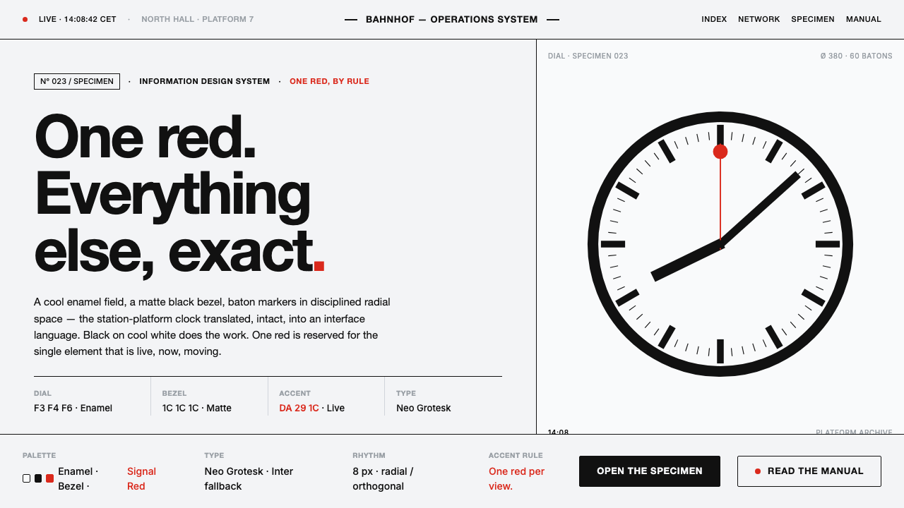 Hilfiker Railway ClockEverything exact, one thing live. Black hands on cool enamel white — one red…