What is Peter Märkli Concrete Reliefs?
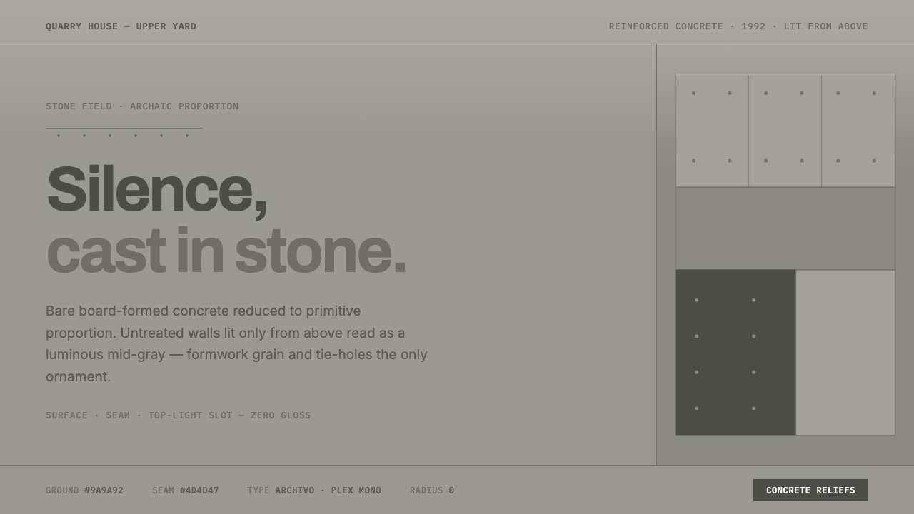
Peter Märkli’s concrete reliefs turn architectural restraint into an atmosphere: pale stone, primitive proportion, and surfaces quiet enough to make light feel material.
Peter Märkli Concrete Reliefs in brief
Peter Märkli Concrete Reliefs is a visual language derived from bare board-formed concrete and reduced architectural proportion. Its central reference is La Congiunta in Giornico, completed in 1992 to house Hans Josephsohn’s reliefs. There, untreated reinforced-concrete galleries receive light only from above, allowing the walls to read as luminous mid-gray planes rather than as the heavy darkness often associated with Brutalism.
The style is not interested in concrete as an emblem of force, infrastructure, or urban severity. It treats concrete as a quiet recording surface. Formwork grain, hairline seams between boards, and regularly placed tie-hole dots remain visible, but none are amplified into decoration. They are evidence of making: marks left by the process that formed the wall, held without apology and without theatricality.
On screen, this becomes an austere material system: matte concrete grounds, restrained seams, small monospaced labels, severe spacing, and nearly no visual shine. The result should feel archaic and tactile rather than industrially aggressive. A page does not imitate a concrete wall through faux texture; it adopts the wall’s discipline, allowing proportion, lightness, and tiny construction traces to carry the composition.
Where does Peter Märkli Concrete Reliefs come from?
The style belongs to the architectural culture of Ticino, Switzerland, and to the broader landscape of Swiss minimalism and archaic or primitive modernism. Its period reference spans roughly 1990 to 2010, while La Congiunta remains its clearest fixed point. This is a language shaped less by surface styling than by the conviction that a building can become expressive through mass, proportion, and controlled light alone.
La Congiunta gives the system its particular emotional register. The project was built to house Hans Josephsohn’s reliefs, so the architecture does not compete with the works through spectacle, color, or polished finish. Its untreated reinforced concrete establishes a setting in which the material remains present but subdued: a calm field for looking, moving, and noticing the changing presence of overhead light.
Board-formed concrete is essential because it retains the memory of its construction. The grain from wooden formwork and the dots left by tie holes are not added motifs. They arrive with the material itself. Märkli’s approach allows these marks to remain legible while refusing to make them picturesque. Their value lies in their scale and restraint: they reward close attention without demanding it.
Peter Märkli, Hans Josephsohn, and Rudolf Olgiati are the named figures associated with this source context. Together, their presence places the style within a Swiss architectural and artistic conversation concerned with reduction, material gravity, and forms that feel older than fashion. The resulting aesthetic is modern without performing novelty: it seeks permanence through simple masses, muted light, and surfaces that reveal how they came into being.
What defines the Peter Märkli Concrete Reliefs look?
Luminous Concrete
The ground is a light to mid-gray concrete presence, never a glossy neutral backdrop. It should feel mineral, dry, and softly illuminated from within the composition. The aim is not dark Brutalist drama but the suspended brightness of raw walls receiving overhead light.
Formwork Memory
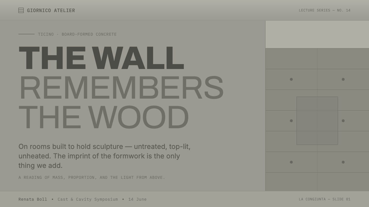
Hairline board seams and faint wood-formwork traces are the signature details. They must remain quiet and sparse, functioning as evidence of assembly rather than as a decorative pattern. A surface should reward close inspection while appearing almost plain at first glance.
Tie-Hole Rhythm
Tie-hole dots introduce the only overtly repeated rhythm. Their regularity gives a surface measure and scale, but they should never become a polka-dot graphic. Used correctly, they suggest structure receding beneath the surface and make silence feel deliberate rather than empty.
Primitive Proportion
Composition relies on broad planes, simple openings, and weighty relationships between large and small areas. Nothing should feel fussy or finely ornamented. The geometry is elementary but not mechanical: it has the gravity of rooms, slabs, recesses, and objects made to endure.
Austere Labels
Small monospaced labels suit the style because they read as measured annotation rather than expressive display type. They should be used for indexes, captions, material notes, and navigation cues. Large text remains restrained, clear, and architectural, with hierarchy produced by placement and space rather than flourish.
Zero Gloss
No reflective sheen, decorative gradient, or soft cosmetic glow belongs here. Depth comes from planes, seams, openings, and tonal restraint, not from simulated luxury materials. The style should feel absorbent and tactile, as if light settles on it instead of bouncing off it.
Who shaped Peter Märkli Concrete Reliefs?
Märkli is the architect at the center of this visual reference. His bare board-formed concrete architecture reduces expression to primitive proportion, untreated material, and light. At La Congiunta, this restraint produces galleries whose walls feel luminous and tactile without relying on finish, ornament, or theatrical contrast.
Josephsohn’s reliefs supplied La Congiunta with its purpose: the galleries were built to house them. His presence matters because the architecture is conceived as a setting for concentrated looking. The concrete does not seek attention for itself; it creates the silent, materially grounded condition in which relief and light can be encountered.
Olgiati is listed among the key figures of the source context, placing this aesthetic within a wider Swiss and Ticino conversation. In this system, his name functions as a contextual marker rather than a source of borrowed visual motifs: the emphasis remains on Märkli’s concrete restraint, archaic proportion, and quiet material presence.
How do you use Peter Märkli Concrete Reliefs today?
For presentation covers, use a broad concrete field and let one architectural mass or recessed plane establish the image. A short title can sit with the calm of an inscription, while a monospaced label supplies project, chapter, or date information. Avoid dramatic hero imagery: the cover should feel like an entrance into a quiet gallery, not an advertisement competing for attention.
Content slides work best when treated as rooms of information. Give text a generous field, use hairline seams to separate zones only when they clarify structure, and keep captions visibly subordinate. Data slides should use the same discipline: charts become measured objects on a mineral ground, with one restrained accent reserved for the most important value rather than a parade of decorative colors.
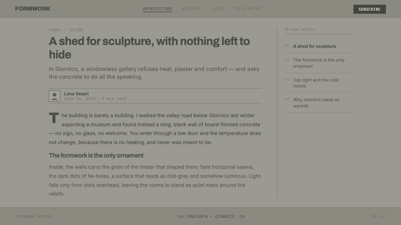
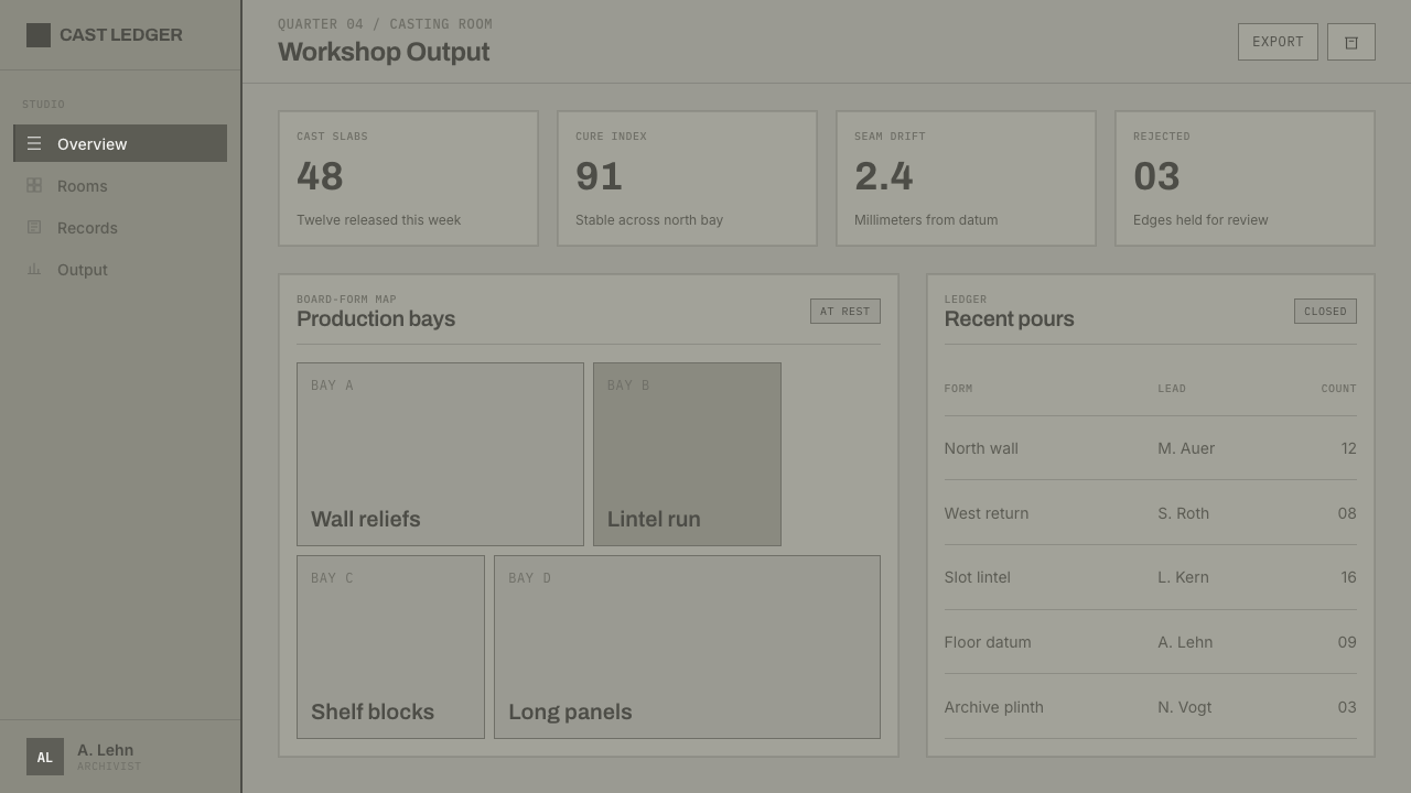
For web interfaces, this style is especially useful for archives, cultural institutions, architecture portfolios, research tools, and dashboards that benefit from calm concentration. Surfaces should feel stable and almost load-bearing. Navigation can be organized as sparse labels, while panels read as slabs or shallow recesses. Interactive emphasis should be precise, never shiny, and should preserve the page’s quiet material hierarchy.
In editorial and marketing work, use the system for long-form stories, exhibition pages, portfolios, and product narratives that need authority without luxury gloss. Pair broad image margins with dense, disciplined captions. Let section changes happen through shifts in plane, light, or spacing rather than ornamental dividers. The most persuasive result feels like a catalogue or gallery guide: deliberate, durable, and physically grounded.
The common mistake is to reduce the style to a gray background plus random concrete texture. That creates atmosphere without structure. Do not overuse cracks, stains, roughness, or tie-hole dots; these marks are meaningful only when they feel like construction evidence. Likewise, polished cards, glass effects, dramatic shadows, and expressive decorative type undermine the source’s central idea: material restraint is the content.
Peter Märkli Concrete Reliefs — FAQ
Is this simply a Brutalist style?
No. It shares exposed concrete with Brutalism, but its mood is notably different. The source reference emphasizes luminous mid-gray walls, overhead light, archaic proportion, and silence rather than darkness, monumentality, or confrontation. The concrete is bare, but the intended effect is contemplative and tactile rather than forceful.
Should a digital design imitate concrete texture realistically?
Usually not. The important translation is structural: matte grounds, restrained tonal variation, hairline seams, and occasional construction traces. Heavy photographic texture, cracks, stains, and noisy grain turn the surface into scenery. The reference works because its material marks are quiet facts of construction, not visual effects.
Why are monospaced labels appropriate here?
They bring a measured, annotative tone that aligns with formwork seams and tie-hole rhythm. Used sparingly, they feel like cataloguing, indexing, or material notation rather than branding theatre. Their role is to clarify the system’s structure while leaving the larger fields of concrete, light, and proportion undisturbed.
Can the style support dashboards and data-heavy pages?
Yes, provided the data is treated as part of the architecture of the page. Clear zones, sparse labels, calm surfaces, and a limited emphasis system make complex information easier to scan. The danger is making every metric compete. Let the hierarchy emerge from placement, grouping, and empty space, as it would in a sequence of concrete galleries.
Where does this style work poorly?
It is a poor fit when a product depends on exuberance, softness, immediate playfulness, or polished luxury. It can also feel too severe when a user needs warmth and reassurance more than concentration. The style succeeds when silence, material honesty, and durable structure support the message; it fails when those values contradict the subject.
Related design styles
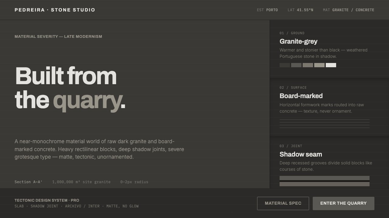 Souto de Moura GraniteArchitecture as raw matter. Dark Portuguese granite ground, board-marked conc…
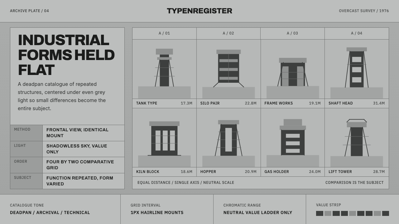 Bechers Industrial TypologyDeadpan order. Mid-grey ground, Archivo labels, and strict hairline grids rev…
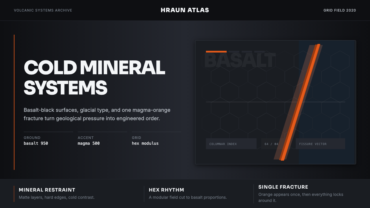 Icelandic Basalt VolcanoCold geology, engineered. Basalt black, Sora type, and one magma fissure hold…
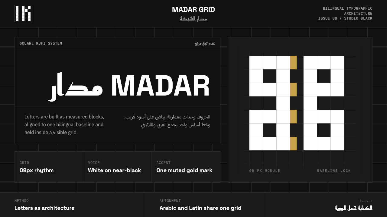 Modern Kufi BrandingRestraint becomes architecture. White Kufi blocks on near-black obey a biling…
 Anton Stankowski ConstructiveProcess becomes visible. Flat blue diagonals and hard square rules make chang…
 Architect Monograph (Black Edition)Architecture stays sovereign. Matte black, Helvetica caps, hairline grids, bl…