What is Souto de Moura Granite?
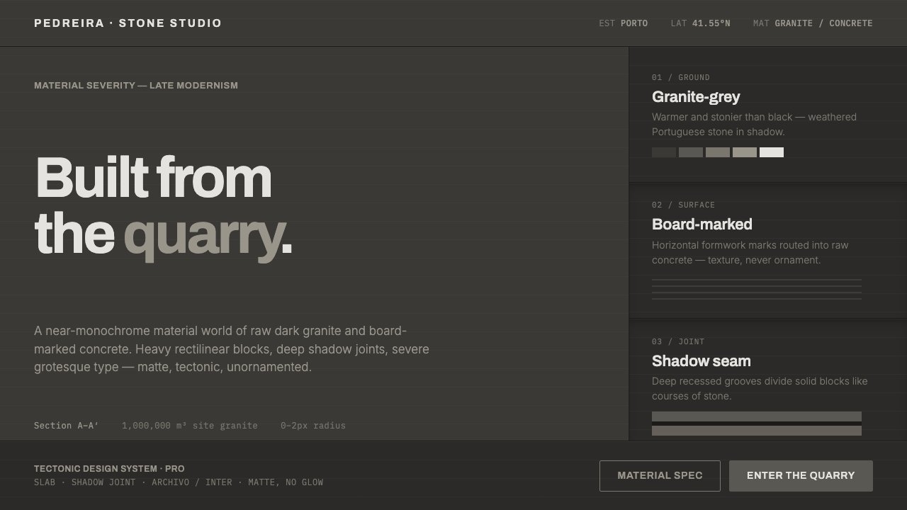
Souto de Moura Granite treats architecture as raw matter: dark Portuguese stone, board-marked concrete, deep joints, and a severe calm that makes structure itself the ornament.
Souto de Moura Granite in brief
Souto de Moura Granite distills the material severity associated with Portuguese architect and Pritzker laureate Eduardo Souto de Moura. Its world is built from dark granite-grey ground, exposed anthracite concrete, massive rectilinear blocks, and shadow joints that read as deliberate cuts into a solid mass. The mood is near-monochrome, matte, and tectonic: quiet in color, forceful in weight.
This is not simply a dark interface or a black-and-grey palette. The darkness is geological rather than electronic. The ground should feel warmer and more stony than pure black, while concrete remains visibly material through board marks and restrained tonal variation. Typography is an austere Archivo grotesque, used without ornament and with enough authority to stand beside heavy architectural forms. Every surface should suggest construction, compression, and permanence.
Where does Souto de Moura Granite come from?
The style belongs to the mature work of Eduardo Souto de Moura, situated in Portugal within the broader traditions of Porto School minimalism, late modernism, and raw-material or tectonic architecture. Its historical frame runs from the nineteen-nineties through the first decade of the twenty-first century, when Souto de Moura’s buildings developed a particularly concentrated language of stone, concrete, mass, and absence. Porto and Braga form the geographical center of this reading.
Braga Municipal Stadium is the clearest expression of the material idea. For the stadium, Souto de Moura blasted roughly a million cubic metres of granite from the site and returned that material to the structure. The gesture collapses extraction, construction, and landscape into one continuous act. Granite is not a surface applied after the fact; it becomes the architectural substance, giving the stadium its charcoal stone-face, severe massing, and sense of being cut from the ground.
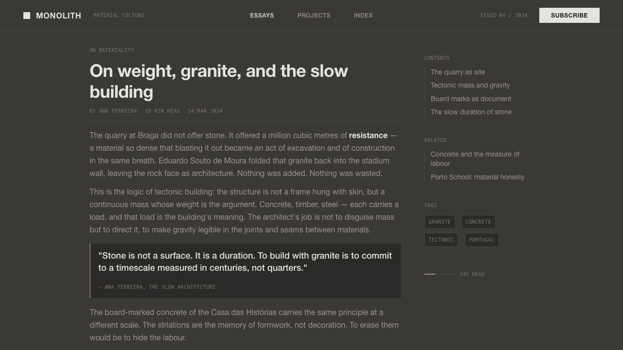
The same sensibility continues from Braga to Casa das Histórias. Across these works, board-marked concrete and dark stone are not treated as decorative effects but as records of making. The architecture gains character from joints, planes, weight, and the relationship between exposed material and deep shadow. Souto de Moura Granite translates that logic into a design system: visual hierarchy comes from mass and spacing, while restraint allows material presence to carry the identity.
What defines the Souto de Moura Granite look?
Stone Ground
The foundation is a dark granite-grey rather than absolute black. It should feel dense, warm, and mineral, like a large stone plane absorbing light. This ground establishes the style’s architectural gravity and keeps the interface from becoming glossy, synthetic, or purely digital.
Exposed Concrete
Concrete appears as a visible construction material, especially through board-marked texture and quiet tonal shifts. The marks should remain subordinate to the plane, giving surfaces a memory of formwork without turning texture into decoration.
Massive Rectilinear Form
Rectangles are not light cards floating above a background; they are architectural masses. Blocks, panels, and containers should feel solid, aligned, and capable of bearing visual weight. Their authority comes from proportion, adjacency, and controlled emptiness.
Deep Shadow Joints
Shadow is used as a joint between masses rather than as a soft atmospheric effect. Dark separations clarify where one plane ends and another begins, creating depth through absence. The result is severe, legible, and architectural.
Austere Grotesque
Archivo grotesque provides the typographic voice. It is neutral but not weak, severe without theatrical display. Type should carry hierarchy through scale, placement, and weight, with no ornamental lettering competing against the material field.
Material Restraint
The palette remains close to stone, charcoal, and exposed concrete. Surfaces are matte, transitions are controlled, and ornament is absent. The style gains richness from material difference and spatial tension rather than from chromatic variety or visual effects.
Who shaped Souto de Moura Granite?
Souto de Moura is the central figure behind this design language. His mature work brings together dark Portuguese granite, exposed anthracite concrete, severe massing, and a quiet relationship between construction and landscape. The system takes its name from that disciplined material world rather than from a decorative motif.
Braga Municipal Stadium is the defining project for the granite logic of the style. Roughly a million cubic metres of granite were blasted from the site and returned to the structure, making the relationship between ground and building unusually direct. Its charcoal stone-face and heavy architectural presence are the clearest references for the system.
Casa das Histórias extends the same vocabulary beyond the stadium: dark stone, board-marked concrete, strong planes, and shadow that defines rather than decorates. It demonstrates how the language can remain quiet while still producing a memorable architectural identity.
How do you use Souto de Moura Granite today?
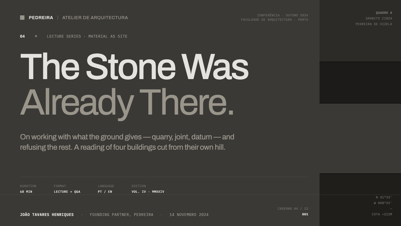
For presentation slides, use the style as a sequence of constructed planes. A cover can place a severe Archivo title against a broad granite-grey field, with a heavy rectilinear block or a deep joint creating the composition’s anchor. Content slides should privilege clear alignment, restrained text, and exposed material texture used as a quiet surface rather than an illustration. Data slides work best when charts are treated as structural masses: solid bars, disciplined labels, deep separations, and no decorative glow or atmospheric effect.
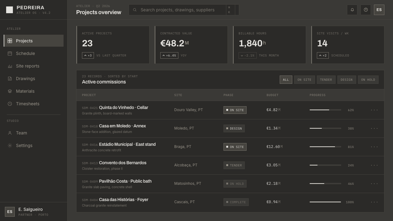
For web interfaces, Souto de Moura Granite suits dashboards, analytical tools, and pricing pages that need authority and visual calm. Use the dark stone ground as the field, near-black or charcoal masses as containers, and board-marked concrete as a limited surface distinction. Panels should feel recessed or embedded through deep joints rather than lifted by soft shadows. Pricing tiers can be separated through mass, spacing, and typographic hierarchy instead of introducing bright accent colors.
For editorial and marketing work, the style supports a strong architectural reading order. Headlines should sit with confidence in the Archivo grotesque, while body text occupies a controlled measure surrounded by generous dark space. Section breaks can be expressed through heavy planes, recessed rules, or changes in material field. Marketing pages benefit from close crops of stone and concrete, severe statements, and a deliberate alternation between dense mass and open silence.
The common mistake is to imitate the surface while losing the construction. A black background, industrial typeface, and random concrete texture do not create this style if the layout is busy, glossy, or decorated with floating effects. Avoid excessive texture, ornamental icons, bright color accents, and soft ambient shadows. The goal is not to make a digital page look rugged; it is to make hierarchy feel built, weighted, and materially inevitable.
Souto de Moura Granite — FAQ
Is Souto de Moura Granite simply a dark mode?
No. Dark mode usually changes the value relationship between foreground and background, while this style builds an entire material atmosphere. Its ground should feel like warm dark granite, its blocks should carry architectural weight, and its joints should define depth. Without matte materiality, rectilinear mass, and disciplined spacing, a dark interface remains only a dark interface.
Why is the ground warmer than pure black?
Pure black feels absolute and screen-based; granite-grey carries geological presence. The warmer stone ground keeps the palette close to Portuguese granite and exposed concrete, giving the design depth without adding chromatic variety. It also allows charcoal masses and shadow joints to remain distinct instead of collapsing into a single flat field.
How should texture be used without becoming decorative?
Treat texture as evidence of construction, not as a graphic pattern. Board marks should remain quiet and subordinate to the plane, while stone should read through density and tonal character rather than photographic noise. If the texture attracts attention before the content or structure does, it has become an ornament and should be reduced.
What kinds of products suit this style best?
It works best where material authority, concentration, and structural clarity are desirable: architecture portfolios, cultural institutions, analytical dashboards, technical tools, and pricing experiences with a serious point of view. It is less natural for products that depend on softness, playfulness, sensory abundance, or bright emotional warmth. The style should be chosen when its severity supports the product’s character, not merely because dark surfaces are fashionable.
Related design styles
 Elemental Social HousingBuild half a good house, well. Dusty cement-grey panels, hatched bare-frame g…
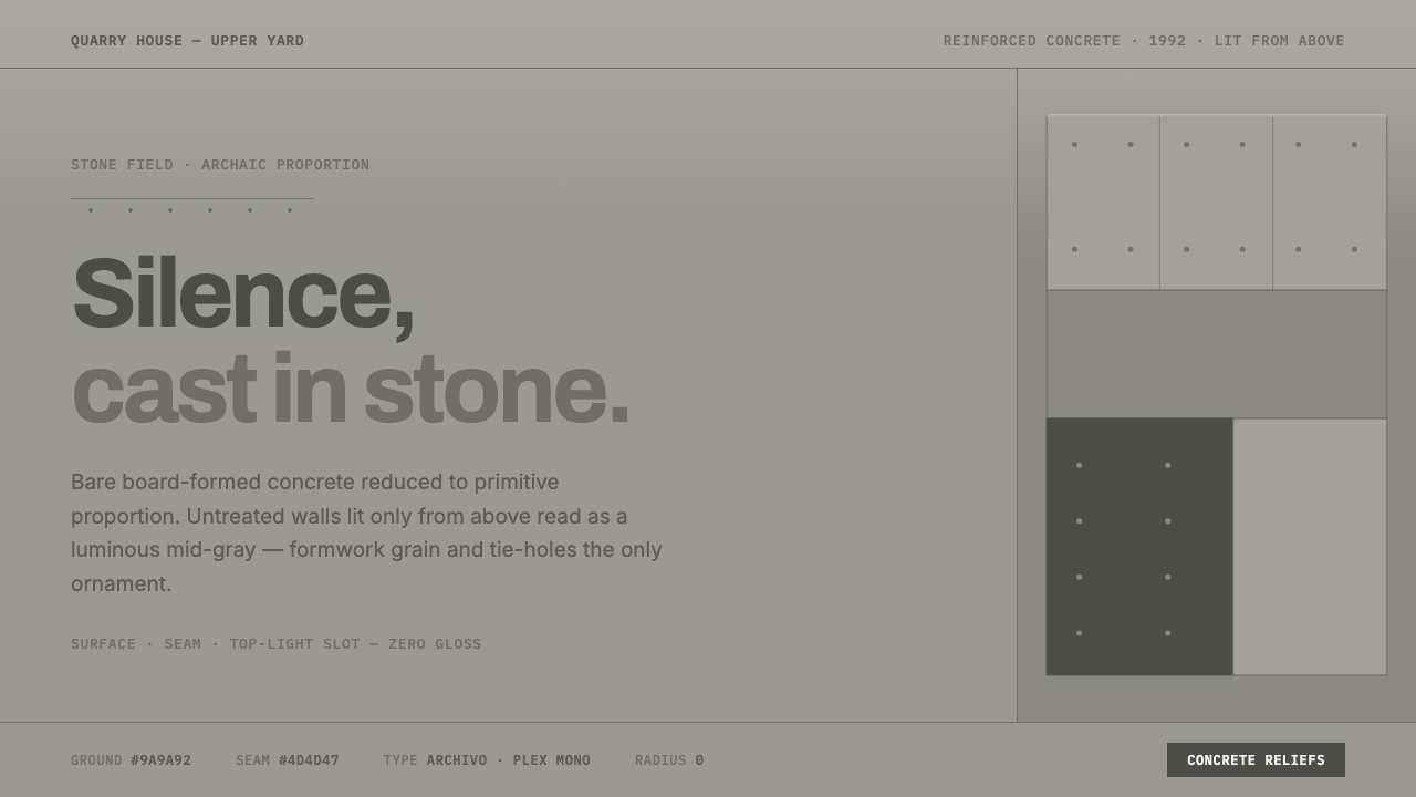 Peter Märkli Concrete ReliefsSilence cast in stone. Luminous mid-gray concrete, hairline formwork seams, t…
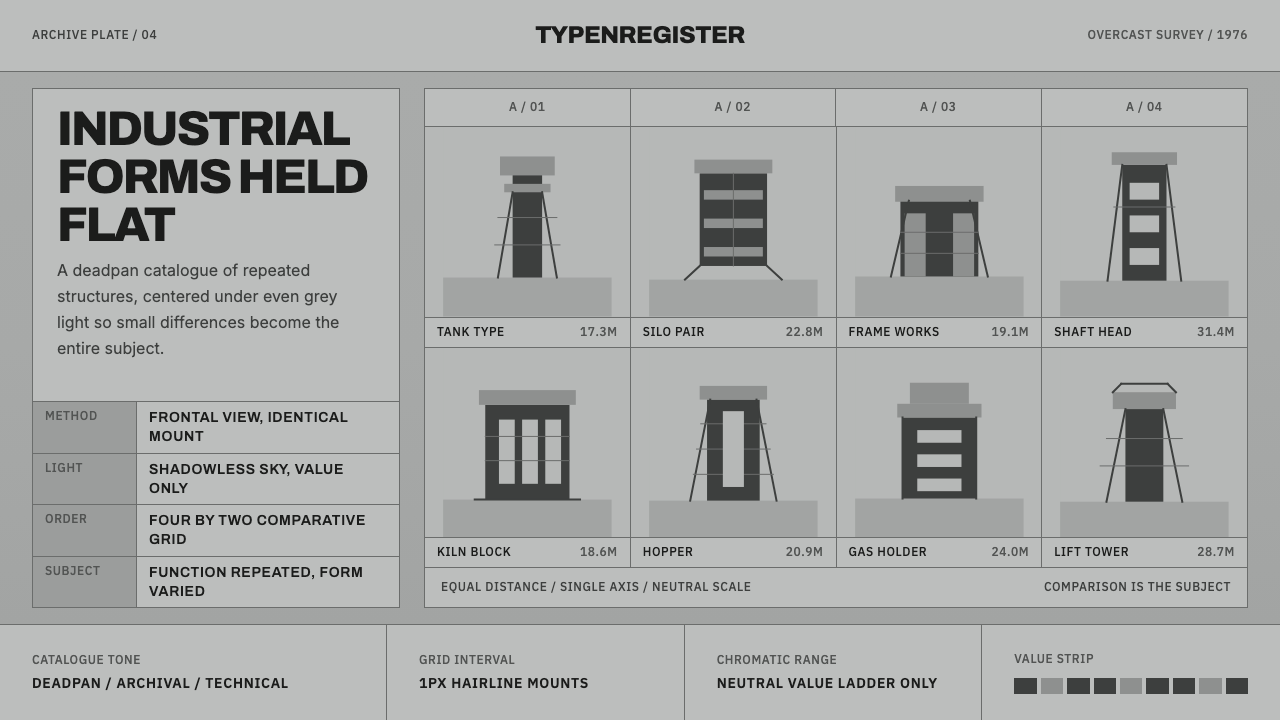 Bechers Industrial TypologyDeadpan order. Mid-grey ground, Archivo labels, and strict hairline grids rev…
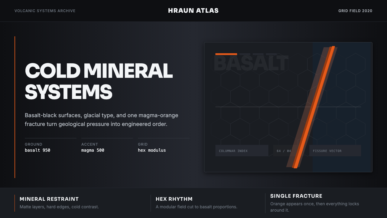 Icelandic Basalt VolcanoCold geology, engineered. Basalt black, Sora type, and one magma fissure hold…
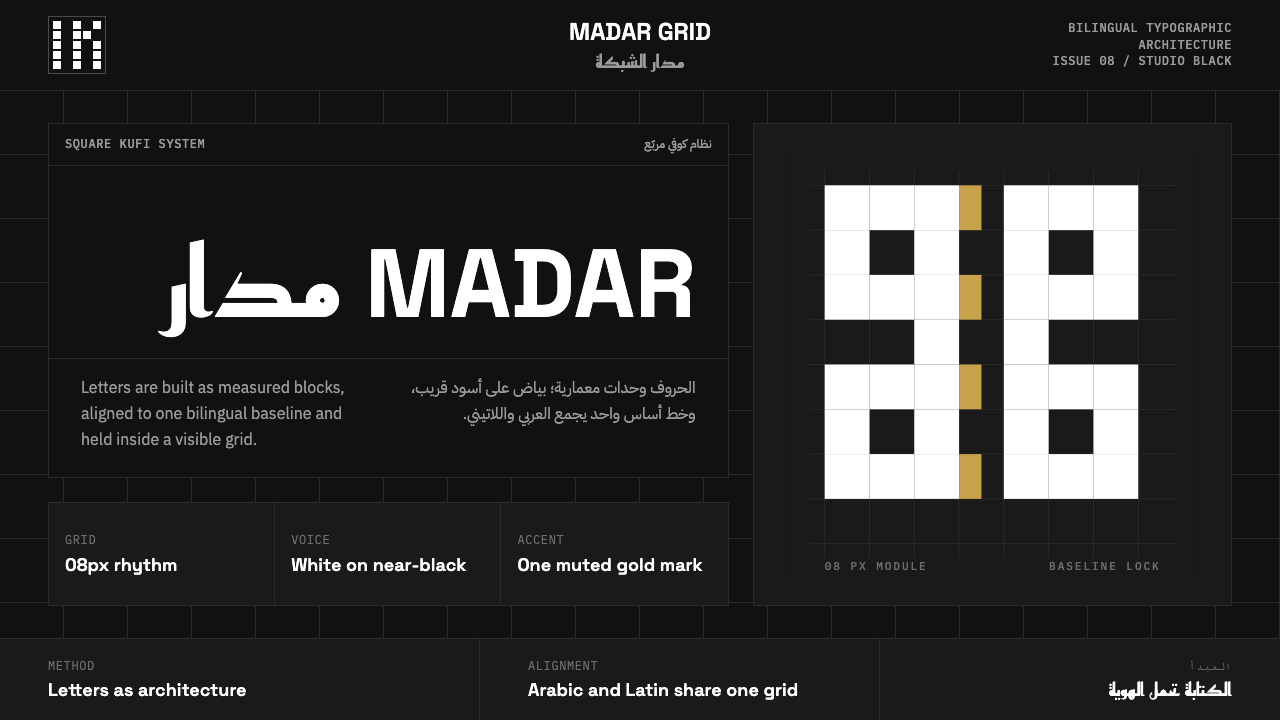 Modern Kufi BrandingRestraint becomes architecture. White Kufi blocks on near-black obey a biling…
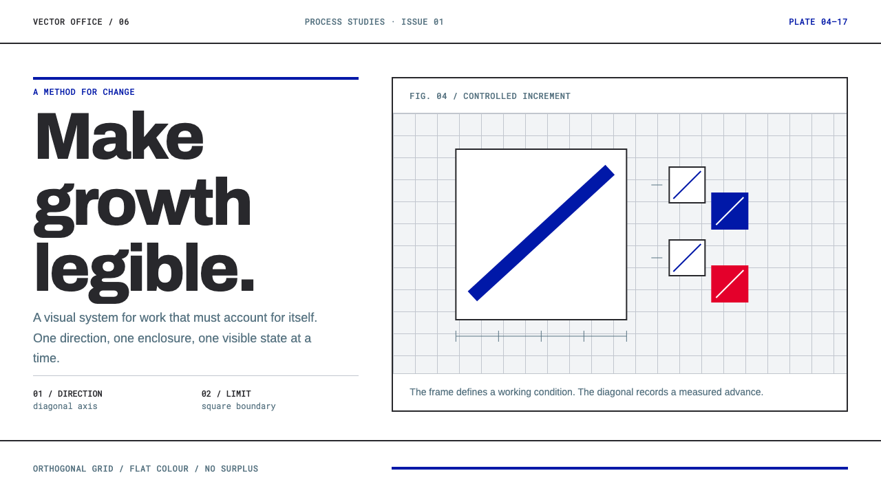 Anton Stankowski ConstructiveProcess becomes visible. Flat blue diagonals and hard square rules make chang…