What is Deep Aquifer Water Court?
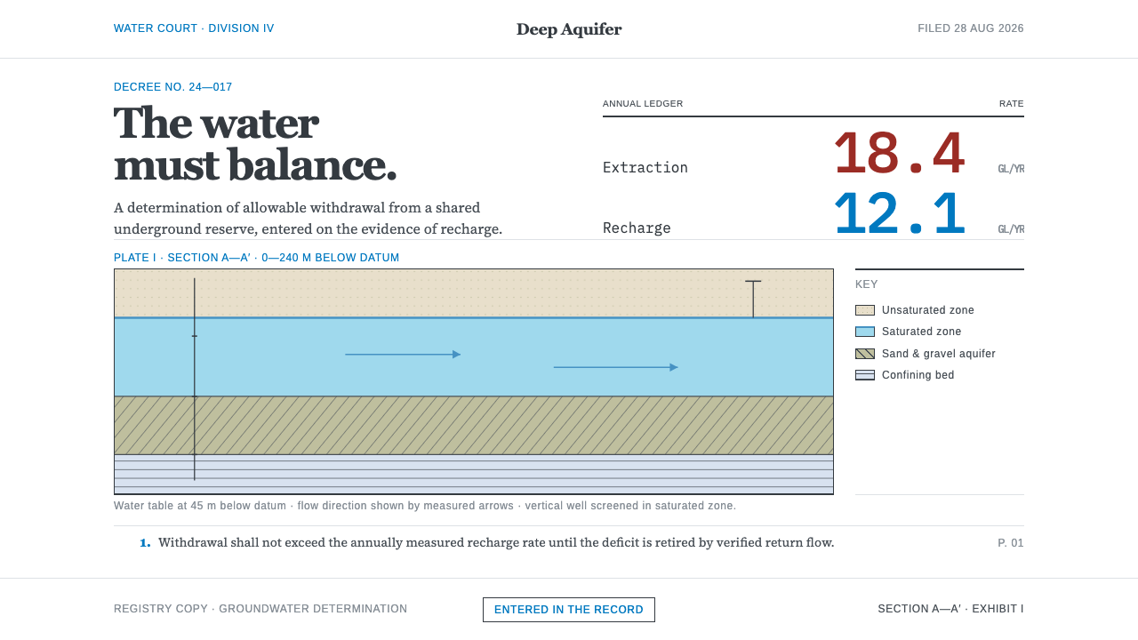
Deep Aquifer Water Court styles a ruling on groundwater: white paper, a book serif, hairline rules, one flat cross-section, and two rates set side by side.
Deep Aquifer Water Court in brief
Deep Aquifer Water Court is a document style built around a single imagined institution: a standing court that decides questions of groundwater. Who may pump how much from an aquifer that ignores the border above it? Has extraction outrun recharge? Its characteristic artefact is not a dashboard or a poster but a filing, a decree on white bond stock with numbered paragraphs set in a book serif, thin rules, and no boxes where whitespace will do.
Bound into that decree is the plate, a hydrogeologic cross-section drawn on a white ground in the flat diagram language that the United States Geological Survey has published for decades. A water table, a saturated zone, confining beds: each layer is a flat fill keyed to a legend, with no three-dimensional rendering, no lighting and no texture. The plate teaches the reader how the ground is arranged beneath the surface before the text argues about who has the right to draw on it.
The tone is deliberately unexcited, and that is the point. Water scarcity is dramatic enough without help. In this style the drama is carried entirely by two numbers sitting next to each other in a table: how much is taken out and how much is put back. Restraint makes the deficit hard to ignore, because nothing else on the page competes with it.
Where does Deep Aquifer Water Court come from?
The style draws on two bodies of law and one body of mapping. The first law is the doctrine of prior appropriation that governs water rights in the American West, a system in which rights to take water are recorded, ranked and adjudicated. The source places the start of this lineage at the 1969 Colorado Water Right Determination and Administration Act, and the document grammar of numbered findings, orders and decrees owes much to the water-rights courts of that tradition. The second is international law, where the grammar of judgments from The Hague supplies the formal, impersonal voice.
Groundwater did not enter international law quickly. Aquifers are hidden, they cross borders without markers, and a pumping well in one country can lower the water level under another. The text of record here is the United Nations law of transboundary aquifers of 2008, followed by the Guarani Aquifer Agreement of 2010, a regional accord among the states that share one of the world's great aquifers. Both documents treat an aquifer as a shared resource with a budget, and that framing is the conceptual core of the style: the question is never only who owns the water, but how fast it is being taken compared with how fast it returns.
The places that give the style its subject matter are overdrafted and transboundary aquifers around the world. The source names the Ogallala and High Plains system, the Guarani, and the Nubian Sandstone, three very different settings with one common feature: extraction that can exceed natural recharge, and a legal question about who bears the consequences. The visual language of the court is the visual language of those disputes, written in the calm register in which such disputes are actually argued.
On the mapping side, the plate belongs to a long tradition of USGS water-level-change cartography and to the transboundary aquifer mapping associated with UNESCO's International Hydrological Programme. Those traditions trained a generation of readers to understand an aquifer through a flat, labelled section and a legend, and to read a change in water level as a measured quantity rather than a story. Oscar E. Meinzer and Chusei Yamada, the two key figures attached to this style, stand for its two halves: the scientific description of groundwater and the legal description of how it is shared.
What defines the Deep Aquifer Water Court look?
White Bond Ground
The page is plain white, modelled on the bond stock of legal filings. There is no tinted background, no textured paper effect, and no atmospheric gradient. White is not an absence of decision here; it is the neutral field on which a record is kept. Because the ground makes no claims, everything printed on it, a paragraph, a rule, a table row, has to justify itself, which suits a style whose subject is evidence.
The Numbered Decree in a Book Serif
Text is organised as numbered paragraphs, the way a judgment or a decree is, and set in a book serif, the sort of face made for long, sober reading. Headings are modest. The voice is impersonal, with findings stated plainly and sequentially. The serif signals a document meant to be read closely and cited, not skimmed, and the numbering gives every paragraph a precise address that can be referred back to.
Hairline Rules, Few Boxes
Structure is made with thin rules and whitespace rather than with boxes, panels or shaded containers. A line separates a heading from a body, a table header from its rows, a caption from its plate. Where space alone can do the separating, nothing is drawn at all. The effect is the quiet precision of a printed legal document, in which hierarchy is a matter of alignment and spacing and the eye is never asked to move between competing frames.
The Keyed Plate
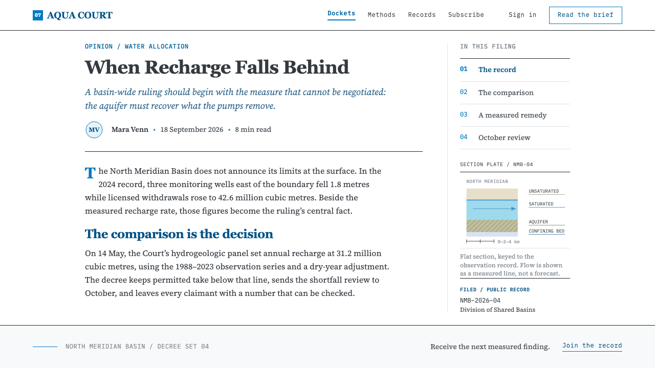
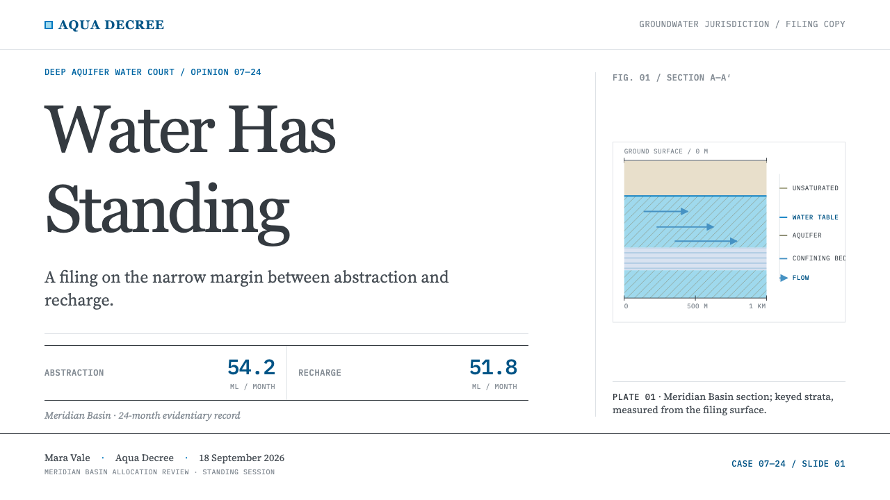
The hydrogeologic cross-section is the visual centrepiece. It is drawn flat, with no perspective and no lighting, in the diagram language of USGS publications. Each layer, water table, saturated zone, confining bed, receives a fill that is explained in a legend, so the picture can be decoded entirely from its key. Colour and pattern here are information, not decoration, and the discipline is that a viewer should be able to name every area on the plate by consulting the legend.
Two Numbers, Side by Side
The emotional weight of the style sits in a table, specifically in a pair of figures set next to each other: the rate of extraction and the rate of recharge. Nothing else is made large or bright. Because the page around them is calm, the gap between the two rates carries the whole argument. Designers using this style should resist emphasising the deficit with alarm colours or oversized display type; the comparison is already the headline.
Flat, Unlit, Unexcited
The whole system refuses atmosphere. Nothing is rendered in three dimensions, nothing glows, and nothing is textured to look like water or earth. The tone is neutral on purpose: it treats the reader as someone who will draw their own conclusion from the numbers. This is a style of understatement, and its authority comes from the fact that it never raises its voice. Where other design systems add emphasis, this one removes it.
Who shaped Deep Aquifer Water Court?
Meinzer is the figure associated with the scientific half of this style. He belongs to the tradition of the United States Geological Survey, where groundwater came to be studied as a measurable body with an inflow, an outflow and a stored volume. His place in this system is symbolic as much as historical: he stands for the idea that an aquifer can be described, mapped and quantified, which is what makes the court's central question about extraction versus recharge answerable at all.
Yamada is the figure associated with the legal half of the style, connected to the United Nations work on the law of transboundary aquifers that culminated in 2008. The significance for design is the framing he represents: shared groundwater as a resource governed by principles, not left to whoever pumps first. The formal, measured voice of the court, with its numbered paragraphs and neutral register, is a visual echo of international legal drafting.
The Survey supplies the visual grammar of the plate. For decades it has published hydrogeologic sections and water-level-change maps in a flat, legend-keyed style, and Deep Aquifer Water Court adopts that language directly. This is a case of a public scientific institution creating a design vocabulary by sheer consistency: clear fills, labelled layers, and nothing ornamental. The system borrows its credibility from that history of plain, careful communication.
The programme is associated in the source with transboundary aquifer mapping. Its significance for the style is that it connects the map to the border: an aquifer is drawn as one body of water that sits under more than one jurisdiction, and the cartography has to make that unity visible. The plate in this system inherits that purpose, showing the ground as a shared structure rather than as territory divided along the lines above it.
How do you use Deep Aquifer Water Court today?
Deep Aquifer Water Court suits subjects where evidence and fairness are the substance: sustainability and ESG reporting, water utilities, environmental consultancies, policy and legal technology, research institutes, and any product that has to show a difference between two quantities without theatre. It is a weak fit for playful or promotional work. Applied well, it means adopting the grammar of a filing, not just the colour white.
For presentation slides, the cover can be a caption-like page in the manner of a case filing: a modest title in the book serif, a numbered reference line, and plenty of white. Content slides work as short numbered findings, one idea per paragraph, separated by hairline rules. For data, there are two natural hero slides: a flat, legend-keyed cross-section or schematic, and a two-column table where the extraction figure and the recharge figure are placed side by side with matching weight. Resist adding charts that dramatise the gap; the table is already doing that job.
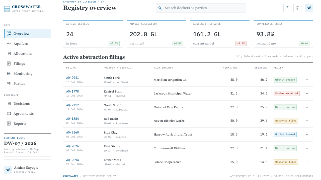
For web interfaces, the style fits reports, compliance portals, monitoring dashboards and documentation. Layout can be a single readable column with numbered sections, a quiet sidebar index, and tables with fine rules rather than shaded rows. Cards are unnecessary; whitespace and rules replace them. Charts follow the plate's rules: flat fills, a clear legend, no gradients and no hover glows. If a dashboard must present a rate and its counter-rate, place them in adjacent cells of the same table.
For editorial and marketing work, the style produces white papers, policy briefs, annual reports and long-form explainers that feel authoritative without sounding alarmed. Captions and footnotes should be treated as part of the argument, numbered and precise. Photography is optional and should be used sparingly; a diagram of the ground is usually a stronger image than a photograph of a dry field. Calls to action should be written as plain statements of next steps, in the same sober voice as the rest of the document.
The most common mistake is to add emphasis because the subject feels urgent: red alarm colours, huge numerals, dramatic gradients, or three-dimensional cutaways with lighting. Each of these cancels the style's central advantage, which is that restraint lets the numbers speak. A second mistake is to box everything, turning the hairline-and-whitespace structure into a grid of cards. A third is to treat the plate as an illustration rather than a keyed diagram; if the legend is missing or the fills cannot be decoded, the plate has lost its authority.
Deep Aquifer Water Court — FAQ
What is a hydrogeologic cross-section and why does the style centre on one?
A hydrogeologic cross-section is a vertical slice through the ground that shows how layers of rock and sediment are arranged and where water sits within them, including the water table, the saturated zone and the confining beds that restrict flow. The style centres on one because it makes the invisible visible in the plainest possible way. It also fits the court's logic: before anyone can argue about extraction and recharge, the reader needs to see what an aquifer physically is.
Is this based on a real court?
The standing court is a framing device for the design system, not a claim about a single existing institution. What is real is its document grammar, which the source traces to The Hague and to the water-rights courts of the American West, and the legal texts it follows, from the 1969 Colorado act to the 2008 United Nations law of transboundary aquifers and the 2010 Guarani Aquifer Agreement. The style borrows the manner of those documents without reproducing any specific one.
Why keep the design so plain when the subject is so serious?
Because seriousness is better served by restraint than by volume. A water deficit is already alarming, so the design avoids adding emphasis that would let a reader dismiss the page as advocacy. When the page is calm and the figures are exact, the reader trusts the comparison. This is the same reason legal and scientific documents are typographically quiet: their authority depends on never appearing to persuade by anything but the evidence.
How should colour be used in the plate?
Colour in the plate is a coding system, not a mood. Each layer receives a flat fill explained in the legend, and the fills should be distinguishable from one another by tone or pattern as well as hue so that the diagram still reads in greyscale or for colour-blind viewers. Keep the surrounding page white and the type neutral, so the plate's fills are the only colour doing real work, and avoid gradients or shading that suggest depth the section does not need.
Can this style work with a dark background?
The system is defined by white bond stock and a printed-record feel, so the dark inversion is not its natural form. A dark version is possible for screen use, such as a night mode for a monitoring tool, but it must keep the same rules: flat fills keyed to a legend, hairline separators, no glow and no dramatisation of the deficit. The test is whether the page still reads as a calm record of two quantities rather than as an alarm panel.
Related design styles
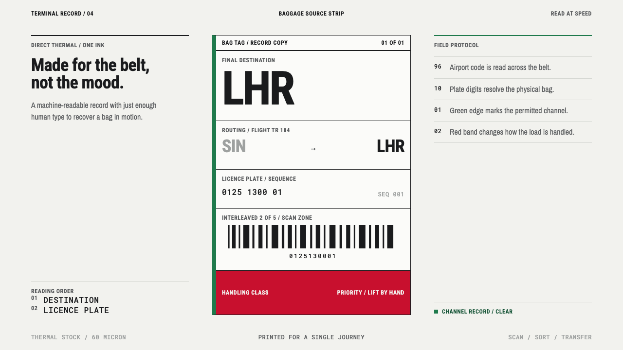 Airport Baggage TagBuilt to be read in motion. Burned-black codes, hard rules and functional cha…
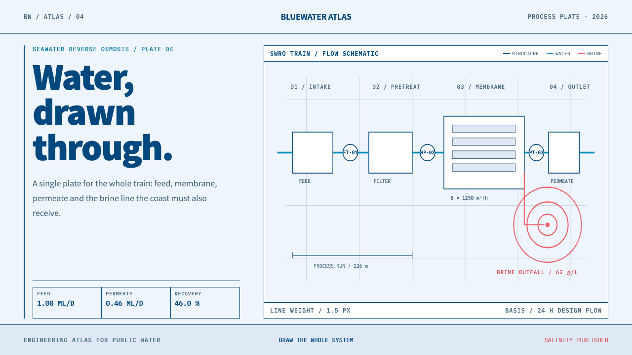 Desalination MegaplantInfrastructure made legible. Navy process lines map cyan water flow and coral…
 Elemental Social HousingBuild half a good house, well. Dusty cement-grey panels, hatched bare-frame g…
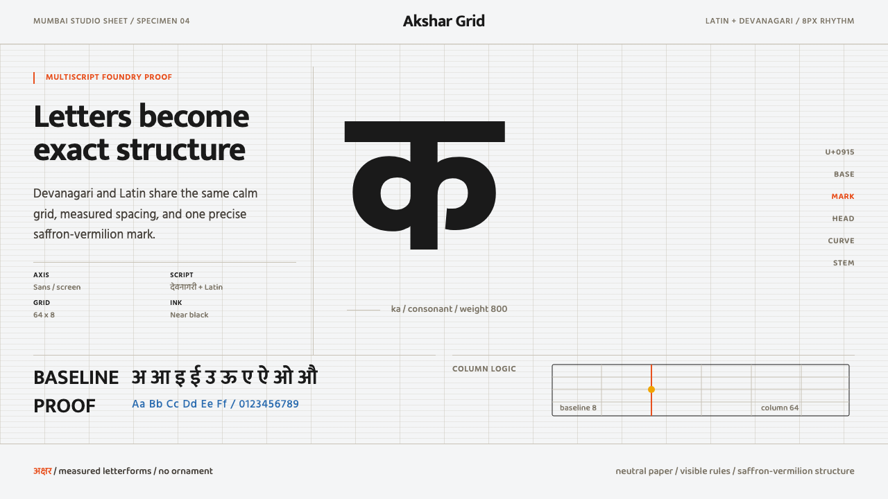 Modern Devanagari TypeType is the subject. Warm off-white grid, giant glyphs, one saffron-vermilion…
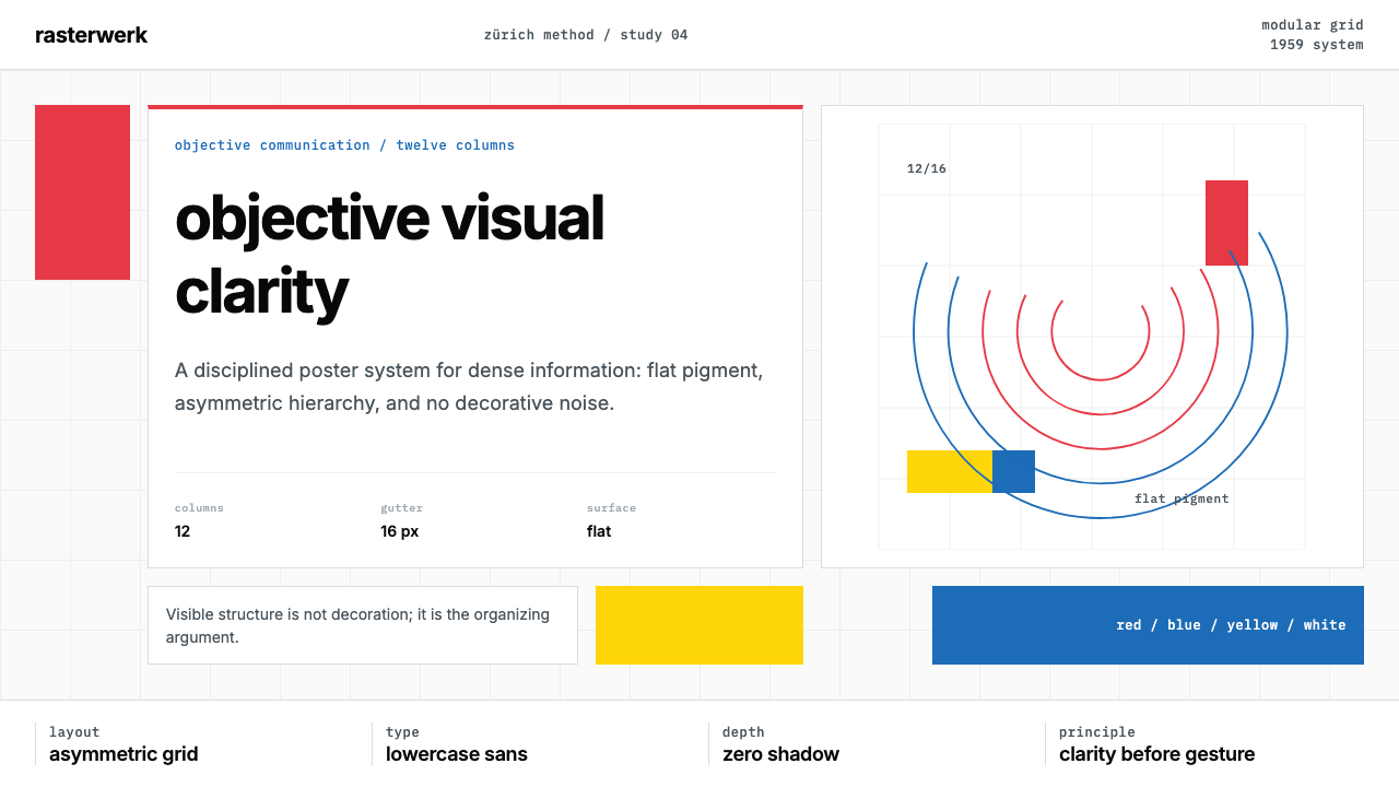 Müller-Brockmann SwissClarity is the system. Inter grids, red-blue blocks, and concentric arcs make…
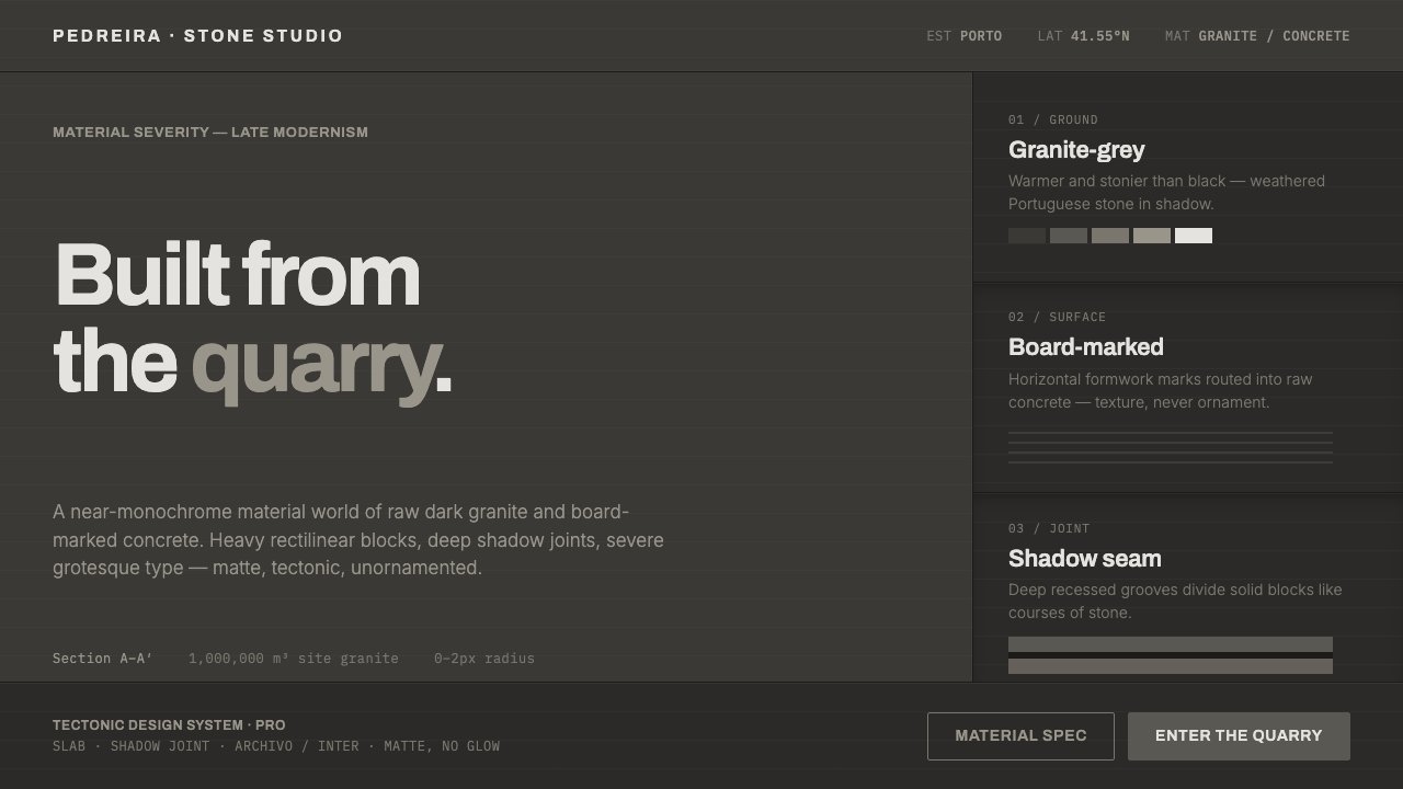 Souto de Moura GraniteArchitecture as raw matter. Dark Portuguese granite ground, board-marked conc…