What is Olgiati Monolithic Concrete?
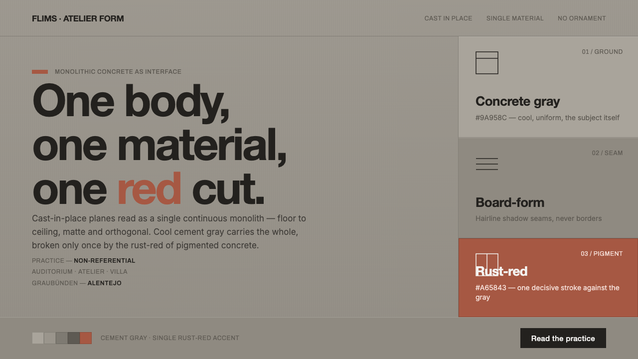
Olgiati Monolithic Concrete makes material the entire argument: a cool, continuous gray field, cut with sharp openings and interrupted only once by rust red.
Olgiati Monolithic Concrete in brief
Olgiati Monolithic Concrete is an interface language distilled from the work of Swiss architect Valerio Olgiati, whose buildings treat concrete not as a neutral construction medium but as the source of a building’s unity. In projects such as Plantahof Auditorium, Atelier Bardill, and Villa Além, cast-in-place concrete reads as one continuous body from floor to ceiling. The visual impression is not of assembled parts, decorative surfaces, or layered finishes. It is of a single material presence with weight, continuity, and a deliberately limited vocabulary.
Its digital translation begins with a cool, uniform concrete gray ground. This gray is matte rather than glossy, calm rather than atmospheric, and intentionally free from visual noise. Surfaces should feel orthogonal and continuous, as though the interface has been cut from one slab rather than composed from a collection of independent cards. Openings, divisions, and content areas are treated as precise incisions into that field. They establish use and hierarchy without turning into ornament.
The system is broken by one controlled exception: rust red. Drawn from Olgiati’s use of pigmented cement to harmonize with rusty earth, the accent is not an energetic brand color distributed throughout a screen. It is a singular act of contrast. Its restraint gives it consequence. Used against the cool concrete field, it can indicate a decisive action, a point of orientation, or a moment where the otherwise unified surface is intentionally interrupted.
Where does Olgiati Monolithic Concrete come from?
The reference point for this style is Valerio Olgiati’s architectural approach in Switzerland and Portugal. Its period is contemporary, spanning work from Atelier Bardill in 2007 through Plantahof Auditorium in 2010 and Villa Além in 2014, and continuing into the present. The geographical frame matters because the work is associated both with Flims and Graubünden in Switzerland and with Alentejo in Portugal. Rather than deriving its identity from a historical decorative archive, it derives it from a sustained position on material, mass, and visual unity.
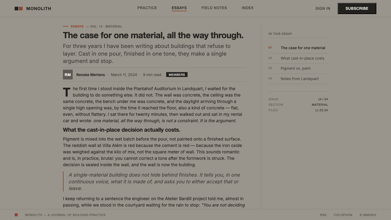
Olgiati treats concrete as the material capable of giving a building coherence. Cast in place and pigmented through the mix, it does not need an additional ornamental layer to explain itself. The building is read as a monolith: one continuous material body whose openings are sharp and whose surfaces remain direct. This is the essential lesson for the style. Unity does not come from applying a shared finish to many unrelated pieces; it comes from making the whole composition behave as though it has one material logic.
The style sits within Swiss minimalism, monolithic single-material architecture, and non-referential architecture. These labels point toward reduction, but reduction here should not be confused with emptiness. The work is austere because it refuses unnecessary visual explanation. The concrete is allowed to remain concrete; the opening is allowed to remain an opening. The resulting character is cool, controlled, and materially explicit rather than decorative, picturesque, or nostalgic.
When this architectural language becomes a visual system, its task is not to imitate a building literally. It is to preserve the underlying discipline: uniform ground, precise interruption, sharp boundaries, and an accent whose rarity makes it structural. A screen influenced by this approach should feel less like a decorated surface and more like an ordered mass with usable apertures. The rust-red interruption should recall pigmented cement meeting rusty earth, not function as a general-purpose flourish.
What defines the Olgiati Monolithic Concrete look?
Monolithic Ground
The dominant field is a cool, even concrete gray that behaves as one continuous surface across the composition. It should not fragment into competing panels, ornamental textures, or unrelated background treatments. Its role is to establish material unity before content begins. The effect should be calm and dense: a ground with presence, but without gloss, theatrical lighting, or visual chatter.
Single-Material Logic
Every visible element should appear to belong to the same material order. Instead of collecting effects to distinguish sections, use cuts, alignment, and changes in occupied space. Content modules can be differentiated, but they should remain members of one body rather than miniature products with their own decorative identities. Consistency is not sameness; it is the sense that every variation was made from the same architectural decision.
Sharp Openings
Boundaries are expressed as exact openings in a solid field. Text blocks, images, controls, and navigation should feel inserted or cut into the surface with intention. The visual language favors orthogonal edges and clear separation over soft dissolves or atmospheric layering. An opening is functional, but it also establishes the rhythm of the composition: absence becomes as deliberate as mass.
Matte Orthogonality
The surface language is matte and orthogonal. It avoids the reflective, polished character that would turn concrete into luxury cladding, and it avoids organic looseness that would weaken the monolithic reading. Straight edges and controlled planar relationships carry the composition. The result should feel built rather than illustrated, firm rather than expressive for its own sake.
Rust-Red Interruption
Rust red is the sole deliberate rupture in the concrete field. Its reference is pigmented cement used to harmonize with rusty earth, so it should retain an earthy, material role. The accent works best when it marks a singular decision: a primary action, a selected state, a directional cue, or one decisive editorial detail. If it appears repeatedly as decoration, it loses the force of interruption.
Swiss Sans-Serif Scale
Large Swiss sans-serif type provides the principal human register within the material field. Typography should be direct, roomy, and emphatic enough to stand against the mass of gray without needing ornamental support. Hierarchy comes from proportion, placement, and restraint. The type should read as an inscription on a constructed surface, not as a decorative layer floating over it.
Who shaped Olgiati Monolithic Concrete?
Olgiati is the sole named architect behind this reference system. His approach treats concrete as the material that gives a building unity: cast in place, pigmented through the mix, and allowed to read as one continuous body. The interface style takes its central discipline from that position, translating material continuity and sharply defined openings into a digital composition.
Completed in 2007, Atelier Bardill is one of the named works anchoring the contemporary period of the style. Within this system, it serves as a reminder that the reference is architectural rather than merely graphic: unity comes from a continuous material reading, not from applying a concrete-like texture to an otherwise unrelated composition.
Plantahof Auditorium, completed in 2010, is cited as a monolithic concrete work within Olgiati’s practice. For designers, its value is conceptual: a project can be severe without becoming busy, because the material field, the mass, and the openings already provide a complete visual order. The digital equivalent is a screen that lets ground, content, and interruption do the work.
Villa Além, completed in 2014 in Alentejo, is the clearest source reference for the rust-red relationship to earth. The style does not turn that relationship into a broad palette. Instead, it preserves the logic of one pigmented interruption against a cool monolithic field. This limitation is what keeps the accent architectural and intentional.
How do you use Olgiati Monolithic Concrete today?
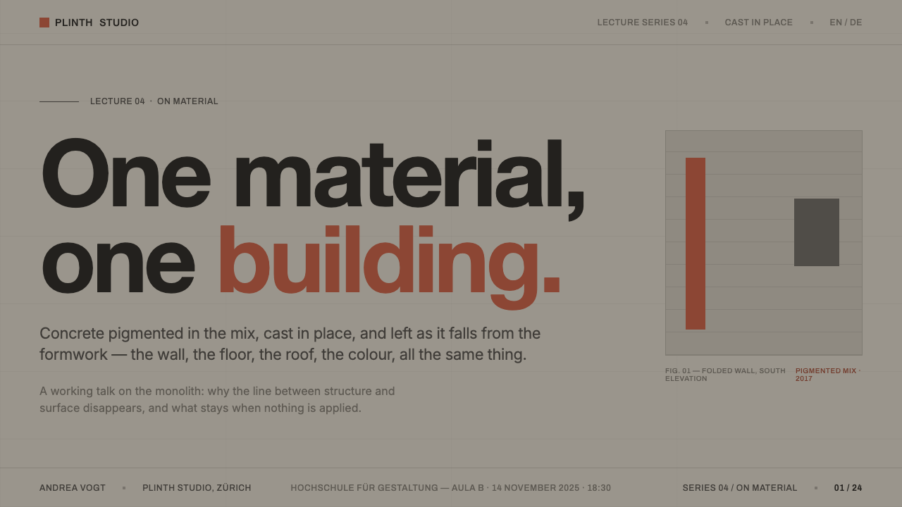
For presentation slides, use the style to establish a strong distinction between mass and information. Cover slides should begin with the concrete field and one large Swiss sans-serif title, positioned as an inscription within the surface. A single rust-red stroke, mark, or compact area can identify the presentation’s central subject. Avoid filling the cover with abstract concrete imagery; the style is strongest when the material reading is created by uniformity, empty space, and one decisive interruption.
Content slides should behave like a sequence of cut openings in the same monolith. Keep explanatory text in disciplined blocks, place section labels with clear intent, and allow large unoccupied areas to maintain the sense of mass. Data slides should not be dressed up with ornamental chart frames. Let charts appear as precise informational cuts within the gray field, with rust red reserved for the comparison or data point that truly needs emphasis. The objective is legibility with material composure, not a theatrical architectural imitation.
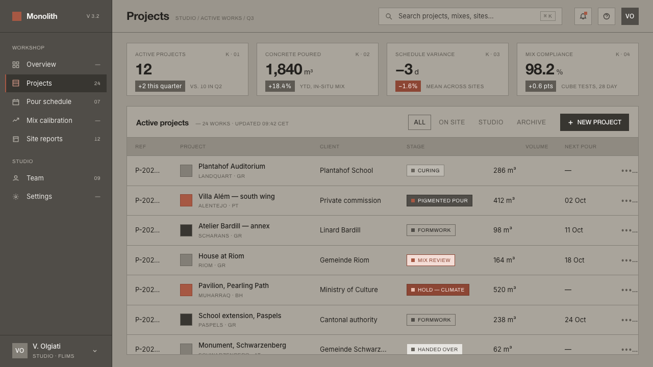
For web interfaces, the style is especially useful for dashboards, analytical tools, pricing pages, and product surfaces that benefit from calm authority. Begin with one continuous ground and organize navigation, filters, metrics, and actions as deliberate apertures within it. The large sans-serif voice can carry page titles and key figures, while quieter text supports scanning. Avoid turning every control into a floating object. The interface should feel unified even when it contains dense information.
Editorial and marketing work can use the system to make a proposition feel substantial and focused. An article page can place its headline against an expansive concrete-gray field, then introduce quotations, captions, and reading sections as measured cuts. A marketing page can use one rust-red moment to carry the call to action or the essential claim, leaving supporting material quiet. This makes the emphasis credible because the rest of the page refuses to compete for the same attention.
The common mistake is to reduce the style to a gray background plus a red button. That produces a color treatment, not a monolithic system. Do not simulate concrete with noisy texture, add multiple competing accent colors, soften every division into a floating layer, or scatter rust red through the interface. The real discipline is continuity: one material reading, sharp functional openings, direct Swiss sans-serif hierarchy, and one interruption meaningful enough to disturb the whole.
Olgiati Monolithic Concrete — FAQ
Is this style simply a concrete texture applied to a minimal interface?
No. Texture is not the governing idea. The source material is Olgiati’s use of cast-in-place, pigmented concrete as one continuous architectural body. In an interface, that principle becomes a uniform material reading, sharp functional openings, and a refusal of unrelated decorative layers. A noisy concrete texture may actually weaken the style by replacing material unity with surface effect.
Why is rust red used so sparingly?
Its force comes from being the exception to the cool monolithic gray. The reference is pigmented cement used to harmonize with rusty earth, not a broad decorative palette. When rust red appears once, it can alter the reading of the whole composition. When it appears everywhere, it becomes ordinary interface emphasis and loses its material, architectural meaning.
Can the system support dense dashboards and data-heavy pages?
Yes, provided density is organized as a series of precise openings rather than a collection of floating widgets. The continuous gray ground can give varied information a shared context, while direct sans-serif hierarchy helps users scan titles, metrics, and supporting detail. Rust red should identify the one comparison, state, or action that deserves immediate attention, not decorate every chart.
What role should photography or imagery play?
Imagery should be treated as an opening within the material field, not as a competing atmosphere laid over it. Use it only when it clarifies a project, object, place, or argument. Its boundaries should remain sharp and its placement should strengthen the orthogonal order. If an image introduces too many unrelated colors, textures, or moods, it can dissolve the monolithic reading that the system depends on.
When is Olgiati Monolithic Concrete a poor fit?
It is a poor fit when a product needs constant visual warmth, playful variation, or many simultaneous expressive voices. The style is built around austerity, continuous material presence, and one controlled interruption. It works best when the product’s message benefits from focus, gravity, and calm precision. If the content depends on exuberant decoration or a broad changing palette, the system’s defining restraint will become a limitation rather than a strength.
Related design styles
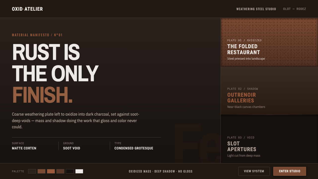 RCR Weathering SteelRust is the only finish. Matte weathering steel emerges from soot-dark voids…
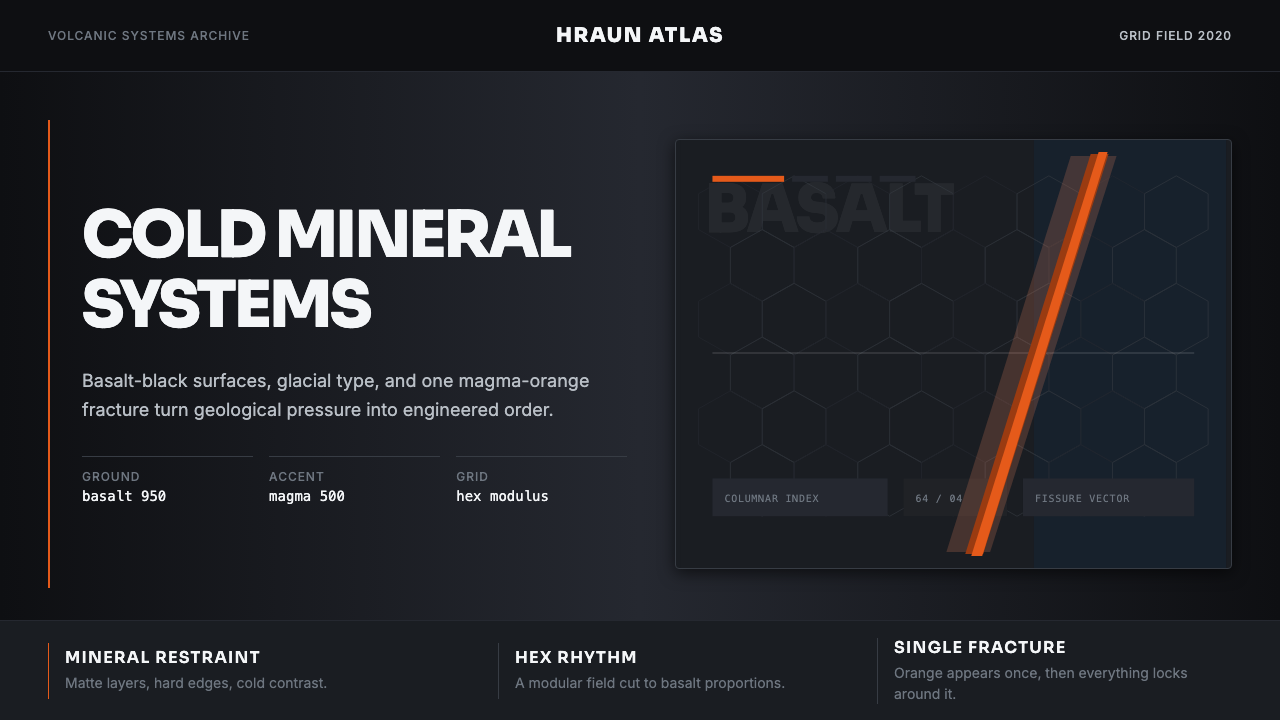 Icelandic Basalt VolcanoCold geology, engineered. Basalt black, Sora type, and one magma fissure hold…
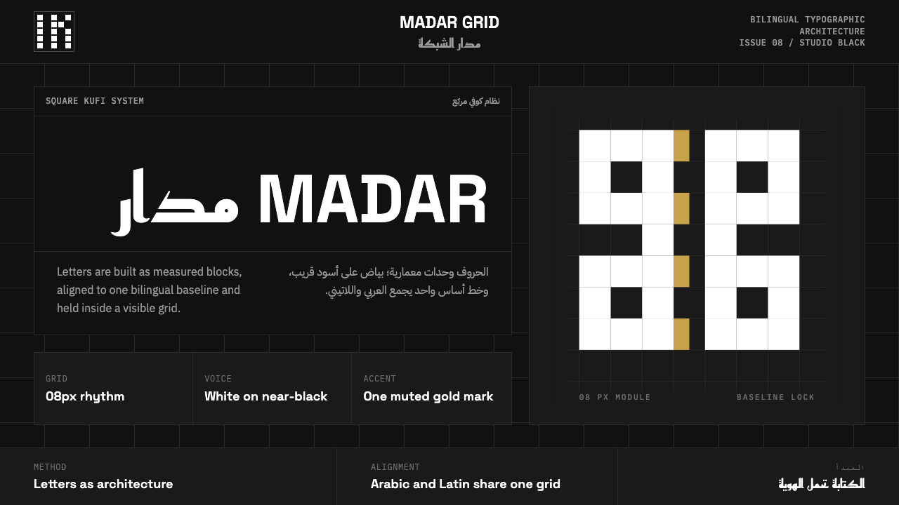 Modern Kufi BrandingRestraint becomes architecture. White Kufi blocks on near-black obey a biling…
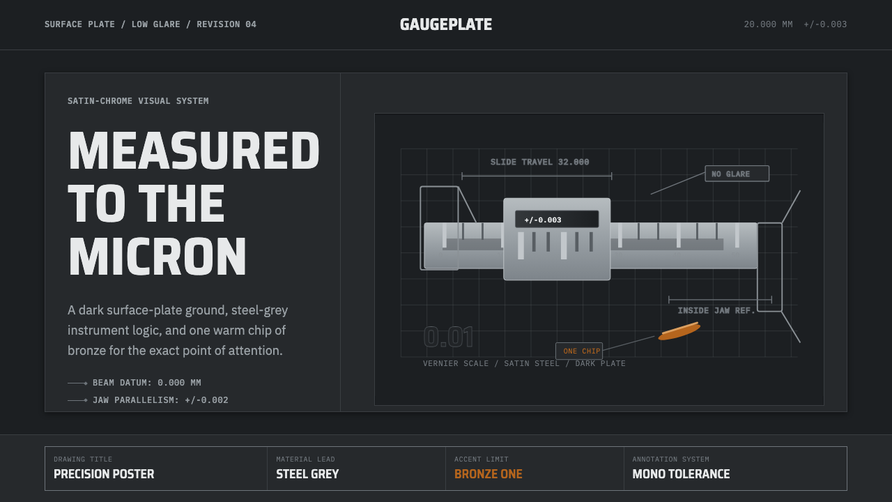 Caliper MachiningPrecision refuses drama. Steel-gray grid, mono tolerances, one bronze swarf a…
 Dessau GrayscaleAustere monochrome authority. Darkroom black, glazing gray, and a steel-windo…
 Foundry Industrial GrayBuilt for the dark shop floor. Graphite canvas, hairline plates, mono labels,…