What is Caliper Machining?
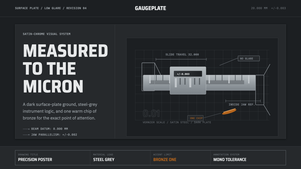
Caliper Machining is what precision looks like when it refuses to perform — steel gray, engraved tolerances, and exactly one warm bronze accent stolen from a curl of fresh-cut swarf.
Caliper Machining in brief
Caliper Machining is the visual language of the machine shop, distilled from a single, very specific object: a hardened stainless-steel vernier caliper resting on a dark surface plate, surrounded by bright, freshly curled CNC swarf under low, anti-glare light. It is an aesthetic built entirely around measurement — the tools, marks, and notation that machinists use to confirm that a part is exactly the size it is supposed to be, no more and no less.
Steel gray is the dominant material color throughout, treated as structure rather than backdrop. Against it, a single warm bronze — the color of freshly oxidizing copper-alloy chip — is allowed to appear, and only there. Everything else in the system stays disciplined: monospaced dimension and tolerance callouts, engraved vernier scale markings, and thin leader lines connecting labels to the parts they describe, all borrowed directly from the conventions of technical engineering drawings.
The overall effect reads as competence rather than decoration. Nothing in this system is trying to look impressive; it is trying to look correct. That distinction — between a design that performs precision and a design that simply records it — is the entire premise of the style.
Where does Caliper Machining come from?
The lineage begins with a mathematical invention rather than a tool. In 1631 the French mathematician Pierre Vernier, working in the Franche-Comté region, published a treatise describing a graduated auxiliary scale that let an instrument read fractional divisions of a main scale far more precisely than the eye alone could judge. That scale — still called the vernier scale after him — is the reason a caliper can report a measurement finer than the spacing of the marks printed on it, and it remained a piece of abstract mathematical instrument-making for roughly two centuries before it became a everyday shop tool.
The jump from mathematical principle to practical workshop object happened in the United States in the mid-nineteenth century. Joseph R. Brown, a toolmaker in Providence, Rhode Island, built the first commercially practical vernier caliper in 1851, engineering it as a robust, reliable instrument that ordinary machinists could use on a shop floor rather than a laboratory bench. Brown went on to found the Brown & Sharpe Manufacturing Company, which became one of the most influential precision-tool makers of the American industrial era, standardizing measurement practice across a rapidly mechanizing manufacturing economy built on interchangeable parts.
The next major chapter belongs to Japan. Mitutoyo, founded in 1934, grew over the following decades into one of the world's leading manufacturers of calipers, micrometers, and precision measuring instruments, and its rise tracked the broader postwar emergence of East Asian manufacturing as a byword for exacting tolerances and disciplined quality control. Precision measurement culture in this region became closely associated with a particular craft ethic — patient, understated, and oriented around getting a physical detail exactly right rather than merely close.
The contemporary visual style this system draws on — steel-gray tools, curled bright swarf, low anti-glare workshop lighting, engraved markings — crystallized more recently still, from roughly 2010 onward, as CNC machining shops became a recognizable subject on video and photography platforms. Close-up shots of a caliper's jaws closing on a freshly cut part, or a coil of metal shaving catching the light, turned an ordinary quality-control routine into a widely recognized visual shorthand for precision itself.
What defines the Caliper Machining look?
Color
Steel gray dominates as the material color of tools, surface plates, and structural elements, ranging from a muted mid-tone to a near-black shadow value. Against this restrained field, exactly one warm bronze — echoing the color of freshly cut copper-alloy swarf — is permitted as accent, reserved for the single most important element on any given screen. No other hue is allowed to compete with it.
Typography
Dimension and tolerance callouts are set in a monospaced typeface with tabular, evenly spaced figures — the same convention used on engineering drawings, where every digit must align in a column regardless of value. This is a functional choice as much as a stylistic one: monospaced tolerance notation is built to be scanned quickly and compared at a glance, not read as prose.
Materials and Surface
Surfaces read as hardened and matte rather than polished and reflective — a brushed steel finish on the caliper body, a dark, non-glare surface plate beneath it. Reflections are minimized deliberately, since a genuinely precise measuring environment avoids glare that could obscure a reading; the aesthetic inherits this practical discipline directly.
Notation and Iconography
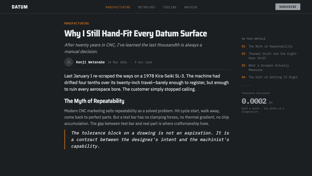
Thin leader lines connect labels to the exact feature they describe, engraved vernier scale markings appear as decorative-functional texture, and tolerance values are set with the plus-or-minus notation of an engineering drawing. These marks are never purely ornamental — each one mimics a real annotation a machinist would actually use to communicate a measurement.
Lighting and Mood
Light is low, diffuse, and deliberately anti-glare, closer to workshop task lighting than to a dramatic studio spotlight. Shadows are soft rather than theatrical, and highlights are reserved almost exclusively for the metal itself — a curl of swarf catching a hint of light, an engraved scale line picking up just enough contrast to read.
Composition and Grid
Layouts favor a strict orthogonal grid reminiscent of a technical drawing sheet: parts and callouts align to clean horizontal and vertical axes, with generous negative space around the primary subject so nothing crowds the measurement being illustrated. Diagonal or organic composition is avoided entirely — precision culture treats deviation from the grid as an error rather than an expressive choice.
Precision Notation
Tolerances are expressed the way a real technical drawing expresses them — as a nominal value paired with an allowable plus-or-minus range, rather than as a single confident number. This convention carries an implicit honesty: it admits that no physical part is ever manufactured to a perfectly exact size, only within a defined and accepted margin, and the design language keeps that admission visible rather than smoothing it away.
Who shaped Caliper Machining?
The French mathematician who published the treatise describing the auxiliary graduated scale, now known as the vernier scale, that allows an instrument to read fractional divisions far finer than its main scale's marked increments. His invention is the mathematical foundation underneath every caliper reading, though it took roughly two centuries to move from mathematical proposal to shop-floor tool.
The Providence, Rhode Island toolmaker who built the first commercially practical vernier caliper in 1851, translating Vernier's abstract scale into a robust instrument ordinary machinists could rely on. His work marks the moment precision measurement moved from the laboratory bench onto the shop floor as an everyday tool.
The precision-tool company Joseph R. Brown founded, which grew into one of the most influential instrument and machine-tool makers of the American industrial era. It helped standardize measurement practice across a manufacturing economy that was rapidly organizing itself around interchangeable parts and consistent tolerances.
The Japanese precision-instrument manufacturer, founded in 1934, that grew into one of the world's leading makers of calipers, micrometers, and measuring equipment. Its rise paralleled the broader postwar reputation of East Asian manufacturing for exacting tolerances, and its instruments remain a recognizable visual reference within contemporary precision-metrology culture.
How do you use Caliper Machining today?
Caliper Machining works best wherever a product needs to signal exactness and competence without resorting to flash. Applying it well means treating steel gray as structure and the single bronze accent as a scarce resource — spent on exactly the element that matters most on a given screen, never scattered across several.
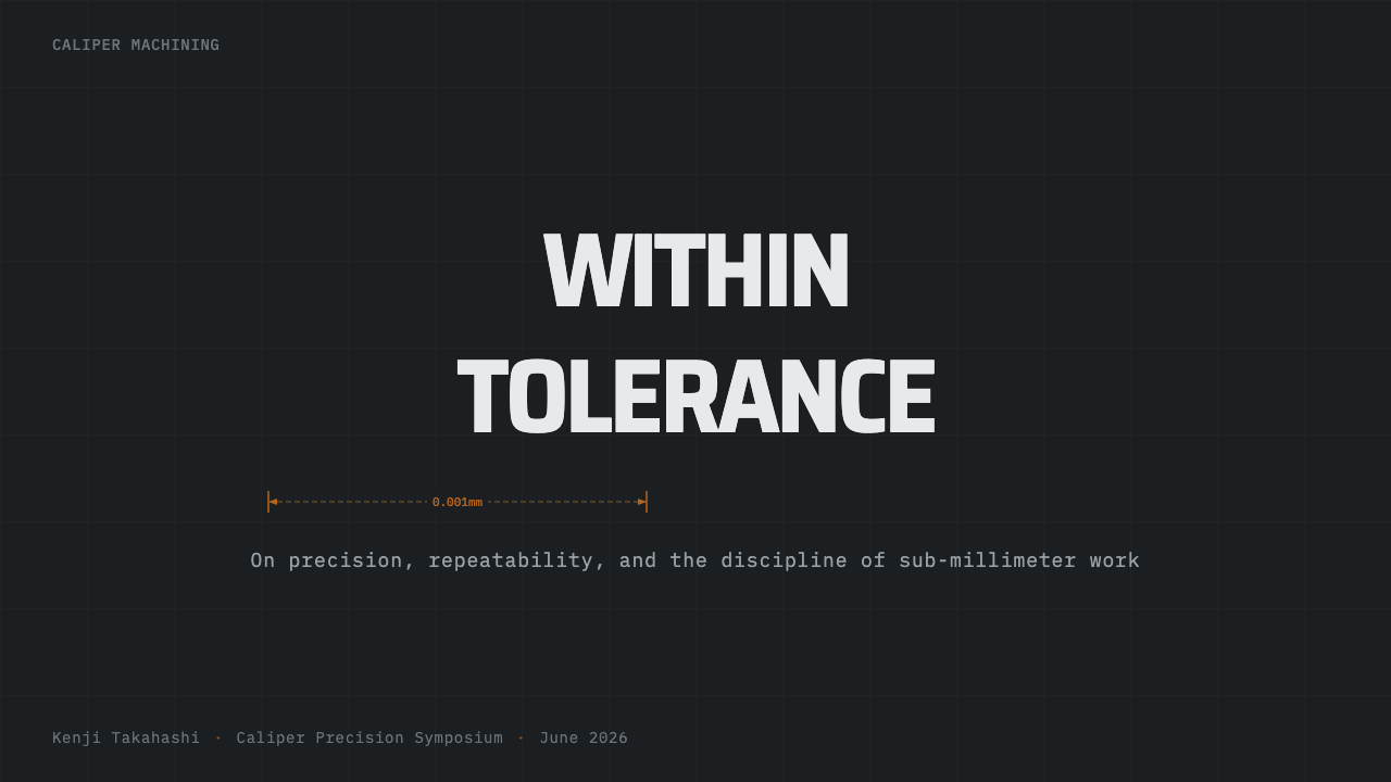
For presentation slides, cover pages benefit from the dark surface-plate ground with a single lit object — a caliper, a part, a diagram — picked out in bronze against the steel-gray field, echoing a macro photograph of a tool under workshop light. Content slides should behave like drawing sheets: monospaced callouts, thin leader lines, and generous negative space rather than dense bullet lists. Data slides suit a diagrammatic treatment — bar charts and tables rendered in steel gray with a single bronze highlight marking the one figure that matters most.
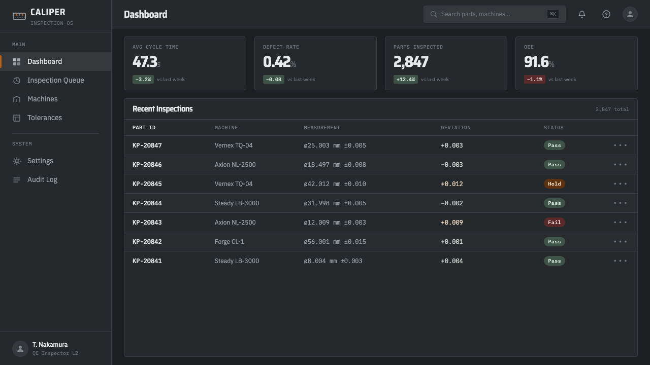
For web interfaces, the style is a natural fit for engineering, manufacturing, and industrial-hardware software — dashboards for CNC monitoring, quality-control tools, supply-chain platforms for machined parts, or any developer- and engineer-facing product that wants to read as rigorous rather than playful. Pricing pages can use the bronze accent to mark the recommended tier the way a tolerance callout marks a critical dimension, leaving every other tier in undecorated steel gray.
For editorial and marketing content, the system suits engineering blogs, hardware startups, tool and instrument brands, and manufacturing trade publications, where technical credibility matters more than warmth. It performs poorly for food, wellness, children's products, or anything that depends on softness and organic texture, since its entire vocabulary is built from hardened metal and exacting notation.
The most common mistake is treating the bronze accent as decoration rather than as a scarce signal, scattering it across several elements until it loses its function as a pointer to the single most important thing on the screen. A second common error is reaching for literal, glossy photographic metal textures instead of the restrained, matte, low-glare treatment the style actually depends on — a shiny, high-contrast chrome look reads as generic 'tech,' not as the disciplined precision-instrument register this system is built around.
Caliper Machining — FAQ
Why does the palette allow only one accent color instead of a richer metallic range?
Because the discipline is the point. A real precision instrument doesn't advertise itself with color — steel is steel, and the only naturally occurring accent in a machine shop is the warm tone of freshly cut metal chip catching the light. Limiting the palette to steel gray plus that single bronze keeps every use of color meaningful: it always marks the one thing that currently matters, which is exactly how a machinist's eye is trained to scan a workpiece for the one dimension that's out of tolerance.
Where does the term 'vernier' actually come from, and how does it relate to the caliper?
It comes directly from Pierre Vernier, the French mathematician who published the principle in 1631. A vernier scale is a short auxiliary scale that slides alongside a main scale; by comparing which pair of marks on the two scales line up most closely, an instrument can report a fractional reading finer than the main scale's own increments. The caliper is simply the tool this scale is most famously mounted on, but the same principle appears on other precision instruments too — the caliper borrowed the scale's name almost by association.
Is this style only suitable for industrial or engineering products?
It is strongest there, but the underlying idea — restraint as a signal of competence, one scarce accent color reserved for what matters most — travels further than the literal subject matter. It can work for any product that wants to communicate rigor over charm: technical documentation tools, developer platforms, financial or scientific instruments, or premium hardware brands outside of machining altogether. It struggles wherever warmth, playfulness, or sensory richness is the actual goal.
How is this different from generic industrial-gray tech dashboards?
Generic industrial-gray design usually borrows the color without the notation system — flat gray panels with modern sans-serif labels and no real technical grammar underneath. Caliper Machining is specifically anchored in the vocabulary of measurement itself: monospaced tolerance callouts, engraved vernier markings, leader lines, and the plus-or-minus notation of an actual engineering drawing. The gray is the same; the discipline underneath it is what makes this style read as a precision instrument rather than a generic 'tech' skin.
Can this theme work as a light-mode design, given it's built as a dark one?
It resists a simple inversion, because the dark surface plate isn't an arbitrary background choice — it's specifically what makes the bright metal swarf and the engraved scale markings catch light and read clearly, the way a genuine dark, non-reflective surface plate is used in real metrology to keep glare from obscuring a measurement. A light version would need to rebuild that contrast logic from scratch — perhaps a pale, matte surface with darker engraved lines — rather than simply swapping the background and foreground values.
Related design styles
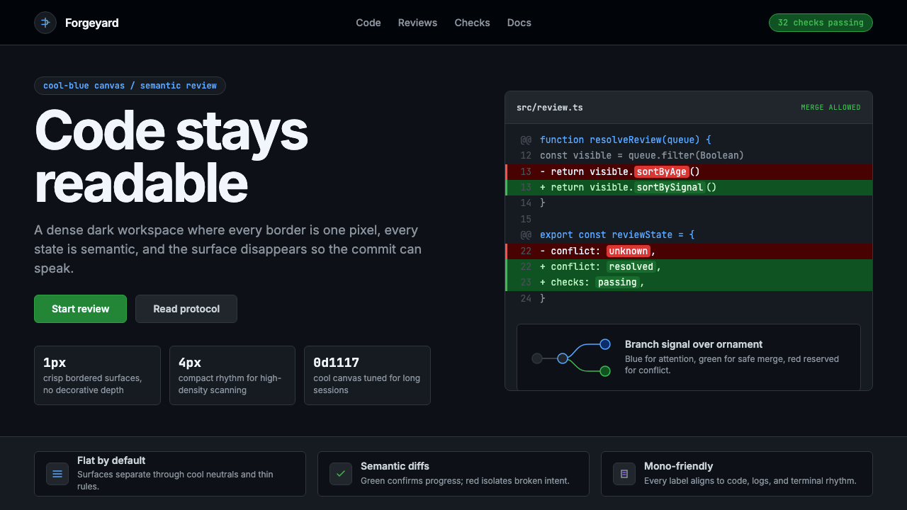 GitHub DarkCode-first darkness. Cool-blue canvas, 1px borders, green/red diff lines.
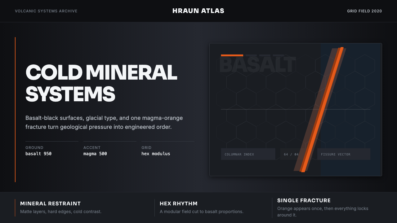 Icelandic Basalt VolcanoCold geology, engineered. Basalt black, Sora type, and one magma fissure hold…
 Linear 2024Precision down to the millisecond. Near-black, indigo-violet accents, Inter D…
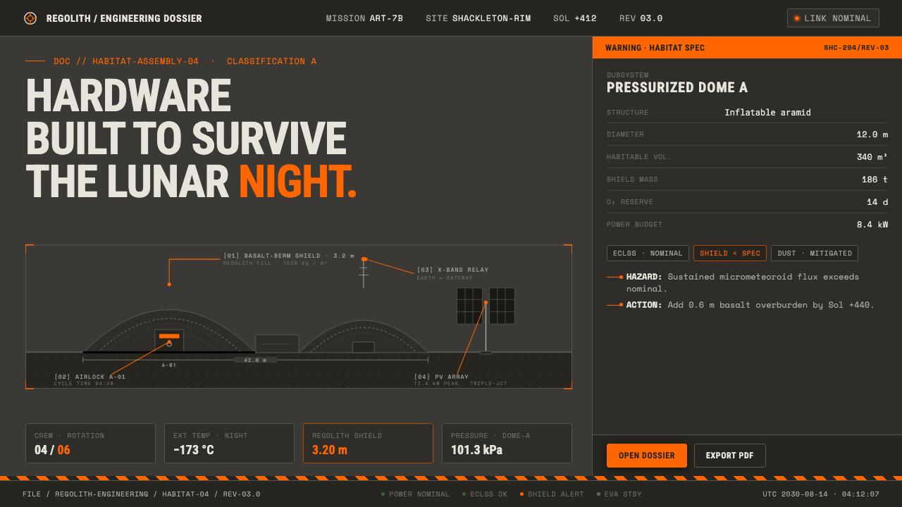 Lunar Base 2030Hardware built to survive the lunar night. Regolith gray, ANSI hazard orange,…
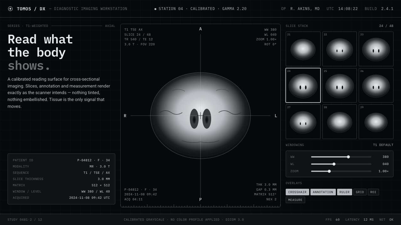 MRI ScanReads like a radiology viewport. Tissue-gray tomograms on pure black, IBM Ple…
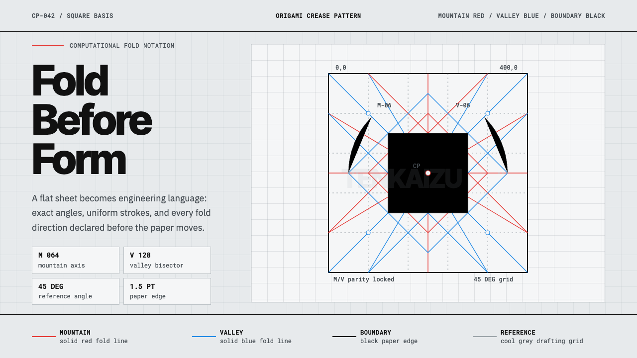 Origami Crease PatternPrecision is the brand. Red and blue fold lines map a cool grey drafting latt…