What is Origami Crease Pattern?
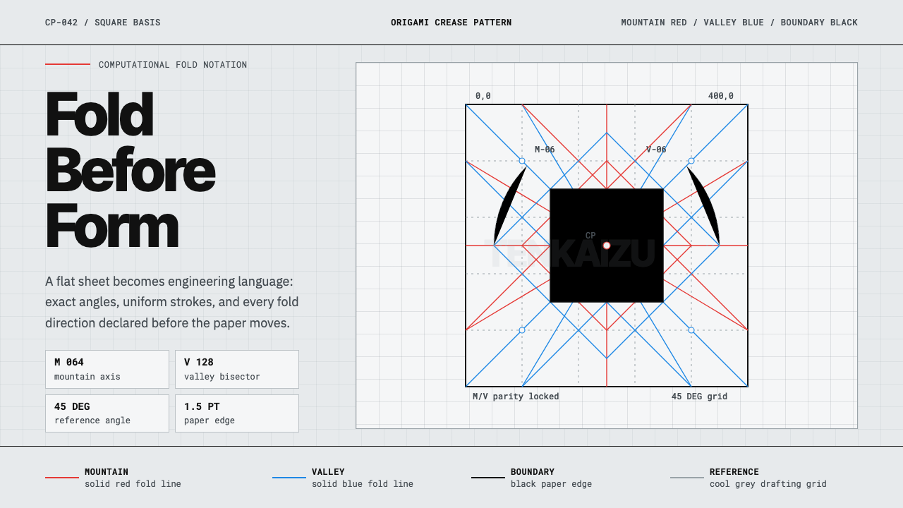
Origami Crease Pattern turns the folding blueprint of a paper model — every mountain and valley line mapped before a single fold — into a cool, exact drafting system read like an engineering diagram rather than a craft.
Origami Crease Pattern in brief
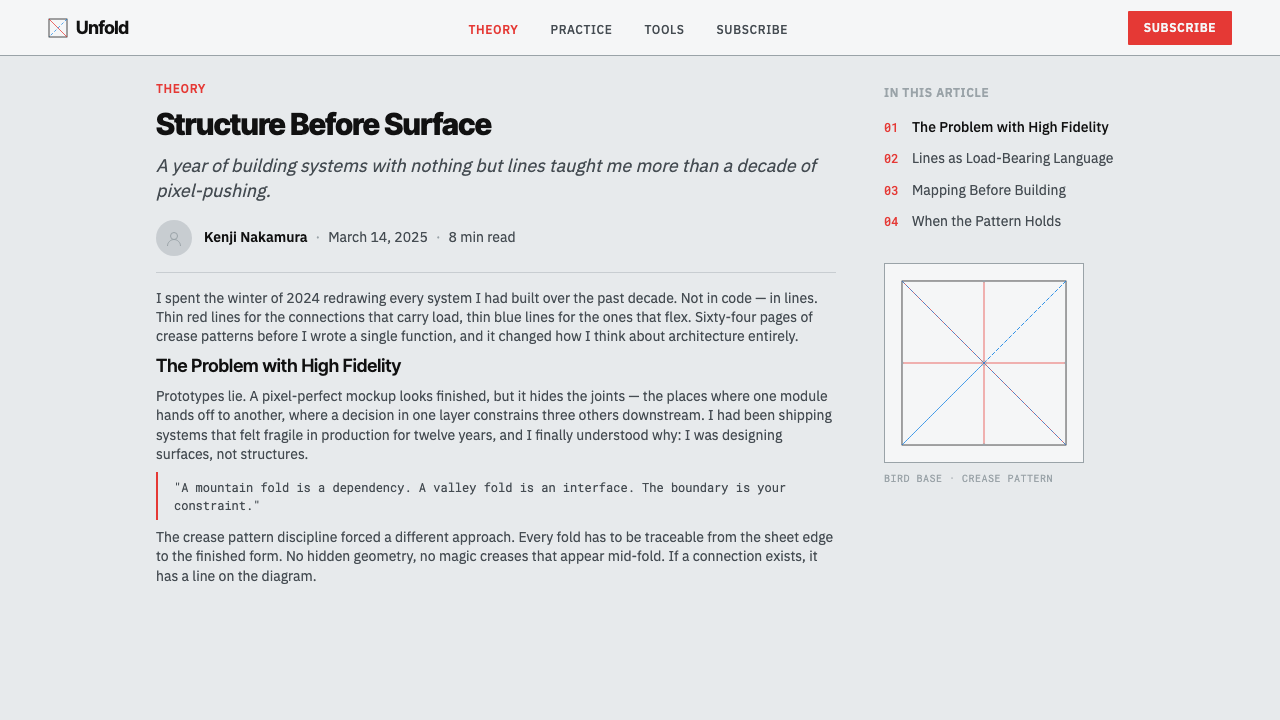
Origami Crease Pattern is a design system built from the crease pattern, or tenkaizu (展開図) — the flat diagram showing every fold line a piece of paper must receive to become a finished origami model, drawn out completely before any actual folding begins. It belongs to computational origami, the modern, software-assisted branch of paper-folding design where complex models are worked out mathematically on a flat plane first, then folded second.
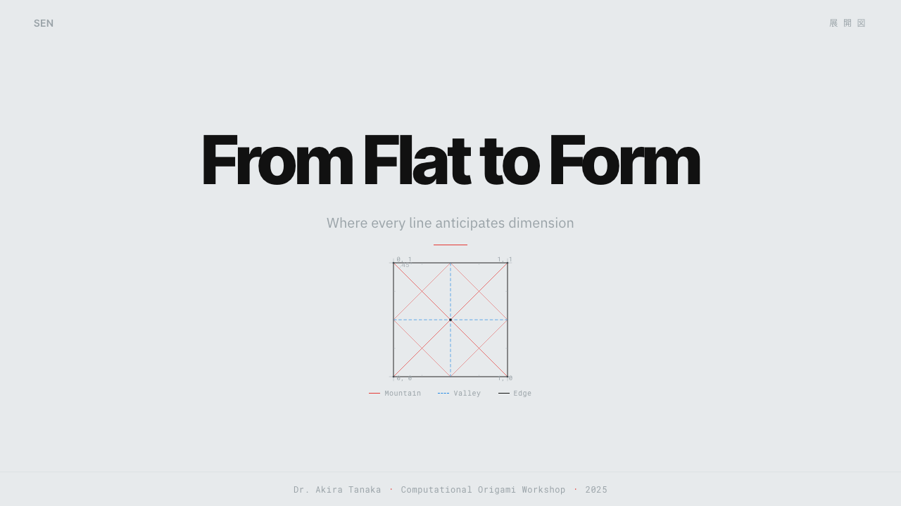
The visual grammar follows a strict software convention rather than an artistic one: mountain folds — creases that fold away from the viewer — are drawn in red, valley folds — creases that fold toward the viewer — are drawn in blue, and the outer boundary of the paper is drawn in black. This is not a stylistic choice but a notation standard, the same way a circuit diagram or architectural blueprint uses fixed symbols so that any trained reader can interpret the drawing correctly.
The ground itself is a near-white sheet shifted toward a faint, cool drafting grey, evoking technical paper rather than warm artist's stock. Lines are thin and perfectly uniform in weight, angles are exact rather than approximate, and small reference marks — the kind a drafter adds to note a measurement or a fold sequence — appear throughout. The overall effect is dense, mathematical, and entirely built from line: nothing is rendered as texture, shading, or illustration.
Where does Origami Crease Pattern come from?
Crease-pattern notation grew out of the broader history of origami as it moved from an oral, hands-on craft tradition into a subject that could be analyzed, taught, and eventually computed. For most of origami's long history, folding sequences were passed down through direct demonstration or, later, through step-by-step folding diagrams showing a model at each stage of construction. The crease pattern represents a different and more abstract kind of documentation: instead of showing the sequence of folds, it shows the complete, final map of every crease at once, the way a building's floor plan shows every wall regardless of the order in which they were built.
The step-by-step folding diagram itself — the more familiar numbered-arrow instructions most people associate with origami books — was substantially standardized by Akira Yoshizawa, the Japanese origami master widely credited with elevating folding from a children's pastime into a serious artistic and technical discipline in the twentieth century, working alongside the American writer Samuel L. Randlett, who helped codify and popularize the Yoshizawa-Randlett system of folding symbols internationally.
Crease-pattern notation itself matured later and separately, as origami designers began working out increasingly complex models — insects with many legs, dense multi-limbed creatures — that could no longer be practically taught step by step. Robert J. Lang, an American physicist and one of the most prominent figures in modern computational origami, was central to this shift: his work applies mathematical algorithms to derive the full crease pattern needed to fold a target shape, treating origami design as a problem in geometry and optimization rather than pure craft intuition.
This computational turn, which matured roughly from the 2010s onward as folding software became widely available, transformed the crease pattern from an internal working sketch into a finished, shareable artifact in its own right — a technical drawing precise enough that a sufficiently skilled folder could reconstruct an entire complex model from the pattern alone, without ever seeing a photograph of the finished piece.
This shift also changed who a crease pattern was made for. Earlier folding notation was written primarily for beginners and hobbyists learning a specific model step by step. Crease patterns, by contrast, are written for an audience that already understands the notation and wants the complete geometric truth of a design in one glance — closer to how an engineer reads a schematic than how a hobbyist reads an instruction booklet. That shift in audience is part of why the style reads as cool and technical rather than warm and instructional.
What defines the Origami Crease Pattern look?
Mountain and Valley Notation
The system's most fundamental rule is color-coded fold direction: red lines mark mountain folds, blue lines mark valley folds, following the standard convention used across computational origami software and diagrams. This is a functional notation, not a decorative palette — swapping the colors would break the diagram's meaning entirely.
Black Boundary
The outer silhouette of the paper is always traced in solid black, distinguishing the sheet's physical edge from the internal fold lines. This boundary anchors the whole composition, giving every crease pattern the same recognizable frame regardless of how complex the internal geometry becomes.
Cool Drafting Ground
The background sits near-white but shifted toward a faint cool grey, evoking technical drafting paper rather than warm craft stock. This subtle coolness keeps the system feeling engineered and precise rather than handmade, reinforcing the diagram's identity as a mathematical document.
Uniform Thin Line Weight
Every line in the system — mountain, valley, or boundary — is drawn at the same thin, exact weight, with no variation for emphasis or hierarchy. Hierarchy is carried entirely by color and position, not by line thickness, keeping the drawing as clean and unambiguous as a technical schematic requires.
Exact Angles and Geometry
Fold lines meet at mathematically precise angles rather than approximate hand-drawn ones, reflecting the system's roots in computational, algorithm-derived design. The resulting lattice of intersecting lines is dense but never arbitrary — every intersection corresponds to an actual geometric requirement of the folded form.
Reference Markers
Small marks — the kind a drafter would use to note a measurement point, a fold sequence number, or a reference axis — appear throughout the pattern. These markers reinforce the system's identity as functional documentation meant to be read and executed, not merely admired as an abstract pattern.

Who shaped Origami Crease Pattern?
An American physicist and one of the most prominent figures in modern computational origami, whose mathematical algorithms for deriving a full crease pattern from a target folded shape turned crease-pattern design into a rigorous, computable discipline rather than a matter of trial and error.
The Japanese origami master widely credited with elevating paper folding into a serious artistic and technical discipline in the twentieth century, whose folding notation laid the groundwork that later, more complex crease-pattern documentation would build upon.
An American writer who helped codify and popularize the Yoshizawa-Randlett system of folding symbols internationally, establishing the standardized visual vocabulary — including the mountain-and-valley fold distinction — that crease-pattern notation later built upon.
How do you use Origami Crease Pattern today?
Origami Crease Pattern reads as engineering drafting rather than craft, and applying it well means keeping every line functional and exact — nothing should be added purely for visual richness, since the system's identity depends on looking like a document meant to be executed, not admired.
On presentation slide covers, the style suits a composition built from a dense lattice of red and blue lines converging toward a title set in a plain, technical typeface, evoking a diagram about to be folded into shape. Content slides should use the mountain-valley color code functionally — red and blue reserved specifically for two contrasting categories of information, such as increases versus decreases, rather than used decoratively. Data visuals suit the style particularly well: a line chart or network diagram rendered in the same thin uniform red-and-blue lines on cool grey looks entirely at home in this system.
For web interfaces, the palette and precision suit technical products — developer tools, engineering dashboards, CAD-adjacent software — where the goal is to signal rigor and exactness. A near-white, cool-grey ground with red and blue reserved strictly for two specific interactive states (for example, an increase and a decrease, or an active and inactive toggle) keeps the coding meaningful rather than arbitrary. Because the system depends on restraint, it does not suit interfaces needing many simultaneous color-coded categories.
In editorial and marketing contexts, the style suits content about mathematics, engineering, design process, or origami itself, where the reader benefits from feeling they are looking at real working documentation. Long-form layouts can use thin rule lines in the same red-and-blue convention to mark structural divisions, and marketing pages should let the density of the lattice itself carry visual interest rather than adding illustration or photography on top of it.
The most common mistake is treating red and blue as a generic bold color accent rather than as functional notation — using them interchangeably, or applying them to decorative elements unrelated to any real fold-direction distinction. This breaks the system's core premise: every red or blue line should correspond to something a reader could genuinely interpret as a mountain or valley fold, the way a real crease pattern would.
Origami Crease Pattern — FAQ
Is a crease pattern the same thing as a step-by-step origami folding diagram?
No, they are two different kinds of documentation. A step-by-step folding diagram shows a model at each stage of construction, one fold at a time, in sequence — the format most origami books use. A crease pattern shows all fold lines at once, in their final complete state, without indicating the order in which they were folded. This makes crease patterns more compact and mathematically complete, but harder to follow for a beginner, since they require the reader to reconstruct the folding sequence themselves.
Why is the mountain-valley color code (red/blue) treated as a fixed rule rather than a style choice?
Because the entire point of a crease pattern is that it can be read unambiguously by anyone trained in the notation, the way a musical score or a circuit diagram can be. If red and blue were swapped arbitrarily from one pattern to the next, a folder would have no reliable way to know which lines to fold which direction, defeating the notation's purpose as a shared technical language across computational origami software and publications.
Can this style use a warm-toned paper background instead of cool grey?
It resists that direction, because the cool grey ground is specifically what signals technical drafting rather than craft or illustration. A warm-toned background would shift the associations toward traditional handmade origami paper or an art print, undermining the engineering, mathematical identity the system depends on. Where warmth is genuinely desired, it belongs to a different system — Origami Folded Paper, which is built around the physical paper object itself rather than its technical blueprint.
What kind of content should avoid this style?
The style is a poor match for anything that needs to feel warm, handmade, or emotionally expressive — craft brands, children's content, or products emphasizing organic texture will feel undercut by its cold, exact, diagrammatic quality. It also does not suit content where color needs to carry broad, varied emotional or categorical meaning, since the system's red-and-blue vocabulary is reserved specifically for the mountain-valley fold distinction and loses its logic if repurposed for anything else.
Related design styles
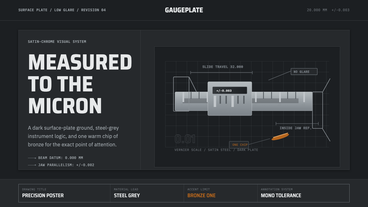 Caliper MachiningPrecision refuses drama. Steel-gray grid, mono tolerances, one bronze swarf a…
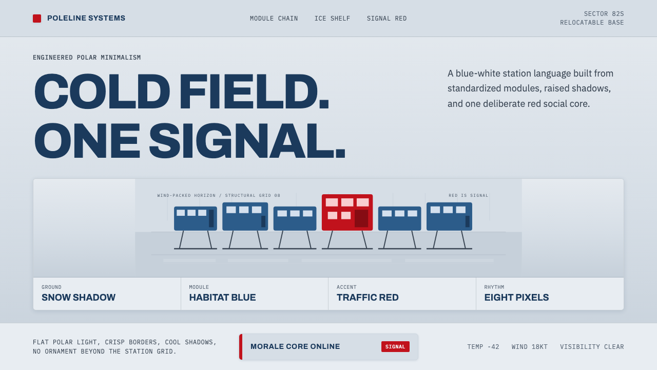 Antarctic StationCold precision, one red signal. Archivo modules ride a blue-white horizon gri…
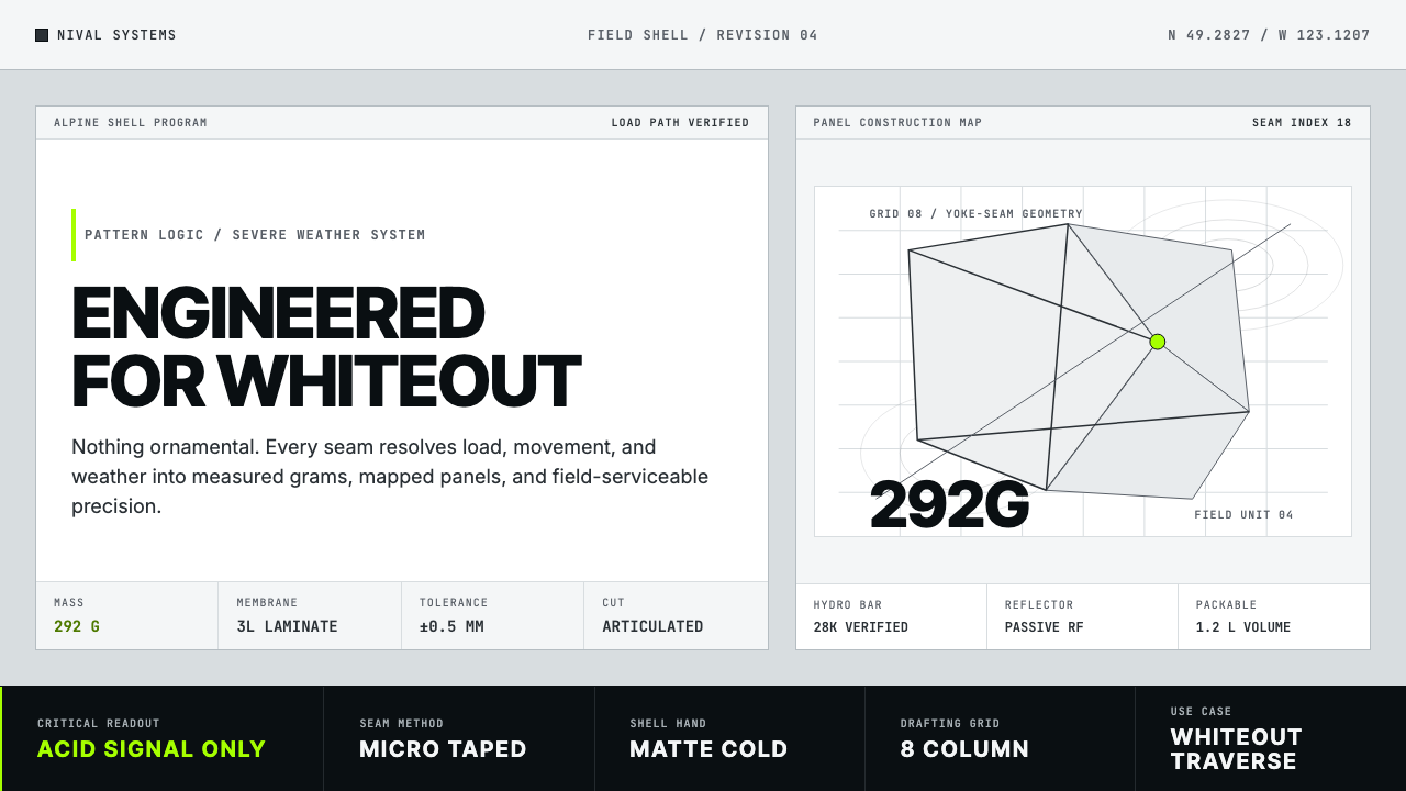 Arc'teryx Technical OutdoorEngineered, never ornamental. Glacier silver grid, mono specs, one acid-green…
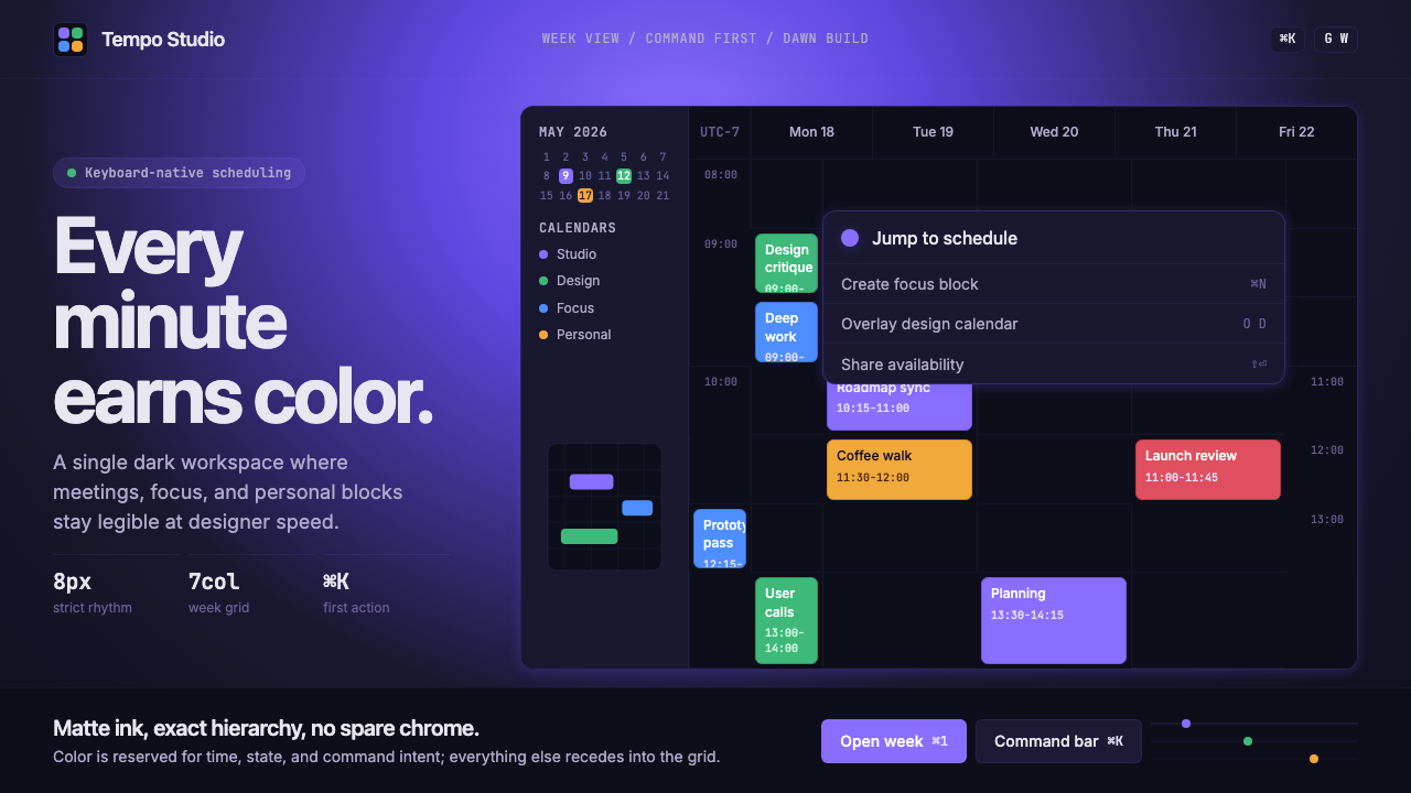 Cron CalendarDesigner-tech restraint. Purple wash, ink grid, mono shortcuts, surgical even…
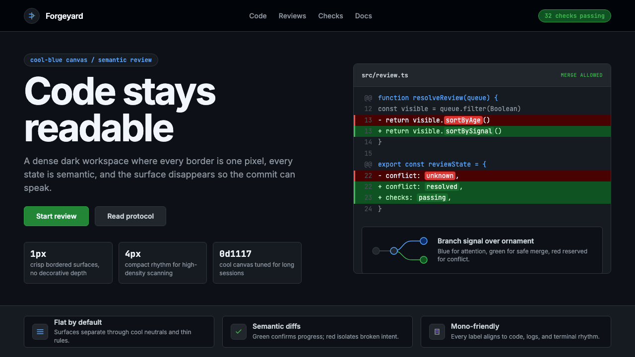 GitHub DarkCode-first darkness. Cool-blue canvas, 1px borders, green/red diff lines.
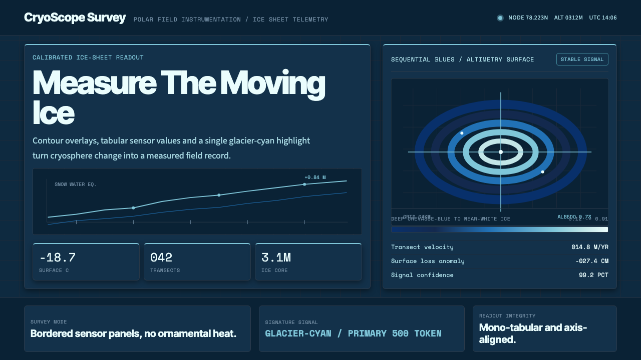 Glacier Arctic SurveyCold precision. Crevasse-blue panels, cyan readouts and contour grids calibra…