What is Foundry Industrial Gray?
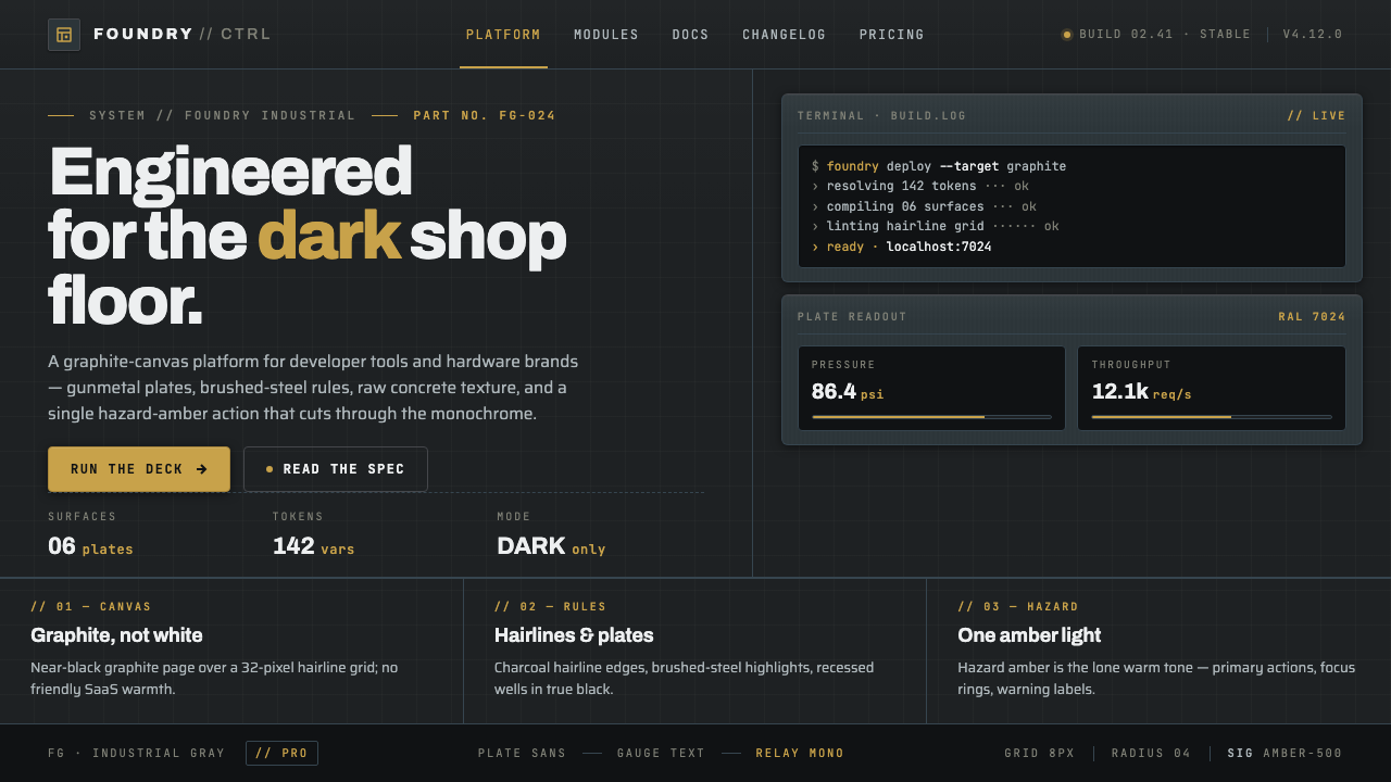
Foundry Industrial Gray turns the dark shop floor into an interface language—graphite fields, machined plates, technical type, and one hazard-amber signal cutting through the metal.
Foundry Industrial Gray in brief
Foundry Industrial Gray is a contemporary visual style for developer tools, hardware products, and technically positioned marketing sites. Its atmosphere begins with a near-black canvas built from gunmetal, graphite, and blackened iron rather than a single flat dark background. Raw concrete texture, brushed steel, and faintly varied surfaces give the page the character of a working facility: dense, controlled, and made for operation rather than display.
The style borrows from industrial control panels, machine housings, fabrication floors, and engineering documentation, but translates those references into a polished web language. Precise grid lines divide the field into plates and bays. Hairline rules suggest assembly seams. Panels appear machined, mounted, or bolted into place even when they are only visual blocks. The effect is not nostalgia for a factory; it is a declaration that the product is engineered, dependable, and ready for serious work.
Typography carries the same discipline. Slab or grotesk display type gives headlines a firm industrial presence, while mono labels make metadata, commands, statuses, and technical notes feel instrument-like. Most of the page remains restrained and monochrome. A single hazard-amber call to action provides the visual alarm: it is not decoration, but an operational signal that tells the viewer where action begins.
Where does Foundry Industrial Gray come from?
Foundry Industrial Gray belongs to the period from 2010 to the present, emerging within the global internet rather than from one national school or a single physical workshop. Its immediate setting is the modern landing page for developer tools and hardware: products are expected to appear capable, technical, and precise, while their websites must communicate complexity without becoming visually chaotic. Dark-mode product web design provided the environmental condition in which this language could become natural.
The style also draws from industrial and brutalist-influenced landing pages. Brutalist influence appears in the refusal to disguise structure: surfaces are allowed to feel heavy, grids remain visible, typography is direct, and content blocks behave like constructed objects. Industrial influence adds the vocabulary of gunmetal, concrete, brushed steel, blackened iron, machined plates, and hazard markings. Together they produce a visual system that feels less like a showroom and more like a control room built around a working machine.
Its typographic origin is equally important. Slab and grotesk display type provide the broad, load-bearing forms of the page, while mono typography introduces the voice of systems, terminals, measurements, and technical records. This slab-and-mono pairing creates a hierarchy between announcement and evidence: the display face states what the product is, while the mono label explains how the system identifies, organizes, or monitors it.
The named reference figures in the source material—Linear, Vercel, Raycast, and Teenage Engineering—place the style within a recognizable contemporary product-design conversation. They are associated here as reference points for the engineered, dark, technically articulate direction rather than as a claim that any one of them created the style. The broader movement is global and internet-native: a shared vocabulary of dark product interfaces, industrialized landing pages, and typography that treats software and hardware as things made with tools.
What defines the Foundry Industrial Gray look?
Graphite Atmosphere
The background is near-black but never visually empty. Gunmetal, graphite, blackened iron, and concrete-like gray create a layered field with restrained tonal variation. The darkness should feel like a material environment rather than a color preference: a shop floor after the lights have narrowed, a machine enclosure, or a panel lit by its own instruments. Light surfaces are reserved for emphasis, so every lighter plate, label, and line has operational presence.
Machined Plates
Content is organized as plates, bays, and instrument surfaces. Panels may sit against the graphite field with a subtle change in tone, a crisp edge, or a hairline rule that implies assembly. The visual language of a plate is useful because it gives information a physical location: a specification belongs on one surface, a status belongs on another, and a primary action reads like a marked control. Depth comes from adjacency and construction, not from soft atmospheric effects.
Technical Typography
Slab and grotesk display faces establish authority through broad, sturdy forms, while mono labels introduce a measured technical voice. Mono is most effective for short identifiers, statuses, navigation metadata, command-like language, and small annotations rather than long reading passages. The contrast between display and mono should clarify roles: the large face announces, the technical face qualifies, and ordinary supporting text remains quiet enough for sustained reading.
Grid Lines and Seams
The grid is visible enough to suggest precision but quiet enough not to compete with content. Lines can separate plates, align labels, mark transitions, or frame a technical diagram. Their character is hairline and exact, like a seam in fabricated metal. A strong composition lets these lines establish the logic of the page while avoiding a decorative lattice. Every visible rule should help the viewer understand grouping, direction, or hierarchy.
Hazard-Amber Action
Hazard amber is a signal color, not a general accent palette. It should identify the action with the greatest consequence or priority: launch, deploy, try, purchase, or enter the system. Against the graphite field, its warmth reads like a warning lamp or safety marker. The discipline lies in scarcity. If every link, badge, and illustration receives amber, the signal stops functioning and the page loses its industrial hierarchy.
Constructed Depth
Foundry Industrial Gray creates depth through stacking, edges, tonal planes, and alignment. A darker plate can recede beneath a lighter instrument surface; a rule can make a panel feel mounted; a tightly aligned label can make a card read like a calibrated module. The result should remain sharp and controlled. Excessive blur, decorative glow, or glossy effects change the reference from fabricated equipment to gaming spectacle, weakening the style's technical credibility.
Who shaped Foundry Industrial Gray?
Linear is named in the source material as a key figure associated with Foundry Industrial Gray. Within this reference set, it represents the style's relationship to developer-tool interfaces: dark operational surfaces, disciplined structure, technical labeling, and a product voice that treats software as an engineered system. Its relevance is as a contemporary reference point for the broader dark-mode product web movement.
Vercel appears in the source material as another key figure for this aesthetic. It belongs to the same global internet context in which developer infrastructure is presented through dark, precise, highly structured web surfaces. In a Foundry Industrial Gray treatment, this reference supports the use of graphite fields, visible alignment, mono metadata, and restrained signals that make technical capability feel immediate rather than ornamental.
Raycast is identified as a key figure in the supplied lineage of the style. Its place in that lineage reinforces the connection between dark product surfaces and command-oriented interaction. The resulting design vocabulary favors compact labels, clear states, strong panel boundaries, and a sense that the interface is waiting for an intentional instruction. Raycast therefore serves as a reference for the operational side of the aesthetic.
Teenage Engineering is named as a key figure alongside the developer-tool references, extending Foundry Industrial Gray toward hardware and industrial product expression. Its inclusion makes the material vocabulary especially important: metal, concrete, blackened surfaces, precise edges, and a deliberate relationship between object and control. In this context, hardware marketing can feel like a designed instrument panel rather than a conventional product catalog.
How do you use Foundry Industrial Gray today?
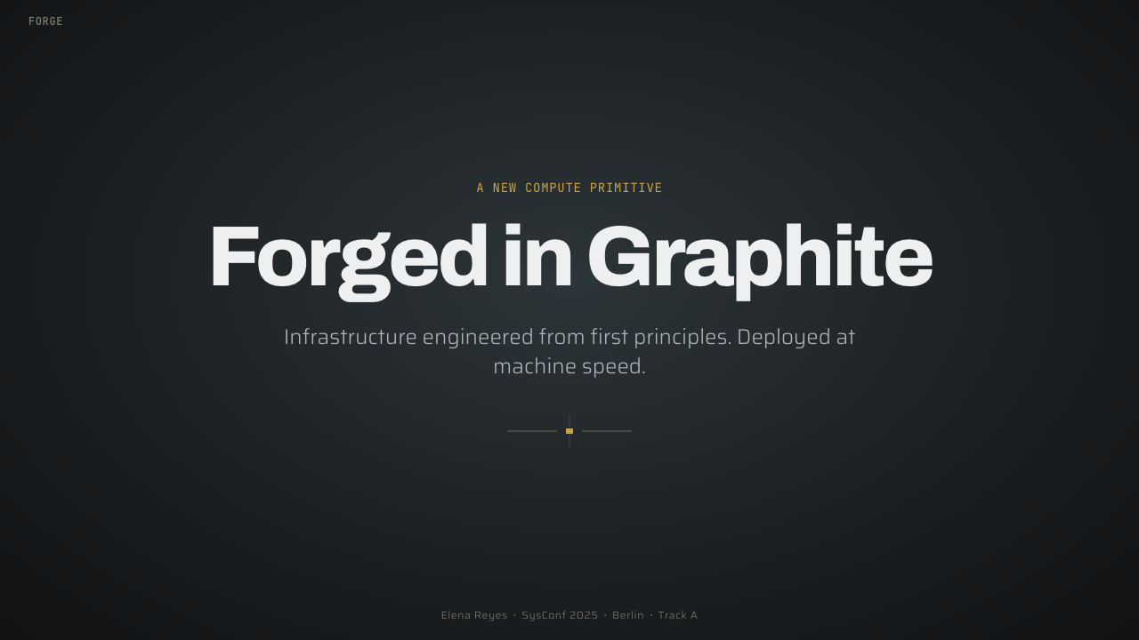
For presentation covers, Foundry Industrial Gray works best when the opening slide feels like the front plate of a machine. Use a deep graphite field, a strong slab or grotesk title, and a restrained technical label that establishes context. A thin grid, seam, or panel boundary can create the sense of a constructed surface. The cover should have one clear point of activation, usually an amber signal or short operational phrase. Content slides should then preserve the same system: dark plates for distinct topics, mono labels for metadata, and a firm typographic hierarchy that keeps dense technical material readable.
Data slides benefit from the style's control-panel logic. Charts should read as instruments rather than decoration, with clear axes, strong grouping, and a limited tonal range. Use amber only to identify the most important measure, change, or threshold; let the surrounding values remain in related grays so the signal remains legible. Tables, timelines, and system diagrams can use hairline rules and aligned columns to communicate precision. The danger is making every line equally prominent. A useful industrial panel has primary readings, secondary indicators, and quiet background structure.
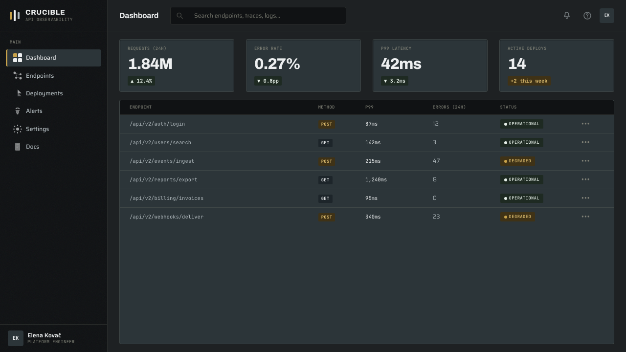
For web interfaces, the style suits developer dashboards, command surfaces, monitoring tools, deployment products, and technical pricing pages. Keep the main field near-black, separate functional regions through graphite plates, and use mono labels for status, plan metadata, or system terminology. Pricing tiers can be treated as distinct fabricated modules, with amber reserved for the recommended or highest-priority action. Buttons should feel like controls, inputs like instrument fields, and navigation like a clearly labeled panel rather than a decorative menu.
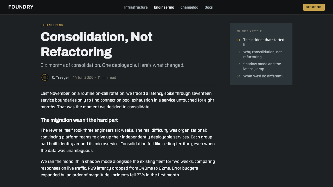
Editorial and marketing work can use Foundry Industrial Gray to make technical subjects feel substantial. An article layout may place a narrow reading column inside a wider field of metadata, diagrams, section rules, and material-like plates. Case studies can alternate between dense explanatory passages and schematic callouts. Marketing pages should let product claims sit against the dark material environment, then use one amber action to convert attention into movement. Photography or illustration, when present, should support the industrial vocabulary through equipment, surfaces, interfaces, or constructed geometry rather than introducing a disconnected lifestyle mood.
The common mistake is confusing industrial seriousness with visual overload. Adding more textures, more glowing edges, more amber accents, or more faux-metal effects does not make the page more engineered; it makes the hierarchy noisy. Another frequent error is using mono type for every piece of text, which turns technical distinction into monotony. The style depends on controlled contrast: material against text, display type against mono labels, dark plates against lighter readings, and one decisive action signal against a restrained field.
Foundry Industrial Gray — FAQ
Is Foundry Industrial Gray simply a dark mode theme?
No. Dark mode describes the broad condition of a dark interface, while Foundry Industrial Gray adds a specific material and structural language. Its field is built from graphite, gunmetal, concrete, brushed steel, and blackened iron. Its panels feel fabricated, its rules suggest seams, and its typography separates display announcements from mono technical information. A generic dark theme can be soft, minimal, or atmospheric; Foundry Industrial Gray should feel engineered and operational.
Why is the amber accent so restricted?
Because it functions as a hazard or activation signal. In an industrial environment, a warning color has meaning precisely because it is scarce. On this dark gray field, amber should identify the action or state that deserves immediate attention. If it is spread across every link, icon, badge, and decorative detail, it becomes an ordinary brand color and loses its operational force. Restraint makes the accent more visible and more useful.
Can the style be used for a light-background product?
It can be adapted, but the result will no longer express the style at full strength. The dark graphite canvas is not incidental; it establishes the visual conditions in which metal plates, restrained highlights, and hazard amber feel coherent. A lighter adaptation would need to preserve the deeper principles: constructed panels, precise alignment, slab or grotesk display type, mono technical labels, and a clear operational accent. Simply switching the background to white while keeping a few gray cards would produce a diluted industrial look.
Should every element have a metallic texture or border?
No. Material references work best when they establish a hierarchy rather than cover everything. A few carefully differentiated plates, a restrained concrete or steel surface, and selected hairline seams can make the whole page feel fabricated. If every element receives texture, beveling, or an outline, the interface becomes theatrical and difficult to scan. The style's credibility comes from the relationship between constructed surfaces and quiet negative space, not from applying industrial effects indiscriminately.
Where does Foundry Industrial Gray struggle?
It is strongest when the product values capability, control, precision, and technical seriousness. It may struggle when warmth, softness, sensory richness, or playful intimacy is central to the experience. A consumer product that depends on comfort or organic character could feel unnecessarily severe in this language. The style can also become intimidating if its dark surfaces, technical labels, and warning accent are used without enough explanatory content. The right question is whether the product genuinely benefits from an engineered, instrument-like identity.
Related design styles
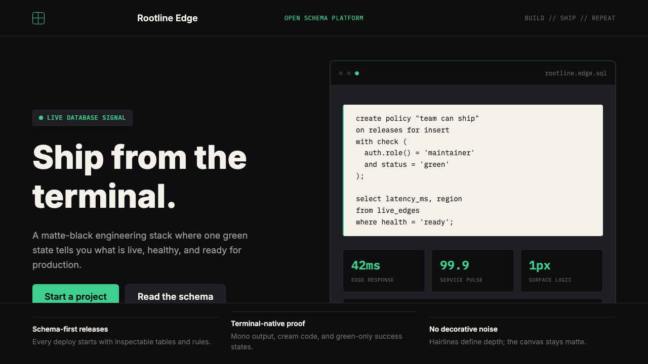 Supabase Postgres Green (2024)Midnight-terminal confidence. Matte black, Inter, mono code, and one electric…
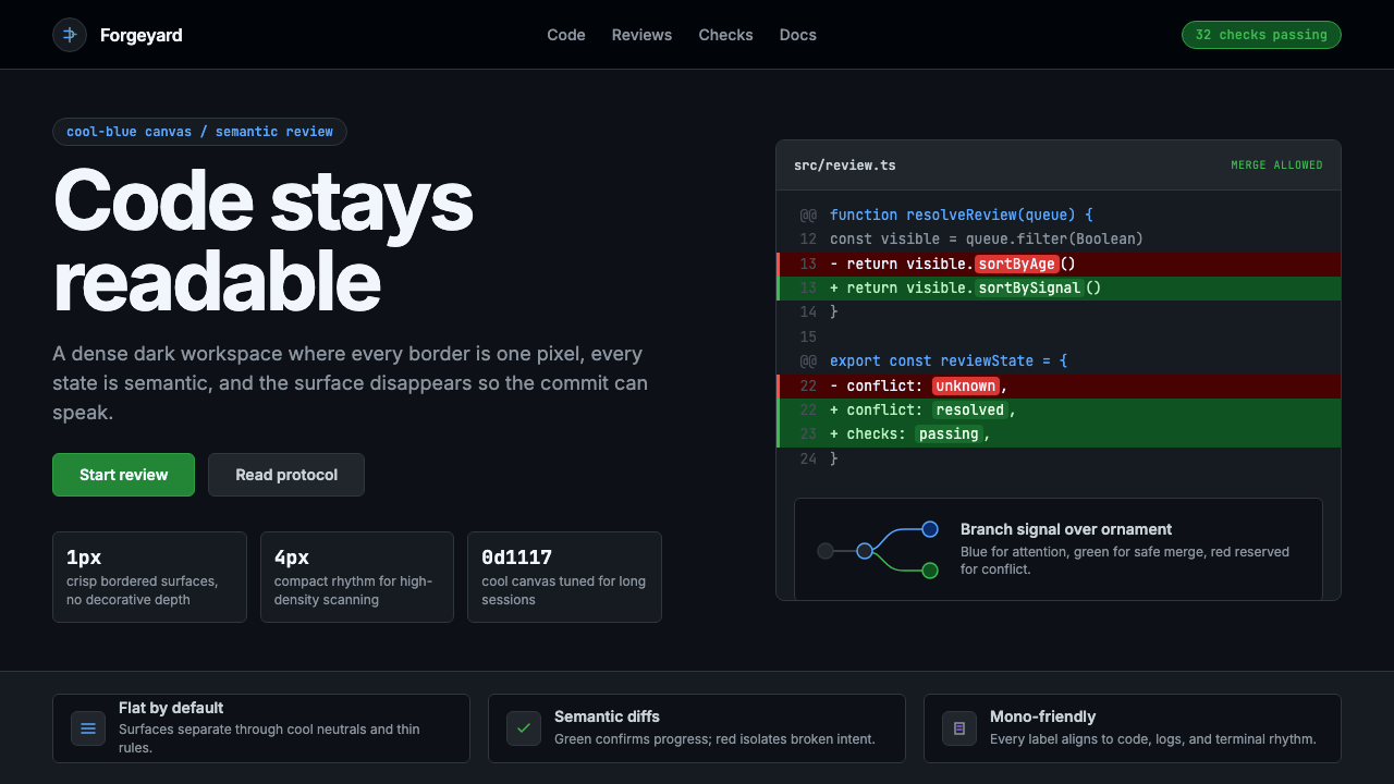 GitHub DarkCode-first darkness. Cool-blue canvas, 1px borders, green/red diff lines.
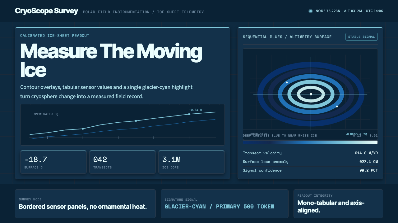 Glacier Arctic SurveyCold precision. Crevasse-blue panels, cyan readouts and contour grids calibra…
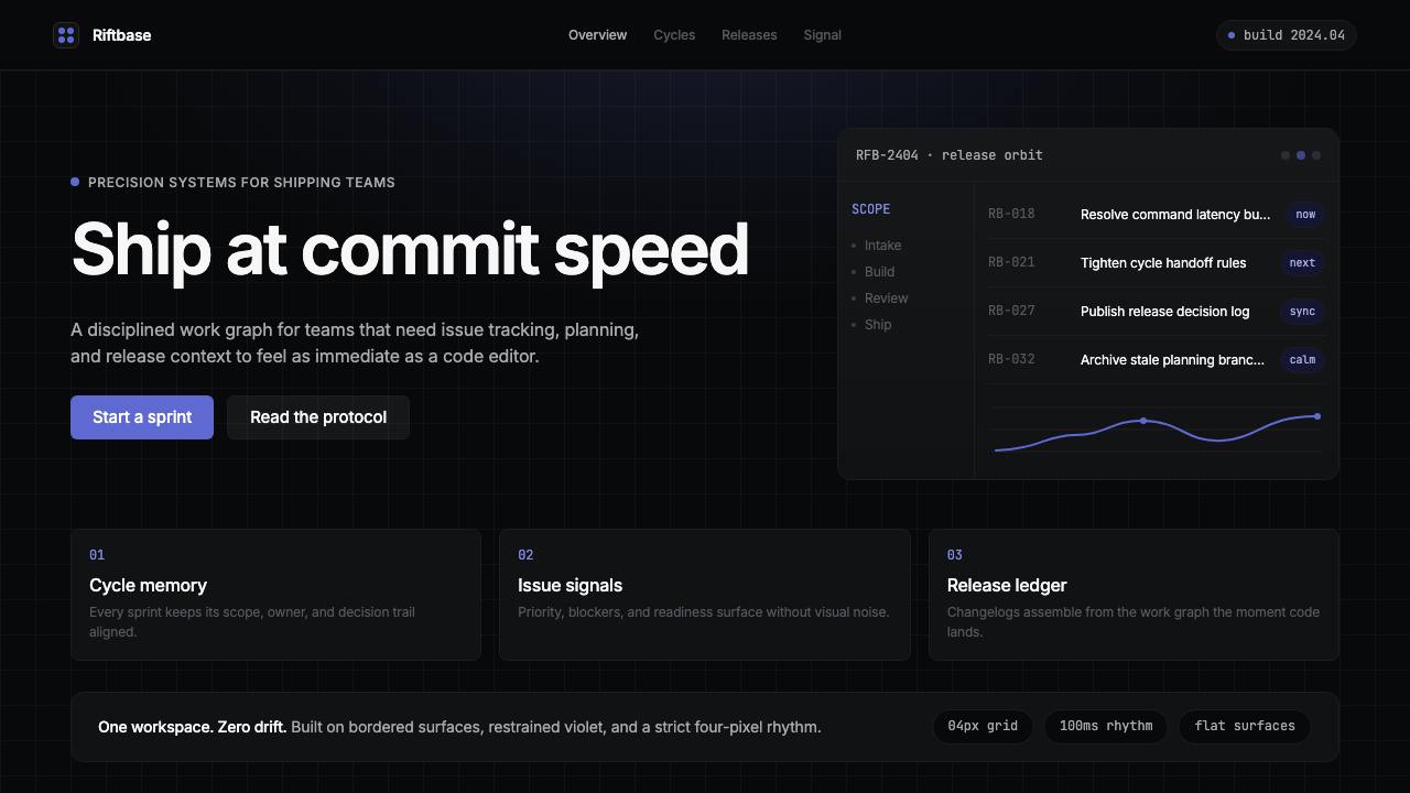 Linear 2024Precision down to the millisecond. Near-black, indigo-violet accents, Inter D…
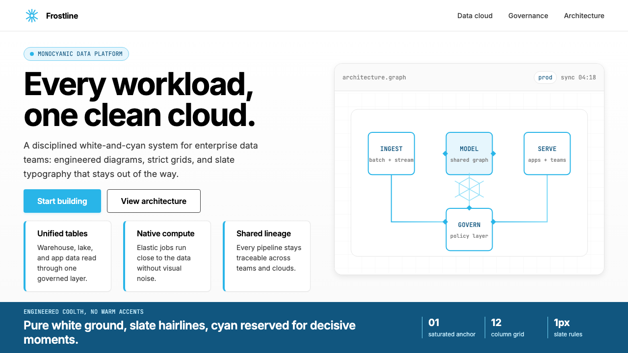 Snowflake Data CloudCool precision wins. Icy cyan, Inter grids, and hex data diagrams stay engine…
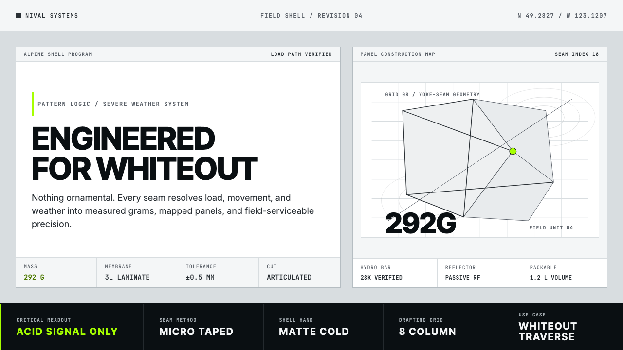 Arc'teryx Technical OutdoorEngineered, never ornamental. Glacier silver grid, mono specs, one acid-green…