What is Polish Milk Bar (PRL)?
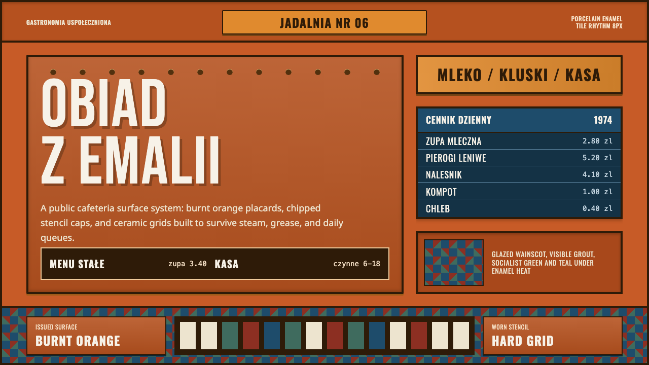
Polish Milk Bar (PRL) turns the chipped orange enamel signage of a socialist-era canteen into a design system — state frugality read as structure, not nostalgia.
Polish Milk Bar (PRL) in brief
This is a style built around a single physical fact: the bar mleczny, Poland's state-subsidized milk bar, announced itself not on paper but on vitreous enamel — sheets of metal fired with glass so the surface would survive decades of steam, grease, and scrubbing. The system takes that surface literally. Every panel reads as fired enamel or glazed geometric tile rather than print: a warm, slightly matte burnt-orange ground, chipped at the corners where the glass coat has flaked back to bare metal, carrying blocky stenciled capital letters that look cut from a template rather than drawn by hand.
Layout is unglamorous on purpose. Menus, price boards, and directional signs sit inside rigid grids, the kind a sign-painter would rule out with a straightedge and a fixed unit of measure, not the kind an art director would compose for drama. Lettering is condensed and heavy, built for legibility across a crowded serving hall rather than for elegance up close — every character slightly too wide for its stencil break, every line locked to the row below it.
Beneath the signage, a patterned wainscot runs like a dado rail: small glazed tiles in a repeating geometric pattern, institutional rather than decorative, the kind found in canteens, clinics, and transit halls across the socialist bloc. Color is never bright for its own sake — the orange is warm but tired, the whites are yellowed, the greens and browns that appear alongside it read as worn institutional paint rather than a chosen palette. Nothing in this system pretends to be new. Wear is not a flaw layered on top; it is the material telling you how long it has been in service.
Where does Polish Milk Bar (PRL) come from?
The bar mleczny belongs to a specific stretch of Polish history: the Polish People's Republic, or PRL (Polska Rzeczpospolita Ludowa), the socialist state that governed Poland from the years immediately following the Second World War until 1989–1990. Milk bars predated the PRL — some trace to charitable and cooperative canteens of the interwar period — but the socialist state adopted and multiplied them as a matter of policy, folding them into what was called gastronomia uspołeczniona, or socialized catering: a network of state-run eating establishments meant to feed ordinary citizens cheaply, quickly, and without ceremony.
Their social function was the point. A bar mleczny served simple, largely dairy-and-starch meals — pierogi, kluski, soups, milk-based dishes, hence the name — at prices set low enough that a factory worker, a student, or a pensioner could eat a full meal on almost no money. There was no waiter service, no menu design in the commercial sense, and often no real décor budget. What passed for branding was whatever the state sign-making apparatus could produce cheaply and durably: enameled placards, tiled surfaces, stenciled lettering applied by workshops that made identical signage for clinics, rail stations, and factory canteens as readily as for milk bars.
That sign-making tradition sits inside a broader current usually called socialist modernism: a utilitarian design language shared across the Eastern Bloc that valued standardization, durability, and legibility over ornament or individual authorship. Vitreous enamel was the material of choice precisely because it was industrial rather than artisanal — mass-produced sheet steel, glazed and fired at scale, resistant to weather and scrubbing, cheap to reproduce identically across hundreds of state institutions. The aesthetic that resulted was not designed to look distinctive; it was designed to be interchangeable, which is exactly what gives it its unmistakable, unified look in hindsight.
Milk bars survived the fall of the PRL more or less intact as an institution — a handful still operate in Polish cities today, some still carrying their original enamel signage, others restored with self-conscious nostalgia. But the visual language this system draws from belongs to the earlier decades: the everyday material culture of a planned economy, where a canteen sign, a clinic sign, and a factory sign were cut from the same cloth because they were, quite literally, produced by the same state workshops.
What defines the Polish Milk Bar (PRL) look?
Color
The signature ground is a warm, worn burnt orange — never a clean, saturated orange but one that reads as fired glass slightly dulled by decades of steam and light. It sits alongside institutional whites gone slightly yellow, and secondary tones of tired green or brown drawn from the same worn-paint family. Color here signals age and institution rather than mood or brand energy; it should always look like it was chosen by a state procurement list, not a stylist.
Surface
The ground is never treated as flat print or paper. Every panel should read as vitreous enamel or glazed ceramic tile — a hard, faintly reflective, fired surface, with visible chips at corners and edges where the glass coat has worn through to bare metal beneath. This is the system's most important discipline: color and texture together must communicate a physical, fired material, not an ink or a screen.
Typography
Lettering is blocky, condensed, and stenciled — built from the kind of interrupted strokes a physical stencil template produces, with small gaps where the cutting bridges would sit. Letterforms favor capitals over lowercase, width over elegance, and a slightly uneven hand-applied feel over machine precision. Nothing here should look like a refined display typeface; it should look like it was cut from sheet metal by a sign shop.
Grid
Layout follows a rigid, unglamorous grid — the kind ruled out with a straightedge for maximum legibility across a crowded room, not composed for visual interest. Rows of information stack directly on top of one another with consistent divisions; there is no asymmetric tension or deliberate imbalance. The grid's job is to be read quickly by a tired queue of people, not to be admired.
Wear and patina
Age is structural, not decorative. Chips in the enamel expose bare or rusted metal beneath; paint on the wainscot fades unevenly; corners round off from decades of contact. This wear should always be applied consistently with how a real fired surface degrades — at edges, corners, and high-touch points first — never as a random distressed-texture overlay dropped uniformly across a panel.
Wainscot pattern
Below the main signage, a band of small repeating glazed tiles functions like a dado rail — a low, utilitarian pattern shared with clinics, transit halls, and factory canteens of the same era. The pattern is modest and geometric, never ornamental in a decorative-arts sense; it exists to be scrubbed clean, not admired, and should always sit as a supporting band rather than a focal element.
Institutional restraint
Nothing in this system is designed to persuade or delight in the commercial sense. There is no hierarchy of charm, no friendly rounded corners, no inviting imagery — only the flat, necessary communication of a state canteen telling a queue of people what is available and what it costs. That restraint, applied consistently, is what keeps the style from sliding into kitsch decoration.
Who shaped Polish Milk Bar (PRL)?
This was the state administrative structure that ran milk bars alongside cafeterias, workplace canteens, and other subsidized eating establishments across the PRL. Rather than individual restaurateurs or designers, it was this bureaucratic network — standardizing menus, pricing, and signage across thousands of locations — that produced the shared, anonymous visual language this style draws from.
Beyond the central administrative apparatus, individual state-run canteens, workplace cafeterias, and cooperative eateries each carried the same enamel-and-tile visual kit, reproduced by regional sign-making workshops. Their collective, repeated use of identical materials — rather than any single designer's hand — is what gives the aesthetic its consistency across the whole PRL era.
A broader design current shared across socialist Eastern Europe from the 1950s onward, valuing standardization, industrial materials, and legibility over ornament or individual authorship. Milk-bar signage is one small, everyday expression of this larger movement, which also produced the era's public housing, transit systems, and civic architecture.
An industrial craft tradition — glazing and firing glass onto sheet steel — used across Europe from the late nineteenth century onward for durable outdoor and public signage, from railway placards to advertising plaques. The PRL's catering institutions inherited and mass-adopted this technique specifically for its durability and low unit cost at scale, which is why it survives, chipped but legible, on many milk-bar facades today.
How do you use Polish Milk Bar (PRL) today?
This style transfers well because its logic is material rather than decorative: once you treat every surface as fired enamel or glazed tile rather than flat print, the rest of the system — color, lettering, grid, wear — follows from that one commitment. Applying it well means resisting the urge to clean it up; the worn, institutional quality is the entire point, not a flaw to be smoothed over.
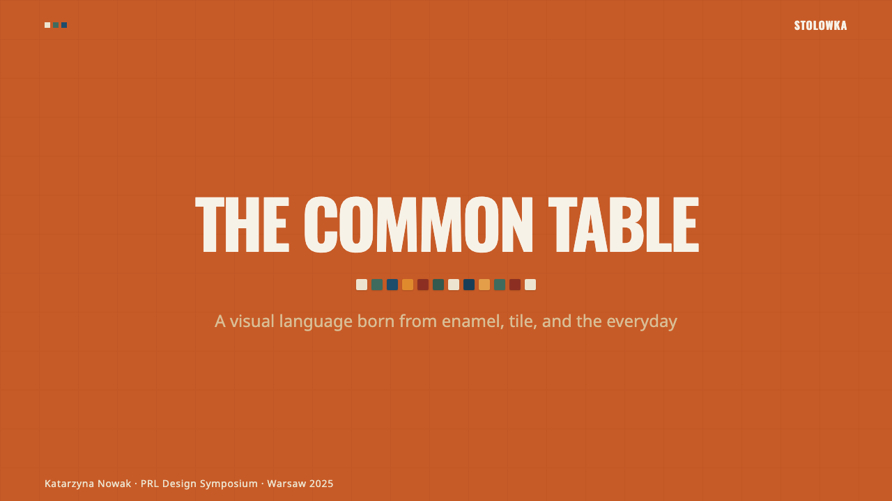
On presentation slides, a cover benefits from a full-bleed enamel-plaque treatment: burnt-orange ground, a chipped corner or two, condensed stenciled type for the title set dead-center or hard-left in a rigid block. Content slides should behave like a canteen price board — rows of information locked to a strict grid, no soft dividers, section headers rendered as if stamped rather than typeset. Data should be shown plainly, as a numbered list or simple table rather than a decorative chart, in keeping with a system that never dressed anything up.
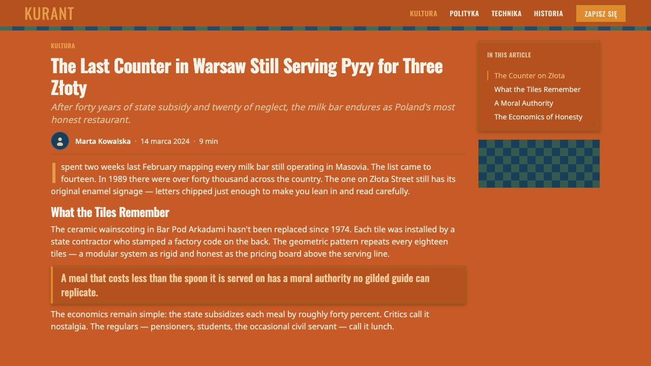
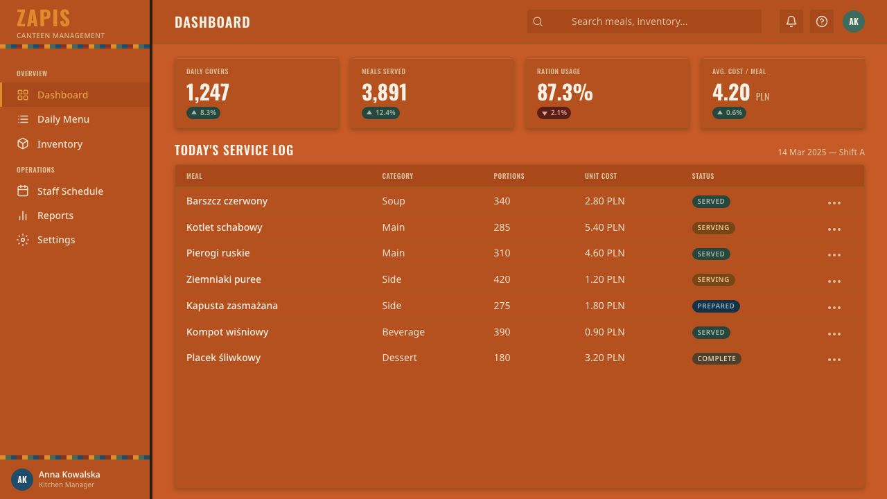
For web interfaces, the style suits dashboards, internal tools, and pricing pages that want to read as no-nonsense and durable rather than polished. Use the burnt-orange ground sparingly, as a header band or key accent rather than wall-to-wall color; keep body content on the worn institutional whites; render buttons and tabs as blocky, stenciled labels rather than soft rounded pills. A thin tiled pattern can anchor a footer or sidebar the way a wainscot anchors a room, without competing with the main content above it.
In editorial and marketing contexts, the style works best when it is allowed to feel like signage rather than illustration — pull-quotes rendered as enamel placards, section breaks marked by a stenciled numeral rather than a decorative rule, imagery treated as photographs of worn surfaces rather than clean vector graphics. It reads as authentic and unpretentious, which suits food culture, history, and civic storytelling far better than luxury or lifestyle contexts.
The most common mistake is making the style too polished — rendering the orange as a clean, glossy brand color, giving the lettering crisp machine-perfect edges, or skipping the chips and unevenness that make the surface believable. Treated that way, it collapses into a generic warm-orange theme with no connection to its source. The orange should always behave like structural signage material, not a decorative accent color chosen for warmth; the wear should always look earned, never applied as a filter.
Polish Milk Bar (PRL) — FAQ
What's the difference between this style and a generic "retro orange" theme?
A generic retro-orange theme treats orange as a mood — warm, nostalgic, cheerful. This style treats orange as a material fact: it is the color of fired vitreous enamel, chipped and worn from decades of use in a specific institutional context. The difference shows up in the details that surround the color — stenciled condensed lettering, rigid utilitarian grids, tiled wainscot bands, visible wear at edges — none of which a generic retro palette would include on its own.
Should the wear and chipping be applied evenly across a whole design?
No. Real enamel wears unevenly — corners, edges, and high-contact points degrade first, while the center of a panel tends to stay more intact. Applying an even distressed texture across an entire surface reads as a filter rather than a material, and undermines the physical believability the whole system depends on. Concentrate wear at edges, corners, and points a hand or cart would repeatedly touch.
Can this style work with bright, high-saturation orange instead of the muted burnt tone?
It works against the system rather than with it. A bright, saturated orange reads as a modern brand color — energetic, decorative, chosen for shelf appeal. The muted, slightly dulled burnt-orange tone is what signals fired enamel that has spent decades under steam and light. Pushing the saturation up collapses the material illusion and the whole reference back to state-issued signage.
What kind of content or products does this style suit best?
It suits food and hospitality branding with an honest, unpretentious angle; history, heritage, and civic-storytelling content; and any product that wants to signal durability, plainness, and no-nonsense function over polish — internal tools, utilitarian dashboards, archival projects. It struggles in luxury, wellness, or lifestyle contexts where the whole point is to look expensive or aspirational rather than worn and institutional.
How should typography be handled if the target medium can't render a true stencil break?
Lean on weight, width, and case instead: choose a heavy, condensed, all-capitals treatment with slightly generous letter spacing, and let the enamel-and-chip surface behind it carry the material signal. A blocky condensed capital letterform without a literal stencil gap still reads as institutional signage far more than a refined display face would; the stencil break is a bonus detail, not the load-bearing element.
Related design styles
 Mod Scooter ChromeSharp chrome discipline. Steel ground, roundel targets, condensed type, mirro…
 Soviet Space ProgramHeroic by construction. Red fields, gold stars, black keylines, and diagonal…
 Matchbox LabelPropaganda for the pocket. Flat orange-red-yellow spot inks on dark slate, co…
 Muhammad Ali Fight Poster (1965)Type does the fighting. Blood red and dead black collide in a stacked letterp…
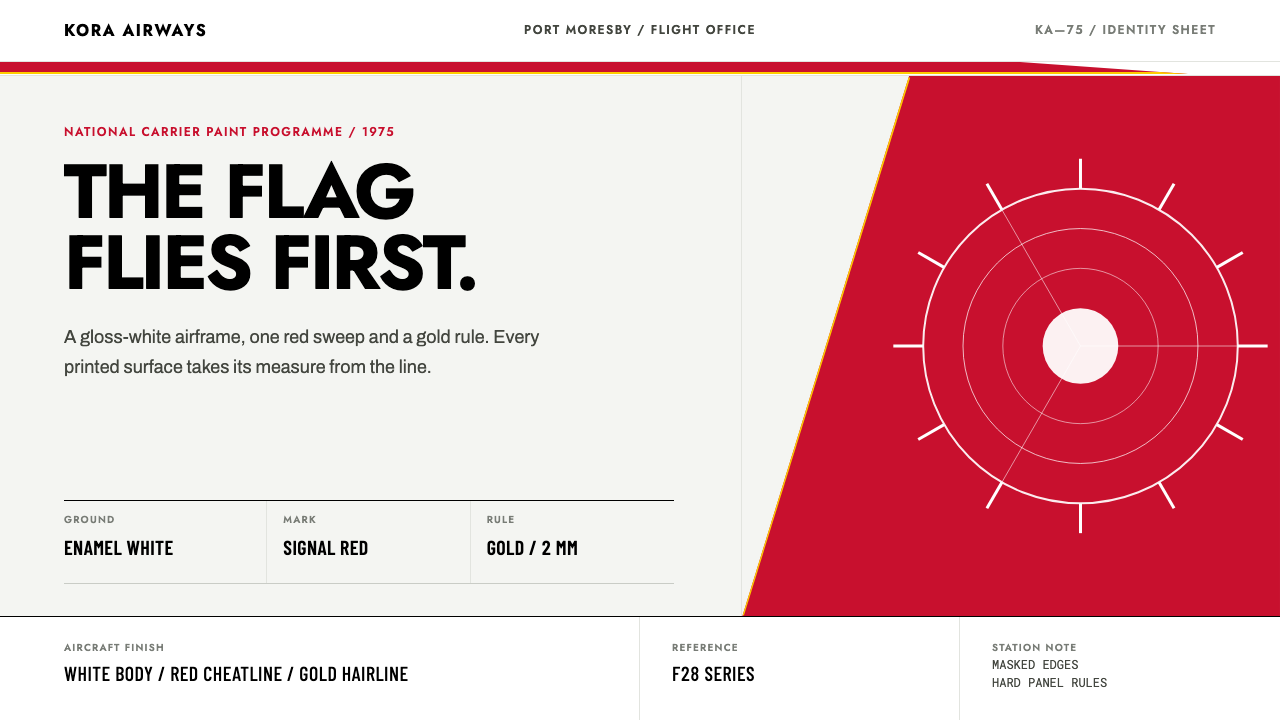 Air Niugini Livery 1975A flag engineered for flight. Signal red sweeps across enamel white, underlin…
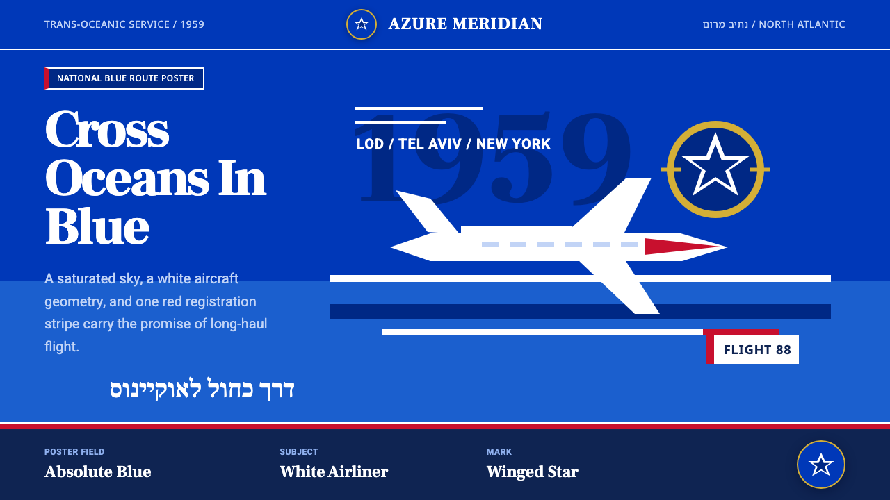 El Al Israel AirlinesNational blue takes command. White aircraft geometry cuts a flat jet-age post…