What is Punk Xerox 1977?什么是 Punk Xerox 1977?
Punk Xerox 1977 is the aesthetic of deliberate degradation — ransom-note letters, torn edges, and screaming color photocopied until every surface becomes an act of refusal.朋克复印机1977是蓄意降解的美学——勒索信字母、撕裂边缘、在尖叫的色彩中反复复印,直到每一个表面都成为一次拒绝的姿态。
Punk Xerox 1977 in briefPunk Xerox 1977 速览
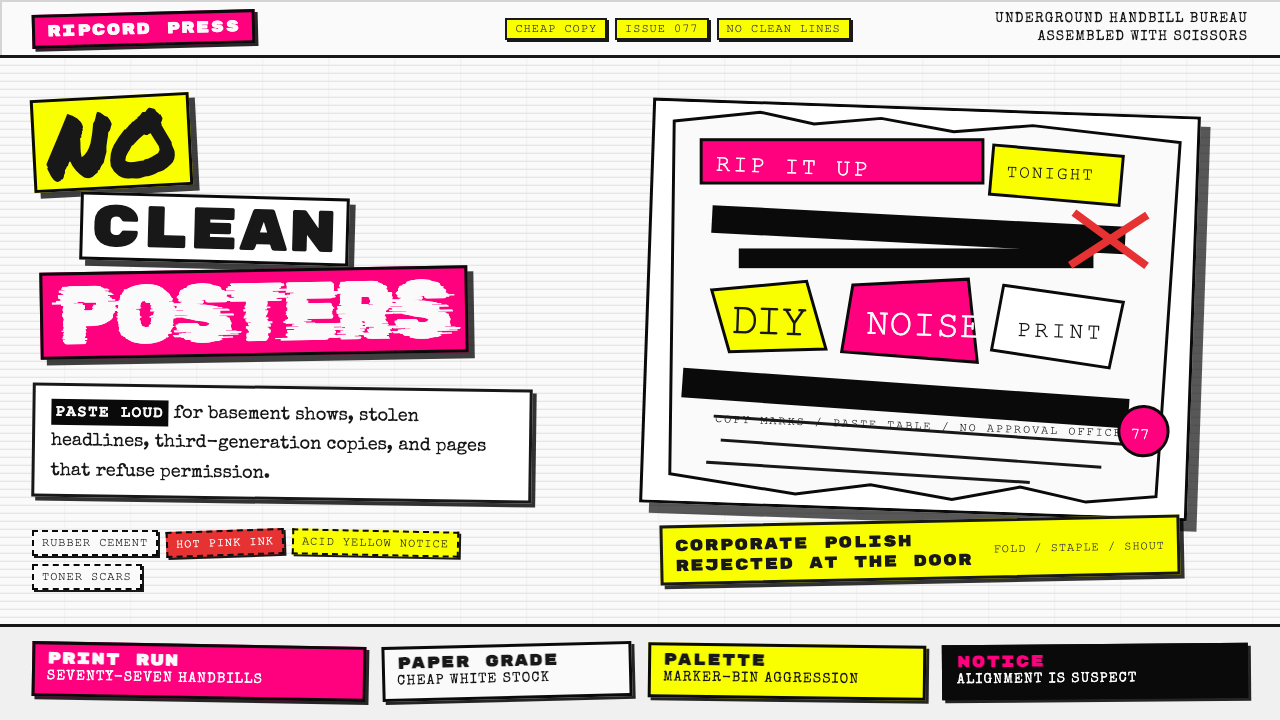
Punk Xerox 1977 is the visual language born in London's underground music scene between 1976 and 1980, assembled from photocopier output, cut magazines, rubber cement, and the confrontational energy of a youth culture explicitly rejecting polished commercial aesthetics. Every letter is a different size. Every edge is torn or cut unevenly. Every surface carries the visible grain of reproduction — the streaks, the skewed angles, the black halos of a Xerox machine pushed past its intended purpose.朋克复印机1977是诞生于1976至1980年间伦敦地下音乐圈的视觉语言,由复印机输出、剪切的杂志、橡皮胶水,以及一种明确拒绝精致商业美学的青年文化的对抗能量拼贴而成。每个字母大小不一,每条边缘都被撕裂或不均匀地剪开,每个表面都留有再生产的可见颗粒感——复印机被推离其本来用途时产生的条纹、倾斜角度与黑色光晕。
The core visual logic is the inverse of professional design: quality is not the goal, rawness is. Where corporate graphics of the era sought smooth gradients, aligned grids, and consistent typography, Punk Xerox assembled mismatched clippings from newspapers and magazines into ransom-note compositions where the act of cutting and pasting was itself made visible. Hot pink and acid yellow — the cheapest, loudest inks available — collided against stark white or off-white paper. Black was used heavily for photocopied newsprint clippings, crude hand-lettering, and confrontational imagery.其核心视觉逻辑是专业设计的逆面:目标不是品质,而是粗粝。彼时企业图形追求平滑渐变、对齐网格与一致排版,朋克复印机则将来自报纸与杂志的不匹配剪报拼贴成勒索信式的构图,令剪切与粘贴的行为本身清晰可见。荧光粉红与酸性黄——最廉价、最刺眼的油墨色——在素白或泛黄的纸张上正面碰撞。黑色被大量用于复印报纸剪报、粗犷手写字,以及具有对抗性的图像。
This is anti-design made deliberate and coherent. The aesthetic communicates urgency and authenticity precisely because it refuses the conventions that signal expertise. It says: this was made by someone with scissors and a coin-operated photocopier, and that is the point. The roughness is the message.这是被蓄意化为连贯系统的反设计。这种美学能够传递紧迫感与真实性,恰恰是因为它拒绝了那些通常用以标示专业能力的约定俗成。它所说的是:这是某个人用剪刀和投币式复印机做出来的,而这正是全部意义所在。粗糙就是信息本身。
See the Punk Xerox 1977 design system查看 Punk Xerox 1977 完整设计系统
Where does Punk Xerox 1977 come from?Punk Xerox 1977 从何而来?
The aesthetic has a precise historical origin. In 1976, graphic artist Jamie Reid began creating artwork for the Sex Pistols, a London punk band managed by Malcolm McLaren. Reid drew on the Situationist International — a French political art movement — particularly their practice of détournement: taking existing imagery from consumer culture and subverting it to produce a critical message. His most iconic work defaced official portraits of Queen Elizabeth II with ransom-note lettering, transforming a symbol of institutional authority into a vehicle for confrontation. These images, reproduced cheaply and distributed as flyers, posters, and record sleeves, established the visual grammar of punk.这种美学有着精确的历史起源。1976年,平面艺术家杰米·里德开始为伦敦朋克乐队性手枪创作视觉作品,该乐队由马尔科姆·麦克拉伦担任经理人。里德的灵感来源于情境主义国际——一个法国政治艺术运动,尤其是其「异轨」实践:截取消费文化中的既有图像并对其进行颠覆,以产生批判性信息。他最具代表性的作品用勒索信式字母涂污了伊丽莎白二世女王的官方肖像,将一个制度权威的象征转化为对抗的载体。这些图像以低成本复制,以传单、海报和唱片封套的形式广泛传播,确立了朋克的视觉语法。
The Xerox machine was not incidental to the movement — it was its infrastructure. In an era before desktop publishing, the photocopier offered instant, cheap, infinitely reproducible output. Punk musicians, artists, and fans used it to produce fanzines (self-published fan magazines), gig flyers, and political manifestos. Each generation of photocopying degraded the image slightly: contrast increased, halftones collapsed into solid black, thin lines disappeared. Rather than treating this degradation as a defect, punk aesthetics embraced it as a quality — proof of circulation, of hands passing the object along, of information spreading outside official channels.复印机对于这场运动并非偶然存在——它是这场运动的基础设施。在桌面出版普及之前,复印机提供了即时、廉价、可无限复制的输出。朋克音乐人、艺术家和乐迷用它制作同人志(自出版的粉丝杂志)、演出传单和政治宣言。每经过一代复印,图像就轻微降解一次:对比度增加,半色调崩溃为实心黑色,细线消失。朋克美学没有将这种降解视为缺陷,而是将其拥抱为一种品质——证明了流通的痕迹,证明了物品在一双双手中传递,证明了信息在官方渠道之外扩散。
Parallel scenes developed simultaneously in New York City and Los Angeles. New York punk, centered on CBGB and associated with bands like Television, Talking Heads, and the Ramones, produced its own graphic culture — slightly cleaner than London punk but sharing the cut-and-paste immediacy and the rejection of commercial finish. The Los Angeles hardcore scene in the late 1970s and early 1980s produced some of the most aggressive graphic work of the period, with bands and labels pushing the degraded aesthetic toward maximum visual compression and illegibility.平行的场景在纽约和洛杉矶同步发展。以CBGB为中心、与电视乐队、谈话头和雷蒙斯等乐队相关联的纽约朋克,产生了自己的平面文化——比伦敦朋克略显整洁,但同样具有剪切粘贴的即时感和对商业精修的拒绝。七十年代末至八十年代初的洛杉矶硬核场景则产生了这一时期最具攻击性的平面作品,乐队和厂牌将降解美学推向极度的视觉压缩与难以辨读。
The movement also drew from design history in ways its practitioners often did not consciously acknowledge. The cut-up technique had precedents in Dada collage of the 1910s and 1920s — Hannah Höch's photomontages, Raoul Hausmann's typographic experiments — and in Beat generation cut-up writing methods. What punk added was mass distribution via photocopy, an explicitly anti-commercial ethic, and a specific sonic and subcultural context that gave the visual language its meaning. By 1980, the aesthetic had been extensively documented and was beginning its long second life as a reference style for designers who came after.这场运动还以实践者们往往未曾有意识承认的方式从设计史中汲取营养。剪切技法在二十世纪一二十年代达达主义拼贴中有着先例——汉娜·霍赫的摄影蒙太奇、劳尔·豪斯曼的排版实验——也在垮掉一代的文字剪切写作方法中留有印记。朋克所添加的,是通过复印机实现的大规模传播、明确的反商业伦理,以及赋予这套视觉语言以意义的特定声音与亚文化语境。到1980年,这种美学已被大量记录,并开始了其漫长的第二生命——作为后来设计师们的参照风格。
What defines the Punk Xerox 1977 look?Punk Xerox 1977 的视觉特征是什么?
Color色彩
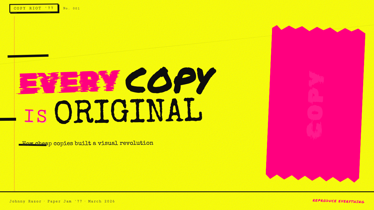
The palette is deliberately aggressive and limited: hot pink and acid yellow are the signature hues, chosen because they were the cheapest and most attention-demanding colors available for offset printing and screen printing on a budget. Black appears heavily — not as an elegant neutral but as the raw output of photocopied newsprint and crude hand-lettering. White or off-white paper provides the ground. These colors do not harmonize; they clash, and the clash is the point. Secondary or muted tones are conspicuously absent — every color choice reads as a shout rather than a suggestion.色板是蓄意激进且有限的:荧光粉红与酸性黄是标志性色调,被选择是因为它们是廉价胶印与低成本丝网印刷中能获得的最廉价、最抓眼球的颜色。黑色大量出现——不作为优雅的中性色,而是作为复印报纸和粗犷手写字的原始输出。白色或泛黄的纸张提供底面。这些颜色并不和谐,它们相互碰撞,而碰撞本身就是目的。次级色或柔和色调明显缺席——每一个色彩选择都像是一声嘶吼,而非一种暗示。
Typography字体排印
The ransom-note approach to type is the movement's most recognizable characteristic: letters sourced from different publications, at different sizes, in different typefaces, cut individually and pasted together to form words and sentences. No two letters share the same baseline. No two words share the same weight or style. This typographic cacophony is both the aesthetic and the communicative strategy — it signals that the message was assembled urgently, with whatever materials were at hand, and that the content matters more than its presentation. Hand-lettering appears alongside clipped letterforms, sometimes in the same word.勒索信式排版是这场运动最具辨识度的特征:字母来源于不同出版物,大小各异,字体各异,被逐一剪下并粘贴在一起,构成词语和句子。没有两个字母共享同一基线,没有两个词语拥有相同的字重或风格。这种排版上的喧嚣既是美学,也是传达策略——它表明这条信息是在紧迫中拼凑而成的,用的是手头任何可用的材料,内容的分量远比其呈现方式更重要。手写字与剪切字母并排出现,有时甚至在同一个词中混用。
Surface Degradation表面降解
Photocopying introduces visible artifacts: grain, streaks, halo effects around dark areas, contrast compression, and the slight skewing that results from paper fed imprecisely. Punk Xerox aesthetics treat all of these as features rather than failures. Multiple generations of copying — photocopying a photocopy — produce progressively more distorted, higher-contrast, more grainy images. This deliberate degradation signals authenticity and circulation: the rougher the surface, the more hands it has passed through, the more real it is. Clean, smooth reproduction is associated with corporate production and therefore rejected.复印会引入可见的痕迹:颗粒感、条纹、暗色区域周围的光晕效应、对比度压缩,以及纸张送入不精确时产生的轻微倾斜。朋克复印机美学将所有这些视为特征而非缺陷。多代复印——复印一份复印件——产生出逐渐更加失真、对比度更高、颗粒感更强的图像。这种蓄意的降解传递真实性与流通感:表面越粗糙,经过的手越多,它就越真实。清晰、光滑的复制与企业生产相关联,因此遭到拒绝。
Collage and Cut-and-Paste拼贴与剪切粘贴
Composition is assembled rather than designed. Images, headlines, and blocks of text are cut from existing sources — newspapers, magazines, official documents, advertising materials — and repositioned to create new meanings through juxtaposition. The cut edges are left visible; the seams between elements are not concealed. Torn paper edges appear alongside straight cuts, creating irregular silhouettes. This process makes the act of production visible and legible as a physical, manual act, which is inseparable from the movement's anti-corporate, DIY ethic.构图是被拼装出来的,而非被设计出来的。图像、标题和文字块从现有来源剪取——报纸、杂志、官方文件、广告材料——并被重新定位,通过并置创造新的意义。剪切边缘保持可见,元素之间的接缝不加掩盖。撕裂的纸张边缘与直线剪切并排出现,形成不规则的轮廓。这一过程使生产行为作为一种物理的、手工的行为清晰可见,与这场运动反企业、自己动手的伦理不可分割。
Confrontational Imagery对抗性图像
Subject matter is deliberately provocative: defaced portraits of authority figures, consumer imagery stripped of its original context and reframed as critique, symbols of institutional power subjected to graphic violence — overprinted, slashed, obscured. Images are not used to illustrate or decorate; they are used to create cognitive friction. The viewer is meant to be unsettled, not comforted. This confrontational relationship with imagery distinguishes Punk Xerox from later styles that borrow its surface texture while stripping away the critical content.题材是蓄意挑衅的:被涂污的权威人物肖像、被剥离原始语境并重新框定为批判的消费品图像、制度权力的象征遭受图形暴力——被叠印、被划破、被遮蔽。图像不用于图解或装饰,而是用于制造认知摩擦。观者应该感到不安,而非得到安慰。这种与图像的对抗性关系,使朋克复印机有别于后来那些借用其表面质感却剥离批判性内容的风格。
Illegibility as Intent难以辨读作为意图
Punk Xerox does not optimize for readability. Text is sometimes overprinted on busy backgrounds, rotated to unexpected angles, sized so small as to require effort, or set in such extreme contrast that it becomes difficult to parse. This is not carelessness but strategy: illegibility demands active engagement from the reader, filters out passive audiences, and signals that the work exists outside mainstream communication conventions. The degree of illegibility varies — some pieces prioritize a single legible slogan against chaotic background noise, others make even the central message effortful to extract.朋克复印机不以可读性为优化目标。文字有时叠印在繁杂的背景上,被旋转到意想不到的角度,字号小到需要费力辨认,或被设置在极度对比中以至于难以解读。这不是粗心,而是策略:难以辨读要求读者主动参与,过滤掉被动的受众,并表明这件作品存在于主流传播约定之外。难以辨读的程度因作品而异——有些作品将单一清晰的口号置于混乱的背景噪音中突出显示,另一些则连核心信息的提取都需要耗费气力。
DIY Material Evidence自制材料的痕迹
The materials of production are never concealed — they are displayed. Rubber cement bleed-through, fingerprints transferred onto the original before copying, tape residue, the shadows cast by layers of pasted paper — all remain in the final image. This material evidence is proof of process and of the absence of professional mediation. A piece that looks too clean, too precisely cut, or too evenly reproduced loses authenticity within this aesthetic system. The visible trace of human hands making the object is, paradoxically, what gives it authority.生产材料从不被掩盖——它们被展示出来。橡皮胶水渗透的痕迹、复印前留在原件上的指印、胶带残留、粘贴纸张的层次投下的阴影——所有这些都留在最终图像中。这些物质证据是过程的证明,也是专业中介缺席的证明。在这套美学体系中,看起来过于整洁、剪切过于精确或复制过于均匀的作品会失去真实性。人手制作这件物品时留下的可见痕迹,悖论式地赋予了它权威性。
See the Punk Xerox 1977 design system查看 Punk Xerox 1977 完整设计系统
Who shaped Punk Xerox 1977?谁塑造了 Punk Xerox 1977?
Reid is the defining visual architect of punk graphics. His work for the Sex Pistols — including the safety-pin-and-ransom-type treatment of the Queen's portrait for the 'God Save the Queen' single, and the collaged sleeve for 'Never Mind the Bollocks' — established the visual template that defined the movement internationally. Reid's approach was rooted in Situationist politics: he saw visual art not as a commercial service but as a tool for ideological disruption. His practice of defacing existing imagery rather than creating original illustration was both politically motivated and economically practical — it required no specialist equipment, only scissors and a photocopier.里德是朋克视觉设计最重要的奠基者。他为性手枪创作的作品——包括为单曲《上帝保佑女王》以安全别针与勒索信排版处理女王肖像,以及为《管他妈的》专辑制作的拼贴封套——确立了在国际上定义这场运动的视觉模板。里德的方法植根于情境主义政治:他将视觉艺术视为意识形态颠覆的工具,而非商业服务。他涂污既有图像而非创作原始插图的实践,既出于政治动机,也出于经济实用性——它不需要任何专业设备,只需剪刀与复印机。
Garrett was the graphic designer for Manchester post-punk bands Buzzcocks and Magazine, and his work represents a more formally sophisticated strain of punk graphic design that operated alongside and after the raw Xerox moment. Working from the late 1970s, Garrett absorbed the collage aesthetics and typographic disorder of punk and began formalizing them — introducing more systematic grid structures beneath the surface chaos, and treating found imagery and layered type as design elements to be composed rather than simply assembled. His work documents the transition from first-generation punk graphics to the post-punk design language that influenced British graphic design through the 1980s.加勒特是曼彻斯特后朋克乐队嗡嗡鸡与杂志的平面设计师,他的作品代表了一种更具形式复杂性的朋克平面设计流派,与原始复印机时刻并行发展、并在其之后延续。从七十年代末开始工作,加勒特吸收了朋克的拼贴美学与排版混乱,并开始将其形式化——在表面混乱之下引入更系统的网格结构,将找到的图像和叠加的字体视为需要被构建而非仅仅被拼装的设计元素。他的作品记录了从第一代朋克平面设计向后朋克设计语言的过渡,这种语言在整个八十年代影响了英国平面设计。
Sterling — who worked under the name Linder — was a visual artist and musician closely associated with the Manchester punk scene and the band Buzzcocks. Her photomontage work, which juxtaposed domestic consumer imagery (food, household objects) with fragmented female bodies from soft-focus advertising, represented punk's most direct engagement with feminist critique through collage. Her covers for Buzzcocks singles extended the cut-and-paste vocabulary into territory that was simultaneously more formally composed and more conceptually layered than straight Xerox punk. Sterling's work is a reminder that the aesthetic had multiple intellectual strands, not all of them reducible to raw aggression.斯特林——以林德之名工作——是与曼彻斯特朋克场景和嗡嗡鸡乐队密切相关的视觉艺术家与音乐人。她的摄影蒙太奇作品将家用消费品图像(食物、日常用品)与来自柔焦广告的女性身体碎片并置,代表了朋克通过拼贴进行女性主义批判的最直接介入。她为嗡嗡鸡单曲创作的封套将剪切粘贴词汇延伸进了比纯粹复印机朋克在形式上更为构建、在概念上更为多层次的领域。斯特林的作品提醒我们:这种美学有着多条智识脉络,并非都可简化为原始的攻击性。
Bubbles — the working name of designer Colin Fulcher — was one of the most formally inventive designers working in the punk and post-punk orbit, producing work for Stiff Records, Elvis Costello, and Ian Dury and the Blockheads. His practice was distinctive in its range: he absorbed punk's collage energy and typographic anarchism but applied it with a knowledge of design history — Constructivism, Dadaism, Art Deco — that produced work of unusual sophistication. His record sleeve designs often operated as sequential works, with back and inner sleeves extending the typographic and visual system established on the front cover. Bubbles demonstrates that punk graphic design could be simultaneously anti-establishment and deeply historically literate.巴布尔斯——设计师科林·富尔彻的工作名——是在朋克与后朋克轨道内工作的形式上最富创造力的设计师之一,为硬气唱片、埃尔维斯·科斯特洛,以及伊恩·杜里与障碍乐队创作作品。他的实践以其广度而显著:他吸收了朋克的拼贴能量与排版无政府主义,但以对设计史的了解加以应用——构成主义、达达主义、装饰艺术——产生了异乎寻常的复杂性。他的唱片封套设计常作为序列性作品运作,背面与内页封套延续封面确立的排版与视觉系统。巴布尔斯证明,朋克平面设计可以同时是反建制的,又是在历史上高度博学的。
Perry was the creator of Sniffin' Glue, widely regarded as the first British punk fanzine, launched in July 1976 and produced for roughly a year before he folded it. Sniffin' Glue was produced entirely by hand — handwritten text, cut-and-paste images, run off on a photocopier — and distributed through record shops and at gigs. Its graphic quality was emphatically amateur: crooked columns, uneven margins, text running into images, pages assembled without any pretense of professional layout. But this amateur quality was the point: Perry demonstrated that anyone with a photocopier and something to say could produce a publication, democratizing media production in a way that anticipated desktop publishing by nearly a decade.佩里是《嗅胶水》的创始人,这份刊物被广泛认为是英国第一份朋克同人志,于1976年7月创刊,大约出版一年后停刊。《嗅胶水》完全手工制作——手写文字、剪切粘贴图像、在复印机上印出——通过唱片店和演出现场发行。其视觉品质明确带有业余性:歪斜的栏目、不均匀的页边距、文字与图像相互侵入、页面拼装时没有任何专业版面的自欺欺人。但这种业余品质正是重点所在:佩里证明,任何拥有复印机并有话要说的人都可以出版一份刊物,以比桌面出版提前近十年的方式使媒体生产民主化。
How do you use Punk Xerox 1977 today?今天怎么用 Punk Xerox 1977?
Punk Xerox 1977 is a high-signal aesthetic: applied correctly, it communicates urgency, authenticity, and a deliberate rejection of corporate polish. Applied carelessly, it reads as mere chaos or unfinished work. The key is understanding that the original aesthetic was purposeful in its disorder — every torn edge, every mismatched letter, every overexposed image was the result of choices made under constraints, not the absence of choices. Contemporary use must replicate that purposefulness, even when the constraints themselves are artificial.朋克复印机1977是一种高信号强度的美学:应用得当,它传递紧迫感、真实性,以及对企业精修风格的蓄意拒绝。应用草率,则会被解读为纯粹的混乱或未完成的作品。关键在于理解:原始美学的失序是有目的的——每一条撕裂的边缘、每一个不匹配的字母、每一张过曝的图像,都是在约束条件下做出的选择,而非选择的缺席。当代运用必须复制这种目的性,即使约束条件本身是人为制造的。
For presentation slides, Punk Xerox works most effectively on cover and section-break pages where a strong tonal statement is needed. A cover built on this aesthetic uses a dramatically cropped or degraded image — high contrast, stripped of midtones, given visible grain — combined with ransom-note title lettering where each word is set in a different weight and scale. The background should be raw white or near-white; color appears in isolated, flat bursts of hot pink or acid yellow rather than as wash. Content slides, if they must follow this cover system, should be treated as deliberate reductions — one concept per page, large text, minimal elements, with roughness preserved through intentional asymmetry and uneven spacing rather than through literal photocopier artifacts.对于演示文稿,朋克复印机在封面与章节分隔页上最为有效——那些需要强烈基调声明的地方。基于这种美学构建的封面使用戏剧性裁切或降解的图像——高对比度,去除中间调,带有可见颗粒感——配合勒索信式的标题字母,每个词都以不同的字重和比例呈现。背景应为原始白色或接近白色;色彩以荧光粉红或酸性黄的孤立、平面的爆发出现,而非作为底色渲染。如果内容页必须延续这套封面系统,应被视为蓄意的精简——每页一个概念,大号文字,极简元素,通过刻意的不对称和不均匀间距而非字面意义上的复印机痕迹来保留粗粝感。
For web interfaces, the style is best suited to landing pages and editorial contexts rather than functional dashboards. A Punk Xerox landing page works when the brand proposition is specifically about independence, anti-establishment positioning, authenticity, or disruption. The implementation uses raw white backgrounds, typographic hierarchy built from extreme scale contrast (a massive headline alongside very small body text), flat hot-pink or acid-yellow accent elements used sparingly, and border or outline treatments that appear hand-drawn or rough-edged rather than precisely rendered. Navigation should be sparse and typographic; interactive states can use color as a sudden, jarring switch rather than a smooth transition.对于网页界面,这种风格最适合落地页和编辑性语境,而非功能性仪表板。当品牌主张明确关于独立性、反建制定位、真实性或颠覆性时,朋克复印机落地页才会奏效。实施方式是:原始白色背景,通过极端比例对比构建的排版层级(巨大的标题旁边是极小的正文),荧光粉红或酸性黄的平面强调元素被克制使用,边框或轮廓处理呈现手绘或粗糙边缘的感觉而非精确渲染。导航应简洁且以字体为主;交互状态可以使用色彩作为突然的、令人震惊的切换,而非平滑过渡。
For editorial and marketing work, the style supports strong opinionated voices and content that explicitly positions itself against convention. An editorial layout in this mode uses intentional column misalignment, pull quotes set in ransom-note style, and section dividers that are crude rules or torn-edge devices rather than refined ornament. Marketing materials for brands in music, fashion, youth culture, or independent media can use the aesthetic to signal subcultural literacy — but only if the underlying brand positioning actually supports that signal. Applying Punk Xerox to a generic enterprise SaaS product or a financial services brand reads as costume rather than identity.对于编辑和营销内容,这种风格支持立场鲜明的声音,以及明确将自身定位为反约定俗成的内容。这种模式下的编辑版面使用刻意的栏目错位、以勒索信风格呈现的引用段落,以及用粗糙线条或撕裂边缘装置而非精制装饰作为章节分隔符。音乐、时尚、青年文化或独立媒体领域的品牌营销材料可以使用这种美学来表明对亚文化的熟悉——但只有当底层品牌定位确实支持这一信号时才有效。将朋克复印机应用于一般企业SaaS产品或金融服务品牌,读起来像是服装表演而非身份认同。
A common mistake when applying this aesthetic is treating visual disorder as the primary goal and losing all compositional logic in the process. Authentic Punk Xerox — even in its most chaotic examples — maintains a basic hierarchy: there is usually one dominant element (a single large image or a single dominant word) around which the chaos is organized. Without that anchor, the result is not punk but merely illegible. A second common mistake is using too many colors: the historical palette was constrained to one or two colors beyond black and white by the economics of printing. Introducing a full-spectrum color palette dissolves the aesthetic's urgency and makes it look decorative rather than confrontational.应用这种美学时最常见的错误,是将视觉失序作为首要目标,在过程中失去所有构图逻辑。真实的朋克复印机——即使在其最混乱的例子中——也保持着基本的层级:通常有一个主导元素(单一的大图像或单一的主导词语),混乱围绕这个锚点被组织起来。没有这个锚点,结果不是朋克,而只是难以辨读。第二个常见错误是使用过多颜色:历史上的色板受印刷经济条件限制,黑白之外只有一到两种颜色。引入全谱色板会消解这种美学的紧迫感,使其看起来像装饰性的而非对抗性的。
See the Punk Xerox 1977 design system查看 Punk Xerox 1977 完整设计系统
Punk Xerox 1977 — FAQPunk Xerox 1977 · 常见问题
Is Punk Xerox just about making things look dirty and broken?朋克复印机只是把东西弄得看起来脏乱破败吗?
No — and this is the most important distinction to make before applying the style. Punk Xerox is not a texture applied to design; it is a stance communicated through design choices that happen to produce a particular texture. The roughness, the mismatched type, the degraded surfaces all exist to communicate something specific: urgency, independence, opposition to institutional polish. When contemporary designers apply the surface without the stance — using grunge filters on corporate content, or adding ransom-note type to a luxury brand campaign — the result reads as hollow appropriation. The aesthetic only functions when the visual language aligns with an actual communicative position that the roughness is meant to express.不——这是在应用这种风格之前最重要的区分。朋克复印机不是叠加在设计上的一种纹理,而是通过设计选择传递的一种立场,这些选择恰好产生了特定的纹理。粗粝感、不匹配的字体、降解的表面之所以存在,是为了传递某种特定的东西:紧迫感、独立性、对制度精修的反对。当当代设计师在没有立场的情况下应用这种表面——将垃圾滤镜用于企业内容,或将勒索信字体加入奢侈品牌活动——结果只会显得空洞地挪用。只有当视觉语言与粗粝感所要表达的真实传达立场对齐时,这种美学才能发挥作用。
How does Punk Xerox relate to Dada and Constructivism?朋克复印机与达达主义和构成主义有什么关系?
Punk Xerox shares techniques with both movements but differs fundamentally in context and intent. Dada collage — particularly the Berlin Dada photomontages of John Heartfield and Hannah Höch — used cut-and-paste assembly and typographic disruption to produce political critique, which is the closest historical parallel to punk's approach. Soviet Constructivism contributed the diagonal composition and bold typographic scale that appear in some punk graphic work, though usually filtered through Situationist posters rather than direct engagement. The difference is that Dada and Constructivism were produced by trained artists working within avant-garde art institutions, while Punk Xerox was deliberately non-institutional — it was produced outside art schools, without professional equipment, by people who often had no formal design training. That distinction is part of its ideology.朋克复印机与两种运动共享技法,但在语境和意图上存在根本差异。达达主义拼贴——尤其是约翰·哈特菲尔德和汉娜·霍赫的柏林达达摄影蒙太奇——使用剪切粘贴组装和排版颠覆来产生政治批判,这是与朋克方法在历史上最接近的平行。苏联构成主义贡献了对角线构图和粗粝排版比例,这些出现在一些朋克平面作品中,尽管通常是通过情境主义海报而非直接接触过滤而来。区别在于:达达主义和构成主义是由受过训练的艺术家在前卫艺术机构内工作产生的,而朋克复印机是蓄意非机构化的——它在艺术学校之外生产,没有专业设备,由那些往往没有正式设计培训的人制作。这一区别本身就是其意识形态的一部分。
Can the style work for digital-native products, or is it inherently tied to print?这种风格能用于数字原生产品吗,还是说它本质上与印刷品绑定?
The style originated in print production but its principles translate to digital contexts — with some important adaptations. The original degradation effects came from physical reproduction processes: photocopier artifacts, ink bleed, paper texture. In digital contexts, these must be simulated or approximated, which risks tipping into nostalgic pastiche if handled poorly. The most effective digital translations focus on the compositional and typographic principles — extreme scale contrast, collage-based layouts, unapologetically asymmetric compositions — rather than attempting to perfectly simulate Xerox artifacts. The color system — hot pink, acid yellow, black, raw white — translates directly. Motion design can reference the aesthetic through sudden cuts, high-contrast transitions, and type that appears to have been stamped or slammed onto the screen rather than smoothly animated in.这种风格起源于印刷生产,但其原则可以转译到数字语境——需要一些重要的适应。原始的降解效果来自物理复制过程:复印机痕迹、油墨渗透、纸张纹理。在数字语境中,这些必须被模拟或近似,如果处理不当,可能会滑向怀旧的仿古。最有效的数字转译聚焦于构图和排版原则——极端的比例对比、基于拼贴的版面、毫不歉疚的不对称构图——而非试图完美模拟复印机痕迹。色彩系统——荧光粉红、酸性黄、黑色、原始白色——可以直接转译。动态设计可以通过突然的剪切、高对比度转场,以及看起来是被盖章或砸到屏幕上而非平滑动画进入的字体来呼应这种美学。
How do I avoid the look reading as dated rather than referential?如何避免这种风格看起来是过时的而非参照性的?
The line between 'referencing a historical aesthetic' and 'looking like it was made in that period' depends almost entirely on the quality and purposefulness of the selection. A design that borrows every element of the 1977 idiom simultaneously — the specific color combination, the ransom-note type, the Xerox grain, the torn edges, the safety-pin imagery — will read as costume. A design that selects two or three elements and applies them with contemporary compositional thinking — clear hierarchy within the chaos, deliberate use of negative space, a single conceptual anchor — reads as reference. The most successful contemporary applications of Punk Xerox tend to be formally rigorous underneath their surface disorder: they know exactly which rule they are breaking and why, and they break only that rule.「参照历史美学」与「看起来像是那个时期制作的」之间的界限,几乎完全取决于选择的质量和目的性。一个同时借用1977年惯用语每一个元素的设计——特定的色彩组合、勒索信字体、复印机颗粒感、撕裂边缘、安全别针图像——将被解读为服装表演。一个选取两三个元素并以当代构图思维加以应用的设计——混乱中的清晰层级、刻意使用留白、单一的概念锚点——则被解读为参照。最成功的朋克复印机当代应用,往往在其表面失序之下是形式上严格的:它们清楚地知道自己在打破哪条规则、为什么打破,并且只打破那一条规则。
What kinds of brands and projects are genuinely suited to this style?哪些类型的品牌和项目真正适合这种风格?
Punk Xerox is well-suited to independent music labels and artists, fashion brands with genuine subcultural positioning, activist organizations and political campaigns, arts institutions presenting provocative or boundary-testing work, youth-facing media brands that want to signal insider cultural knowledge, and any project where the communication of independence and non-corporate authenticity is a core brand value. It is poorly suited to healthcare, financial services, enterprise software, hospitality, food and beverage (with the exception of specific beverage brands that have built their identity around counterculture), children's products, and luxury goods. The honest test is whether the roughness communicates something true about the organization using it — or whether it is borrowed texture in service of a brand that would be better served by a different aesthetic.朋克复印机非常适合:独立音乐厂牌和艺术家、具有真实亚文化定位的时尚品牌、活动家组织和政治竞选、展示挑衅性或突破边界作品的艺术机构、想要表明内部文化知识的青年媒体品牌,以及任何以传达独立性和非企业真实性为核心品牌价值的项目。它不适合:医疗保健、金融服务、企业软件、酒店业、食品饮料(特定饮料品牌除外,其身份认同围绕反主流文化构建)、儿童产品,以及奢侈品。诚实的测试是:这种粗粝感是否传达了关于使用它的机构的某些真实的东西——还是说它只是借来的纹理,服务于一个用其他美学会更好的品牌。
Related design styles相关设计风格
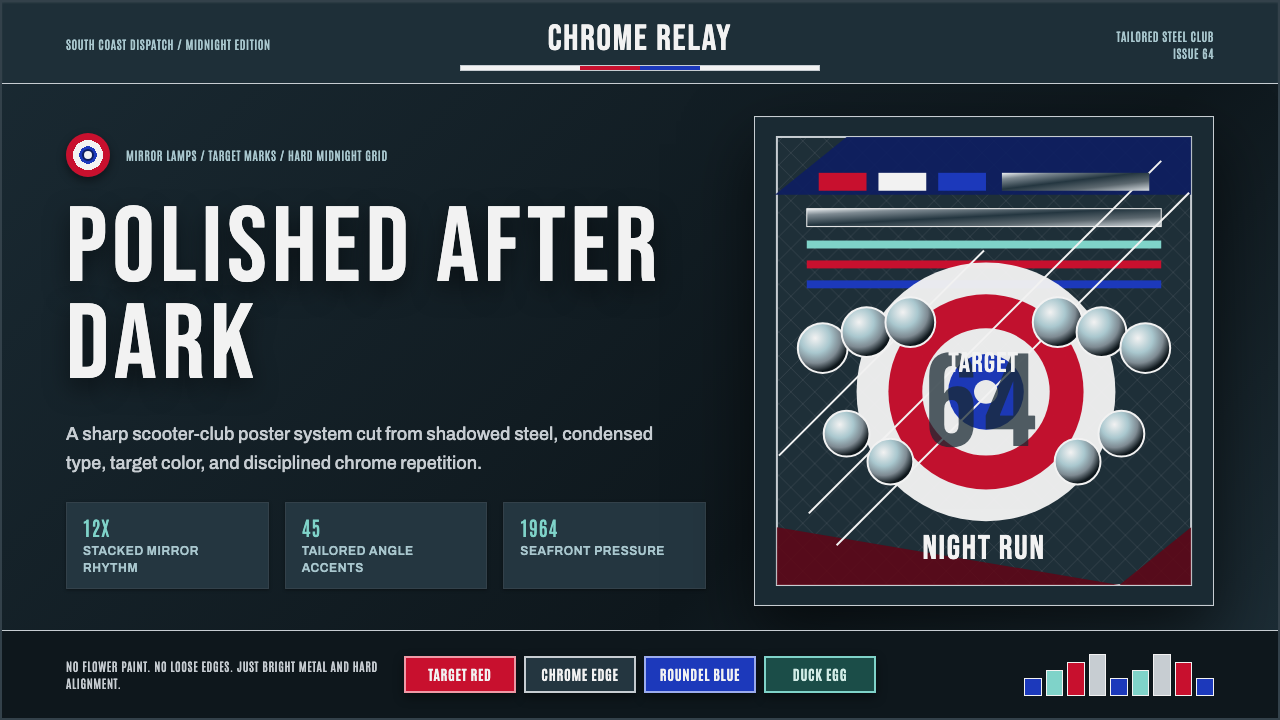 Mod Scooter ChromeSharp chrome discipline. Steel ground, roundel targets, condensed type, mirro…锋利的铬钢纪律:深钢底、靶心圆与窄体大字组成镜面节奏。
 Warhol PopMass culture turns iconic. Hot pink, yellow, cobalt grids repeat flat silkscr…大众文化成了图标。热粉、亮黄、钴蓝网格重复扁平罐头。
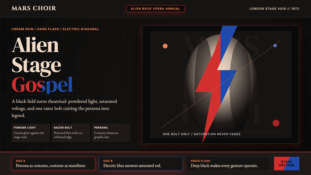 Bowie — Ziggy StardustTheater at full voltage. Cream-on-black portrait cut by one red and electric-…满电压的剧场感:黑底奶油肖像,被红与电蓝闪电劈开。
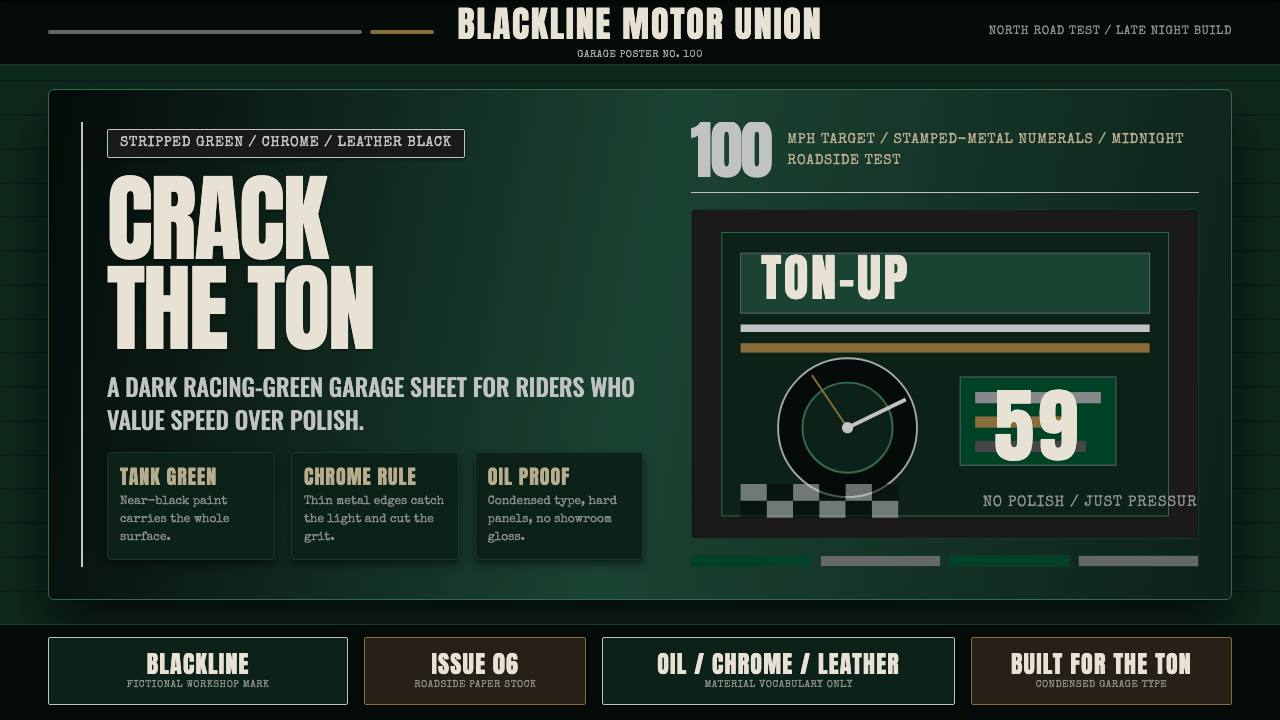 Café Racer Ton-UpGarage grit at speed. Near-black racing green, chrome rules, condensed sign t…高速车库粗粝感:近黑赛车绿、铬色细线与窄体招牌字。
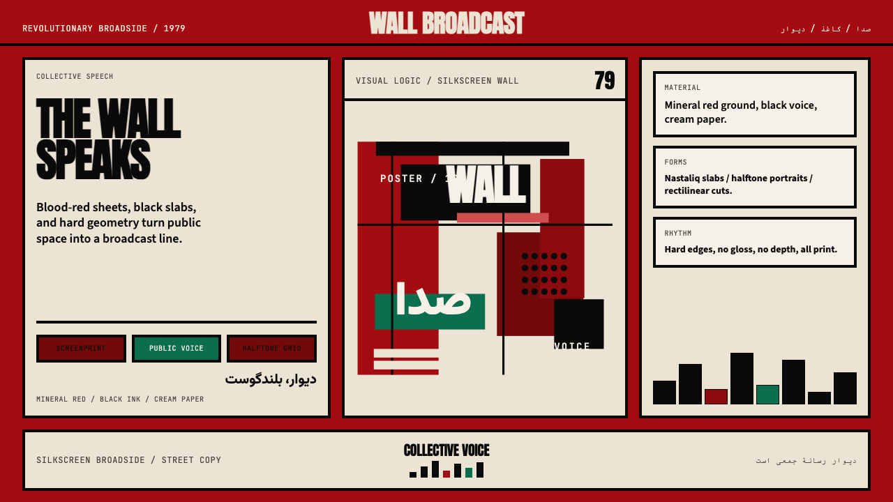 Iranian Revolution Poster (1979)Collective voice in ink. Blood red, black slabs, and hard screenprint geometr…集体之声凝成油墨海报。血红、黑色字块与硬边丝网几何。
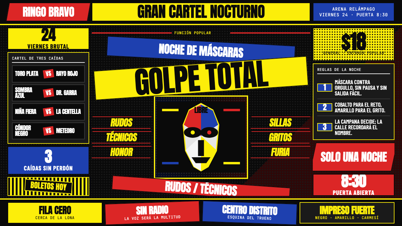 Lucha Libre PosterStreet-poster voltage. Yellow Anton banners, crimson diagonals, cobalt grids…街头高压海报:黑底上的荧光黄Anton、猩红斜线与钴蓝网格。