What is Warhol Pop?什么是 Warhol Pop?
Andy Warhol proved that a soup can, silk-screened thirty-two times, could outlast every manifesto written against it.安迪·沃霍尔证明了一个罐头,印制三十二遍之后,可以比所有反对它的宣言活得更久。
Warhol Pop in briefWarhol Pop 速览
Warhol Pop is the visual system distilled from Andy Warhol's studio practice at The Factory in 1960s Manhattan: flat silkscreen color pulled across celebrity portraits and consumer-goods packaging, hard-edged repetition that turns a single image into a grid, and a palette of hot pink, electric yellow, cobalt blue, and acid green that makes every surface vibrate with the energy of a roadside billboard. It is the design language of mass production turned reflexive — the supermarket aisle staring back at itself.沃霍尔波普是从安迪·沃霍尔1960年代曼哈顿「工厂」工作室的创作实践中提炼出的视觉系统:将扁平丝网印刷色彩覆盖于名人肖像与消费品包装之上,以硬边重复将单一图像转化为网格,以热粉、电光黄、钴蓝与酸性绿组成的色板让每一块画面都像路边广告牌一样震颤不已。这是大批量生产转向自我审视时的设计语言——超市货架开始凝视自身。
Where earlier modernisms sought to purge commerce from art, Warhol Pop absorbs commerce entirely. The soup can is not a critique of the soup can; it is the soup can, faithfully reproduced and then reproduced again, until repetition itself becomes the content. In design terms this means embracing brand logic: high-contrast silhouettes, flat fields of uniform color, and a register of imagery drawn from what was already everywhere — celebrity faces, product labels, newspaper photographs. The style trusts familiarity as a visual force.更早的现代主义运动力图将商业从艺术中驱逐出去,沃霍尔波普则将商业彻底吸收进来。那个汤罐头不是对汤罐头的批判,它就是汤罐头——忠实复制,再复制一遍,直到重复本身成为内容。在设计层面,这意味着拥抱品牌逻辑:高对比度剪影、大面积均匀色块,以及从无处不在的事物中取材的图像系谱——名人面孔、产品标签、报纸照片。这种风格将熟悉感视为视觉力量。
Visually, Warhol Pop is defined by a handful of consistent moves: a single high-contrast source image reduced to two or three flat tones, a grid of repeated instances in color variants, deliberate misregistration that lets the ink edge drift slightly outside the silhouette, and type borrowed from commercial signage rather than fine art tradition. The result is simultaneously democratic and iconic — work that announces itself as printable, reproducible, and intended for everyone.在视觉上,沃霍尔波普由几个一贯的手法所定义:将单一高对比度源图像简化为两到三个平面色调;在不同配色方案中重复排列成网格;故意制造套色错位,让墨迹边缘略微溢出轮廓;以及从商业标牌而非纯艺术传统借用的字体。最终效果既民主又标志性——宣告自身可印刷、可复制、面向所有人的作品。
Where does Warhol Pop come from?Warhol Pop 从何而来?
The visual grammar of Warhol Pop crystallized in 1962, when Andy Warhol, then a successful commercial illustrator in New York, painted the Campbell's Soup Cans series — thirty-two canvases, one for each variety then offered by the brand. The paintings were shown at the Ferus Gallery in Los Angeles in July of that year, hung in a row along the wall like a supermarket shelf. The gesture was deadpan and radical in equal measure. Warhol had not made the soup cans look like art; he had insisted that they already were. The critical establishment was unsettled; the public understood immediately.沃霍尔波普的视觉语法在1962年成形。当时的安迪·沃霍尔已是纽约颇具名气的商业插画师,他创作了《坎贝尔金宝汤罐》系列——三十二块画布,对应该品牌当时销售的每一种口味。这批作品于同年7月在洛杉矶费鲁斯画廊展出,沿墙一字排开,宛如超市货架。这个姿态既冷静又激进:沃霍尔并没有让汤罐头看起来像艺术,他只是坚持认为它们本来就是艺术。评论界因此不安,大众却立刻心领神会。
Warhol's method was as important as his subject matter. He had spent the 1950s as a sought-after commercial illustrator, producing shoe advertisements, record covers, and department-store promotions using a blotted-line technique that introduced slight unpredictable variation into each reproduction. By 1962 he was using photo-silkscreen to transfer found photographic images onto canvas — a process that allowed him to work at industrial scale, vary color across a series without repainting, and introduce the mechanical register-drift that became one of the style's signatures. The Factory, the studio he established on East 47th Street and later moved to Union Square, operated as a literal production house: assistants applied color, Warhol directed.沃霍尔的方法论与他的选题同样重要。1950年代,他以制作鞋类广告、唱片封面与百货公司促销品为生,运用一种名为「墨迹晕染」的技法,在每次复制中引入轻微的、不可预测的变化。1962年前后,他开始使用照相丝网印刷将现成的摄影图像转印到画布上——这一工艺让他得以以工业规模生产,无需重新绘制便能在系列作品间变换颜色,并制造出那种机械套色偏移,那后来成为这种风格最重要的标志之一。他先后在东47街、后来迁至联合广场的工作室「工厂」,实际上就是一座生产车间:助手负责上色,沃霍尔负责导演。
Warhol was not working in isolation. The broader Pop Art movement emerged simultaneously on both sides of the Atlantic in the late 1950s and early 1960s. In Britain, artists including Richard Hamilton and Eduardo Paolozzi were already making collages from American advertising imagery, theorizing the relationship between mass culture and fine art. In New York, Roy Lichtenstein was reproducing comic-strip panels at monumental scale, Robert Indiana was turning the word LOVE into a logotype, and Jasper Johns had been painting targets and flags since the mid-1950s. What distinguished Warhol's contribution was the systematic embrace of mechanical reproduction and commercial color — not ironic distance from it, but full absorption into it.沃霍尔并非孤立地工作。更广泛的波普艺术运动在1950年代末至1960年代初于大西洋两岸几乎同步涌现。在英国,理查德·汉密尔顿和爱德华多·包罗奇等艺术家已经在用美国广告图像制作拼贴画,并从理论上探讨大众文化与纯艺术之间的关系。在纽约,罗伊·利希滕斯坦将漫画格放大至纪念碑尺寸,罗伯特·印第安纳将单词「LOVE」变成品牌标志,贾斯珀·约翰斯自1950年代中期便开始绘制靶心与旗帜。沃霍尔贡献的独特之处在于对机械复制与商业色彩的系统性接纳——不是对它保持反讽距离,而是全面融入其中。
The cultural context that made Warhol Pop legible was postwar American consumer culture at its peak self-confidence. Television was everywhere; celebrity was industrialized; brands had become a shared visual language. Warhol understood that Marilyn Monroe and a Campbell's soup can occupied the same visual ecosystem — both were images circulated until they detached from their referents and became pure surface. His silk-screened Marilyns, produced shortly after her death in 1962, made this explicit: the same face in hot pink, turquoise, lime yellow, and orange, repeated until it ceased to be a person and became a pattern. The style that emerged from this insight — flat, loud, grid-organized, color-varied — remains one of the most immediately recognizable visual grammars in twentieth-century design.使沃霍尔波普变得可读的文化语境,是战后美国消费文化处于其最高自信的时刻。电视无处不在,名人效应已被产业化,品牌成为共享的视觉语言。沃霍尔看清了玛丽莲·梦露与金宝汤罐头处于同一视觉生态系统中——两者都是被反复流通直至与所指剥离、成为纯粹表面的图像。1962年,就在梦露去世后不久,他创作的丝网印刷梦露系列将这一判断明确化:同一张面孔以热粉、青蓝、草绿、橙色反复出现,直到它不再是一个人,而成为一种图案。这种从此洞见中生长出的风格——扁平、喧嚣、以网格组织、以色彩变奏——至今仍是二十世纪设计中最一眼可辨的视觉语法之一。
What defines the Warhol Pop look?Warhol Pop 的视觉特征是什么?
Flat High-Saturation Color扁平高饱和色
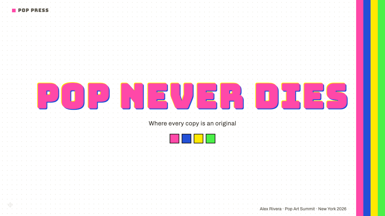
Color in Warhol Pop is applied as solid, uniform fields with no gradation, no shading, and no tonal variation within a single area. The palette leans toward the extreme end of saturation: hot pink that reads almost fluorescent, yellow that competes with neon signage, cobalt and electric blue that feel broadcast-quality. Color is not used to model form — the silhouette carries the form — but to differentiate instances in a series and to create the visual temperature associated with commercial printing at full-bleed.沃霍尔波普中的色彩以均匀实色块施用,无渐变、无阴影、单一区域内无色调变化。色板趋向饱和度的极端:读来几乎像荧光色的热粉,能与霓虹招牌竞争的亮黄,具有广播级质感的钴蓝与电蓝。色彩不用于塑造形体——形体由轮廓承担——而是用于在系列内区分不同版本,并制造与全版面商业印刷相关联的视觉温度。
Silk-Screen Misregistration丝网套色错位
One of the style's most distinctive textural notes is the slight slippage between the image layer and the color layer — where the ink extends a few millimeters beyond the edge of the silhouette, or where two color passes fail to align exactly. In Warhol's actual prints this was a product of manual screen registration; in contemporary design work it is a deliberate aesthetic choice, introduced as a visible offset halo around key shapes. The misregistration marks the work as hand-touched and printed rather than digitally perfect, and carries a subtle energy that pure precision would neutralize.这种风格最具辨识度的质感特征之一,是图像层与色彩层之间轻微的错位滑移——墨迹超出轮廓几毫米,或两次色版印刷未能精确对齐。在沃霍尔的实际版画中,这是手工套版的产物;在当代设计工作中,它成为一种刻意的美学选择,以关键形状周围可见的偏移光晕形式引入。这种错位标记着作品是手工触碰和印刷而成,而非数字完美呈现,并带有一种纯粹精确性会消除的微妙张力。
Repetition as Composition重复即构图
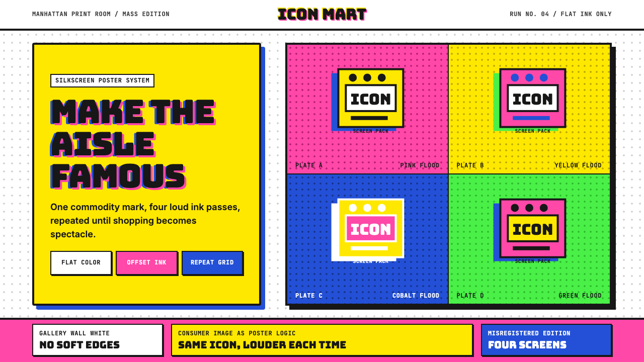
The grid of repeated images is Warhol Pop's most structurally distinctive move. Rather than a single centered composition with supporting elements, the style arranges multiples of the same image across a regular grid, varying only the color assignment. This approach borrowed directly from commercial printing layouts and contact sheets. Compositionally it means the grid itself is the layout decision: all cells are equal, hierarchy is expressed through color temperature rather than position, and the collective impression of the grid reads differently from any single cell examined in isolation.重复图像的网格排列是沃霍尔波普在结构上最具特色的手法。这种风格不采用单一居中构图配合辅助元素,而是将同一图像的多个实例排列于规则网格中,仅改变配色方案。这一做法直接借鉴自商业印刷版式与接触印样。在构图上,这意味着网格本身就是版面决策:所有格子地位平等,层级通过色温而非位置来表达,整个网格的集体印象与单独审视任何一格所得到的感受截然不同。
High-Contrast Silhouette高对比度剪影
Source imagery is reduced to high-contrast silhouettes before color is applied — details within the shadow areas collapse to a single flat dark tone, and highlights merge into a single flat light tone. This reduction is not loss but economy: the silhouette extracts the most legible version of the face or object, the version that survives reproduction at any scale and in any color variant. The technique is closely related to the commercial poster and signage tradition where legibility at a distance is paramount.源图像在施色之前被简化为高对比度剪影——阴影区域内的细节塌陷为单一平面暗色,高光区域合并为单一平面亮色。这种简化不是损失,而是提炼:剪影提取了人脸或物体最易辨认的版本,即在任何尺寸、任何配色方案下都能经受复制的版本。这一技法与商业海报及标牌传统密切相关,那些传统中远距可读性至关重要。
Commercial Typography商业字体排印
When type appears in Warhol Pop work, it comes from the vernacular of commercial signage, product labeling, and tabloid headlines rather than from typographic refinement. Letter spacing is often tight, weight is often heavy, and the type sits on or near the image rather than in a designated text zone below it. The effect is closer to a product label or a newspaper front page than to art-world convention. This typographic vernacularism is intentional: it closes the aesthetic gap between the artwork and the commercial object it depicts.当文字出现在沃霍尔波普作品中时,它来自商业标牌、产品标签与小报头条的俗语传统,而非排版精炼的传统。字间距通常紧凑,字重通常偏重,文字叠压于图像之上或紧邻其旁,而非安置在图像下方的指定文字区域。效果更接近产品标签或报纸头版,而非艺术界惯例。这种排版上的俗语主义是刻意为之:它消弭了艺术作品与其所描绘的商业物品之间的美学鸿沟。
Serial Color Variation序列色彩变奏
A defining characteristic of the style is the production of variations — not a single finished version but a set of instances, each carrying the same compositional structure with a different color assignment. The Marilyn series, the Mao series, the flower prints: all work this way. In design application this translates to a system where a primary visual module can be recolored across a palette without any other change, producing a family of outputs that feel simultaneously unified and varied. The variation is not revision; it is multiplication.这种风格的一个决定性特征是生产变体——不是单一的完成版本,而是一组实例,每个实例承载相同的构图结构,却赋予不同的配色方案。梦露系列、毛泽东系列、花卉版画,都以这种方式运作。在设计应用中,这转化为一种系统:主视觉模块可以在色板范围内重新配色而不做任何其他改动,产生一个既统一又富于变化的输出族群。这种变奏不是修订,而是倍增。
Deadpan Flatness不动声色的平面性
The emotional register of Warhol Pop is deliberately neutral — not warm, not confrontational, not celebratory. The same mechanical process that makes a portrait of Elvis Presley also makes a portrait of an electric chair; the flatness is morally consistent. In design terms this means avoiding visual hierarchy cues that suggest urgency, warmth, or concern. Everything is presented at the same visual temperature. This neutrality is not blandness — it is a stance that forces the viewer to bring their own emotional reading to the image.沃霍尔波普的情感基调是刻意中性的——不温暖,不对抗,不庆典。制作埃尔维斯·普雷斯利肖像的机械过程,与制作电椅肖像的过程完全相同;这种平面性在道德上是一以贯之的。在设计上,这意味着避免暗示紧迫感、温度感或关切感的视觉层级线索。一切都以相同的视觉温度呈现。这种中性不是平淡,而是一种立场——迫使观者将自己的情感解读带入图像之中。

Who shaped Warhol Pop?谁塑造了 Warhol Pop?
Born Andrew Warhola in Pittsburgh in 1928 to Carpatho-Rusyn immigrant parents, Warhol trained at the Carnegie Institute of Technology and moved to New York in 1949, where he built a successful career in commercial illustration before pivoting decisively to fine art around 1960. The Factory studio became a social and creative hub where the silk-screen method was developed into an industrial practice. Warhol managed his own celebrity with the same detached precision he applied to his subjects, producing self-portraits, interview transcripts, and eventually a magazine — Interview — as extensions of his media-analysis project. He died in 1987 following complications from routine surgery, having reshaped the boundary between commercial and fine art more durably than almost any figure of his century.安迪·沃霍尔1928年生于匹兹堡,父母为喀尔巴阡路辛裔移民。他在卡内基理工学院接受训练,1949年移居纽约,在商业插画领域建立成功事业后,于1960年前后决定性地转向纯艺术。「工厂」工作室成为社交与创作的枢纽,丝网印刷法在此被发展为一种工业化实践。沃霍尔以同样超然的精确性经营自己的名人形象,产出自画像、访谈文字记录,最终创办杂志《访谈》,作为其媒体分析计划的延伸。1987年,他因常规手术并发症去世,对商业与纯艺术之间界限的重塑,比他那个世纪几乎任何人都更为持久。
Lichtenstein's parallel practice illuminates the Pop Art moment by contrast. Where Warhol gravitated toward the photographic image and the celebrity, Lichtenstein mined the comic strip and the romance novel — line-art sources with their own Ben-Day dot printing signature. The two artists approached mechanical reproduction from different directions and arrived at related conclusions: that the imagery of mass culture, enlarged and isolated in a gallery context, acquired a reflective quality it lacked in its original setting. Lichtenstein's typographic approach — dialogue balloons, onomatopoeic sound effects set in bold sans-serif — contributed a specifically comic-derived letterform tradition to the broader Pop design vocabulary.利希滕斯坦的并行实践通过对比照亮了波普艺术时刻。沃霍尔倾向于摄影图像与名人,利希滕斯坦则开采漫画格与言情小说——那些带有本戴网点印刷标记的线描图源。两位艺术家从不同方向接近机械复制,却得出相关的结论:大众文化图像经过放大,在画廊语境中单独呈现,便获得了在其原始环境中所缺乏的反思性。利希滕斯坦的排版手法——对话气泡、以粗体无衬线字体设置的拟声词音效——为更广泛的波普设计词汇贡献了一个源自漫画的字体形态传统。
Sedgwick occupied a structurally important position in the Warhol ecosystem as the Factory's most visible female muse and superstar during the period 1965 to 1966. Her significance to the design legacy of Warhol Pop is less about individual artworks and more about the Factory model itself: the production of celebrity through image circulation, costume repetition, and the deliberate blurring of private person and public surface. Sedgwick's visual presence — raccoon-eye makeup, geometric shift dresses, short bleached hair — embodied the Pop aesthetic applied to personal style, demonstrating that the silkscreen logic of flat planes and high-contrast reduction could operate equally in fashion, film, and social performance.塞奇威克在1965至1966年间作为「工厂」最显眼的女性缪斯与超级明星,占据了沃霍尔生态系统中结构上重要的位置。她对沃霍尔波普设计遗产的意义,与其说在于个别艺术作品,不如说在于「工厂」模式本身:通过图像流通、服装重复以及刻意模糊私人个体与公共表面之间的界限来制造名人。塞奇威克的视觉形象——浣熊眼妆、几何直筒裙、短促漂白的头发——体现了波普美学应用于个人风格的样态,证明丝网印刷的扁平色块与高对比度简化逻辑,在时装、电影与社交表演中同样可以运作。
Indiana's contribution to the Pop Art vocabulary was the reduction of language to logotype. His LOVE image — the word arranged in a two-by-two block with the O tilted — became one of the most reproduced graphic images of the twentieth century after its use as a United States Postal Service stamp in 1973. Indiana's approach differed from Warhol's in that it began with words rather than photographs, treating language itself as a flat graphic element subject to the same color-field treatment as any other shape. His stencil-derived letterforms and his insistence on primary and secondary colors deployed in hard-edged blocks contributed a linguistic dimension to the Pop graphic system that remains influential in logo and identity design.印第安纳对波普艺术词汇的贡献,是将语言简化为品牌标志。他的「LOVE」图像——单词排列成两行两列的方块,O字倾斜——在1973年被用作美国邮政邮票后,成为二十世纪被复制最多的平面图像之一。印第安纳的方法与沃霍尔的不同:他从文字而非照片出发,将语言本身视为平面图形元素,与任何其他形状一样接受色块处理。他源自镂字板的字母形态,以及他在硬边色块中运用三原色与间色的坚持,为波普图形系统贡献了一个语言维度,至今仍在标志与视觉识别设计中产生影响。
Hamilton, working in Britain, produced in 1956 what is often cited as the first Pop artwork: the small collage 'Just what is it that makes today's homes so different, so appealing?' — a composite of American advertising clippings that catalogued the aspirational consumer interior. Hamilton's analytical stance toward mass-culture imagery — treating it as worthy of close formal attention rather than as background noise — provided the theoretical framework within which Warhol's more intuitive practice would later be understood. His influence on British graphic design, particularly the interplay of photography, type, and flat color in editorial and poster contexts, runs in parallel to the American strand of Pop without being identical to it.汉密尔顿在英国工作,1956年创作了常被引为第一件波普艺术品的作品:小型拼贴画《究竟是什么让今天的家庭如此不同、如此有吸引力?》——一幅由美国广告剪报拼合而成的图像,编目了充满憧憬的消费主义室内空间。汉密尔顿对大众文化图像的分析性立场——将其视为值得认真形式关注的对象,而非背景噪音——提供了一个理论框架,沃霍尔更为直觉性的实践日后将在其中被理解。他对英国平面设计的影响,尤其是在编辑与海报语境中摄影、字体与平面色彩的相互作用,与美国波普支流并行运行,却并不等同于它。
How do you use Warhol Pop today?今天怎么用 Warhol Pop?
Warhol Pop is one of the few historical styles that transfers directly and legibly into contemporary digital design contexts, because its underlying logic — flat color, high contrast, repetition, grid — is native to both screen and print. Applying it well requires understanding what the style is actually doing structurally, not merely copying its surface markers. The misregistration halo, the hot-pink field, the grid of repeated portraits: each of these does specific compositional work, and dropping them into a layout without that understanding produces decoration rather than system.沃霍尔波普是少数几种能够直接、清晰地移植到当代数字设计语境中的历史风格之一,因为它的底层逻辑——扁平色彩、高对比度、重复、网格——对于屏幕和印刷都是原生的。要用好它,需要理解这种风格在结构上实际做了什么,而不仅仅是复制其表面标记。错位光晕、热粉色块、重复肖像的网格:每一项都在做具体的构图工作,若不理解这一点便将它们植入版面,只会产生装饰而非系统。
For presentation slides, Warhol Pop is particularly effective on cover pages and section dividers. A cover built on the style's logic takes a single high-contrast image — a product photograph, a portrait, an icon — reduces it to two flat tones, and tiles it in a grid of three or four, each cell in a different color from the palette. The deck title sits over this grid in bold commercial-style type. Content slides should use the palette sparingly: one accent color per slide for key data labels or callout boxes, black on white or near-white for body text, and generous white space so the color reads as signal rather than wallpaper. Data visualization slides work especially well with this approach — bar charts become color-coded grid elements that feel designed rather than defaulted.对于演示文稿,沃霍尔波普在封面页和章节分隔页上尤为有效。基于这种风格逻辑构建的封面,取一张单一高对比度图像——产品照片、肖像或图标——将其简化为两个扁平色调,以三到四格的网格排列,每格使用色板中不同的颜色。演讲题目以粗体商业风格字体叠压于这个网格之上。内容页应克制使用色板:每页以一个强调色用于关键数据标签或引用框,正文以黑色置于白色或接近白色的背景上,并保留充裕的留白,使色彩读来是信号而非墙纸。数据可视化页面尤其适合这种处理方式——柱状图成为经过配色的网格元素,感觉是被设计过的,而非默认样式。
For web interfaces, Warhol Pop suits marketing landing pages, event pages, and product launch contexts more than it suits transactional or utility interfaces. The palette's intensity is a feature in contexts where the goal is to command attention and communicate cultural confidence, but it can overwhelm in interfaces where users need to concentrate or complete tasks. A Warhol Pop-inflected pricing page works when each pricing tier gets its own flat color field from the palette, making tier comparison a color-reading exercise. A dashboard built on this logic should restrict the full palette to status indicators and alerts, keeping the primary information architecture in a quieter register.对于网页界面,沃霍尔波普更适合营销落地页、活动页面和产品发布场景,而非交易或实用类界面。在目标是吸引注意力和传达文化自信的语境中,色板的强度是一种特性;但在需要用户专注或完成任务的界面中,它可能造成视觉压迫。一个受沃霍尔波普影响的定价页面,当每个定价层级各获一块来自色板的专属平面色域时效果最佳,使层级比较成为一种读色练习。以这种逻辑构建的仪表板,应将完整色板限制在状态指示器和警示上,主要信息架构保持在更安静的视觉层次中。
For editorial and marketing work, the style offers strong tools for high-impact hero sections and campaign materials. A Warhol-inflected editorial spread uses a full-bleed repeated-image grid as a background layer, with the headline dropped over it in a contrasting flat color. Campaign posters work well with the four-up or nine-up grid of color variants — the viewer gets multiple readings of the same visual in a single glance, which is itself the communicative point. The style is particularly effective for cultural events, music releases, fashion editorials, and brand campaigns that want to signal irreverence and cultural literacy simultaneously.对于编辑与营销工作,这种风格为高冲击力的首屏区域和推广物料提供了有力工具。受沃霍尔影响的编辑版面,使用全版面的重复图像网格作为背景层,标题以对比鲜明的纯色叠压其上。活动海报适合四格或九格的配色变体网格——观者在一瞥之间便能获得同一视觉的多重解读,这本身就是这种方式的传播要义。这种风格对于文化活动、音乐发行、时装编辑和希望同时传递反叛精神与文化素养的品牌推广活动,尤为有效。
A common mistake when applying Warhol Pop is reaching for the full palette at once. The style's most successful contemporary applications typically commit to two or three colors from the palette — one dominant, one accent, one structural — and use the remainder for variation within a series rather than mixing them all on a single surface. A second frequent error is using naturalistic photography without the necessary reduction step: an unprocessed photograph in a Warhol Pop layout looks like a stock-image intrusion, not a Pop statement. The image must be reduced to high-contrast flat tones before it functions correctly within the visual system. Finally, do not confuse the decorative surface of misregistration with its purpose — it should appear at edges and as a subtle halo, not as a pervasive texture that muddies legibility across the entire composition.应用沃霍尔波普时最常见的错误,是一次性动用整个色板。这种风格在当代最成功的应用,通常只从色板中选取两到三种颜色——一种主导色、一种强调色、一种结构色——将其余颜色保留用于系列内部的变奏,而非在单一画面上混合使用。第二个常见错误是在未经必要简化的情况下使用自然主义摄影:一张未经处理的照片出现在沃霍尔波普版面中,看起来像是素材库图片的侵入,而非波普声明。图像必须先被简化为高对比度的扁平色调,才能在这套视觉系统中正确运作。最后,不要将错位的装饰表面与其目的混淆——它应该出现在边缘,作为微妙的光晕,而不是弥漫于整个构图、损害可读性的普遍纹理。
Warhol Pop — FAQWarhol Pop · 常见问题
Is Warhol Pop the same as Pop Art?沃霍尔波普和波普艺术是同一回事吗?
Pop Art is the broader movement; Warhol Pop is one specific visual system within it. Pop Art included a wide range of artists — Lichtenstein's comic-strip enlargements, Indiana's word-as-logotype work, Hamilton's British collage practice, Hockney's California imagery — each with distinct visual vocabularies. What Curio calls Warhol Pop specifically refers to the silkscreen aesthetic: the flat high-saturation color, the serial repetition grid, the misregistration halo, and the celebrity-or-consumer-product subject matter. Applying a Lichtenstein-derived style — Ben-Day dots, comic-strip outlines, dialogue balloons — would be a different system within the Pop Art family.波普艺术是更广泛的运动;沃霍尔波普是其中一种具体的视觉系统。波普艺术包括众多艺术家——利希滕斯坦的漫画格放大、印第安纳的文字即品牌标志、汉密尔顿的英国拼贴实践、霍克尼的加州图像——每种都有截然不同的视觉词汇。Curio所称的沃霍尔波普,专门指丝网印刷美学:扁平高饱和色彩、序列重复网格、套色错位光晕,以及以名人或消费品为主题的图像内容。运用源自利希滕斯坦的风格——本戴网点、漫画格轮廓、对话气泡——将是波普艺术家族中的另一套系统。
Does the style work in monochrome or limited color?这种风格在单色或有限配色情况下也能奏效吗?
Yes, with adjustments. The serial color variation is what gives Warhol Pop its most recognizable quality, but the underlying structure — high-contrast silhouette, grid repetition, flat fields — functions in monochrome. A single-color screen print is entirely within Warhol's practice; his 1960s shadow prints and later work explored this. In contemporary application, a two-color version using one saturated hue and black on white can read as Warhol-adjacent while feeling more restrained. The key is maintaining the other structural elements — the repetition, the flat tones, the high contrast — so the restriction reads as a deliberate choice rather than a budget constraint.可以,但需要调整。序列色彩变奏是赋予沃霍尔波普最具辨识度品质的元素,但其底层结构——高对比度剪影、网格重复、扁平色块——在单色条件下同样有效。单色丝网版画完全在沃霍尔实践范围之内;他1960年代的阴影版画及后期作品都探索过这一方向。在当代应用中,以一种饱和色加黑色置于白底的双色方案,可以读来接近沃霍尔气质,同时感觉更为克制。关键在于维持其他结构性元素——重复、扁平色调、高对比度——使限制读来是刻意选择,而非预算约束。
How do I introduce misregistration without it looking like a rendering error?如何引入套色错位效果,而不让它看起来像渲染错误?
The difference between deliberate misregistration and an accidental rendering artifact lies in consistency and placement. Authentic misregistration is consistent in direction — the offset drifts the same way across the composition — and it appears at the edges of silhouetted shapes, not as a general blur or as color fringing on typography. Apply the offset as a separate color layer, slightly larger than the primary image layer, visible as a halo or shadow of a second hue. The offset should be noticeable but not dominant — it should read as a printing characteristic when you know to look for it, not as a mistake visible to everyone at a glance. Typography should generally remain crisp even when the image layers carry the offset.刻意的套色错位与意外渲染瑕疵的区别,在于一致性与位置。真实的错位在方向上是一致的——偏移在构图中始终朝同一方向漂移——且出现在剪影形状的边缘,而非作为普遍性模糊或排版上的色彩边缘。将偏移作为独立色彩层施用,略大于主图像层,以第二种色调的光晕或阴影形式可见。偏移应当明显但不主导——当你知道去寻找时,它读来是一种印刷特征,而非所有人一眼便能发现的错误。即便图像层带有偏移,文字排印通常应保持清晰。
Can Warhol Pop suit a professional or corporate context, or is it inherently counter-cultural?沃霍尔波普能适用于专业或企业语境吗,还是它本质上是反文化的?
The style is flexible enough to read as sophisticated rather than transgressive in corporate contexts, provided the application is controlled. What makes Warhol Pop feel counter-cultural in careless use is typically the combination of maximum palette saturation, dense repetition, and misregistration all applied simultaneously at full intensity. Pulling back on any of these axes — choosing two colors rather than four, spacing the grid generously, keeping the misregistration subtle — shifts the register from agitprop toward editorial confidence. The style has been used effectively by cultural institutions, fashion brands, and technology companies precisely because its visual authority is distinct from both corporate conservatism and blank minimalism. The key is intentionality: every element must feel chosen, not defaulted.只要应用得当,这种风格在企业语境中可以读来老练而非反叛。在粗心使用中让沃霍尔波普显得反文化的,通常是将最高饱和度色板、密集重复和套色错位同时以全强度叠加。在这些维度中任一退一步——选两种色彩而非四种,让网格间距更宽松,保持错位效果微妙——便能将基调从激进宣传材料转向编辑自信。这种风格已被文化机构、时装品牌和科技公司有效运用,正是因为其视觉权威感有别于企业保守主义与空洞的极简主义。关键是意图性:每个元素都必须感觉是被选择的,而非默认的。
What is the right way to handle photography in a Warhol Pop layout?在沃霍尔波普版面中,正确处理摄影图像的方式是什么?
Photography must be processed before it enters a Warhol Pop layout — the style does not accommodate naturalistic photographs with full tonal range. The correct process is to reduce the photograph to high-contrast flat tones: collapse the shadows to a single dark field, collapse the highlights to a single light field, and eliminate the midtone gradient entirely. The result should read as a silkscreen print rather than a photograph. In practice this means applying a high-threshold posterization that leaves two or three tones maximum. Once reduced, the image can be colored as a flat element — the dark areas taking one hue, the light areas taking another — and repeated in the grid with color variants. Portrait and product photography suit this treatment well; landscape and atmospheric photography, which depend on tonal subtlety, resist it.摄影图像进入沃霍尔波普版面之前,必须经过处理——这种风格不容纳具有完整色调范围的自然主义照片。正确的处理方式是将照片简化为高对比度的扁平色调:将阴影塌陷为单一暗色域,将高光合并为单一亮色域,完全消除中间调渐变。结果应该读来像丝网版画而非照片。实践中,这意味着施用高阈值的色调分离,最多保留两到三个色调。一旦简化完成,图像便可作为平面元素着色——暗色区域取一种色相,亮色区域取另一种——并在网格中以不同配色方案重复排列。肖像摄影和产品摄影很适合这种处理;依赖色调微妙性的风景和氛围摄影则对此有抵抗性。
Related design styles相关设计风格
 Psychedelic Fillmore (Mouse, 1968)Legibility becomes ritual. Magenta-cyan vibration and bulbous mandalas melt t…可读性成为仪式:洋红青色震颤与泡泡字曼陀罗融化画框。
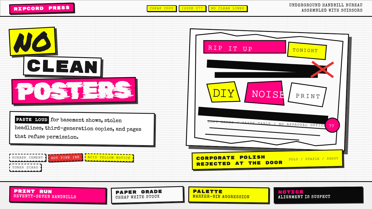 Punk Xerox 1977Anti-design shouts. Hot pink and acid yellow collide with ransom type on Xero…反设计在尖叫:荧光粉与酸黄撞上复印纸勒索字。
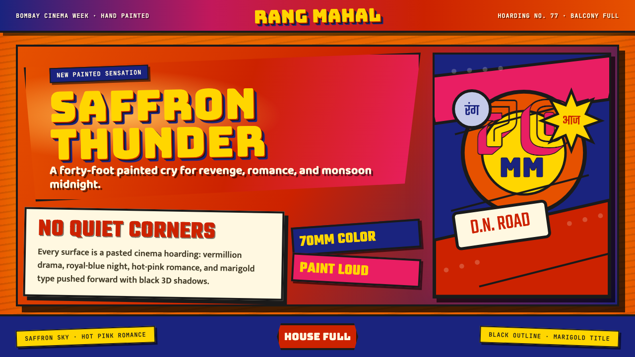 Bollywood Poster Art (1970s)Subtlety is unaffordable. Saffron fields, Bungee shadows, diagonal hoarding d…节制太便宜:藏红花底、Bungee黑影与斜向招贴制造十米戏剧。
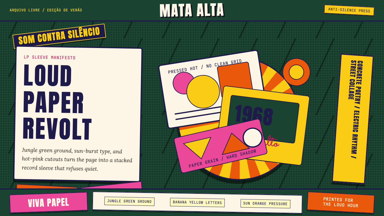 Brazilian Tropicália (1968)Art must be loud. Jungle green, banana yellow Anton type, and hard-shadow col…艺术必须喧哗:丛林绿、香蕉黄Anton字与硬阴影拼贴爆发。
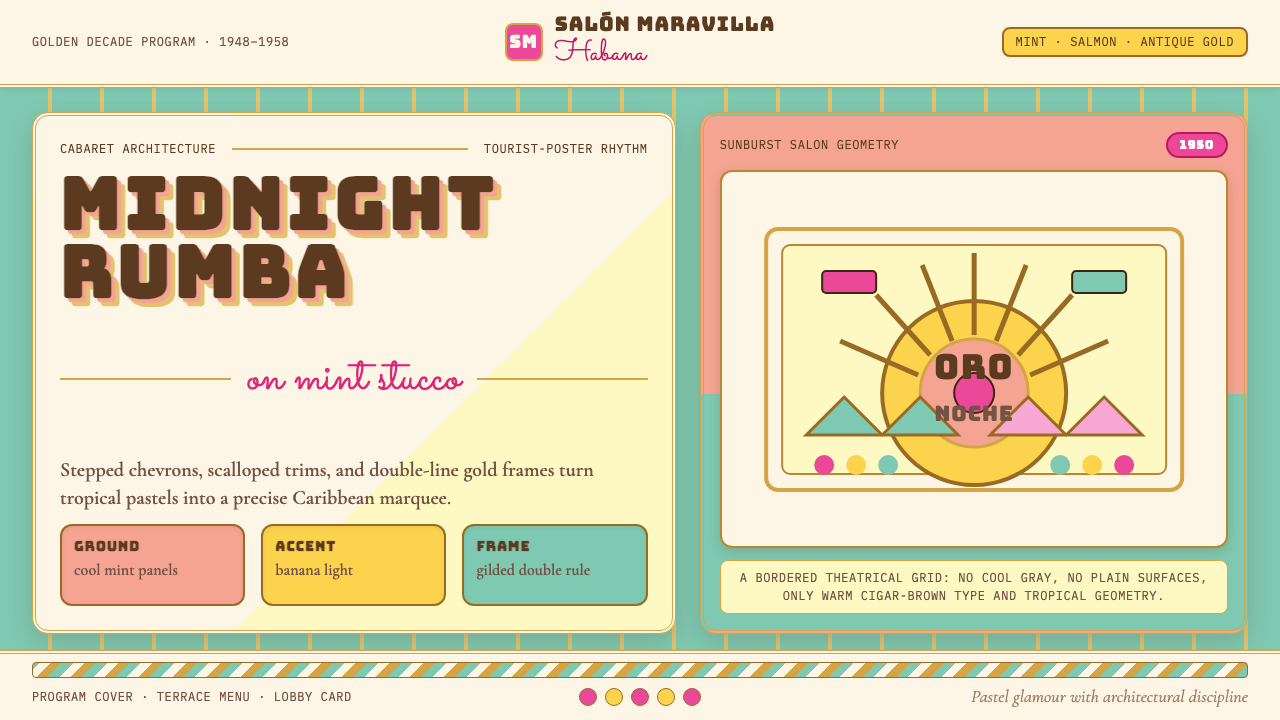 Cuban Art Deco (Havana 1950)Tropical Deco goes theatrical. Mint and salmon panels, gold double rules, Bun…热带装饰艺术登上舞台:薄荷与三文鱼色分区,金色双线框配Bungee招牌字。
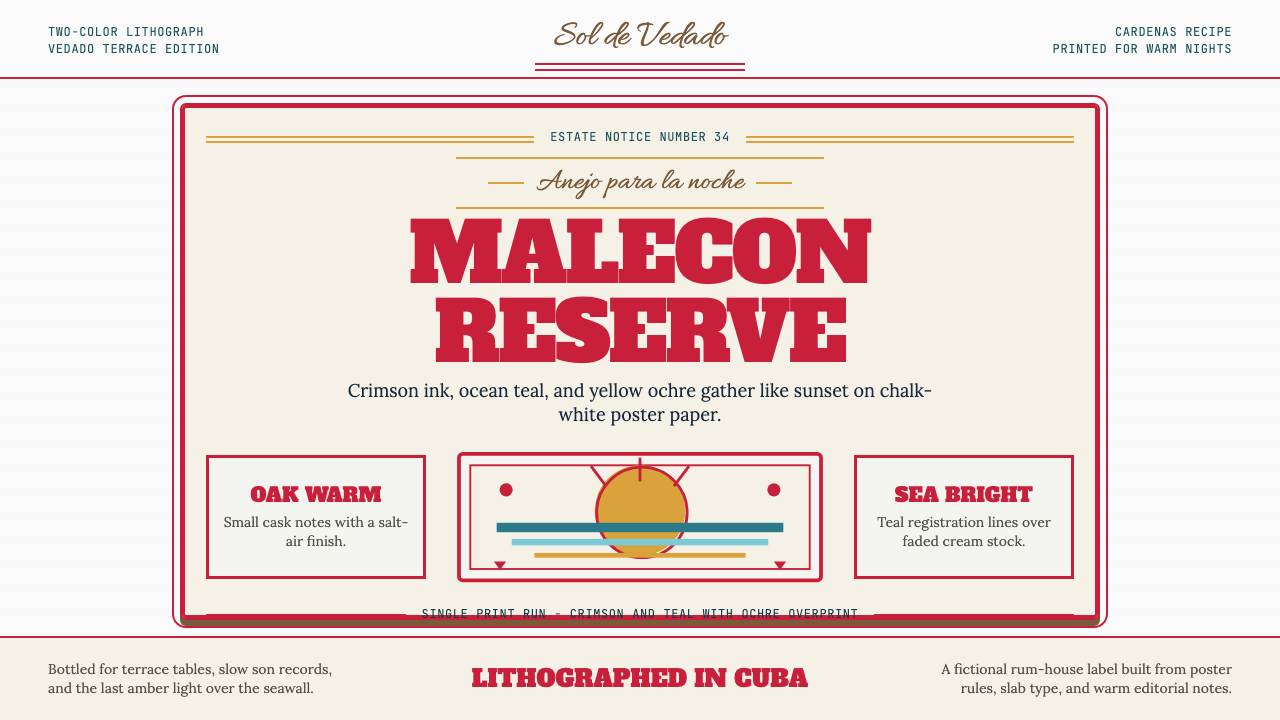 Havana Club Cuban RumSunset in print. Crimson slab type and ocean teal rules age on chalk-white pa…印刷里的日落。深红粗衬线与海洋青绿线框落在白垩纸上。