What is Cuban Art Deco (Havana 1950)?什么是 Cuban Art Deco (Havana 1950)?
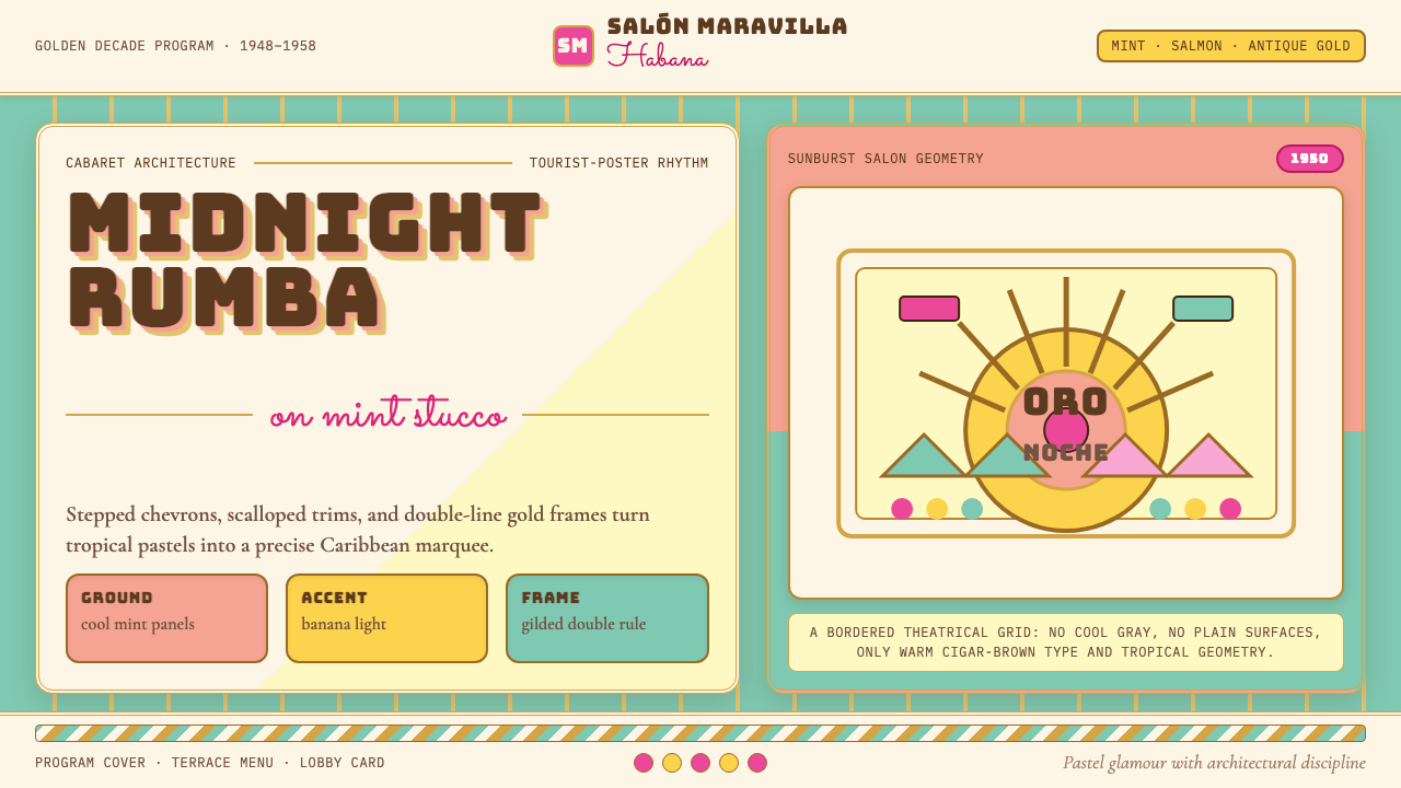
Havana in the 1950s turned Art Deco into a tropical spectacle — pastel panels, gilded double rules, and cabaret marquee lettering that made even a hotel brochure feel like an invitation to dance.1950年代的哈瓦那将装饰艺术变成了一场热带奇观——粉彩色块、镀金双线框、夜总会招牌字体,让一张酒店宣传册都像是一张舞会请柬。
Cuban Art Deco (Havana 1950) in briefCuban Art Deco (Havana 1950) 速览
Cuban Art Deco is the most chromatic, palm-touched variant of the global Art Deco language. Where European Deco skewed toward chrome and onyx austerity, and American Deco toward streamlined sobriety, Havana's designers embraced colour with theatrical confidence: mint green, salmon orange, flamingo pink, and banana yellow were layered against one another, outlined in gold double rules, and crowned with stepped chevrons and scalloped edges that gave every surface a festive, almost edible quality.古巴装饰艺术是全球装饰艺术语言中色彩最为绚烂、最具热带风情的变体。欧洲装饰艺术偏向铬与缟玛瑙的冷峻,美式装饰艺术追求流线型的庄重,而哈瓦那的设计师们则以戏剧性的自信拥抱色彩:薄荷绿、三文鱼橙、火烈鸟粉与香蕉黄层叠交织,以金色双线框勾勒轮廓,顶部装饰阶梯形人字纹与扇贝边——让每一个表面都呈现出节日般、近乎甜蜜的质感。
The style flourished during Havana's golden decade — roughly 1948 to 1958 — when the city was simultaneously a playground for international tourists and a hotbed of Cuban creative ambition. Hotel brochures, nightclub program covers, airline posters, and department store signage all participated in the same visual conversation: geometric precision imported from Paris and New York, radically re-saturated with Caribbean light. The result was a design language that felt simultaneously cosmopolitan and unmistakably local.这一风格在哈瓦那的黄金十年(约1948至1958年)蓬勃兴盛。彼时的哈瓦那既是国际游客的度假天堂,也是古巴创意野心的温床。酒店宣传册、夜总会节目单、航空公司海报与百货公司招牌,共同参与着同一场视觉对话:从巴黎与纽约引进的几何精确性,被加勒比阳光彻底重新饱和。这套设计语言由此既显得国际范十足,又带有无可误认的本土气质。
At its core, Cuban Art Deco is an architecture of contrasts: the formal grid of European Deco held in productive tension with tropical exuberance. Motifs borrowed from Aztec and Afro-Cuban decorative traditions — sunburst radiations, repeating fan forms, stylised palm fronds — were fitted into the stepped arches and symmetrical facades that characterized the international Deco vocabulary. Typography played a central role too: monumental slab or geometric display faces (the visual equivalent of a neon marquee) sat alongside cursive script flourishes borrowed from the hand-lettered tradition of Cuban carnival posters.古巴装饰艺术的核心是一种对比的建筑学:欧洲装饰艺术的形式网格与热带的奔放情感形成富有张力的共存。从阿兹特克与非裔古巴装饰传统中借鉴的母题——旭日放射纹、重复扇形、风格化棕榈叶——被嵌入阶梯形拱门与对称立面,融入国际装饰艺术的词汇体系。字体排印同样举足轻重:粗厚的平底衬线或几何展示字体(相当于视觉上的霓虹灯招牌)与花体草书并置,后者源自古巴嘉年华海报的手绘字母传统。
See the Cuban Art Deco (Havana 1950) design system查看 Cuban Art Deco (Havana 1950) 完整设计系统
Where does Cuban Art Deco (Havana 1950) come from?Cuban Art Deco (Havana 1950) 从何而来?
Art Deco arrived in Cuba through multiple channels simultaneously. The 1925 Exposition Internationale des Arts Décoratifs et Industriels Modernes in Paris set the global template, and Cuban architects, designers, and commercial artists working in Havana absorbed it through architectural journals, imported tourist-trade print, and direct study in Europe and the United States. By the late 1920s, Havana's Vedado and Centro Habana neighbourhoods were already acquiring Deco apartment buildings and commercial facades. But Cuba's version did not simply copy the source material — it immediately began absorbing local colour, both literal and cultural.装饰艺术风格经由多条渠道同时抵达古巴。1925年巴黎国际现代工业装饰艺术博览会确立了全球模板,在哈瓦那工作的古巴建筑师、设计师与商业美术家通过建筑期刊、进口旅游印刷品及在欧美的直接学习吸收了这一风格。至1920年代末,哈瓦那的维达多与中哈瓦那街区已陆续出现装饰艺术风格的公寓楼与商业立面。但古巴版本并非简单照搬源材料——它从一开始便持续吸纳本土色彩,无论是字面意义上的还是文化层面的。
The key institution was Havana's commercial printing and advertising industry, which by the 1940s was producing some of the hemisphere's most inventive chromolithographed posters, cigar box labels, and tourist brochures. Illustrators like Conrado Massaguer, who founded the influential magazine Social in 1916, had already established a sophisticated graphic culture in Cuba that embraced European modernism while maintaining strong ties to Afro-Cuban visual traditions and the vivid palette of the Caribbean landscape. When Art Deco's geometric grammar arrived, it found a culture already primed for theatrical, colour-saturated design.关键机构是哈瓦那的商业印刷与广告业。至1940年代,这一行业已能生产出西半球最富创意的彩色石版海报、雪茄盒标签与旅游宣传册。插画家孔拉多·马萨格尔于1916年创办了颇具影响力的杂志《社会》,他与同代人已在古巴建立起一套成熟的图像文化——拥抱欧洲现代主义,同时与非裔古巴视觉传统及加勒比风景的鲜艳色板保持着深厚联结。当装饰艺术的几何语法到来时,它遇到的是一种早已为戏剧性、高饱和度设计做好准备的文化土壤。
The economic and political context of the 1950s intensified the style. Fulgencio Batista's government (1952–1959) actively cultivated international tourism and foreign investment, funding large-scale hotel and entertainment construction in Havana. The Hotel Nacional, the Habana Hilton (now Habana Libre), and the Hotel Capri all opened or expanded during this period, each commissioning visual identity programmes — menus, stationery, signage, brochures — that became showcases for the mature Cuban Deco style. The Tropicana Cabaret, operating under an open sky in the Marianao suburb, became perhaps the most internationally visible expression of the aesthetic: its graphic materials combined geometric Deco structure with the lush, flambouyant spirit of the cabaret stage.1950年代的经济与政治背景进一步激化了这一风格。巴蒂斯塔政府(1952—1959年)积极推动国际旅游业与外资引进,在哈瓦那出资兴建了大规模酒店与娱乐设施。国家饭店、哈瓦那希尔顿(今哈瓦那自由饭店)与卡普里饭店均在这一时期落成或扩建,各自委托设计了成套视觉识别方案——菜单、信笺、标识、宣传册——成为成熟古巴装饰风格的展示橱窗。位于马里亚瑙郊区的热带天堂露天夜总会,或许是这一美学最广为国际所知的表达:其平面设计材料将几何装饰结构与夜总会舞台的繁茂奔放精神融为一体。
The architects and designers working in this period — Eladio Rivadulla and Esteban Rodríguez-Castells among the most prominent in built form — synthesised the international Deco vocabulary with a specifically Cuban palette and ornamental sensibility. The Bacardí Building, completed in 1930 by Esteban Rodríguez-Castells and his collaborators, had already established the template: its terracotta-coloured upper sections, stylised bat reliefs, and stepped crown demonstrated that European Deco geometry could support tropical ornament rather than suppress it. The visual culture of the 1950s extended this logic into ephemeral media — printed matter, signage, fabric — and amplified the colour until the dial could go no further.活跃于这一时期的建筑师与设计师——以埃拉迪奥·里瓦杜亚和埃斯特万·罗德里格斯-卡斯泰尔斯在建筑领域最为杰出——将国际装饰艺术词汇与专属古巴的色板和装饰感性熔于一炉。埃斯特万·罗德里格斯-卡斯泰尔斯与合作者于1930年落成的百加得大厦已然确立了这一模板:赤陶色上层外立面、风格化蝙蝠浮雕与阶梯形顶冠,证明了欧洲装饰艺术的几何学完全可以承载热带装饰,而非压制它。1950年代的视觉文化将这一逻辑延伸至印刷品、标识、织物等短暂性媒介,并将色彩的饱和度拨到了极限。
What defines the Cuban Art Deco (Havana 1950) look?Cuban Art Deco (Havana 1950) 的视觉特征是什么?
Tropical Pastel Palette热带粉彩色板
The Cuban Deco palette centres on warm and cool pastels deployed at high saturation against each other: mint green faces salmon orange, flamingo pink answers banana yellow. These are not the muted, powder-washed pastels of later mid-century design — they are vivid and assertive, luminous as tropical fruit in direct sunlight. Gold and warm ivory serve as the unifying neutrals, appearing as border lines, rule work, and ground panels that prevent the coloured fields from overwhelming each other. Black is used sparingly, typically in typography and fine detail lines, never as a dominant ground.古巴装饰艺术色板以高饱和度的暖色与冷色粉彩相互对置为核心:薄荷绿与三文鱼橙对照,火烈鸟粉与香蕉黄呼应。这绝非后来中世纪设计中那种柔和的、粉雾化的粉彩——它们鲜艳而有主张,如热带水果在直射阳光下发出的光泽。金色与暖象牙色充当统一性中性色,以边框线条、分隔线和底面色块的形式出现,防止各色块相互压制。黑色使用节制,通常仅用于字体与精细细节线条,从不作为主导底色。
Stepped Chevrons and Geometric Banding阶梯形人字纹与几何条带
The stepped chevron — a zigzag form that rises in stair-like increments — is perhaps the most distinctive single motif in Cuban Deco, appearing on building cornices, border ornaments, programme covers, and textile patterns alike. It is typically rendered in contrasting colours or outlined in gold, giving it a jewel-like, almost three-dimensional quality despite being a flat mark. Horizontal and vertical banding — alternating strips of colour that divide a composition into zones — is the structural complement to the chevron, creating a sense of orderly rhythm beneath the ornamental surface.阶梯形人字纹——一种以阶梯状递增的锯齿形态——大概是古巴装饰艺术中最具辨识度的单一母题,出现于建筑檐口、边框装饰、节目单封面与纺织图案之中。它通常以对比色呈现或以金色勾边,赋予其宝石般、几近三维的质感,尽管本质上仍是平面标记。水平与垂直条带——将构图分割为不同区域的交替色条——是人字纹的结构补充,在装饰表面之下制造出有序的律动感。
Sunburst and Fan Motifs旭日纹与扇形母题
Radiating lines — whether emanating from a central point like a sunburst or spreading from a base like a hand fan — permeate Cuban Deco at every scale, from architectural relief panels to letterhead ornaments. The sunburst connects to both Art Deco's global vocabulary and to Afro-Cuban solar symbolism, giving it unusual cultural resonance in the Cuban context. Fan forms echo the physical fans carried by Havana's elegantly dressed patrons and appear most often at corner positions, as compositional anchors, or as transitions between contrasting colour fields.放射线条——无论是从中心点向四周展开的旭日纹,还是从基部展开的扇形——在古巴装饰艺术中渗透于各种尺度,从建筑浮雕板到信笺装饰均有呈现。旭日纹既与装饰艺术的全球词汇相通,又与非裔古巴太阳符号学产生共鸣,在古巴语境中具有不同寻常的文化感召力。扇形则呼应着哈瓦那优雅宾客手持的实物扇子,最常出现在角落位置,作为构图锚点或不同色块之间的过渡元素。
Double-Line Gold Rules and Ornamental Borders双线金边与装饰性边框
A hallmark of Cuban Deco print culture is the double rule — two parallel lines of equal or slightly varying weight — rendered in gold or warm metallic tones. These rules function simultaneously as border, separator, and luxury signal. They appear framing title areas on brochure covers, dividing columns in programme layouts, and outlining decorative panels. Unlike the single ruled lines of Swiss or Bauhaus typography, the double rule in Cuban Deco carries an explicit ornamental intent: it is there to be seen, not merely to organise.双线框是古巴装饰艺术印刷文化的一大标志——两条等宽或略有粗细差异的平行线,以金色或暖金属色调呈现。这些线框同时承担边框、分隔符与奢华信号三重功能,出现于宣传册封面的标题区域、节目单版面的分栏处,以及装饰性色块的轮廓线。与瑞士风格或包豪斯排印中的单线不同,古巴装饰艺术中的双线框带有明确的装饰意图:它在那里是为了被看见,而非仅仅为了组织版面。
Monumental Display Type with Script Accents纪念碑式展示字体与草书点缀
Cuban Deco typography operates on bold contrast between two opposing registers: heavy, architecturally solid display faces — often with slab serifs or geometric construction — that evoke neon marquees and building lettering, and flowing cursive scripts that reference the hand-lettered tradition of Cuban carnival posters and cabaret signage. A typical composition places the main title in a thick, uppercase display face, then adds a subtitle or venue name in a loose, forward-leaning script. The contrast is not a collision but a conversation — the formality of one answering the warmth of the other.古巴装饰艺术的字体排印建立在两种截然对立的字体类型之间的强烈对比上:厚重的、具有建筑感的展示字体(常带有平底衬线或几何结构),令人联想到霓虹灯招牌与建筑字母;以及流动的花体草书,源自古巴嘉年华海报与夜总会招牌的手绘字母传统。典型构图将主标题设为粗重的全大写展示字体,副标题或场馆名则采用飘逸前倾的草书。这种对比不是冲突,而是对话——一者的正式感与另一者的温暖感相互呼应。
Alternating Ground Panels交替底色分区
Rather than committing a single colour to the background and a contrasting colour to foreground elements, Cuban Deco compositions frequently divide the ground itself into alternating coloured panels — mint and salmon, ivory and flamingo pink — each of which hosts its own typographic or ornamental elements. This creates a sense of tiled or panelled space that recalls the decorative tilework of Havana's interiors and the alternating facades of its residential streets. The technique allows more colours to coexist at similar saturation levels without one dominating, because each colour controls its own territory.古巴装饰艺术构图并非简单地将单一颜色作为背景、以对比色呈现前景元素,而是频繁地将底面本身分割为交替的彩色区域——薄荷绿与三文鱼橙、象牙白与火烈鸟粉——每个区域各自承载着字体或装饰元素。这制造出一种瓦片或镶板般的空间感,令人联想到哈瓦那室内装饰的彩色瓷砖与住宅街道的交替立面色彩。这一技法使更多颜色能够在相近饱和度下共存而不互相压制,因为每种颜色各自掌管自己的领地。
Tropical and Architectural Ornament热带与建筑装饰纹样
Cuban Deco does not reject ornament — it curates it, selecting motifs that bridge the geometric vocabulary of international Deco with the natural environment and cultural inheritance of the Caribbean. Stylised palm fronds appear as corner flourishes and border elements; scalloped arch forms echo the vernacular tile rooflines of colonial Havana; repeating flame or wave patterns carry both Deco energy and Afro-Cuban visual resonance. These ornaments are always rendered in the flat, silhouetted manner of the broader Deco language — no modelling, no shading — but their selection is distinctly Cuban.古巴装饰艺术并不拒绝装饰——它精心筛选装饰,挑选那些能够连通国际装饰艺术几何词汇与加勒比自然环境及文化遗产的母题。风格化棕榈叶作为角饰与边框元素出现;扇贝形拱门呼应着殖民时期哈瓦那的地方性瓦屋顶线条;重复的火焰或波浪纹同时承载着装饰艺术的活力与非裔古巴视觉传统的共鸣。这些装饰元素始终以装饰艺术语言中惯用的平面剪影方式呈现——无立体塑造,无明暗渲染——但其选择本身是鲜明的古巴特质。
See the Cuban Art Deco (Havana 1950) design system查看 Cuban Art Deco (Havana 1950) 完整设计系统
Who shaped Cuban Art Deco (Havana 1950)?谁塑造了 Cuban Art Deco (Havana 1950)?
Massaguer was the most prominent commercial illustrator and graphic impresario of early-to-mid twentieth-century Cuba. His 1916 founding of the magazine Social gave Havana a sophisticated showcase for modernist graphic design, caricature, and chromolithography that became enormously influential on the generation of artists who would go on to define the mature Cuban Deco visual style. Massaguer's own illustration work — covers, portraits, editorial cartoons — moved fluidly between European Art Nouveau influence and the emerging Deco idiom, helping to establish the idea that international design vocabulary could be inhabited and inflected by Cuban artists rather than simply imported.马萨格尔是二十世纪上半叶古巴最杰出的商业插画家与图像主办人。他于1916年创办的杂志《社会》为哈瓦那提供了一个现代主义平面设计、漫画与彩色石版印刷的高水准展示平台,对后来定义成熟古巴装饰艺术视觉风格的一代艺术家产生了深远影响。马萨格尔自身的插画作品——封面、肖像、编辑漫画——在欧洲新艺术运动影响与新兴装饰艺术风格之间流动自如,帮助确立了一个理念:国际设计词汇可以被古巴艺术家内化和改造,而非仅仅照单全收。
Rodríguez-Castells was the lead architect of the Bacardí Building (completed 1930), which remains the most celebrated single monument of Cuban Art Deco. Working within the international Deco vocabulary of stepped massing and geometric ornament, he fused it with distinctly tropical and Cuban elements: terracotta-coloured cladding, stylised bat reliefs (the Bacardí corporate symbol), and a crowned lantern top that reads both as skyscraper ambition and as festive confection. The building's success established the model for what Cuban Deco could achieve architecturally and gave later designers a landmark to orient themselves against.罗德里格斯-卡斯泰尔斯是百加得大厦(1930年落成)的主导建筑师,该建筑至今仍是古巴装饰艺术最具声望的单体纪念碑。他在国际装饰艺术的阶梯体量与几何装饰词汇框架内工作,同时融入了鲜明的热带与古巴元素:赤陶色外饰面、风格化蝙蝠浮雕(百加得企业标志),以及兼具摩天楼抱负与节日甜点气息的加冕灯笼顶。这座建筑的成功确立了古巴装饰艺术在建筑层面可以达到的高度,也为后来的设计师提供了一座可供参照定位的地标。
Rivadulla was among the most prolific architects working in the Cuban Art Deco idiom during the 1940s and 1950s, responsible for numerous residential and commercial buildings in Havana that adapted the style to everyday urban contexts rather than prestige institutional commissions. His work demonstrated that the Cuban Deco vocabulary — pastel facades, ornamental cornices, decorative tilework — could function as a vernacular architectural language for the city's middle-class neighbourhoods, not merely as a luxury register for hotels and corporate towers. This democratisation of the style contributed to its visual dominance of Havana's streetscape.里瓦杜亚是1940至1950年代以古巴装饰艺术风格创作最为多产的建筑师之一,在哈瓦那留下了大量住宅与商业建筑,将这一风格适配于日常城市语境,而非仅服务于声望性的机构委托。他的作品表明,古巴装饰艺术词汇——粉彩外立面、装饰性檐口、装饰性彩砖——可以作为城市中产阶级街区的地方性建筑语言发挥作用,而非仅是酒店与企业大厦的奢华专属。这种风格的大众化进一步强化了其在哈瓦那街景中的视觉主导地位。
The Tropicana Cabaret, operating in the Marianao suburb under an open sky since 1939, became by the 1950s the most internationally recognised showcase for Cuban entertainment culture. The anonymous team of graphic artists who produced its menus, programme covers, promotional posters, and printed ephemera created what may be the most concentrated body of mature Cuban Deco print design in existence. Their work is notable for the confidence with which it handles multiple colours simultaneously — saturated tropical pastels coexisting without muddiness — and for the fluency with which it moves between formal geometric structure and exuberant ornamental expression.热带天堂夜总会自1939年起在马里亚瑙郊区的露天场地运营,至1950年代已成为国际上最知名的古巴娱乐文化展示窗口。创作其菜单、节目单封面、宣传海报及各类印刷品的佚名图形艺术家团队,留下了现存最集中的成熟古巴装饰艺术印刷设计作品集。他们的作品以两点著称:一是同时驾驭多色而不混浊的信心——饱和的热带粉彩和谐共存;二是在正式几何结构与奔放装饰表达之间流畅切换的娴熟技艺。
The Hotel Nacional, completed in 1930 and continuously operated as Havana's most prominent address through the 1950s, sustained a visual identity programme across decades that stands as a touchstone of Cuban Deco print culture. Its brochures, menus, stationery, and matchbook covers — produced by successive generations of Havana's commercial graphic artists — chronicle the evolution of the style from its more restrained early-Deco origins toward the fully saturated, ornamentally confident idiom of the late 1950s. The hotel's materials were widely distributed internationally as part of Cuban tourism promotion, making them among the most exported examples of the style.国家饭店于1930年落成,整个1950年代始终保持着哈瓦那最显赫地址的地位,其视觉识别方案历经数十年持续运营,已成为古巴装饰艺术印刷文化的重要参照。由哈瓦那历代商业图形艺术家制作的宣传册、菜单、信笺与火柴盒封面,记录了这一风格从早期装饰艺术较为克制的起点,演进为1950年代末充分饱和、装饰自信风格的全过程。这些印刷品作为古巴旅游推广材料被广泛散发至国际市场,使其成为传播最广的古巴装饰艺术风格范本之一。
How do you use Cuban Art Deco (Havana 1950) today?今天怎么用 Cuban Art Deco (Havana 1950)?
Cuban Art Deco is a high-energy, high-intent style. Applying it well requires committing to its core logic — alternating colour panels, gold rule work, stepped ornament, layered typography — rather than cherry-picking individual elements and expecting the mood to follow. The style rewards boldness; timid half-measures produce neither the warmth of mid-century illustration nor the precision of European Deco. Identify which elements are load-bearing for the project at hand and deploy them fully before adding secondary details.古巴装饰艺术是一种高能量、高意图的风格。用好它需要全力投入其核心逻辑——交替色彩分区、金色线框、阶梯装饰、分层字体排印——而不是摘取个别元素就期待氛围自然而生。这一风格奖励大胆;胆怯的半吊子处理既得不到中世纪插画的温暖,也得不到欧洲装饰艺术的精确。先识别哪些元素对手头项目是结构性的,充分部署之后再叠加次要细节。
For presentation slides, Cuban Deco works most effectively when the cover page establishes the tonal contract: alternating mint and salmon (or flamingo and ivory) ground panels, a primary title in a heavy display face, a secondary script line beneath, and a double gold rule framing the composition. Content slides should simplify to one or two ground colours per slide and use the colour alternation principle at section transitions rather than slide by slide. Data visualisations can use the palette meaningfully — bar charts whose bars cycle through the tropical pastels, with gold rules as axis lines — but resist the temptation to apply ornamental borders to individual chart elements, which makes data harder to read rather than more festive.在演示文稿方面,古巴装饰艺术最有效的切入点是在封面页确立整体的色调契约:交替的薄荷绿与三文鱼橙(或火烈鸟粉与象牙白)底色分区,主标题使用粗重展示字体,其下加一行草书副标题,双金线框框住整体构图。内容页应简化为每页一至两种底色,将色彩交替原则用于章节切换处,而非逐页切换。数据可视化可以有意义地运用这套色板——柱状图的柱条循环使用热带粉彩,以金色线条作为坐标轴——但须克制在图表单个元素上叠加装饰边框的冲动,那会让数据更难阅读,而非更具节日气息。
For web interfaces, Cuban Deco translates best into contexts that call for warmth, theatricality, and a sense of curated luxury: event landing pages, boutique hotel booking flows, cultural institution homepages, restaurant or entertainment venue sites. The alternating panel structure maps naturally onto full-width section blocks; the double-rule border logic works well as card outlines and modal frames. Dashboard and analytical tool contexts are more challenging — the style's richness can compete with data density — but carefully limited applications (a branded header in full Deco treatment over a mostly neutral body) can work well. Pricing pages benefit from using colour to tier levels, with each tier panel in a distinct palette colour.在网页界面方面,古巴装饰艺术最适合需要温暖感、戏剧性与精心打造的奢华感的场景:活动落地页、精品酒店预订流程、文化机构主页、餐厅或娱乐场所网站。交替分区结构自然映射为全宽的内容板块;双线边框逻辑适合用作卡片轮廓与弹窗边框。仪表板与分析工具类场景挑战更大——风格的丰富性可能与数据密度产生竞争——但精心克制的局部应用(以完整装饰风格处理的品牌页头,搭配整体中性的主体内容)可以运行良好。定价页面适合用色彩区分价格层级,每个层级面板使用一种专属色板颜色。
For editorial and marketing work, the style is most naturally at home in contexts with a Latin American, Caribbean, hospitality, or entertainment character, but it travels more broadly too. A magazine feature on 1950s design history, a cocktail brand identity, a cultural festival program, or a travel publication can all use the full vocabulary appropriately. The double-rule border and alternating panel structure are particularly effective in printed matter — brochures, menus, event programmes — where they can be rendered with physical metallic inks rather than simulated gold. For social media and digital marketing, the key is cropping compositions tightly enough that the ornamental richness reads at thumbnail scale: a bold display title over a single saturated panel, with just one ornamental element, performs better than a complex multi-panel layout reduced to icon size.在编辑与营销内容方面,这一风格最自然地归属于带有拉丁美洲、加勒比海、酒店款待或娱乐属性的场景,但它的适用范围更广。关于1950年代设计史的杂志专题、鸡尾酒品牌视觉识别、文化节目册或旅游出版物,都可以恰当地使用完整词汇。双线边框与交替分区结构在印刷品中尤为有效——宣传册、菜单、活动节目单——此时可以使用实体金属油墨,而非模拟金色。对于社交媒体与数字营销,关键在于将构图裁剪得足够紧凑,使装饰性的丰富感能够在缩略图尺寸下被读取:一个粗重的展示字标题置于单一饱和色块之上,加上一个装饰元素,比一个复杂的多分区版面缩小到图标尺寸效果更好。
A common mistake when applying Cuban Art Deco is treating all the tropical pastels as interchangeable and distributing them evenly across a composition. The style's chromatic intelligence lies in pairing: specific colours face each other as complementary contrasts (mint opposite salmon, flamingo opposite ivory) rather than rotating through the full palette randomly. A second frequent error is using the ornamental motifs — chevrons, sunbursts, scalloped edges — as decorative afterthoughts applied to an otherwise complete layout, rather than integrating them into the compositional architecture from the beginning. The ornament in Cuban Deco is structural: it defines zones, marks transitions, and frames hierarchy. Appended ornament reads as costume; integrated ornament reads as style.应用古巴装饰艺术时最常见的错误,是将所有热带粉彩视为可互换色彩并在构图中均匀分布。这套风格的色彩智识在于配对:特定颜色作为互补对比相互面对(薄荷绿对三文鱼橙,火烈鸟粉对象牙白),而非随机轮换整个色板。第二个常见错误是将装饰母题——人字纹、旭日纹、扇贝边——作为装饰性点缀,在原本已完整的版面上事后附加,而非从一开始就将其整合进构图架构。古巴装饰艺术中的装饰是结构性的:它定义区域、标记过渡、框定层级。附加的装饰读起来像服装;整合的装饰读起来才是风格。
See the Cuban Art Deco (Havana 1950) design system查看 Cuban Art Deco (Havana 1950) 完整设计系统
Cuban Art Deco (Havana 1950) — FAQCuban Art Deco (Havana 1950) · 常见问题
How does Cuban Art Deco differ from mainstream Art Deco?古巴装饰艺术与主流装饰艺术有何不同?
Mainstream Art Deco — as expressed in the 1925 Paris Exposition and its immediate aftermath — favoured cool chromatic restraint: silver, black, ivory, and muted jewel tones against dark grounds. Streamlining and machined precision were aspirational values. Cuban Art Deco kept the geometric grammar but inverted the colour logic entirely: warm, saturated pastels at high intensity rather than cool metallic tones at low saturation. Ornament was amplified rather than refined. The style also incorporates local referents — Afro-Cuban solar motifs, Caribbean palm forms, the tile and ironwork traditions of colonial Havana — that give it a cultural specificity absent from the international Deco vocabulary.以1925年巴黎博览会及其直接影响为代表的主流装饰艺术,倾向于冷静的色彩克制:银色、黑色、象牙白,以及深色底面上的低饱和宝石色调。流线型与机械精度是其追求的价值。古巴装饰艺术保留了几何语法,却将色彩逻辑完全颠覆:高强度的暖色饱和粉彩,而非低饱和的冷金属色调。装饰被放大而非精炼。这一风格还融入了地方性参照——非裔古巴太阳母题、加勒比棕榈形态、殖民时期哈瓦那的瓷砖与铁艺传统——赋予其国际装饰艺术词汇所不具备的文化特殊性。
Can this style work for digital products, or is it fundamentally a print style?这一风格适合数字产品吗,还是它本质上是一种印刷风格?
Cuban Art Deco was developed for print — lithography, letterpress, architectural surface — and its original richness depended on physical ink saturation and metallic finishes that digital screens approximate rather than replicate. That said, the style translates to digital contexts well when its principles are understood rather than its specific material effects mimicked. The alternating panel structure maps naturally to responsive full-width layouts. The typography contrast between display and script is achievable with contemporary web type. Gold rule work can be rendered as fine-weight lines or borders in warm tones without needing actual metallic rendering. The main adjustment for digital is restraint in complexity per viewport: what works on a A4 brochure spread may need to be edited down significantly for a mobile screen.古巴装饰艺术为印刷而生——石版印刷、活字印刷、建筑表面——其原始的丰富感依赖于实体油墨的饱和度与金属光泽效果,数字屏幕只能近似而无法复制。尽管如此,当理解其原则而非模仿其特定材料效果时,这一风格可以很好地移植至数字场景。交替分区结构自然映射为响应式全宽布局。展示字体与草书之间的对比可以通过当代网页字体实现。金色线框可以用细线或暖色调边框呈现,无需实际金属渲染。数字场景的主要调整在于控制每个视口的复杂度:在A4宣传册跨页上行之有效的版面,移至移动端屏幕时可能需要大幅削减。
Is Cuban Art Deco appropriate for brands outside Latin America or hospitality contexts?古巴装饰艺术适合拉丁美洲或酒店款待场景之外的品牌吗?
Yes, with awareness. The style carries cultural specificity — it emerged from a particular place, period, and social context — and that specificity is part of its power. Deploying it thoughtfully for a cocktail brand, a music festival, a fashion editorial, or a premium food product can work well because the style's associations (warmth, pleasure, elegance, tropical exuberance) align with those product categories. Using it for contexts where those associations would mislead — a financial services firm, a medical device, a serious news publication — would create tonal dissonance. The question to ask is whether the style's emotional and cultural resonances serve the product's core message, not whether the product is geographically or historically connected to Cuba.可以,但需要有意识地使用。这一风格带有文化特殊性——它源自特定的地点、时期与社会背景——这种特殊性是其力量的一部分。将其审慎地用于鸡尾酒品牌、音乐节、时尚大片或高端食品,可以取得良好效果,因为该风格的联想(温暖、愉悦、优雅、热带奔放)与这些产品类别高度契合。将其用于上述联想会产生误导的场景——金融服务公司、医疗器械、严肃新闻出版物——则会造成情感基调上的失谐。应当追问的问题是:这一风格的情感与文化共鸣能否服务于产品的核心信息,而非这个产品在地理上或历史上是否与古巴有所关联。
What happened to Cuban Art Deco after the 1959 Revolution?1959年革命后,古巴装饰艺术命运如何?
The 1959 Cuban Revolution brought an abrupt end to the social and economic conditions that had sustained the mature Deco style. Tourism from the United States was severed; the hotel industry was nationalised; the advertising industry that had produced much of the style's most exuberant print work was dismantled. Revolutionary Cuba developed its own distinct visual culture — most famously the OSPAAAL poster movement, with its bold silkscreen graphics influenced by Pop Art and Soviet constructivism — that consciously departed from the pre-revolutionary commercial aesthetic. The Deco buildings and their original graphics survived physically, but the style was no longer produced as a living design language. It has since been rediscovered and re-engaged as a historical aesthetic, both by Cuban designers looking to reclaim pre-revolutionary visual heritage and by international designers drawn to its unique chromatic exuberance.1959年古巴革命骤然终结了支撑成熟装饰艺术风格的社会与经济条件。来自美国的旅游业被切断;酒店业被国有化;曾产出大量风格最奔放印刷品的广告业被解散。革命后的古巴发展出了自己独特的视觉文化——最广为人知的是OSPAAAL海报运动,以深受波普艺术与苏联构成主义影响的大胆丝网印刷图像为特征——有意识地与革命前的商业美学划清界限。装饰艺术建筑及其原始图像实物得以留存,但这一风格不再作为鲜活的设计语言被生产。此后,它作为历史性美学被重新发现与再度介入——既被寻求追溯革命前视觉遗产的古巴设计师重拾,也吸引着被其独特色彩奔放性所吸引的国际设计师。
How do I avoid making Cuban Art Deco look like a generic 'retro tropical' cliché?如何避免让古巴装饰艺术沦为通俗的『复古热带』刻板印象?
The difference between authentic Cuban Deco application and generic tropical retro lies in structural commitment. Generic tropical retro borrows surface elements — palm motifs, pastel colours, script fonts — and applies them decoratively to an otherwise conventional layout. Authentic Cuban Deco applies the full structural logic: alternating ground panels as the primary compositional device, double-rule borders as zone markers, the specific pairing of contrasting pastels rather than a freely chosen tropical palette, and the particular tension between architectural display type and script flourish. If the colour and motif choices could be swapped for different tropical references without changing the underlying composition, the structure is not doing enough work. Specificity of reference — the stepped chevron, the gold double rule, the sunburst fan form — is also important: generic retro tends to drift toward coconut-and-hibiscus imagery, while Cuban Deco is resolutely geometric.真实的古巴装饰艺术应用与泛化的热带复古刻板印象之间的区别,在于结构层面的投入深度。泛化的热带复古借用表面元素——棕榈母题、粉彩颜色、草书字体——将其作为装饰性点缀附加于本质上仍是传统的版面结构之上。真实的古巴装饰艺术则应用完整的结构逻辑:交替底色分区作为主要构图手段,双线边框作为区域标记,特定互补粉彩的配对而非随意选取的热带色板,以及建筑式展示字体与草书花体之间的特定张力。如果色彩与母题的选择可以被其他热带参照替换而底层构图不受影响,那么结构所承担的工作还远远不够。参照的特殊性同样重要——阶梯形人字纹、金色双线框、旭日扇形——泛化的复古风格往往漂向椰子与芙蓉的意象,而古巴装饰艺术始终是坚决的几何性的。
Related design styles相关设计风格
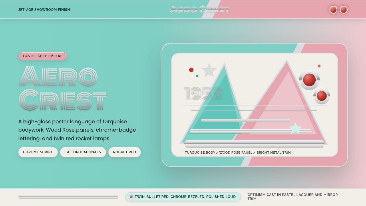 Cadillac TailfinShowroom optimism. Pastel aqua, Wood Rose panels, chrome Monoton, and rocket…展厅式乐观:湖绿粉彩、玫瑰木粉、镀铬 Monoton 与火箭红点。
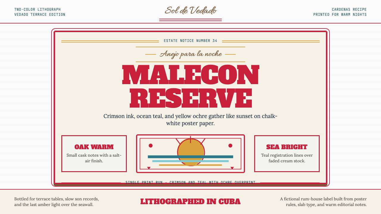 Havana Club Cuban RumSunset in print. Crimson slab type and ocean teal rules age on chalk-white pa…印刷里的日落。深红粗衬线与海洋青绿线框落在白垩纸上。
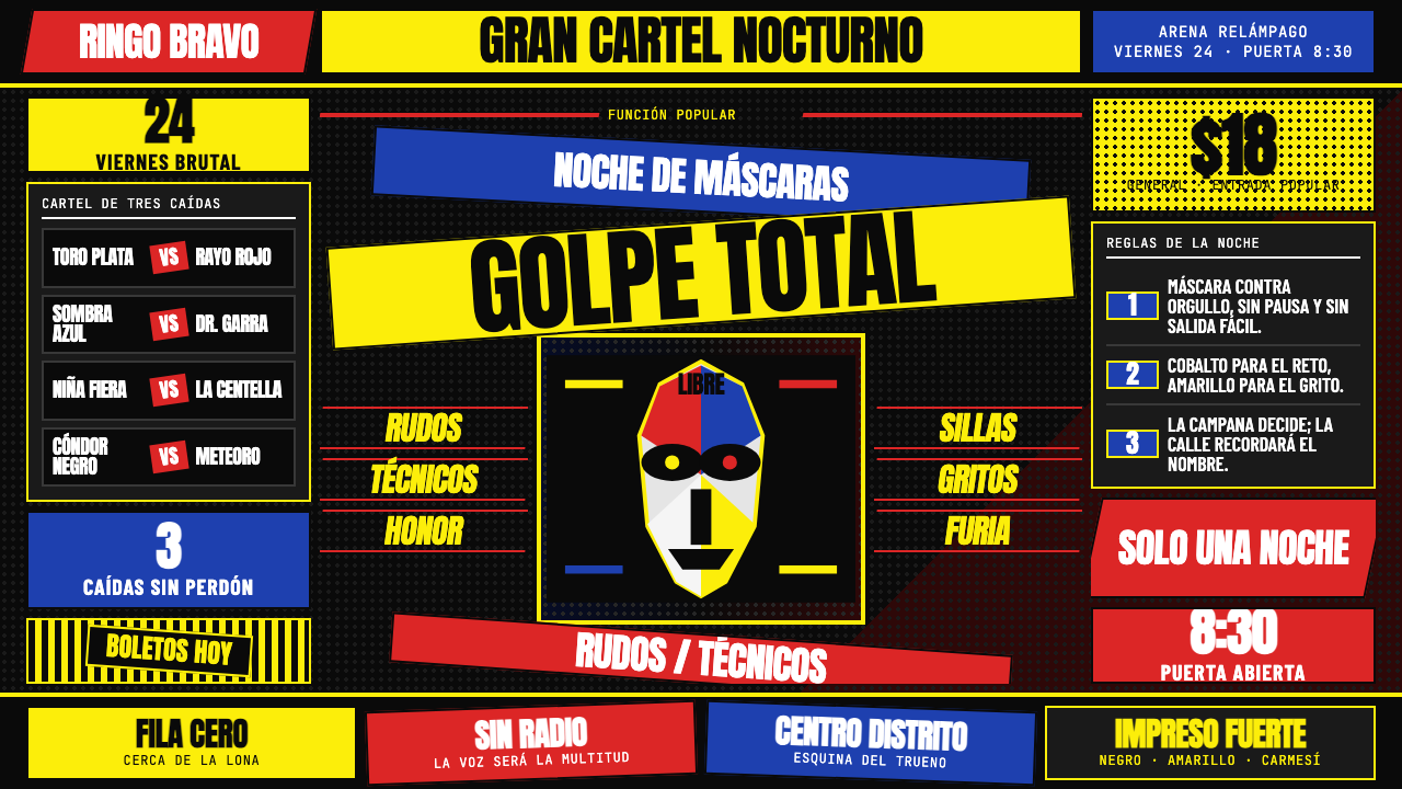 Lucha Libre PosterStreet-poster voltage. Yellow Anton banners, crimson diagonals, cobalt grids…街头高压海报:黑底上的荧光黄Anton、猩红斜线与钴蓝网格。
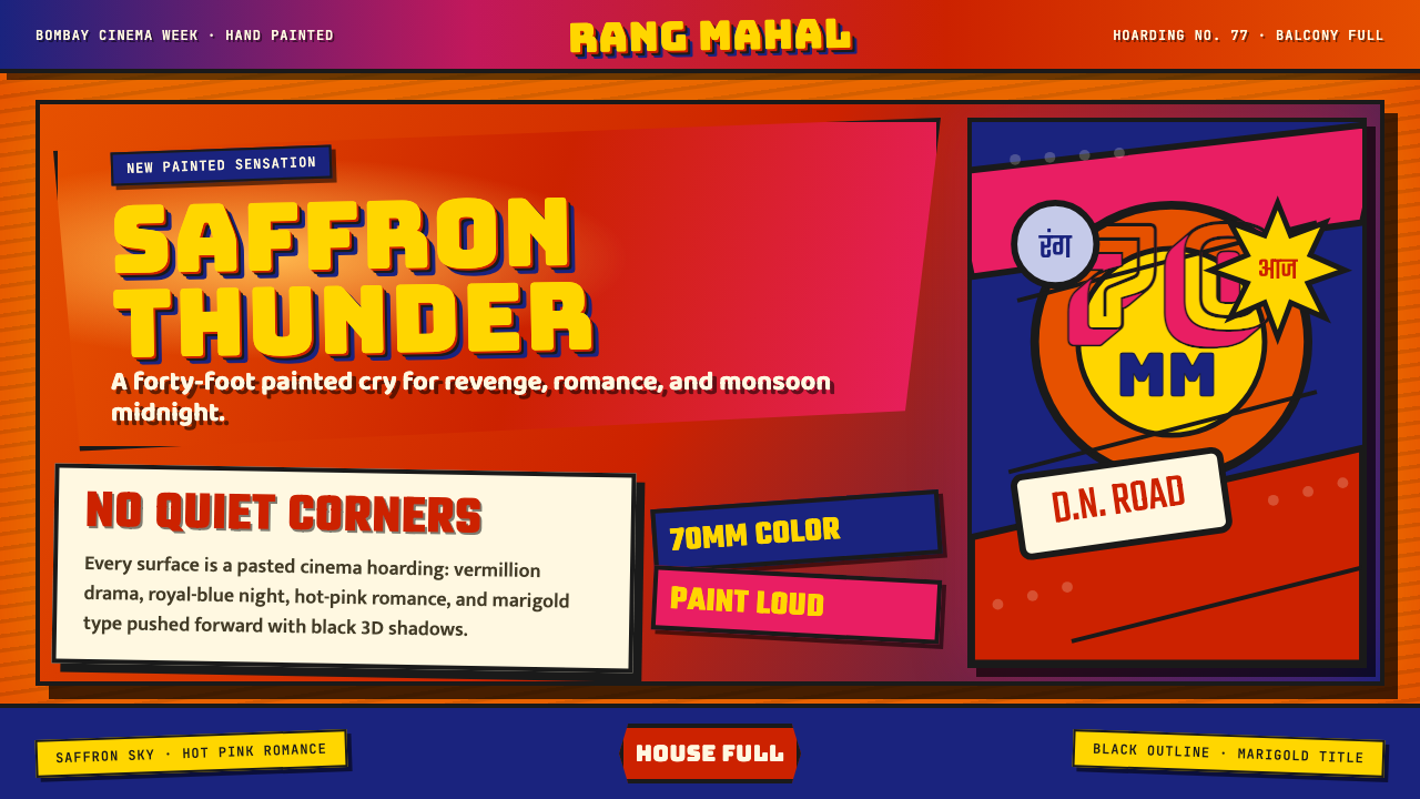 Bollywood Poster Art (1970s)Subtlety is unaffordable. Saffron fields, Bungee shadows, diagonal hoarding d…节制太便宜:藏红花底、Bungee黑影与斜向招贴制造十米戏剧。
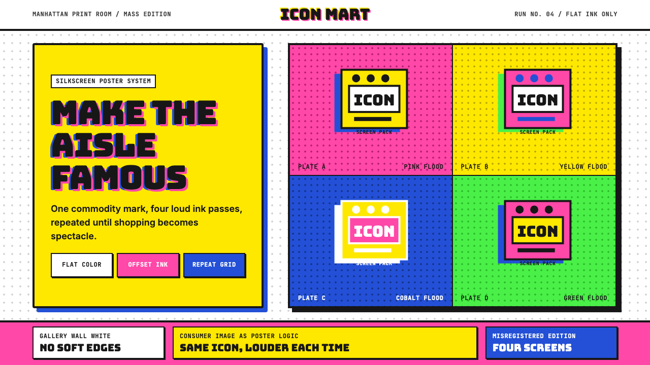 Warhol PopMass culture turns iconic. Hot pink, yellow, cobalt grids repeat flat silkscr…大众文化成了图标。热粉、亮黄、钴蓝网格重复扁平罐头。
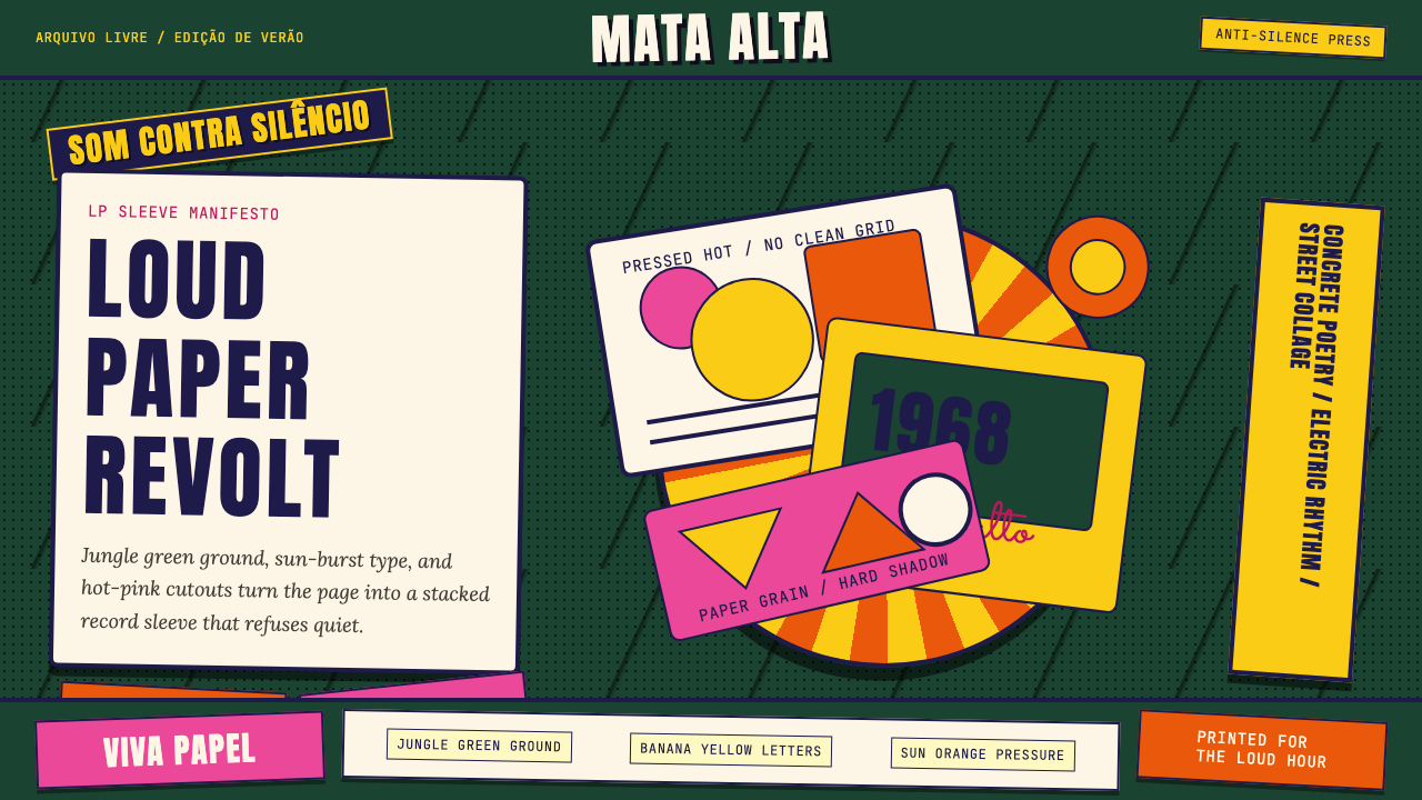 Brazilian Tropicália (1968)Art must be loud. Jungle green, banana yellow Anton type, and hard-shadow col…艺术必须喧哗:丛林绿、香蕉黄Anton字与硬阴影拼贴爆发。