What is Lucha Libre Poster?什么是 Lucha Libre Poster?
Lucha Libre posters are the loudest broadsheets in Latin American graphic history — pure black grounds, screaming diagonal type, and a palette so saturated it reads from across a dusty street.墨西哥摔角海报是拉丁美洲印刷史上声量最响的视觉语言——纯黑底色、嘶吼般的对角线字体,以及那套在尘土飞扬的街头也能一眼夺目的高饱和配色。
Lucha Libre Poster in briefLucha Libre Poster 速览
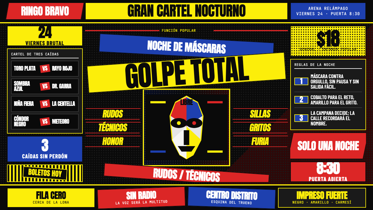
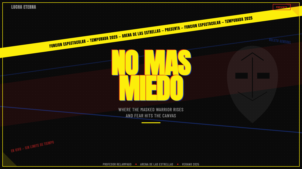
Lucha Libre poster design is a graphic system born from the promotional culture of Mexican professional wrestling. Every element of these broadsheets — the diagonal axis layouts, the hand-lettered display type in screaming scale, the masked-fighter silhouettes, and the saturated palette of red, yellow, blue, and silver — was engineered for a single purpose: to be unmissable on a telephone pole or arena wall at thirty paces.墨西哥摔角海报设计是一套诞生于职业摔角赛事推广文化的图形系统。这些大幅海报上的每一个元素——对角线轴线构图、嘶吼般比例的手写粗体字、蒙面摔角手剪影、以及饱和的红黄蓝银配色——都只为一个目的而生:在电话杆或竞技场墙上,从三十步开外就能夺人眼球。
As a design vocabulary, the style is maximalist by conviction rather than by accident. Where quieter traditions treat empty space as a virtue, Lucha Libre posters treat it as waste. Every square centimeter of the sheet is occupied. Type crashes into illustration, color blocks collide at hard diagonal edges, and multiple competing hierarchies are held together not by restraint but by sheer chromatic force. The result is a visual experience closer to a shout than a statement.作为一套视觉语汇,这种风格的极繁是出于信念,而非偶然。当其他设计传统将留白奉为美德时,墨西哥摔角海报将它视为浪费。每一平方厘米都有内容填充,文字冲撞插图,色块以硬朗的对角边缘碰撞,多重相互竞争的层级不靠克制维持,而靠纯粹的色彩张力凝聚在一起。最终呈现出的视觉体验,更像是一声呐喊,而非一句陈述。
The underlying structure, however, is more disciplined than it first appears. Diagonal axes replace the horizontal baseline grid, giving the whole composition a sense of kinetic energy — as if the layout itself is mid-motion. Weight and contrast do the work that whitespace would do in a calmer system, separating the fighter's name from the venue details from the ticket price without ever introducing silence.然而,其底层结构比初看时更有纪律。对角线轴取代了水平基线网格,赋予整个构图一种动能感——仿佛版式本身正处于运动之中。字重与对比度承担起在更平静的设计系统中由留白承担的工作,将摔角手姓名、场馆信息与票价分隔开来,却始终不引入任何静默。
See the Lucha Libre Poster design system查看 Lucha Libre Poster 完整设计系统
Where does Lucha Libre Poster come from?Lucha Libre Poster 从何而来?
Lucha Libre wrestling arrived in Mexico in the early twentieth century, drawing on American, European, and Japanese wrestling traditions. The sport found its definitive home in Mexico City, where the Arena México — inaugurated in 1956 — became the cathedral of the form. The theatrical elements that made Lucha Libre distinctively Mexican — the elaborate masks, the dramatic personas, the aerial acrobatics — were matched by an equally theatrical promotional apparatus. Posters were the primary advertising medium in an era before television saturation, and the printers who produced them developed a visual language as bold and performative as the wrestlers themselves.墨西哥摔角(Lucha Libre)于二十世纪初传入墨西哥,融合了美国、欧洲与日本摔角传统。这项运动在墨西哥城找到了其最终的精神家园——1956年落成的墨西哥竞技场(Arena México)成为这一运动形式的圣殿。使墨西哥摔角独树一帜的戏剧性元素——精心制作的面具、戏剧性人格、空中特技——与同样充满剧场感的宣传机器相得益彰。在电视尚未普及的时代,海报是主要广告媒介,制作它们的印刷工人发展出了一套与摔角手本人同样大胆、同样富有表演性的视觉语言。
The golden era of the poster style ran roughly from the 1960s through the 1980s, concentrated in Mexico City and Guadalajara but spreading across the republic wherever arenas hosted events. Printing was typically done by silkscreen — a medium that rewards flat areas of intense color and punishes fine detail. The technical constraints of screenprinting shaped the aesthetic: limited color separations meant each hue had to carry maximum weight, hairline registration meant shapes needed hard edges, and the urgency of weekly event promotion meant layouts had to be readable at a glance. The style was not designed in any studio; it accumulated organically across dozens of anonymous workshops.这种海报风格的黄金时代大约跨越1960年代至1980年代,以墨西哥城和瓜达拉哈拉为中心,但凡有竞技场举办赛事的地方都有其身影。印刷通常采用丝网印刷——这种媒介青睐大面积的强烈纯色,却对精细细节毫不宽容。丝网印刷的技术限制塑造了这一美学:有限的色彩分版意味着每种颜色都必须承载最大重量,精细套印意味着形状需要硬朗的边缘,而每周活动宣传的紧迫性意味着版面必须一目了然。这种风格并非诞生于某个设计工作室——它在数十家无名工坊中有机积累而成。
The figures who defined the era were the wrestlers themselves, whose visual identities became the subject matter of the posters. El Santo — whose silver mask made him one of the most recognizable figures in Mexican popular culture — became a recurring protagonist on thousands of broadsheets from the 1950s through the 1980s. Blue Demon and Mil Máscaras each brought their own chromatic identities (cobalt and a kaleidoscopic multicolor respectively) to the poster tradition, giving printers specific color cues to work with. The wrestlers' masked faces, printed as bold graphic silhouettes, became the emblematic image of the genre.定义那个时代的核心人物是摔角手本身,他们的视觉形象成为海报的核心内容。埃尔·桑托(El Santo)——其银色面具使他成为墨西哥大众文化中辨识度最高的人物之一——从1950年代至1980年代在数千张海报上反复出现。蓝色恶魔(Blue Demon)和千面人(Mil Máscaras)各自带来了独特的色彩身份(分别是钴蓝与万花筒般的多彩),为印刷工人提供了具体的色彩线索。摔角手的蒙面形象以大胆的图形剪影印出,成为这一流派的标志性图像。
The broader cultural context matters. Lucha Libre poster design did not emerge in isolation — it was part of a vivid street-print culture that included event flyers, boxing promotion, circus announcements, and the illustrated broadsheets known as corridos. This tradition drew on the graphic urgency of earlier Mexican popular print, including the deeply influential woodcut work associated with the Taller de Gráfica Popular (People's Graphic Workshop), founded in 1937. The diagonal compositions and saturated palettes of the wrestling posters share visual DNA with this longer Mexican tradition of print made for public walls rather than gallery walls.更广泛的文化语境同样重要。墨西哥摔角海报设计并非孤立涌现——它是一种生动的街头印刷文化的组成部分,与活动传单、拳击宣传、马戏团公告以及被称为「corridos」的图文并茂印刷品共生共存。这一传统汲取了更早期墨西哥大众印刷的图形张力,其中包括1937年创立的「人民图形工坊」(Taller de Gráfica Popular)颇具影响力的木刻传统。摔角海报的对角线构图与高饱和色板,与这一为公共墙面而非画廊墙面制作印刷品的更长久的墨西哥传统共享着视觉基因。
By the 1990s, offset printing and digital production gradually displaced the screenprinted broadsheet, and the specific vernacular of the hand-lettered wrestling poster began to thin. But the visual vocabulary had already been absorbed into Mexican graphic culture broadly, and from the 2000s onward, designers internationally began studying and reviving the aesthetic — finding in its maximalism, its chromatic confidence, and its structural use of the diagonal a set of tools that translated unexpectedly well into digital environments.1990年代,胶印与数字制版逐渐取代了丝网印大幅海报,手写字体摔角海报的那种特定方言开始式微。但这套视觉语汇已被更广泛的墨西哥图形文化所吸收;从2000年代起,国际设计师开始研究和复兴这一美学——在其极繁主义、色彩自信以及对角线的结构性运用中,发现了一套意外地能够迁移到数字环境的工具。
What defines the Lucha Libre Poster look?Lucha Libre Poster 的视觉特征是什么?
Palette色板
The canonical palette is built on four anchors: pure black as the ground, fluorescent yellow for the dominant headline banner, crimson red for price chips and diagonal accent bars, and cobalt blue for secondary headings and structural accents. Silver appears as a fifth element — referencing the metallic sheen of the wrestlers' masks — typically applied to key names or borders. The palette is always deployed at full saturation with no tinting, no pastels, and no gradients. Each color is a declaration, not a suggestion.经典色板建立在四个锚点上:纯黑作为底色,荧光黄用于主标题横幅,猩红用于票价标签与对角线装饰条,钴蓝用于副标题与结构性强调。银色作为第五元素出现——呼应摔角手面具的金属光泽——通常施于核心人名或边框。色板始终以满饱和度部署,无渐变、无粉彩色调。每种颜色都是一个宣告,而非一个建议。
Diagonal Axis对角线轴
The organizing spine of a Lucha Libre poster is rarely horizontal or vertical — it runs diagonally across the sheet, typically from lower-left to upper-right or upper-left to lower-right. This axis manifests as angled type baselines, raked color bands, and tilted silhouettes. The effect is kinetic: the composition appears to be in motion, matching the explosive athleticism of the sport it promotes. No other structural choice defines the genre as immediately as this diagonal grammar.墨西哥摔角海报的组织脊柱几乎从不是水平或垂直的——它斜跨整张海报,通常从左下至右上或从左上至右下。这条轴线以倾斜的文字基线、斜切的色带与倾斜的剪影体现出来。效果是动感的:构图看起来正处于运动之中,与它所宣传的这项运动的爆炸性athleticism相互呼应。没有任何其他结构性选择像这套对角线语法一样,如此即刻地定义了这一流派。
Hand-Lettered Display Type手写展示字体
In the original posters, display type was often hand-lettered directly onto the printing plate — each headline drawn rather than set. The resulting letterforms are thick-stroked, compressed in width, and frequently outlined or shadowed in a contrasting color to separate them from the background. The type communicates at the scale of signage: individual letters may be taller than a hand's span. Contemporary applications that capture this quality use bold condensed display faces with visible structure — letterforms that feel drawn rather than generated — and maintain the tradition of outlining or banding the type in a second color.在原始海报中,展示字体通常直接手绘到印版上——每一行标题是画出来的,而非排版出来的。由此产生的字形笔画粗重、字宽压缩,并常以对比色描边或加阴影,使其从底色中脱离出来。文字以标牌的尺度传达信息:单个字母可能比一个手掌的宽度还高。捕捉这种气质的当代应用,使用具有可见结构的粗重压缩展示字体——那种感觉是被画出来而非被生成的字形——并保持以第二种颜色为文字描边或加色带的传统。
Masked Silhouette蒙面剪影
The central image of most Lucha Libre posters is the wrestler's portrait, reduced to a bold graphic silhouette that emphasizes the mask over the face. Masks in the tradition carry encoded color identities — a silver mask, a cobalt mask, a tiger-striped mask — and these translate directly into the chromatic choices of the surrounding layout. The silhouette treatment is flat and hard-edged: no gradients, no skin tones, no photographic texture. The figure reads as an icon rather than a portrait, which makes it legible at distance and reproducible across printing conditions.大多数墨西哥摔角海报的核心图像,是摔角手的肖像被简化为强调面具而非面孔的粗犷图形剪影。这一传统中的面具携带着编码的色彩身份——银色面具、钴蓝面具、虎纹面具——这些直接转化为周围版面的色彩选择。剪影处理是平面且硬边的:无渐变,无肤色,无摄影质感。这个形象作为图标而非肖像被识别,这使其在远处清晰可读,并可在各种印刷条件下复制。
Maximum Density最大密度
Where modernist design traditions treat negative space as an active compositional element, the Lucha Libre poster fills it. Multiple text hierarchies — fighter name, event name, venue, date, ticket price, sponsor callouts — coexist in a single sheet without breathing room. Density is managed through contrast rather than spacing: a name in fluorescent yellow sits against black, a price chip in crimson cuts across a cobalt band, and the collision itself creates separation. This is a maximalism with internal logic, not chaos.当现代主义设计传统将负空间视为主动的构图元素时,墨西哥摔角海报将其填满。多重文字层级——摔角手姓名、赛事名称、场馆、日期、票价、赞助商呼吁语——在一张海报上共存,没有呼吸空间。密度靠对比而非间距来管理:荧光黄的名字置于黑底之上,猩红票价标签切过钴蓝色带,碰撞本身制造了区隔。这是一种有内在逻辑的极繁,而非混乱。
Hard-Cut Geometry硬切几何
Every shape in a Lucha Libre poster has a hard, straight edge — corners are sharp, color transitions are abrupt, and no element softens its boundary with a rounded corner or a feathered edge. This hard-cut geometry derives directly from the silkscreen process: ink either covers or does not cover. In digital translation, it means zero corner radius, zero blur, and color bands separated by sharp diagonal lines rather than gradients. The hard cut is not a stylistic affectation; it is a document of how the originals were made.墨西哥摔角海报中的每一个形状都有硬朗、笔直的边缘——角是尖锐的,色彩过渡是突兀的,没有任何元素以圆角或羽化边缘柔化其边界。这种硬切几何直接来自丝网印刷工艺:油墨要么覆盖,要么不覆盖。在数字转化中,这意味着圆角归零、模糊归零,色带以锋利的对角线而非渐变分隔。硬切不是风格上的做作;它是原始海报制作方式的记录。
Silver Accent银色点缀
Silver functions as the style's prestige register — reserved for the most important name on the sheet, for border treatments on the primary event box, or for outline strokes on the central silhouette. In print, this was achieved with metallic ink, which under arena lighting produced a genuine gleam. In digital work, silver is approximated through high-contrast light grey or near-white tones applied against the black ground. It is never used as a background or as a dominant color — always as a signal that something here is worth special attention.银色在这种风格中充当最高规格的符号——保留给海报上最重要的姓名、主赛事框的边框处理,或中心剪影的描边。在印刷中,这通过金属油墨实现,在竞技场灯光下产生真实的光泽。在数字作品中,银色通过施于黑色底面的高对比度浅灰或近白色调来近似呈现。它从不用作背景或主导色——始终作为一个信号,标示这里有值得特别关注的内容。
See the Lucha Libre Poster design system查看 Lucha Libre Poster 完整设计系统
Who shaped Lucha Libre Poster?谁塑造了 Lucha Libre Poster?
El Santo — born Rodolfo Guzmán Huerta in 1917 — was the defining figure of Lucha Libre and its most consequential visual subject. His silver mask, worn across a career spanning five decades, became one of the most recognizable icons in Mexican popular culture, transcending wrestling into film, comic books, and eventually mythology. On posters, his name and mask dominated the composition regardless of the actual billing — his presence alone was the primary advertising argument. He died in 1984 without ever publicly revealing his face, and the decision to keep the mask on was itself a graphic act: it preserved the icon over the individual.埃尔·桑托——本名鲁道弗·古斯曼·薇尔塔,生于1917年——是墨西哥摔角最具代表性的人物,也是其最重要的视觉主体。他那副跨越五十年摔角生涯始终佩戴的银色面具,成为墨西哥大众文化中辨识度最高的图标之一,超越摔角界延伸至电影、漫画,最终成为一种神话。在海报上,无论实际赛事如何排名,他的名字与面具总是主导整个构图——他的存在本身就是最主要的广告论据。他于1984年离世,一生从未公开摘下面具,而这一坚持本身就是一个图形行为:它将图标保留在了个体之上。
Blue Demon — Alejandro Muñoz Morales — was El Santo's great rival and professional partner across hundreds of bouts from the 1940s onward. His cobalt-and-silver mask made him an equally vivid poster subject, and his name reliably appeared alongside Santo's in the billing. The chromatic contrast between the two — silver Santo versus cobalt Blue Demon — gave poster designers a ready-made color opposition to organize their layouts. Blue Demon's career similarly extended into film, where he and Santo appeared together in a series of wrestling horror films that became cult objects of Mexican cinema.蓝色恶魔——阿莱杭德罗·穆尼奥斯·莫拉莱斯——是埃尔·桑托最强劲的对手与职业搭档,两人从1940年代起共同参加了数百场比赛。他那副钴蓝与银色的面具使他成为同样引人注目的海报主角,他的名字与桑托的名字并列出现在赛事阵容中已是惯例。两人之间的色彩对比——银色的桑托对上钴蓝的蓝色恶魔——为海报设计者提供了一套现成的色彩对立关系来组织版面。蓝色恶魔的职业生涯同样延伸至电影界,他与桑托共同出演了一系列摔角恐怖电影,成为墨西哥电影史上的cult经典。
Mil Máscaras — the name translates as Thousand Masks — debuted in 1965 and brought a new dimension to the poster tradition. Where El Santo and Blue Demon each carried a single fixed chromatic identity, Mil Máscaras changed his mask for every appearance, introducing a kaleidoscopic visual unpredictability to the promotional material. Poster designers faced the challenge of representing a wrestler whose identity was deliberately unstable, and the solutions they developed — collages of multiple mask silhouettes, rainbow-band treatments, typography that carried the chromatic load — enriched the genre's visual vocabulary. His international career, spanning Japan, the United States, and Europe, helped export the aesthetic beyond Mexico.千面人——其名字直译为「千副面具」——于1965年首次亮相,为海报传统带来了新的维度。埃尔·桑托与蓝色恶魔各自携带着单一固定的色彩身份,而千面人每次登场都更换面具,为宣传材料引入了一种万花筒般的视觉不可预测性。海报设计者面临着如何呈现一位视觉身份刻意不稳定的摔角手的挑战,他们开发出的解决方案——多副面具剪影的拼贴、彩虹色带处理、承担色彩重量的字体——丰富了这一流派的视觉词汇。他跨越日本、美国与欧洲的国际职业生涯,帮助将这一美学输出至墨西哥以外。
The visual style was not the creation of any single named designer — it was the accumulated practice of dozens of anonymous print shop workers across Mexico City, Guadalajara, and other arena cities. These craftsmen developed the diagonal layout conventions, the color hierarchies, and the hand-lettering techniques that define the genre, working under the constraints of weekly deadlines and limited color separations. Their anonymity is itself historically significant: the style is a vernacular, not an authored work, and its authority comes from collective practice rather than individual genius. Contemporary designers who engage with the tradition are in dialogue with a workshop culture rather than a singular artistic vision.这种视觉风格并非任何一位署名设计师的创造——它是墨西哥城、瓜达拉哈拉及其他竞技场城市数十家无名印刷工坊工人积累实践的结晶。这些工匠在每周截止日期与有限色彩分版的约束下,发展出了对角线版面惯例、色彩层级体系与手写字体技法,定义了这一流派。他们的匿名性本身具有历史意义:这种风格是一种方言,而非一部署名的作品,其权威性来自集体实践而非个人天才。当代设计师与这一传统的对话,是在与一种工坊文化互动,而非与某个单一艺术愿景对话。
The Taller de Gráfica Popular — People's Graphic Workshop, founded in Mexico City in 1937 — was a collective of politically committed printmakers who used woodcut and linocut to produce socially engaged broadsheets, posters, and illustrations. While the Taller's subject matter was political rather than sporting, its graphic vocabulary — bold outlines, flat areas of strong color, diagonal compositions, and type integrated directly into the image — fed directly into the broader street-print culture from which the Lucha Libre poster emerged. The Taller demonstrated that print made for public walls could be both visually sophisticated and viscerally immediate, establishing a template that wrestling promoters and their printers adapted with great effectiveness.人民图形工坊(Taller de Gráfica Popular)——1937年创立于墨西哥城——是一个政治立场鲜明的版画家集体,他们以木刻和亚麻油毡版画创作具有社会参与性的印刷品、海报与插图。尽管工坊的主题是政治性而非体育性的,其图形语汇——粗重轮廓线、大面积强烈纯色、对角线构图、文字直接融入图像——直接滋养了墨西哥摔角海报涌现其中的更广泛的街头印刷文化。工坊证明了为公共墙面制作的印刷品既可以具有视觉复杂性,又可以具有直接的感官冲击力,确立了一套模板,被摔角赛事推广者及其印刷工人极为有效地加以改造运用。
How do you use Lucha Libre Poster today?今天怎么用 Lucha Libre Poster?
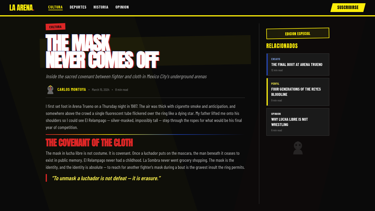
Lucha Libre poster design translates into digital work most effectively when applied with structural commitment rather than surface decoration. The temptation is to borrow only the palette — dropping fluorescent yellow and crimson onto an otherwise conventional layout — and call it done. That approach produces a tinted version of something ordinary. The style's power comes from its compositional logic: the diagonal axis, the maximum density, the hard-cut edges, and the use of color as pure hierarchy signal rather than mood. All of these must be present for the result to carry authentic voltage.墨西哥摔角海报设计最有效地转化为数字作品的方式,是结构性的承诺,而非表面装饰。诱惑在于只借用色板——将荧光黄和猩红叠加到一个本来普通的版面上——然后就此收手。这种做法不过产生了一个普通事物的着色版本。这种风格的力量来自其构图逻辑:对角线轴、最大密度、硬切边缘,以及将色彩用作纯粹的层级信号而非情绪铺垫。所有这些都必须同时在场,结果才能传递出真实的电压。
For presentation slides, the style is exceptional for cover pages and section dividers. A cover works by assigning the dominant diagonal axis to the title — angled type in fluorescent yellow or crimson across a pure black ground — with the speaker name or event name treated as a secondary band running parallel at a different scale. Section dividers use full-bleed color blocks with angled cuts between them, using the color shift itself as the transition. Content slides require more discipline: the diagonal energy should be used for accent elements only — a tilted label, an angled price chip on a data comparison — while the body text remains on a legible grid. Data visualizations gain a great deal from this system: bar charts become bold flat color blocks, legends use the chromatic hierarchy naturally, and the overall slide reads as a designed object rather than a software default.在演示文稿中,这种风格在封面页和章节分隔页上表现出色。封面的做法是将主导对角线轴赋予标题——荧光黄或猩红的倾斜文字横跨纯黑底面——演讲者姓名或活动名称作为次级色带以不同比例平行排布。章节分隔页使用全幅色块,色块之间以斜切过渡,用色彩的转换本身作为章节切换的信号。内容页需要更多纪律:对角线能量应只用于点缀元素——一个倾斜的标签、一个数据对比中的斜切价格标签——而正文保持在可读的网格上。数据可视化在这套系统中受益良多:柱状图变成粗犷的平面色块,图例自然地使用色彩层级,整体幻灯片读起来像是一个被设计过的对象,而非软件的默认输出。
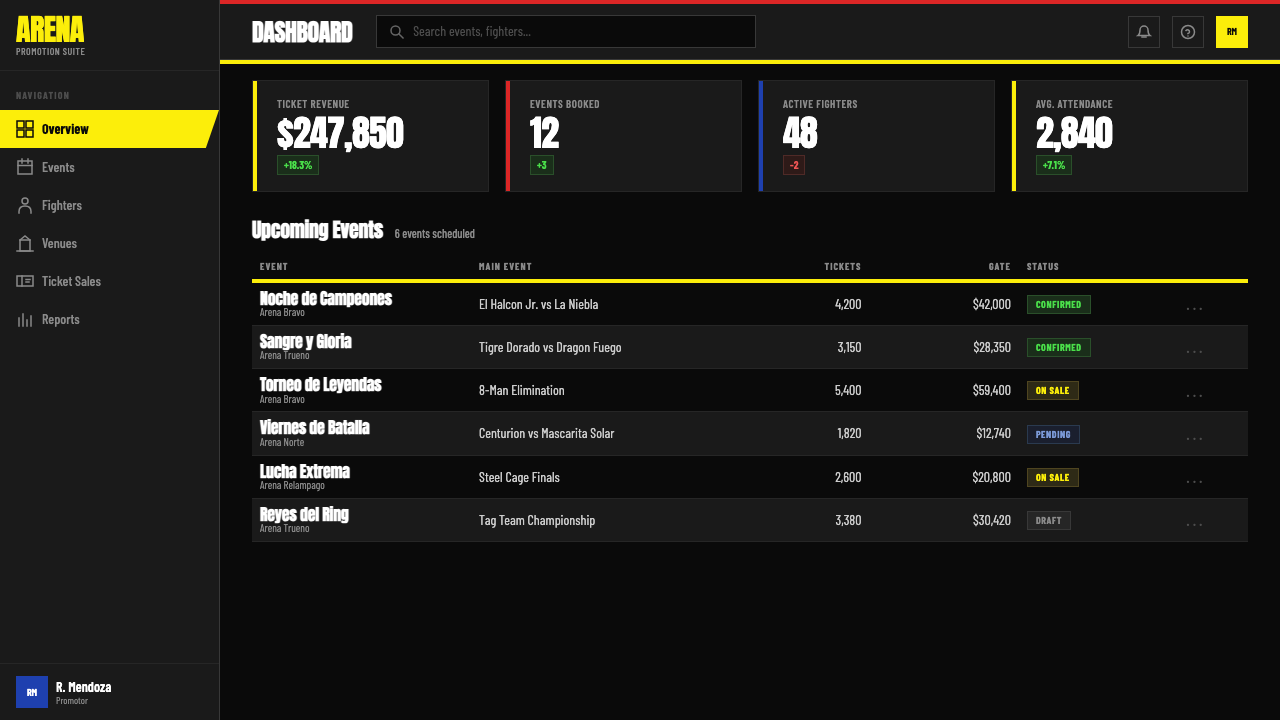
For web interfaces, the style is best suited to contexts where bold hierarchy and immediate scannability are the priority: pricing pages, event landing pages, promotional announcements, and dashboards that need to communicate status at a glance. The approach is to treat the page as a vertical sequence of full-width color bands, each with a hard diagonal cut at its lower edge, alternating between black-ground and color-ground sections. Navigation bars should be pure black with type in fluorescent yellow or white — no rounded corners, no subtle gradients, no ghost buttons. Interactive states use the crimson accent: hover turns a yellow button crimson, not lighter yellow. The silhouette treatment from the poster tradition translates directly into hero imagery: subjects cut out against a solid color ground, edges hard.对于网页界面,这种风格最适合大胆层级与即时可扫描性是首要需求的场景:定价页面、活动落地页、促销公告,以及需要一目了然传达状态的仪表板。做法是将页面视为一系列全幅色带的垂直堆叠,每个色带的下边缘有硬朗的斜切,黑底部分与彩色底部分交替出现。导航栏应该是纯黑底配荧光黄或白色文字——圆角归零,渐变归零,无幽灵按钮。交互状态使用猩红强调色:悬停将黄色按钮变为猩红,而非浅黄。来自海报传统的剪影处理直接转化为主视觉图像:主体从纯色底中切出,边缘硬朗。
For editorial and marketing work, the style supports both long-form content and short-burst promotional materials. A marketing page built on this system uses alternating full-width sections in the primary palette, with feature headlines set at poster scale — large enough that individual letters command attention. Pull quotes work especially well when treated as color band interruptions: a crimson band cuts across the page at a slight diagonal, carrying a short quote in black or white type. For social media cards and event promotions, the style is already native: the single-image format is essentially a constrained broadsheet, and the principles of maximum density, diagonal axis, and chromatic hierarchy apply directly without translation.对于编辑与营销内容,这种风格同时支持长篇内容与短促的促销材料。基于这套系统构建的营销页面使用主色板中交替出现的全幅区块,特性标题以海报尺度排印——大到单个字母本身就能吸引注意力。引用语在被当作色带打断处理时效果尤为出色:一条猩红色带以轻微的角度斜切过页面,承载黑色或白色字体的短句。对于社交媒体卡片与活动宣传,这种风格本来就是原生的:单图格式本质上就是一张受约束的大幅海报,最大密度、对角线轴与色彩层级的原则可以无需转译地直接应用。
A common mistake is treating the palette as a license for undifferentiated saturation — applying fluorescent yellow, crimson, and cobalt simultaneously across every element at full intensity. Authentic posters are saturated, but they are also hierarchical: one color dominates, one accents, one signals a specific element type. Yellow headlines, crimson price chips, cobalt secondary labels — the system works because each color has a role. When all three compete equally, the hierarchy collapses and the composition becomes noise rather than signal. Similarly, introducing soft shadows, rounded corners, or gradient fills immediately neutralizes the style's defining quality — the hard-cut, flat, abrupt geometry that makes it legible at distance. Every softening is a step away from the source.一个常见错误是将色板视为无差别高饱和的许可——将荧光黄、猩红与钴蓝同时以满强度施加到每一个元素上。真实的海报是饱和的,但同时也是有层级的:一种色彩主导,一种点缀,一种标示特定的元素类型。黄色标题、猩红价格标签、钴蓝次级标签——这套系统奏效,因为每种颜色都有其角色。当三者平等竞争时,层级崩溃,构图变成噪声而非信号。同样,引入柔和阴影、圆角或渐变填充会立即中和这种风格的决定性品质——那种使其在远处可读的硬切、平面、突兀的几何感。每一次柔化都是远离源头的一步。
See the Lucha Libre Poster design system查看 Lucha Libre Poster 完整设计系统
Lucha Libre Poster — FAQLucha Libre Poster · 常见问题
Is this style appropriate only for sports or entertainment contexts?这种风格只适合体育或娱乐场景吗?
Not at all — the style's power is independent of its subject matter. The original posters were sports promotion, but the visual system they developed is fundamentally about hierarchy, urgency, and legibility at distance. These qualities transfer well to any context where you need information to land immediately and confidently: product launches, limited-time offers, event announcements, pricing pages, and status dashboards all benefit from the same compositional principles. The style does carry an energy — it is never quiet — and it is not suited to contexts where the brand voice is delicate, minimalist, or luxury-restrained. But within its natural register, which is anywhere boldness is appropriate, the subject matter is secondary.完全不是——这种风格的力量独立于其主题内容。原始海报是体育推广,但它们发展出的视觉系统从根本上是关于层级、紧迫感和远距离可读性的。这些品质能很好地迁移到任何需要信息即刻、自信着陆的场景:产品发布、限时优惠、活动公告、定价页面与状态仪表板,都能从同样的构图原则中获益。这种风格确实携带着一种能量——它从不安静——并不适合品牌声音需要纤细、极简或奢侈克制的场景。但在其自然音域内——任何大胆是合适的地方——主题内容是次要的。
How does this style differ from other bold Latin American graphic traditions?这种风格与其他大胆的拉丁美洲图形传统有何不同?
The most important distinction is structural. Other Latin American poster traditions — Brazilian carnival design, Cuban revolutionary posters, Peruvian chicha graphics — share high saturation and expressive energy, but each has its own compositional logic. Brazilian carnival work tends toward symmetry and figurative exuberance. Cuban political posters use flat areas of color with strong silhouettes but often a more measured scale relationship between elements. Chicha graphics are dense and psychedelic, often centered on portraiture with a characteristic rainbow gradient approach. Lucha Libre's defining traits are the hard diagonal axis, the complete absence of gradients, the silver accent, and the collision of flat color bands — a vocabulary drawn specifically from the silkscreen process and the arena environment. The shared quality is loudness; the grammar is distinct.最重要的区别在于结构。其他拉丁美洲海报传统——巴西嘉年华设计、古巴革命海报、秘鲁奇恰图形——共享高饱和度与表现性能量,但各有其自身的构图逻辑。巴西嘉年华作品倾向于对称与具象的丰盛感。古巴政治海报以大面积平色与强烈剪影为特征,但元素间的尺度关系往往更为从容。奇恰图形密集而迷幻,常以肖像为中心,带有特征性的彩虹渐变手法。墨西哥摔角海报的决定性特征是硬朗的对角线轴、对渐变的彻底拒绝、银色点缀,以及平面色带的碰撞——这套语汇特定地来自丝网印刷工艺与竞技场环境。共同的品质是响亮;语法是各自鲜明的。
Can a light-background version of this style work, or does it require black grounds?这种风格可以有浅色背景版本吗,还是说它必须依赖黑色底面?
The black ground is not a technical requirement but a structural one — it is the surface against which fluorescent yellow and crimson read at their maximum contrast and energy. A light-background variant is possible but requires significant rethinking. On cream or white, the yellow loses its fluorescent quality and reads more as a muted mustard; the red remains strong but the overall energy drops considerably. If a light variant is needed, the most successful approach is to treat the background as a reserved zone and concentrate the palette into bold color-band elements — the white functions like negative space that the diagonal bands cut across, rather than as the dominant ground. The result is a version of the style that has more in common with its street-print cousins than with the classic black-ground poster.黑色底面不是技术要求,而是结构要求——它是荧光黄和猩红在最大对比度与能量下显现的表面。浅色背景变体是可能的,但需要大量重新思考。在奶油色或白色上,黄色失去其荧光品质,读起来更像是低沉的芥末黄;红色依然强烈,但整体能量大幅下降。如果需要浅色变体,最成功的做法是将背景视为保留区域,将色板集中到粗犷的色带元素中——白色的功能像是对角色带切过的负空间,而非主导底色。结果是一个与其街头印刷同类更相近的风格版本,而非经典的黑底海报。
How should imagery and photography be handled in this style?在这种风格中,图像与摄影应该如何处理?
Photography, when used, should be treated the way the original posters treated their subjects: reduced to high-contrast silhouettes or bold graphic extractions rather than presented as naturalistic windows into a scene. The practical approach is to isolate the subject against a transparent or solid-color ground, increase the contrast until the midtones collapse, and treat the result as a flat shape rather than a photograph. Facial detail, skin texture, and ambient light are the enemies of this style — they introduce the softness and naturalism the system explicitly rejects. A portrait processed this way — reduced to a high-contrast silhouette with a strong mask or costume detail — becomes native to the style. Full photographic naturalism, used without treatment, will always fight with the flat-color geometry of the surrounding design.摄影在使用时,应该像原始海报对待其主体一样处理:简化为高对比度剪影或粗犷的图形提取,而非呈现为对某一场景的自然主义窗口。实际做法是将主体从透明或纯色底中隔离出来,提升对比度直至中间调消失,然后将结果作为平面形状而非照片处理。面部细节、皮肤质感与环境光是这种风格的敌人——它们引入了这套系统明确拒绝的柔和感与自然主义。以这种方式处理过的肖像——简化为高对比度剪影,带有强烈的面具或服装细节——将成为这种风格的原生元素。未经处理的完整摄影自然主义,将永远与周围设计的平面色彩几何产生冲突。
Does applying this style mean every design element must be aggressive and loud?应用这种风格是否意味着每个设计元素都必须激进而响亮?
The style is inherently high-energy, but internal contrast is what makes it work — and internal contrast requires some elements to be relatively quieter. In a well-constructed Lucha Libre layout, the fighter name screams in fluorescent yellow at maximum scale; the venue and date are set much smaller in a secondary color; the body copy (ticket information, sponsor text) recedes further still. The loudness is relative: the loudest element is loud because everything else makes room for it. A design where every element competes at maximum volume is not authentic to the tradition — it is a failure to apply the system's hierarchical logic. The correct question is not 'how loud should everything be?' but 'what is the single most important thing, and how loud does everything else need to be to make that one thing unmissable?'这种风格天然是高能量的,但内部对比才是使其奏效的机制——而内部对比需要某些元素相对更为安静。在一个构建精良的墨西哥摔角海报版面中,摔角手姓名以荧光黄在最大比例下嘶吼;场馆与日期以小得多的尺度用次级色彩排印;正文(票务信息、赞助商文字)则进一步退居幕后。这种响亮是相对的:最响的元素之所以响,是因为其他一切都为它让出了空间。每个元素都以最大音量竞争的设计并不忠实于这一传统——它是对这套系统层级逻辑的失败应用。正确的问题不是「每件事应该多响?」,而是「最重要的一件事是什么,其他一切需要有多响才能使那一件事无从错过?」
Related design styles相关设计风格
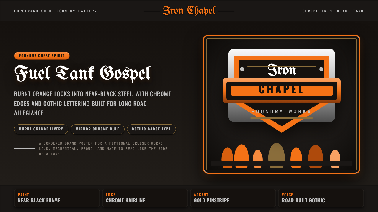 Harley Orange & BlackBuilt like a tank badge. Burnt orange, chrome hairlines, gothic type on near…像油箱徽章般强硬:燃橙、镀铬细线、哥特字压在近黑底上。
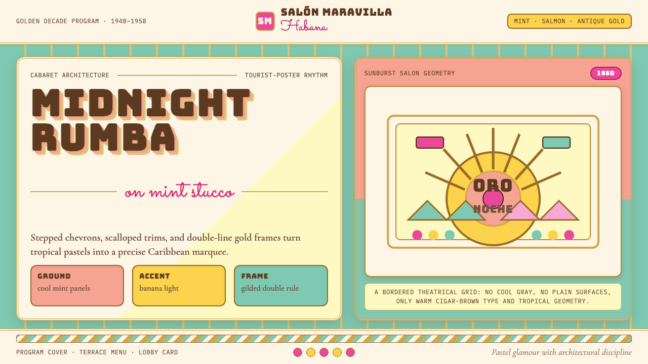 Cuban Art Deco (Havana 1950)Tropical Deco goes theatrical. Mint and salmon panels, gold double rules, Bun…热带装饰艺术登上舞台:薄荷与三文鱼色分区,金色双线框配Bungee招牌字。
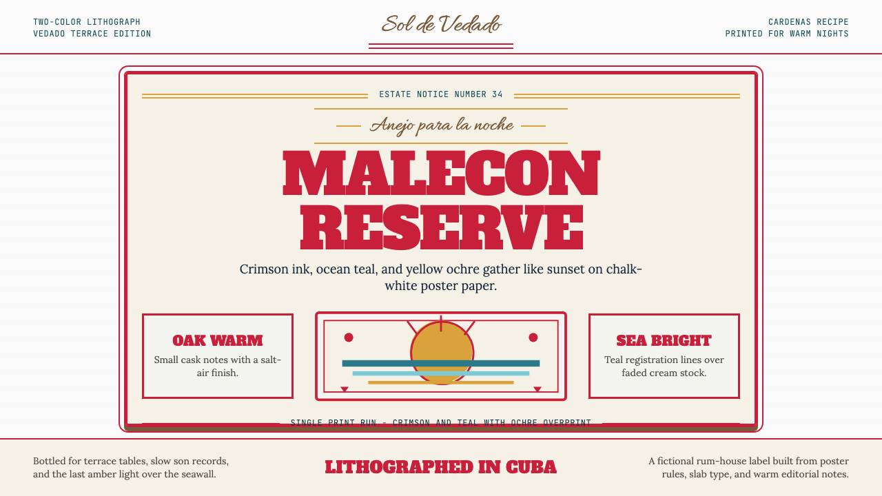 Havana Club Cuban RumSunset in print. Crimson slab type and ocean teal rules age on chalk-white pa…印刷里的日落。深红粗衬线与海洋青绿线框落在白垩纸上。
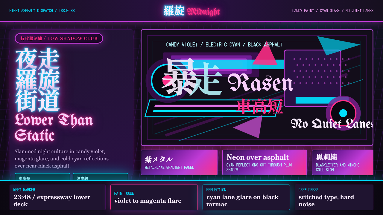 JDM BosozokuNight culture shouts. Candy violet, cyan neon, and stacked Mincho-blackletter…夜色里吼叫:糖果紫与电光青,明朝体和黑体叠满柏油。
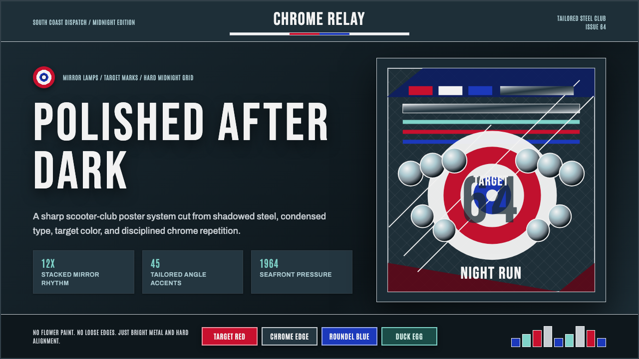 Mod Scooter ChromeSharp chrome discipline. Steel ground, roundel targets, condensed type, mirro…锋利的铬钢纪律:深钢底、靶心圆与窄体大字组成镜面节奏。
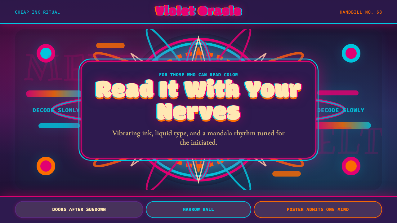 Psychedelic Fillmore (Mouse, 1968)Legibility becomes ritual. Magenta-cyan vibration and bulbous mandalas melt t…可读性成为仪式:洋红青色震颤与泡泡字曼陀罗融化画框。