What is Psychedelic Fillmore (Mouse, 1968)?
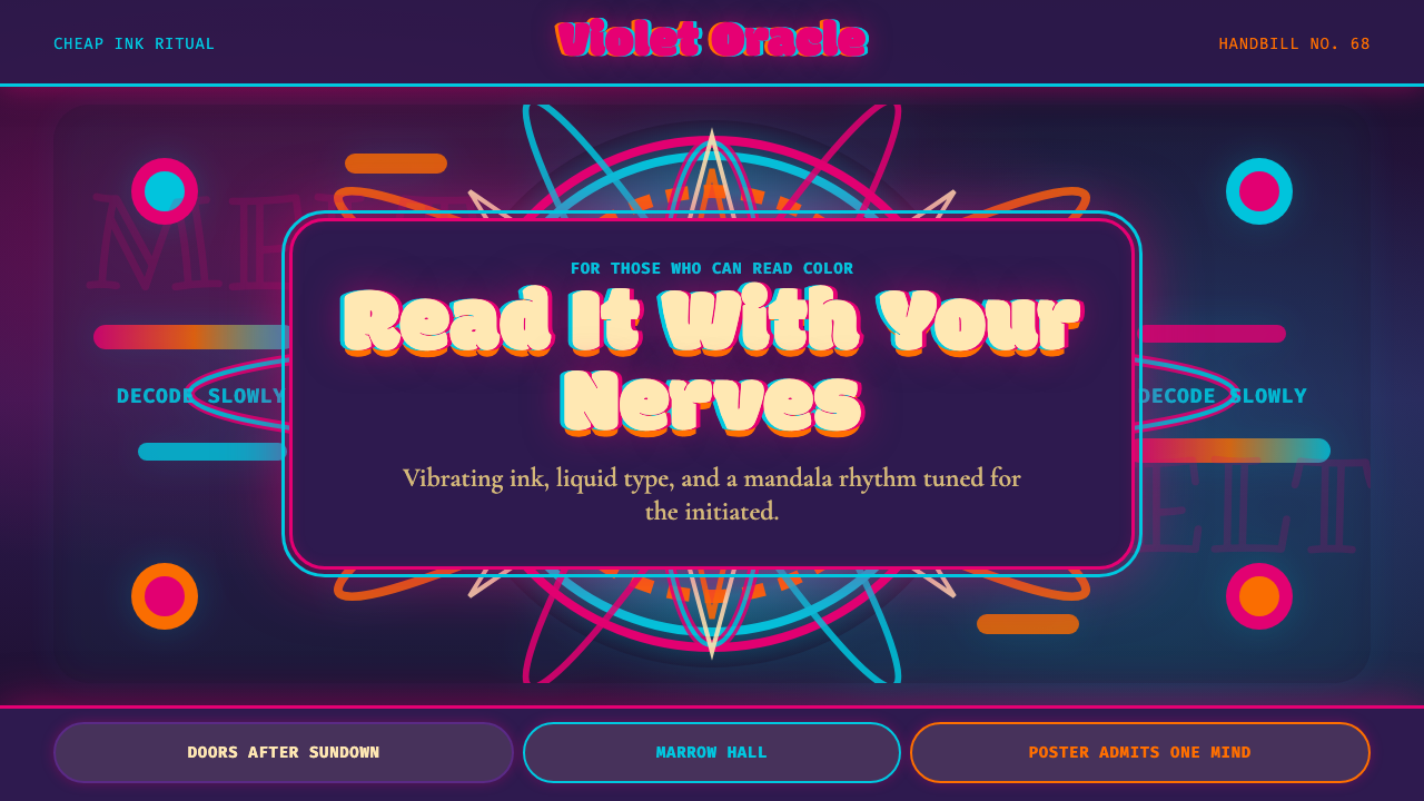
The Fillmore concert posters of 1966–1971 proved that design could be a tribal ritual — vibrating complementary colors and liquid lettering so deliberately unreadable that only the initiated could decode them.
Psychedelic Fillmore (Mouse, 1968) in brief
Psychedelic Fillmore poster art is the visual language of San Francisco's acid counterculture — a graphic system built on maximum chromatic tension, letterforms dissolved past the threshold of legibility, and swirling mandala compositions designed to simulate altered perception on paper. Where most design traditions treat readability as a virtue, this one weaponizes its absence: the difficulty of decoding the poster is part of its meaning.
The style emerged from a tight community of artists working for concert promoter Bill Graham at the Fillmore Auditorium and Fillmore West from 1966 onward. Stanley Mouse, Alton Kelley, Rick Griffin, Wes Wilson, and Victor Moscoso — collectively known as the Big Five — each developed distinct but interrelated approaches. What they shared was an appetite for pushing print to its physiological limits: colors placed so they appeared to vibrate against each other, type bent and stretched until reading it required effort and surrender.
Visually, the style is dense where most design is spare, emotional where most is rational, and deliberately excessive where most is controlled. It draws on Art Nouveau's organic curves, Victorian circus typography's extravagance, and indigenous mandala symbolism — but combines them through a psychedelic lens that rejects the idea of the neutral or invisible designer in favor of an overwhelming, immersive presence.
Where does Psychedelic Fillmore (Mouse, 1968) come from?
The immediate context was San Francisco in 1966: the Haight-Ashbury neighborhood had become the center of a rapidly growing counterculture organized around psychedelic experience, communal living, and opposition to the Vietnam War. Bill Graham, a concert promoter with a gift for logistics and a nose for talent, had secured the Fillmore Auditorium as a venue for shows by the Grateful Dead, Jefferson Airplane, Big Brother and the Holding Company, and Jimi Hendrix. He needed posters — cheap, reproducible, printed fast — to announce these events. The artists he commissioned quickly understood that a standard commercial handbill was not culturally appropriate. The audience was already primed for sensory overload; the poster had to match that register.
The Big Five drew from an eclectic archive of sources. Wes Wilson was the first to develop the liquid, bulbous lettering style — letters inflated from within, their counter-forms pushing outward against tight compositions — that would define the genre. He was drawing on Art Nouveau, particularly the sinuous organic type of Alphonse Mucha and Jules Chéret, but distorting it toward something more visceral and less decorative. Victor Moscoso brought a different influence: he had studied under Josef Albers at Yale and understood the optical effects of simultaneous contrast — the way complementary colors placed adjacent to each other appear to vibrate, creating a visual hum that made posters feel active even when standing still. Stanley Mouse and Alton Kelley had roots in hot rod and biker subculture graphics, where skull imagery and confrontational iconography were already established currencies.
The technical context mattered too. These were offset lithograph prints produced quickly and cheaply. Color registration could drift; edges could blur. The artists incorporated these production imperfections rather than fighting them, and the slight misalignment of color layers added to the hallucinatory quality of the final object. The standard poster format — roughly eleven by seventeen inches, printed in quantity and distributed as free handbills — was designed to be posted on telephone poles and in shop windows, which meant legibility at a distance was both theoretically desirable and practically impossible given the design choices being made.
By 1967, the style had spread beyond San Francisco. The posters were being collected as art objects by people who had never attended a Fillmore show. They appeared in galleries and were reproduced in magazines. The Summer of Love brought international press attention to Haight-Ashbury, and the poster aesthetic traveled with that coverage to Europe and beyond. By 1968, the year this style is anchored to, the idiom had been widely imitated, licensed, and misunderstood — prompting some of the original artists to push their experiments further into abstraction and complexity, maintaining a leading edge against the imitators.
What defines the Psychedelic Fillmore (Mouse, 1968) look?
Vibrating Complementary Color
The defining chromatic signature is the deliberate pairing of colors that sit directly opposite each other on the color wheel — magenta against cyan, orange against violet, acid yellow against electric blue. When placed at full saturation in adjacent areas of roughly equal visual weight, complementary colors create an optical illusion of movement and vibration at their shared edge. The Fillmore artists understood this effect as a tool for simulating altered perception: the poster itself appears to pulse. Victor Moscoso in particular applied this principle systematically, derived from his formal study of color theory under Josef Albers.
Liquid and Bulbous Lettering
Typography in this style is not set — it is sculpted. Letters swell from within, their strokes thickening in the middle and narrowing at the terminals, their overall forms inflated and organic rather than constructed from geometric rules. Words curve and wrap around compositional shapes; individual letters lean into each other or merge at their serifs. Legibility is sacrificed to atmosphere: the text communicates mood and tribal identity first, specific information second. Reading the poster becomes an act of decipherment requiring close inspection and patience.
Mandala and Radial Composition
Where most western graphic design of the era organized content along rectilinear grids, Fillmore poster composition frequently radiates outward from a central point or spirals inward toward one. This mandala logic — borrowed loosely from South Asian and Tibetan visual traditions that had entered hippie consciousness through Alan Watts, Timothy Leary, and the Psychedelic Review — created compositions that rewarded prolonged looking. The viewer's eye does not scan from corner to corner but circles and descends, making the act of reading the poster resemble meditation.
Dense Pattern and Decorative Layering
Horror vacui — the fear of empty space — governs these compositions. Backgrounds are never left neutral; they are filled with intricate repeated patterns, graduated tonal fields, or secondary imagery that competes visually with the foreground elements. This density was partly indebted to Art Nouveau's surface-coverage philosophy and partly to the print economics of the time: filling the plate cost nothing extra, and rich visual texture communicated value and effort to the audience. The result is work that becomes richer the longer you look, revealing secondary images and details that were invisible at first glance.
Skull, Nature, and Countercultural Iconography
The imagery vocabulary is specific and intentional: human skulls (carried from hot rod culture through Mouse and Kelley's earlier work), figures from Art Nouveau and Victorian illustration, roses and thorns, celestial bodies, Native American and South Asian motifs repurposed through a psychedelic filter. These symbols functioned as a shared pictorial language for the Haight-Ashbury community — recognizable to insiders, disorienting to outsiders. The skull in particular was a complex symbol: memento mori, biker emblem, and liberation from social conformity simultaneously.
Deliberate Illegibility as Message
In most design contexts, when text becomes unreadable the designer has failed. In Fillmore poster art, controlled illegibility is the message. The poster announces who is performing, when, and where — but it presents this information as a puzzle that rewards belonging. Decoding the lettering requires familiarity with the visual conventions of the community; if you know how to look, the information reveals itself. This makes the poster function simultaneously as advertising and as a test of cultural membership. The design proves that legibility and communication are not the same thing.
Chromatic Saturation at Maximum
Color is never muted, never diluted, never pastel. Every hue appears at or near its fullest intensity — the magenta is as magenta as ink allows, the cyan as insistent as the press can manage. This commitment to maximum saturation was both an aesthetic choice and a product of the offset lithography process, which could produce vivid spot colors economically. The effect is that the eye receives no resting place: the entire surface of the poster demands attention simultaneously, amplifying the sense of visual excess that was the style's cultural signature.

Who shaped Psychedelic Fillmore (Mouse, 1968)?
Mouse (born Stanley Miller) came to the Fillmore scene from Detroit's custom car culture, where skull-and-crossbones imagery and hand-lettered signage were already a vernacular. Partnering with Alton Kelley, he developed a style that fused hot rod iconography with Art Nouveau borrowed imagery, most famously adapting Edmund Joseph Sullivan's illustration of a skeleton for the Grateful Dead skull-and-roses motif that became one of the most recognizable icons in rock history. Mouse Studios, the partnership with Kelley, produced dozens of canonical Fillmore posters and established the visual identity of the Dead across multiple decades.
Wilson is credited as the primary inventor of the liquid, inflated lettering style that became the genre's typographic signature. Working quickly under the pressures of a weekly poster schedule, he developed an approach to hand-lettered type that maximized visual density and organic flow over readability. His letters appear to grow from the page as living organisms. Wilson created more than sixty Fillmore posters between 1966 and 1967 alone, establishing the visual template that all subsequent artists in the genre would negotiate with. He stopped working for Graham in 1967 in a dispute over rights, which led to Mouse and Kelley taking a more prominent role.
Moscoso was the most formally trained of the Big Five, holding a degree from Cooper Union and having studied color theory under Josef Albers at Yale. He applied Albers's simultaneous contrast principles — the optical vibration produced by adjacent complementary colors — with unusual rigor and consistency, creating posters that felt physiologically active in a way that went beyond conventional graphic boldness. Moscoso also pioneered the deliberate reversal of figure and ground: he frequently made the background the most visually active element, with the text and central image receding rather than advancing.
Griffin came from a surfing magazine background — he had created the famous 'Murphy' character for Surfer Magazine in the early 1960s — and brought a cartoonist's fluency with narrative imagery to the Fillmore poster tradition. His work is the most cosmologically ambitious of the Big Five, incorporating imagery from pre-Columbian cultures, early Christian iconography, celestial navigation charts, and surreal hybrid creatures. Later in his career Griffin converted to Christianity and reapplied his psychedelic visual language to religious imagery, producing a body of work that demonstrated how thoroughly the style had become a grammar rather than a message.
Kelley's contribution to the Mouse–Kelley partnership was primarily as a visual researcher and image-finder. He had an extraordinary gift for unearthing source imagery from Victorian engravings, Art Nouveau lithographs, tattoo flash, and other vernacular visual traditions, and for recognizing which of these historical images could be recontextualized within the psychedelic idiom. The skull-and-roses adaptation began when Kelley found Sullivan's original illustration in a poetry anthology. His curatorial sensibility gave the Mouse–Kelley collaboration its archival richness and historical density.
How do you use Psychedelic Fillmore (Mouse, 1968) today?
Applying Psychedelic Fillmore style requires accepting a fundamental trade-off: this aesthetic prioritizes atmosphere and tribal signaling over information efficiency. It is most effective in contexts where the audience is already converted — where the visual excess is understood as a mark of belonging rather than a failure of communication. Used inappropriately, it reads as noise. Used well, it creates an experience of immersion that rational design cannot achieve.
For presentation slides, the style works best on cover pages and section dividers rather than content slides. A cover built in this idiom — a centrally radiating composition in two or three saturated complementary colors, with the event or project title hand-lettered or set in a display face that echoes the organic quality of the originals — creates immediate mood. Content slides, however, should generally not attempt to carry the full visual intensity: the density that makes a cover image arresting makes a data table unreadable. Reserve the chromatic vibration and dense patterning for moments of emphasis, not for every page. A common mistake is applying the color palette and the dense layering uniformly across an entire deck, which fatigues the viewer and destroys the hierarchy that makes content legible.
For web interfaces, Fillmore-derived aesthetics suit landing pages, event pages, and brand-statement moments more than they suit functional UI. A festival or music event site can carry the full weight of the style — saturated backgrounds, hand-style typography in the headline, radial or spiral compositional structures in hero sections. Dashboard interfaces and utility screens should not attempt this style at full intensity; the visual complexity that communicates richness in a poster creates cognitive overload in a tool someone must use repeatedly and quickly. If applying the aesthetic to a web product, isolate it to marketing surfaces and let the product UI breathe.
For editorial and marketing work, the style offers genuine power for contexts involving music, counterculture, festival events, or brands positioning themselves as anti-establishment. A concert announcement, a festival identity system, or a clothing brand invoking 1960s California can draw directly on this language. The key technical considerations are typography and color. The liquid lettering of the originals was hand-drawn — contemporary applications typically use display typefaces that echo its organic quality without reproducing it literally. On color: the complementary pairing system requires discipline. Choose one dominant complementary pair — say, a warm red-orange against a deep blue-violet — and let secondary colors appear only in small supporting roles. Deploying three or four fully saturated complementary pairs simultaneously tips from vibrant into chaotic.
A common mistake when borrowing this aesthetic is mistaking its surface for its system. The Fillmore posters look the way they do not because someone chose bright colors and curved type, but because specific artists applied specific principles — optical color theory, compositional radicalism, iconographic specificity — within the constraints of a particular printing technology and community context. Surface-level imitation (heavy saturation, wavy lines, vintage texture overlays) produces pastiche. The style rewards designers who understand the optical logic of complementary color contrast and apply it structurally rather than decoratively. Similarly, the deliberate illegibility works only when the audience has reason to make the effort; in a context where the viewer has no reason to decode, illegible type is simply bad design.
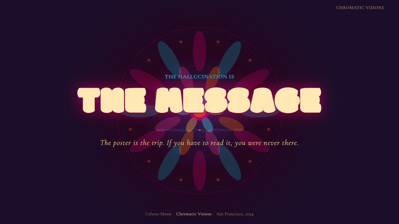
Psychedelic Fillmore (Mouse, 1968) — FAQ
Is this style actually meant to be read, or is it purely visual?
Both, but in an unusual priority order. The original Fillmore posters did contain essential information — performer names, dates, venue — but the visual system deliberately made that information difficult to extract without effort. The style is legible to insiders and semi-legible to outsiders, which was the point: it functioned as a visual shibboleth. In contemporary use, a designer choosing this style is usually making a cultural statement rather than prioritizing information delivery. If your primary goal is information transfer, this style will work against you. If your primary goal is atmosphere, identity, and the signaling of cultural allegiance, it is precisely the right tool.
How is this different from generic 1960s psychedelia?
Generic 1960s psychedelia in contemporary design usually means rainbow gradients, peace signs, and a vaguely tie-dye aesthetic — surface symbols without structural logic. Fillmore poster art is more specific: it has a precise color theory origin (Josef Albers's simultaneous contrast, applied by Moscoso), a specific typographic approach (the bulbous liquid lettering pioneered by Wilson), and a coherent compositional philosophy (radial and mandala structures, horror vacui, deliberate figure-ground reversal). Understanding the difference matters for application: authentic Fillmore-derived work applies optical principles, not just vintage signifiers. The goal is that the colors genuinely vibrate at their edges, not merely that they look bold.
Can this style work in a digital product, or is it fundamentally print-native?
The style is print-native in origin but translates to screen with some significant adaptations. The optical vibration of complementary colors actually intensifies on backlit screens, where saturated hues are more luminous than on paper — this can be an advantage or a liability depending on the context. The hand-lettered quality of the original typography requires a display typeface substitute; no amount of CSS styling will produce the same organic quality as Wilson's letterforms. The mandala compositional logic translates well to hero sections and full-screen landing pages but is poorly suited to UI components that must be modular and reusable. Treat it as a visual identity language for marketing surfaces rather than a UI design system.
Why do these posters still feel powerful more than fifty years later?
Several reasons compound. The optical principles are real and lasting: complementary color vibration is a perceptual fact, not a fashion. The mandala compositional structure rewards extended looking in a way that grid-based design does not. And the style arrived at a cultural moment of such intensity that it absorbed historical weight — these objects are inseparable from the music they announced and the social upheaval they accompanied. Contemporary designers who borrow from this tradition are borrowing not just a visual system but a set of cultural associations so strong they function almost as a brand. That borrowed gravity is both the style's greatest asset and its greatest risk: used carelessly, it reads as costume.
What is the biggest structural mistake designers make with this style?
Using saturated color without understanding simultaneous contrast. Many designers adopt the high-saturation palette of Fillmore art but place colors that do not actually create optical tension next to each other — or they use complementary pairs correctly but at unequal areas, which dampens the vibration effect. The chromatic energy of the originals comes not from saturation alone but from the specific relationship between complementary hues at roughly equal visual weight. Getting that ratio wrong produces something that looks colorful but does not vibrate; it looks like a reference rather than the thing itself. Study Moscoso's work specifically — his posters are essentially demonstrations of applied simultaneous contrast theory.
Related design styles
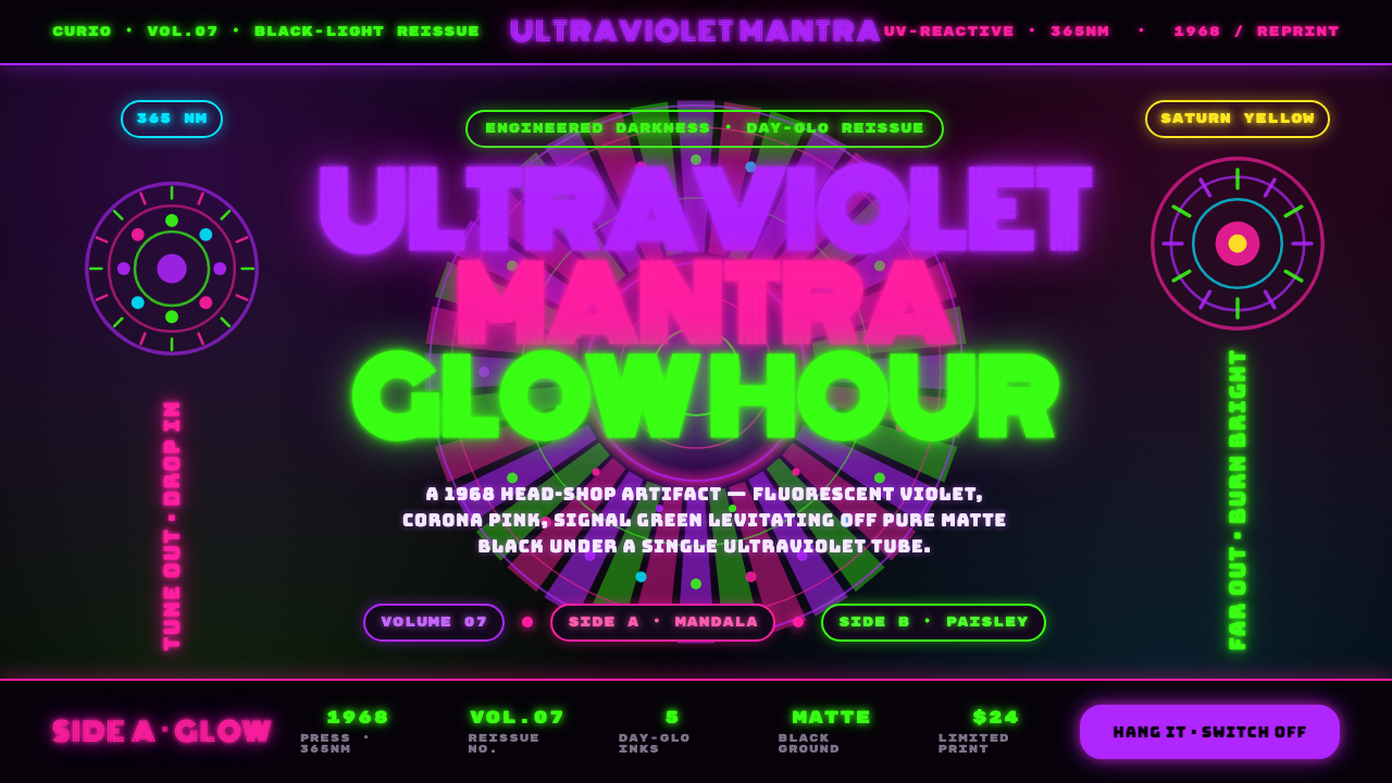 UV Blacklight PosterEngineered darkness. Day-Glo violet, Corona pink, and signal green levitating…
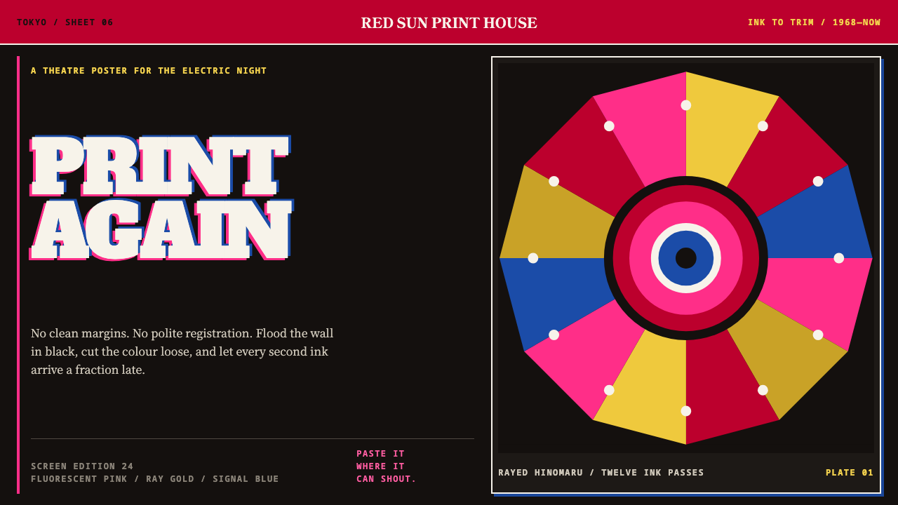 Tadanori YokooPrints against polite order. Fluorescent pink cuts through black with a rayed…
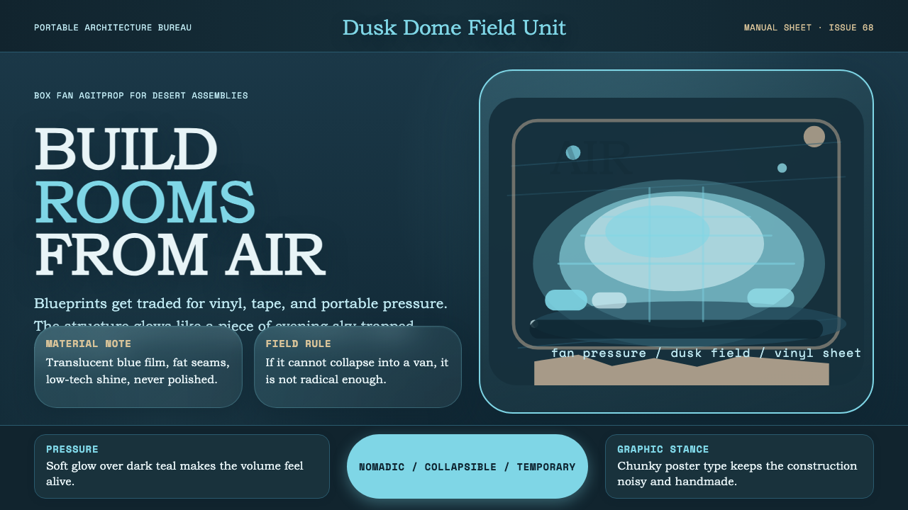 Ant Farm InflatablesTemporary architecture glows. Vinyl-blue domes swell over dark desert teal.
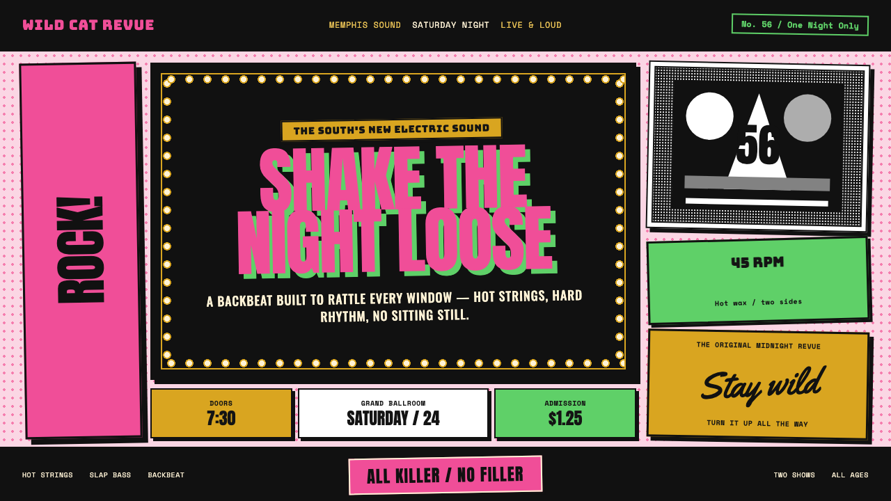 Elvis Presley (1956)Rock learned to shout. Bubblegum pink, acid green and jailhouse type land wit…
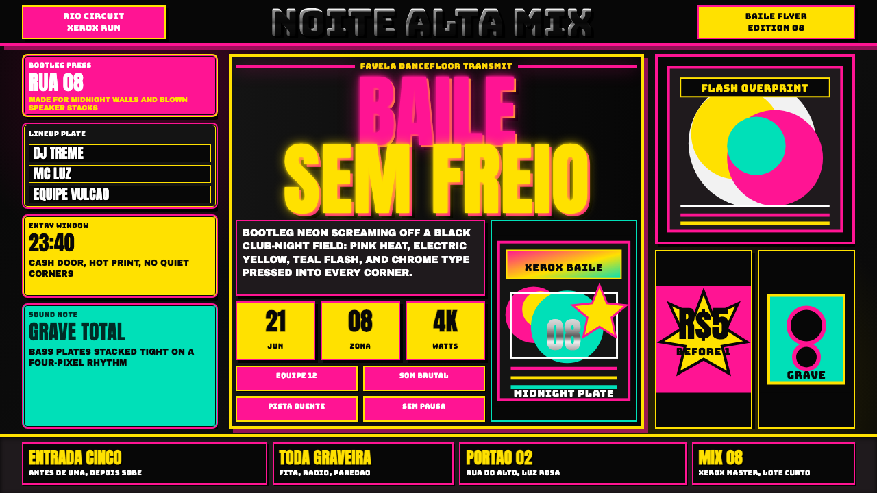 Funk Baile MixtapeNight refuses subtlety. Neon pink/yellow flyer plates cram chrome type on bla…
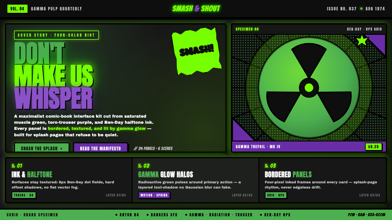 Hulk Gamma GreenDon't make us whisper. Muscle green, trouser purple, inked panels, Ben-Day ha…