What is Chicago House?
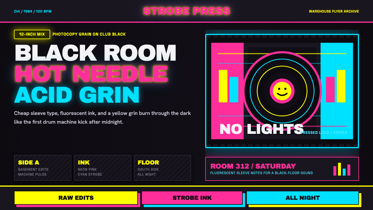
Chicago house was never designed — it was photocopied. Born in the darkness of The Warehouse in 1984, this aesthetic emerged from Xerox-grain flyers, smudged vinyl sleeves, and strobe-lit black clubs where neon pink, yellow, and cyan burned against pure black like signals from another frequency.
Chicago House in brief
Chicago house is the visual language that grew alongside the music scene anchored at The Warehouse club and Trax Records in Chicago from 1984 onward. Its aesthetic was never the product of a design studio or an art school — it emerged from necessity: cheap photocopiers, thin black vinyl sleeves, hand-lettered flyers, and the optical effects of strobe lighting on dark rooms. The result is an aesthetic of high contrast and luminous color that reads less like a designed system and more like a physical condition.
The palette is fundamentally dark. True black grounds dominate, against which neon pink, electric yellow, and cyan appear not as decoration but as emission — colors that seem to generate their own light rather than reflect it. This is the visual equivalent of what a 12-inch single sounds like when the bass kicks through a subwoofer in a dark room: dense, loud, and spatially disorienting in the best possible way.
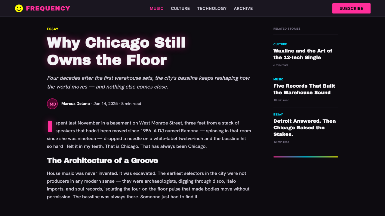
Typography in the style is heavy and often compressed, echoing the photocopied dance-music flyers of Chicago's underground club circuit. Letterforms are frequently pushed to the edges of their legibility — oversized, stacked, distorted by the reproduction process, or smeared by Xerox drift. The smiley face, an icon burned into acid-house mythology, appears as a graphic element reduced to its most essential geometry: two dots and a curve that somehow carries a full emotional charge.
Where does Chicago House come from?
The story begins with a DJ and a club. Frankie Knuckles arrived in Chicago from New York in 1977 and took up residence as the resident DJ at The Warehouse, a members-only club on South Jefferson Street that catered primarily to Black and Latino gay men. Knuckles was already editing reel-to-reel tape, extending and restructuring the Philadelphia soul and European disco records he played, creating something the crowd couldn't hear anywhere else. By 1984, the music being made and played in Chicago had mutated far enough from its sources to deserve its own name — house, after the club.
Trax Records, founded by Larry Sherman and Screamin' Rachael Cain in 1983, became the primary document of this sound. Their 12-inch singles — pressed onto thin, sometimes warped black vinyl with minimal sleeve design — established the visual register almost by accident. Budget constraints meant simple typography, high-contrast black-and-white printing, and whatever a photocopier could manage. The Xerox machine was not a stylistic choice; it was the only option. But the aesthetic it produced — grain, smear, blown-out letterforms, hard tonal contrast — turned out to be exactly right for the music.
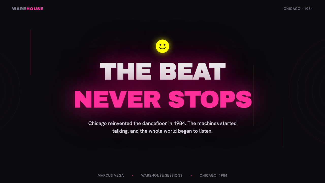
The acid-house smiley face arrived in 1988 when the sound crossed the Atlantic to Britain and fused with MDMA culture at clubs in London and Manchester. The yellow smiley — a symbol with roots in American commercial graphic design of the 1960s and 1970s — was repurposed by British ravers into the emblem of a subculture. Printed on T-shirts, drawn on flyers, stenciled on walls, it became one of the most recognizable graphic symbols of the late twentieth century. In its Chicago house context, it stands for the moment when an underground Black American music form became a global phenomenon.
The visual language of Chicago house is inseparable from the social conditions that produced it. The clubs where house music was born were spaces of genuine subcultural freedom for communities that found few such spaces elsewhere in 1980s American society. The aesthetic of darkness, strobe, and neon was not just a stylistic preference — it was also a condition of relative invisibility and self-determination. To apply the style seriously is to carry some of that history with you.
What defines the Chicago House look?
Black Ground
Unlike most design styles that build on light or neutral grounds, Chicago house treats pure black as the irreducible starting point. Black is not a background color — it is the field from which everything else emerges. This inversion of the conventional light-ground principle is not arbitrary; it mirrors the physical experience of the club itself, where the room disappears and only the light sources remain visible. All compositional decisions follow from this darkness.
Neon Color as Emission
The neon pink, electric yellow, and cyan that define the palette do not behave like conventional design colors — they appear to emit rather than reflect light. This luminous quality is inseparable from the dark ground: on black, these colors achieve a visual intensity that no light-ground palette can replicate. The three hues correspond loosely to the color temperature range of club lighting — magenta spot, white strobe, cyan wash — and carry that spatial and physical charge when applied in other contexts.
Xerox Typography
The typefaces associated with Chicago house are heavy, condensed, and often degraded — letterforms that have passed through too many photocopier generations and emerged with their edges softened, their ink spread, their weight increased. This is typography at the limit of legibility, where the act of reading becomes slightly physical. Text is frequently set at extreme sizes — enormous headers, microscopic credits — with little middle ground, evoking the hierarchy of a 12-inch sleeve.
The Smiley as Geometric Icon
The acid-house smiley is the movement's most recognizable graphic element, but it is worth understanding what makes it work visually: it is among the simplest possible reductions of a face to geometry — two circular dots for eyes, a curved arc for a mouth, all contained in a circle. At full neon yellow on black, it reads as a graphic event rather than an illustration. Its power comes precisely from its simplicity: too simple to be ironic, too crude to be designed, yet unmistakable.
Grain and Noise
Chicago house aesthetics embrace reproduction artifacts that most design systems try to eliminate. Photocopier grain, halftone dot patterns, ink spread, and tonal smearing are not mistakes to be corrected — they are the texture of the style. Grain is the evidence of process: it tells you how the thing was made, and that information is part of the meaning. In contemporary digital applications, grain is often added artificially to recapture this quality, though it is worth remembering that the original was not a choice.
Compositional Density
Dance-music flyers and vinyl sleeves were small objects that needed to carry a large amount of information at high speed — club name, address, DJ lineup, date, time — while also being readable across a dark room or under strobe lighting. The compositional response was density: elements packed close, scale used aggressively to establish hierarchy, and very little white space in the conventional sense. Space in Chicago house is black space, not white space — the negative field is the dark ground itself.
Strobe as Visual Logic
The strobe light is not just a historical fact about how the style was born — it is a structuring principle that explains many of its visual decisions. Under strobe, motion freezes, color intensifies, and edges become unusually sharp. Design that works under these conditions must have extreme contrast, must read in single frames rather than continuous scanning, and must communicate its essential meaning in the first instant of visual contact. Chicago house graphics are designed — consciously or not — for the strobe.
Who shaped Chicago House?
Knuckles is the originating figure — not a designer, but the DJ whose musical practice at The Warehouse created the cultural container from which the visual style emerged. His approach to editing and mixing records was itself a kind of compositional logic: layering, contrast, the extension of a single element to fill a space. The aesthetic that grew around his sets was an accurate visual translation of how his music felt in a dark room.
Sherman's Trax Records was the label that pressed and distributed the canonical recordings of Chicago house — tracks by Larry Heard, Marshall Jefferson, Jesse Saunders, and others. The visual identity of Trax releases — minimal, high-contrast, budget-constrained — established the sleeve aesthetic that the style has carried ever since. The accident of financial limitation became the grammar of the visual system.
Heard's productions for Trax — including the track 'Can You Feel It' — represent the deepest and most atmospheric register of Chicago house. Where some house tracks were dense and percussive, Heard's work was spare, introspective, and oceanic. The visual aesthetic of his releases — dark, minimal, focused on the emotional weight of the music rather than its energy — offered a counterpoint to the more maximalist flyer culture and broadened the visual range the style could accommodate.
The smiley is perhaps the only truly anonymous design object in the Chicago house canon — no single designer can credibly claim authorship of its application to the music scene. It appeared in British rave culture in 1988 as a found object, repurposed from commercial graphic design of the 1960s. What makes it significant as a design figure is precisely that it required no design: its geometric simplicity was already total. Every application of it since has been an act of quotation.
The Warehouse itself — the physical space at 206 South Jefferson Street, Chicago — is a figure in the visual language because it established the environmental conditions the aesthetic was optimized for: darkness, subwoofer pressure, strobe, sweat, and a crowd of bodies in motion. Design that works in that space has specific requirements that no amount of studio refinement can fully simulate. The club closed in 1983, but its spatial logic continues to underpin the entire visual system.
How do you use Chicago House today?
Chicago house is among the most context-sensitive styles in the library — its extreme contrast and luminous neon palette make it immediately recognizable and emotionally charged, but those same qualities mean it can easily overwhelm or misalign with its context. Before applying it, ask whether the product or content actually wants the associations this visual language carries: underground subculture, night life, physical intensity, darkness as freedom. If those associations are desirable, the style delivers them with unusual force.
For presentation slides, Chicago house works best for covers and chapter breaks — moments where impact matters more than sustained readability. A cover built on this system: true black field, one or two neon elements (a word, a shape, the smiley), and type pushed to the upper end of its legible scale. Content slides are harder to sustain in this style because the dark ground and neon palette reduce reading speed. The solution is to treat content slides as light-mode variations — near-black or dark charcoal grounds rather than pure black, with the neon reserved for key data points or callouts. Data visualizations in this system should use neon as the signal color: a single neon line on a dark grid reads as an event.
For web interfaces, the style has a natural home in music platforms, event listings, nightlife applications, and any product with a dark-mode-first approach. On the web, the practical constraint is accessibility: neon pink on black achieves very high contrast ratios, but the combination can cause visual fatigue in extended reading. Use neon for interactive elements, headings, and navigational markers; use a slightly lower-intensity near-white for body text. The grain texture can be applied to hero sections and image treatments without being carried through into content areas where legibility is primary.
For editorial and marketing work — event posters, music releases, brand identity for nightlife or entertainment contexts — the style operates in its original register and requires the least translation. The key discipline is restraint with the neon palette: one primary neon per composition (plus black and white), with a second neon appearing only as a secondary accent. Using all three neons simultaneously produces visual chaos rather than energy. The grain should be present but not overwhelming — enough to signal process and texture, not enough to compete with the text.
The most common mistake when applying Chicago house is confusing darkness with edginess and neon with maximalism. The original aesthetic was dark because the clubs were dark — darkness was the field condition, not a stylistic choice. Designers new to the system often add multiple neon colors simultaneously, stack textures, layer effects, and try to heighten the aesthetic through accumulation. The result is invariably loud without being powerful. The authentic system is austere: one true-black ground, one or two neons used with precision, type that carries its own weight without decoration. The noise and grain serve the emptiness; they do not fill it.
Chicago House — FAQ
Is Chicago house the same as the broader rave aesthetic?
They overlap but are not identical. Chicago house is the source material — a specific aesthetic rooted in a specific city, a specific year, and a specific community. The broader rave aesthetic, which emerged in Britain and Europe in the late 1980s and early 1990s, drew from Chicago house but mixed it with other visual influences: psychedelia, science fiction, fluorescent color in general, and the visual culture of ecstasy-era youth movements. Chicago house at its most specific is leaner, more minimal, and more directly connected to the visual conditions of Black underground club culture. Rave aesthetics tend to be more maximalist, more colorful in a fluorescent-rainbow sense, and less architecturally grounded.
Can this style work in contexts that aren't nightlife or music?
Yes, but the translation requires understanding what the style actually does rather than what it looks like. At its core, Chicago house is about high-contrast signal against dark ground — information that needs to be readable at speed, under difficult conditions, in single visual frames. That logic applies anywhere you need immediate impact and high readability in dark-mode contexts: data dashboards, performance monitoring tools, gaming interfaces, creative-tools dark themes. What does not transfer easily is the cultural coding — the smiley, the specific neon palette, the grain — which carries subcultural references that may be misread or feel appropriative in contexts far from their origin.
How do I handle accessibility with this palette?
The good news is that the core pairing of this style — bright neon against pure black — tends to produce very high contrast ratios that exceed accessibility standards. The challenge is with extended text: neon type for sustained reading causes visual fatigue, and the grain texture can reduce effective contrast for users with visual impairments. The practical approach is to use near-white rather than neon for body text, reserve neon for interactive elements and headlines, and apply grain to backgrounds and images rather than text surfaces. For data visualizations, a single neon against a dark field is highly accessible; multiple neons at the same saturation can be difficult to distinguish for users with color vision differences.
What separates Chicago house aesthetics from generic dark-mode design?
Generic dark mode is dark because it reduces eye strain — it uses dark grey backgrounds, desaturated colors, and soft shadows to create a comfortable reading environment. Chicago house is dark because the club was dark — it uses true black, maximum saturation, and the grain of reproduction artifacts. The difference is attitude: generic dark mode seeks to minimize the experience of the interface; Chicago house seeks to maximize the experience of the content. Generic dark mode wants you to forget you're using a screen; Chicago house wants you to feel the bass. The two are aesthetically opposite in intent even when they share a surface resemblance.
Is it appropriate to use this style for brands or products unrelated to music?
Appropriateness depends on how much of the cultural coding you carry across versus how much you leave behind. The underlying visual logic — dark field, luminous accent, grain as texture, density as composition — can be applied to non-music contexts without discomfort. The specific signifiers — the smiley, the explicit reference to club culture, the 1984 timestamp — are more specific and carry subcultural weight that should be handled thoughtfully. The distinction matters because Chicago house originated in a specific community with specific social stakes. Using its visual power while acknowledging its origins produces genuine work; using it as a generic 'edgy dark aesthetic' tends to produce something that feels borrowed and thin.
Related design styles
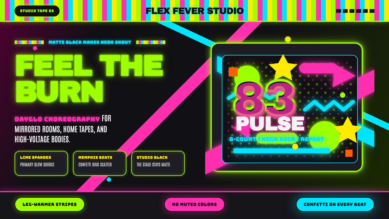 80s Aerobics Fluoro SpandexNeon refuses restraint. Lime spandex, pink-cyan confetti, and black-stage typ…
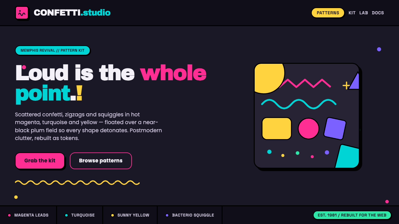 Memphis Web Pattern RevivalLoud is the point. Confetti dots, zigzags and Bacterio squiggles in hot magen…
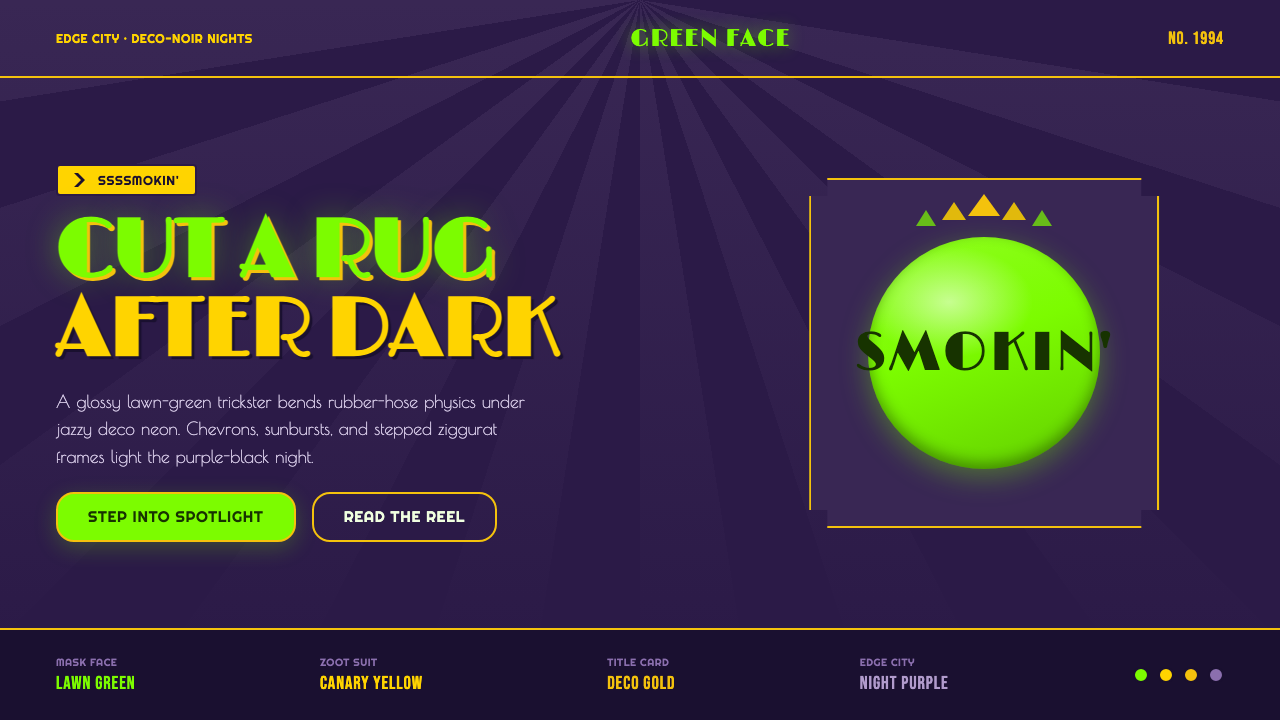 The Mask 1994 Green FaceLoud, theatrical, ssssmokin'. Lawn-green and canary-yellow scream against dec…
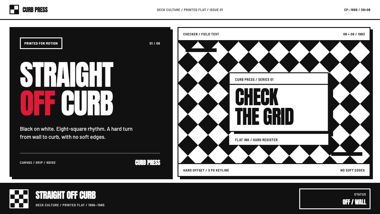 Vans Checkerboard (1966)Built to hit hard. Anton type, black-white checkers, one sanctioned red mark.
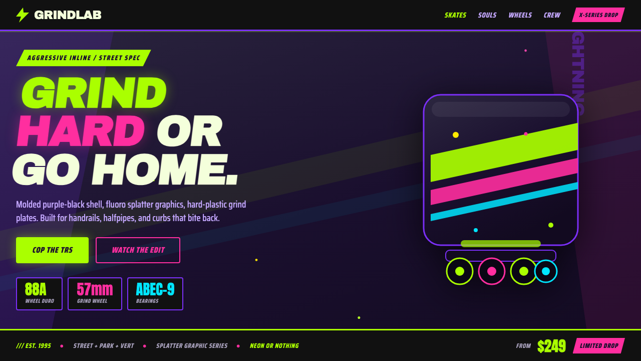 90s Aggressive Inline SkateX-Games attitude in plastic and paint. Fluoro lime and magenta slash across m…
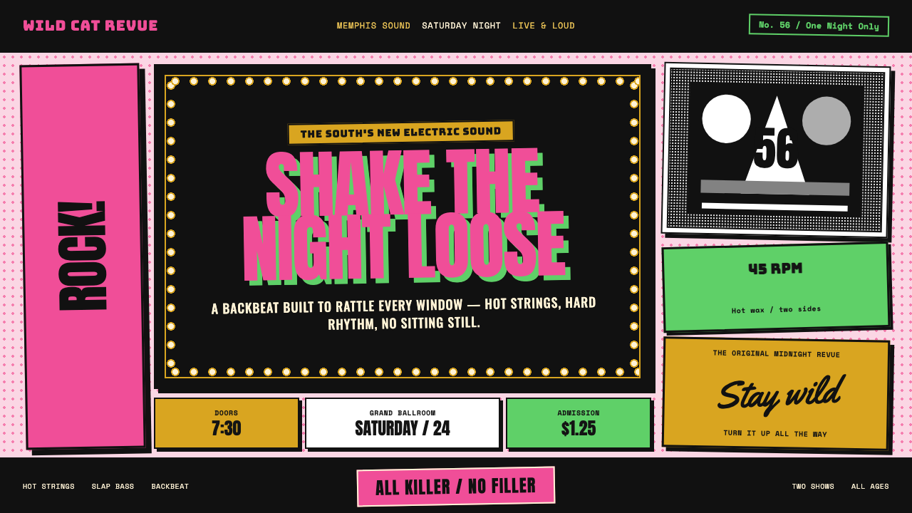 Elvis Presley (1956)Rock learned to shout. Bubblegum pink, acid green and jailhouse type land wit…