What is Cadillac Tailfin?
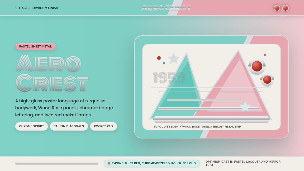
The 1959 Cadillac did not merely travel — it announced arrival. Its soaring rear tailfins, twin rocket taillights, and acres of mirror-polished chrome were not engineering choices but cultural declarations: postwar America had won, and it intended to look the part. As a design system, Cadillac Tailfin Chrome 1959 translates that atmosphere of jet-age showroom glamour into a visual language built on pastel aqua-turquoise, Wood Rose pink, and bright chrome accents — a palette that feels simultaneously celebratory and surprisingly precise.
Cadillac Tailfin in brief
Cadillac Tailfin Chrome 1959 is a design style rooted in the apex year of American automotive styling: the year General Motors designers, led by Harley Earl and Bill Mitchell, produced the most extravagant tailfin ever bolted to a production car. The resulting aesthetic — pale two-tone body panels in aqua and pink, chrome trim used with structural boldness, and jet-age graphic motifs like bullet shapes and rocket silhouettes — became an emblem of an entire cultural moment.
The style belongs to the broader Atomic Age and Space Age design movements that swept American visual culture from the late 1940s through the early 1960s. These movements drew their vocabulary from aeronautics, rocketry, and nuclear energy: pointed forms, streamlined profiles, materials that gleamed under artificial light, and colors chosen not from the natural world but from the palette of optimism. Aqua-turquoise evoked the future; chrome implied technological mastery; pink was feminine aspiration translated into steel.
Visually, the system is characterized by high contrast between cool pastels and warm metallic accents, dramatic silhouette work, and typography that treats display lettering as a form of chrome sculpture. Body copy is set in clean geometric sans-serifs that echo the rationality underlying the extravagance. Nothing here is accidental or spontaneous: the showroom finish required meticulous control, and the design system inherits that standard.
Where does Cadillac Tailfin come from?
The tailfin itself has a specific origin story. Harley Earl, General Motors' first head of styling and the man who essentially invented the discipline of automotive design as an autonomous creative field, saw the Lockheed P-38 Lightning fighter aircraft at an air show in 1941. The twin-boom tail design struck him as the visual embodiment of American technological confidence. He began incorporating fin-like forms into Cadillac rear fenders, starting subtly in 1948 and escalating year by year. By 1959, under his successor Bill Mitchell, the fins had grown to their maximum height — a sweep of sheet steel that rose above the roofline and terminated in the famous dual-bullet taillights, each one tipped in red like a tiny rocket exhaust.
The broader cultural context was the postwar American economic boom. Returning veterans flooded into a consumer economy flush with wartime industrial capacity now redirected toward household goods and automobiles. The automobile was not merely transportation — it was the primary status symbol of suburban American life, the object through which families expressed their prosperity and aspirations. General Motors understood this with unusual clarity and responded by treating the annual model change as a media event, with styling becoming the primary differentiator between otherwise mechanically similar vehicles.
The 1959 model year also coincided with the peak of the Space Race. Sputnik had launched in 1957, and the United States' initial failures to respond produced a national anxiety that was channeled, in part, through popular culture's embrace of space imagery. Rockets, satellites, and lunar surfaces appeared in advertising, domestic products, and clothing. The Cadillac tailfin, already pointing toward the sky, absorbed this cultural anxiety and converted it into aspiration. To drive a 1959 Cadillac was to align oneself with the American project of reaching the stars.
The style's decline was swift and instructive. By 1961, tailfins were already shrinking. European and Japanese competitors demonstrated that efficiency and restraint could be equally compelling, and the economic anxieties of the mid-1960s made the 1959 Cadillac's exuberance seem like a monument to a moment already passing. But the aesthetic freeze-frame of 1959 became, in retrospect, one of the most recognizable design signatures of the entire twentieth century — immediately legible as a time, a place, and a set of values.
What defines the Cadillac Tailfin look?
Color
The palette is built around two unexpected companions: pale aqua-turquoise and Wood Rose pink, deployed as two-tone fields on large surfaces rather than as accents. These are not the saturated colors of urgency but the controlled pastels of postwar affluence — colors chosen to photograph well under showroom fluorescents and to appear aspirational rather than aggressive. Chrome acts as the third element, functioning less like a color and more like a material finish: a mobile highlight that responds to ambient light and gives every surface a sense of depth without adding hue.
Silhouette and Form
The defining formal move is the fin: an upward-sweeping blade that gives the vehicle — and the design system derived from it — its most distinctive profile. In two-dimensional application, this translates into graphic elements that suggest upward thrust and forward momentum: angled cuts, swept horizontals that taper to a point, and shapes that imply speed even when static. The bullet is the secondary form: cylindrical at its base, tapering to a rounded point, appearing in both the taillights and in decorative trim. These forms are not merely decorative but carry narrative weight — they tell a story of direction, velocity, and destination.
Chrome as Structure
On the 1959 Cadillac, chrome is not a garnish applied over a finished form — it is a structural system that divides the body into zones, defines the relationship between upper and lower surfaces, and creates visual hierarchy across what would otherwise be an undifferentiated expanse of painted steel. In a design system, chrome accent logic means using bright, reflective strips and outlines not for decoration but to establish composition. A chrome band draws the eye along a horizontal axis; a chrome surround lifts an element clear of its background; chrome lettering in a display face turns product naming into a material experience.
Typography
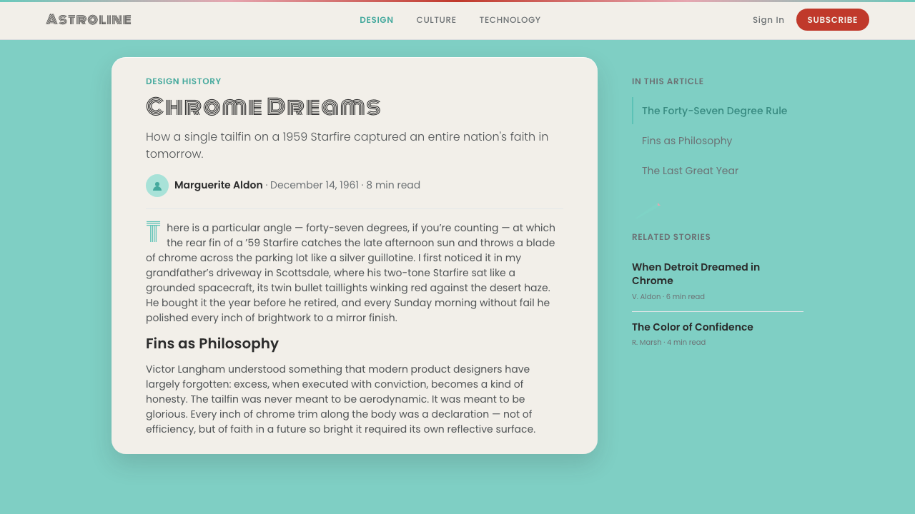
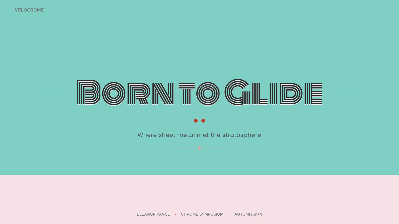
Display typography in this system takes its cue from the chrome script lettering used on the 1959 Cadillac's body — letterforms that suggest molten metal, with rounded terminals, high stroke contrast, and the sense that each letter was cast rather than drawn. Monoton, the canonical chrome display face for this system, has the rhythm of neon and the weight of polished trim. Body text steps aside entirely: a clean, rationalist geometric sans-serif provides contrast without competing, functioning more like instrument-panel text than editorial prose.
Scale and Drama
The 1959 Cadillac was, by any measure, a large car — and it made no effort to disguise that fact. Scale is used as a statement of confidence. In the design system, this translates into compositions that are not afraid of large empty fields of pastel color, large headline type set at a scale that commands attention, and graphic elements that are given room to breathe rather than crowded together for efficiency. Emptiness is not absence here — it is the showroom floor, the stage on which the central object performs.
Decorative Motifs
Unlike modernist design systems that refuse ornament on principle, the Cadillac Tailfin aesthetic embraces a specific vocabulary of decorative elements: the rocket, the bullet, the starburst, the sweeping speed line, and the winged or finned badge. These motifs are not arbitrary — they are drawn from a coherent cultural mythology of American technological aspiration. In application, they function as punctuation marks in the visual system, appearing at moments of emphasis (the end of a headline, the corner of a panel, the center of a badge or icon) rather than as field decoration.
Light and Surface
The 1959 Cadillac was designed to be seen under specific conditions — the fluorescent-lit showroom and the headlights of passing cars at night. Its surfaces are calibrated for reflected light: the chrome catches and scatters it, the pastels soften and hold it. In digital application, this translates into a careful attention to highlights and surface sheen — not via realistic rendering but through the strategic placement of lighter tones where a specular highlight would naturally fall. The effect suggests materiality without simulating physics.

Who shaped Cadillac Tailfin?
Earl was General Motors' first vice president of styling and the most influential automotive designer in American history. He served from 1927 to 1958, during which time he established the practice of the annual model change as a styling event, built the GM Styling Studio into a major creative institution, and introduced the tailfin to the American automobile. His career arc tracks almost perfectly with the rise and peak of American consumer optimism — he retired the year before the 1959 Cadillac, his most extravagant legacy, went into production.
Mitchell succeeded Earl as GM's vice president of styling in 1958 and presided over the production of the 1959 Cadillac — the car that represented the absolute apex of the tailfin era. Where Earl was the populist showman, Mitchell was the purist who believed in automotive design as a form of sculpture. He simultaneously brought the tailfin to its extreme and began the stylistic pivot away from it, guiding GM's design language toward the leaner, more European-influenced aesthetic of the 1960s.
Not a person but an object — the twin-boom fighter aircraft that inspired Harley Earl's first tailfin experiments. Seen at a restricted military air show in 1941, the P-38's twin vertical stabilizers gave Earl the formal idea he had been searching for: a way to bring the emotional charge of aviation into the domestic automobile. The P-38 thus functions in this design story the way a single painting sometimes functions in art history: as the catalyst for an entire subsequent movement.
The institution where the 1959 Cadillac was born — a purpose-built creative facility that Earl established in the 1930s and that grew into one of the largest industrial design organizations in the world. The Studio introduced to automotive design the practice of full-scale clay modeling, the use of Damsyl Dream Cars as public testing grounds for radical styling ideas, and the systematic coordination of color, interior, and exterior design across an entire product lineup. The Studio's methods influenced industrial design practice well beyond the automobile industry.
Not a designer but a historical event that recalibrated the cultural meaning of the 1959 Cadillac's form language. When the Soviet Union launched the world's first artificial satellite in October 1957, it triggered a wave of American anxiety about technological primacy that was immediately channeled into popular culture — including automotive styling. The tailfin, already pointing skyward, became redolent with new meaning: the rocket, the satellite, the aspiration to literally leave Earth. The 1959 Cadillac arrived in showrooms eighteen months after Sputnik, at the peak of this cultural moment.
How do you use Cadillac Tailfin today?
The Cadillac Tailfin Chrome aesthetic is one of the most atmospherically specific historical styles available to contemporary designers — it does not generalize, and this specificity is both its greatest asset and its primary constraint. Applying it correctly means committing to the emotional register of postwar American optimism: confidence without irony, glamour without apology, technology as promise rather than anxiety. If the product or message cannot inhabit that register authentically, the style will read as kitsch or costume rather than conviction.
For presentation slides, this system excels on covers and dividers where bold atmosphere matters more than information density. A cover using the two-tone palette — aqua field above, rose field below, divided by a chrome-like horizontal band — with a large display title in chrome-style lettering makes an immediate and memorable statement. Content slides should pull back: clean geometric sans-serif on a near-white ground, with the aqua or rose reserved for data highlights and section headers. Data visualizations work well in this system when chart elements are given the weight and definition of automotive body panels rather than the delicacy of editorial illustration.
For web and digital interfaces, the style suits contexts with celebratory or aspirational messaging — product launch pages, event sites, limited-edition packaging, and brand moments rather than day-to-day utility screens. A full-bleed aqua hero section with a chrome-style wordmark and a bullet-point list styled as a spec sheet creates instant period atmosphere. Navigation and functional UI should be simplified to near-monochrome to allow the accent palette to carry maximum impact when it appears.
For editorial and marketing materials, the system's strength is in large-format applications: posters, exhibition graphics, out-of-home advertising, and packaging where the compositions can breathe at scale. The two-tone body-panel logic — one color for the upper field, another for the lower, a bright dividing line between — translates directly into editorial page layouts. Pull quotes set in large chrome-style display type against a solid pastel ground become self-contained visual statements.
The most common mistake when applying this style is treating it as a retro pastiche — layering on every period signifier simultaneously (the fins, the bullets, the chrome script, the starbursts, the pastel, the rocket motifs) until the result collapses into parody. Authentic Cadillac Tailfin design was actually quite disciplined: the extravagance was structural (the fins were enormous and functional as heat dissipators) and the color palette was restrained (two tones, not five). Pick one or two signifiers as the conceptual anchor and use the rest of the system's vocabulary sparingly.
Cadillac Tailfin — FAQ
Is this style too retro to use seriously in contemporary design?
Retro legibility is precisely the style's functional advantage in the right contexts. The 1959 Cadillac aesthetic is so saturated with specific cultural associations — postwar optimism, American exceptionalism, mid-century glamour — that activating even a portion of it immediately communicates a tone that would take paragraphs of copy to establish otherwise. The question is not whether the style is retro but whether the product's values align with those associations. A limited-edition product, a nostalgia-driven campaign, a venue or event that wants to feel like a particular kind of American confidence — these are all contexts where the style's historical weight becomes a feature rather than a liability.
How do the two pastels — aqua and rose — actually work together without clashing?
The 1959 Cadillac two-tone combinations worked because they were never used in equal proportion or direct adjacency without a dividing element. The chrome trim band between the two colors does two things: it provides a neutral separator that prevents the two pastels from competing directly, and it lightens both colors by association, making them appear cooler and more refined than they would in isolation. In application, the principle is the same: use a sharp bright line, a white field, or a chrome-referencing neutral strip to divide the aqua and rose fields. The proportions matter too — typically one color claims significantly more area than the other, with the secondary color used as a lower body accent or a detail element.
What kind of products or brands should avoid this style entirely?
Any brand or product that needs to communicate contemporary technological credibility should approach this style carefully. The 1959 Cadillac is historically located before the digital era, before sustainability became a design value, and before the cultural authority of American industrial supremacy eroded. Tech products, financial services, healthcare, and any brand positioned around precision engineering will find the style's exuberance counterproductive — the very associations that make it powerful in entertainment or lifestyle contexts actively undermine the authority signals those categories depend on. The style also struggles in contexts requiring cultural neutrality: its American-ness is indelible, and deploying it globally requires either acknowledging that specificity as part of the brand story or accepting that it will read as culturally alien in markets outside North America.
How is this different from other mid-century American styles like Atomic Age or Populuxe?
These labels describe overlapping but distinct emphases within American postwar visual culture. Atomic Age design is primarily about form language — boomerangs, starbursts, atomic orbitals translated into furniture legs and wallpaper patterns. Populuxe (a term coined by design historian Thomas Hine) captures the broader consumer culture of the 1950s and early 1960s, including domestic interiors, appliances, and packaging. Cadillac Tailfin Chrome 1959 is more specific and more monumental: it is about the automobile as a culture's most public and most expensive status object, produced at a moment when automotive scale, finish quality, and chromework reached an absolute peak never equaled before or since. The specific two-tone palette, the quality of the chrome forms, and the connection to aerospace aesthetics distinguish it from the pattern-based charm of Atomic Age textiles or the pastel appliance warmth of Populuxe kitchens.
Can this style work for a dark-mode or dark-background application?
Dark-mode adaptation is possible but requires a significant rethinking of the palette logic. The original 1959 Cadillac two-tone system is inherently light — the pastels only work as pastels (rather than as muddy mid-tones) against a light or white ground. On a dark background, aqua-turquoise and rose pink both tend toward neon rather than pastel, shifting the register from showroom glamour to nightclub sign. This can be a deliberate effect — a dark adaptation of this system that embraces the neon-sign quality of the hues has its own legitimacy, suggesting the nighttime cruising culture of the 1950s rather than the showroom floor. But it is a different system, darker in mood and more restless in energy. Chrome and metallic lettering perform well on dark grounds, which is the element most worth preserving in any dark-mode variant.
Related design styles
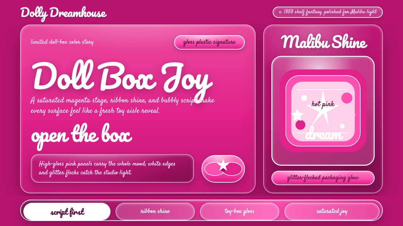 Barbie Hot Pink (Pantone 219)Saturated joy in plastic. Hot magenta, cursive script, gloss streaks, and gli…
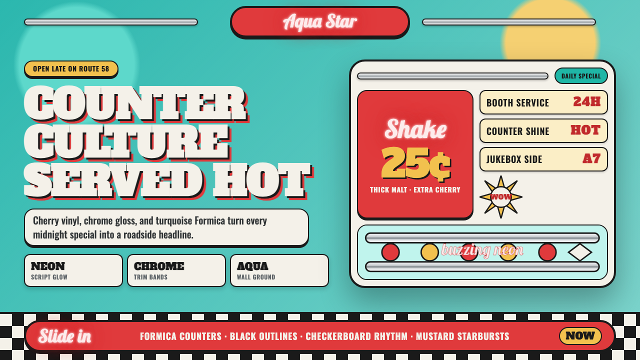 1950s Diner AquaRoadside optimism shouts. Aqua walls, cherry vinyl, chrome bands, and neon sc…
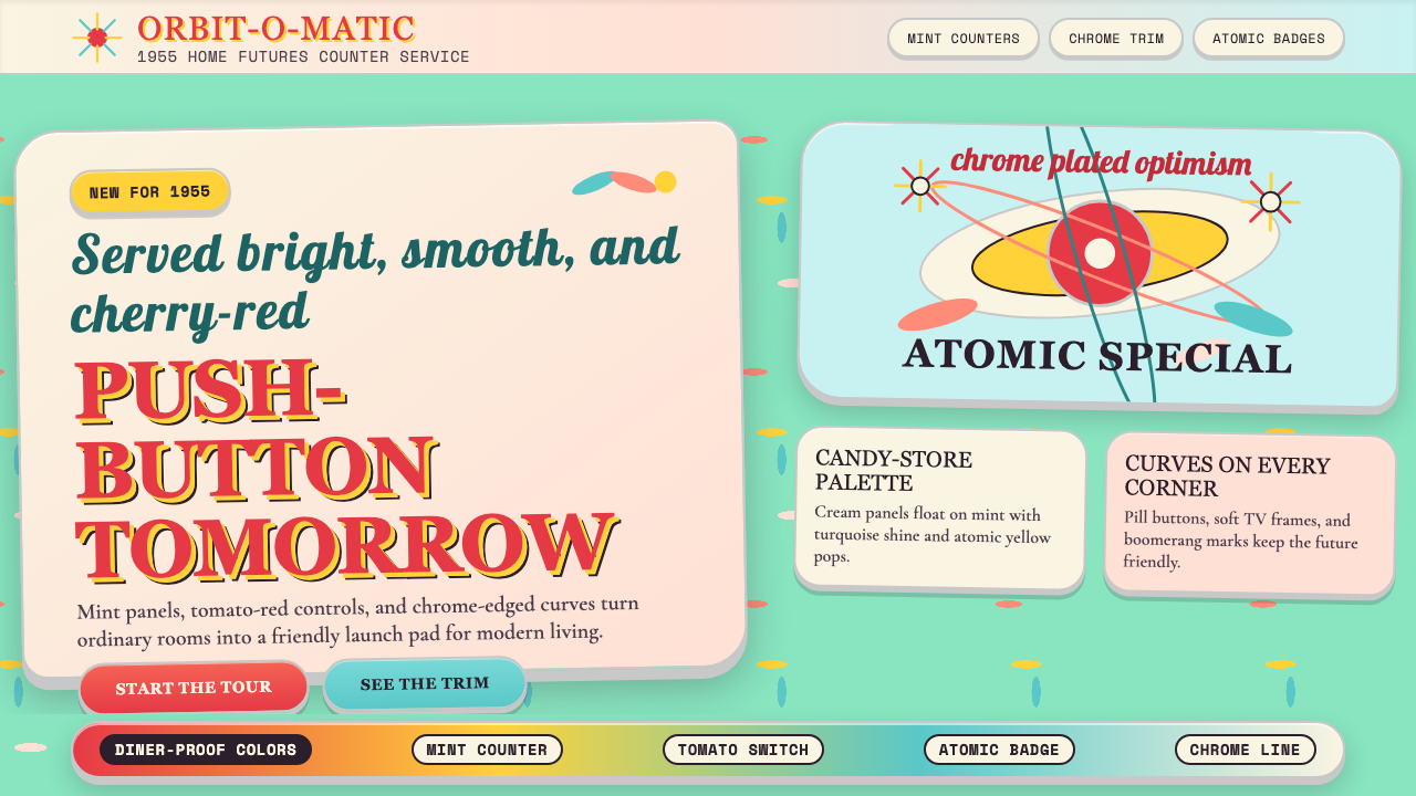 Populuxe Atomic AgeThe future grins. Mint Formica, tomato-red pills, Cooper Black, and atomic st…
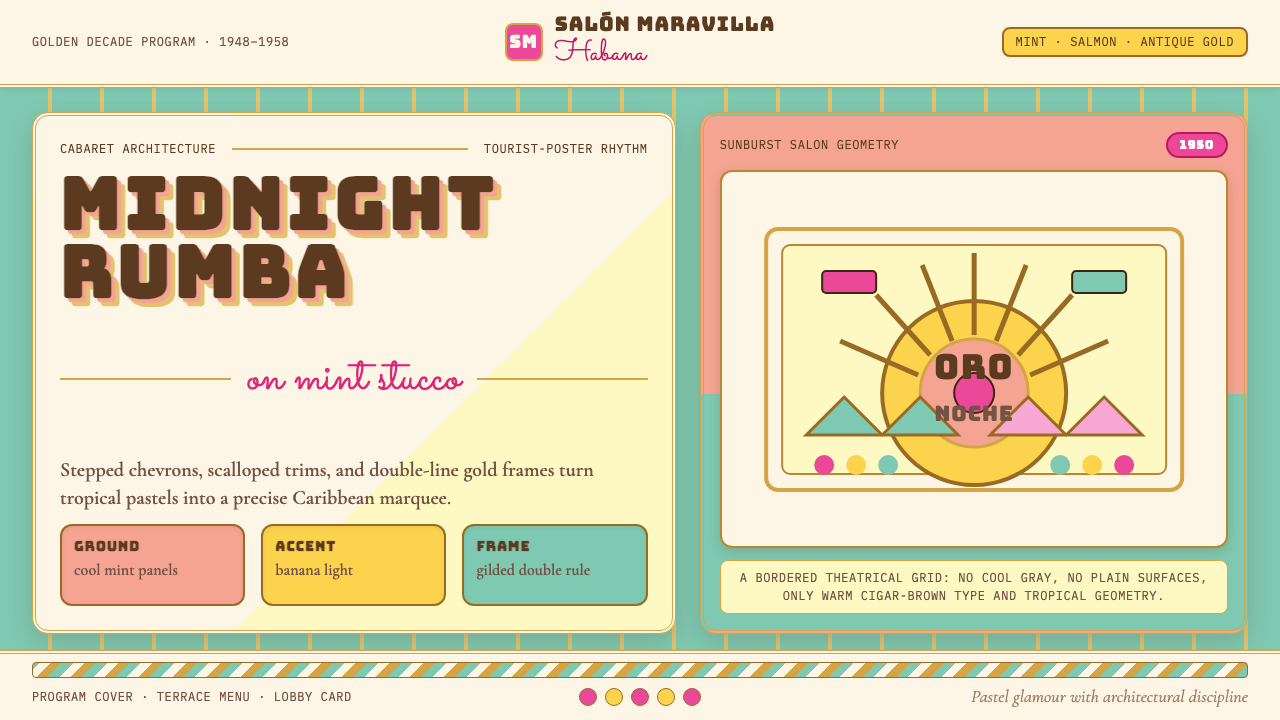 Cuban Art Deco (Havana 1950)Tropical Deco goes theatrical. Mint and salmon panels, gold double rules, Bun…
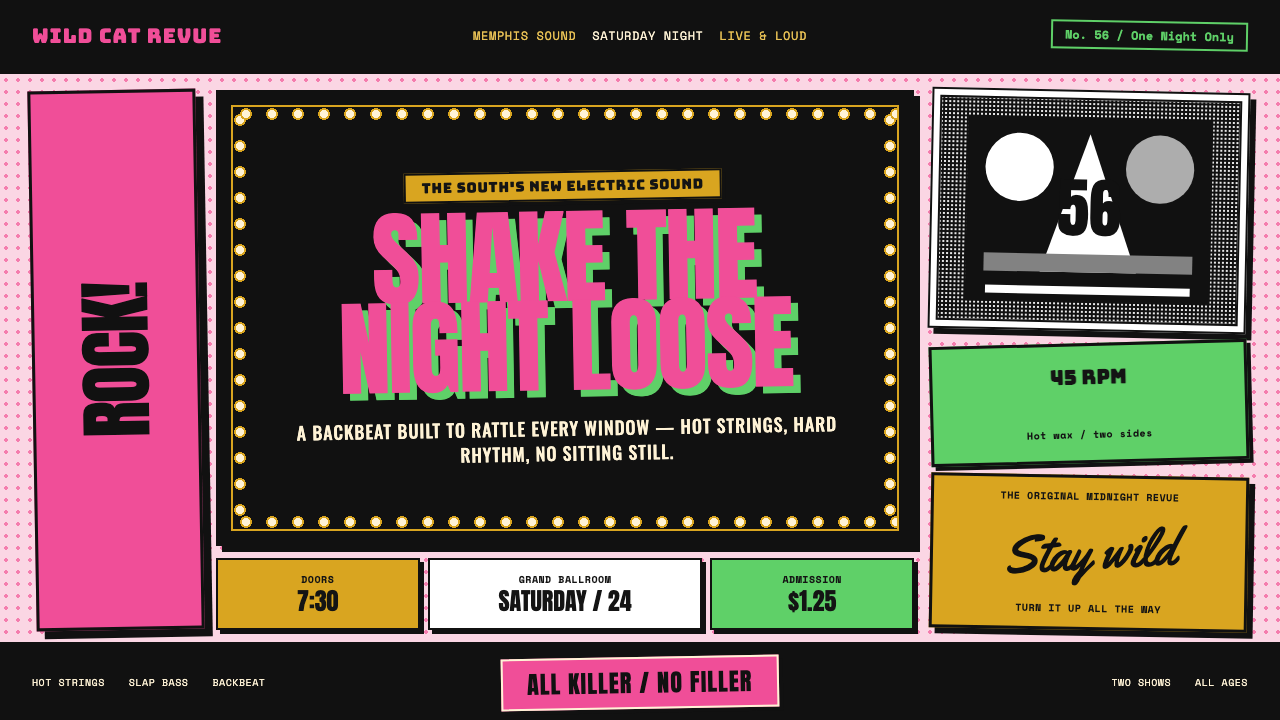 Elvis Presley (1956)Rock learned to shout. Bubblegum pink, acid green and jailhouse type land wit…
 Fiji Bula Floral ShirtLoud cloth, zero quiet corners. Teal ground carries orange blooms and magenta…