What is Populuxe Atomic Age?什么是 Populuxe Atomic Age?
Populuxe is the grin on the face of the American future — chrome fins, atomic starbursts, and Formica in every color the postwar boom could imagine.Populuxe 是美国未来的咧嘴笑容——铬银尾鳍、原子星芒,以及战后繁荣所能想象出的每一种色彩的福美家台面。
Populuxe Atomic Age in briefPopuluxe Atomic Age 速览
Populuxe is the exuberant, commercial visual language of American consumer culture between 1954 and 1964 — a decade when the postwar economic boom, Cold War optimism, and the mass production of automobiles, appliances, and suburban housing converged into a single, gloriously excessive aesthetic. The term was coined retrospectively by cultural historian Thomas Hine in his 1986 book of the same name, combining 'popular,' 'luxury,' and a Latin suffix suggesting abundance. Hine identified a sensibility that was not quite high modernism and not quite kitsch, but something genuinely its own: the belief, held with total sincerity, that chrome-trimmed push-button convenience was the rightful inheritance of every American family.Populuxe 是1954至1964年间美国消费文化最欢腾的视觉语言——在那个十年里,战后经济繁荣、冷战乐观主义、以及汽车、家电与郊区住宅的大规模量产共同汇聚成一种壮丽的过剩美学。这个词由文化历史学家托马斯·海因在其1986年同名著作中追溯命名,融合了「popular」(大众的)、「luxury」(奢华的)与一个暗示丰裕的拉丁语后缀。海因所捕捉的感性气质既不是高级现代主义,也不是俗气,而是真正属于自己的东西:一种真诚至极的信念——镶着铬银边的按钮式便利,是每个美国家庭应得的权利。
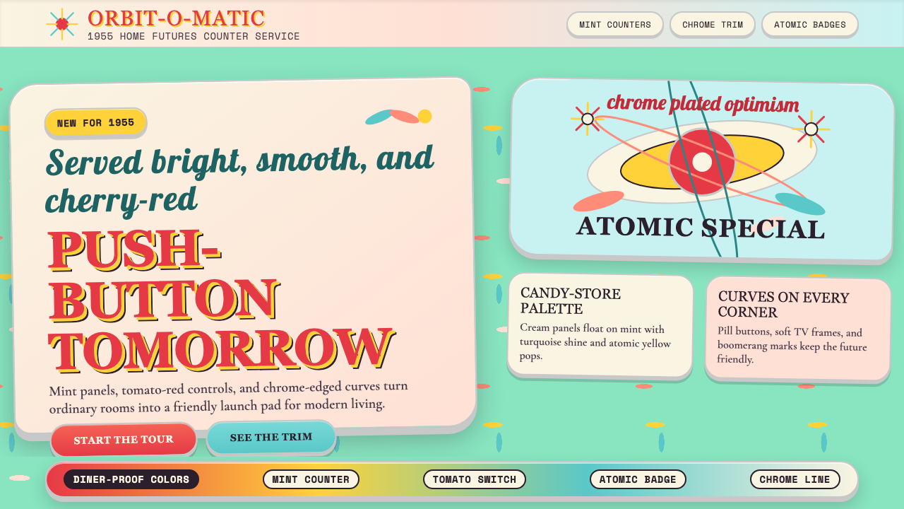
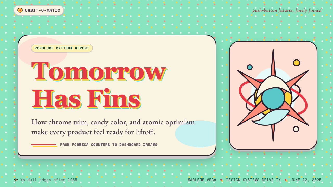
Visually, Populuxe is defined by softened, biomorphic curves — the kidney bean, the boomerang, the amoeba — combined with explosive radial motifs that reference atomic science and space exploration. Surfaces are richly colored in palettes that would have been considered garish by European modernist standards: mint green and turquoise paired with coral and tomato red, atomic yellow alongside charcoal and warm cream. Chrome appears as trim, edging, and hardware. The overall effect is one of cheerful abundance: nothing is bare, nothing is neutral, and optimism is the only permissible mood.在视觉上,Populuxe 由柔化的仿生曲线定义——肾形、飞镖形、变形虫形——与爆发性的放射状母题相结合,后者引用了原子科学与太空探索的意象。表面以大胆的色系着色,这些色彩组合在欧洲现代主义的标准下会被视为俗丽:薄荷绿与青绿色搭配珊瑚粉和番茄红,原子黄与炭灰及暖奶油并置。铬银以镶边、装饰条与五金件的形式出现。整体效果是一种欢乐的丰盛感:没有任何东西是裸露的,没有任何东西是中性的,乐观主义是唯一被允许的情绪。
Populuxe is often confused with Mid-Century Modern, and the two movements share a historical moment, but they are temperamentally opposite. Mid-Century Modern is disciplined, restrained, and indebted to European Bauhaus and Scandinavian craft traditions. Populuxe is its louder, sweeter, more democratic sibling — designed not for the museum but for the roadside diner, the suburban kitchen, the automobile showroom, and the television advertisement. Where Mid-Century Modern aspires toward timelessness, Populuxe celebrates its own moment with unabashed enthusiasm.Populuxe 常被与 Mid-Century Modern 混为一谈,两者确实共享同一历史时刻,但在气质上截然相反。Mid-Century Modern 克制、内敛,深受欧洲包豪斯与斯堪的纳维亚工艺传统影响。Populuxe 则是它更嘈杂、更甜腻、更民主的孪生兄弟——设计的目的地不是博物馆,而是路边餐馆、郊区厨房、汽车展厅与电视广告。Mid-Century Modern 追求永恒,Populuxe 则毫不掩饰地庆祝自己所处的当下时刻。
See the Populuxe Atomic Age design system查看 Populuxe Atomic Age 完整设计系统
Where does Populuxe Atomic Age come from?Populuxe Atomic Age 从何而来?
The roots of Populuxe lie in the immediate postwar United States — specifically in the economic conditions that followed the end of World War II in 1945. Wartime manufacturing had built extraordinary industrial capacity; when that capacity redirected toward consumer goods, it produced an unprecedented flood of automobiles, refrigerators, washing machines, and suburban homes. The GI Bill sent millions of veterans to college and into homeownership; the interstate highway system, begun under the Federal Aid Highway Act of 1956, connected those suburbs to commercial strips lined with motels, diners, and service stations. Populuxe is the aesthetic of that infrastructure — the visual language that merchants, manufacturers, and architects developed to capture the attention and desires of this newly mobile, newly prosperous mass consumer.Populuxe 的根源在于战后美国的特定经济条件——尤其是1945年二战结束后的那几年。战时制造业建立了惊人的工业产能;当这些产能转向消费品生产时,汽车、冰箱、洗衣机与郊区住宅的洪流随之涌现。《退伍军人权利法案》将数百万退伍军人送进大学与自置住房;始于1956年《联邦援助公路法》的州际公路系统,将那些郊区与一排排汽车旅馆、路边餐馆、加油站连成一体。Populuxe 正是这套基础设施的美学——商人、制造商与建筑师为捕获这批新晋流动、新晋富裕的大众消费者的注意力与欲望而发展出的视觉语言。
The atomic and space contexts were equally formative. The United States detonated its first hydrogen bomb in 1952; the Soviet Union launched Sputnik in 1957. For much of the decade, the future felt like a scientific fact — something that scientists and engineers were actively building, and that ordinary Americans would soon inhabit. This produced a design vocabulary that borrowed freely from the imagery of atomic science: the starburst as an atom diagram, the orbit ellipse as a decorative motif, the rocket tail fin translated into car design. These were not metaphors of anxiety but of confidence — the atomic age was thrilling, and Populuxe dressed accordingly.原子与太空的时代背景同样至关重要。美国于1952年引爆了首枚氢弹,苏联于1957年发射了人造卫星斯普特尼克。在这个十年的大部分时间里,未来感觉像一个科学事实——一种科学家与工程师正在积极建造、普通美国人即将居住其中的东西。这催生了一套自由借用原子科学意象的设计词汇:星芒形作为原子图解,椭圆轨道作为装饰母题,火箭尾翼被转译进汽车设计。这些并非焦虑的隐喻,而是信心的表达——原子时代令人振奋,Populuxe 盛装以待。
The geographic centers of the style were Detroit, Los Angeles, and the new suburban developments like Levittown on Long Island. Detroit, as the capital of the American automobile industry, drove the most extravagant formal experiments: the 1957 Chevrolet Bel Air, designed under Harley Earl, introduced chrome-framed tailfins that transformed a piece of machinery into a fantasy object. Los Angeles contributed Googie architecture — the roadside vernacular of jutting roofs, acute angles, boomerang shapes, and neon signs developed by architects like John Lautner and Douglas Honnold to attract customers from speeding automobiles. Levittown and its successors provided the domestic stage on which these consumer goods performed.这种风格的地理中心是底特律、洛杉矶以及莱维敦(长岛)等新郊区开发项目。底特律作为美国汽车工业的首都,推动了最为夸张的形式实验:1957年雪佛兰 Bel Air 在哈利·厄尔主导下设计,以铬银镶框的尾鳍将一件机械品变成了幻想对象。洛杉矶贡献了 Googie 建筑——由约翰·劳特纳和道格拉斯·霍诺尔德等建筑师发展出的路边方言,以悬挑屋顶、锐角、飞镖形体量与霓虹招牌吸引驾车飞速而过的顾客。莱维敦及其后继者则提供了这些消费品上演的家庭舞台。
Raymond Loewy, the most prominent American industrial designer of the period, gave the aesthetic a theoretical and commercial framework. His concept of the Most Advanced Yet Acceptable product — abbreviated MAYA — held that consumers would only adopt innovation up to the limit of their comfort with novelty. The Populuxe decade was, in part, a sustained experiment in finding that limit: how much fin, how much chrome, how much turquoise could be absorbed before it tipped from exciting into alienating. The answer, it turned out, was quite a lot — and then, by the mid-1960s, rather suddenly, not very much at all.雷蒙德·洛伊,这一时期最重要的美国工业设计师,为这种美学提供了理论与商业框架。他的「最先进但仍可接受」(MAYA)理念认为,消费者对创新的接受程度有一个舒适上限。Populuxe 的十年在某种程度上就是持续探索这条边界的实验:多少尾鳍、多少铬银、多少青绿色能被消化,而不至于从令人兴奋滑入令人陌生。答案是相当多——然后,在1960年代中期,突然间又变得相当少了。
What defines the Populuxe Atomic Age look?Populuxe Atomic Age 的视觉特征是什么?
Color色彩
The Populuxe palette is warm, saturated, and deliberately celebratory. Mint green, turquoise, and aqua anchor the cool register; coral, tomato red, and atomic yellow provide the hot counterpoint; charcoal and warm cream serve as neutrals. These colors appear in high-contrast pairings — turquoise against coral, yellow against charcoal — with no attempt at restraint. The palette was directly linked to consumer goods of the era: the same colors that appeared on a 1958 Frigidaire refrigerator or a Howard Johnson's restaurant façade governed the typography and graphic design of the period.Populuxe 色板温暖、饱和,带有刻意的庆典感。薄荷绿、青绿色与水绿色把持冷色调寄存区;珊瑚粉、番茄红与原子黄提供炽热的对位;炭灰与暖奶油充当中性色。这些颜色以高对比度配对出现——青绿色对珊瑚粉,黄色对炭灰——毫无克制的意图。这套色板与当时的消费品直接挂钩:出现在1958年飞利浦冰箱或霍华德·约翰逊餐厅外立面上的颜色,同样支配着这一时期的字体与平面设计。
Shape and Biomorphic Curves形态与仿生曲线
Where Bauhaus geometry was mathematical and angular, Populuxe geometry is biological and flowing. The kidney bean, the boomerang, the teardrop, and the amoeba are the foundational forms — shapes that suggest motion and organic life rather than mechanical precision. These forms appear in furniture silhouettes, countertop edges, swimming pool plans, and graphic layouts alike. The curves are never tentative; they are wide, confident arcs that consume space freely, communicating abundance and forward momentum.包豪斯几何是数学的、有棱角的,Populuxe 几何则是生物性的、流动的。肾形、飞镖形、泪滴形与变形虫形是基础形态——这些形状暗示运动与有机生命,而非机械精度。它们出现在家具轮廓、台面边缘、泳池平面与图形版面中。这些曲线从不犹豫;它们是宽阔自信的弧线,自由地占据空间,传递丰盛感与向前的冲劲。
Starburst and Radial Motifs星芒与放射状母题
The starburst — a central point from which multiple straight rays or pointed spikes radiate outward — is the signature decorative motif of the Atomic Age. It references both the scientific diagram of an atom and the visual drama of an explosion, carrying connotations of energy, discovery, and modernity. Eight-pointed and twelve-pointed starbursts appear on everything from kitchen clocks to television backdrops to promotional graphics. Related motifs include the orbit ellipse, the boomerang in flight, and the converging chevron — all suggesting speed, trajectory, and technological optimism.星芒——从中心点向外放射多条直线或尖刺的图形——是原子时代的标志性装饰母题。它同时引用了原子的科学图解与爆炸的视觉戏剧性,携带着能量、发现与现代性的联想。八角与十二角星芒出现在从厨房挂钟到电视背景再到促销图形的一切事物上。相关母题还包括椭圆轨道、飞行中的飞镖形与汇聚的人字纹——都暗示速度、轨迹与技术乐观主义。
Typography字体排印
The typographic voice of Populuxe is round, bold, and friendly — the opposite of modernist geometric strictness. Cooper Black, with its heavy rounded strokes and soft terminals, became the defining display face of the era: thick enough to read from a moving car, approachable enough to sell milkshakes. Brush Script and similar informal scripts appeared on diner signs and packaging, conveying handmade warmth within a mass-produced context. Futura Bold appeared in more aspirational contexts — aerospace advertising, institutional graphics — bringing a space-age geometry to headlines. These three voices — round serif, script, geometric sans — often coexisted in the same visual environment.Populuxe 的字体声音圆润、粗重、友善——与现代主义几何严肃性截然相反。Cooper Black 以其厚重的圆弧笔画与柔软的终端,成为这一时代决定性的展示字体:粗壮到能从行驶中的汽车上辨认,亲切到足以推销奶昔。Brush Script 与类似的非正式手写体出现在餐馆招牌与包装上,在大规模生产的语境中传达手工制作的温度。Futura Bold 则出现在更具抱负的场合——航天广告、机构图形——为标题带来太空时代的几何感。这三种声音——圆润衬线体、手写体、几何无衬线体——常常在同一视觉环境中共存。
Chrome, Gloss, and Surface Richness铬银、光泽与表面丰富性
If Bauhaus demanded material honesty, Populuxe celebrated material extravagance. Chrome trim was applied to automobiles, appliances, and furniture hardware as a signifier of quality and modernity — not because chrome was structurally necessary, but because it caught light brilliantly and signaled prosperity. Formica, the laminated plastic surface material, allowed color and pattern to appear on kitchen counters, table tops, and diner banquettes at low cost and in high durability. The surfaces of Populuxe objects are meant to be seen and touched: glossy, reflective, and assertively present in ways that matte modernist materials are not.包豪斯要求材料诚实,Populuxe 则庆祝材料的奢靡。铬银装饰被应用于汽车、家电与家具五金件,作为质量与现代性的能指——不是因为铬银在结构上是必要的,而是因为它能绝妙地捕捉光线、彰显繁荣。福美家(Formica)这种层压塑料表面材料,以低成本和高耐用性让色彩与图案出现在厨房台面、桌面与餐馆卡座上。Populuxe 对象的表面意在被看见和触摸:光滑、反光,以一种无光现代主义材料所没有的方式强势存在。
Optimism as Visual Principle乐观主义作为视觉原则
Populuxe is not merely a collection of forms and colors — it is an emotional stance rendered visual. Every design choice reinforces the message that things are good, getting better, and about to become spectacular. Rounded corners soften aggression; bright colors signal vitality; upward-pointing fins suggest ascent; starbursts announce energy. The style has no vocabulary for doubt, fatigue, or difficulty. This makes it tonally distinct from both the Bauhaus (which was built on rational principles and political urgency) and from later postmodern irony. Populuxe means it.Populuxe 不仅是形式与色彩的集合——它是一种被视觉化的情感姿态。每一个设计选择都在强化同一条信息:现在很好,正在变得更好,即将变得壮观。圆角软化了攻击性;明亮的色彩传递活力;向上翘起的尾鳍暗示上升;星芒宣告能量。这种风格没有表达怀疑、疲惫或困难的词汇。这使其在气质上有别于包豪斯(建立于理性原则与政治紧迫性之上),也有别于后来的后现代反讽。Populuxe 是认真的。
Pattern and Repetition图案与重复
Repetitive geometric and biomorphic patterns appear extensively in Populuxe — on Formica surfaces, wallpapers, upholstery fabrics, and tiled floors. The boomerang pattern, the atomic dot cluster, the overlapping ellipse, and the checker grid in two-tone colors are characteristic. Unlike modernist patterns that tend toward rigorous mathematical repetition, Populuxe patterns feel hand-drawn and slightly playful even when printed by machine. The scale of the pattern relative to the object is often deliberately oversized — a tablecloth pattern whose motifs are nearly as large as the dishes placed on it.重复性几何与仿生图案在 Populuxe 中大量出现——在福美家表面、墙纸、软包面料与瓷砖地板上。飞镖形图案、原子点簇、叠加椭圆形与双色棋盘格是典型特征。与趋向严格数学重复的现代主义图案不同,Populuxe 图案即便由机器印制,感觉也是手绘的、略带玩性的。图案相对于对象的比例常常刻意放大——桌布图案的母题几乎和摆在上面的盘子一样大。
See the Populuxe Atomic Age design system查看 Populuxe Atomic Age 完整设计系统
Who shaped Populuxe Atomic Age?谁塑造了 Populuxe Atomic Age?
Loewy was the most commercially successful industrial designer in American history, responsible for the visual identity of products ranging from the Lucky Strike cigarette pack to the Studebaker automobile to the NASA Skylab interior. His MAYA principle — Most Advanced Yet Acceptable — provided the theoretical underpinning for the Populuxe decade's constant negotiation between novelty and familiarity. Loewy understood that mass-market consumers wanted to feel modern without feeling disoriented, and his designs consistently hit that threshold with commercial precision. His 1953 Studebaker Starliner coupe and his work on the Pennsylvania Railroad's locomotives demonstrate his ability to bring streamlined, aspirational form to objects of everyday American life.洛伊是美国历史上商业上最成功的工业设计师,他的作品从幸运牌香烟包装到斯图贝克汽车,再到美国宇航局天空实验室内部设计。他的 MAYA 原则——最先进但仍可接受——为 Populuxe 十年在新奇与熟悉之间不断协商提供了理论基础。洛伊理解大众消费者想要感受现代感而不感到迷失方向,他的设计始终以商业精度命中这一阈值。他1953年设计的斯图贝克 Starliner 双门轿跑与他在宾夕法尼亚铁路机车上的工作,展示了他将流线型、有抱负的形态带入美国日常生活对象的能力。
Saarinen was the Finnish-American architect who most elegantly bridged the gap between Mid-Century Modern discipline and Populuxe exuberance. His TWA Flight Center at Idlewild Airport (completed 1962) is a single continuous concrete shell whose swooping organic curves suggest flight itself — a building that is simultaneously a serious structural achievement and an unabashed piece of Atomic Age theater. His Tulip Chair and Pedestal series, designed for Knoll in the mid-1950s, applied the same biomorphic logic to furniture: a single curving form that eliminated the 'slum of legs' underneath chairs and tables. Saarinen's work demonstrates how the Populuxe formal vocabulary could be applied with genuine rigor.萨里宁是芬裔美国建筑师,他最优雅地弥合了 Mid-Century Modern 的克制与 Populuxe 的欢腾之间的鸿沟。他为爱德怀德机场设计的环球航空飞行中心(1962年竣工)是一个单一连续的混凝土壳体,其腾跃的有机曲线本身暗示飞行——既是严肃的结构成就,也是原子时代戏剧性的毫不掩饰的表达。他在1950年代中期为诺尔公司设计的郁金香椅与基座系列,将同样的仿生逻辑应用于家具:一个单一的弯曲形态,消除了椅子和桌子下方的「腿的贫民窟」。萨里宁的作品展示了 Populuxe 形式词汇如何以真正的严谨性被运用。
Lautner was the Los Angeles architect who pushed Googie — the roadside commercial vernacular that is Populuxe's architectural expression — to its most dramatic extreme. Trained under Frank Lloyd Wright, Lautner brought a genuine structural intelligence to forms that lesser architects applied only as costume. His Chemosphere house (1960), a octagonal pod cantilevered over a Hollywood hillside on a single concrete column, is the most extreme domestic expression of Atomic Age optimism: a home that looks like it landed from the future. His commercial work, including coffee shops and gas stations along Southern California's commercial strips, defined the visual landscape of the Populuxe decade for motorists.劳特纳是洛杉矶建筑师,他将 Googie——Populuxe 的建筑表达形式,路边商业方言——推向最戏剧性的极端。师承弗兰克·劳埃德·赖特,劳特纳将真正的结构智慧带入了那些次等建筑师仅作为表面装饰使用的形态。他的化学圈住宅(1960年),一个悬挑于好莱坞山坡之上、由单根混凝土柱支撑的八边形舱体,是原子时代乐观主义最极端的居住表达:一座看起来从未来降落的房子。他在南加州商业大道沿线的商业作品,包括咖啡馆与加油站,为驾车者定义了 Populuxe 十年的视觉景观。
Nelson served as design director of Herman Miller from 1947 to 1972, and in that role he occupied a unique position between modernist restraint and popular accessibility. His Ball Clock (1947) — a sculptural wall clock whose twelve spheres radiate from a central spindle like an atom diagram — became one of the most reproduced objects of the Populuxe era, appearing in living rooms, offices, and television set dressings throughout the 1950s. His Marshmallow Sofa (1956), with its grid of circular cushions in bright colors, applied biomorphic Populuxe color sensibility to a structurally rational frame. Nelson demonstrated that the era's visual enthusiasms could be channeled through serious design thinking.纳尔逊于1947至1972年担任赫曼·米勒公司设计总监,在这一职位上他占据了现代主义克制与大众可及性之间的独特位置。他的球形时钟(1947年)——一个十二个球体从中心轴辐射而出如原子图解的雕塑性挂钟——成为 Populuxe 时代复制量最大的对象之一,出现在整个1950年代的客厅、办公室与电视布景中。他的棉花糖沙发(1956年),以明亮色彩的圆形靠垫网格构成,将仿生 Populuxe 色彩感性应用于结构上理性的框架。纳尔逊证明了这一时代的视觉热情可以通过严肃的设计思维加以引导。
Hine was the cultural critic and historian whose 1986 book 'Populuxe' gave the era its name and its first serious analytical framework. Before Hine, the aesthetic of the 1950s was either dismissed as commercialized kitsch or subsumed into broader accounts of Mid-Century Modern. Hine argued that the exuberance of the period — the fins, the colors, the starbursts — was a genuine cultural expression of postwar American confidence and collective aspiration, and that it deserved to be understood on its own terms rather than measured against European modernist standards. His critical rehabilitation of the style made possible its subsequent influence on postmodern design and its current digital-era revival.海因是文化评论家与历史学家,他1986年的著作《Populuxe》赋予了这一时代其名称与第一个严肃的分析框架。在海因之前,1950年代的美学要么被斥为商业化俗气,要么被并入更宏观的 Mid-Century Modern 叙述中。海因认为,这一时期的欢腾——尾鳍、色彩、星芒——是战后美国信心与集体抱负的真实文化表达,值得按其自身条件来理解,而不是以欧洲现代主义标准来衡量。他对这种风格的批评性重评,使其后来对后现代设计的影响以及当前数字时代的复兴成为可能。
How do you use Populuxe Atomic Age today?今天怎么用 Populuxe Atomic Age?
Populuxe translates into contemporary design work with surprising fidelity — its visual language is specific enough to be immediately recognizable but broad enough to accommodate modern formats from presentation decks to web interfaces to social media graphics. The key is committing fully to the aesthetic's emotional register: half-hearted Populuxe, with one starburst dropped onto an otherwise neutral layout, reads as costume rather than conviction. When the style works, it works because every element — color, shape, type, texture — is pulling in the same direction.Populuxe 以令人惊讶的忠实度转化为当代设计作品——它的视觉语言足够具体,能被立即识别,又足够宽广,能容纳从演示文稿到网页界面再到社交媒体图形的现代格式。关键是完全投入这种美学的情感基调:半心半意的 Populuxe,把一个星芒图案丢在一个其他方面中性的版面上,读起来像服装而非信念。当这种风格奏效时,是因为每个元素——色彩、形态、字体、质感——都在朝同一方向拉动。
For presentation slides, Populuxe excels on covers and section dividers where bold visual impact matters most. A cover slide benefits from a large biomorphic shape in a warm saturated tone anchoring one quadrant, with an oversized headline set in a rounded, heavy typeface against a contrasting ground — coral on charcoal, or turquoise on cream. Content slides should be cleaner but not neutral: a starburst or boomerang used as a modest accent in a corner, a consistent warm-tone accent color applied to data labels and headings, and text set in generous sizes that maintain the era's confident readability. Data visualization takes well to the palette — bar charts in the Populuxe range of turquoise, coral, and atomic yellow carry warmth and optimism that standard corporate blues and grays cannot.对于演示文稿,Populuxe 在封面与章节分隔页上表现最佳,这些地方需要最强烈的视觉冲击。封面页受益于一个锚定某一象限的温暖饱和色仿生大形,配以在对比底面上以圆润粗重字体设置的超大标题——珊瑚粉映衬炭灰,或青绿色映衬奶油色。内容页应当更干净但不中性:星芒或飞镖形作为角落的谨慎点缀,一种一致的暖调强调色应用于数据标签和标题,文字以充裕的字号设置,保持这一时代自信的可读性。数据可视化很适合这套色板——青绿色、珊瑚粉与原子黄的柱状图携带着标准企业蓝灰色无法表达的温暖与乐观。
For web interfaces, Populuxe works particularly well in contexts where personality and warmth are competitive advantages: consumer-facing landing pages, food and hospitality brands, entertainment platforms, and any product that wants to signal friendliness and accessibility over authority and precision. A dashboard or pricing page in this style uses rounded card shapes, a warm cream or off-white background field, and reserves the saturated accent colors for interactive states and primary calls to action. Navigation should be typographically warm — rounded, medium-weight letterforms — rather than the tight geometric sans-serifs that read as cool and efficient.对于网页界面,Populuxe 在个性与温度是竞争优势的场景中尤为出色:面向消费者的落地页、餐饮与酒店品牌、娱乐平台,以及任何想要传达友好可及而非权威精准的产品。这种风格下的仪表板或定价页面使用圆角卡片形状、温暖的奶油色或米白底面,并将饱和强调色保留给交互状态与主要行动号召按钮。导航字体应当温暖——圆润、中等字重的字形——而非读起来冷峻高效的紧凑几何无衬线体。
For editorial and marketing applications, the style suits campaigns that need to stand out in saturated media environments. A Populuxe-derived editorial spread uses the biomorphic shape as a structural frame — a kidney-bean shaped image crop, a boomerang dividing a two-column layout — rather than standard rectangular containers. The color works best when applied in large fields rather than small accents: a full-bleed coral section header, a turquoise pull-quote block, an atomic yellow background for a feature callout. The typography should mix scale dramatically — an oversized display face next to tight body text — to reinforce the era's characteristic contrasts.对于编辑与营销应用,这种风格适合需要在饱和媒体环境中脱颖而出的活动。Populuxe 衍生的编辑跨页将仿生形态用作结构性框架——肾形图片裁切、飞镖形分割双栏版面——而非标准矩形容器。色彩最好以大面积色块而非小范围点缀的方式使用:全出血珊瑚粉章节标题、青绿色引述块、原子黄特写标注背景。字体应在尺度上形成戏剧性混搭——超大展示字体与紧凑正文并置——强化这一时代的标志性对比。
The most common mistake when applying Populuxe is treating it as a retro novelty layer rather than a coherent visual system. Designers often import one or two elements — a starburst graphic, a turquoise color field — while keeping the underlying layout and typographic logic modern-neutral, producing a pastiche that reads as dated rather than deliberate. A second common error is palette restraint: Populuxe earned its character through generous color commitment, and pulling the saturation or the warmth back toward contemporary safe tones drains the life from the style. If the color palette feels slightly too much — that is usually the right amount.应用 Populuxe 时最常见的错误是将其视为复古新奇装饰层,而非连贯的视觉系统。设计师常常引入一两个元素——一个星芒图形、一块青绿色色域——同时保持底层版面与字体逻辑的现代中性,产生一种读起来是过时而非刻意的拼贴。第二个常见错误是色板上的克制:Populuxe 的性格来自于慷慨的色彩投入,将饱和度或温度拉回当代安全色调会抽干这种风格的生命力。如果色板感觉稍微有点过分——那通常就是恰当的用量。
See the Populuxe Atomic Age design system查看 Populuxe Atomic Age 完整设计系统
Populuxe Atomic Age — FAQPopuluxe Atomic Age · 常见问题
Is Populuxe just another word for kitsch?Populuxe 只是俗气的另一种说法吗?
Not exactly, though the line between them is worth examining. Kitsch describes objects or aesthetics that try to achieve an emotional effect through borrowed sentiment — cheap imitations of valued styles. Populuxe, by contrast, was the sincere commercial aesthetic of its own moment: it was not imitating anything but expressing a genuine cultural mood. Thomas Hine's analytical contribution was to argue that the style's sincerity and internal coherence distinguished it from kitsch. That said, poorly applied Populuxe — a single starburst dropped onto a contemporary neutral layout — can slide toward kitsch precisely because it loses the sincerity that made the original work. The style requires commitment to function.不完全是,尽管两者之间的界线值得审视。俗气(kitsch)描述的是试图通过借用情感来达到效果的对象或美学——对有价值风格的廉价模仿。Populuxe 则相反,它是自身时代真诚的商业美学:它不是在模仿任何东西,而是在表达一种真实的文化情绪。托马斯·海因的分析贡献正是论证了这种风格的真诚性与内在连贯性使其有别于俗气。话虽如此,应用不当的 Populuxe——把一个星芒图案丢进当代中性版面——恰恰可能滑向俗气,因为它失去了使原作有效的那种真诚性。这种风格需要全情投入才能发挥作用。
How do Populuxe and Mid-Century Modern coexist in the same project?Populuxe 与 Mid-Century Modern 如何在同一个项目中共存?
Carefully, and with a clear hierarchy. The two movements share a historical moment and some formal vocabulary — biomorphic curves appear in both, as does a preference for warm wood tones and specific mid-century furniture forms. But their emotional registers are different: Mid-Century Modern is restrained and confident in a quiet way, while Populuxe is exuberant and confident loudly. A successful hybrid uses Mid-Century Modern as the structural logic — clean grids, disciplined typographic hierarchy, restrained negative space — and Populuxe as the accent register: the color choices, the occasional starburst or boomerang motif, the rounded edge on a card or button. Reversing the hierarchy — using Populuxe as the structure and Mid-Century Modern as accent — tends to produce a muddy result where neither voice is clear.需要谨慎,并确立清晰的层级。这两个运动共享同一历史时刻和部分形式词汇——仿生曲线在两者中都出现,对暖木色调与特定中世纪家具形态的偏好也是共通的。但它们的情感基调不同:Mid-Century Modern 以一种安静的方式克制而自信,Populuxe 则欢腾而响亮地自信。成功的融合以 Mid-Century Modern 作为结构逻辑——干净的网格、克制的字体层级、有原则的留白——以 Populuxe 作为点缀基调:色彩选择、偶尔的星芒或飞镖形母题、卡片或按钮上的圆角边缘。将层级倒置——以 Populuxe 为结构、Mid-Century Modern 为点缀——往往产生两种声音都不清晰的混浊结果。
Does Populuxe work in dark-mode interfaces?Populuxe 适合深色模式界面吗?
Yes, but it requires a different palette strategy than the light-mode original. The historic Populuxe palette was built on cream and warm white grounds — charcoal and dark tones appeared as accents rather than backgrounds. Inverting to a dark ground changes the emotional register from 'cheerful diner' to something closer to 'neon-lit evening strip' — more dramatic, more Vegas, less family breakfast. On a dark background, turquoise and atomic yellow both carry well as primary accent colors; coral tends to lose its warmth and slide toward orange. The starburst and biomorphic shape vocabulary translates intact, and if anything gains in visual drama against a dark field. The key is to avoid treating dark Populuxe as simply a color inversion — rebuild the palette actively for the dark context rather than mechanically flipping light tones to dark.可以,但需要与浅色模式原版不同的色板策略。历史上的 Populuxe 色板建立在奶油色与暖白色底面上——炭灰与深色调作为点缀而非背景出现。反转为深色底面,将情感基调从「欢乐餐馆」变为接近「霓虹灯亮起的夜晚商业街」的东西——更有戏剧性、更像拉斯维加斯,少了些家庭早餐的感觉。在深色背景上,青绿色与原子黄都能很好地作为主要强调色;珊瑚粉则容易失去温度,滑向橙色。星芒与仿生形态词汇可以完整移植,在深色底面上视觉戏剧性甚至有所增强。关键是不要将深色 Populuxe 仅仅视为色彩反转——要主动为深色语境重建色板,而非机械地将浅色调翻转为深色。
What contexts are wrong for Populuxe?哪些场景不适合使用 Populuxe?
The style struggles in contexts that require trust signals built on gravity, sobriety, or precision. Financial services, medical interfaces, legal platforms, and enterprise software where users need to feel that errors are unlikely and consequences are being taken seriously — these are poor fits. Populuxe's visual message is fundamentally 'everything is great and getting better,' which is reassuring in consumer and entertainment contexts but potentially counterproductive when users need to feel that complexity is being handled with care. The style also underperforms in luxury positioning that depends on restraint and quietness as signals of quality — the visual exuberance that makes a roadside diner compelling makes a premium watch brand feel cheap.这种风格在需要依靠庄重、冷静或精准来建立信任信号的场景中力不从心。金融服务、医疗界面、法律平台,以及企业软件中用户需要感觉错误不太可能发生、后果被认真对待的地方——这些都是糟糕的匹配。Populuxe 的视觉信息从根本上是「一切都很好,而且会越来越好」,这在消费者与娱乐语境中令人安心,但在用户需要感受到复杂性被谨慎处理的场合可能适得其反。这种风格在依赖克制与安静作为质量信号的奢侈品定位中也表现不佳——使路边餐馆引人注目的视觉欢腾,会让高端手表品牌显得廉价。
Is the Populuxe revival in contemporary design authentic or ironic?当代设计中的 Populuxe 复兴是真诚的还是反讽的?
Both, and the distinction matters. The most interesting contemporary work in the Populuxe register tends to be genuinely affectionate — designers who find real pleasure in the warmth, optimism, and visual generosity of the style and apply it with conviction rather than winking distance. The ironic version — where the starburst and the coral color are deployed as quotation marks around a fundamentally postmodern sensibility — tends to produce work that is clever but hollow. The original Populuxe worked because it was sincere; contemporary work in the style succeeds in proportion to how much of that sincerity the designer can recover. Audiences are perceptive about the difference, even when they cannot name it.两者都有,而且区别很重要。当代在 Populuxe 基调上最有趣的作品往往是真诚充满爱意的——设计师真心享受这种风格的温暖、乐观与视觉慷慨,以信念而非反讽距离来应用它。反讽版本——星芒与珊瑚色被用作引号,框住一种从根本上是后现代感性的东西——往往产生聪明但空洞的作品。原版 Populuxe 之所以有效,是因为它是真诚的;当代这种风格的作品,成功程度与设计师能够找回多少这种真诚性成正比。受众对这种区别很敏感,即便他们无法将其命名。
Related design styles相关设计风格
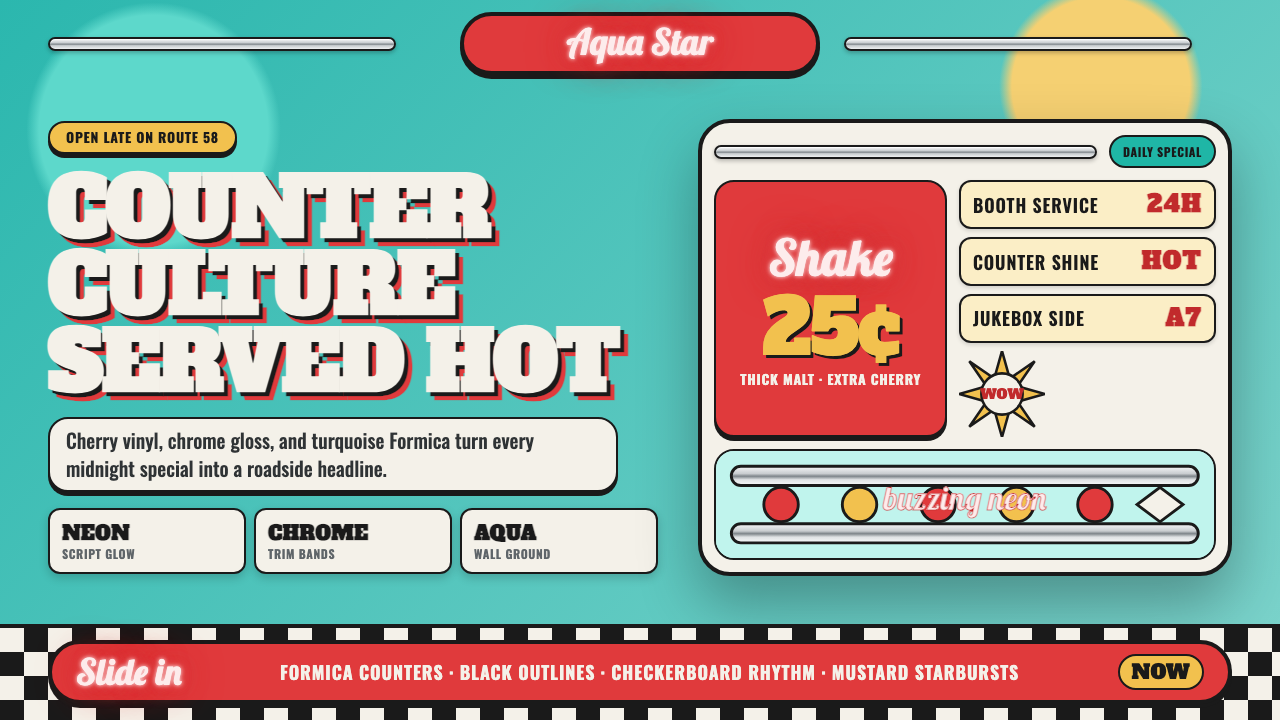 1950s Diner AquaRoadside optimism shouts. Aqua walls, cherry vinyl, chrome bands, and neon sc…公路乐观主义在叫卖:湖水蓝墙、樱桃红皮革、镀铬条与霓虹手写体发光。
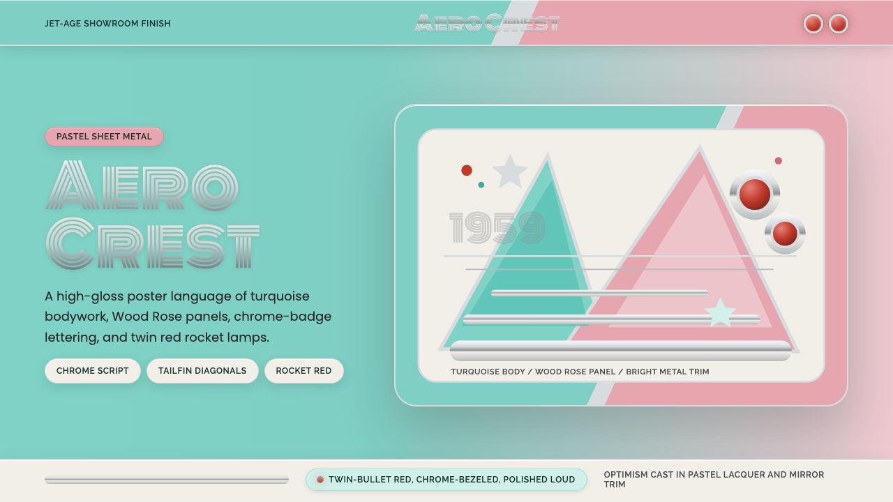 Cadillac TailfinShowroom optimism. Pastel aqua, Wood Rose panels, chrome Monoton, and rocket…展厅式乐观:湖绿粉彩、玫瑰木粉、镀铬 Monoton 与火箭红点。
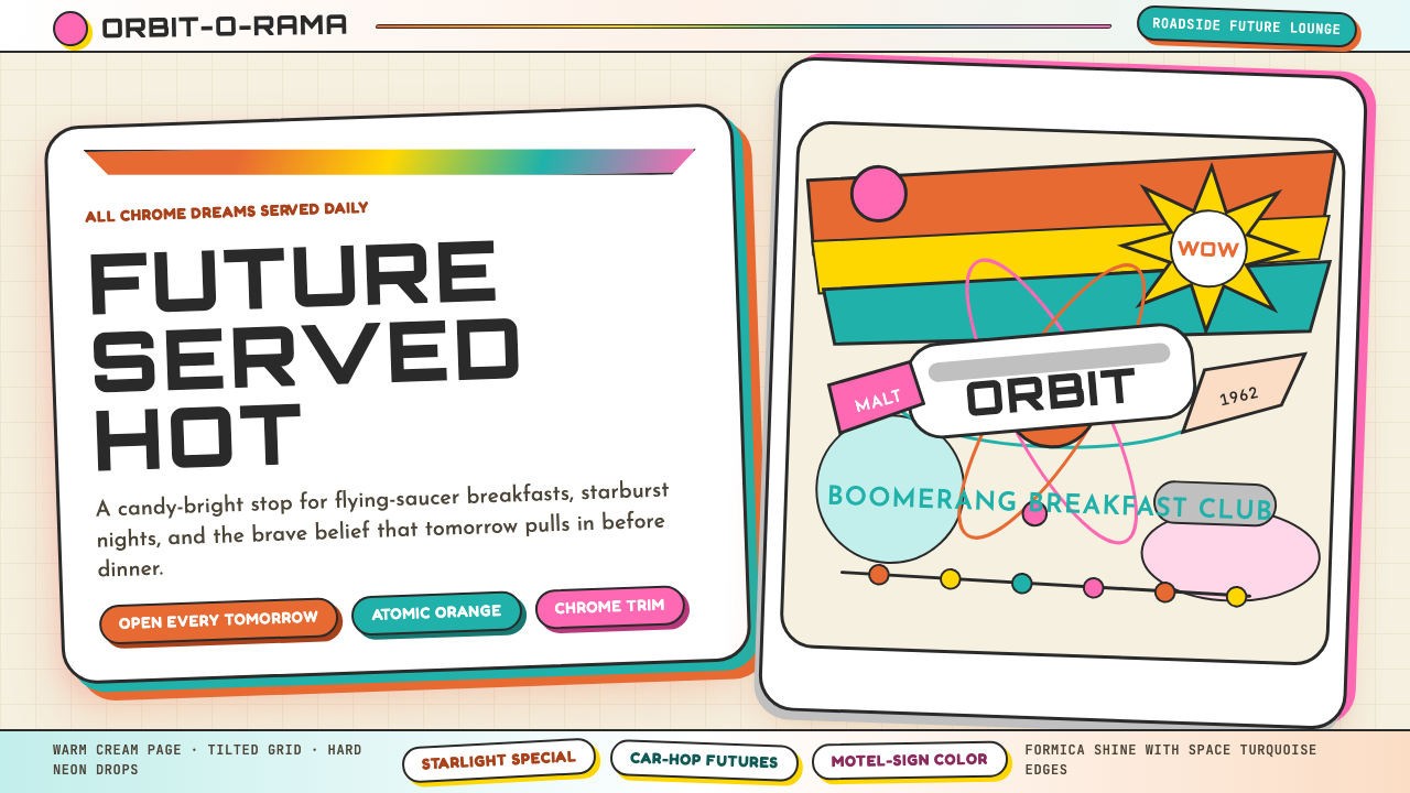 Googie / Space Age (1960s)Tomorrow pulls in grinning. Atomic orange, space turquoise, tilted signs and…明天笑着驶来:原子橙、太空青、倾斜招牌与星爆。
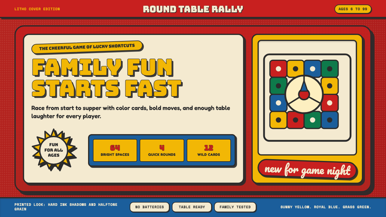 Vintage Board Game BoxShelf appeal shouts. Fire-engine red, Bungee lockups, yellow bursts, and ink…货架感在喊:消防红底、Bungee 标题、黄爆炸章与硬黑影。
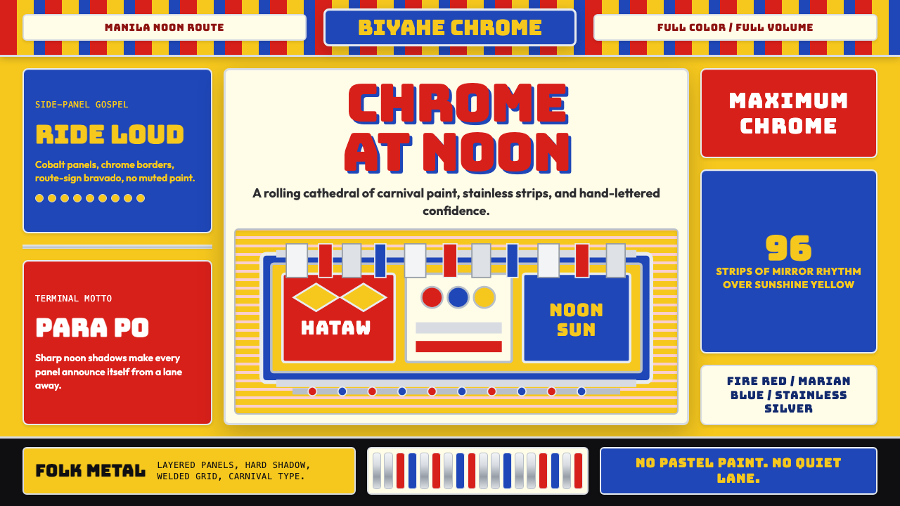 Filipino Jeepney (Chrome & Streamer)Maximalism has wheels. Sunshine yellow, chrome strips, Bungee route-sign type.极繁主义上路:阳光黄、铬银饰条与 Bungee 路牌字。
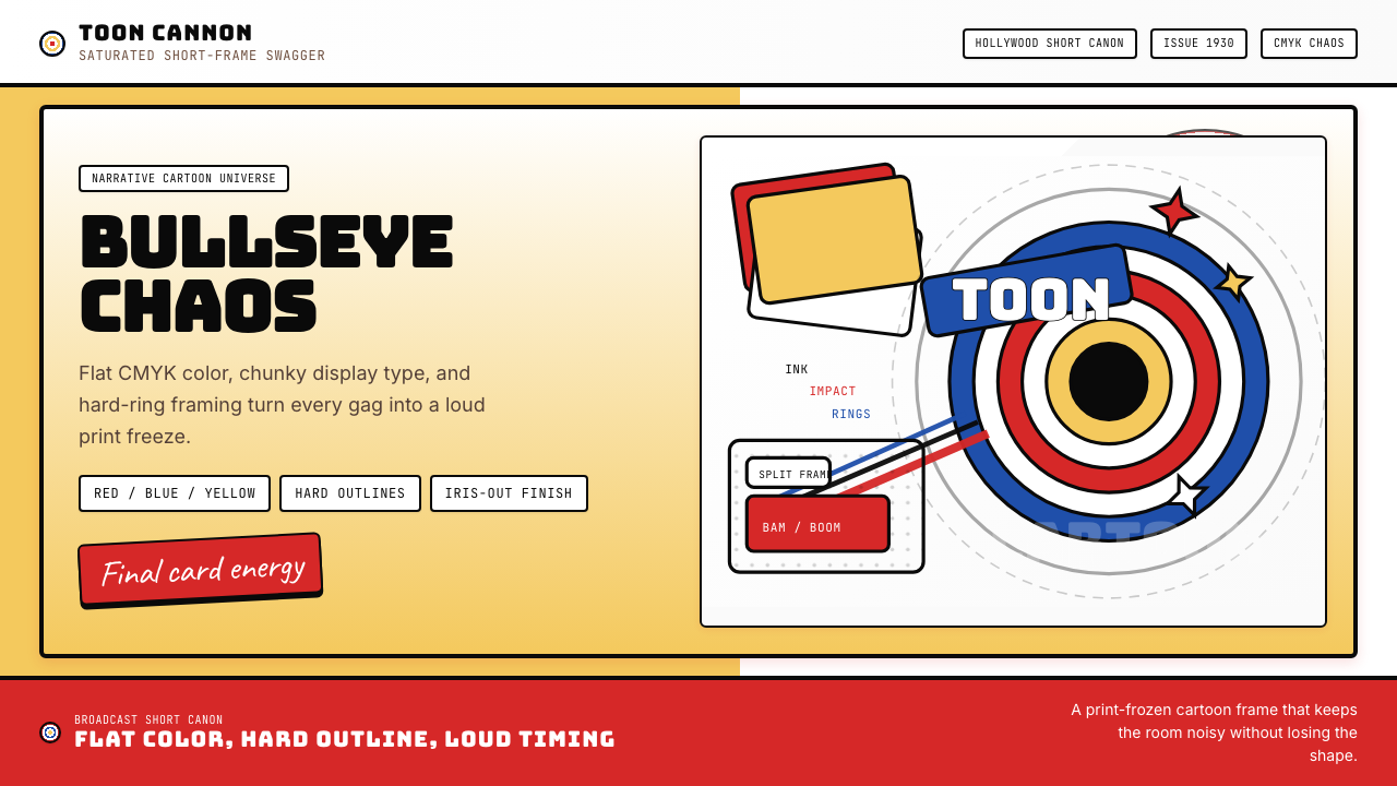 Looney Tunes (Warner Bros.)Pure cartoon chaos. Bull's-eye rings, Bungee type, and red-blue-yellow blocks.纯卡通混乱。牛眼环、粗壮标题字与红蓝黄块面。