What is Googie / Space Age (1960s)?什么是 Googie / Space Age (1960s)?
Googie is the visual shout of postwar American optimism — boomerang rooflines, starburst signs, and the unshakeable belief that tomorrow would arrive in chrome and candy color.Googie 是战后美国乐观主义的视觉呐喊——回旋镖屋顶、星爆霓虹招牌,以及对明天将以铬合金与糖果色驶来的坚定信念。
Googie / Space Age (1960s) in briefGoogie / Space Age (1960s) 速览
Googie — also known as Space Age or Populuxe — is the mid-century American design style that made roadside architecture look like the future had already arrived. It emerged in Southern California in the late 1940s and peaked between 1955 and 1965, spreading from coffee shops and motels to bowling alleys, car washes, and the original Tomorrowland at Disneyland. The name itself comes from John Lautner's 1949 coffee shop on Sunset Strip in Los Angeles, and it stuck because it sounded as playful and forward-looking as the buildings looked.Googie——又称 Space Age(太空时代)或 Populuxe——是美国中世纪的设计风格,让路边建筑看起来仿佛未来已经降临。它于1940年代末在南加州破土而出,在1955至1965年间达到巅峰,从咖啡馆和汽车旅馆蔓延至保龄球馆、洗车场,以及迪士尼乐园最初的 Tomorrowland。这个名字来自 John Lautner 于1949年在洛杉矶日落大道设计的一家咖啡厅,名字本身听起来就和那些建筑一样充满玩味与前瞻感,于是便沿用下来。
The visual language of Googie is defined by exuberance and speed. Nothing sits at a right angle when it can lean, sweep, or launch upward. Rooflines soar at dramatic angles. Signs explode into starbursts, atomic orbits, and boomerang silhouettes. Colors are saturated to the point of near-fluorescence — the palette runs to atomic orange, space turquoise, flamingo pink, and chrome silver, always pushing toward the brightest, most candy-sweet version of each hue. Chrome trim catches every available ray of California sunlight. Everything signals motion, energy, and optimism about a future that was, in this vision, going to be absolutely fabulous.Googie 的视觉语言以奔放与速度感定义。没有什么东西愿意静静地垂直站立,所有元素都在倾斜、横扫或向上腾飞。屋顶线以戏剧性的角度高耸。招牌炸裂成星爆、原子轨道和回旋镖的轮廓。色彩饱和到接近荧光——原子橙、太空青、火烈鸟粉、铬合金银,始终追求每种色相最明亮、最甜蜜的那个版本。铬合金装饰捕捉每一缕加州阳光。一切都在传递运动、能量,以及对一个将会无比美好的未来的乐观。
Googie was not a fine-art movement or an academic project. It was vernacular commercial design — the architecture and graphics of diners, motels, gas stations, and shopping centers built for a car-driving, suburb-dwelling, television-watching American public that had survived the war and now believed the atomic age was going to be wonderful. Its designers drew inspiration from the space race, jet aviation, and atomic science — the starburst motif echoes both the hydrogen bomb's detonation pattern and the rings of Saturn. The style is inseparable from its context: without the postwar boom, the suburban highway, and the optimism of a generation that saw technology as pure promise, Googie does not exist.Googie 并非纯艺术运动,也不是学院式项目。它是一种通俗商业设计——专为驾车出行、居住郊区、收看电视的美国大众所建造的餐馆、汽车旅馆、加油站和购物中心的建筑与平面语言。这群人经历了战争,现在相信原子时代将会美妙无比。设计师从太空竞赛、喷气航空和原子科学中汲取灵感——星爆图案既呼应了氢弹爆炸的辐射形态,也令人联想到土星环。这种风格与它所处的语境密不可分:没有战后经济繁荣、郊区公路与那一代人将技术视为纯粹承诺的乐观主义,Googie 便无从存在。
See the Googie / Space Age (1960s) design system查看 Googie / Space Age (1960s) 完整设计系统
Where does Googie / Space Age (1960s) come from?Googie / Space Age (1960s) 从何而来?
The immediate birthplace of Googie was postwar Los Angeles, a city expanding outward along newly built freeways at a pace that outran any established architectural tradition. The suburb needed to be seen from a moving car. Signage had to compete with highway speed. Buildings had to announce themselves at a glance. John Lautner, a student of Frank Lloyd Wright, designed the Googie's coffee shop in 1949 with a cantilevered roof that swept upward at the corner — visible, dramatic, and immediately legible to a driver doing forty miles an hour. It was architecture adapted to the automobile age, and it set the template.Googie 的直接诞生地是战后的洛杉矶——一座沿着新建高速公路向外急速扩张的城市,扩张的速度超过了任何既有建筑传统所能适应的节奏。郊区需要在行驶中的汽车上被看见。招牌必须与公路车速竞争。建筑必须在一瞥之间完成自我宣告。Frank Lloyd Wright 的学生 John Lautner 于1949年设计了 Googie's 咖啡厅,那个悬挑的屋顶在角落向上高扬——醒目、戏剧性,对时速四十英里的驾驶者而言立即可读。这是适应汽车时代的建筑,它奠定了范本。
The broader context was the postwar American love affair with technology and the future. The atomic bomb had ended the war; atomic energy was going to power the future. The space race, ignited by Sputnik in 1957, turned orbital mechanics and rocket silhouettes into cultural imagery. Jet aviation was shrinking the continent. Television was bringing the world into the living room. Googie absorbed all of this — its starburst signs echoed atomic diagrams, its swooping rooflines referenced jet wings and flying saucers, its color palette suggested the candy-colored optimism of science fiction illustration. The style was not commenting on the space age from a distance; it believed it was the space age, happening right now at this coffee shop.更宏观的背景是战后美国人与技术和未来之间的爱情故事。原子弹终结了战争;原子能将驱动未来。1957年 Sputnik 点燃的太空竞赛,将轨道力学与火箭轮廓转化为文化意象。喷气航空正在压缩大陆的距离。电视将世界带入客厅。Googie 将这一切尽数吸收——它的星爆招牌呼应了原子结构图,它的弧形屋顶线参照了喷气机机翼与飞碟,它的色彩令人联想到科幻插画的糖果色乐观。这种风格并非在远处评论太空时代;它相信自己就是太空时代,此刻正在这家咖啡馆里发生。
Wayne McAllister and the firm Armet & Davis were among the most prolific designers of the style's peak years, creating dozens of coffee shops and roadside buildings across Southern California in the late 1950s and early 1960s. Their work — Norm's Restaurants, Pann's, Ships — defined the Googie coffee shop typology: a kidney-shaped or boomerang-plan interior, floor-to-ceiling glass walls, a cantilevered roofline that extended well beyond the structural walls, and signage that used neon, animated elements, and explosive graphic forms. The style also extended to gas stations, motels, bowling alleys, and retail buildings, each finding its own version of the swept-upward angle and atomic ornament.Wayne McAllister 以及 Armet & Davis 事务所是该风格鼎盛时期最多产的设计师,在1950年代末至1960年代初为南加州设计了数十家咖啡馆与路边建筑。他们的作品——Norm's 餐厅、Pann's、Ships——定义了 Googie 咖啡馆的类型学:肾形或回旋镖形平面、落地玻璃幕墙、悬挑至结构墙以外的屋顶线,以及使用霓虹灯、动态元素和爆炸性图形形态的招牌。这种风格也延伸至加油站、汽车旅馆、保龄球馆和零售建筑,每一种建筑类型都找到了自己版本的向上扫掠角度与原子装饰。
Googie's reach extended beyond architecture into popular culture. Hanna-Barbera's animated television series The Jetsons, which debuted in 1962, brought the visual vocabulary of Space Age design into American living rooms every Saturday morning — transparent bubble roofs, elevated platforms on retractable poles, rounded pod-shaped rooms. The 1961 expansion of Los Angeles International Airport produced the Theme Building, a flying-saucer structure on four sweeping arched legs that remains one of the purest expressions of Googie at an institutional scale. By the mid-1960s, the style was so embedded in American commercial visual culture that it was effectively invisible — it simply looked like the present, not like a style at all.Googie 的影响延伸至建筑之外,进入大众文化。Hanna-Barbera 的动画电视剧《The Jetsons》于1962年首播,每个周六早晨将太空时代设计的视觉词汇带入美国家庭客厅——透明泡泡屋顶、可伸缩支柱上的高架平台、圆润的舱形房间。1961年扩建的洛杉矶国际机场建成了主题建筑(Theme Building)——一个悬浮在四条弧形腿上的飞碟结构,至今仍是 Googie 在机构尺度上最纯粹的表达之一。到1960年代中期,这种风格已如此深嵌于美国商业视觉文化,以至于实际上变得隐形——它看起来只是当下的模样,根本不像一种风格。
What defines the Googie / Space Age (1960s) look?Googie / Space Age (1960s) 的视觉特征是什么?
Color色彩
The Googie palette is saturated, warm, and deliberately upbeat — atomic orange, space turquoise, flamingo pink, sunburst yellow, and chrome silver are the core hues. These are not subtle colors; they are chosen for visibility at highway speed and for their associations with novelty, technology, and optimism. Turquoise in particular carried powerful Space Age associations in mid-century America, evoking swimming pools, the sky, and the color of early rocket insignia. Colors are used boldly and in close contrast with one another — orange against turquoise, pink against white — rather than harmonized in the conventional sense. The effect is festive, energetic, and impossible to miss.Googie 的色板饱和、温暖、刻意向上——原子橙、太空青、火烈鸟粉、日晕黄和铬合金银是核心色相。这些绝非低调的颜色;它们被选择,是为了在公路车速下保持可见度,以及它们与新奇、技术和乐观主义的关联。尤其是青绿色,在美国中世纪携带着强烈的太空时代联想,令人联想到游泳池、天空和早期火箭徽章的颜色。颜色以大胆、互相形成强烈对比的方式使用——橙对青、粉对白——而非以传统意义上的调和方式处理。效果热烈、充满能量,令人无从忽视。
Form and Angle形态与角度
Nothing in Googie sits level. The defining formal move is the dynamic angle — rooflines, sign edges, canopies, and structural elements consistently tilt between roughly five and twenty degrees from horizontal. This tilt implies speed and forward motion, as though the building itself is about to take off. Alongside the tilted angle, Googie favors sweeping curves — boomerang shapes, kidney forms, and parabolic arches — that suggest the aerodynamic profiles of jets and spacecraft. Sharp points and acute angles appear in starburst motifs and zigzag trim, adding a sense of explosive energy to the overall composition.Googie 里没有什么东西是平的。最具决定性的形态动作是动态角度——屋顶线、招牌边缘、雨棚和结构元素,始终以大约五到二十度的角度偏离水平。这种倾斜暗示速度与前进运动,仿佛建筑本身随时准备腾飞。除了倾斜角度,Googie 还偏爱大幅度的曲线——回旋镖形、肾形和抛物线拱——令人联想到喷气机与宇宙飞船的气动轮廓。锐角和尖点出现在星爆图案与锯齿状装饰中,为整体构图增添一种爆炸性的能量感。
Starburst and Atomic Ornament星爆与原子装饰
The starburst — a central point radiating lines or elongated lozenges outward in all directions — is the signature ornamental motif of Googie, appearing on signs, light fixtures, tile patterns, fabric, and anywhere else that welcomed decoration. It reads simultaneously as an exploding atom, a stylized sun, Saturn's rings seen from above, and the spark of a new idea. Alongside the starburst, Googie uses atomic orbit diagrams (electrons in elliptical paths), boomerang shapes, and kidney curves as recurring visual vocabulary. These motifs give the style its distinctive sense of being plugged directly into the scientific and technological imagery of the era.星爆——一个中心点向四面八方放射出线条或拉长菱形的图案——是 Googie 的标志性装饰母题,出现在招牌、灯具、瓷砖图案、面料,以及任何欢迎装饰的地方。它同时被解读为爆炸的原子、风格化的太阳、从上方俯瞰的土星环,以及一个新想法的火花。除星爆外,Googie 还将原子轨道图(椭圆轨道上的电子)、回旋镖形和肾形曲线作为反复出现的视觉词汇。这些母题赋予这种风格一种直接接入那个时代科学与技术意象的独特感。
Chrome and Reflectivity铬合金与反射感
Chrome is the material soul of Googie. It appears as trim on signs, as structural columns, as edging on countertops and furniture, and as the finish on every surface that could plausibly be polished to a mirror. Chrome's appeal in this context is both functional and symbolic: functionally, it is durable, easy to clean, and catches light dramatically; symbolically, it represents the industrial future — machines, spacecraft, laboratories — rendered in a form accessible at the roadside coffee shop. In graphic applications of the style, chrome is translated into highly reflective metallic treatments, beveled lettering with bright highlights, and surfaces that suggest polished metal without necessarily reproducing it literally.铬合金是 Googie 的材料灵魂。它以招牌装饰、结构柱、台面与家具边缘,以及每一个可以抛光至镜面效果的表面呈现。铬合金在这一语境中的吸引力兼具功能性与象征性:功能上,它耐用、易清洁、能戏剧性地捕捉光线;象征上,它代表工业未来——机器、宇宙飞船、实验室——以路边咖啡馆可及的形式呈现。在这种风格的平面应用中,铬合金被转化为高反射金属质感、带有明亮高光的斜面字母,以及暗示抛光金属而不必字面复现它的表面。
Typography字体排印
Googie lettering is expressive, constructed, and often physically dimensional. Sign letters are frequently built up in three-dimensional form — pushed out from a backlit panel, assembled from individual metal characters mounted on a sign face, or formed from neon tubing. Letterforms tend toward the rounded and the italic: a slight forward lean reinforces the sense of speed, while rounded terminals soften the overall effect into something friendly and fun rather than aggressive. Script and brush lettering appear alongside constructed letterforms, especially for informal applications like menu signage and secondary identifiers. The overall effect prioritizes legibility at a glance and a personality that is optimistic and approachable.Googie 的字体排印充满表现力、结构性强,且常常在物理上呈立体形态。招牌字母频繁以三维形式构建——从背光面板向外凸出,由安装在招牌面上的独立金属字符组装,或由霓虹灯管弯曲成形。字形倾向于圆润与斜体:轻微的前倾强化了速度感,而圆润的收笔则将整体效果柔化为友好有趣而非咄咄逼人的气质。书写体与毛笔字体与构建型字形并列出现,尤其在菜单招牌与次级标识等非正式应用中。整体效果优先考虑一瞥之间的易读性,以及乐观而亲切的个性。
Space and Openness空间感与开放性
Googie interiors and facades favor transparency and visual openness. Floor-to-ceiling glass walls blur the boundary between inside and outside, allowing the dramatically angled interior to be read from the parking lot and the neon-lit exterior to wash into the dining room. This openness is both practical — maximizing the visibility of the business to passing traffic — and expressive of the era's confidence that technology (in this case plate glass and steel-frame construction) had removed barriers. In graphic applications, the equivalent sensibility appears as generous spacing around type and illustration, compositions that breathe rather than crowd, and a preference for bold single statements over complex layered arrangements.Googie 的室内与立面偏爱通透与视觉开放性。落地玻璃幕墙模糊了室内外的边界,使戏剧性倾角的室内从停车场可以一览无余,而霓虹灯照亮的外部光线也涌入餐厅。这种开放性既有实用目的——最大化商业空间对过往车流的可见度——也表达了那个时代对技术(此处是平板玻璃与钢框架结构)已经消除了藩篱的自信。在平面应用中,同等的感性体现为文字与插图周围的慷慨间距、呼吸而非拥挤的构图,以及对大胆单一陈述胜过复杂分层排列的偏好。
Exuberant Optimism奔放的乐观主义
More than any specific formal element, Googie is defined by its emotional register: unironic, forward-looking, and celebratory. The style does not hedge. It does not suggest that the future might be complicated. It announces — through every tilted angle, saturated color, and chrome flourish — that tomorrow is going to be tremendous, and that this hamburger stand is proof. This attitude is the style's greatest strength and its most important characteristic. Any technically correct application of Googie's visual vocabulary that fails to communicate genuine enthusiasm will feel like pastiche. The style demands commitment to its optimism.比任何具体形式元素更甚,Googie 以其情感基调定义自身:无讽刺、向前看、充满庆祝感。这种风格不留余地。它不暗示未来可能是复杂的。它宣告——通过每一个倾斜角度、饱和色彩与铬合金花饰——明天将会无比美好,而这家汉堡摊就是明证。这种态度是这种风格最大的力量,也是它最重要的特征。任何在技术上正确应用 Googie 视觉词汇,却未能传递真诚热情的作品,都会显得像是仿制品。这种风格要求对其乐观主义的全力投入。
See the Googie / Space Age (1960s) design system查看 Googie / Space Age (1960s) 完整设计系统
Who shaped Googie / Space Age (1960s)?谁塑造了 Googie / Space Age (1960s)?
Lautner studied under Frank Lloyd Wright at Taliesin before establishing his own practice in Los Angeles. His 1949 Googie's coffee shop on Sunset Strip gave the movement its name, but his contribution extended far beyond that single building. Lautner spent decades designing residential and commercial structures in Southern California that pushed structure and geometry to theatrical extremes — cantilevered roofs, hyperbolic paraboloid shells, and spaces that dissolved the boundary between architecture and landscape. His work established that the swept angle and the soaring roofline could be taken seriously as architectural ideas, not merely as roadside novelty.Lautner 在 Taliesin 师从 Frank Lloyd Wright,后在洛杉矶建立了自己的事务所。他1949年在日落大道设计的 Googie's 咖啡厅赋予了这场运动它的名字,但他的贡献远不止于这一栋建筑。Lautner 用数十年时间在南加州设计住宅与商业建筑,将结构与几何推向戏剧性的极限——悬挑屋顶、双曲抛物面壳体,以及消解建筑与景观边界的空间。他的作品确立了扫掠角度与高耸屋顶线可以作为严肃的建筑理念,而不仅仅是路边的奇观。
McAllister was one of the earliest and most influential designers of the drive-in restaurant and roadside commercial building in the American West. His work in the 1930s through 1950s — including early drive-ins, casinos, and coffee shops in Las Vegas and California — prefigured many of Googie's formal moves: the circular plan, the dramatic sign tower, the building designed to be read from a car. His coffee shop designs in particular established the typological conventions that Armet & Davis and others refined into the classic Googie idiom of the late 1950s.McAllister 是美国西部免下车餐厅与路边商业建筑最早也最具影响力的设计师之一。他在1930至1950年代的作品——包括拉斯维加斯和加州的早期免下车餐厅、赌场与咖啡馆——预示了 Googie 的许多形式动作:圆形平面、戏剧性招牌塔楼、为从汽车中被读取而设计的建筑。他的咖啡馆设计尤其确立了类型学惯例,供 Armet & Davis 等事务所在1950年代末提炼成经典的 Googie 语汇。
The Los Angeles architectural firm of Louis Armet and Eldon Davis was the most prolific producer of Googie coffee shops during the style's peak decade. Their designs for Norm's Restaurants, Pann's Coffee Shop, and dozens of other Southern California diners established the canonical Googie typology: kidney-shaped counters, boomerang-plan dining rooms, cantilevered rooflines extending dramatically beyond the glass walls, and internally illuminated sign pylons. Armet & Davis treated the coffee shop as a designed total environment, coordinating architecture, signage, furniture, and tableware into a single coherent vision of the atomic-age future.洛杉矶建筑事务所 Louis Armet 与 Eldon Davis 的合伙公司,是该风格鼎盛十年中最多产的 Googie 咖啡馆设计者。他们为 Norm's 餐厅、Pann's 咖啡馆以及数十家南加州餐馆所做的设计,确立了经典 Googie 类型学:肾形吧台、回旋镖形就餐空间、悬挑至玻璃幕墙以外的屋顶线,以及内部发光的招牌塔柱。Armet & Davis 将咖啡馆视为完整的设计环境,将建筑、招牌、家具与餐具协调成原子时代未来的单一连贯愿景。
When the animation studio Hanna-Barbera launched The Jetsons in 1962, they commissioned production designers to create a visual world that extrapolated the Space Age aesthetic into the far future. The result — transparent bubble homes elevated on retractable poles, rounded pod-shaped rooms, moving walkways, and robots with mid-century friendly faces — translated Googie's architectural vocabulary into a domestic, animated context that reached millions of American households weekly. The Jetsons did more to embed Space Age visual culture in the popular imagination than almost any built structure, and its imagery continues to define the shorthand for retro-futurism.当动画公司 Hanna-Barbera 于1962年推出《The Jetsons》时,他们委托制作设计师创建了一个将太空时代美学延伸至遥远未来的视觉世界。结果——建在可伸缩支柱上的透明泡泡住宅、圆润的舱形房间、移动走廊,以及拥有中世纪友好面孔的机器人——将 Googie 的建筑词汇转化为每周触达数百万美国家庭的家庭动画语境。《The Jetsons》将太空时代视觉文化植入大众想象的贡献,几乎超过任何一栋已建成的建筑,而它的意象至今仍定义着复古未来主义的速记符号。
The architecture firm of William Pereira and Charles Luckman designed the iconic Theme Building at Los Angeles International Airport, completed in 1961. The structure — a flying saucer suspended above the terminal concourse on four sweeping parabolic arches — is the most photographed single expression of Googie at institutional scale. It brought the vocabulary of roadside Space Age design into the context of a major public infrastructure project, demonstrating that the style's optimism about technology and the future was not limited to coffee shops and bowling alleys but could serve as the face of a city's gateway to the world.建筑事务所 William Pereira 与 Charles Luckman 设计了洛杉矶国际机场标志性的主题建筑,于1961年竣工。这一结构——一个悬浮于四条扫掠抛物线拱之上的飞碟,高悬于航站楼连廊上方——是 Googie 在机构尺度上被拍摄最多的单一表达。它将路边太空时代设计的词汇带入了重大公共基础设施项目的语境,证明这种风格对技术与未来的乐观并不局限于咖啡馆和保龄球馆,同样可以作为一座城市通向世界的门面。
How do you use Googie / Space Age (1960s) today?今天怎么用 Googie / Space Age (1960s)?
Googie translates into contemporary design work as a deliberately retro-futurist visual language — one that signals optimism, energy, and a playful relationship with technology. The key to applying it successfully is understanding its emotional core: this is not a style of restraint or ambiguity. Every element should feel like it is pointing forward, celebrating something, or radiating enthusiasm. Half-committed Googie looks like a mistake; committed Googie looks like a party.Googie 在当代设计实践中以一种刻意复古未来主义的视觉语言呈现——传递乐观、能量以及与技术之间玩味性的关系。成功应用它的关键在于理解它的情感内核:这不是一种克制或暧昧的风格。每个元素都应感觉像是在向前指引、庆祝某件事,或散发热情。半心半意的 Googie 看起来像错误;全力投入的 Googie 看起来像派对。
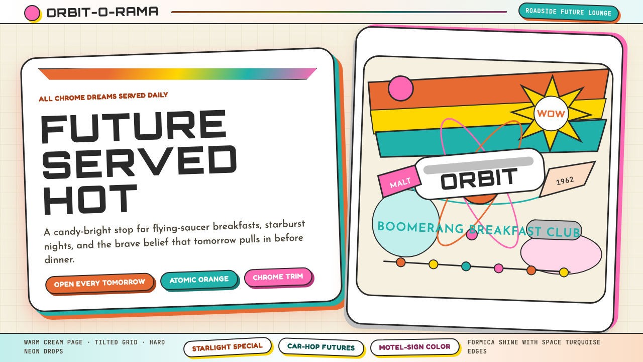
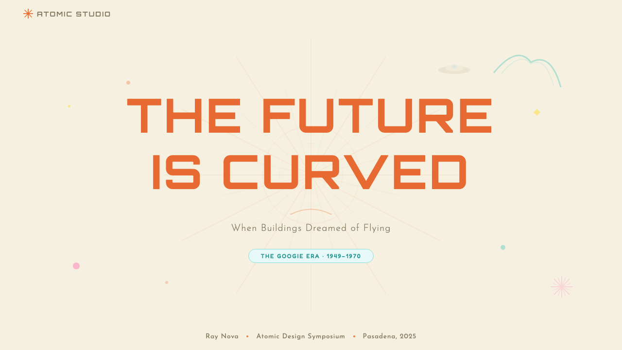
For presentation slides, Googie is most effective on cover and section-break pages where visual impact matters more than information density. A cover works well with a starburst or atomic orbit motif as a full-bleed background element, the title set in bold rounded lettering with a forward lean, and the color palette limited to two or three of the core hues — a dominant saturated field with chrome or white lettering. Content slides should be pulled back toward legibility: the Googie sensibility can live in a single bold colored shape or icon alongside clean, well-spaced text, without attempting to reproduce the full exuberance of a roadside sign on a data-heavy page. Data slides benefit from the style's bold color logic — use the saturated palette to differentiate categories, and let bar charts or area charts take on something of the confident, graphic quality of mid-century illustration.对于演示文稿,Googie 在视觉冲击力比信息密度更重要的封面页与章节过渡页上最为有效。封面以星爆或原子轨道图案作为满版背景元素效果出色,标题以粗重圆润、略带前倾的字体排列,色彩限于两到三种核心色相——主导的饱和色域配以铬合金或白色文字。内容页则应向易读性靠拢:Googie 的感性可以体现在单个大胆彩色形状或图标中,搭配简洁、间距充足的文字,而无需在数据密集页面上复现路边招牌的全部奔放。数据页面受益于这种风格大胆的色彩逻辑——用饱和色板区分类别,让柱状图或面积图呈现中世纪插画那种自信、平面的品质。
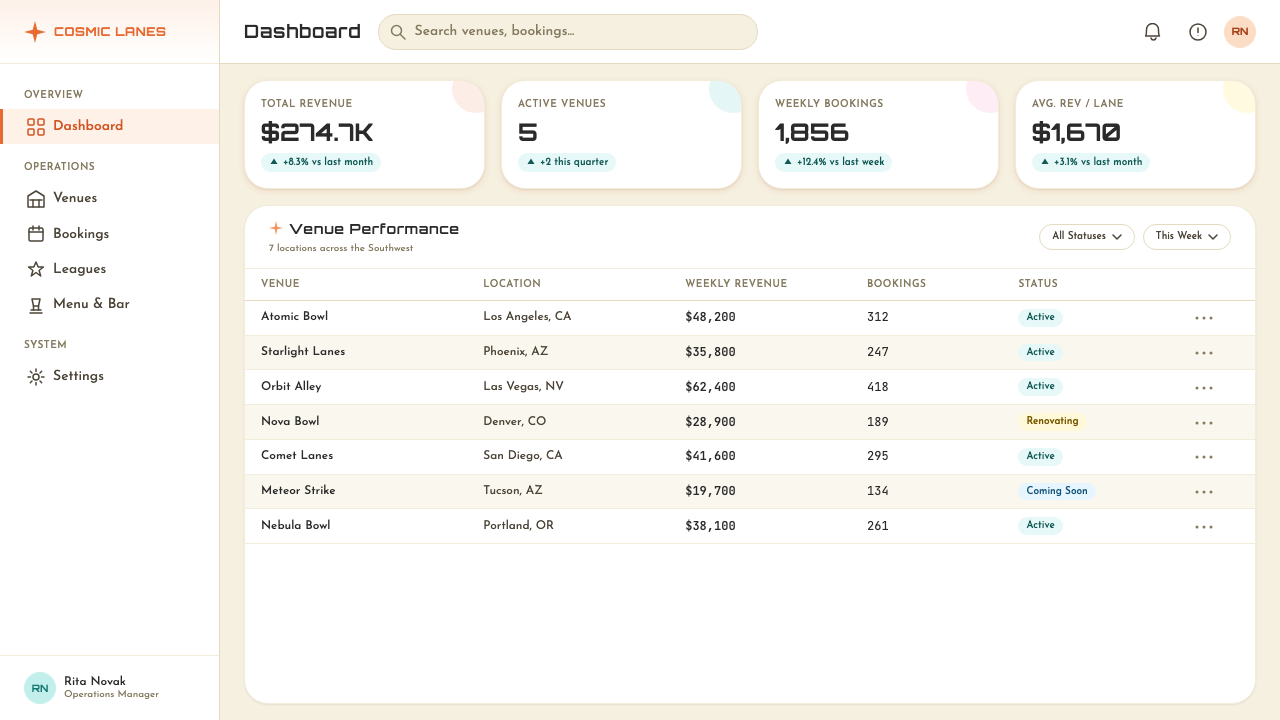
For web interfaces, Googie suits contexts where personality and energy are competitive advantages — entertainment platforms, event marketing, food and beverage brands, retro-themed products, and any application that wants to communicate that using it is going to be fun. Dashboard and pricing pages can incorporate the style through color field backgrounds in the signature hues, card components with bold colored borders or metallic-feeling header strips, and typography that leans toward the rounded and friendly end of the sans-serif spectrum. Navigation elements benefit from the style's emphasis on visibility: high-contrast color pairings, clear typographic hierarchy, and a boldness that makes interactive elements unmissable.对于网页界面,Googie 适合个性与能量是竞争优势的场景——娱乐平台、活动营销、餐饮品牌、复古主题产品,以及任何希望传达使用它将是一种乐趣的应用。仪表板与定价页面可以通过标志性色相的色域背景、带有大胆彩色边框或金属质感标题条的卡片组件,以及朝向无衬线字体圆润友好一端的字体排印来融入这种风格。导航元素受益于这种风格对可见度的强调:高对比度的色彩搭配、清晰的字体层级,以及让交互元素无法被忽视的大胆感。
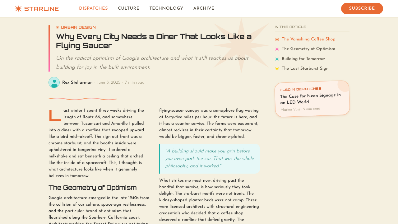
For editorial and marketing work, Googie provides a strong framework for retro-futurist campaigns, mid-century themed content, and any brand positioning around optimism, Americana, or technological excitement. Editorial layouts can use the boomerang and starburst as structural shapes that frame or separate content sections. Marketing pages benefit from the style's poster-like boldness: large, saturated color fields alternating with chrome or white sections, a single dominant hue per module, and headline typography that echoes the forward-leaning energy of neon sign lettering. The style works particularly well for event promotions, seasonal campaigns, and limited-edition product launches where the goal is to stand out immediately and create a sense of celebration.对于编辑与营销内容,Googie 为复古未来主义营销活动、中世纪主题内容以及任何围绕乐观主义、美国精神或技术兴奋感进行品牌定位的场景提供了强有力的框架。编辑版面可以使用回旋镖和星爆作为框架或分隔内容部分的结构性形状。营销页面受益于这种风格海报式的大胆:大面积饱和色域与铬合金或白色区块交替出现,每个模块以单一主导色为主,标题字体呼应霓虹招牌字母向前倾斜的能量感。这种风格特别适合活动推广、季节性营销活动和限量版产品发布,目标是立即脱颖而出,营造庆祝感。
A common mistake when applying Googie is deploying the color palette without the dynamic form language — using the saturated hues on a conventional, grid-aligned layout and wondering why it does not feel right. Googie color and Googie form are inseparable; the orange and turquoise mean something different on a tilted, sweeping shape than on a rectangular card. A related mistake is treating the style as ironic or nostalgic rather than sincere. The original Googie was not winking at you — it genuinely believed the future was going to be chrome and candy-colored. Contemporary applications that treat the style as camp or kitsch typically feel thin; those that commit to the enthusiasm, however anachronistic it might seem, tend to succeed.应用 Googie 时最常见的错误,是在没有动态形态语言的情况下使用色彩——在传统的网格对齐版面上使用饱和色相,然后疑惑为何感觉不对。Googie 的色彩与 Googie 的形态是不可分割的;橙色与青色在倾斜、弧形的形态上所传递的意义,与在矩形卡片上截然不同。另一个相关错误是将这种风格视为讽刺性或怀旧性的,而非真诚的。原版 Googie 并非在朝你眨眼——它真诚地相信未来将是铬合金与糖果色的。将这种风格视为坎普或媚俗来处理的当代应用通常显得单薄;而那些投入热情的应用,无论看起来多么时代错位,往往都能成功。
See the Googie / Space Age (1960s) design system查看 Googie / Space Age (1960s) 完整设计系统
Googie / Space Age (1960s) — FAQGoogie / Space Age (1960s) · 常见问题
Is Googie the same as mid-century modern?Googie 和中世纪现代主义是同一回事吗?
They overlap in era but diverge sharply in character. Mid-century modern — as the term is typically used in furniture and interior design — describes a relatively refined, internationally influenced aesthetic: clean lines, organic forms, natural materials, and a restrained palette that includes warm neutrals and earthy tones. Googie is the exuberant, commercial, American vernacular cousin of that sensibility. Where mid-century modern is tasteful and serene, Googie is loud and celebratory. Mid-century modern was designed for the living room; Googie was designed to be seen from a car doing fifty miles an hour on a four-lane highway. Both belong to the same cultural moment, but they address very different audiences and contexts.两者在时代上重叠,但在气质上截然不同。中世纪现代主义——按照该术语在家具与室内设计领域的通常用法——描述一种相对精炼、受国际影响的美学:简洁线条、有机形态、天然材料,以及包含温暖中性色和大地色调的克制色板。Googie 是这种感性的奔放、商业性、美国通俗版本。中世纪现代主义是有品味而宁静的,Googie 是喧闹而庆祝性的。中世纪现代主义为客厅而设计;Googie 为在四车道公路上时速五十英里行驶的汽车驾驶者而设计。两者属于同一文化时刻,但面向截然不同的受众与语境。
Can Googie work for a serious or professional brand?Googie 能用于严肃或专业的品牌吗?
It depends entirely on what kind of seriousness the brand is communicating. Googie is not suited to contexts where gravitas, sobriety, or institutional authority are the primary values — legal services, financial planning, healthcare communications, or luxury positioning that depends on restraint. But for brands communicating that they are genuinely excited about what they do, that they see their work as forward-looking, and that engaging with them will be an energetic rather than a cautious experience, Googie can be used with real seriousness of purpose. Technology companies, creative agencies, food and hospitality brands, and entertainment platforms can all find authentic uses for the style without it tipping into kitsch — provided the application is committed and the rest of the brand's communication is coherent.这完全取决于品牌在传达哪种严肃性。Googie 不适合庄重感、稳重或机构权威是主要价值的场景——法律服务、财务规划、医疗健康传播,或依赖克制感的奢侈品定位。但对于那些传达对自身工作真诚兴奋、将工作视为前瞻性的,以及与之互动将是充满能量而非谨慎体验的品牌,Googie 可以以真正严肃的目的被使用。科技公司、创意机构、餐饮品牌和娱乐平台都能找到对这种风格的真实应用,而不使其滑向媚俗——前提是应用是全力投入的,品牌其他传播内容也是连贯的。
What is the difference between Googie and retro-futurism more broadly?Googie 与更广义的复古未来主义有何区别?
Retro-futurism is a broad category describing any aesthetic that imagines the future through the visual conventions of a past era — steampunk imagines the future through Victorian industry, dieselpunk through 1930s Art Deco, atompunk through 1950s atomic anxiety. Googie is a specific, historically grounded instance of retro-futurism: it is the actual visual language that mid-century Americans produced when they tried to picture the future. It is not an imagined or constructed aesthetic — it is a documented one, with specific buildings, designers, motifs, and a clear geographic and temporal origin. When contemporary designers invoke Googie, they are referencing something real, not assembling a pastiche from invented conventions.复古未来主义是一个宽泛的类别,描述任何通过过去某个时代的视觉惯例想象未来的美学——蒸汽朋克通过维多利亚时代工业想象未来,柴油朋克通过1930年代装饰艺术,原子朋克通过1950年代的原子焦虑。Googie 是复古未来主义一个具体的、有历史依据的实例:它是美国中世纪人在试图描绘未来时实际创作出的视觉语言。它不是被想象或建构出的美学——它是一种有据可查的美学,有具体的建筑、设计师、母题,以及清晰的地理与时代起源。当代设计师援引 Googie 时,他们在参照某种真实存在的东西,而非从虚构惯例中拼凑仿制品。
How do I avoid making Googie look cheap or tacky?如何避免 Googie 看起来廉价或俗气?
The line between exuberant and cheap in Googie is mostly a question of restraint within exuberance. The original Googie buildings were not cheap — they used real chrome, quality neon, plate glass, and carefully engineered structural systems. The exuberance was in the form and the color, not in cutting material corners. In graphic applications, this translates to: do not use all the motifs at once. Choose one or two — a starburst, a boomerang curve, an atomic orbit — and develop them carefully rather than filling the composition with every available symbol. Keep the color palette to two or three hues, give each element room to breathe, and ensure the typography is clean and intentional. The style rewards confidence and penalizes timidity and clutter equally.在 Googie 中,奔放与廉价之间的界限主要是奔放之内的克制问题。原版 Googie 建筑并不廉价——它们使用真正的铬合金、优质霓虹灯、平板玻璃和精心设计的结构系统。奔放体现在形态与色彩上,而非在材料上偷工减料。在平面应用中,这转化为:不要同时使用所有母题。选择一两个——星爆、回旋镖曲线、原子轨道——并仔细发展它们,而不是用每一个可用符号填满构图。将色彩限于两到三种色相,给每个元素以呼吸空间,确保字体排印干净而有意图。这种风格奖励自信,同等程度地惩罚胆怯与杂乱。
Does Googie work in dark-background layouts?Googie 在深色背景版面中有效吗?
Dark backgrounds suit Googie well, perhaps better than many other historical styles — because the style's original context included neon signs against night skies, chrome catching artificial light, and lit interiors glowing through glass walls after dark. A dark Googie palette typically leads with space-black or deep midnight blue as the field, then brings the signature hues — particularly atomic orange, turquoise, and chrome white — forward as the active color layer. This combination has a strong night-drive aesthetic: the colors appear to glow rather than sit flat, which reinforces the neon-and-chrome energy of the original style. The main risk on dark grounds is that the palette can easily tip into a generic neon-cyberpunk look; anchoring the composition with the distinctive Googie motifs — the starburst, the boomerang, the rounded lettering — keeps it specific.深色背景与 Googie 颇为契合,甚至可能比许多其他历史风格更为适合——因为这种风格的原始语境本就包括夜空下的霓虹招牌、捕捉人造光线的铬合金,以及入夜后透过玻璃幕墙发光的照亮室内。深色 Googie 色板通常以太空黑或深午夜蓝作为底色,再将标志性色相——尤其是原子橙、青色和铬合金白——作为活跃色层推至前景。这种组合具有强烈的夜驾美学:颜色看起来像是在发光,而非平铺,这强化了原版风格霓虹与铬合金的能量感。在深色底面上的主要风险是色板很容易倾向于泛化的霓虹赛博朋克风;以 Googie 独特母题——星爆、回旋镖、圆润字体——锚定构图,才能保持其特殊性。
Related design styles相关设计风格
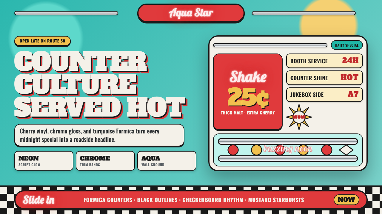 1950s Diner AquaRoadside optimism shouts. Aqua walls, cherry vinyl, chrome bands, and neon sc…公路乐观主义在叫卖:湖水蓝墙、樱桃红皮革、镀铬条与霓虹手写体发光。
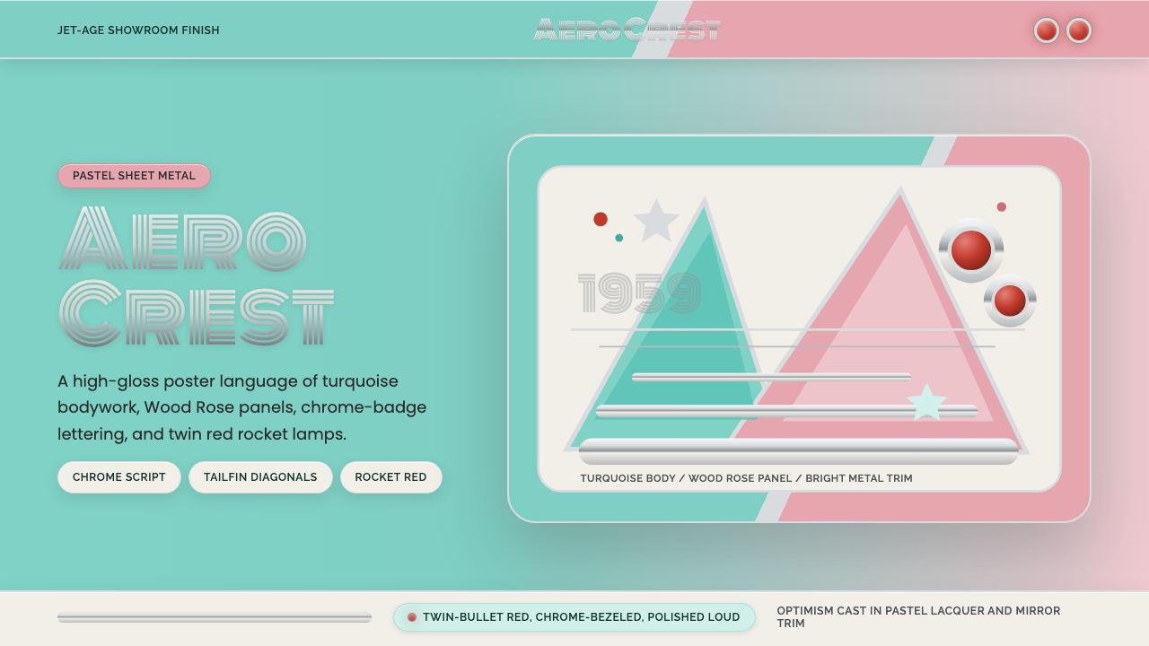 Cadillac TailfinShowroom optimism. Pastel aqua, Wood Rose panels, chrome Monoton, and rocket…展厅式乐观:湖绿粉彩、玫瑰木粉、镀铬 Monoton 与火箭红点。
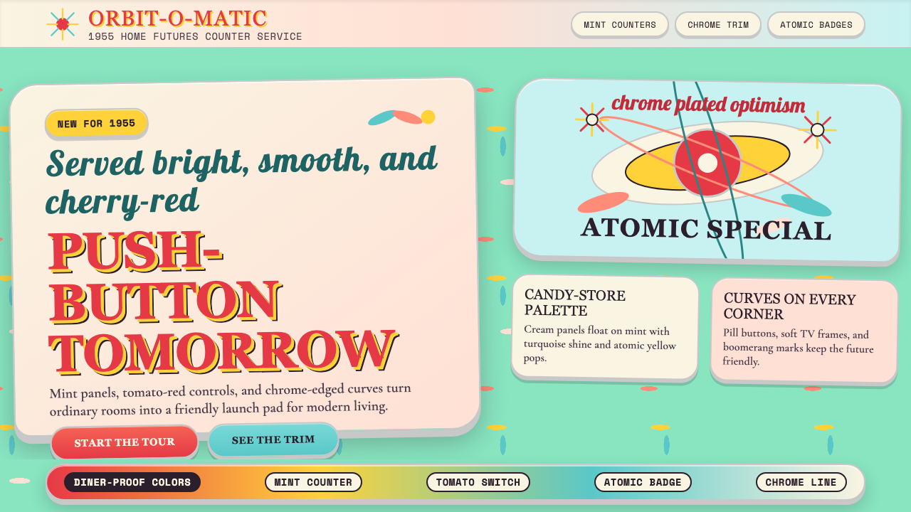 Populuxe Atomic AgeThe future grins. Mint Formica, tomato-red pills, Cooper Black, and atomic st…未来咧嘴发光:薄荷绿、番茄红圆钮、Cooper Black 与原子星芒。
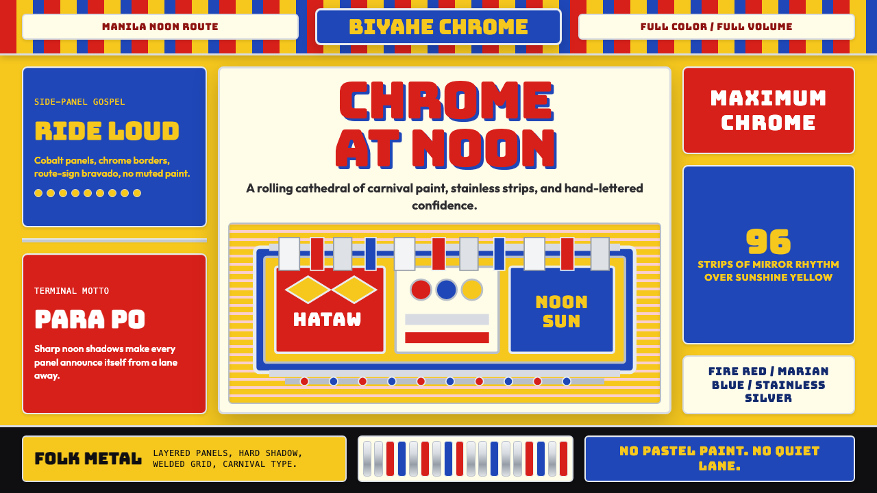 Filipino Jeepney (Chrome & Streamer)Maximalism has wheels. Sunshine yellow, chrome strips, Bungee route-sign type.极繁主义上路:阳光黄、铬银饰条与 Bungee 路牌字。
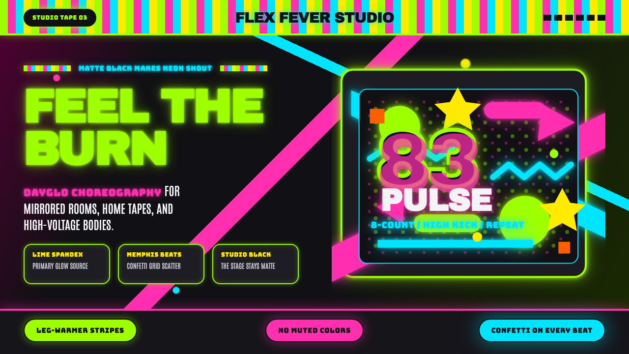 80s Aerobics Fluoro SpandexNeon refuses restraint. Lime spandex, pink-cyan confetti, and black-stage typ…霓虹拒绝克制:荧光绿氨纶、粉蓝彩屑与黑场大字一起燃烧。
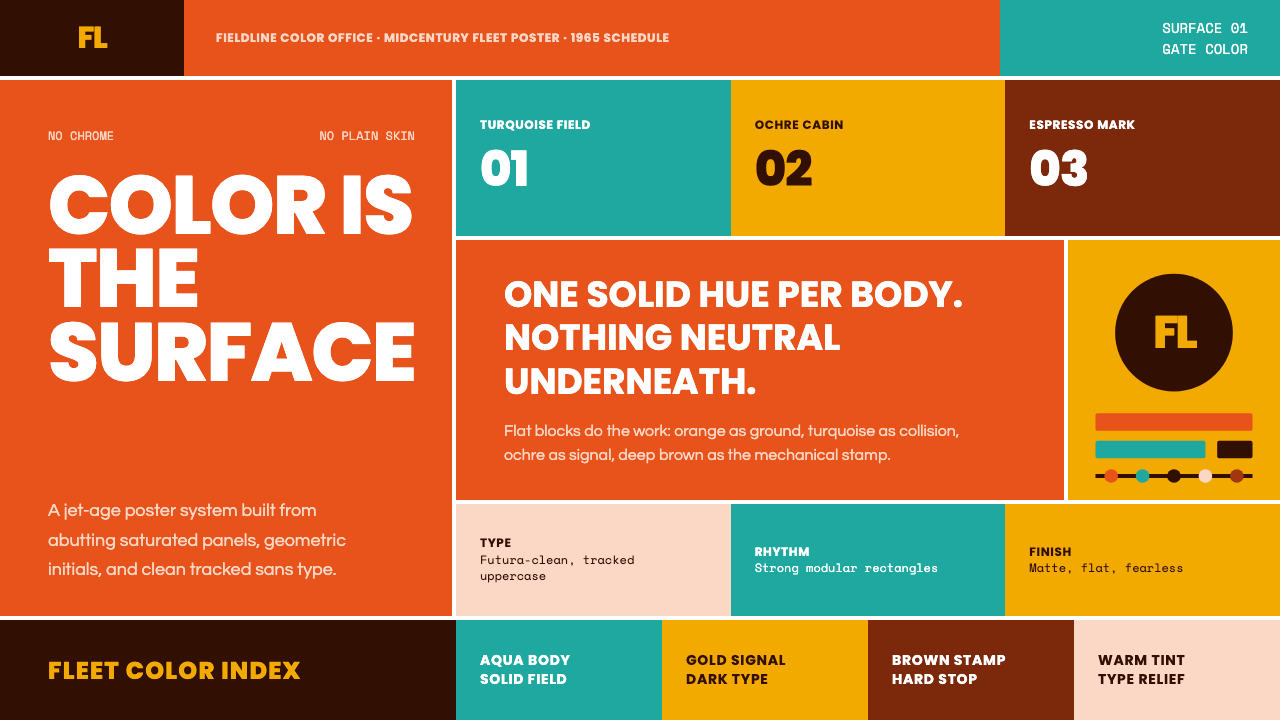 Braniff (Girard)Color becomes fuselage. Jellybean orange, turquoise blocks, and geometric san…颜色就是机身。橙色底、青绿块与几何无衬线锁定网格。