What is Braniff (Girard)?
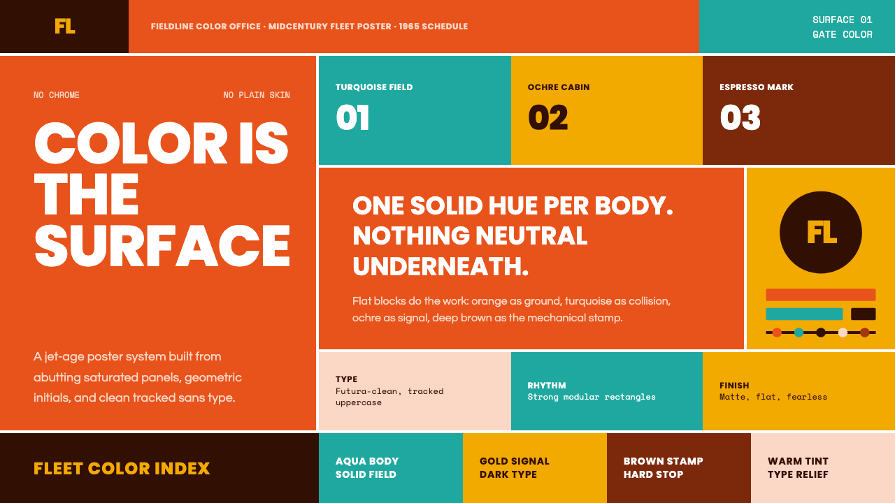
In 1965 Alexander Girard abolished the neutral airplane. Solid jellybean colors — one saturated hue per fuselage — announced that color itself could be the product, the brand, and the entire visual argument.
Braniff (Girard) in brief
Braniff (Girard) is a midcentury American corporate identity system built around the radical proposition that a single unmodulated color, applied without apology to an entire surface, constitutes a complete design. When Alexander Girard rebranded Braniff International Airways in 1965 under the campaign headline 'The End of the Plain Plane,' he repainted the carrier's Boeing 727 fleet in solid orange, turquoise, ochre, and lavender — one hue per aircraft, no chrome trim, no cream belly. The result was not decoration; it was architecture by other means.
The visual language of this system rests on three interlocking decisions: solid-field color as ground rather than accent, geometric sans-serif type as the only letterform, and a clean geometric logotype — the 'BI' mark — that functions as a pure shape rather than a legible glyph at distance. Together these elements produce an aesthetic that reads simultaneously as pop, as modernism, and as pure corporate conviction. There is no illustration, no metaphor, no story told through pictorial means — only saturated hue and flat geometry.
The system belongs to a lineage that runs from the color-field painters of the New York School through Herman Miller's textile and furniture design — Girard led Herman Miller's textile division — and into the Texan midcentury modernism that grew in relative isolation from both the East Coast and European mainstreams. It carries that tradition's democratic confidence: good color, properly applied, requires no further justification.
Where does Braniff (Girard) come from?
Alexander Girard was born in New York in 1907 and educated in architecture in London, Florence, and New York. He came to wide attention in 1952 when Nelson Procter, then leading Herman Miller, hired him to design the company's textile line. Girard's textiles — bold geometrics, saturated solid colors, folk-art references rendered in an entirely modernist vocabulary — gave Herman Miller a visual warmth that the Eames furniture needed but had not supplied on its own. For the next two decades, Girard shaped the color identity of one of America's most influential design companies while maintaining a private architecture and interior practice whose clients included Henry Ford II.
Harding Lawrence became president of Braniff International in 1965 with an aggressive growth mandate and a willingness to use design as a competitive weapon. Lawrence hired the advertising agency Wells Rich Greene and charged Mary Wells Lawrence with developing a campaign that would make Braniff impossible to ignore. Wells brought in Alexander Girard for the aircraft livery and interiors and approached Emilio Pucci — then the most fashion-forward name in Italian ready-to-wear — for the flight attendant uniforms. Charles and Ray Eames contributed the lounge seating that carried Girard's textile patterns. The resulting program was one of the most complete corporate identity campaigns of the decade: color, type, interior, uniform, and object design aligned under a single visual philosophy.
The specific colors Girard chose for the fleet — a range of pure warm and cool hues — were derived from his deep study of pre-Columbian and folk art, sources he had been collecting and cataloguing since the 1940s. He did not arrive at solid jellybean orange from Pop Art; he arrived there from Oaxacan textiles and Peruvian ceramics. This grounds the system in a very different tradition than the purely ironic or commercial register of contemporaneous American Pop. The color is exuberant but not cynical — it declares that an airline ought to be beautiful the way a festival ought to be beautiful.
Braniff collapsed in 1982, the first major airline to fail after federal deregulation. The design program died with the company. But it had already been absorbed into the broader history of corporate identity design, influencing everything from airline liveries to sports team branding. The system has been periodically revived — most recently in a brief Braniff relaunch in the 1990s and early 2000s — but neither revival captured the conviction of the Girard original. What Girard built in 1965 was not a style that could be recreated by copying the colors; it was a position that had to be believed.
What defines the Braniff (Girard) look?
Solid-Field Color as Ground
The defining principle of this system is that color functions as ground — the primary surface — rather than as highlight, border, or accent. An entire fuselage, an entire wall, an entire panel receives one saturated hue with no gradation, no shadow, and no modulation. The color does not describe an object; it is the object. This commitment to solid fields produces immediate visual recognition across enormous distances and at high speed, which is precisely why it worked for aviation and why it continues to work wherever a brand needs to be readable in a glance.
Chromatic Range and Purity
Girard's palette for the Braniff fleet was not built from a single tone family but from the full chromatic range — warm orange and ochre alongside cool turquoise and lavender, each hue at its maximum saturation. The critical rule is purity: no graying, no muddying, no neutralizing. These are colors that have not been politely adjusted for corporate convention. The palette draws from the same visual tradition as folk textiles and pre-Columbian ceramics — a tradition that treats full-chroma color not as excess but as a form of respect for the viewer's visual capacity.
Geometric Sans-Serif Typography
Type in this system is strictly geometric sans-serif — clean, circular letterforms with no ink traps, no optical corrections, no humanist curves. This typographic choice is not arbitrary; it is the only letterform that can coexist with saturated solid color without creating tonal or stylistic competition. Serif type would import historical associations that conflict with the system's modernity. Grotesque or humanist sans-serif would introduce warmth and irregularity that the flat color fields do not need. Geometric sans-serif type is itself a form of solid geometry placed alongside other solid geometry.
Logomark as Pure Geometry
The 'BI' logotype that Girard developed for Braniff functions less as a legible letterform combination and more as a geometric shape — a mark that reads as pattern before it reads as text. At the scale of an aircraft fuselage or an airport terminal signage, the mark does not need to be read in the conventional sense; it needs to be recognized. This approach anticipates the brand-mark logic that would become standard in corporate identity design decades later: primary function is recognition, not spelling.
Total System Coherence
What made the Braniff program historically significant was not any single element but the extension of the same visual logic from the largest surface to the smallest detail — from fuselage to seat fabric to ticket jacket to flight attendant uniform. This total coherence is Girard's clearest inheritance from midcentury modernism: the conviction that a design system is not a set of rules applied to individual objects but a philosophy that must pervade every point of contact. Partial application produces inconsistency; full application produces an environment.
Flat Without Minimalism
This system is flat in its execution — no gradients, no drop shadows, no simulated materials — but it is emphatically not minimal. Minimalism withholds; Braniff declares. The color fields are maximum saturation, not neutral or reduced. The effect is generous and even festive rather than austere or restrained. This distinction is important for application: you cannot achieve this look by simplifying; you achieve it by committing to a color at its fullest intensity and then removing everything that would dilute or qualify it.
Folk Modernism
Girard's deep study of pre-Columbian textiles, Mexican folk art, and indigenous American craft gave this visual system a warmth and cultural depth that purely commercial or purely formalist design typically lacks. The colors feel lived-in and celebratory because they descend from visual traditions that used color for celebration and ceremony — not from the corporate color wheel. This folk modernism is the quality most difficult to replicate without understanding its source: borrowing the color profile alone without the underlying cultural generosity produces work that looks like a theme park version of the original.

Who shaped Braniff (Girard)?
Girard was an architect by training who became America's most significant midcentury textile designer and one of its most accomplished corporate identity designers. At Herman Miller from 1952 onward he developed a textile line of extraordinary chromatic range, drawing from folk art traditions across Mexico, Central America, and the American Southwest. His work for Braniff in 1965 represented the fullest realization of his conviction that saturated color, properly applied at scale, constitutes a complete design argument. He also designed the interiors of La Fonda del Sol restaurant in New York and the Textiles and Objects shop in Manhattan, both of which used color with the same total-environment commitment as the Braniff program.
As president of Braniff from 1965, Lawrence provided the organizational authority and commercial courage that made the Girard program possible. Most airline executives of the period regarded design as a cost center managed for conventionality; Lawrence treated it as a revenue driver and a strategic differentiator. His willingness to paint the entire fleet in bold colors — colors that were unprecedented in commercial aviation — required overriding significant internal resistance. Without a client willing to commit fully, Girard's program would have been diluted into something merely interesting rather than genuinely historic.
Pucci designed the Braniff flight attendant uniforms, contributing fashion's most forward-looking sensibility to the program. His signature — kaleidoscopic color patterns built from geometric forms — was entirely compatible with Girard's visual philosophy and added a layer of high-fashion credibility that positioned Braniff as culturally aspirational rather than merely colorful. The Pucci collaboration helped establish a template for airline identity programs that has since been widely imitated: involving a name designer for the human-facing elements of the service creates an alignment between the brand's object design and its people design.
The Eames contributed lounge seating for the Braniff cabin interiors, upholstered in Girard textiles. Their involvement reflects the dense interconnections of the Herman Miller circle: Girard, the Eameses, and George Nelson all worked under the same institutional umbrella and shared both clients and visual values. The Braniff commission represented one of the few occasions when the Herman Miller aesthetic was applied at the scale of a transportation environment rather than an office or domestic setting, demonstrating how fully that midcentury modernist vocabulary could absorb scale change without losing its identity.
Mary Wells Lawrence of Wells Rich Greene was the advertising creative who conceived the 'End of the Plain Plane' campaign concept and assembled the design team. Her strategic framing — treating the Braniff rebrand as a fashion event rather than a transportation efficiency message — was what opened the space for Girard's chromatic radicalism. Without that framing, the colors would have needed to be justified on functional grounds, which they could not be. Within the narrative of a fashion moment, the colors needed only to be gorgeous, which they were.
How do you use Braniff (Girard) today?
Applying the Braniff (Girard) system correctly requires a fundamental shift in how you think about color's role: color is not applied to a layout — color is the layout. Before choosing a typeface or planning a grid, choose one dominant hue at its fullest saturation and commit to treating it as the primary surface of the composition. Every other decision — type color, secondary geometry, spacing — should serve to clarify and enhance that color commitment rather than compete with it.
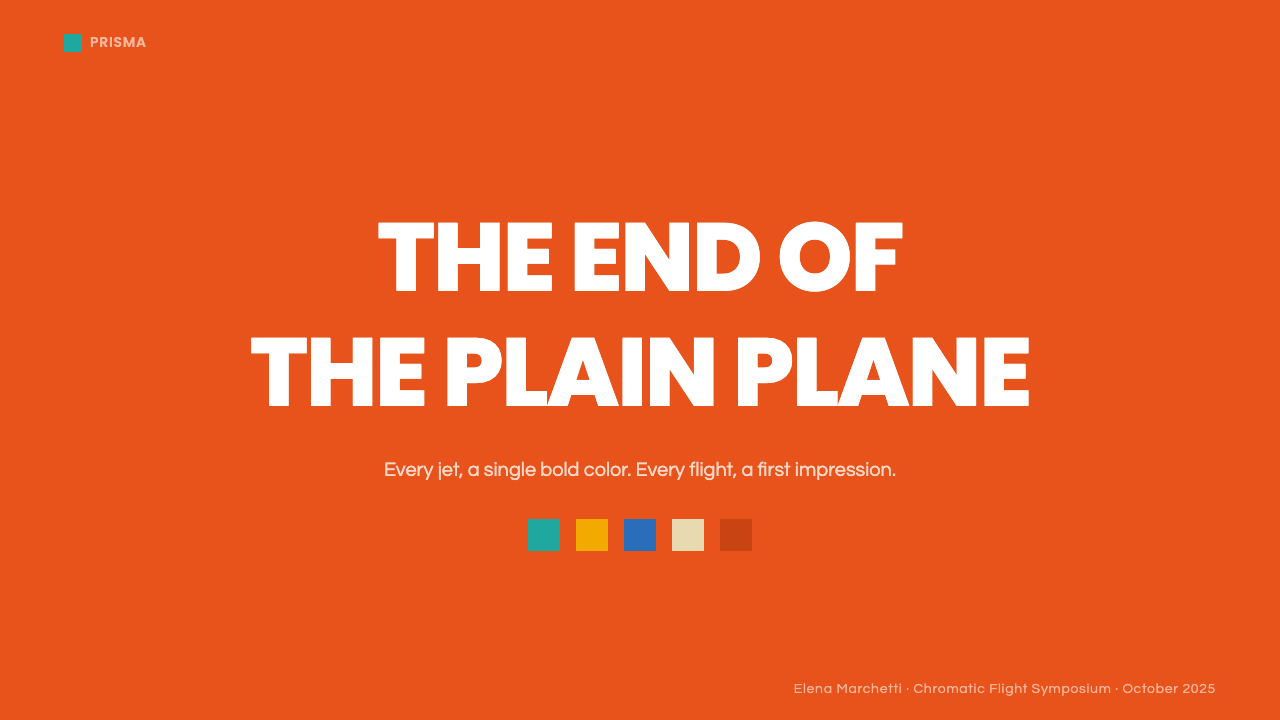
For presentation slides, this system works with striking force on cover pages. Choose one fully saturated color — not a pastel, not a neutral — and give it the entire background. Place a short title in white or black geometric sans-serif type, large and centered or dramatically offset, with nothing else on the page. The cover becomes a color object rather than a title page. For content slides, use a white or very light neutral ground and introduce color only in key data elements, active-state indicators, or section headers. This prevents the density that would occur if every slide received the same full-saturation treatment.
For web interfaces and dashboards, the system is most effective as a bold header or section treatment rather than a page-wide color field. A full-width color band at full saturation — used for a feature tier, a status alert, or a key metric block — carries the visual weight of the original program without overwhelming a data-dense interface. The rest of the interface can remain near-white, with the saturated color reserved for the moments that most need recognition at a glance.
For marketing and editorial work, this system produces poster-quality presence. Full-bleed color blocks alternated with white text areas create a rhythm that is simultaneously modern and exuberant. Product announcements, event promotions, and brand campaigns benefit from assigning one color to each major message — not mixing multiple saturated hues in the same layout, but maintaining a clear one-to-one relationship between hue and concept across a campaign.
The most common mistake when working with this system is hedging the color. Designers who are uncomfortable with the full commitment typically introduce a lighter tint, a desaturated variant, or a gradient modulation to 'make the color more usable.' This is precisely backwards. The visual power of the Braniff system comes from the refusal to qualify the color — from treating the full-chroma hue as the finished decision rather than the starting point for adjustment. A slightly muted version of this system is not a safer version; it is simply a less effective one.
Braniff (Girard) — FAQ
Is this system the same as Pop Art?
Superficially similar but fundamentally different. Pop Art used saturated color ironically — as a commentary on commercial culture, mass reproduction, and consumer desire. Girard used saturated color sincerely, deriving it from folk art traditions that treated color as celebratory and communal rather than critical or ironic. The Braniff palette feels festive where Pop Art feels knowing. Both are influenced by the commercial color environment of postwar America, but they arrive from opposite directions: Pop Art is fine art that borrowed from commercial culture; Braniff is commercial design that drew from folk tradition.
Can this system work for a dark-background interface?
Yes, but with an important adjustment. The Girard program was built on color-as-ground with no dark background as the universal base; the colors were themselves the ground. For a dark-interface adaptation, you can use a deep neutral — very dark, near-black — as the base and introduce one fully saturated accent color for interactive elements, primary actions, and key data points. Avoid the temptation to use multiple saturated colors against the dark ground; the system's power in any context depends on disciplined commitment to one dominant hue per composition, not a rainbow of competing accents.
How does this differ from Swiss International Style, which also uses bold color and geometric type?
Swiss Style uses color with precision and restraint — typically one or two colors from a controlled palette, used for hierarchy and emphasis within a rigorous mathematical grid. The goal is maximal clarity and readability. Braniff (Girard) uses color with abundance and exuberance — one fully saturated hue at maximum intensity, deployed as the primary surface rather than as an accent. Swiss Style is cool and systematic; this system is warm and declarative. Swiss Style subordinates color to structure; this system makes color the structure. Both are disciplined, but the nature of the discipline is opposite.
Why does this style feel so contemporary despite originating in 1965?
Because its core logic — that color at full saturation, flat and unmodulated, is sufficient and complete — anticipates the digital display environment in ways that 1965 could not have predicted. Screens render flat saturated color with absolute fidelity; they were made for this system. The techniques that dominated print and broadcast design between the 1970s and 2000s — gradients, shadows, photographic texture, bevels — were all responses to the limitations of those media. When flat digital interfaces became standard after 2010, they rediscovered an aesthetic that Girard had already articulated fully half a century earlier.
Is this system only suitable for bold, extroverted brands?
Not necessarily, though it does require the brand to be willing to make a declaration. The Braniff program worked because the client accepted that design makes an argument — that choosing a color is taking a position, not decorating a surface. A brand that is fundamentally uncertain about its own identity will resist the full-saturation commitment, and a diluted version of this system will always read as a compromise rather than a statement. The style is best suited to products and organizations that have a clear, confident point of view they want to communicate immediately and memorably — regardless of whether that point of view is exuberant, authoritative, or quietly proud.
Related design styles
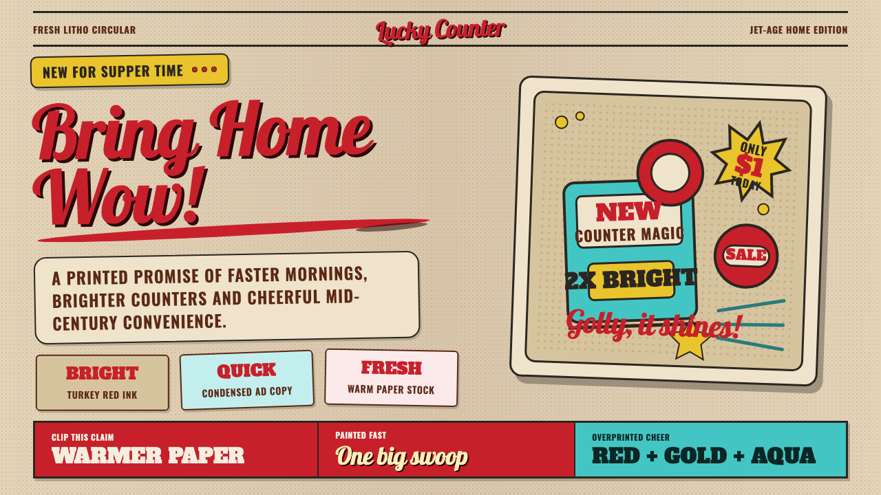 1950s Brush Script AdSells tomorrow in one swoop. Turkey red script, tan paper, starbursts, and ha…
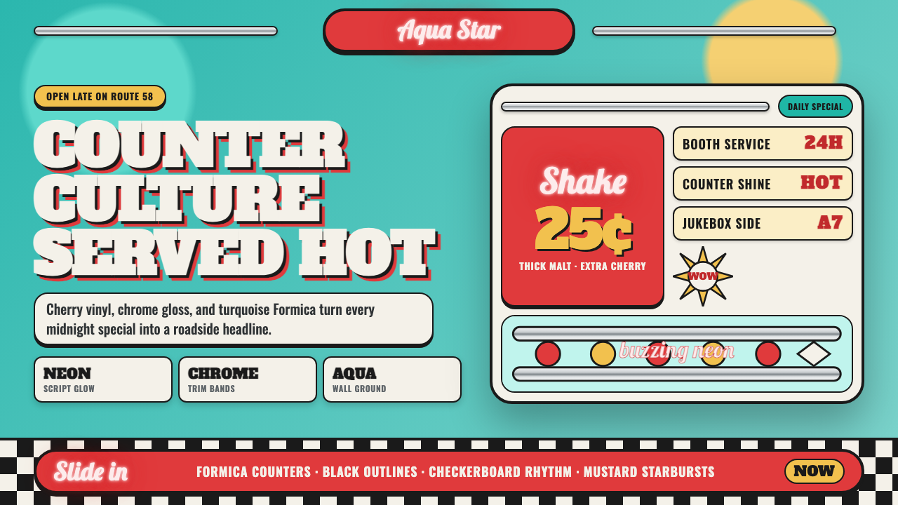 1950s Diner AquaRoadside optimism shouts. Aqua walls, cherry vinyl, chrome bands, and neon sc…
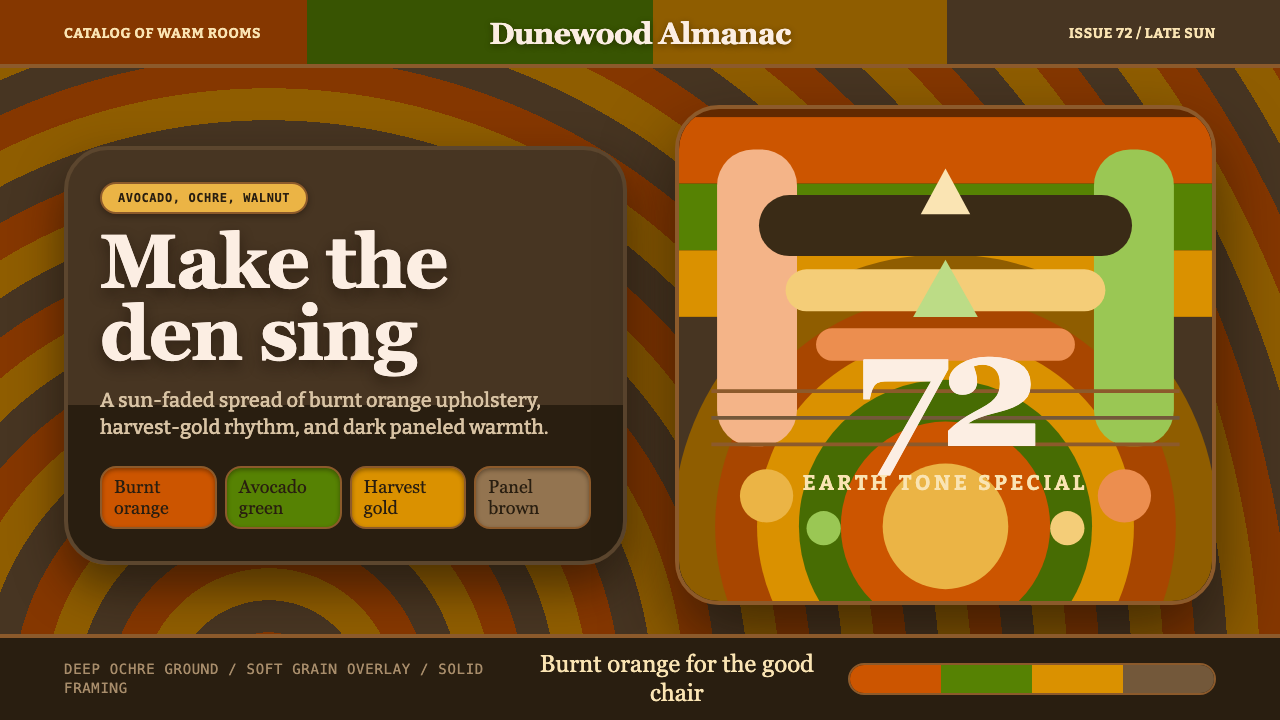 1970s Earth TonesWarm maximalism stays muddy. Bulbous slabs, avocado bands, and harvest-gold r…
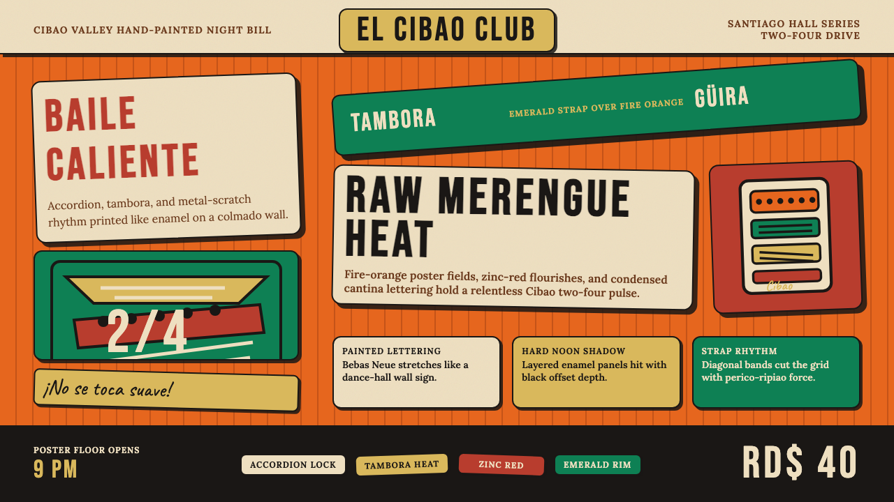 Dominican Merengue Perico RipiaoMaximalism keeps time. Fire-orange fields, Bebas Neue, and diagonal emerald s…
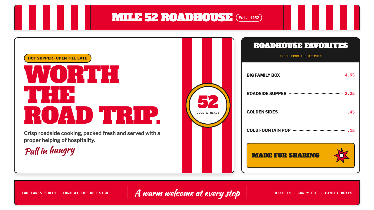 KFC Colonel (1952)Roadside appetite, turned up loud. Enamel red stripes and slab-serif shouts f…
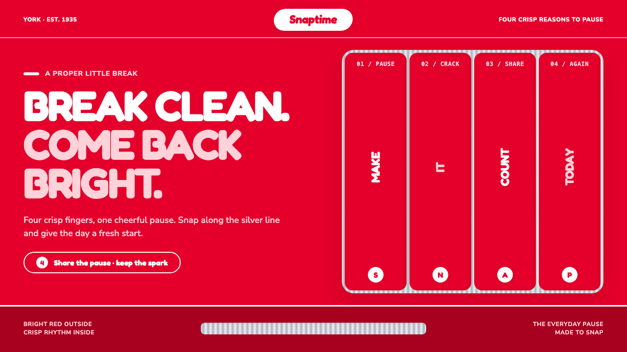 KitKat (1935)A break you can hear. Pillar-box red, plump white type, and silver grooves se…