What is iPod Silhouette 2004?什么是 iPod Silhouette 2004?
Three ingredients — a saturated flat field, a black dancing silhouette, and a single white cord — turned Apple's iPod campaign into the defining poster language of the early 2000s.一块饱和纯色场、一个黑色舞者剪影、一条白色耳机线——这三个元素让苹果 iPod 广告成为 2000 年代初最具辨识度的海报语言。
iPod Silhouette 2004 in briefiPod Silhouette 2004 速览
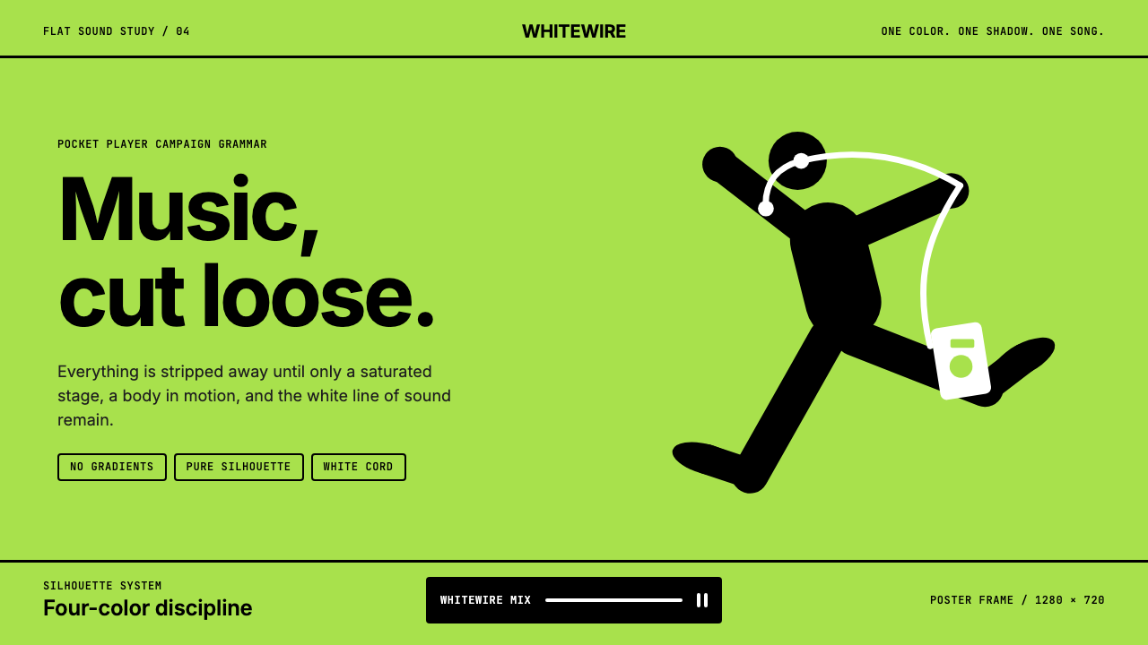
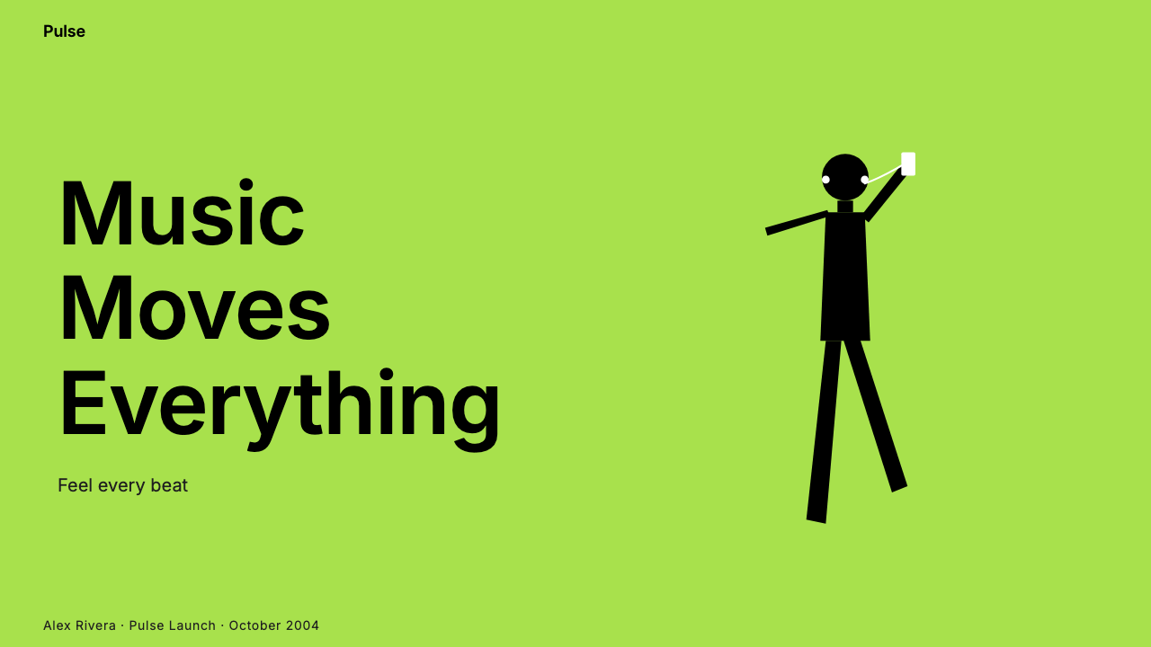
iPod Silhouette is the visual design language codified by Apple's 2003–2006 advertising campaign: saturated flat-color backgrounds — lime green, magenta, cyan, electric orange — serve as stages for anonymous black silhouette figures frozen in ecstatic, mid-dance poses. Tethering each silhouette to the only representational object in the frame is a white cord ending in white earbuds and a white iPod. The entire composition operates with exactly three layers: background, silhouette, and white device.iPod 剪影是苹果公司 2003 至 2006 年广告活动所确立的视觉设计语言:高饱和纯色背景——柠檬绿、品红、天蓝、电光橙——充当舞台,其上是匿名的黑色人物剪影,凝固于狂喜的舞蹈瞬间。将每个剪影与画面中唯一具象物件相连的,是一条白色线缆,末端是白色耳机与白色 iPod。整个构图只有三层:背景、剪影、白色设备。
What makes the system remarkable is its absolute economy. No gradients, no textures, no drop shadows, no facial features, no clothing detail. The silhouette is not a specific person — it is the universal experience of losing yourself in music, abstracted to its geometric shadow. The white cord functions as both a literal product shot and a compositional line that leads the eye. Typography — where it appears — is set in a clean sans-serif at minimal size, deliberately subordinate to the image. The poster communicates before a single word is read.这套系统之所以出色,在于其绝对的经济性。无渐变、无纹理、无投影、无面部特征、无服装细节。剪影不指向某个具体的人——它是将自己沉浸于音乐这一普遍体验的几何投影。白色线缆既是字面意义上的产品展示,也是引导视线的构图线索。文字排印——若出现——以极小的无衬线字体呈现,刻意从属于画面。这幅海报在任何文字被阅读之前便已完成传达。
As a design vocabulary for contemporary work, iPod Silhouette translates into a precise set of decisions: use one dominant saturated color per composition, render any figures or focal objects as flat black silhouettes against that field, reserve white exclusively for the hero element or key typographic message, and enforce zero-texture discipline throughout. The result is work that reads instantly at any size — from a thumbnail to a billboard — because every element is legible at its most reduced form.作为当代设计的视觉词汇,iPod 剪影转化为一组精确的决策:每个构图使用一种主导饱和色;将任何人物或焦点元素渲染为该底色上的平面黑色剪影;将白色专门保留给主角元素或关键文字信息;并在全局贯彻零纹理原则。由此产生的作品在任何尺寸下都能即时传达——从缩略图到广告牌——因为每个元素在最简化状态下依然清晰可读。
See the iPod Silhouette 2004 design system查看 iPod Silhouette 2004 完整设计系统
Where does iPod Silhouette 2004 come from?iPod Silhouette 2004 从何而来?
In 2001, Apple released the first iPod alongside the memorable slogan '1,000 songs in your pocket.' The product was a technological statement, but the advertising that would define it culturally came two years later. In 2003, Apple's long-standing creative partner TBWA\Chiat\Day — the Los Angeles agency led by creative director Lee Clow — developed the Silhouette campaign under the direction of art director Susan Alinsangan. The brief was to communicate not the device's specifications but the emotional state it produced: freedom, movement, joy, the total absorption of music. The silhouette concept answered that brief with unusual precision.2001 年,苹果发布了第一代 iPod,附以令人难忘的口号「口袋里的一千首歌」。这款产品本身是技术宣言,但真正在文化层面定义它的广告则在两年后诞生。2003 年,苹果长期合作的创意伙伴 TBWA\Chiat\Day——由创意总监李·克劳主持的洛杉矶广告公司——在艺术总监苏珊·阿林桑安的主导下发展出剪影广告活动。创意简报的核心不是传达产品规格,而是传达它所产生的情感状态:自由、运动、喜悦、被音乐完全吸纳的体验。剪影这一概念以异乎寻常的精准度回应了这份简报。
The visual strategy drew from a tradition of flat poster art — the kind of simplified, high-contrast graphic language seen in mid-century travel posters and constructivist propaganda — but fused it with the energy of contemporary street and club culture. The dancing figures were shot as live performers in studio conditions, then reduced photographically to pure black shapes. The flat color backgrounds were chosen for maximum saturation and differentiation: each colorway would become its own seasonal variant, allowing the campaign to refresh while maintaining instant recognition. By the time the campaign reached its peak in 2004 through television spots, outdoor advertising, and retail environments, the silhouette format had become so recognizable that the product itself did not need to be named.这套视觉策略借鉴了平面海报艺术的传统——那种见于中世纪旅行海报与构成主义宣传品的简化、高对比度图形语言——但将其与当代街头及俱乐部文化的能量融合在一起。舞者形象在摄影棚拍摄真实表演者后,经摄影手段简化为纯粹的黑色轮廓。纯色背景按最大饱和度与区分度选取:每种配色方案都成为一个季节性变体,让广告活动得以在保持即时识别度的同时持续焕新。到 2004 年广告活动通过电视广告、户外广告与零售空间达到高峰时,剪影形式已变得如此具有辨识度,以至于产品本身根本不需要被点名。
Steve Jobs's involvement shaped the discipline of the campaign. Apple's design culture under Jobs operated by elimination — removing every element that was not strictly necessary until what remained was as close to pure function as possible. The Silhouette posters embody this logic: the human figure is stripped to shadow, the product is stripped to outline, the environment is stripped to color. What survives is not minimalism as aesthetic gesture but reduction as argument: the music matters, the body responds, and the device is the only manufactured object in the world worth showing.史蒂夫·乔布斯的介入塑造了这次广告活动的严格纪律。乔布斯时代苹果的设计文化以删减为核心——持续移除一切非严格必要的元素,直到剩余之物尽可能接近纯粹功能。剪影海报体现了这一逻辑:人体被剥减至阴影,产品被剥减至轮廓,环境被剥减至色彩。留存下来的不是作为美学姿态的极简主义,而是作为论点的简化:音乐至关重要,身体随之回应,而这款设备是世界上唯一值得展示的人造物。
The campaign ran through approximately 2006, with hundreds of color and figure variations. Its legacy extended well beyond advertising. The visual language entered the broader culture as shorthand for a certain kind of confident, bold simplicity associated with Apple's design philosophy in that era. When designers today invoke the iPod Silhouette aesthetic, they are drawing on a system that was not designed as a fine-art exercise but as a commercial communication solution — one that solved the problem of making a small electronic device feel like an invitation to dance.广告活动一直延续至 2006 年前后,产生了数百个配色与人物变体。其影响远超广告领域本身。这套视觉语言进入了更广泛的文化,成为与苹果那个时代设计哲学相关联的那种自信、大胆、简洁的速记符号。当今天的设计师援引 iPod 剪影美学时,他们所借鉴的是一套并非为纯艺术而生的系统,而是一个商业传播解决方案——一个解决了如何让一款小型电子设备感觉像舞蹈邀请函这一问题的方案。
What defines the iPod Silhouette 2004 look?iPod Silhouette 2004 的视觉特征是什么?
Saturated Flat Background饱和纯色背景
The background of any iPod Silhouette composition is a single, fully saturated flat color — no gradient, no vignette, no texture. The color functions as the entire environment: sky, floor, and atmosphere collapsed into one unbroken field. The specific hues associated with the campaign — lime green, hot magenta, bright cyan, electric orange — sit at the outer boundary of sRGB saturation, chosen to maximize visual energy while remaining unambiguously flat. Any approach that introduces gradation or lightfall into the background immediately exits the system.iPod 剪影构图的背景是单一、完全饱和的纯色——无渐变、无晕映、无纹理。这块颜色充当整个环境:天空、地面与氛围折叠为一块不间断的色场。与该广告活动关联的特定色调——柠檬绿、热品红、亮天蓝、电光橙——处于色域饱和度的外缘,旨在最大化视觉张力同时保持明确的平面性。任何将渐变或光感引入背景的尝试都会立即脱离这套系统。
Black Silhouette Figure黑色剪影人物
The human figure is rendered as a flat, featureless black shape — no interior line work, no facial detail, no clothing texture. The silhouette communicates through posture alone: the arc of a raised arm, the tilt of a head, the spread of fingers holding earbuds. Figures are typically shown in mid-motion, conveying liberation and physical response to music rather than posed stillness. The anonymity of the silhouette is intentional: it is not a portrait but a mirror, inviting the viewer to project themselves into the figure.人体被渲染为平坦、无特征的黑色轮廓——无内部线条、无面部细节、无服装纹理。剪影仅靠姿态传达:抬起的手臂弧线、头部的倾斜、拿着耳机的手指张开的形态。人物通常展示在动态瞬间,传递对音乐的解放感与身体回应,而非摆拍的静止感。剪影的匿名性是刻意为之:它不是肖像,而是一面镜子,邀请观者将自己投射进那个身影。
The White Cord白色线缆
The white earphone cord is the most distinctive single element of the visual system. Against a saturated background, white reads with maximum contrast and pulls the eye with line energy. The cord traces a path from the silhouette figure's ears or hands down to the white iPod — a compositional arc that narrates a story in a single gesture: human, connected, device. The cord also serves as the only color in the composition that is neither background hue nor black, making it function simultaneously as product identification, compositional rhythm, and emotional symbol of the musical connection.白色耳机线缆是这套视觉系统中最具辨识度的单一元素。在饱和背景上,白色以最高对比度呈现,以线条能量牵引视线。线缆从剪影人物的耳朵或手部延伸至白色 iPod——一条在单一手势中叙述故事的构图弧线:人、连接、设备。线缆也是构图中既非背景色、也非黑色的唯一颜色,使其同时承担产品识别、构图节奏与音乐连接情感象征三重功能。
Three-Layer Absolute Discipline三层绝对纪律
The system operates on exactly three layers and refuses a fourth. Layer one: the flat color field, which fills every pixel of the background with no variation. Layer two: the black silhouette, which is pure foreground against that field with no shadow, blur, or glow beneath it. Layer three: the white device and cord, which float above the silhouette in compositional terms and serve as the sole detail carrier. Typography, when present, belongs to the white layer and is kept secondary to the figures. Introducing any fourth visual layer — a texture overlay, a gradient band, a decorative border — breaks the fundamental tension that gives the system its power.这套系统严格运行在三个层次上,并拒绝第四层。第一层:纯色场,以零变化填充背景的每一个像素。第二层:黑色剪影,在该色场上呈现为纯粹的前景,其下无投影、模糊或光晕。第三层:白色设备与线缆,在构图意义上浮于剪影之上,作为唯一的细节承载者。排版文字(若存在)归属于白色层,并保持从属于人物形象的地位。引入任何第四视觉层——纹理叠加、渐变条带、装饰边框——都会打破赋予系统力量的根本张力。
Typography as Whisper排印作为耳语
When type appears in the iPod Silhouette system — typically a product name, tagline, or album title — it is set in a clean, geometric sans-serif at a scale that is deliberately quiet relative to the image. The type does not compete with the silhouette; it annotates it. Weight is kept light to medium, and the text is typically positioned at the very bottom of the composition or tucked into a corner, respecting the primacy of the visual. This restraint stands in contrast to most advertising typography of the era, which used type as the dominant communication layer.当排印文字出现在 iPod 剪影系统中——通常是产品名称、口号或专辑名——它以简洁的几何无衬线字体排印,相对于图像刻意保持安静的体量。文字不与剪影竞争;它注解剪影。字重保持轻至中等,文字通常置于构图最底部或缩进角落,尊重视觉形象的主导地位。这种克制与同时代大多数广告排版形成鲜明对比——那个时代的广告排版往往将文字作为主导传达层。
Per-Color Compositional Completeness单色构图完整性
Each colorway in the campaign functions as a complete, self-contained composition. Lime green is not interchangeable with magenta — the specific background hue was chosen to complement the energy and posture of each figure. This means that applying the system correctly requires treating color not as a brand color to be consistently reproduced across all applications, but as an expressive environment tailored to each composition. Multiple colorways exist in the campaign because each dance, each posture, each musical mood calls for its own background.广告活动中的每个配色方案都作为完整、自足的构图运作。柠檬绿不能与品红互换——特定的背景色调是为搭配每个人物的能量与姿态而选择的。这意味着正确应用这套系统,需要将颜色不视为在所有应用场景中一致复现的品牌色,而是视为为每个构图量身定制的表达性环境。广告活动中存在多种配色方案,因为每个舞蹈动作、每个姿态、每种音乐情绪都需要属于自己的背景。
Zero Decorative Ambiguity零装饰歧义
Every element in an iPod Silhouette composition earns its presence through a specific communicative function. The background color sets emotional register. The silhouette conveys human experience. The white device names the product. Nothing exists for decoration. There are no abstract geometric overlays, no ornamental patterns, no badge treatments, no visual noise. This austerity is not a consequence of the medium — it is the medium. The style's power depends entirely on the clarity produced by the removal of everything that is not doing functional work.iPod 剪影构图中的每个元素都以特定传达功能赢得其存在的权利。背景颜色设定情感基调,剪影传达人类体验,白色设备点明产品,没有任何元素出于装饰目的存在。无抽象几何叠加,无装饰图案,无徽章处理,无视觉噪声。这种朴素感不是媒介的结果——它就是媒介本身。这种风格的力量完全依赖于移除一切非功能性内容后所产生的清晰度。

See the iPod Silhouette 2004 design system查看 iPod Silhouette 2004 完整设计系统
Who shaped iPod Silhouette 2004?谁塑造了 iPod Silhouette 2004?
Jobs's role in the iPod Silhouette campaign was less as a visual author and more as the enforcer of the philosophy that made the visuals possible. His insistence that every Apple product and communication achieve the highest clarity through elimination — removing buttons, removing menus, removing visual noise — gave the advertising team the organizational permission to strip the posters down to three elements. The campaign's commercial success under Jobs validated a design approach that most advertising executives of the era would have considered dangerously underspecified.乔布斯在 iPod 剪影广告活动中扮演的角色,与其说是视觉创作者,不如说是使这些视觉成为可能的那种哲学的执行者。他对每一件苹果产品与传播物都必须通过删减达到最高清晰度的坚持——删除按键、删除菜单、删除视觉噪声——赋予广告团队在组织层面将海报精简至三个元素的许可。这次广告活动在乔布斯领导下的商业成功,验证了一种设计路径的正当性,而同时代大多数广告高管都会认为这种路径危险地缺乏信息量。
Lee Clow was the creative director at TBWA\Chiat\Day who oversaw the Apple relationship from the iconic '1984' Super Bowl commercial through the iPod era. His contribution to the Silhouette campaign was the strategic conviction that the most powerful advertising Apple could run was advertising that felt nothing like advertising — that communicated a cultural and emotional truth rather than a product feature list. Clow's influence ensured the campaign maintained its radical simplicity against the institutional pressure that inevitably accompanies large-scale media buys.李·克劳是 TBWA\Chiat\Day 的创意总监,自标志性的「1984」超级碗广告起便主持着与苹果的合作关系,一直延续至 iPod 时代。他对剪影广告活动的贡献是一种战略信念:苹果能够发布的最有力广告,是那种感觉完全不像广告的广告——传达一种文化与情感真相,而非产品功能清单。克劳的影响确保了广告活动面对大规模媒介投放所不可避免带来的机构性压力时,仍然维持了其激进的简洁性。
Alinsangan served as the art director credited with developing the visual execution of the Silhouette campaign at TBWA\Chiat\Day. The specific decisions that define the system — the choice to use flat color rather than graduated backgrounds, the reduction of performers to pure black shapes, the elevation of the white cord to compositional protagonist — emerged from her creative direction. Her work on the campaign established a visual template that was immediately recognizable, endlessly reproduced, and influential enough to define the visual culture of the mid-2000s consumer technology space.阿林桑安是 TBWA\Chiat\Day 中被认定为发展了剪影广告活动视觉执行的艺术总监。定义这套系统的那些具体决策——选择纯色而非渐变背景、将表演者简化为纯黑轮廓、将白色线缆提升为构图主角——均源于她的创意指导。她在这次广告活动中的工作确立了一套视觉模板:即时可辨、被无数次复制,并具有足够的影响力,以至于定义了 2000 年代中期消费科技领域的视觉文化。
Although Jony Ive's primary domain was hardware industrial design, his visual philosophy — that a product should declare its function through the clarity of its form — provided the theoretical underpinning that the advertising team translated into the Silhouette campaign. The white iPod itself, with its monochromatic body and minimal controls, was the physical object that made the campaign's three-layer logic work: it was already designed to be the single white element in any composition, its form inseparable from its role in the poster.尽管乔纳森·伊夫的主要领域是硬件工业设计,他的视觉哲学——产品应通过形态的清晰度宣告其功能——为广告团队转化为剪影广告活动提供了理论基础。白色 iPod 本身,凭借其单色机身与极简控件,是使广告活动三层逻辑得以运作的实体对象:它在设计之初便已成为任何构图中唯一的白色元素,其形态与其在海报中的角色不可分割。
The Los Angeles office of TBWA\Chiat\Day was the institutional structure within which the Silhouette campaign was developed, and its culture of preserving radical creative concepts against client-side risk aversion was essential to the campaign's integrity. The agency's history of producing conceptually ambitious work for Apple — from '1984' to 'Think Different' to the Silhouette series — created an accumulated trust that allowed the team to present and execute an advertising campaign that, stripped to its essentials, showed almost nothing about the product it was selling.TBWA\Chiat\Day 洛杉矶办公室是剪影广告活动得以孵化的机构结构,其抵御客户方风险规避、守护激进创意概念的文化,对广告活动的完整性至关重要。该机构为苹果创作具有概念野心作品的历史——从「1984」到「不同凡想」再到剪影系列——积累了足够的信任,使团队得以提出并执行一场在本质上几乎不展示被销售产品任何信息的广告活动。
How do you use iPod Silhouette 2004 today?今天怎么用 iPod Silhouette 2004?
The iPod Silhouette system translates with unusual directness into contemporary design work because its logic is structural rather than era-specific. The core constraint — one saturated flat background, black silhouette forms, white hero element — is a compositional rule that produces high-impact work across media. However, the system is easy to misread as a simple recipe, and that misreading produces weaker results. Correct application starts with understanding that the three layers must all be present and each must do its assigned work exclusively: background carries color and energy, silhouette carries human presence and motion, white carries product identity or primary message.iPod 剪影系统能以异乎寻常的直接性转化为当代设计工作,因为其逻辑是结构性的,而非特定于某个时代。核心约束——一块饱和纯色背景、黑色剪影形态、白色主角元素——是一条在各种媒介上都能产生高冲击力作品的构图规则。然而,这套系统很容易被误读为一个简单配方,而这种误读会产生更弱的结果。正确应用始于理解:三个层次必须全部存在,且每个层次都必须专一地完成其指定工作——背景承载色彩与能量,剪影承载人类存在与动态,白色承载产品识别或主要信息。
For presentation slides, the system works exceptionally well on cover pages and section dividers where impact takes priority over information density. A cover built in this language uses one saturated background color that sets the emotional tone of the presentation, places a silhouette that relates metaphorically to the subject matter, and reserves white for the title and any essential metadata. Content slides should not attempt to replicate the full silhouette treatment — instead, they borrow the palette discipline: single dominant background hue, black for body text and data labels, white for structural dividers and key callouts. Data visualization adopts the three-color logic: bars and chart segments in the background color, comparison bars in black, annotations in white. The result is a slide deck with visual consistency without forcing every slide to be a poster.对于演示文稿,这套系统在冲击力优先于信息密度的封面页和章节分隔页上表现尤为出色。以这种语言构建的封面使用一种饱和背景色设定演示的情感基调,放置一个在隐喻上与主题相关的剪影,并将白色保留给标题和必要元数据。内容页不应尝试复制完整的剪影处理——而是借用色彩纪律:单一主导背景色、黑色用于正文与数据标签、白色用于结构分割线与关键标注。数据可视化采用三色逻辑:柱条与图表扇区使用背景色,对比柱条使用黑色,注释使用白色。结果是一套视觉一致的幻灯片,而无需强迫每张幻灯片都成为一幅海报。
For web interfaces — dashboards, pricing pages, product landing pages — the system informs layout and color hierarchy without requiring literal silhouette imagery on every screen. Establish a primary saturated background hue as the brand anchor color; use it for hero sections, feature blocks, and primary calls to action. Reserve black for body text and structural elements. Use white for cards, input fields, and content areas that require legibility at extended reading lengths. Interactive states — hover, active, selected — are ideal candidates for the silhouette treatment: a user avatar that becomes a flat black shape on a saturated hover state, for instance, directly applies the campaign's logic at a micro-interaction level.对于网页界面——仪表板、定价页、产品落地页——这套系统在不要求每个屏幕都使用字面剪影图像的情况下,指导版面与色彩层级。将主导饱和背景色确立为品牌锚点色;将其用于英雄区块、功能模块与主要行动号召。将黑色保留给正文与结构性元素。将白色用于卡片、输入框与需要较长阅读时间的内容区域。交互状态——悬停、激活、选中——是剪影处理的理想候选:例如,一个用户头像在饱和色悬停状态下变为平面黑色轮廓,直接在微交互层面应用了广告活动的逻辑。
For editorial layouts and marketing materials, the style supports strong, poster-like communication in a way that few contemporary design systems permit. A marketing page section built in this language places a full-width saturated color block containing a black silhouette illustration above the fold, with white headline text positioned to work compositionally with the figure's posture or gaze direction. Print materials — event posters, product announcements, conference branding — translate directly: the three-layer rule works as well on a physical A2 poster as on a social media card. The critical discipline for editorial application is that the silhouette must be a genuine figure — a person, a hand holding a device, an animal, a recognizable object reduced to outline — not an abstract blob. The system depends on the viewer's ability to read the black shape as a human presence.对于编辑版面与营销材料,这种风格支持强劲的、海报式的传达,这是当代很少设计系统所允许的。以这种语言构建的营销页面区块,在首屏放置一个包含黑色剪影插图的全宽饱和色块,白色标题文字在位置上与人物的姿态或视线方向配合形成构图关系。印刷材料——活动海报、产品公告、会议品牌——可以直接转化:三层规则在实体 A2 海报上与在社交媒体卡片上同样有效。编辑应用的关键纪律是:剪影必须是真实的形象——一个人、一只拿着设备的手、一个动物、一个简化为轮廓的可识别物体——而非抽象的色块。这套系统依赖于观者将黑色形态读解为人类存在的能力。
The most common mistake when applying iPod Silhouette is treating it as a color-and-contrast recipe without honoring the three-layer discipline. Designers frequently add a fourth element — a soft drop shadow beneath the silhouette figure, a gradient in the background color, a secondary texture behind the white device — each of which individually seems like a minor enhancement but collectively dissolves the tension that gives the system its power. A related error is using the silhouette treatment for static, upright, or formally posed figures: the campaign's figures were always in dynamic motion, and a silhouette standing at attention reads as corporate iconography rather than joyful energy. When using this system, commit to motion, commit to flatness, and commit to the rule of three layers — any accommodation in those three areas dilutes the result.应用 iPod 剪影时最常见的错误,是将其视为色彩与对比度配方,而不遵守三层纪律。设计师常常添加第四个元素——剪影人物下方的软投影、背景色中的渐变、白色设备后方的次级纹理——这些单独看来像是细微改善,但集体上瓦解了赋予系统力量的张力。另一个相关错误是将剪影处理用于静止的、直立的或正式摆姿的形象:广告活动中的人物始终处于动态运动中,而立正站立的剪影读来像企业图标而非喜悦能量。使用这套系统时,请坚守动态感、坚守平面性、坚守三层规则——在这三个方面的任何妥协都会稀释结果。
See the iPod Silhouette 2004 design system查看 iPod Silhouette 2004 完整设计系统
iPod Silhouette 2004 — FAQiPod Silhouette 2004 · 常见问题
Can the system work with colors outside the original campaign palette?这套系统能使用原始广告活动色板以外的颜色吗?
Yes, with important qualifications. The original lime green, magenta, cyan, and orange were chosen for maximum saturation within a specific color space, and they carry cultural associations with the early iPod era that some applications may want and others may want to avoid. The system's underlying rule is not about specific hues but about saturation level and flatness: the background must be a single fully saturated color, whichever hue is chosen. Deep navy, rich violet, and warm coral can all work as background fields if deployed at full saturation with zero gradient. Pastels, mid-tone neutrals, and muted hues break the system because they lack the chromatic intensity that gives the background its stage-like quality.可以,但有重要限定。原始的柠檬绿、品红、天蓝与橙色是在特定色彩空间内按最高饱和度选取的,它们携带着某些应用场景可能希望拥有、另一些可能希望回避的 iPod 早期时代文化联想。这套系统的底层规则不在于特定色调,而在于饱和度水平与平面性:无论选择哪种色调,背景都必须是单一、完全饱和的颜色。深海军蓝、浓郁紫罗兰与暖珊瑚红都能作为背景场,只要以完全饱和度且零渐变部署。粉彩色、中性调与低饱和色调会破坏这套系统,因为它们缺乏赋予背景舞台感的色度强度。
Does the style require actual silhouette photography, or can illustrated shapes work?这种风格需要真实的剪影摄影,还是插画形态也可以使用?
Illustrated silhouettes work and are often more practical for contemporary applications. The system's requirement is not photographic origin but visual fidelity to the silhouette principle: the figure must read as a flat, featureless black shape with no interior detail. Vector illustrations that capture dynamic human posture — a figure in mid-leap, a hand raised with earphones — translate the system's logic precisely. What does not work are silhouettes with internal detail lines, hatching, or tonal variation, as these reintroduce descriptive complexity that the system is specifically designed to eliminate. The silhouette's power comes from what it withholds.插画剪影完全可行,且对当代应用往往更具实用性。这套系统的要求不在于摄影来源,而在于对剪影原则的视觉忠实:人物必须被读解为平坦、无特征的黑色轮廓,内部无任何细节。捕捉动态人体姿态的矢量插画——一个腾空跳跃的身影、一只举起拿着耳机的手——能够精准转化这套系统的逻辑。不适用的是带有内部细节线条、排线或色调变化的剪影,因为这些会重新引入这套系统专门设计来消除的描述性复杂度。剪影的力量来自于它所隐藏的内容。
How does this style relate to contemporary flat design and Material Design?这种风格与当代扁平设计和 Material Design 是什么关系?
The iPod Silhouette campaign (2003) is an important historical precedent for the flat design movement that became dominant in digital interfaces around 2012–2013, but the relationship is one of influence rather than equivalence. Flat design adopted the no-gradient, no-texture principles that the Silhouette campaign embodied, but distributed them across a much broader color range and removed the silhouette figure as a compositional device. Material Design (2014) then reintroduced depth through elevation shadows and z-axis metaphors — a direct departure from the Silhouette system's absolute flatness. If flat design is a descendant, it is a diluted one. The Silhouette system's specific contribution — the three-layer structural constraint and the use of human motion as the primary communicative element — has no direct parallel in any contemporary design system.iPod 剪影广告活动(2003 年)是大约在 2012 至 2013 年间主导数字界面的扁平设计运动的重要历史先驱,但两者是影响关系而非等同关系。扁平设计采纳了剪影广告活动所体现的无渐变、无纹理原则,但将其分布在更宽广的色彩范围内,并移除了剪影人物作为构图装置的角色。Material Design(2014 年)随后通过高度投影与 Z 轴隐喻重新引入了深度感——这与剪影系统的绝对平面性形成直接背离。如果说扁平设计是其后裔,那也是一个稀释版本。剪影系统的特定贡献——三层结构约束与将人体动态作为主要传达元素——在任何当代设计系统中都没有直接对应物。
What happens when the system needs to carry more than one message?当这套系统需要承载多个信息时该怎么办?
The honest answer is that the system is not well-suited to multi-message compositions. Its power is built on singular focus: one background, one figure, one device. When multiple messages are required — for instance, a landing page that must communicate a product name, a key benefit, a price point, and a call to action — the correct approach is to break the content into multiple distinct zones, each treated as a separate iPod Silhouette composition with its own background color and figure, rather than attempting to crowd all information into one three-layer field. A pricing page, for example, might use lime green with a dancing figure for the entry tier, magenta with a different figure for the mid tier, and cyan with a third figure for the premium tier — each card complete in itself, the variety of color signaling the differentiation.坦诚的回答是:这套系统不适合多信息构图。其力量建立在单一焦点之上:一个背景、一个人物、一个设备。当需要传达多个信息时——例如,一个落地页必须同时传达产品名称、核心卖点、价格与行动号召——正确的做法是将内容分解为多个独立区域,每个区域作为一个独立的 iPod 剪影构图处理,拥有各自的背景色与人物,而非试图将所有信息塞入一个三层色场。例如,一个定价页面可以为入门档使用柠檬绿搭配舞动人物,为中级档使用品红搭配不同人物,为高级档使用天蓝搭配第三个人物——每张卡片在自身内部完整,色彩的多样性传达层级差异。
Is iPod Silhouette appropriate for serious or formal contexts?iPod 剪影风格适合严肃或正式的场景吗?
The system's origins in consumer advertising and its association with music, dance, and physical liberation make it a natural fit for contexts that want energy, joy, and cultural immediacy. It can be applied in more serious contexts — a conference keynote, a product launch for a professional tool, a brand campaign for a technology platform — but those applications work best when the silhouette figures are chosen to reflect the professional activity rather than dance. A silhouette of a person at a standing desk, a coder gesturing at a screen, or a designer holding a stylus deploys the system's three-layer discipline while redirecting its emotional register from euphoric to purposeful. The underlying grammar of the style is neutral; the emotional connotation is carried by the figure's posture and the background color's temperature.这套系统起源于消费品广告,且与音乐、舞蹈和身体解放相关联,使其天然适合追求能量、喜悦与文化即时感的场景。它也可以应用于更严肃的场景——会议主题演讲、专业工具的产品发布、科技平台的品牌活动——但这些应用在选择能反映专业活动而非舞蹈的剪影人物时效果最佳。一个站在立式工作台旁的人物剪影、一个对着屏幕做手势的程序员、一个拿着触控笔的设计师——在部署这套系统三层纪律的同时,将其情感基调从狂喜重新定向为目标感。这种风格的底层语法是中性的;情感内涵由人物姿态与背景色调温度共同承载。
Related design styles相关设计风格
 Braniff (Girard)Color becomes fuselage. Jellybean orange, turquoise blocks, and geometric san…颜色就是机身。橙色底、青绿块与几何无衬线锁定网格。
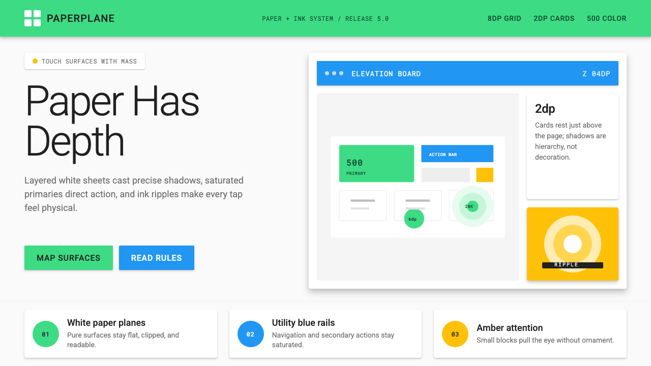 Android Lollipop (Material 1.0)Paper becomes physical. Roboto, green FABs and sharp shadows give white cards…纸张拥有物理感:Roboto、鲜绿浮动按钮与硬阴影让白卡片产生深度。
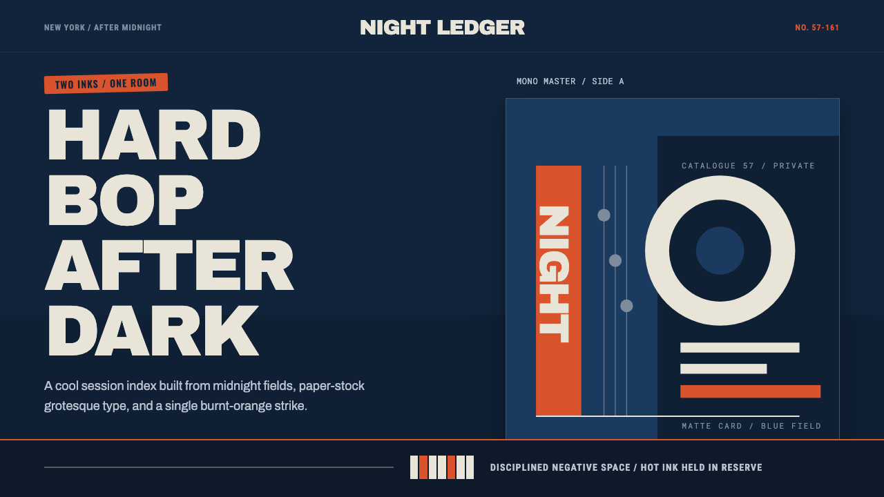 Blue Note JazzCool intelligence, printed flat. Midnight blue, paper type, and one burnt-ora…冷静而智性的平面感:午夜蓝、纸白粗体与一抹焦橙油墨。
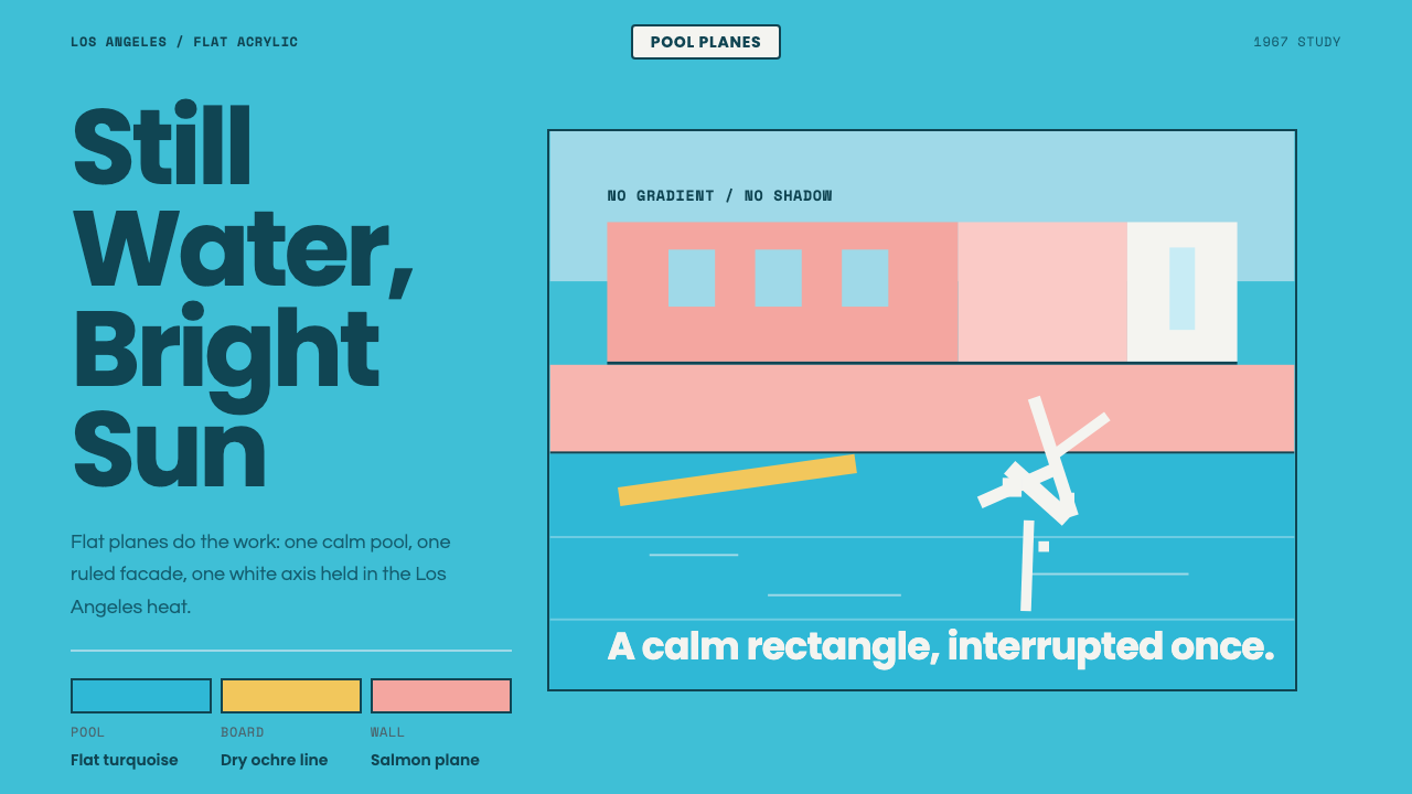 Hockney Pool BlueSerenity turns graphic. Turquoise planes, salmon edges, one white splash.宁静变成图形:绿松石色块、鲑鱼粉边界与一道白色水花。
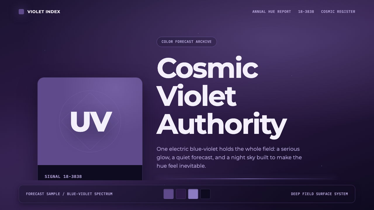 Pantone Ultra VioletCosmic authority. Ultra Violet glows through chip blocks, Montserrat, and dee…宇宙感权威。紫色卡片、Montserrat 与深靛星云托起光感。
 Saul Bass CorporateAuthority distilled. Deep blue geometry, tight Inter lockups, and white space…权威被蒸馏:深蓝几何、紧排 Inter 与留白承载标志。