What is Android Lollipop (Material 1.0)?什么是 Android Lollipop (Material 1.0)?
Material Design turned the screen into layered paper — every tap blooms into a ripple, every card casts a shadow with real depth.Material Design 将屏幕变成了层叠的纸张——每一次触碰都绽放成涟漪,每一张卡片都投下真实的阴影。
Android Lollipop (Material 1.0) in briefAndroid Lollipop (Material 1.0) 速览
Android Lollipop's Material Design 1.0, launched in November 2014, was Google's first attempt to unify the visual language of every surface it owned — phone, tablet, watch, television, and web — under a single coherent system. The central metaphor was paper and ink: interfaces were composed of layered sheets of digital material, each occupying a distinct elevation in a three-dimensional space. Shadows were not decorative; they were information, communicating which surface sat above which and by how much.2014年11月发布的 Android Lollipop 带来了 Material Design 1.0——谷歌首次尝试将旗下所有界面平台(手机、平板、手表、电视与网页)的视觉语言统一在同一套连贯体系之下。核心隐喻是纸张与墨水:界面由层叠的数字材料纸张构成,每一张纸在三维空间中占据独特的高度。阴影不是装饰性的,而是信息性的,传达哪个界面层位于哪个界面层之上,以及相差多少。
The system broke decisively from both the skeuomorphic textures that had characterized early touchscreen design and the flat, purely two-dimensional minimalism that emerged as a reaction to skeuomorphism. Material Design kept the flat, colorful surfaces of the post-skeuomorphic moment but restored a sense of physical hierarchy through mathematically precise shadows and layering. The result was a design language with genuine spatial logic: components could move through space, stack on top of each other, and cast shadows that changed as their elevation changed.这套体系与早期触屏设计的拟物化纹理彻底决裂,同时也有别于作为拟物化反动而兴起的纯粹二维扁平极简主义。Material Design 保留了后拟物化时代的平面、色彩鲜明的界面,但通过数学上精确的阴影与分层恢复了物理层级感。结果是一套具有真实空间逻辑的设计语言:组件可以在空间中运动,叠放在彼此之上,并随着高度变化而投射出不同的阴影。
Color was saturated and deliberate. The Material palette organized hues into numbered intensity levels, and the canonical usage called for bold, unapologetic primaries and accents — the kind of vivid, high-saturation colors that look confident on a bright mobile display. Motion was equally principled: every transition followed the physics of the real world, with elements accelerating and decelerating in ways that felt natural rather than mechanical. The floating action button — a circular element hovering above the content plane — became the defining icon of the era, a shape that still reads immediately as Material Design.色彩浓郁而有目的性。Material 色板将色相按饱和度数字编排,标准用法要求使用大胆、直率的主色与强调色——那种在明亮移动屏幕上显得自信的高饱和色彩。动效同样有原则:每一次过渡都遵循真实世界的物理规律,元素的加速与减速方式让人感到自然而非机械。浮动操作按钮——一个悬浮于内容层之上的圆形元素——成为这个时代的标志性图标,其形态至今仍能让人立刻联想到 Material Design。
See the Android Lollipop (Material 1.0) design system查看 Android Lollipop (Material 1.0) 完整设计系统
Where does Android Lollipop (Material 1.0) come from?Android Lollipop (Material 1.0) 从何而来?
The story of Material Design begins inside Google's scattered design culture of the early 2010s. By 2012, Google operated dozens of products — Search, Maps, Gmail, YouTube, Play, Chrome, Android — each with its own visual conventions, interaction patterns, and typography. The Android ecosystem itself was fragmented: device manufacturers layered their own skins over the operating system, and Google's own apps looked inconsistent from one product to the next. The company was producing beautiful individual moments but no coherent experience.Material Design 的故事始于2010年代初谷歌分散的设计文化。到2012年,谷歌运营着数十款产品——搜索、地图、Gmail、YouTube、Play、Chrome、Android——每款产品都有各自的视觉规范、交互模式与排版体系。Android 生态系统本身四分五裂:设备制造商在操作系统之上叠加各自的皮肤,谷歌自家的应用在不同产品之间外观各异。公司产出了许多独立的精彩瞬间,却没有连贯的体验。
Matías Duarte, who had led interface design at Palm and Danger before joining Google in 2010, was the central creative force behind the effort to unify this chaos. Duarte had a background in industrial design philosophy and brought a discipline that was unusual in software: he insisted that digital interfaces should behave as if they had physical properties — mass, momentum, and material composition. His team began developing what they internally called 'authentic motion' and 'tactile surfaces,' language that foreshadowed the paper-and-ink metaphor that would define the final system. Nicholas Jitkoff contributed the interaction model, and Christian Robertson designed Roboto, the typeface that would become inseparable from the platform.曾在 Palm 和 Danger 主导界面设计、2010年加入谷歌的 Matías Duarte,是这场统一行动背后的核心创意力量。Duarte 有工业设计哲学背景,带来了一种在软件领域罕见的纪律:他坚持认为数字界面应该表现得如同具有物理属性——质量、动量与材料构成。他的团队开始开发他们内部称为「真实运动」与「触觉表面」的概念,这些语言预示了最终体系中纸张与墨水的核心隐喻。Nicholas Jitkoff 贡献了交互模型,Christian Robertson 设计了 Roboto——这款字体将与这个平台永久相连。
The design system was formally revealed to the world at Google I/O in June 2014 under the name Material Design, and deployed in the Android 5.0 Lollipop release that November. The launch was accompanied by an unusually thorough public specification — a comprehensive guidelines document covering everything from the physics of motion to the exact elevation values of every standard component. This specification was itself a design artifact: it communicated to third-party developers and designers worldwide that Material Design was a system with rules, not a collection of loosely connected visual decisions.这套设计体系于2014年6月在 Google I/O 上以「Material Design」之名正式向世界发布,并于当年11月随 Android 5.0 Lollipop 一同落地。发布同时附带了一份异乎寻常详尽的公开规范——一份覆盖动效物理规律到每个标准组件精确高度值的全面指导文件。这份规范本身就是一件设计作品:它向全球第三方开发者与设计师传达,Material Design 是一套有规则的体系,而非一组松散相连的视觉决策。
The timing placed Material Design at an inflection point in the mobile industry. The smartphone market had matured past its early novelty phase; users now expected applications to feel coherent and considered. Apple had launched its own flat redesign with iOS 7 in 2013, and the broader industry was searching for a post-skeuomorphic visual language that felt modern without feeling cold. Material Design offered an answer that was systematic, optimistic, and backed by the full weight of Google's platform reach — it shipped simultaneously on Android, on the web through a comprehensive component library, and was explicitly offered to iOS developers as well.Material Design 发布的时机恰逢移动行业的拐点。智能手机市场已走过早期新鲜感阶段,用户开始期待应用感觉连贯且经过深思熟虑。苹果已于2013年随 iOS 7 推出自己的扁平化重设计,整个行业正在寻找一种后拟物化的视觉语言——既要感觉现代,又不能显得冷漠。Material Design 提供了一个系统化、乐观主义的答案,并借助谷歌平台的全部覆盖力推行:它同时在 Android 上发布,通过完整的组件库在网页上落地,并被明确提供给 iOS 开发者使用。
What defines the Android Lollipop (Material 1.0) look?Android Lollipop (Material 1.0) 的视觉特征是什么?
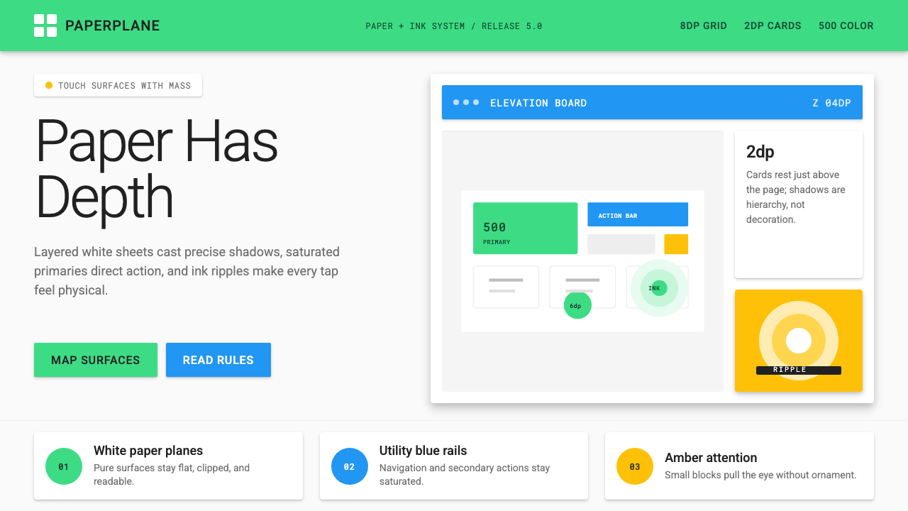
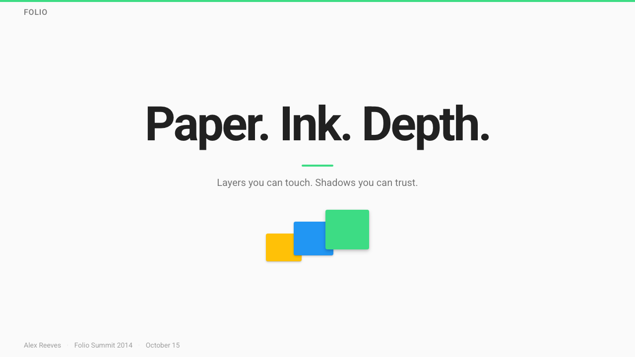
Elevation and Shadow高度与阴影
Every element in the Material system occupies a specific position in a virtual z-axis, and its shadow communicates that position to the viewer. A resting card casts a shallow, close shadow; a dialog box lifted above the page casts a deeper, more diffuse shadow. These shadows are not stylistic flourishes — they encode hierarchy. The floating action button, raised highest of all standard components, receives the most dramatic shadow and consequently draws the eye before any other interactive element on the screen.Material 体系中的每个元素都在虚拟z轴上占据特定位置,其阴影向观看者传达这一位置。静止的卡片投下浅而紧密的阴影;悬浮于页面之上的对话框投下更深、更漫射的阴影。这些阴影不是风格上的点缀——它们编码了层级关系。浮动操作按钮作为所有标准组件中高度最大的元素,获得最强烈的阴影效果,因而在屏幕上所有可交互元素中最先吸引目光。
Ink Ripple墨水涟漪
When a user touches any interactive surface, an expanding circular wave — the ink ripple — emanates from the point of contact. This animation serves a functional purpose beyond aesthetics: it confirms exactly where the touch was registered and communicates that the system has received the input. The ripple is always centered on the precise touch point, making it both a feedback mechanism and a quiet demonstration of the paper-and-ink metaphor. Buttons, list items, cards, and navigation tabs all share this same interaction signature.当用户触摸任何可交互界面时,一圈以触点为中心向外扩散的圆形波纹——墨水涟漪——从接触点向外扩散。这个动画具有超越美学的功能目的:它精确确认触摸被系统接收的位置,并传达系统已响应输入。涟漪始终以精确的触点为圆心,使其既是反馈机制,又是对纸张与墨水隐喻的静默诠释。按钮、列表项、卡片与导航标签都共享这一交互特征。
Bold, Saturated Color大胆、饱和的色彩
Material Design's color approach organizes hues into a numbered intensity scale, and the intended usage calls for the five-hundred-series shades — deep, vivid, fully saturated — as primary surfaces, with the accent color drawn from an even more intense level. The effect is confident and unapologetic: interfaces built on this system do not retreat into neutral grays. The accent color, often a complementary or high-contrast hue to the primary, is reserved for the floating action button and key interactive states, creating a clear visual hierarchy between structural surfaces and action affordances.Material Design 的色彩方法将色相按饱和度数字编排,标准用法要求以五百色阶——深沉、鲜明、完全饱和——作为主色界面,以更高强度色阶作为强调色。效果自信而直率:基于这套体系构建的界面不会退缩至中性灰色。强调色通常是与主色形成对比或高对比度的色相,被保留给浮动操作按钮和关键交互状态,在结构性界面与操作可供性之间建立清晰的视觉层级。
Physics-Based Motion基于物理的动效
Material Design codified motion as a design discipline rather than an afterthought. Transitions follow easing curves that mimic the behavior of physical objects: elements enter the screen with a quick acceleration and leave with a gradual deceleration, mimicking the way a sheet of paper would behave if slid onto a surface. Elements that expand — like the floating action button transforming into a full-screen dialog — do so from their point of origin, preserving spatial continuity. Staggered entrance animations on lists reinforce the sense that items have weight and arrive with momentum.Material Design 将动效编成设计纪律,而非事后附加的点缀。过渡遵循模拟物理对象行为的缓动曲线:元素以快速加速进入屏幕,以缓慢减速离开,模拟一张纸张被滑到界面上的方式。扩展的元素——如浮动操作按钮变形为全屏对话框——从其原始位置开始展开,保持空间连续性。列表上的交错入场动画强化了项目具有重量、带着动量到来的感觉。
Card-Based Layout卡片式布局
The card — a bounded, elevated rectangle containing a discrete unit of content — became Material Design's primary organizational metaphor for heterogeneous information. Cards allow disparate content types to coexist without explicit grid lines; the shadow of each card defines its boundary implicitly. A feed of cards can contain images, text, actions, and media in any combination, and the card container normalizes their visual weight relative to each other. This made cards the default choice for social feeds, search results, product listings, and any context where content variety was high.卡片——包含独立内容单元的、有边界的、具有高度的矩形——成为 Material Design 处理异质信息的主要组织隐喻。卡片允许不同类型的内容共存,无需显式网格线;每张卡片的阴影隐性界定其边界。卡片流可以以任意组合包含图片、文字、操作与媒体,而卡片容器将它们相互之间的视觉重量标准化。这使卡片成为社交信息流、搜索结果、产品列表以及任何内容多样性高的场景的默认选择。
Roboto and Type ScaleRoboto 与字体层级
Christian Robertson's Roboto typeface was designed specifically for Material Design and optimized for screen legibility across a wide range of display sizes. Its letterforms balance geometric precision with natural, slightly condensed proportions — more mechanical than humanist, but warm enough to avoid clinical coldness. Material Design specified a deliberate type scale with named roles — display, headline, title, subheading, body, caption — each with a recommended size relationship to the others, creating a system where hierarchy is communicated purely through scale and weight without relying on decorative differentiation.Christian Robertson 专为 Material Design 设计的 Roboto 字体针对各种显示尺寸的屏幕可读性进行了优化。其字形在几何精确性与自然、略微紧缩的比例之间保持平衡——比人文主义字体更具机械感,但又足够温暖以避免临床式的冰冷。Material Design 规定了明确的字体层级,以角色命名——展示、标题、副标题、正文、说明——每个层级都与其他层级有推荐的尺寸关系,构建了一套仅通过大小和字重传达层级的体系,无需依赖装饰性区分。
Floating Action Button浮动操作按钮
The floating action button — a circular element that hovers above all other content at the highest standard elevation — represented Material Design's most architecturally specific contribution to interface conventions. It signals the single primary action of a screen: composing a message, adding an item, initiating a recording. Its persistent visibility and prominent shadow ensure it is never ambiguous about what the page's principal affordance is. The button's boldly saturated accent color, distinct from the primary surface palette, marks it as action rather than content. Its shape, circular and self-contained, became one of the most recognizable UI signatures of the decade.浮动操作按钮——一个悬浮于所有其他内容之上、处于最高标准高度的圆形元素——代表了 Material Design 对界面约定最具建筑感的贡献。它标志着一个界面的唯一主要操作:撰写消息、添加项目、启动录音。其持久可见性和突出阴影确保页面的主要可供性始终清晰无误。按钮浓郁饱和的强调色,与主色界面色板明显区别,将其标记为操作而非内容。其圆形、自包含的形态,成为这十年间最易辨认的界面标志之一。
See the Android Lollipop (Material 1.0) design system查看 Android Lollipop (Material 1.0) 完整设计系统
Who shaped Android Lollipop (Material 1.0)?谁塑造了 Android Lollipop (Material 1.0)?
Duarte served as Vice President of Design at Google and was the primary creative architect of Material Design. With a background spanning industrial design philosophy and software interface work at Palm and Danger, he brought an unusually physical sensibility to digital design. His insistence that interfaces should behave as if they possessed mass, momentum, and material composition gave Material Design its defining conceptual framework. He led the team that developed the paper-and-ink metaphor and championed the comprehensive public specification that made Material Design a cross-platform standard rather than merely an Android visual update.Duarte 担任谷歌设计副总裁,是 Material Design 的主要创意架构师。凭借横跨工业设计哲学与在 Palm、Danger 的软件界面工作背景,他为数字设计带来了一种异乎寻常的物理感性。他坚持认为界面应该表现得如同具有质量、动量与材料构成,这一立场赋予了 Material Design 其定义性的概念框架。他领导的团队发展出纸张与墨水的隐喻,并推动了那份全面的公开规范——正是这份规范使 Material Design 成为跨平台标准,而非仅仅是 Android 的视觉更新。
Robertson designed Roboto, the typeface that became inseparable from Material Design and Android as a platform. Roboto was built to address a specific challenge: delivering typographic clarity and warmth across the extreme variety of screen sizes, pixel densities, and use contexts in the Android ecosystem. Its balanced geometry — precise enough to feel systematic, natural enough to feel readable at small sizes — made it one of the most widely deployed typefaces in the history of digital design. Robertson also contributed to the broader typography guidelines that defined Material Design's type scale and weight system.Robertson 设计了 Roboto——这款字体与 Material Design 及 Android 平台永久相连。Roboto 的诞生是为了应对一个具体挑战:在 Android 生态系统极度多样的屏幕尺寸、像素密度和使用情境中实现排版清晰度与温度的统一。其均衡的几何感——精确到感觉系统化,自然到在小尺寸下感觉易读——使其成为数字设计史上部署最广泛的字体之一。Robertson 还参与制定了定义 Material Design 字体层级与字重体系的更广泛排版指南。
Jitkoff was a key interaction designer on the Material Design team, contributing to the behavioral model that gave the system its physical coherence. Where Duarte shaped the conceptual and visual framework, Jitkoff worked on the interaction principles that governed how elements entered, exited, and moved through the interface. His work on motion and transition helped translate the paper metaphor from visual description into behavioral specification — rules that could be implemented consistently across the thousands of applications built on the platform.Jitkoff 是 Material Design 团队的核心交互设计师,为赋予体系物理连贯性的行为模型做出了贡献。Duarte 塑造了概念与视觉框架,而 Jitkoff 则专注于支配元素如何进入、离开界面并在界面中运动的交互原则。他在动效与过渡上的工作帮助将纸张隐喻从视觉描述转化为行为规范——这些规则能够在基于该平台构建的数千款应用中被一致实现。
Lockheimer, as the engineering leader for Android at the time of Lollipop's launch, was responsible for ensuring that Material Design shipped as a functioning system rather than a design vision document. The challenge was formidable: Android runs on thousands of device configurations with different screen sizes, hardware capabilities, and manufacturer customizations. Lockheimer's leadership ensured that the elevation model, motion system, and component library were implemented at the platform level — making them available to every application developer on the platform rather than requiring each team to build them independently.Lockheimer 在 Lollipop 发布时担任 Android 工程负责人,负责确保 Material Design 作为一个功能完备的体系落地,而非仅停留于设计愿景文件。挑战是巨大的:Android 在数千种设备配置上运行,涉及不同的屏幕尺寸、硬件能力与制造商定制。Lockheimer 的领导力确保了高度模型、动效体系与组件库在平台层面得以实现——使每位平台应用开发者都能直接使用,而无需各自团队独立构建。
Wiley led the design work on Google Search and was one of the early advocates for bringing Material Design coherence to Google's web presence. His work helped ensure that Material Design was not purely a mobile-native system but extended to the browser-based experiences that formed the majority of Google's user touchpoints. The challenge of translating the elevation and shadow model — conceived for the relatively constrained dimensions of a mobile screen — to the variable widths and scroll behaviors of a web page required significant adaptation, and Wiley's team developed many of the responsive grid and breakpoint conventions that are now standard in Material Design for web.Wiley 主导了谷歌搜索的设计工作,是推动将 Material Design 连贯性引入谷歌网页端体验的早期倡导者之一。他的工作帮助确保 Material Design 不是纯粹的移动原生体系,而是延伸至构成谷歌用户接触点大多数的浏览器端体验。将高度与阴影模型——为移动屏幕相对受限的尺寸而构思——平移到网页可变宽度与滚动行为中,需要大量适配工作;Wiley 的团队开发了许多如今已成为网页版 Material Design 标准的响应式网格与断点约定。
How do you use Android Lollipop (Material 1.0) today?今天怎么用 Android Lollipop (Material 1.0)?
Material Design 1.0 translates cleanly into contemporary presentation work when its spatial logic is understood rather than superficially copied. The system's elevation hierarchy is its most useful organizing principle for slides: treat the background as the lowest layer, content blocks as mid-elevation surfaces, and key callouts or data points as elevated elements that demand attention. A slide built this way has inherent depth without relying on arbitrary decorative elements — the shadow of a highlighted card does the work that a colored border would do less elegantly.当 Material Design 1.0 的空间逻辑被理解而非表面复制时,它能够清晰地转化为当代演示工作。该体系的高度层级是幻灯片最有用的组织原则:将背景视为最低层,内容块视为中等高度的界面,关键引用或数据点视为需要吸引注意力的高层元素。以此方式构建的幻灯片具有内在深度,无需依赖任意的装饰性元素——被突出的卡片的阴影完成了彩色边框以较不优雅的方式所做的工作。
For presentation covers and section dividers, the Material aesthetic supports bold, full-bleed color surfaces in the deeply saturated primary range, with white or near-white type set at a generous scale. The floating action button's visual grammar — a high-contrast circular element floating above a colored field — can be adapted as a logo lockup or a large numeral on a section break slide. Content slides should follow a card-based discipline: each major point contained in its own bounded surface, with spacing doing the work of separation rather than rules or borders.在演示封面与章节分隔页上,Material 美学支持大胆的全出血色彩界面,使用深饱和主色系,白色或近白色大号文字与之搭配。浮动操作按钮的视觉语法——一个高对比度圆形元素悬浮于彩色背景之上——可以被改编为标志锁定或章节过渡页上的大数字。内容页应遵循卡片式纪律:每个要点包含在自己的有界面中,间距承担分隔的功能,而非依赖分割线或边框。
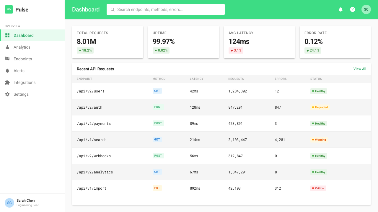
In web UI design, Material 1.0 is particularly well-suited to dashboards, analytics interfaces, and structured data products. The card metaphor handles heterogeneous data types elegantly — metrics, charts, tables, and alerts can each inhabit their own bounded container at varying elevations without the layout becoming cluttered. For pricing pages, the elevation model provides natural affordance for tier differentiation: the recommended plan can be visually elevated above its alternatives through a deeper shadow, without requiring a different color or an arbitrary badge. Navigation should follow the Material tab and drawer conventions — horizontal tabs for primary navigation, a side drawer for secondary pathways.在网页界面设计中,Material 1.0 特别适合仪表板、分析界面与结构化数据产品。卡片隐喻优雅地处理异质数据类型——指标、图表、表格与警报各自居于不同高度的有界容器中,版面不会因此显得杂乱。对于定价页面,高度模型为等级区分提供了自然的可供性:推荐方案可以通过更深的阴影在视觉上高于其他方案,无需不同颜色或任意徽章。导航应遵循 Material 标签页与侧边栏约定——水平标签页用于主导航,侧边抽屉用于次级路径。
Editorial and marketing applications of Material Design work best when the color confidence of the system is embraced rather than neutralized. A feature article layout can use a full-width saturated primary color as the header surface, with white type at display scale, transitioning to white cards for body content below. Marketing pages benefit from the system's built-in contrast between action and content: calls to action in the accent color stand apart from body content surfaces without requiring additional visual complexity. The ripple interaction signature, even simulated as a static circular glow behind a button, signals the design language instantly.Material Design 的编辑与营销应用在拥抱而非中和其色彩自信时效果最佳。特色文章版面可以使用全宽深饱和主色作为标题界面,白色展示级别文字,向下过渡至正文内容的白色卡片。营销页面受益于体系内置的操作与内容之间的对比:强调色的行动号召从正文内容界面中脱颖而出,无需额外视觉复杂性。涟漪交互特征,即使模拟为按钮后的静态圆形光晕,也能立即传达设计语言。
A common mistake when applying Material Design is using the shadow system decoratively rather than informationally — adding maximum-elevation shadows to everything to create a sense of richness, rather than reserving deep shadows for components that are genuinely elevated above others. This collapses the hierarchy the system is built around and produces layouts that feel busy rather than layered. Similarly, using the full range of the saturated palette simultaneously — many different bold colors across a single surface — violates the system's logic, which calls for one dominant primary, one accent, and careful neutrals. Material Design's visual energy comes from restraint applied to bold raw material, not from the boldness alone.应用 Material Design 时最常见的错误是将阴影体系用作装饰性的而非信息性的——给所有内容都添加最大高度的阴影以创造丰富感,而非将深阴影保留给真正高于其他组件的元素。这会破坏体系所依赖的层级结构,产生感觉繁忙而非分层的版面。同样,同时使用饱和色板的全部范围——在单一界面中使用许多不同的大胆色彩——违反了体系逻辑:该逻辑要求一种主色、一种强调色和审慎的中性色。Material Design 的视觉张力来自对大胆原材料的克制应用,而非单纯的大胆本身。
See the Android Lollipop (Material 1.0) design system查看 Android Lollipop (Material 1.0) 完整设计系统
Android Lollipop (Material 1.0) — FAQAndroid Lollipop (Material 1.0) · 常见问题
What distinguishes Material Design 1.0 from the flat design movement it emerged alongside?Material Design 1.0 与同期兴起的扁平化设计运动有何区别?
Flat design, as popularized by Windows Phone and iOS 7, pursued two-dimensionality as an aesthetic end: all surfaces existed on the same visual plane, shadows were eliminated entirely, and depth was not part of the visual vocabulary. Material Design shared flat design's rejection of skeuomorphic textures and gradients but reintroduced depth as a systematic, informational element rather than a decorative one. The result is sometimes called 'material flat' — surfaces are clean and geometric, but they stack in space and their spatial relationships carry meaning. The shadow under a card is not decoration; it tells you the card floats above the background.以 Windows Phone 和 iOS 7 为代表普及的扁平化设计,将二维性作为审美目标:所有界面存在于同一视觉平面,阴影被完全消除,深度不在视觉词汇之列。Material Design 同样拒绝拟物化纹理与渐变,但将深度作为系统化、信息性的元素重新引入,而非装饰性元素。结果有时被称为「材料扁平」——界面干净而具几何感,但在空间中叠放,其空间关系承载着意义。卡片下方的阴影不是装饰;它告诉你卡片悬浮于背景之上。
Can Material Design 1.0 work for premium or luxury product contexts?Material Design 1.0 适合高端或奢侈品类的产品场景吗?
Material Design 1.0 is optimistic, bold, and democratic — its visual character communicates accessibility and platform consistency more than exclusivity. For contexts where luxury positioning is essential, the saturated primary palette and high-contrast components can read as utilitarian rather than refined. The system adapts better to premium when the palette is constrained to a single deep primary and near-neutral accents, the type scale is used conservatively, and the elevation model is simplified rather than fully deployed. In practice, many luxury digital products prefer a system with more typographic refinement and more neutral color discipline than Material 1.0 natively provides.Material Design 1.0 是乐观的、大胆的、民主的——其视觉性格传达的是亲和力与平台一致性,而非排他性。对于奢侈品定位至关重要的场景,饱和主色板与高对比度组件可能被解读为实用主义而非精致。当色板被限制为单一深色主色与近中性强调色、字体层级使用保守、高度模型简化而非完全展开时,该体系能更好地适应高端场景。在实践中,许多奢侈品数字产品倾向于比 Material 1.0 原生提供的具有更多排版精致度与更中性色彩纪律的体系。
How does Material Design 1.0 handle dark mode or dark-background layouts?Material Design 1.0 如何处理深色模式或深色背景版面?
Material Design 1.0 was conceived as a light-surface system — white and near-white cards on light backgrounds were canonical. Dark mode was not a defined part of the original specification; it was introduced systematically in Material Design 2 in 2018. Applying the Material 1.0 aesthetic to dark backgrounds requires significant adaptation: shadows lose their communicative value on dark surfaces because they rely on contrast against light backgrounds. Elevation on dark surfaces must instead be communicated through overlaid color tints — lighter tints at higher elevations — which departs from the original system. The saturated accent colors remain effective on dark grounds, but the primary palette often requires desaturation to avoid visual aggression.Material Design 1.0 被构思为浅色界面体系——白色与近白色卡片在浅色背景上是标准形态。深色模式不是原始规范的定义部分;它在2018年的 Material Design 2 中被系统性引入。将 Material 1.0 美学应用于深色背景需要大量适配:阴影在深色界面上失去传达价值,因为它们依赖与浅色背景的对比。深色界面上的高度必须通过叠加色彩色调来传达——高度越高,色调越浅——这偏离了原始体系。饱和强调色在深色背景上仍然有效,但主色板通常需要降低饱和度以避免视觉攻击感。
Is Material Design 1.0 appropriate for non-Google, non-Android products?Material Design 1.0 适合非谷歌、非 Android 的产品吗?
Material Design was explicitly designed as an open system and Google encouraged its adoption beyond Android from the start — the web component library and the cross-platform specification were intended for any developer or designer. Many non-Google web applications, progressive web apps, and even iOS applications adopted Material components either wholesale or in adapted form through the mid-2010s. The risk is one of attribution rather than aesthetics: a product built with strict Material 1.0 conventions reads as Google-adjacent, which may or may not align with how the product wants to position itself. For distinctive brand contexts, the system works best as a structural foundation whose color, type, and specific components are customized enough to carry a distinct identity.Material Design 从一开始就被明确设计为开放体系,谷歌从一开始就鼓励其在 Android 以外被采用——网页组件库与跨平台规范面向任何开发者或设计师。2010年代中期,许多非谷歌网页应用、渐进式网页应用乃至 iOS 应用都完整或经改编地采用了 Material 组件。风险在于归属感而非美学:以严格 Material 1.0 约定构建的产品会被解读为谷歌系,这与产品的自我定位可能一致,也可能不一致。对于有独特品牌语境的产品,该体系最有效的用法是作为结构性基础,其色彩、字体与具体组件被充分定制以形成独特身份。
How does Material Design 1.0 relate to later Material versions?Material Design 1.0 与后续 Material 版本有什么关系?
Material Design has gone through substantial evolution since 2014. Material Design 2, released in 2018, refined the elevation model, introduced dark mode, expanded the color system's flexibility, and softened many of the system's harder edges — rounded corners became more prevalent, and the floating action button's prominence was reduced. Material Design 3, released in 2021 as Material You, introduced dynamic color — the ability to derive a complete palette from the user's wallpaper — and moved the system much further toward personalization and away from the bold, fixed palette of the original. The original Material Design 1.0 aesthetic is now the most visually distinct of the three versions: its sharp corners, deep shadows, and highly saturated fixed palette read immediately as a specific historical moment rather than a generic contemporary interface style.Material Design 自2014年以来经历了大量演进。2018年发布的 Material Design 2 改进了高度模型,引入了深色模式,扩展了色彩体系的灵活性,并软化了许多体系的硬边特征——圆角变得更普遍,浮动操作按钮的突出性被降低。2021年以「Material You」名义发布的 Material Design 3 引入了动态色彩——从用户壁纸衍生完整色板的能力——并将体系大幅推向个性化,远离了原始版本大胆、固定的色板。原始 Material Design 1.0 美学如今是三个版本中视觉上最具辨识度的:其锐利直角、深阴影与高饱和固定色板立即让人联想到一个特定的历史时刻,而非通用的当代界面风格。
Related design styles相关设计风格
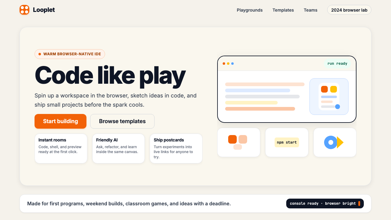 Replit 2024Coding feels warm. Coral buttons, cream panels, rounded code tiles make build…编程变得温暖:珊瑚按钮、奶油面板与圆角代码块让构建更好玩。
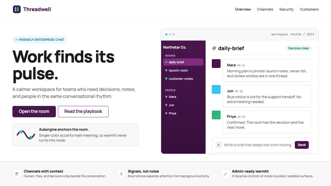 Slack 2019Warm enterprise chat. Aubergine rail, Manrope type, and single-accent badges…温暖企业对话:茄紫侧栏、Manrope 与单色徽章让它有人味。
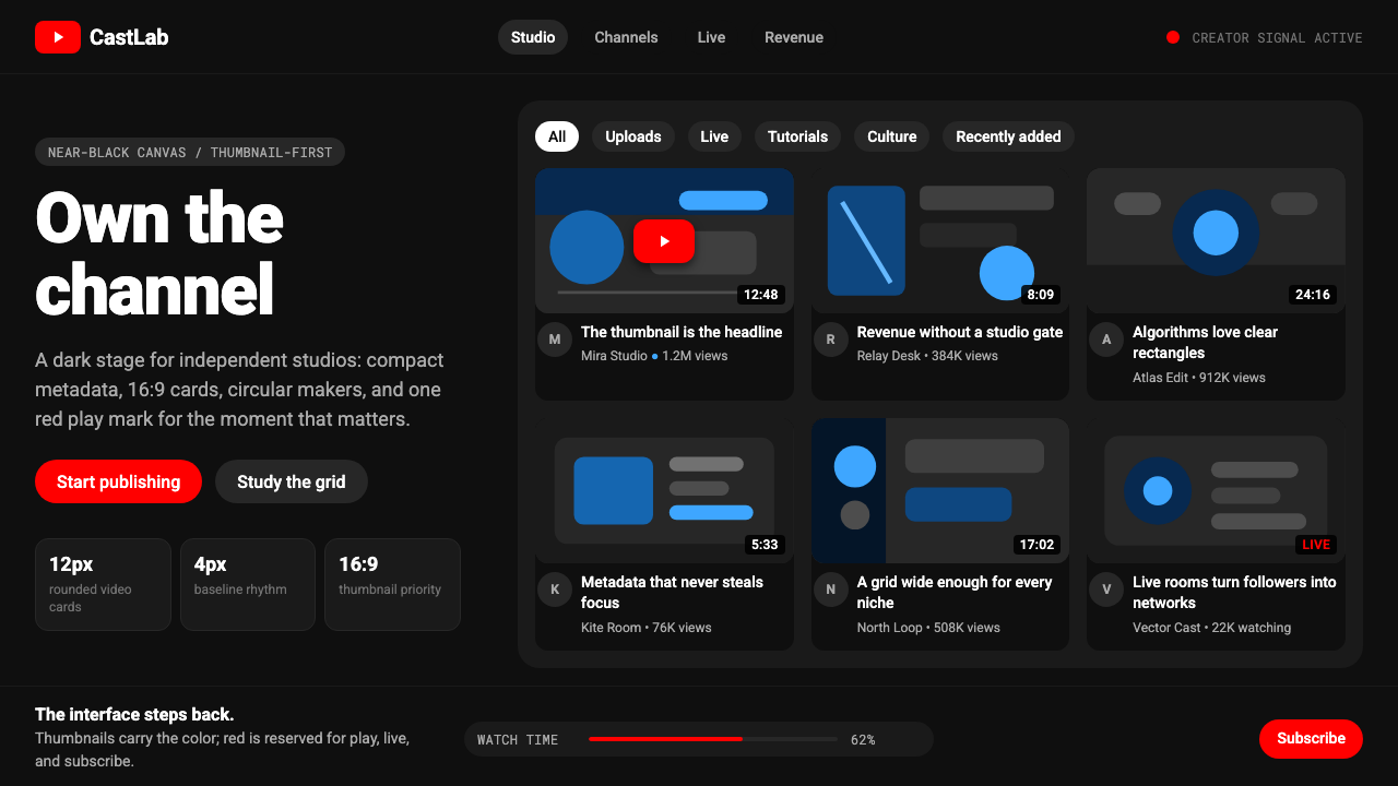 YouTube Creator EconomyThe UI disappears. Near-black Roboto grids let thumbnails shout; red only mea…界面退后:近黑Roboto网格让缩略图发声,红色只为播放。
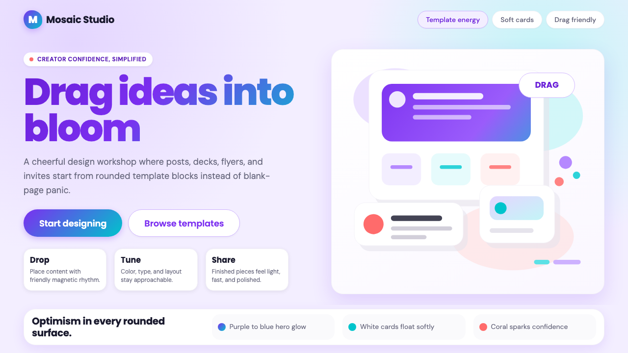 Canva 2024Confidence feels draggable. Purple-blue gradients and floating white template…信心可拖拽:紫蓝渐变与漂浮白卡,让创作变柔和。
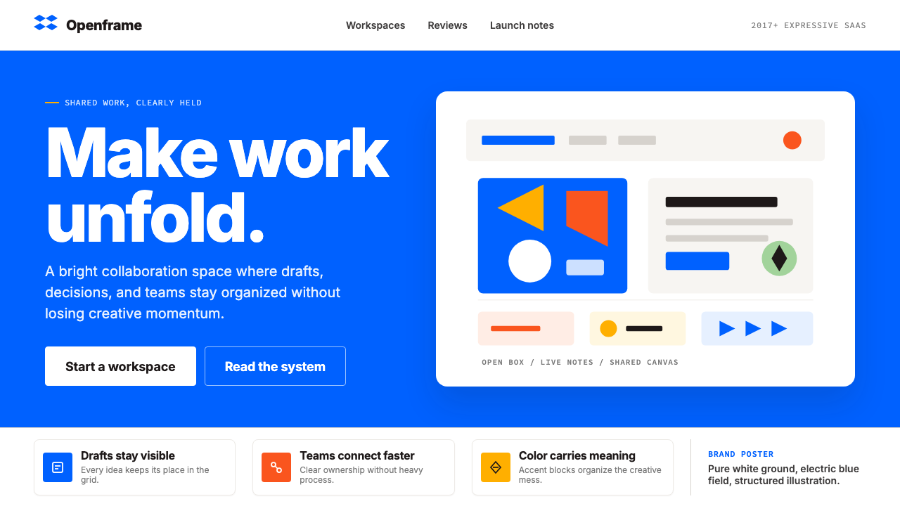 Dropbox ModernFriendly SaaS gets loud. Electric blue and Sharp Sans drive a structured geom…友好 SaaS 变响亮:电蓝与 Sharp Sans 推动几何网格。
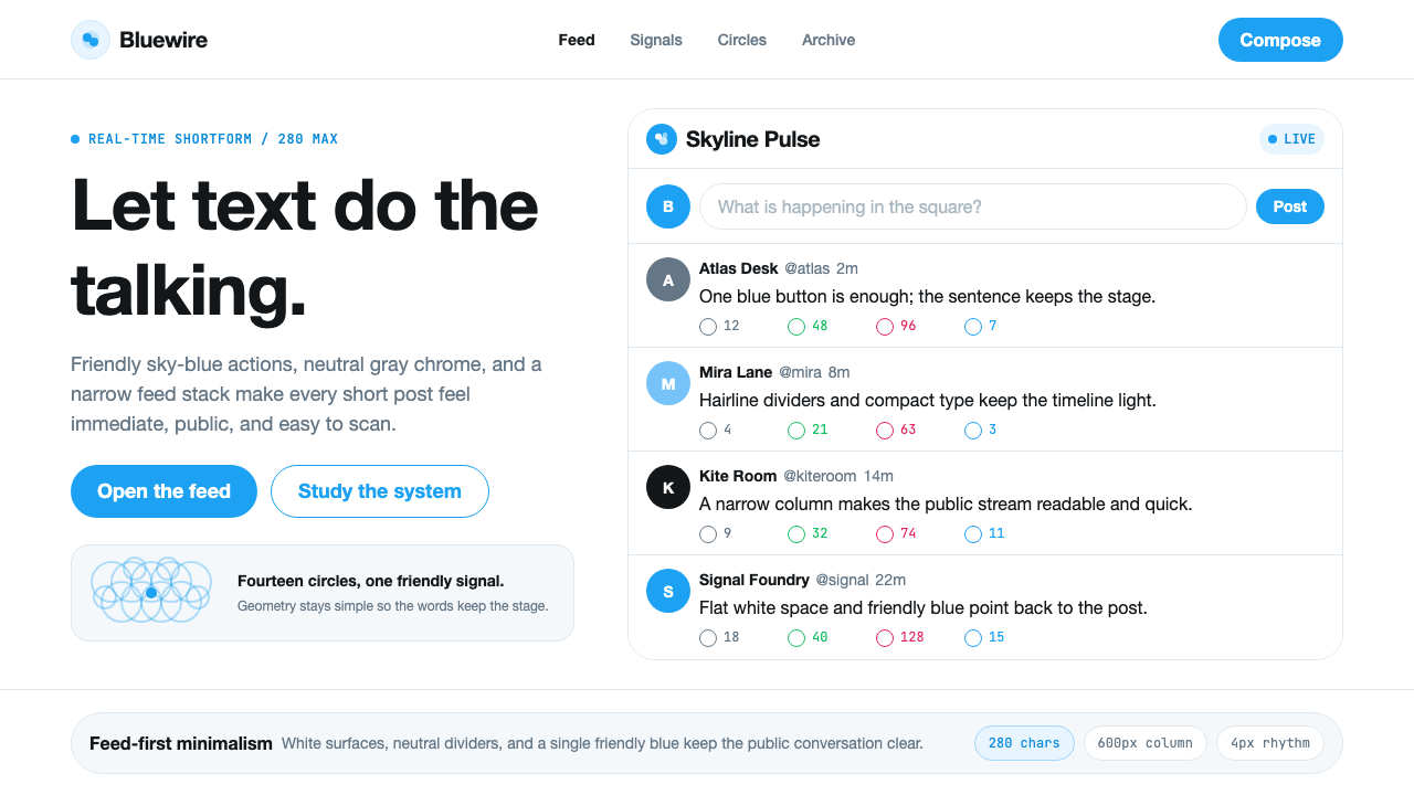 Twitter (Classic Bird)Text takes the stage. Sky blue actions, white feed stack, and hairline divide…文字占据舞台:天蓝动作、白色信息流与细分割线让表达清晰。