What is Slack 2019?什么是 Slack 2019?
Slack's 2019 redesign distilled a chaotic rainbow into a disciplined aubergine-anchored identity that made enterprise software feel genuinely human.Slack 2019年的品牌重塑将混乱的彩虹色系精炼为以茄紫为锚点的克制视觉语言,让企业软件真正散发出人情味。
Slack 2019 in briefSlack 2019 速览
Slack 2019 refers to the visual identity system created for Slack following a comprehensive brand refresh led by the design firm Pentagram under partner Michael Bierut. Released in 2019, the system replaced an earlier logo and inconsistent color application with a tightly governed design language built around a four-color lozenge mark — aubergine purple as the dominant ground, with yellow, green, blue, and pink appearing as disciplined quadrant accents rather than as equal partners in a chaotic rainbow.Slack 2019指的是Slack在Pentagram设计公司合伙人Michael Bierut主导的品牌全面焕新后所形成的视觉识别系统。这套系统于2019年发布,以一套治理严格的设计语言取代了此前的旧标志与混乱的色彩应用——以四色菱形标志为核心,茄紫色作为主导底色,黄、绿、蓝、粉则作为克制的象限点缀色,而非混乱彩虹中地位平等的四个成员。
The resulting aesthetic sits at a considered midpoint between enterprise credibility and approachable warmth. Rounded geometries, generous whitespace, and restrained accent use give interfaces and collateral a conversational quality — nothing feels cold, bureaucratic, or intimidating, but nothing is frivolous either. The system was designed to scale: from a tiny app icon to a billboard, from a notification badge to a full-screen marketing page, the visual logic holds.由此形成的美学风格处于企业可信度与亲和温度之间的精准中点。圆润的几何形态、充裕的留白,以及克制的点缀色运用,赋予界面与周边物料一种如同对话般的品质——没有什么是冷漠、官僚或令人生畏的,但也没有什么是轻浮的。这套系统被设计为可扩展的:从极小的应用图标到广告牌,从通知徽章到全屏营销页,视觉逻辑始终一以贯之。
What distinguishes Slack 2019 from earlier productivity software aesthetics is its insistence on warmth without sacrificing legibility. The aubergine sidebar and navigation surfaces carry visual weight and authority while the content areas breathe. Typography — anchored by a rounded humanist sans-serif — reinforces the conversational register. This combination made Slack 2019 a reference point for a generation of SaaS and productivity tools seeking to escape the sterile blue-and-white conventions of earlier enterprise software.Slack 2019有别于早期生产力软件美学之处,在于它对温暖感的坚守与对清晰可读性的同等重视。茄紫色的侧栏与导航面承载着视觉重量与权威感,而内容区域则自由呼吸。排版——以圆润人文风格无衬线字体为核心——强化了对话性的基调。这种组合使Slack 2019成为新一代SaaS与生产力工具的参照基准,帮助它们摆脱早期企业软件刻板的蓝白色规范。
Where does Slack 2019 come from?Slack 2019 从何而来?
Slack was founded in 2013 in Vancouver by Stewart Butterfield and a small team as a pivot from a failed video game called Glitch. The original product was a workplace messaging tool built to solve the team's own internal communication problems, and its initial visual identity reflected that scrappy origin: a colorful, informal, slightly chaotic hashtag-shaped logo in eleven colors, which quickly became both beloved and visually unmanageable as the company scaled.Slack由Stewart Butterfield和一支小团队于2013年在加拿大温哥华创立,起源于一款名为Glitch的失败电子游戏的转型。最初的产品是一款职场通讯工具,用以解决团队自身的内部沟通问题,其早期视觉形象也折射出这种草根气质:一个由十一种颜色组成的彩色、非正式、略显混乱的井号形标志——随着公司规模扩大,这个标志既深受用户喜爱,又在视觉管理上愈发难以驾驭。
By the late 2010s, Slack had grown into one of the world's most widely used enterprise software platforms, with millions of daily users and a prominent position in corporate IT stacks. The eleven-color original logo — while iconic to early adopters — presented significant reproduction challenges: it looked muddy on dark backgrounds, it required careful color matching in print, and it was difficult to maintain visual consistency across the dozens of surfaces where a modern software brand must appear. The brand had, in a sense, outgrown its startup origins.到2010年代末,Slack已成为全球使用最广泛的企业软件平台之一,拥有数百万日活用户,在企业IT体系中占据重要位置。那个十一色原版标志——对早期用户而言堪称标志性——在落地呈现上面临重大挑战:在深色背景上显得浑浊,在印刷时需要严格的色彩管理,并且难以在一个现代软件品牌必须出现的数十个触点上保持视觉一致性。这个品牌在某种意义上已经超越了它的创业起点。
In 2019, Slack engaged Pentagram, the independent design partnership, to undertake a comprehensive brand refresh. The project was led by Michael Bierut, one of the firm's New York partners and one of the most celebrated graphic designers of his generation. Bierut's solution was disciplined reduction: the eleven-color palette was distilled to four — yellow, green, blue, and pink — arranged in a simplified lozenge mark that preserved the spirit of the original hashtag symbol while making it reproducible across any medium and at any scale. Aubergine purple, which had been a secondary surface color in earlier iterations, was elevated to the dominant brand color, providing the warmth and distinctiveness the identity needed.2019年,Slack委托独立设计合伙公司Pentagram主导一次全面的品牌焕新。项目由Michael Bierut领衔——他是该公司纽约分部的合伙人之一,也是他那个时代最受推崇的平面设计师之一。Bierut的解决方案是有纪律的精简:十一色色板被提炼为四色——黄、绿、蓝、粉——以简化的菱形标志排列呈现,既保留了原有井号符号的精神,又使其能在任何媒介和任何尺寸下清晰复制。茄紫色——在早期版本中曾是次要的界面底色——被提升为主导品牌色,为整套视觉识别注入了所需的温度感与辨识度。
The redesign was publicly announced in January 2019 and was immediately controversial among portions of Slack's user base, who had formed strong attachments to the original logo. Pentagram and Slack published detailed explanations of the design rationale, which helped contextualize the decisions. Over time, the new identity proved its utility: it held up under conditions the original could not handle, and the aubergine-anchored system became strongly associated with Slack's brand worldwide — to the point that many subsequent enterprise software companies adopted similar warm-purple sidebar strategies as a direct or indirect reference.此次重新设计于2019年1月公开发布,在Slack部分用户群体中立即引发争议——他们已对旧标志产生了深厚的情感依附。Pentagram与Slack随即发布了详细的设计阐释,帮助用户理解这些决策背后的逻辑。随着时间推移,新版视觉识别证明了其实用价值:它在旧版力所不及的各种条件下依然成立,而以茄紫色为锚点的系统也在全球范围内与Slack品牌深度绑定——乃至此后许多企业软件公司纷纷采用类似的暖紫色侧栏方案,或直接或间接地将其作为参照。
What defines the Slack 2019 look?Slack 2019 的视觉特征是什么?
Aubergine as Anchor茄紫锚点
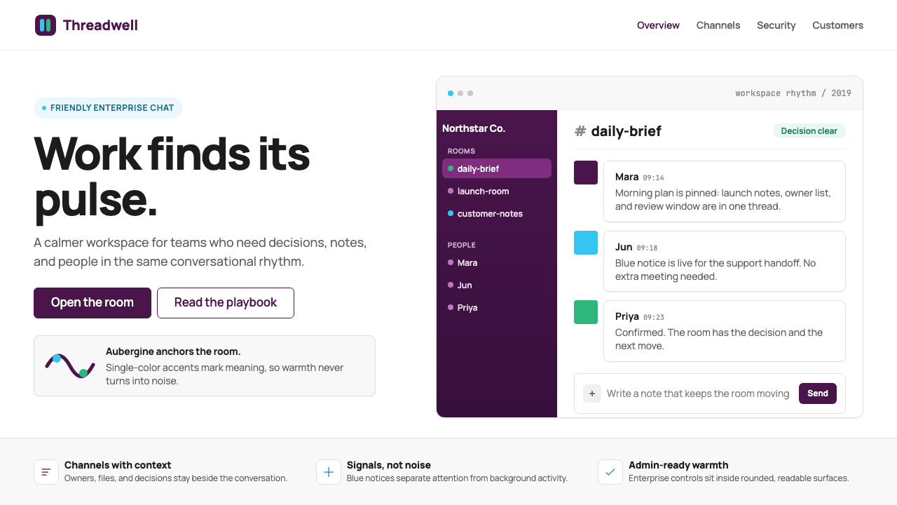
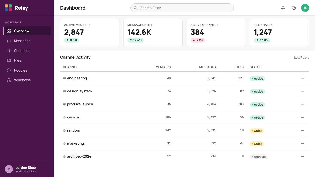
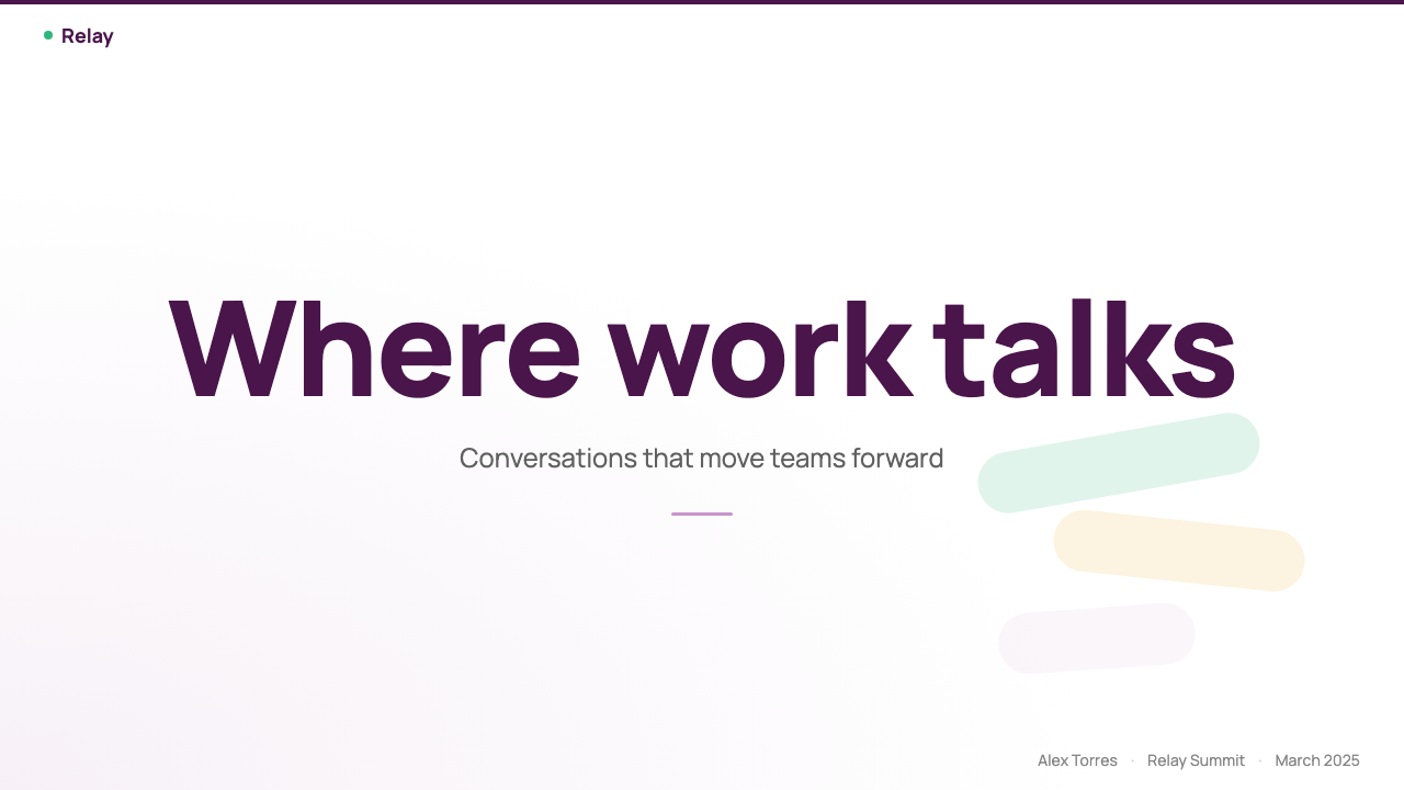
The deepest, richest color in the system — a warm, dark purple closer to an eggplant than a cool violet — functions as the primary structural surface throughout the interface. It appears in navigation sidebars, top bars, and brand backgrounds, grounding the entire visual system in something warmer than typical enterprise navy or corporate grey. Its warmth distinguishes Slack from colder enterprise tools and signals approachability without sacrificing authority.这套系统中最深、最饱满的颜色——一种偏茄子而非冷调紫罗兰的温暖深紫——在整个界面中充当主要结构性底面。它出现在导航侧栏、顶部栏和品牌背景中,以比常见企业藏青或公司灰更温暖的基调为整套视觉系统奠定基础。其温度感将Slack与更冷峻的企业工具区分开来,在不失权威感的前提下传递出亲和力。
Four-Color Accent System四色点缀体系
Yellow, green, blue, and pink operate as a disciplined set of accents rather than a palette to be used simultaneously at full intensity. In the lozenge mark, each color occupies one quadrant; in interface contexts, they appear on notification badges, status indicators, channel icons, and interactive highlights. The rule is restraint: at most one or two accent colors appear on a given screen, preventing the chaotic rainbow quality of the pre-2019 brand from re-emerging.黄、绿、蓝、粉以一套有纪律的点缀色方式运作,而非一套可以同时满负荷使用的完整色板。在菱形标志中,每种颜色各占一个象限;在界面语境中,它们出现在通知徽章、状态指示器、频道图标和交互高亮处。原则是克制:在任意一个屏幕上,最多出现一种或两种点缀色,防止2019年之前品牌的混乱彩虹感卷土重来。
Rounded Geometry圆润几何
Every structural element in the Slack 2019 system tends toward soft corners and rounded forms: the lozenge mark, the channel icons, the notification bubbles, the input fields, and the card containers all share a consistent degree of roundness. This is a deliberate warmth signal — sharp right angles read as rigid and clinical; rounded corners read as approachable. The geometry communicates that this is a tool for humans, not a database interface.Slack 2019系统中的每一个结构性元素都倾向于柔和的圆角与圆润的形态:菱形标志、频道图标、通知气泡、输入框和卡片容器,全都共享一致的圆角程度。这是一种刻意的温度感信号——尖锐的直角传递出刚硬与冷峻;圆角则传递出亲近感。这种几何语言在说:这是一款为人而造的工具,而不是数据库界面。
Humanist Typography人文主义字体
The typeface central to the Slack 2019 identity is a rounded humanist sans-serif — one whose letterforms retain traces of hand-drawn pen strokes rather than being purely constructed from geometric arcs. This choice reinforces the warmth and conversational quality of the brand: humanist letterforms read as more personal than geometric or grotesque alternatives. The type system creates hierarchy through weight and size alone, without needing italics or decorative treatments.Slack 2019视觉识别核心所用的字体是一款圆润的人文主义无衬线字体——其字形保留了手绘钢笔笔触的痕迹,而非纯粹由几何弧线构成。这一选择强化了品牌的温度感与对话性:人文主义字形比几何或怪诞无衬线字形读来更具个人感。排版体系仅凭字重与字号建立层级,无需斜体或装饰性处理。
White and Cream Content Surfaces白色与奶油内容底面
Beneath the aubergine navigation chrome, content surfaces are kept near-white or very lightly warm — a tone closer to cream than a stark technical white. This contrast between dark structural surfaces and light content areas creates natural visual hierarchy: the sidebar recedes, the content advances. The slight warmth in the content backgrounds prevents the UI from feeling clinical, connecting the content zone to the overall brand warmth.在茄紫色的导航外壳之下,内容底面保持接近白色或极淡的暖调——比纯技术白色更接近奶油色。这种深色结构面与浅色内容区之间的对比营造出自然的视觉层级:侧栏退隐,内容前进。内容背景中那一丝暖意使界面免于冰冷的临床感,将内容区与整体品牌温度相连接。
Generous Whitespace and Breathing Room充裕留白与呼吸感
The Slack 2019 layout system is consistently open. Message threads, channel lists, and card containers all carry more internal padding than minimal efficiency would require. This generosity of space is a deliberate signal: it communicates that the product is not trying to squeeze maximum information into every pixel, that there is room to think, and that the interface respects the user's attention. Density is controlled and purposeful — never the result of cramming.Slack 2019的版面系统始终保持开阔。消息线程、频道列表和卡片容器都比最低效率要求多出更多的内部留白。这种空间慷慨是一种刻意的信号:它传达出产品并未试图将最大信息量塞进每一个像素,说明这里有思考的余地,界面尊重用户的注意力。密度是受控且有意为之的——绝非堆砌的结果。
Lozenge Mark Logic菱形标志逻辑
The four-color lozenge replaces the earlier eleven-color hashtag as the primary brand symbol. Its logic is systematic: the four colors are always present, always in their designated quadrant positions, always at the same proportional balance. This consistency means the mark can be reproduced at any scale — even at the size of a mobile app icon — without losing its identity. The lozenge also gives the brand a singular, memorable outline form that the original hashtag lacked.四色菱形取代了早期的十一色井号,成为首要品牌符号。其逻辑是系统性的:四种颜色始终存在,始终在各自指定的象限位置,始终保持相同的比例平衡。这种一致性意味着该标志可以在任意尺寸下复制——哪怕缩小至手机应用图标的大小——而不失其识别性。菱形还赋予了品牌一个原版井号所不具备的、独特而难忘的轮廓形态。
Who shaped Slack 2019?谁塑造了 Slack 2019?
A partner at Pentagram's New York office and the creative lead on the Slack 2019 brand refresh, Bierut is one of the most influential graphic designers of his generation. His practice is known for identity systems that are conceptually grounded and institutionally durable — work for organizations including the Yale School of Architecture, Hillary Clinton's 2016 presidential campaign, and MIT Media Lab demonstrates his ability to distill complex organizations into singular, flexible visual systems. The Slack project was a high-profile consumer-facing identity challenge: to modernize a beloved but unmanageable logo while retaining its spirit.Pentagram纽约分部合伙人,Slack 2019品牌焕新的创意负责人,Bierut是他那个时代最具影响力的平面设计师之一。他的实践以概念扎实、经久耐用的识别系统著称——为耶鲁建筑学院、希拉里·克林顿2016年总统竞选、麻省理工学院媒体实验室等机构所做的工作,充分展示了他将复杂机构提炼为单一、灵活视觉系统的能力。Slack项目是一个备受瞩目的消费者端品牌挑战:在保留原有精神的前提下,对一个深受喜爱却难以管理的标志进行现代化改造。
Co-founder and CEO of Slack from its founding in 2013 through the Salesforce acquisition in 2021, Butterfield shaped the product's cultural identity as much as its visual one. His background included co-founding Flickr, the photo-sharing platform, and the cancelled game Glitch, which seeded the Slack team. Butterfield consistently positioned Slack as a humane alternative to email and traditional enterprise software, and that positioning — warmth, approachability, human communication over bureaucratic process — was directly reflected in the 2019 design brief.Slack联合创始人兼CEO,任期从2013年创立延续至2021年Salesforce收购,Butterfield在塑造产品的文化身份方面与视觉身份同样重要。他的背景包括共同创立图片分享平台Flickr,以及那个孕育了Slack团队的已终止游戏Glitch。Butterfield始终将Slack定位为电子邮件和传统企业软件的人性化替代品,而这种定位——温度、亲和力、以人的沟通取代官僚程序——直接体现在2019年的设计简报中。
An independent design partnership founded in London in 1972, Pentagram operates as a unique structure in which each partner owns their own studio and client relationships while sharing a collective identity. It has produced identity systems for some of the world's most recognizable institutions — including Citibank, the United States Holocaust Memorial Museum, Harley-Davidson, and the New York City transit system — across decades and disciplines. For the Slack project, Pentagram brought its institutional expertise in identity systems that must function across wildly different scale and media contexts.Pentagram是1972年在伦敦创立的独立设计合伙公司,以独特的架构运营——每位合伙人独立拥有自己的工作室与客户关系,同时共享集体身份。数十年来跨越多个设计领域,它为花旗银行、美国大屠杀纪念博物馆、哈雷戴维森、纽约市公共交通系统等全球最具辨识度的机构打造了识别系统。在Slack项目中,Pentagram带来了其在必须跨越截然不同的尺寸与媒介环境的识别系统方面的机构级专业积累。
Co-founder and Chief Technology Officer of Slack, Henderson was the lead engineer behind the original product and a key voice in shaping the technical and cultural infrastructure of the company. While not a designer, his engineering philosophy emphasized reliability and legibility — qualities that translated directly into the functional clarity of the product interface. The Slack engineering culture he helped build valued understandable, well-documented systems, a disposition that aligned with the 2019 design system's emphasis on disciplined, rule-based visual logic.Slack联合创始人兼首席技术官,Henderson是原始产品的首席工程师,也是塑造公司技术与文化基础设施的关键声音。虽非设计师,但他的工程哲学强调可靠性与可读性——这些品质直接转化为产品界面的功能清晰度。他所帮助建立的Slack工程文化重视可理解、有据可查的系统,这种倾向与2019年设计系统对纪律性、规则驱动的视觉逻辑的强调不谋而合。
How do you use Slack 2019 today?今天怎么用 Slack 2019?
The Slack 2019 system is highly transferable to contemporary digital design contexts, particularly for SaaS products, productivity tools, and any platform that needs to communicate both professional credibility and human warmth. Applying it well requires understanding the structural role the aubergine plays — it is not simply a brand color applied decoratively, but the primary surface that frames all content and creates the contrast that makes the rest of the system work.Slack 2019系统对当代数字设计语境具有极强的可移植性,尤其适用于SaaS产品、生产力工具,以及任何需要同时传达专业可信度与人文温度的平台。正确应用它,需要理解茄紫色的结构性角色——它不仅仅是一种装饰性的品牌色,而是框定所有内容的主要底面,并创造出使系统其余部分得以运作的对比关系。
For presentation slides, the system supports both cover and content designs. A cover slide benefits from a full-bleed aubergine ground with the title in clean, lightly weighted type — reversed out in white or a very light neutral — with one accent color (yellow or green) used for a single highlight or decorative element. Content slides work best on near-white grounds with the aubergine used sparingly as a section header background or a sidebar stripe. Data visualizations should use the four-color accent system: assign each data series one of the four accents, keep the charting area clean, and let the color do the categorical work without additional decoration. Avoid using all four accent colors simultaneously on a single chart — two is usually the practical maximum.在演示文稿中,这套系统同时支持封面与内容页设计。封面页适合以茄紫色满版铺底,标题以简洁、较轻字重的字体呈现——从深底反白,或使用极浅的中性色——并以一种点缀色(黄色或绿色)用于单一高亮或装饰元素。内容页在接近白色的底面上效果最佳,茄紫色仅作为段落标题背景或侧边条纹节制出现。数据可视化应运用四色点缀体系:为每个数据系列指定四种点缀色之一,保持图表区域干净,让颜色完成类别区分工作,无需额外装饰。避免在单张图表上同时使用全部四种点缀色——两种通常是实际操作中的最大上限。
For web interfaces — dashboards, pricing pages, onboarding flows, account settings — the system translates directly. A standard application layout uses a left aubergine sidebar for primary navigation, a near-white content area for main content, and accent colors reserved for interactive states, badges, and category indicators. Pricing pages work well with the system's tiered accent logic: assign each pricing tier one of the four accent colors, keep all other visual elements neutral, and let the color difference carry the tier differentiation without requiring heavy decorative treatment.对于网页界面——仪表板、定价页、引导流程、账户设置——这套系统可以直接落地。标准应用版面采用左侧茄紫色侧栏进行主导航,接近白色的内容区承载主要内容,点缀色专用于交互状态、徽章和类别指示器。定价页非常适合这套系统的分级点缀逻辑:为每个价格档位指定四种点缀色之一,其他所有视觉元素保持中性,让颜色差异完成档位区分工作,无需大量装饰性处理。
For editorial and marketing contexts, the system's warmth and roundedness translate to a brand voice that reads as inviting and modern. Marketing pages should lead with the aubergine as a hero background color for high-impact feature sections, alternating with white content sections for readability. The four accent colors work well as category signals in editorial grids — blog tag pills, category headers, feature callouts — providing enough variation to create visual rhythm without becoming chaotic. The rounded typography reinforces a conversational tone that suits blog content, onboarding copy, and help documentation.在编辑和营销语境中,这套系统的温度感与圆润感转化为一种读来亲切、现代的品牌声音。营销页面应以茄紫色作为高影响力特性区域的英雄背景色,与白色内容区交替出现以保证可读性。四种点缀色在编辑网格中作为类别信号效果出色——博客标签徽章、类别标题、特性引导框——提供足够的变化以创造视觉节奏,而不至于流于混乱。圆润的字体排印强化了对话性语调,适合博客内容、引导文案和帮助文档。
A common mistake when applying Slack 2019 is reaching for all four accent colors simultaneously in an attempt to match the brand's energetic quality. In practice, the four-color system works because each color is used sparingly and purposefully — seeing all four at once at full intensity recreates exactly the chaotic quality the 2019 redesign was built to eliminate. Similarly, applying the aubergine too broadly — turning entire content pages purple rather than reserving it for structural navigation surfaces — collapses the contrast that makes the system readable. The system requires restraint: aubergine as structure, near-white as content, and accent colors as precise signals.应用Slack 2019时最常见的错误,是试图同时使用全部四种点缀色以匹配品牌的活力感。实际上,四色系统之所以有效,恰恰是因为每种颜色都被克制而有目的地使用——全部四色同时满负荷出现,恰好重现了2019年重新设计本来要消除的那种混乱感。同样,过于宽泛地应用茄紫色——将整个内容页变成紫色,而非将其保留给结构性导航底面——会瓦解使系统保持清晰可读的对比关系。这套系统需要克制:茄紫色作为结构,接近白色作为内容,点缀色作为精准信号。
Slack 2019 — FAQSlack 2019 · 常见问题
Why was the original eleven-color Slack logo replaced?为什么最初的十一色Slack标志被取代了?
The original logo was designed for a startup context — it was distinctive, energetic, and memorable at a time when Slack needed to stand out in a crowded landscape of enterprise tools. But eleven colors create significant practical problems at scale: the logo was difficult to reproduce cleanly on dark backgrounds, required careful color matching in print, and was nearly impossible to render in single-color contexts. As Slack grew into a global enterprise platform, these reproduction limitations became increasingly costly. The 2019 redesign solved the problem by distilling the essential spirit — color variety, energy, approachability — into a four-color system that could be controlled, reproduced reliably, and governed by clear rules.原版标志是为初创公司语境设计的——在Slack需要从众多企业工具中脱颖而出的时期,它独特、充满活力、令人难忘。但十一种颜色在规模化落地时会带来重大的实际问题:标志在深色背景上难以清晰复制,印刷时需要严格的色彩管理,在单色场景下几乎无法呈现。随着Slack成长为全球性企业平台,这些复制局限的代价越来越高。2019年的重新设计通过将核心精神——色彩多样性、活力、亲和力——提炼为一套可控制、可可靠复制、受清晰规则约束的四色系统,从根本上解决了这个问题。
Is Slack 2019 suitable for products outside of workplace messaging?Slack 2019风格适合职场通讯以外的产品吗?
The system is broadly applicable to any digital product that wants to communicate professional utility with human warmth — project management tools, file-sharing platforms, scheduling applications, and internal tooling all sit within the natural range. It is less well-suited to consumer contexts requiring high sensory richness (food, lifestyle, entertainment) or to contexts demanding clinical precision (medical interfaces, financial data terminals). The warm purple anchor and rounded geometry carry strong associations with the collaborative SaaS category, which is an asset for products in that space and a potential mismatch for products outside it.这套系统广泛适用于任何希望以人文温度传达专业实用性的数字产品——项目管理工具、文件共享平台、日程应用和内部工具都处于其自然适用范围之内。它对于需要高度感官丰富性的消费者场景(食品、生活方式、娱乐)或需要临床精准感的场景(医疗界面、金融数据终端)则不太适合。温暖的紫色锚点与圆润的几何形态与协作型SaaS品类有强烈的关联,这对于该领域的产品是一种优势,对于该领域之外的产品则可能造成错位。
How does Slack 2019 differ from other enterprise software design systems?Slack 2019与其他企业软件设计系统有何不同?
Most enterprise software design systems prior to Slack 2019 relied on cool blues and neutral greys to signal professionalism, creating a visual landscape that was legible but emotionally flat. Slack 2019's most distinctive departure was the choice to make warmth a structural value rather than an accent — the aubergine is not a highlight or a brand moment, it is the primary navigation surface. This inversion gave Slack a visual personality that immediately distinguished it from competitors like Microsoft Teams (which adopted a cooler purple) and Google Chat (which leaned on Material Design conventions). The focus on rounded geometry, humanist type, and generous whitespace further differentiated the system as one designed around human communication rather than data processing.在Slack 2019之前,大多数企业软件设计系统依赖冷色蓝与中性灰来表达专业感,营造出清晰可读却情感平淡的视觉面貌。Slack 2019最具辨识度的出发点,是将温度感作为结构性价值而非点缀——茄紫色不是一个高亮或品牌瞬间,而是主要导航底面。这种反转赋予了Slack一种视觉个性,使其立刻有别于Microsoft Teams(采用了更冷的紫色)和Google Chat(倾向于Material Design规范)等竞争对手。对圆润几何、人文字体和充裕留白的专注,进一步将这套系统定义为围绕人的沟通而非数据处理设计的产物。
Can the Slack 2019 system work in a dark mode variant?Slack 2019系统能做深色模式变体吗?
The system does have a natural dark mode expression, and Slack itself has implemented dark themes. The key is understanding what reverses and what stays fixed. The aubergine sidebar can deepen toward near-black, with navigation text reversing to light; the content area shifts to a dark grey rather than pure black, preserving the slight warmth differential between structural and content surfaces. The four accent colors hold relatively well on dark grounds — yellow and green tend to remain readable, while pink can weaken and may need a slight adjustment toward a more saturated or lighter variant. The humanist type and rounded geometry are media-neutral and translate without modification.这套系统确实有自然的深色模式表达,Slack本身也已实现了深色主题。关键在于理解哪些元素需要反转,哪些保持固定。茄紫色侧栏可以加深至接近黑色,导航文字反转为浅色;内容区转为深灰而非纯黑,保留结构面与内容面之间那一丝细微的温度差异。四种点缀色在深色底面上的表现相对稳定——黄色和绿色通常保持清晰可读,而粉色可能会减弱,可能需要向更高饱和度或更浅的变体做细微调整。人文字体与圆润几何与媒介无关,无需调整即可直接适用。
What makes the Slack 2019 system feel different from a generic purple-and-white interface?是什么让Slack 2019系统有别于普通的紫白界面?
The difference lies in system thinking rather than surface color choice. A generic purple-and-white interface typically uses purple as one of several equal visual elements — a button color, a header accent, a brand moment. In Slack 2019, aubergine is a structural surface: it holds navigation, it frames content, it creates the primary contrast relationship that governs the entire visual hierarchy. The four accent colors are disciplined and rule-governed; the typography is specifically chosen for warmth; the whitespace is generous and intentional. The system coheres because every decision — color, form, type, spacing — reinforces the same values. Surface imitation without that underlying coherence produces something that looks vaguely Slack-like but reads as hollow.区别在于系统思维而非表面色彩选择。普通的紫白界面通常将紫色作为多个平等视觉元素之一使用——按钮颜色、标题点缀、品牌瞬间。而在Slack 2019中,茄紫色是一个结构性底面:它承载导航,框定内容,创造出支配整套视觉层级的主要对比关系。四种点缀色有纪律、受规则约束;字体是专门为温度感而选择的;留白是充裕且有意为之的。这套系统之所以内聚,是因为每一个决定——色彩、形态、字体、间距——都强化了同样的价值观。没有这种底层内聚的表面模仿,只会产出某种隐约像Slack但读来空洞的东西。
Related design styles相关设计风格
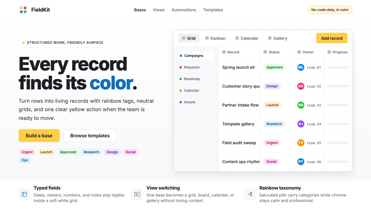 Airtable Spreadsheet-RainbowWork becomes celebratory. Inter grids stay white while rainbow pills and yell…工作变得欢快:白色 Inter 网格中,彩虹标签与黄色按钮点亮节奏。
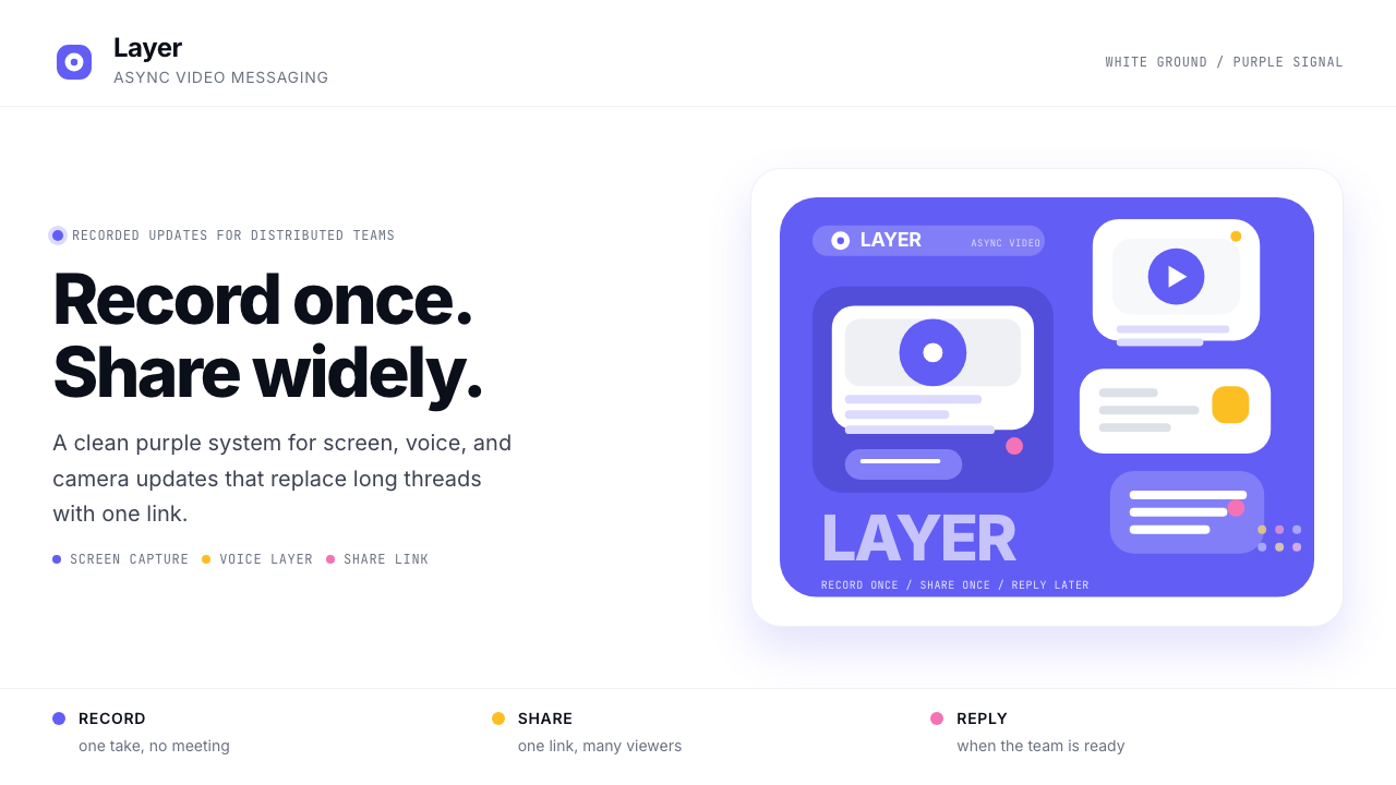 Loom Async-Video PurpleAsync, not meetings. Pure white ground, electric purple, record-button geomet…异步,不开会:纯白底、电紫与录制按钮几何。
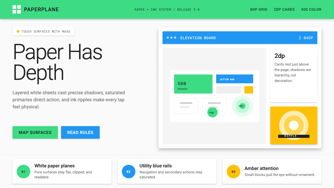 Android Lollipop (Material 1.0)Paper becomes physical. Roboto, green FABs and sharp shadows give white cards…纸张拥有物理感:Roboto、鲜绿浮动按钮与硬阴影让白卡片产生深度。
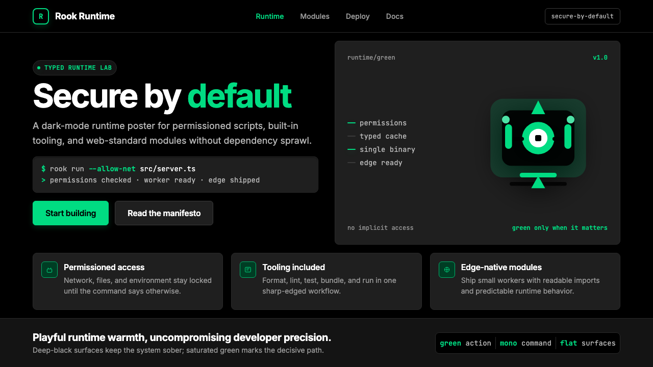 Deno Runtime-GreenWarm precision on black. Saturated green, Inter, and mono code turn security…黑底上的温暖精度:饱和绿、Inter 与等宽代码让安全成为主角。
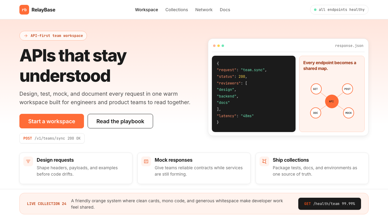 Postman 2024Warm APIs feel approachable. Orange gradients, Inter headlines, and dark mono…温暖的 API 专业感:橙色渐变、Inter 标题与深色等宽代码块。
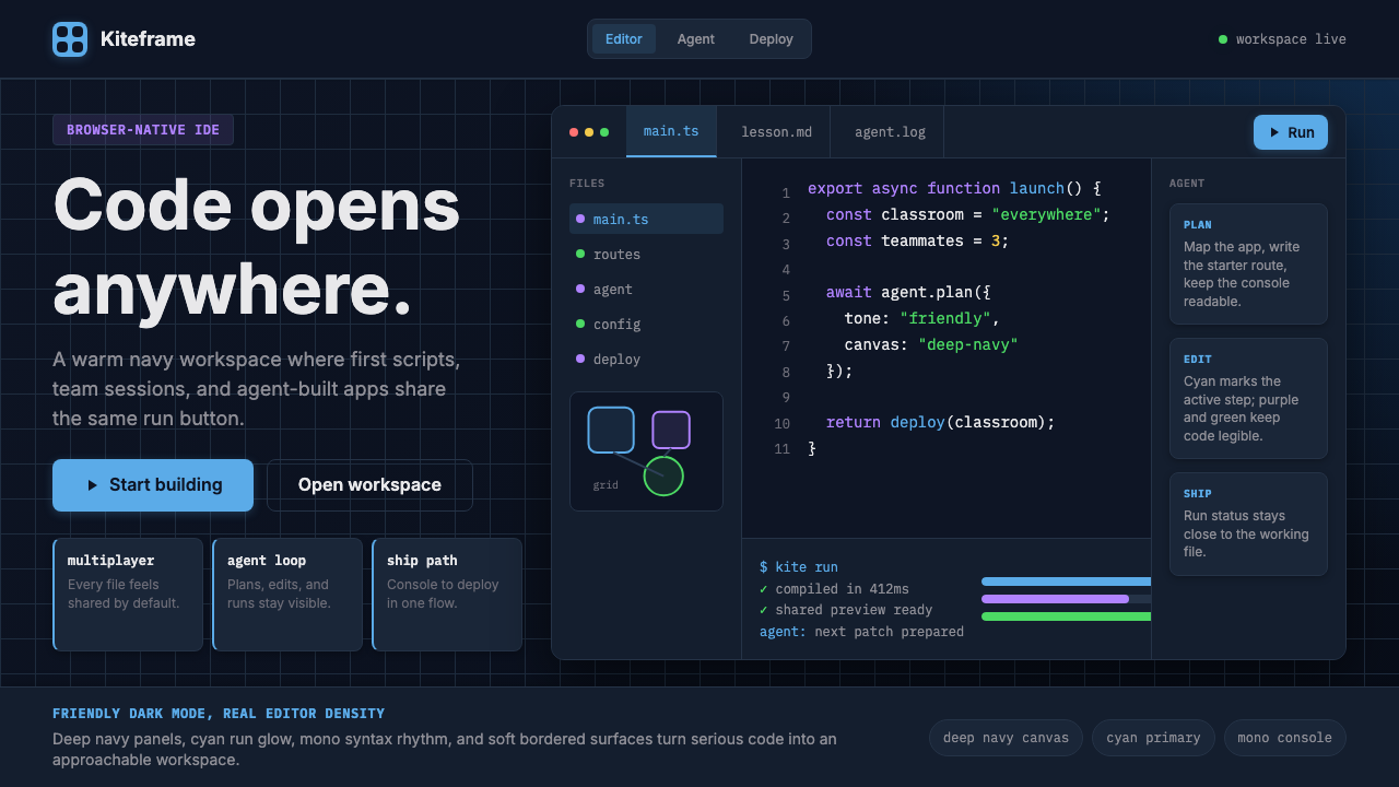 Replit Browser IDE BlueFriendly code gravity. Cyan run lights and mono panels warm the deep navy IDE…亲切的代码引力。青蓝运行光与等宽面板温暖深海军蓝网格。