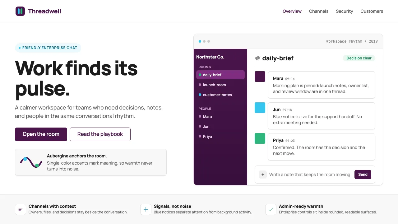
About Slack 2019
Slack's 2019 identity, crafted by Pentagram under Michael Bierut, distilled a chaotic rainbow into a disciplined four-color lozenge mark anchored by aubergine purple. The result is a brand that reads as both approachable and enterprise-ready — a serious collaboration tool that never feels cold.
The design system leans on rounded geometry, generous whitespace, and restrained use of its quadrant accents (yellow, green, blue, pink) to create interfaces that feel conversational rather than corporate.
- Origin
- San Francisco / Vancouver
- Era
- 2013 founded; canonical visual identity from 2019 Pentagram refresh
- Key figures
- Stewart Butterfield · Michael Bierut · Pentagram
- Movements
- SaaS messaging · productivity tooling · post-email work
Slack 2019 design spec
Colors
Background
Surface
Primary
Secondary
Accent
Text
Typography
ManropeHeadings
JetBrains MonoMono
Unlock for 1 credit
The other 11 sections — buttons, cards, spacing, motion, techniques and more — open once you unlock. Download the DESIGN.md or send it to your AI in one click. Unlock once, yours forever.
Sign up nowHave an account? Sign in
Styles similar to Slack 2019
Also inspired by brands & products, with a close feel.
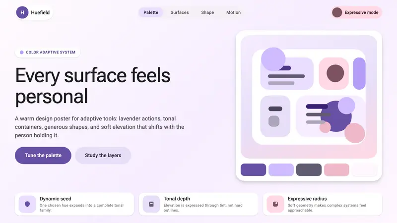 Google Material 3 ExpressiveA living system, themed by your wallpaper. Larger radii, tonal surfaces, emotive shape variation.
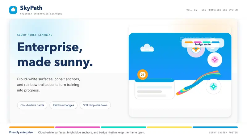 Salesforce TrailheadFriendly enterprise glows. Cloud-white, cobalt, and rainbow badges keep it warm.
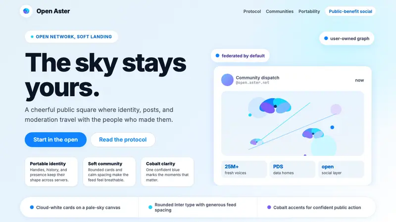 Bluesky AT Protocol 2024Open tech feels warm. Pale sky, cloud cards, Inter, and one cobalt accent carry it.
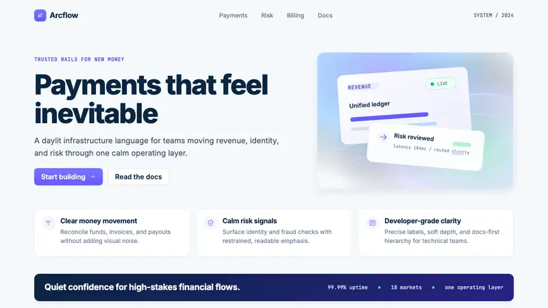 Stripe 2024Trust earns its glow. Indigo mesh, neutral type, and whisper cards float on near-white.