招牌配方
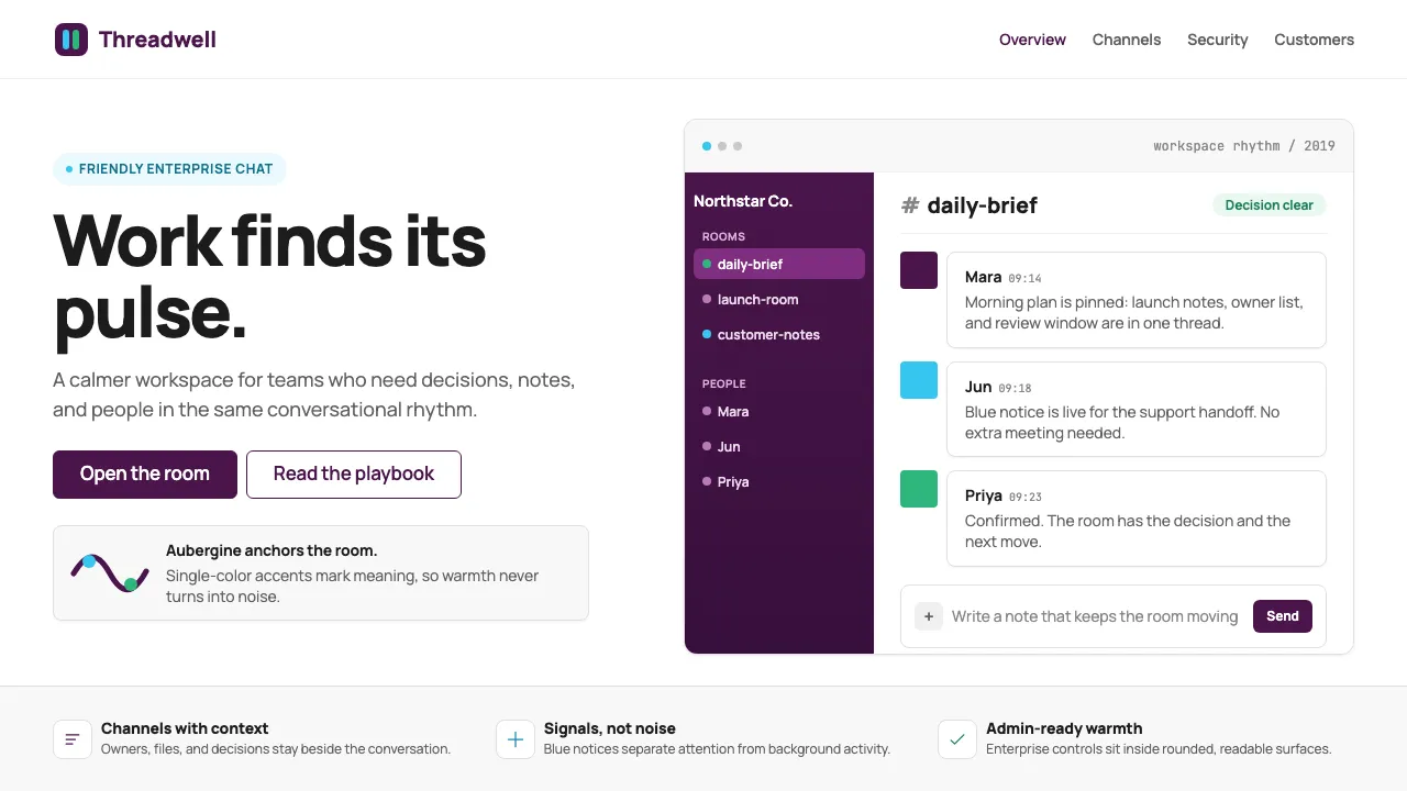
Aubergine Sidebar Gradient
A subtle vertical gradient on navigation surfaces, darkening toward the bottom to add depth without breaking the flat aesthetic.
.sidebar {
background: linear-gradient(180deg, #4A154B 0%, #370F3C 100%);
color: #FFFFFF;
width: 260px;
padding: 16px 0;
}
.sidebar-item {
padding: 6px 24px;
border-radius: 6px;
margin: 0 8px;
color: rgba(255, 255, 255, 0.7);
transition: background 100ms ease-out;
}
.sidebar-item:hover,
.sidebar-item--active {
background: rgba(255, 255, 255, 0.1);
color: #FFFFFF;
}
Quadrant Accent Badge
Status badges using a single quadrant accent color as a filled pill — the Slack way to use brand colors without deploying the full four-color palette.
.badge {
display: inline-flex;
align-items: center;
gap: 6px;
padding: 2px 10px;
border-radius: 9999px;
font-size: 0.8125rem;
font-weight: 600;
letter-spacing: -0.01em;
}
.badge--green {
background: #E9F8F1;
color: #2EB67D;
}
.badge--blue {
background: #EBF9FE;
color: #1BA8D4;
}
.badge--yellow {
background: #FDF5E3;
color: #9E7500;
}
.badge--pink {
background: #FDE8EF;
color: #E01E5A;
}
Message Compose Bar
The signature bottom-anchored input with rounded corners, inline action icons, and a subtle border that intensifies on focus — the most-used component in Slack's UI.
.compose-bar {
display: flex;
align-items: flex-end;
gap: 8px;
border: 1px solid #E0E0E0;
border-radius: 8px;
padding: 8px 12px;
background: #FFFFFF;
transition: border-color 200ms ease-out;
}
.compose-bar:focus-within {
border-color: #4A154B;
box-shadow: 0 0 0 3px rgba(74, 21, 75, 0.15);
}
.compose-bar textarea {
flex: 1;
border: none;
outline: none;
font-family: 'Manrope', sans-serif;
font-size: 0.9375rem;
line-height: 1.5;
resize: none;
color: #1D1C1D;
}
.compose-bar textarea::placeholder {
color: #868686;
}