招牌配方
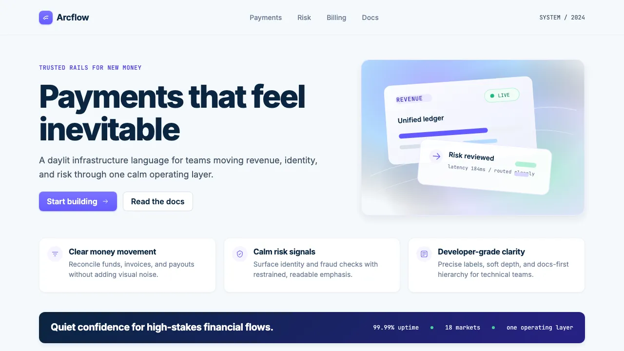
Gradient Mesh Hero
A multi-stop radial gradient background that simulates colored light, characteristic of Stripe's hero sections since ~2020.
.gradient-mesh-hero {
background:
radial-gradient(ellipse 80% 50% at 40% 20%, rgba(99,91,255,0.3) 0%, transparent 70%),
radial-gradient(ellipse 60% 40% at 80% 60%, rgba(168,85,247,0.2) 0%, transparent 70%),
radial-gradient(ellipse 50% 60% at 20% 80%, rgba(29,184,126,0.15) 0%, transparent 70%),
#f6f9fc;
min-height: 600px;
}
Indigo Glow Button
Stripe's primary button uses a vertical gradient and a colored shadow to create a soft "glow" beneath the button, making it feel elevated without heavy shadows.
.btn-primary {
background: linear-gradient(180deg, #7a73ff 0%, #635bff 100%);
color: #ffffff;
border: none;
border-radius: 8px;
padding: 8px 16px;
font-weight: 600;
box-shadow: 0 1px 3px rgba(99,91,255,0.3), 0 1px 2px rgba(0,0,0,0.08);
transition: all 250ms cubic-bezier(0.4, 0, 0.2, 1);
}
.btn-primary:hover {
background: linear-gradient(180deg, #8b85ff 0%, #7a73ff 100%);
box-shadow: 0 4px 8px rgba(99,91,255,0.35), 0 2px 4px rgba(0,0,0,0.1);
transform: translateY(-1px);
}
Whisper Card
Stripe's signature card style — barely-there border, near-invisible shadow, generous padding. The card communicates structure through whitespace rather than decoration.
.whisper-card {
background: #ffffff;
border: 1px solid #edf1f7;
border-radius: 12px;
padding: 24px;
box-shadow: 0 1px 3px rgba(10,37,64,0.06);
transition: box-shadow 250ms cubic-bezier(0.4, 0, 0.2, 1),
transform 250ms cubic-bezier(0.4, 0, 0.2, 1);
}
.whisper-card:hover {
box-shadow: 0 8px 16px rgba(10,37,64,0.08);
transform: translateY(-2px);
}