What is Twitter (Classic Bird)?什么是 Twitter (Classic Bird)?
One sky-blue silhouette, a chronological feed, and the discipline to let text do all the work — Twitter's classic bird era proved that a social platform could be a design statement.一个天蓝色剪影、一条时间流信息流,以及让文字独当一面的克制——推特经典蓝鸟时代证明,社交平台本身可以是一份设计宣言。
Twitter (Classic Bird) in briefTwitter (Classic Bird) 速览
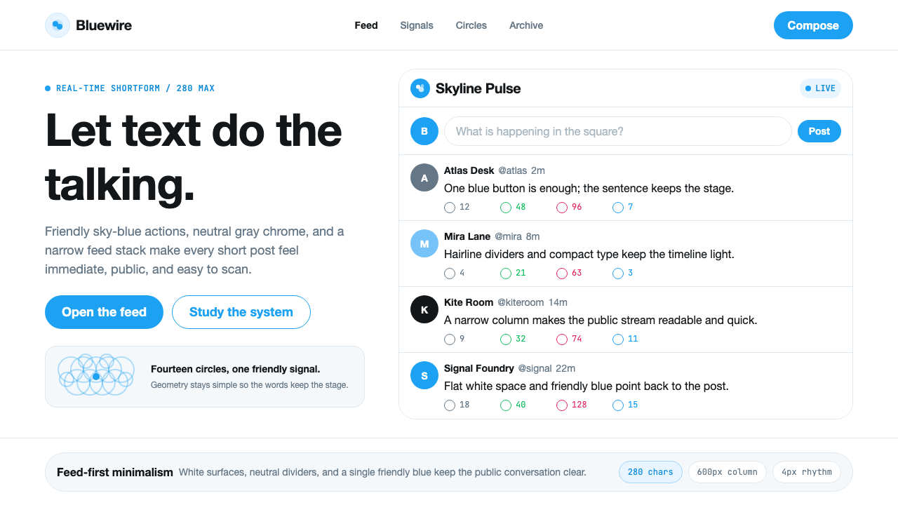
Twitter's classic bird design system — active roughly from 2012 until the platform's rebranding to X in 2023 — is a case study in restraint at internet scale. The visual language was built on a single strong hue (a vivid sky blue that became instantly synonymous with the service), flat white surfaces, a family of rounded pill-shaped buttons, and hairline dividers that organized the feed without ever competing with it. Every interface decision subordinated itself to the tweet.推特经典蓝鸟设计系统——大约从2012年活跃至2023年平台更名为X——是互联网规模下克制美学的教科书案例。这套视觉语言建立在单一强烈色调(一种与这项服务几乎同义的鲜明天蓝色)、扁平白色界面、圆角药丸形按钮家族,以及组织信息流却从不与之竞争的细分割线之上。每一个界面决策都将自身让位于推文本身。
What made the system coherent was not just its palette but its hierarchy of priorities. Typography was set at generous reading sizes on white backgrounds, interaction affordances were colored in that signature blue, and structural chrome — sidebars, nav rails, loading states — was kept in quiet neutral grays. The result was a UI that felt less like software and more like a well-edited newspaper: you noticed the content, not the container.使这套系统连贯的,不仅是色板,更是其优先级层级结构。排版在白色背景上以慷慨的阅读字号呈现,交互元素以标志性蓝色着色,而结构性框架——侧边栏、导航轨、加载状态——则保持在安静的中性灰色调中。结果是一套感觉不像软件、更像一份编辑精良的报纸的界面:你注意到的是内容,而不是容器。
The bird mark itself — popularly called Larry, after NBA player Larry Bird — was an emblem of this philosophy. Constructed in 2012 by designer Martin Grasser from exactly fourteen perfect circles, it achieved the seemingly contradictory qualities of geometric precision and organic warmth. The logo lived at every touchpoint and at every scale, and its single-color flat rendering meant it reproduced cleanly on a phone screen, a billboard, or an embroidered polo shirt.鸟标本身——以NBA球员拉里·伯德命名,通称Larry——是这一哲学的徽章。2012年由设计师Martin Grasser用恰好十四个完美圆形构建,它实现了几何精确与有机温度这两种看似矛盾的品质。这个标志存在于每一个触点、每一种尺寸之上,其单色扁平渲染意味着它在手机屏幕、广告牌或刺绣polo衫上都能清晰再现。
See the Twitter (Classic Bird) design system查看 Twitter (Classic Bird) 完整设计系统
Where does Twitter (Classic Bird) come from?Twitter (Classic Bird) 从何而来?
Twitter was founded in San Francisco in 2006 by Jack Dorsey, Biz Stone, Noah Glass, and Evan Williams, emerging from a brainstorming session at podcasting startup Odeo. The original concept — a short-message dispatch service, initially limited to 140 characters — was inspired partly by SMS culture and partly by the real-time nature of emergency dispatch logs. The name itself came from Dorsey's research into the word 'twitter': a short, inconsequential burst of information, the sound birds make. From the beginning, the bird was not merely a mascot but a conceptual anchor for the service's core metaphor.推特由杰克·多西、比兹·斯通、诺亚·格拉斯和埃文·威廉姆斯于2006年在旧金山创立,起源于播客初创公司Odeo的一次头脑风暴会议。原始概念——一种短消息分发服务,最初限于140个字符——部分受SMS文化启发,部分受紧急调度日志实时性质的影响。这个名字来自多西对「twitter」一词的研究:一段简短无关紧要的信息爆发,鸟儿发出的声音。从一开始,这只鸟就不仅仅是一个吉祥物,而是服务核心隐喻的概念锚点。
The visual identity in Twitter's early years was relatively informal — a text-driven wordmark in a rounded sans-serif, the original light blue bird drawn in a loose, illustrative style. The major turning point came in 2012, when the company retired the last vestiges of its illustrated bird in favor of the pure geometric mark designed by Martin Grasser. The new Larry bird mark dropped the wordmark entirely: the silhouette was now confident enough to stand alone. Simultaneously, the interface underwent a comprehensive redesign under creative director Doug Bowman, who had previously pioneered CSS-based web design at Google. Bowman's team established the flat, white-surface, blue-action vocabulary that would define the platform for a decade.推特早期的视觉识别相对随意——一个圆角无衬线字体的文字标识,原始浅蓝色小鸟以宽松的插图风格绘制。重大转折点出现在2012年,公司淘汰了插图小鸟的最后痕迹,转而采用Martin Grasser设计的纯几何标志。新的Larry鸟标完全舍弃了文字标识:轮廓剪影本身已足够自信,可以独立存在。与此同时,界面在创意总监Doug Bowman的主导下经历了全面重新设计——他此前曾在谷歌开创了基于CSS的网页设计先例。Bowman的团队建立了扁平、白色表面、蓝色动作的设计语汇,这套语汇将定义这个平台长达十年。
The timing of this 2012 redesign was significant. It coincided with the explosive growth of mobile internet and the transition of most users from desktop browsers to smartphone apps. The design system Bowman's team built was not just aesthetically flat — it was architected for multiple screen densities, multiple platform conventions (iOS and Android had different navigation patterns), and the specific ergonomics of thumb-driven touch interaction. The pill-shaped button, the generous tap target, the bottom navigation bar on mobile: each was a response to the new physical reality of how people actually held and used their phones.这次2012年重新设计的时机意义重大。它恰逢移动互联网的爆炸性增长,以及大多数用户从桌面浏览器向智能手机应用的迁移。Bowman团队构建的设计系统不仅在美学上是扁平的——它被设计为适应多种屏幕密度、多种平台规范(iOS和Android有不同的导航模式),以及拇指驱动触控交互的特定人体工程学。药丸形按钮、宽裕的点击目标、移动端底部导航栏:每一个都是对人们实际握持和使用手机这一新物理现实的回应。
The decade from 2012 to 2023 saw gradual evolution within the established language: night mode arrived as a dark-surface variant, the character limit doubled from 140 to 280 in 2017, and the product expanded to include multimedia tweets, threads, Spaces, and Communities. Through all of this, the core visual vocabulary remained remarkably stable. The sky-blue primary, the white card surface, the rounded corner radius, the hairline divider — these persisted as constants while individual features came and went. That stability was itself a design achievement: in an era when most major platforms redesigned aggressively every two to three years, Twitter's visual language aged into something that felt almost timeless.2012年至2023年的十年间,这套已建立的设计语言经历了渐进演化:夜间模式作为深色表面变体出现,字符限制在2017年从140个翻倍至280个,产品扩展至包含多媒体推文、话题串、Spaces和社区功能。在这一切变化中,核心视觉语汇保持了令人印象深刻的稳定。天蓝色主色、白色卡片表面、圆角半径、细分割线——这些作为常量持续存在,而各个功能特性则来了又去。这种稳定性本身就是一项设计成就:在大多数主要平台每两到三年就激进地重新设计的时代,推特的视觉语言老得像是一种近乎永恒的东西。
What defines the Twitter (Classic Bird) look?Twitter (Classic Bird) 的视觉特征是什么?
Sky-Blue Primary Action天蓝色主动作色
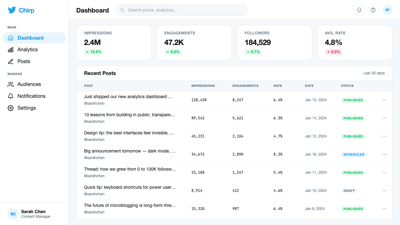
The platform's signature blue — a vivid, medium-saturation sky tone — served as the single source of interactive intent across the entire system. Links, buttons, verified badges, interactive counters, and the primary call-to-action (the Tweet button) all shared this hue. By reserving it exclusively for affordances and actions rather than decoration, the design made the blue itself a signal: wherever you saw it, something was tappable or meaningful. The color's specific tone sat at a friendly midpoint — neither the cold authority of a corporate navy nor the energetic aggression of a saturated primary — which matched the platform's aspiration to feel simultaneously credible and approachable.平台标志性的蓝色——一种鲜明的中饱和度天空调——作为整个系统中交互意图的唯一来源而存在。链接、按钮、认证徽章、互动计数器以及主要行动召唤(发推按钮)都共享这种色调。通过将其专门保留给可供操作的元素和行动而非装饰,设计使蓝色本身成为一种信号:无论你在哪里看到它,都意味着某物是可点击的或有意义的。这种色调的具体调性处于一种友好的中间点——既不是企业海军蓝的冷峻权威,也不是饱和原色的进攻性活力——与平台同时显得可信又平易近人的愿景相匹配。
White Feed Surface白色信息流表面
The default timeline was rendered on a clean white or very lightly tinted near-white ground, with individual tweets separated by hairline dividers rather than card containers or visible gutters. This surface treatment made the feed feel like a continuous document — closer to a typeset broadsheet than to a grid of cards — and it placed maximum emphasis on the text content itself. The approach was intentionally newspaper-like: a legacy medium that had solved the problem of presenting dense text at high velocity and high volume, and whose authority Twitter's feed borrowed by visual association.默认时间线呈现于干净的白色或非常淡的近白底面上,各条推文之间以细分割线分隔,而非卡片容器或可见间距。这种表面处理使信息流感觉像一份连续文件——更接近排版好的大幅报纸,而非卡片网格——它将最大程度的强调置于文本内容本身。这种方式有意模仿报纸:一种已经解决了如何高速、大量呈现密集文字问题的传统媒介,而推特的信息流则通过视觉联想借用了它的权威感。
Pill-Shaped Buttons药丸形按钮
Every button in the classic Twitter system — from the primary Tweet action to secondary follow and reply buttons — used a fully rounded corner radius that produced the characteristic pill or capsule shape. This choice was not arbitrary: the soft rounded form read as inherently friendly and accessible rather than corporate or bureaucratic, and it distinguished interactive elements from structural rectangles (cards, panels, dividers) that used sharper corners. The pill button became one of the most widely imitated interface patterns of the 2010s, spreading across social media competitors and eventually becoming a default pattern in mainstream design systems.经典推特系统中的每个按钮——从主要的发推动作到次要的关注和回复按钮——都使用了产生特征性药丸或胶囊形状的完全圆角半径。这个选择并非随意:柔和的圆角形态读起来天然地友好而易于接近,而非企业化或官僚化,并且它将交互元素与使用更锐利角落的结构性矩形(卡片、面板、分割线)区分开来。药丸按钮成为2010年代被模仿最广泛的界面模式之一,蔓延至社交媒体竞争者,并最终成为主流设计系统的默认模式。
Neutral Gray Chrome中性灰色框架
Everything that was not content and not an interactive action was rendered in a family of quiet, desaturated grays: the navigation rail, the sidebar widgets, the timestamp text, the secondary metadata (retweet counts, impression numbers), and the placeholder states. This gray vocabulary served a crucial structural function — it made the hierarchy legible at a glance without asserting itself visually. Users learned to read the color temperature intuitively: white and gray meant structure, blue meant action, and the full richness of color in any tweet came from the content itself (images, link previews, emoji) rather than the interface.所有既非内容、也非交互动作的元素,都以一系列安静、去饱和的灰色呈现:导航轨、侧边栏部件、时间戳文本、次要元数据(转推数、展示次数)以及占位状态。这个灰色语汇承担了关键的结构功能——它使层级结构一目了然,而不在视觉上主张自身。用户学会了直觉地解读色温:白色和灰色意味着结构,蓝色意味着动作,任何推文中的全部色彩丰富性来自内容本身(图片、链接预览、表情符号),而非界面。
Typography First字体优先
The classic Twitter interface was fundamentally a typographic system. Body text — the tweet content — was set at a generous, comfortable reading size with ample line spacing, reflecting the platform's roots in a text-centric microblogging format. Display names, handles, and timestamps established a clear three-tier hierarchy through size and weight contrast alone, with no color differentiation at the typographic level (color being reserved for interactive states). This typography-first approach meant the interface scaled gracefully across contexts: the same hierarchy worked whether a tweet contained a single word or the full 280 characters.经典推特界面从根本上是一套排版系统。正文——推文内容——以慷慨、舒适的阅读字号配以充裕的行间距呈现,反映了平台根植于以文字为中心的微博格式。显示名称、用户名和时间戳仅通过尺寸和字重对比建立了清晰的三级层级,在排版层面上没有色彩差异(色彩被保留给交互状态)。这种字体优先的方式意味着界面能够在不同情境中优雅地扩展:无论推文包含单个词语还是完整的280个字符,同样的层级结构都能正常工作。
Flat and Icon-Light Interaction扁平且图标克制的交互
Interaction affordances — like, retweet, reply, and share — were represented through a set of minimal line-art icons: a heart, two curved arrows, a speech bubble, an upload arrow. These icons were deliberately simple, almost diagrammatic, using only a single stroke weight and no fills in their resting state. They filled with the action blue on hover or selection, making state change clear without animation complexity. This flat icon approach was a direct application of the interface principle that every interaction element should communicate its function without theatrical embellishment — the iconography worked because of what it did not add.交互可供性——喜欢、转推、回复和分享——通过一套最简化的线条艺术图标呈现:一颗心、两条弯曲箭头、一个对话气泡、一个上传箭头。这些图标被刻意设计得简单,近乎示意图式,在静止状态下仅使用单一笔画粗细且无填充。悬停或选中时,它们会以动作蓝色填充,使状态变化清晰而无需动画复杂性。这种扁平图标方式是界面原则的直接应用——每个交互元素应当在不加戏剧性点缀的情况下传达其功能。这套图标体系之所以有效,恰恰在于它没有添加什么。
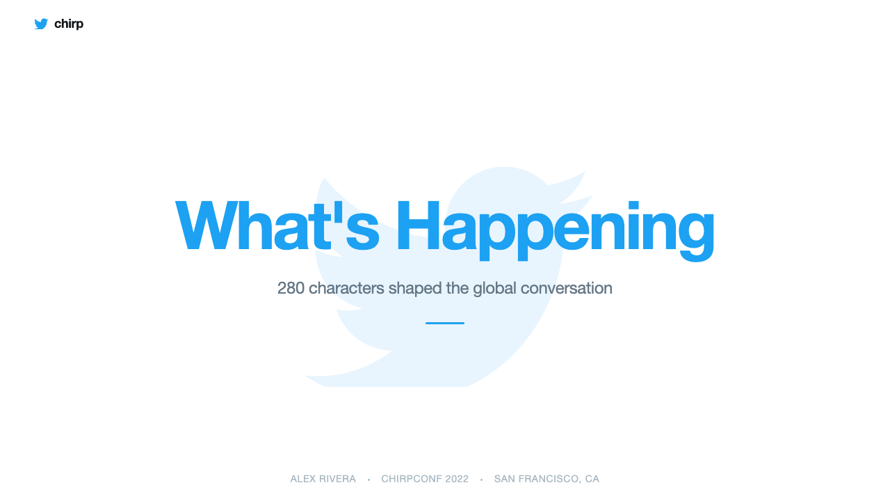
The Larry Bird MarkLarry鸟标
The 2012 geometric bird — constructed by Martin Grasser using a system of overlapping perfect circles — represented the distillation of the platform's design values into a single mark. The bird faces right and slightly upward, an orientation that reads as forward-looking and open. Every curve in the mark is derived from the same circle geometry, giving it a mathematical coherence that holds at any scale: identically legible on a browser favicon sixteen pixels across and on a building-side mural several stories tall. Its single-color flat rendering — always the platform blue or white, never shadowed or textured — embodied the same flatness principle that governed the entire interface.2012年的几何小鸟——由Martin Grasser使用一系列重叠的完美圆形构建——代表了平台设计价值观凝缩于单一标志的成果。小鸟朝右并略微向上看,这种朝向读起来是前瞻性的和开放的。标志中的每条曲线都源自同一圆形几何,赋予它在任何尺寸下都成立的数学连贯性:在十六像素宽的浏览器收藏夹图标上与在几层楼高的建筑墙面壁画上同样清晰可辨。其单色扁平渲染——始终是平台蓝色或白色,从不带阴影或纹理——体现了支配整个界面的同一扁平原则。
See the Twitter (Classic Bird) design system查看 Twitter (Classic Bird) 完整设计系统
Who shaped Twitter (Classic Bird)?谁塑造了 Twitter (Classic Bird)?
Dorsey co-founded Twitter in 2006 and served as its original CEO, stepping back and then returning as CEO in 2015 and again in 2022. His vision for Twitter as a real-time communication utility — closer to a city square than a social network — shaped the product's priority of speed, brevity, and public accessibility. Dorsey's product instincts consistently favored simplicity: he pushed for the platform to do fewer things better and resisted feature bloat, values that aligned with the restraint embedded in the classic visual system.多西于2006年共同创立了推特并担任其最初的CEO,之后退出,分别于2015年和2022年再度回归担任CEO。他对推特作为实时通信工具的愿景——更接近城市广场而非社交网络——塑造了产品对速度、简洁和公共可及性的优先考量。多西的产品直觉始终倾向于简单:他推动平台少做几件事、做得更好,并抵制功能膨胀,这些价值观与经典视觉系统内嵌的克制精神相呼应。
Bowman served as Twitter's first Visual Design Lead and later Creative Director, joining the company in 2009 after a celebrated tenure as Google's first Visual Designer. At Google, he became known for his frustration with data-driven design culture — famously recounting the company testing forty-one shades of blue. At Twitter, Bowman had greater authority to make bold aesthetic decisions, and the 2012 redesign that established the definitive classic visual language bears his mark most strongly. He also hired the design team that would maintain and evolve the system through Twitter's peak years.Bowman担任推特的首任视觉设计主管,后升任创意总监,于2009年加入公司,此前曾以谷歌首位视觉设计师的身份广受赞誉。在谷歌,他因对数据驱动设计文化的不满而闻名——他曾著名地讲述公司测试四十一种蓝色色调的经历。在推特,Bowman有更大的权威做出大胆的美学决策,奠定了决定性经典视觉语言的2012年重新设计最强烈地体现了他的印记。他还招募了在推特鼎盛时期维护和演化这套系统的设计团队。
Grasser designed the 2012 Larry bird mark that became one of the most recognized logos in internet history, replacing the earlier illustrated bird with a geometrically precise silhouette constructed from fourteen overlapping circles. The design process involved extensive mathematical work — each curve in the final mark is derived from the same circle geometry, ensuring harmonic proportion at every scale. Grasser's approach demonstrated that geometric construction methods, long associated with print and branding design, could produce marks that performed as well in digital interface contexts as on physical merchandise.Grasser设计了2012年的Larry鸟标,这成为互联网历史上最具辨识度的标志之一,以由十四个重叠圆形构建的几何精确剪影取代了早期的插图小鸟。设计过程涉及大量数学工作——最终标志中的每条曲线都源自同一圆形几何,确保在每种尺寸下都具有和谐比例。Grasser的方式表明,长期与平面印刷和品牌设计相关联的几何构建方法,能够产生在数字界面场景中与实体商品上同样出色的标志。
Stone co-founded Twitter alongside Dorsey and played a significant role in shaping the platform's cultural identity and tone of voice — factors that directly influenced how the visual design was expected to feel. He consistently advocated for Twitter as a force for openness, conversation, and even social good, an aspirational positioning that the friendly, approachable blue-and-white visual system was designed to support. Stone's public-facing communication style — warm, witty, and non-corporate — set the brand personality that the design needed to embody.斯通与多西共同创立了推特,在塑造平台文化身份和语气方面发挥了重要作用——这些因素直接影响了视觉设计预期呈现的感觉。他始终倡导推特作为开放、对话乃至社会公益力量,这种充满抱负的定位正是友好、平易近人的蓝白视觉系统所被设计来支撑的。斯通面向公众的沟通风格——温暖、机智、非企业化——设定了设计需要体现的品牌个性。
How do you use Twitter (Classic Bird) today?今天怎么用 Twitter (Classic Bird)?
The classic Twitter visual system transfers well to presentation design precisely because it solved the same problem slides must solve: how to present a high volume of text-heavy information at speed without visual noise overwhelming the signal. On a slide cover, the approach works through confident simplicity — a white or near-white background, the primary action blue used for a single headline or keyline accent, and a generously scaled display typeface set in a rounded, approachable weight. The composition should feel like the front page of a well-edited publication rather than an elaborate graphic. Avoid filling the slide with imagery; if imagery is used, it should be a single strong photograph treated as a full bleed, with text placed over a clean white zone.经典推特视觉系统能够很好地迁移到演示文稿设计,正是因为它解决了幻灯片必须解决的同一问题:如何在不让视觉噪音淹没信号的情况下快速呈现大量以文字为主的信息。在幻灯片封面上,这种方式通过自信的简单性起作用——白色或近白色背景,主要动作蓝色用于单个标题或关键线条强调,以及以圆润、平易近人的字重排版的大号展示字体。构图应该感觉像一份编辑精良的出版物的头版,而不是一个精致的图形。避免用图像填满幻灯片;如果使用图像,应该是单张强有力的照片做满版处理,文字置于干净的白色区域之上。
Content and data slides benefit from the same typographic rigor. Body text should be set at a size that feels almost too large — generous readability was a Twitter hallmark — with secondary metadata (dates, sources, captions) stepped down clearly in size and rendered in a quiet gray rather than the action blue. For data visualization, the classic Twitter approach would treat charts as typographic objects: bar charts and line charts in the primary blue for the primary series, neutral gray for comparative or secondary series, and axis labels in the same quiet gray as other metadata. Gridlines, if present, should be the lightest possible weight — barely visible, purely structural.内容和数据幻灯片受益于同样的排版严谨性。正文应以感觉几乎太大的字号呈现——慷慨的可读性是推特的标志——次要元数据(日期、来源、说明)应清晰地降低字号,并以安静的灰色而非动作蓝色呈现。对于数据可视化,经典推特方式会将图表视为排版对象:主要系列的条形图和折线图用主蓝色,对比或次要系列用中性灰色,轴标签用与其他元数据相同的安静灰色。网格线(若有的话)应尽可能轻——几乎不可见,纯粹是结构性的。
For web UI work — dashboards, pricing pages, analytics interfaces — the classic Twitter vocabulary provides a ready-made clarity framework. Establish a clean light background as the base surface, use the sky-blue primary exclusively for actionable elements (buttons, active tabs, selected states, links), and render all structural chrome (navigation, sidebars, dividers, borders) in a family of neutral grays. Pill-shaped buttons are appropriate and period-accurate, but even if a different button shape is preferred, the color discipline — blue for action, gray for structure, white for content — is the core transferable principle. Card components work best when they are minimal: a white surface, a hairline border or very subtle shadow, and content that relies on typographic hierarchy rather than graphic decoration.对于网页界面工作——仪表板、定价页面、分析界面——经典推特语汇提供了一套现成的清晰度框架。将干净的浅色背景确立为基础表面,将天蓝色主色专门用于可操作元素(按钮、活动标签、选中状态、链接),并将所有结构性框架(导航、侧边栏、分割线、边框)以中性灰色系列呈现。药丸形按钮是合适的且符合历史风格的,但即使偏好不同的按钮形状,颜色纪律——蓝色代表动作,灰色代表结构,白色代表内容——也是核心的可迁移原则。卡片组件最好保持简约:白色表面,细线边框或非常微妙的阴影,以及依赖排版层级而非图形装饰的内容。
In editorial and marketing contexts, the style supports authoritative, text-forward communication. A newsletter or blog layout in this idiom would use a narrow content column for maximum reading comfort, with metadata (author, date, reading time) in a small gray treatment above the headline, and section breaks marked by a simple hairline rather than decorative elements. The blue accent color should appear sparingly — reserved for links, for pull-quote markers, or for a single highlighted call-to-action button at the end of an article. Marketing landing pages can leverage the style's poster-like clarity by alternating between white and a very light tinted section background, with blue used only at moments of conversion intent.在编辑和营销场景中,这种风格支持权威性、以文字为主的传播。这种风格的新闻通讯或博客版面会使用窄内容列以获得最佳阅读舒适度,元数据(作者、日期、阅读时间)以小号灰色处理置于标题上方,段落分隔以简单细线而非装饰元素标记。蓝色强调色应克制使用——保留给链接、引用标记,或文章末尾单个高亮的行动召唤按钮。营销落地页可以通过白色与非常浅的着色区块背景交替,以及仅在转化意图时刻使用蓝色,来利用这种风格的海报式清晰感。
A frequent mistake when working in this style is treating the sky blue as a decorative background color. In the authentic Twitter system, blue was never used as a surface — it appeared only on interactive elements and the bird mark itself. Using blue as a panel background, section fill, or illustrative element immediately breaks the system's logic and undermines the clear signal that blue means action. A related mistake is using multiple rounded shapes (circles, bubbles, abstract blobs) as visual interest — the Twitter system's geometry was functional (pill buttons, the bird's circles) rather than decorative. If your layout needs visual texture, reach for typographic contrast and scale before reaching for shapes.在这种风格中常见的错误是将天蓝色当作装饰性背景颜色使用。在真实的推特系统中,蓝色从未被用作表面——它仅出现在交互元素和鸟标本身上。将蓝色用作面板背景、区块填充或插图元素,会立即打破系统逻辑,并破坏蓝色意味着动作这一清晰信号。一个相关的错误是使用多个圆形(圆圈、气泡、抽象斑块)作为视觉趣味——推特系统的几何形态是功能性的(药丸按钮、鸟标的圆形),而非装饰性的。如果你的版面需要视觉纹理,先求助于排版对比和尺度,再考虑形状。
See the Twitter (Classic Bird) design system查看 Twitter (Classic Bird) 完整设计系统
Twitter (Classic Bird) — FAQTwitter (Classic Bird) · 常见问题
How does the classic Twitter style differ from generic flat design?经典推特风格与通用扁平设计有何不同?
Generic flat design, as it proliferated after iOS 7 in 2013, often means simply removing gradients and drop shadows — the surface gets flat, but the underlying system thinking may not deepen. Classic Twitter's flatness was part of a more specific discipline: a strictly reserved color system (blue for action only), a typographic hierarchy built on just two or three levels, and a neutral gray chrome that never competed with content. The result felt editorial rather than merely modern. Where generic flat design can produce layouts that look clean but feel arbitrary, classic Twitter's system had rules that explained every absence and every color choice.通用扁平设计在2013年iOS 7之后大量涌现,往往仅仅意味着去除渐变和投影阴影——表面变得扁平,但底层的系统思维不一定随之深化。经典推特的扁平是更具体纪律的一部分:严格保留的颜色系统(蓝色仅用于动作)、建立在仅两到三个层级上的排版层级,以及从不与内容竞争的中性灰色框架。结果感觉是编辑性的,而非仅仅是现代的。通用扁平设计可能产生看起来干净但感觉任意的版面,而经典推特的系统有规则来解释每一处缺席和每一个颜色选择。
Can this style work for a product that is not a social platform?这种风格能适用于非社交平台的产品吗?
Yes, and it often performs better outside social media than within it — because the core virtues of the style (clear action hierarchy, typographic emphasis, minimal chrome) are universally valuable in information-dense products. The style is particularly well-suited to communication tools, news readers, productivity applications, and any interface where the user needs to process large amounts of text quickly. It performs less well for products that are primarily visual or experiential — photo editing tools, creative applications, consumer lifestyle brands — where the neutral gray and minimal decoration can feel sparse rather than purposeful.可以,而且它通常在社交媒体之外比在其中表现得更好——因为这种风格的核心美德(清晰的动作层级、排版强调、最小化框架)在信息密集型产品中具有普遍价值。这种风格特别适合通信工具、新闻阅读器、生产力应用,以及任何用户需要快速处理大量文本的界面。对于主要是视觉性或体验性的产品——照片编辑工具、创意应用、消费者生活方式品牌——它表现得不那么理想,在这些场景中,中性灰色和最小化装饰可能感觉稀疏而非有意义。
How do you apply this style in dark mode?这种风格在深色模式下如何应用?
Twitter itself introduced a dark mode (and later a true black variant for OLED screens) that demonstrated how the system translates. The key insight from that implementation: the blue primary color shifts slightly in both saturation and lightness to maintain its action-signal legibility against a dark surface, while the gray family inverts — what was light gray structural chrome becomes dark gray, and what was near-white becomes dark near-black. The white card surface becomes a dark elevated surface. Crucially, the color logic does not change: blue remains the exclusive signal of action, gray remains structural, and the darkest surface is reserved for the background. A common dark-mode error is simply inverting all colors — the result tends to feel harsh and loses the original system's warmth.推特自身推出了深色模式(以及后来针对OLED屏幕的纯黑变体),展示了这套系统如何转化。从该实现中得出的关键洞察:蓝色主色在饱和度和亮度上略微偏移,以保持其在深色表面上的动作信号可读性,而灰色系列则反转——原来浅灰色的结构性框架变成深灰色,原来的近白色变成深近黑色。白色卡片表面变成深色的提升表面。至关重要的是,颜色逻辑不变:蓝色仍然是动作的专属信号,灰色仍然是结构性的,最深的表面保留给背景。深色模式的常见错误是简单地反转所有颜色——结果往往感觉刺眼,并失去了原始系统的温度。
What is the relationship between this style and other minimalist tech platforms?这种风格与其他极简主义科技平台有何关系?
The classic Twitter system sits in a family of platform-specific minimalist styles that emerged in the early 2010s, including early Stripe, early Medium, and the first Notion — all of which shared the white surface, generous typography, and reserved accent-color approach. Where Twitter was distinctive was in the specificity of its blue (a signature identity color rather than a neutral accent) and in the pill-button morphology, which neither Stripe nor Medium adopted. These styles were also influenced by the concurrent Swiss-derived design systems popularized in print and corporate communication, but applied the Swiss emphasis on grid and typographic hierarchy to touch-first mobile interaction rather than to static print.经典推特系统属于2010年代初期涌现的一系列平台特定极简主义风格之中,包括早期的Stripe、早期的Medium和第一代Notion——这些产品都共享白色表面、慷慨的排版和保留强调色的方式。推特的独特之处在于其蓝色的特殊性(一种标志性的身份颜色,而非中性强调色)以及药丸按钮形态,这两者Stripe和Medium都未采用。这些风格还受到同时期在平面印刷和企业传播中流行的源自瑞士传统的设计系统的影响,但将瑞士风格对网格和排版层级的强调应用于触控优先的移动交互,而非静态印刷。
Why did the classic Twitter visual language feel so durable across a decade?为什么经典推特视觉语言在十年间感觉如此经久不衰?
Several factors contributed. First, the system was built on principles rather than trends — the decision to let text dominate, to use color as function rather than decoration, to reserve complexity for content rather than interface, are all things that age well because they are in service of legibility rather than style. Second, the platform's core use case — reading and writing short text, in public, in real time — did not change fundamentally across the decade, so the visual system did not need to reinvent itself to remain fit for purpose. Third, and perhaps most importantly, the bird mark and the sky blue became genuinely cultural artifacts: recognized globally, associated with consequential events (elections, breaking news, social movements), and therefore carrying a weight of meaning that made casual redesign feel high-risk. The classic system's durability was earned by becoming irreplaceable.几个因素共同促成了这一点。首先,这套系统建立在原则而非趋势之上——让文字主导、将色彩用作功能而非装饰、将复杂性保留给内容而非界面的决定,都是经得起时间考验的,因为它们服务于可读性而非风格。其次,平台的核心使用场景——公开、实时地阅读和撰写短文字——在这十年间没有根本性的改变,因此视觉系统不需要重新发明自己来保持适用性。第三,也许最重要的是,鸟标和天蓝色成为真正的文化符号:全球可辨识,与重要事件(选举、突发新闻、社会运动)相关联,因此承载了使随意重新设计感觉高风险的意义重量。经典系统的持久性是通过变得不可替代而赢得的。
Related design styles相关设计风格
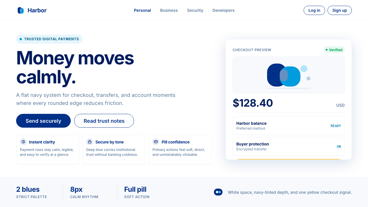 PayPalTrust without coldness. Deep navy, sky cyan, white cards, and pill checkout c…信任却不冰冷:深海军蓝与天青、白卡片和药丸结账提示。
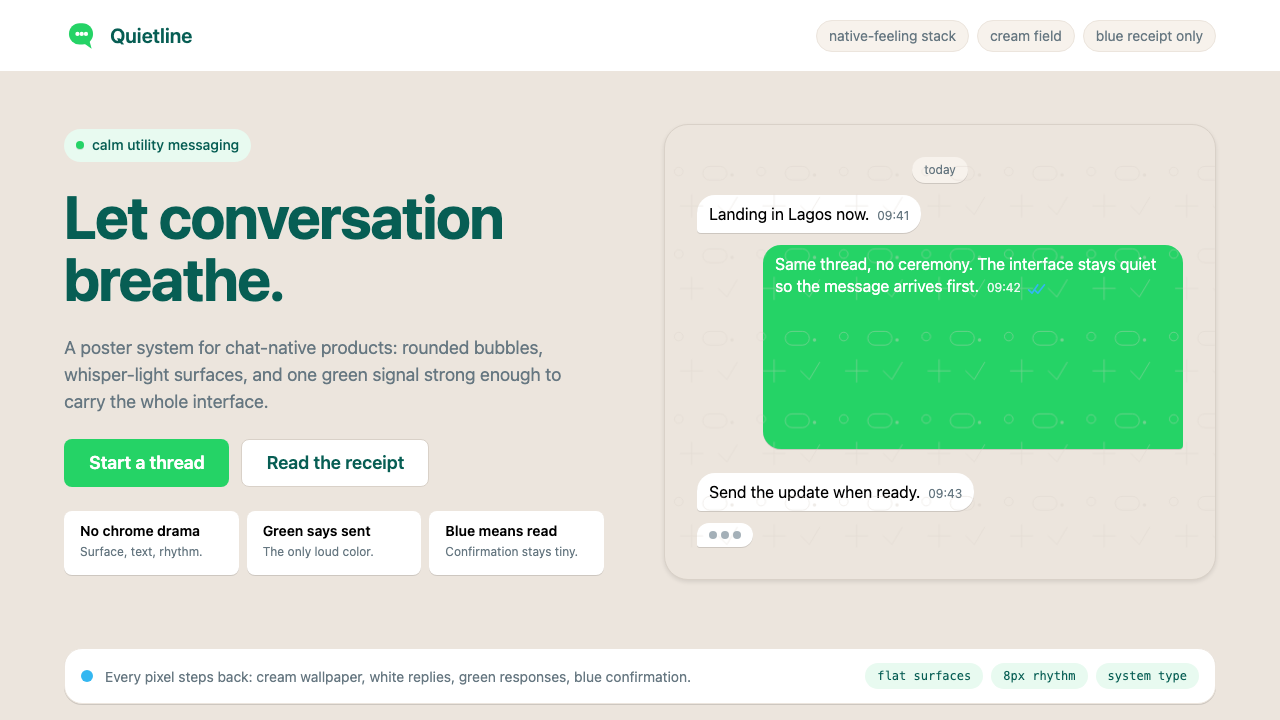 WhatsAppConversation is the interface. Cream wallpaper, green bubbles, and tiny blue…对话就是界面。奶油墙纸、绿色气泡与蓝色小勾让界面退后。
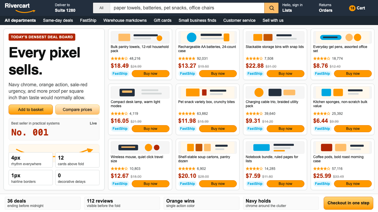 AmazonUgly sells efficiently. Navy chrome, orange buttons, red prices crowd a dense…朴素而高效:深蓝导航、橙色按钮、红价挤满密集网格。
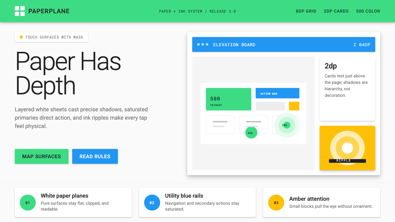 Android Lollipop (Material 1.0)Paper becomes physical. Roboto, green FABs and sharp shadows give white cards…纸张拥有物理感:Roboto、鲜绿浮动按钮与硬阴影让白卡片产生深度。
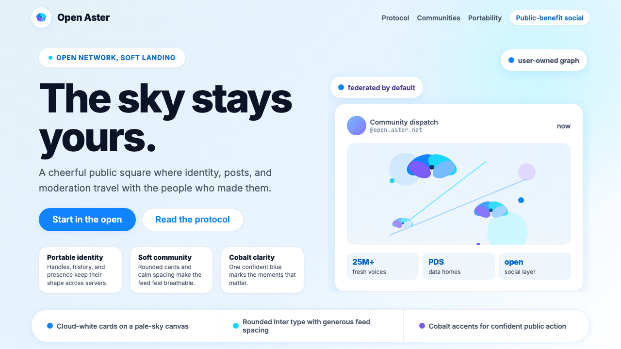 Bluesky AT Protocol 2024Open tech feels warm. Pale sky, cloud cards, Inter, and one cobalt accent car…开放科技也温暖:浅天蓝、云白卡片、Inter 与钴蓝强调。
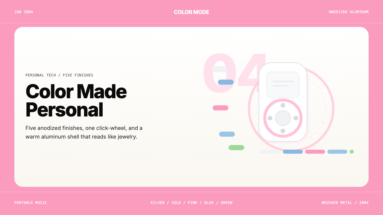 iPod Mini Anodized (2004)Color becomes identity. Pink panels, clean sans, and click-wheel geometry kee…色彩即身份。粉色面板、无衬线字体与点击轮几何保持触感。