What is iPod Mini Anodized (2004)?什么是 iPod Mini Anodized (2004)?
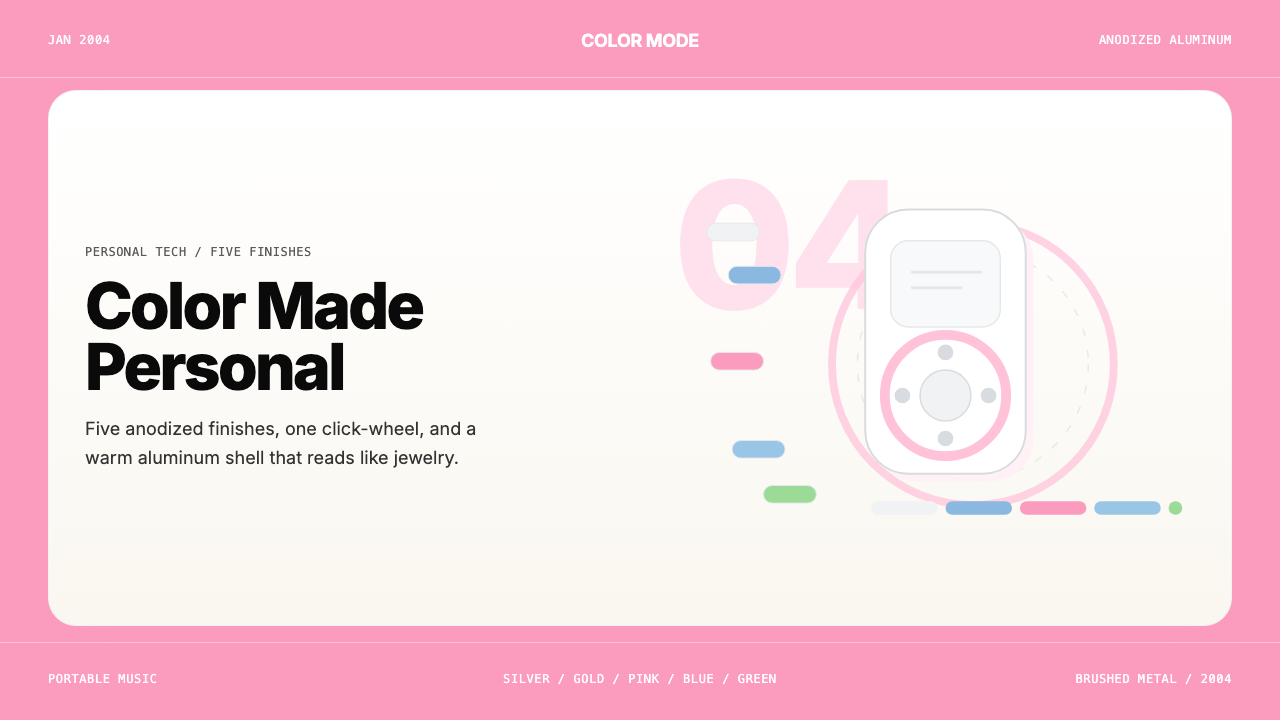
Five anodized-aluminum finishes launched in January 2004 turned a music player into a personal color statement — and set the template Apple would repeat for two decades.2004年1月发布的五种阳极氧化铝配色,让一台音乐播放器成为私人色彩宣言——并奠定了苹果此后二十年反复沿用的设计模板。
iPod Mini Anodized (2004) in briefiPod Mini Anodized (2004) 速览
The iPod mini Anodized design system translates the tactile warmth of mid-2000s Apple hardware into a visual language for screens. Its defining quality is a palette rooted in soft, pastel-saturated tones — the pinks, blues, silvers, and greens of brushed aluminum — balanced against generous amounts of clean white or near-white space. The palette is warm rather than cool, muted rather than saturated at full intensity, and always reads as friendly rather than clinical.iPod mini 阳极氧化设计系统将2000年代中期苹果硬件的触感温度转化为屏幕上的视觉语言。其决定性特质是一套植根于柔和粉彩色调的色板——拉丝铝合金的粉色、蓝色、银色与绿色——以大量干净的白色或近白色空间加以平衡。色板偏暖而非偏冷,有所收敛而非全饱和,始终给人亲切而非冷峻的感受。
Typography in this system is rigorously sans-serif: letterforms are round-shouldered and open, conveying approachability without sacrificing legibility. There is a deliberate restraint in typographic weight — the system avoids heavy, compressed, or condensed cuts in favor of regular and medium weights that echo the quiet confidence of the iPod mini's own silkscreened labeling. Scale does the organizational work that other systems accomplish through decorative dividers or color banding.该系统中的字体排印严格采用无衬线字体:字形圆肩开放,传递亲和力而不牺牲可读性。字重的选择刻意克制——系统回避粗重、压缩或窄体字形,偏好与 iPod mini 丝印标签那种静默自信相呼应的常规与中等字重。尺度层级承担其他系统依赖装饰性分隔线或色带才能完成的组织工作。
The system's spatial logic is defined by breathing room. Cards, panels, and containers favor rounded corners — not the sharp ninety-degree edges of utilitarian design, but the softly radiused corners that mirror the iPod mini's chamfered chassis. Whitespace is not an afterthought but a material in itself, used to give color fields and typographic elements room to feel considered rather than crowded.该系统的空间逻辑由呼吸感定义。卡片、面板与容器偏好圆角——不是实用主义设计那种锐利的九十度直角,而是镜映 iPod mini 机身倒角轮廓的柔和弧角。留白不是事后添补的元素,而是一种材料本身,用于给色块与字体元素腾出空间,使其呈现出经过推敲而非堆砌的质感。
See the iPod Mini Anodized (2004) design system查看 iPod Mini Anodized (2004) 完整设计系统
Where does iPod Mini Anodized (2004) come from?iPod Mini Anodized (2004) 从何而来?
The iPod mini debuted at Macworld Expo San Francisco in January 2004, priced below the standard iPod and offered in five anodized-aluminum finishes: Silver, Gold, Pink, Blue, and Green. The choice of anodized aluminum was not merely cosmetic. Anodizing is an electrochemical process that bonds a colored oxide layer directly into the surface of the aluminum, making the color durable, scratch-resistant, and integral to the material itself rather than applied on top. This gave the iPod mini a finish that felt both premium and permanent — the color was the object, not a coat over it.iPod mini 于2004年1月旧金山Macworld博览会上首次亮相,定价低于标准款iPod,提供五种阳极氧化铝配色:银、金、粉、蓝、绿。选择阳极氧化铝并非单纯出于美观考量。阳极氧化是一种电化学工艺,将有色氧化层直接融入铝材表面,使色彩耐用、抗划伤,且与材料本身融为一体,而非涂覆于表面之上。这赋予了iPod mini一种既高端又永久的质感——色彩就是物品本身,而不是罩在上面的一层涂装。
The visual identity that accompanied the launch drew on Apple's existing clean-white aesthetic but inflected it with the specific pastel warmth of the hardware palette. Advertising campaigns shot each iPod mini against white backgrounds with colored silhouette dancers — the same campaign grammar Apple had been developing since the original iPod's launch in 2001. The anodized colors gave the campaign a new register: personal, choice-driven, identity-forward. A Blue iPod mini and a Pink iPod mini were not just different colors; they were different personalities.发布会伴随的视觉形象延续了苹果既有的纯白美学,但以硬件色板特有的温暖粉彩色调为其注入了新的气质。广告活动将每台iPod mini置于白色背景前,配以彩色剪影舞者——这是苹果自2001年初代iPod发布以来一直在发展的同一套广告语法。阳极氧化配色为这套广告打开了新的维度:私人化、选择驱动、身份优先。蓝色iPod mini与粉色iPod mini不只是颜色不同——它们代表着不同的个性。
The key figures behind the iPod mini's design were Steve Jobs, who personally championed the smaller, more affordable form factor; Jony Ive, whose industrial design team developed the precision-milled aluminum enclosure; Tony Fadell, who led the broader iPod engineering effort; and Phil Schiller, whose marketing instincts shaped the color-as-identity communications strategy. Ive's team had been exploring aluminum as a premium consumer-electronics material since the PowerBook G4, and the iPod mini represented the first time that exploration met a full-spectrum color system.iPod mini设计背后的核心人物包括:亲自推动更小巧、更亲民机型的史蒂夫·乔布斯;其工业设计团队开发了精密铣削铝制外壳的乔纳森·伊夫;主导更广泛iPod工程工作的托尼·法戴尔;以及以营销直觉塑造「色彩即身份」传播策略的菲尔·席勒。伊夫的团队自PowerBook G4以来一直在探索铝材作为高端消费电子材料的可能性,而iPod mini则是这一探索首次与全色谱色彩系统相遇的时刻。
The iPod mini's anodized color approach proved so successful that Apple extended it to subsequent product lines. The iPod nano (introduced in 2005, replacing the mini) expanded the color options further. The iPod shuffle adopted bright solid colors. The iPhone 5c in 2013 revisited the idea of a plastic body in five consumer colors, citing the same logic: the device as personality vehicle. By the time the iPhone 7 introduced jet black and matte black as finish differentiators, Apple had been in the color-as-identity business for over a decade — a lineage that runs directly through the iPod mini's January 2004 launch.iPod mini的阳极氧化色彩策略大获成功,苹果随即将其延伸至后续产品线。2005年推出的iPod nano(取代了mini)进一步扩展了配色选项。iPod shuffle采用了明亮的纯色方案。2013年的iPhone 5c以五种消费者色彩重新诠释了这一理念,援引同样的逻辑:设备是个性的载体。当iPhone 7以亮黑色与磨砂黑作为表面区分时,苹果经营「色彩即身份」这门生意已逾十年——而这一传承的起点,正是2004年1月那次iPod mini的发布。
What defines the iPod Mini Anodized (2004) look?iPod Mini Anodized (2004) 的视觉特征是什么?
Anodized Pastel Palette阳极氧化粉彩色板
The defining palette draws from the five original iPod mini finishes: a soft blush pink, a warm sky blue, a cool silver-white, a muted sage-to-mint green, and a restrained champagne gold. These are not fully saturated primaries — each hue carries a subtle warmth or coolness that keeps the overall effect approachable and tactile. Pink functions as the signature accent; silver-white anchors most background fields; the remaining hues appear as differentiation or accent layers.决定性色板源自五种原始iPod mini配色:柔和的玫瑰粉、温暖的天空蓝、清冷的银白、内敛的鼠尾草至薄荷绿,以及克制的香槟金。这些并非全饱和的纯色——每种色调都带有微妙的温暖或冷调,使整体效果保持亲切与触感。粉色作为标志性强调色;银白色锚定大多数背景域;其余色调作为差异化或强调层出现。
Brushed-Aluminum Texture Logic拉丝铝合金肌理逻辑
Even in purely digital applications, the system evokes the visual logic of brushed metal: subtle directional grain implied through tonal gradients that run along a single axis, light reflections that feel soft rather than specular, and surfaces that appear to have physical weight without relying on heavy drop shadows. The effect is material warmth translated into screen language — not a literal skeuomorphic simulation but an atmospheric reference.即便在纯数字应用场景中,该系统也唤起拉丝金属的视觉逻辑:通过沿单一轴向运行的色调渐变暗示微妙的方向性纹理,光线反射柔和而非高光刺眼,表面呈现出实体重量感而不依赖厚重的投影。效果是将材料温度转化为屏幕语言——不是字面意义上的拟物化模拟,而是一种氛围性的参照。
Rounded Corner Geometry圆角几何
Every container — cards, buttons, panels, image frames — uses a consistently generous corner radius that echoes the iPod mini's physical chassis. The rounding is not merely decorative; it signals approachability and suggests that the interface has been considered from every angle, including the human hand. Sharp right angles are reserved for structural dividers and data tables where precision reading is required.每个容器——卡片、按钮、面板、图片框架——都使用与iPod mini实体机身相呼应的一致性大圆角。这种弧度并非纯粹装饰;它传递亲和力,暗示界面从每个角度(包括持握的手)都经过深思熟虑。锐利直角仅保留给需要精确阅读的结构性分隔线和数据表格。
Whitespace as Material留白即材料
The system treats negative space with the same deliberateness as color or type. Large white or near-white fields surround content islands, giving each colored element room to register as a considered choice rather than one item in a crowded list. The spatial generosity mirrors the iPod mini's own design discipline, where a single click wheel and a handful of controls occupied a chassis that felt edited rather than stripped.该系统以与处理色彩或字体同等的刻意态度对待负空间。大面积白色或近白色域围绕内容岛屿,为每个彩色元素提供呈现为经过权衡的选择所需的空间,而非被挤压在拥挤列表中的一项。这种空间慷慨镜映了iPod mini本身的设计自律——一个点击轮与寥寥几个控件占据的机身,给人以经过精心删减而非纯粹简化的感受。
Clean Sans-Serif Typography干净无衬线字体排印
Letterforms are round, open, and consistently sans-serif throughout. The system favors slightly humanist sans-serif shapes — forms that feel friendly without being playful — at weights that remain readable at small sizes. Hierarchy is established through size and color rather than through competing typefaces or decorative ornament. Text on colored fields is typically set in white or very dark neutral tones to maintain legibility against the warm palette.字形圆润开放,全程采用无衬线字体。系统偏好略带人文气息的无衬线字形——亲切而不失认真的形态——字重保持在小字号下依然清晰可读。层级通过尺寸和色彩建立,而非通过相互竞争的字体或装饰元素。彩色域上的文字通常以白色或极深的中性色调呈现,以在温暖色板上维持可读性。
Color as Identity Differentiator色彩作为身份差异符
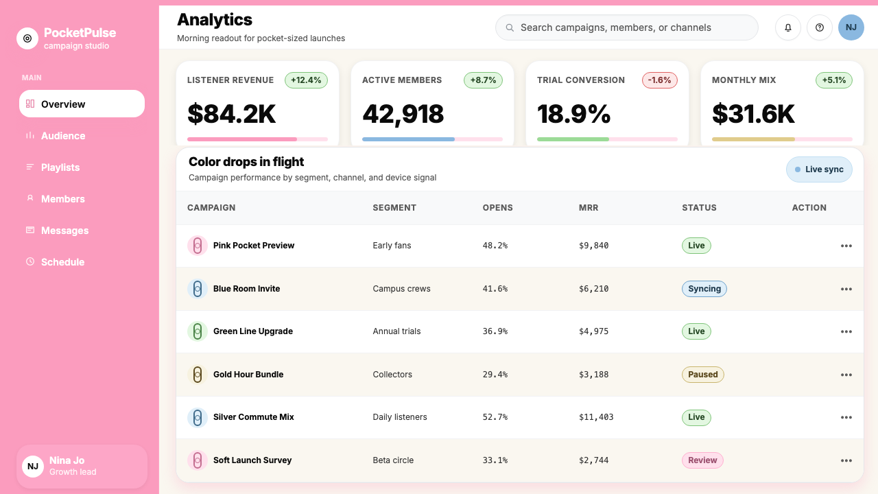
Following the iPod mini's product logic, the system uses color not as decoration but as identity marker. In a multi-product or multi-tier context, each option receives its own anodized hue: pink for one tier, blue for another, silver for a third. This approach gives users an immediate visual handle on differentiation and encourages the same kind of personal identification that made customers choose their iPod mini by color before anything else.遵循iPod mini的产品逻辑,该系统将色彩用作身份标记而非装饰。在多产品或多等级语境中,每个选项获得其专属阳极氧化色调:粉色代表某一等级,蓝色代表另一等级,银色代表第三等级。这种方式给用户提供了即时的视觉辨识手柄,并激发与当年顾客在其他一切考量之前先以颜色选择iPod mini同等的个人认同感。
Soft, Restrained Luminosity柔和克制的光感
Highlights and light effects in the system are soft and directional rather than specular or explosive. A subtle top-edge sheen on a card or button suggests that the surface has been polished without crossing into glossy skeuomorphism. The overall light quality reads as diffuse natural light on a matte metal surface — bright and clean, but never harsh or chrome-like.系统中的高光与光效柔和而具有方向性,而非刺眼或爆发性。卡片或按钮顶边微妙的光泽暗示表面经过打磨,但不越过进入光泽拟物主义的界限。整体光质呈现为哑光金属表面上的漫射自然光——明亮干净,但绝不刺眼或铬金属感。
See the iPod Mini Anodized (2004) design system查看 iPod Mini Anodized (2004) 完整设计系统
Who shaped iPod Mini Anodized (2004)?谁塑造了 iPod Mini Anodized (2004)?
As Apple's Senior Vice President of Industrial Design, Jony Ive led the team that developed the iPod mini's precision-milled aluminum enclosure and chose anodizing as the finishing method. Ive had been pushing aluminum as a premium consumer material since the PowerBook G4 Titanium and earlier; the iPod mini represented the first time his team applied full-spectrum anodized color to a mainstream consumer device at volume. His insistence that color be integral to the material — not painted over it — established the design principle that carried through to the iPhone 5c, the MacBook Air color options, and beyond.作为苹果工业设计高级副总裁,乔纳森·伊夫领导了开发iPod mini精密铣削铝制外壳并选择阳极氧化作为表面处理工艺的团队。早在PowerBook G4钛合金款及更早期,伊夫便一直推动铝材作为高端消费材料的应用;iPod mini是他的团队首次将全色谱阳极氧化色彩规模化应用于主流消费设备。他坚持色彩应融入材料本身而非涂覆其上的原则,这一设计理念延续至iPhone 5c、MacBook Air配色选项及更多产品。
Jobs personally championed the iPod mini concept at a time when the standard iPod was Apple's best-selling product and many within Apple questioned whether a smaller, cheaper variant would cannibalize sales rather than expand the market. His judgment that consumer electronics could function as personal fashion accessories — differentiated by color and size rather than purely by specs — proved correct and opened a design philosophy that Apple has pursued ever since. The launch of the iPod mini at Macworld 2004 was one of Jobs's signature product introductions.在标准款iPod是苹果最畅销产品、苹果内部许多人质疑更小巧廉价的变体是否会蚕食销量而非扩大市场之际,乔布斯亲自力推iPod mini的概念。他关于消费电子产品可以作为个人时尚配件运作——以色彩和尺寸而非纯粹规格来区分——的判断被证明是正确的,并开创了苹果此后一以贯之的设计哲学。2004年Macworld上iPod mini的发布,是乔布斯标志性的产品发布时刻之一。
Known internally as the 'father of the iPod,' Tony Fadell led the hardware engineering team responsible for miniaturizing the iPod platform to fit the mini's smaller chassis. The engineering challenge was substantial: the iPod mini used a 1-inch Hitachi microdrive rather than a standard hard disk, and every component had to be redesigned to the new form factor. Fadell's team made the anodized color strategy viable by ensuring that the aluminum enclosure could be manufactured to tight tolerances at scale — a prerequisite for consistent color across production runs.内部被称为「iPod之父」的托尼·法戴尔领导了负责将iPod平台小型化以适配mini更紧凑机身的硬件工程团队。工程挑战相当艰巨:iPod mini使用了1英寸日立微型硬盘而非标准硬盘,每个组件都必须按照新的外形尺寸重新设计。法戴尔的团队通过确保铝制外壳能够在规模生产中以严格公差制造,使阳极氧化色彩策略成为可行——这是实现生产批次间色彩一致性的先决条件。
Apple's Senior Vice President of Worldwide Marketing, Phil Schiller shaped the communications strategy that made color synonymous with the iPod mini's identity rather than a secondary specification. Under Schiller's direction, Apple's advertising centered the color choice as the primary decision a customer would make — not storage capacity or price, but personality. The silhouette advertising campaign, which had debuted with the original iPod, was extended and inflected with the mini's pastel palette, cementing the association between Apple hardware colors and personal expression that defined the mid-2000s iPod era.苹果全球营销高级副总裁菲尔·席勒塑造了使色彩成为iPod mini身份象征而非次要规格说明的传播策略。在席勒的主导下,苹果的广告将色彩选择定位为消费者首要决策——不是存储容量或价格,而是个性表达。随初代iPod亮相的剪影广告系列得到延伸,并以mini的粉彩色板加以渲染,巩固了苹果硬件色彩与个人表达之间的关联——这一关联定义了2000年代中期的iPod时代。
Though Susan Kare's foundational work on Apple's visual language predates the iPod era — she designed the original Macintosh interface icons and typefaces in the early 1980s — her influence on Apple's approach to friendly, warm, and humanist digital aesthetics is woven into the broader design culture from which the iPod mini's interface emerged. The mini's on-screen menus, with their clean sans-serif labels and generous spacing, owe a cultural debt to Kare's conviction that computers should feel approachable rather than intimidating. She represents the longer thread of Apple human-interface philosophy that the iPod mini's color system extended into hardware.尽管苏珊·卡雷奠基性的苹果视觉语言工作早于iPod时代——她在1980年代初设计了初代Macintosh界面图标与字体——但她对苹果亲切、温暖、人文数字美学方式的影响,深深编织进催生iPod mini界面的更广泛设计文化之中。mini屏幕上的菜单,以其干净的无衬线标签与充裕的间距,在文化上承袭了卡雷关于计算机应令人感到亲近而非望而生畏的信念。她代表了更长的苹果人机界面哲学脉络——iPod mini的色彩系统将这一脉络延伸进了硬件领域。
How do you use iPod Mini Anodized (2004) today?今天怎么用 iPod Mini Anodized (2004)?
The iPod mini Anodized system transfers most naturally to contexts where warmth, personality, and approachability are as important as clarity and hierarchy. It works well where a design needs to feel consumer-grade in the best sense — considered, tactile, and personal — rather than enterprise-neutral or purely utilitarian. The key to applying it correctly is treating the palette as the primary carrier of brand personality, the way Apple treated each iPod mini color as a distinct personality rather than a variant.iPod mini 阳极氧化系统最自然地适用于温暖感、个性化与亲和力和清晰度、层级感同等重要的场景。它在设计需要传递最佳意义上的消费者级别感受——经过推敲的、有触感的、私人化的——而非企业中立或纯粹实用主义的语境中表现出色。正确应用它的关键,是将色板视为品牌个性的主要载体,正如苹果将每种iPod mini配色视为独特个性而非变体的方式。
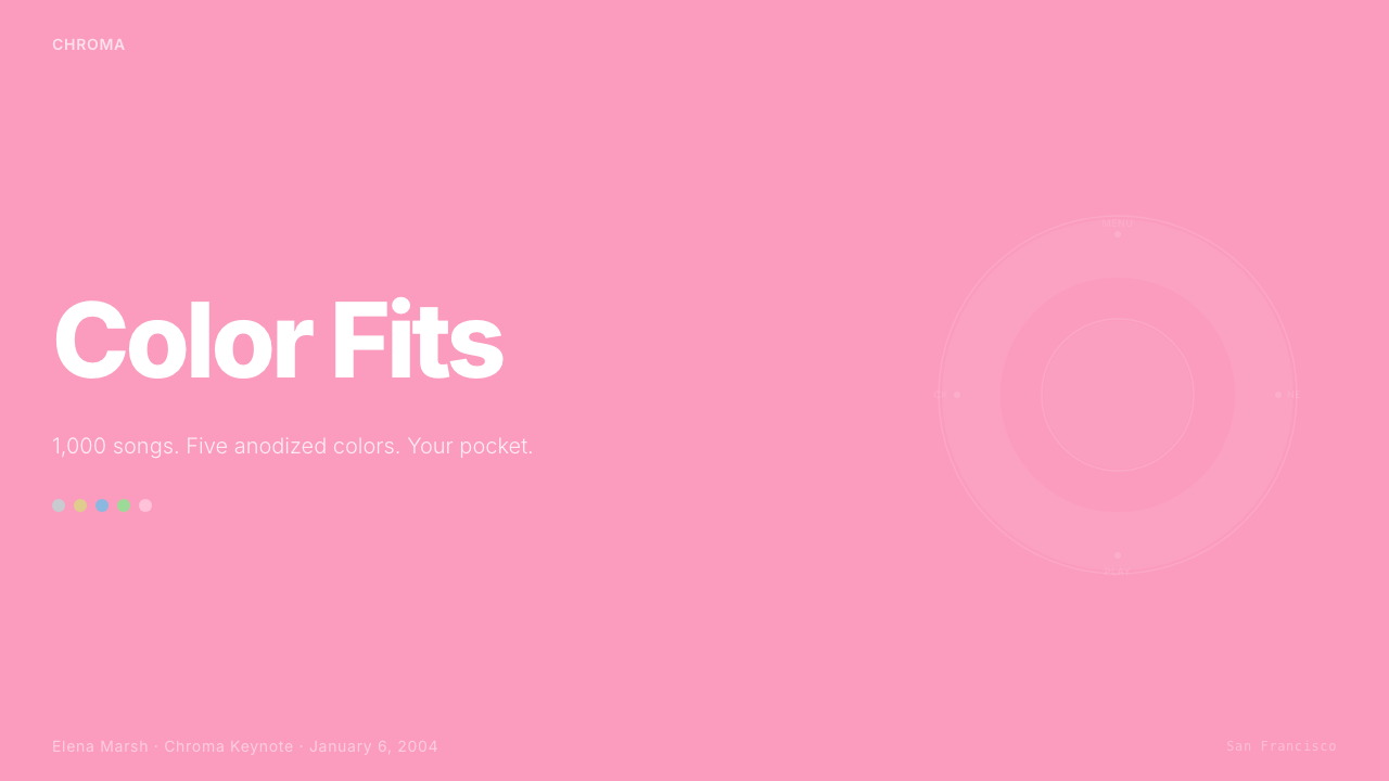
For presentation slides, the system excels on cover pages built around a single dominant anodized hue — a full-bleed pink or blue field with white type, or a white ground with a generous pink or blue geometric block anchoring one quadrant. Content slides should lean heavily on whitespace: one or two content columns with wide margins, section labels in the palette's muted tones, and no decorative borders. Data slides translate the color differentiation logic directly: use the anodized hues to distinguish data series, keeping each series to one consistent color and letting the white background provide the neutral ground against which the colors register clearly.对于演示文稿,该系统在以单一主导阳极氧化色调构建的封面页上表现卓越——满版粉色或蓝色底面配以白色字体,或白色底面上锚定一角的大面积粉色或蓝色几何色块。内容页应大量依赖留白:一至两栏内容配以宽阔页边距,段落标签以色板的柔和色调呈现,无装饰性边框。数据页直接转用色彩差异化逻辑:以阳极氧化色调区分数据系列,每个系列保持一种一致的色彩,让白色背景提供颜色得以清晰呈现的中性底面。
For web interfaces, the system is particularly well-suited to consumer product pages, pricing tiers, and feature comparison sections. The color-as-identity logic maps directly onto tier differentiation: each plan or product receives its own anodized color, making the choice feel personal rather than hierarchical. Dashboards benefit from a predominantly silver-white background with anodized accent colors used for status indicators, progress elements, and primary action buttons. Card components should use the rounded-corner geometry consistently and rely on subtle tonal shifts rather than heavy borders to define their edges.对于网页界面,该系统特别适合消费者产品页面、定价等级与功能对比区块。色彩即身份的逻辑直接映射到等级区分上:每个套餐或产品获得其专属阳极氧化色,使选择感觉私人化而非单纯的高低之分。仪表板受益于以银白为主的背景,阳极氧化强调色用于状态指示器、进度元素与主要操作按钮。卡片组件应统一采用圆角几何,并依赖微妙的色调变化而非厚重边框来界定其轮廓。
For editorial and marketing work, the style supports a warm, magazine-quality aesthetic that reads as premium without being austere. Feature sections alternate between white-ground layouts with a single anodized color as accent and full-color panels where one palette hue fills the background and white type sits above it. Pull quotes and callouts can take the pink or blue field treatment. Marketing emails benefit from the system's natural sense of sectioning: each section block uses either a white ground or one of the soft anodized hues, creating a scannable rhythm without needing visual separators.对于编辑与营销内容,该风格支持温暖的、杂志品质的美学,呈现高端感而不失亲切。特色区块在以单一阳极氧化色作为强调色的白底版面与以一种色板色调填充背景、白色字体置于其上的全色面板之间交替。引述文字与标注可采用粉色或蓝色底面处理。营销邮件受益于该系统天然的分块感:每个内容块使用白色底面或某种柔和阳极氧化色,形成无需视觉分隔线即可扫描的节奏感。
A common mistake when applying this system is pushing the palette toward full saturation. The anodized hues work because they are warm and slightly muted — they carry the quality of light on a real material surface rather than the intensity of a pure color swatch. Increasing saturation in search of vibrancy undermines the tactile, material warmth that makes the system distinctive. Similarly, abandoning the system's commitment to whitespace by filling every available surface with color destroys the breathing room that gives the palette colors their individual weight. Use one dominant hue per composition and let the white field do most of the heavy lifting.应用该系统时最常见的错误是将色板推向全饱和。阳极氧化色调之所以有效,正因为它们温暖而略有收敛——它们承载的是真实材料表面上光线的质感,而非纯色色块的强度。为追求活力而提升饱和度,会破坏使该系统独特的触感与材料温度。同样,放弃系统对留白的承诺、将每处可用表面都填满色彩,会摧毁赋予色板中每种颜色以独立分量的呼吸空间。每个构图中使用一种主导色调,让白色域承担大部分视觉重量。
See the iPod Mini Anodized (2004) design system查看 iPod Mini Anodized (2004) 完整设计系统
iPod Mini Anodized (2004) — FAQiPod Mini Anodized (2004) · 常见问题
How does this system differ from other Apple-derived design systems like the original iMac G3 or iOS 7 flat design?该系统与其他苹果衍生设计系统(如初代iMac G3或iOS 7扁平设计)有何不同?
The iMac G3 system (1998) is defined by translucent candy colors and a playful, slightly retro-futurist energy — the color is literally see-through, implying the technology inside. The iPod mini Anodized system is its opposite: the color is opaque, material, and rooted in a real manufacturing process. iOS 7 flat design (2013) prioritizes pure color at full saturation and the complete elimination of material metaphor — it is resolutely two-dimensional. The iPod mini system, by contrast, retains a quiet material warmth even in digital applications and uses softer, slightly muted tones rather than flat primaries. Think of it as sitting between the warmth of the G3 era and the austerity of flat design.iMac G3系统(1998年)以半透明糖果色和略带复古未来感的活泼气质为特征——色彩字面意义上是透明的,暗示内部的技术。iPod mini阳极氧化系统与之相反:色彩是不透明的、有材料感的,根植于真实的制造工艺。iOS 7扁平设计(2013年)优先采用全饱和纯色,彻底消除材料隐喻——是坚决的二维化。相比之下,iPod mini系统即便在数字应用中也保留了静默的材料温度,使用柔和的、略有收敛的色调而非扁平的原色。可以将它理解为坐落在G3时代的温暖与扁平设计的朴素之间。
Can this system work effectively in dark-mode interfaces?该系统能有效用于深色模式界面吗?
The iPod mini Anodized system is fundamentally a light-ground system — white and near-white fields are structural, not optional. A dark inversion is possible but requires significant adaptation. On a dark background, the anodized pastels tend to lose their material warmth and read instead as slightly washed-out or uncertain — the quality that makes them feel like real aluminum in a light context works against them in darkness. A dark variant works best when the background is a very dark warm neutral rather than pure black, and when the palette is reduced to the most saturated of the anodized hues — typically the blue or pink — with silver used for structural elements and white reserved for primary text.iPod mini阳极氧化系统从根本上是浅色底面系统——白色与近白色域是结构性的,而非可选的。深色反转版本是可能的,但需要大幅改造。在深色背景上,阳极氧化粉彩色调往往失去材料温度,转而呈现为略显失色或不确定的质感——使其在浅色语境中感觉像真实铝材的特质在黑暗中反而成为劣势。深色变体在背景采用极深的温暖中性色(而非纯黑)、色板精简至阳极氧化色调中饱和度最高者(通常是蓝色或粉色)、银色用于结构性元素、白色保留给主要文字时,效果最为理想。
What types of products or brands is this system poorly suited for?该系统不适合哪类产品或品牌?
The system struggles wherever authority, technical rigor, or cultural gravity are the primary desired values. Financial services requiring serious gravitas, legal or medical platforms, industrial B2B tools, luxury goods positioning themselves through restraint and heritage — all of these benefit from color systems with more tonal depth, less warmth, and stronger associations with institutional permanence rather than personal choice. The iPod mini system is optimized for contexts where the user's personal identification with the product is a feature rather than a distraction. When the product needs to recede behind its function rather than invite identification, a different system serves better.在权威感、技术严谨性或文化分量是首要期望价值的场合,该系统会遇到困难。需要严肃庄重感的金融服务、法律或医疗平台、工业B2B工具、通过克制与传承定位自身的奢侈品——所有这些都受益于色调深度更丰富、温暖感更少、与机构永恒性而非个人选择有更强关联的色彩系统。iPod mini系统针对用户与产品的个人认同是一项特性而非干扰的场景进行了优化。当产品需要退隐于其功能之后而非邀请认同时,其他系统更为适合。
How should the system handle more than five product tiers or color options?当产品等级或配色选项超过五种时,该系统应如何处理?
The original iPod mini offered exactly five colors — a number that maps cleanly to five differentiated choices without overwhelming the visual field. When a design context requires more than five tiers, the anodized logic extends through tonal variation within the established hues: light and dark variants of each primary anodized color, or combinations of hue and texture (matte versus polished finishes translated as flat versus lightly shimmering fields). Beyond seven or eight options, the color-as-identity principle begins to break down, and it becomes more effective to use one anchor color per product family with secondary differentiation through typographic or structural variation rather than hue.初代iPod mini恰好提供五种配色——这个数字能够清晰映射到五个有区分度的选择,而不会压垮视觉域。当设计场景需要超过五个等级时,阳极氧化逻辑通过已建立色调内的深浅变化延伸:每种主要阳极氧化色的浅色与深色变体,或色调与质感的组合(哑光与抛光表面处理转化为平涂与轻微闪光的色域)。超过七至八个选项后,色彩即身份的原则开始瓦解,此时更有效的做法是为每个产品系列使用一种锚定色,通过字体或结构变化而非色调来实现次级区分。
Is the rounded-corner requirement strict, or can sharp corners coexist with this system?圆角要求是严格的吗?还是说锐角可以与该系统共存?
The corner radius is one of the system's strongest structural signals, and abandoning it entirely would substantially change the feel of the output. That said, sharp right angles can coexist when used for elements where precision and data density are primary: data tables, specification grids, inline code blocks, and fine-print legal sections. The rule of thumb is that containers which hold content intended to be experienced (narrative text, images, feature descriptions, pricing cards) use the generous rounded corners, while containers that hold data to be read and compared (tables, charts, detailed lists) can use tighter or square corners. This creates a hierarchy of warmth: the experiential layer is soft and rounded, the analytical layer is crisp and exact.圆角是该系统最强烈的结构信号之一,完全放弃它将实质性地改变输出的感受。话虽如此,当用于精确度和数据密度是首要考量的元素时,锐利直角可以共存:数据表格、规格网格、内嵌代码块与细则法律部分。经验法则是:承载用于体验的内容(叙述性文字、图片、功能描述、定价卡片)的容器使用慷慨的圆角,而承载用于阅读和对比的数据(表格、图表、详细列表)的容器可以使用更小或方形的角。这创造了一种温暖的层级:体验层柔和圆润,分析层清晰精确。
Related design styles相关设计风格
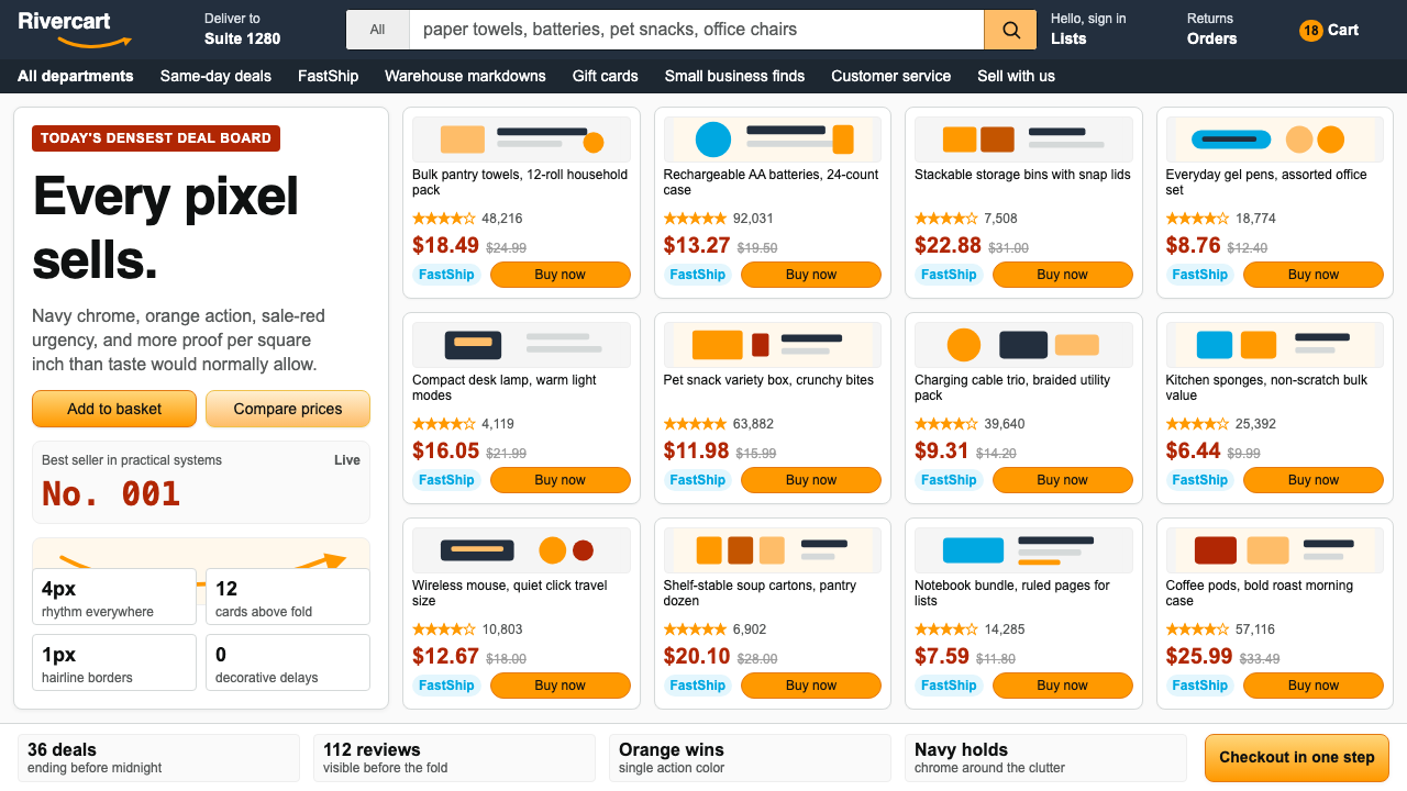 AmazonUgly sells efficiently. Navy chrome, orange buttons, red prices crowd a dense…朴素而高效:深蓝导航、橙色按钮、红价挤满密集网格。
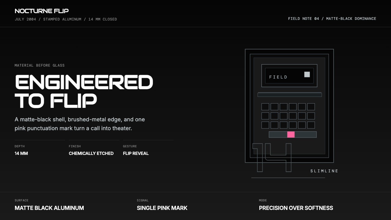 Motorola RAZR Flip (2004)Precision beats glamour. Matte black, brushed steel, and one pink accent.精密胜过炫耀。哑黑金属、拉丝边框与一抹粉色。
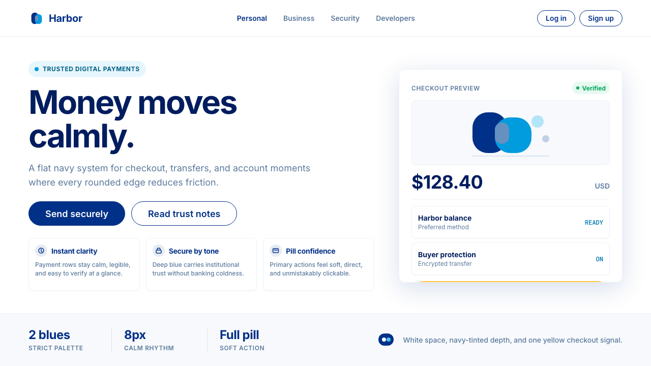 PayPalTrust without coldness. Deep navy, sky cyan, white cards, and pill checkout c…信任却不冰冷:深海军蓝与天青、白卡片和药丸结账提示。
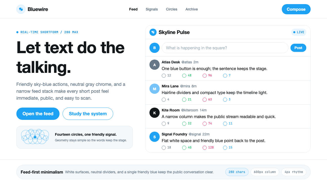 Twitter (Classic Bird)Text takes the stage. Sky blue actions, white feed stack, and hairline divide…文字占据舞台:天蓝动作、白色信息流与细分割线让表达清晰。
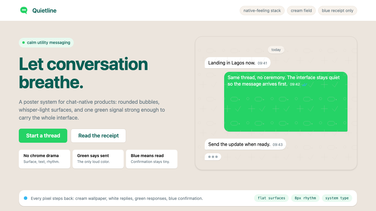 WhatsAppConversation is the interface. Cream wallpaper, green bubbles, and tiny blue…对话就是界面。奶油墙纸、绿色气泡与蓝色小勾让界面退后。
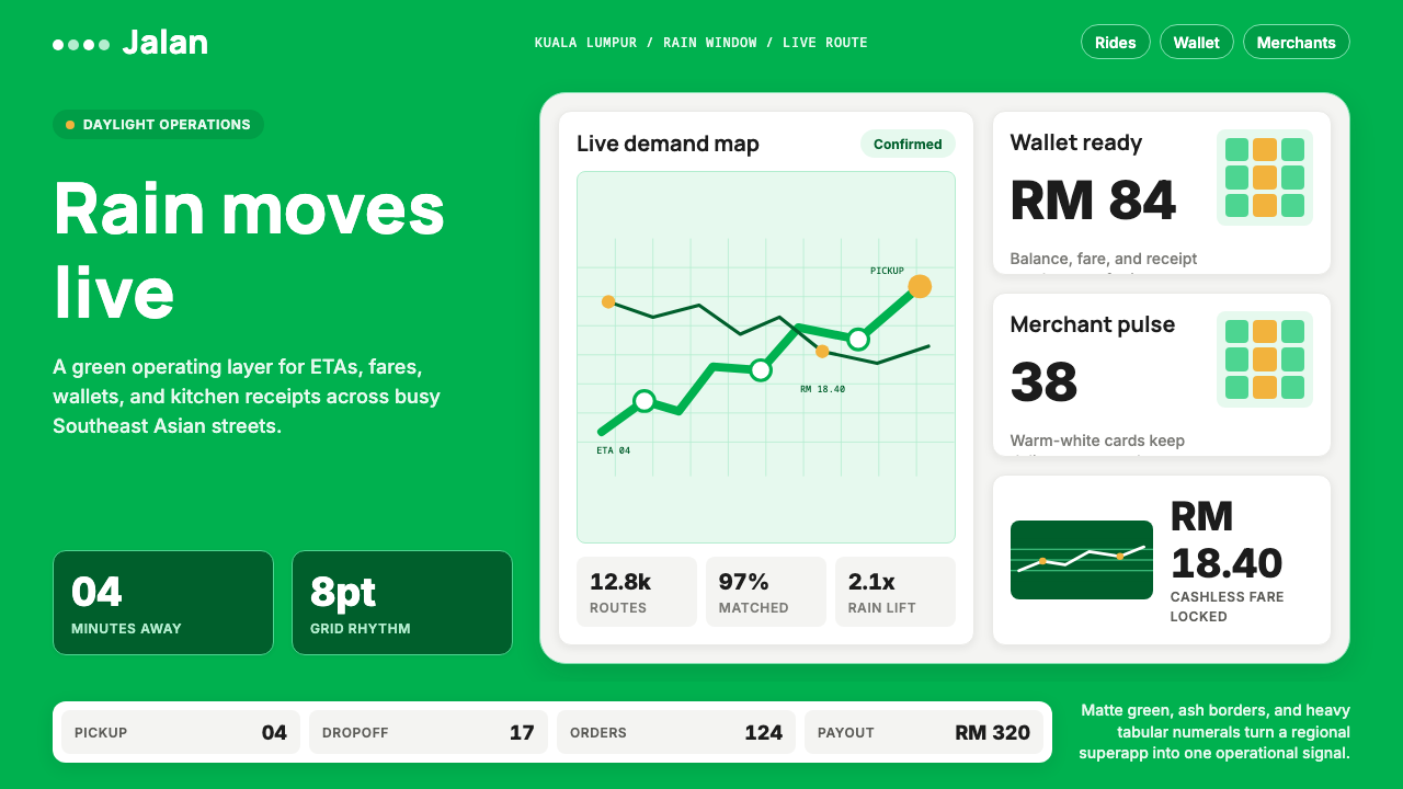 Grab SEA Superapp 2018Operational warmth. Saturated green, Inter numerals, and tight dashboard card…高效而温暖。饱和绿、Inter数字与紧密卡片塑造实时感。