What is Replit 2024?什么是 Replit 2024?
Replit proved that a code editor could feel as warm and inviting as a sketchbook — coral buttons, cream panels, and rounded tiles turned programming into something to look forward to.Replit 证明了代码编辑器可以像画册一样温暖宜人——珊瑚色按钮、奶油面板与圆角卡片,让编程成为一件令人期待的事。
Replit 2024 in briefReplit 2024 速览
Replit 2024 is the visual design language developed by Replit between roughly 2022 and 2024 to position browser-based coding as a creative, welcoming discipline rather than a specialist's technical chore. Its most immediate signals are warmth and approachability: a signature coral-orange accent sits against cream backgrounds, geometric illustrations feel playful rather than clinical, and every interactive surface carries a generous border radius that softens the sharp angles typically associated with developer tools.Replit 2024 是 Replit 在大约 2022 至 2024 年间发展出的视觉设计语言,旨在将浏览器端编程定位为一项有创造力、有温度的活动,而非专家才能胜任的技术苦差。它最直接的信号是温暖与亲和力:标志性的珊瑚橙点缀于奶油色背景之上,几何插画带着玩心而非冷峻,每一个可交互的界面都带有慷慨的圆角,柔化了开发者工具惯有的锐利棱角。
At its core, the system makes a deliberate argument about who programming is for. By replacing the sterile whites and flat grays of conventional IDE aesthetics with warm neutrals and energetic accents, Replit signals that its platform is built for students, hobbyists, and creative builders — not only for professional engineers already comfortable in the terminal. The visual warmth is not incidental; it is the brand's thesis made visible.这套设计语言的核心是一个刻意的主张:编程是为所有人准备的。将传统 IDE 的冷白与平淡灰替换为温暖中性色与充满活力的强调色,Replit 向外界传达出一个清晰信号:这个平台为学生、爱好者与创意构建者而生,而不只是那些早已习惯命令行的职业工程师。视觉上的温暖并非偶然,它是品牌主张的可见化表达。
The style belongs to a broader moment in developer-tool design when products began competing on personality as much as on capability. Where earlier coding environments defaulted to dark themes and minimal color as signals of seriousness, Replit staked out the opposite position: bright, rounded, and friendly. Alongside the coral-and-cream palette, bold headline typography and oversized call-to-action buttons convey a single message — start building now, the environment is ready for you.这种风格属于开发者工具设计的一个更宏观的转折时刻——产品开始在个性与能力上同台竞争。当早期编程环境以深色主题和最少色彩作为「专业」信号时,Replit 选择了截然相反的立场:明亮、圆润、友好。珊瑚与奶油的色调搭配、粗体标题排版和超大号行动按钮共同传递出一条信息——现在就开始构建,这个环境随时为你准备好了。
Where does Replit 2024 come from?Replit 2024 从何而来?
Replit was founded in 2016 by brothers Amjad Masad and Faris Masad with a mission to make programming more accessible. The product launched as a browser-based read-eval-print loop — a place where anyone with a web browser could type code and see it run immediately, without installing anything. For its first years, the visual identity was functional but unremarkable: clean interface conventions borrowed from the developer-tool world, neutral palettes, and modest typography. The platform's differentiation was technical, not aesthetic.Replit 由 Amjad Masad 与 Faris Masad 兄弟于 2016 年创立,使命是让编程更易触达。产品以浏览器端 REPL(读取-求值-打印循环)形式推出,任何拥有网络浏览器的人都可以直接输入代码并立即看到运行结果,无需安装任何软件。在最初几年里,Replit 的视觉形象实用而普通:沿用了开发者工具领域的通行界面规范,中性色调,朴素排版。产品的差异化是技术层面的,而非美学层面的。
The shift toward a distinct visual identity accelerated around 2022, as Replit moved to reframe itself not merely as a coding utility but as a creative platform — a destination for the next generation of builders. The Replit brand team, working in San Francisco, developed a new visual system built around warmth and approachability. Coral-orange emerged as the signature accent: energetic enough to signal possibility, warm enough to avoid the aggressive neon tones associated with gaming or cryptocurrency brands. Cream replaced pure white as the default background tone, lending surfaces a softness that pure white cannot achieve.走向独特视觉身份的转变在 2022 年前后加速。彼时,Replit 开始将自身重新定位——不仅仅是一款编程工具,而是一个创意平台,一个为下一代构建者准备的目的地。总部位于旧金山的 Replit 品牌团队开发了一套以温暖与亲和力为核心的新视觉系统。珊瑚橙作为标志性强调色浮现:充满活力,足以传递可能性的信号;又足够温暖,避免了游戏或加密货币品牌惯用的那种攻击性霓虹色调。奶油色取代纯白成为默认背景基调,赋予界面表面一种纯白无法实现的柔软质感。
The choice of rounded geometry throughout the interface — in buttons, cards, code-block containers, and illustration style — reflected a deliberate distance from the rectilinear severity of traditional terminals and IDEs. Roundness in interface design carries cultural associations with friendliness and safety; Replit deployed it consistently across every scale, from the corner radius of a primary button to the overall silhouettes of its mascot and illustration system. The effect was a product that looked and felt categorically different from every other tool in the developer space.界面上无处不在的圆角几何——按钮、卡片、代码块容器、插画风格——反映了对传统终端和 IDE 直角严肃感的刻意疏离。界面设计中的圆润造型在文化上承载着友好与安全的联想;Replit 在每一个尺度上都一以贯之地运用它:从主按钮的圆角半径到吉祥物与插画系统的整体轮廓。最终效果是一款在视觉感受上与开发者工具领域所有其他产品判然有别的产品。
The 2022–2024 era also coincided with Replit's major push into artificial intelligence, as AI-augmented coding became a central product offering. The visual language had to accommodate a new kind of interaction — conversational, generative, and less predictable than classical code execution. The warm, approachable aesthetic proved well-suited to this expansion: a system that already felt like a creative partner rather than a utility was better positioned to introduce AI as a collaborator than one that felt like a cold technical instrument. The Replit brand team's decisions from 2022 onward gave the product's AI ambitions a visual home.2022 至 2024 年间也正值 Replit 大力推进人工智能整合的时期,AI 增强编程成为核心产品功能。视觉语言需要容纳一种新型交互方式——对话式的、生成式的,比传统代码执行更难以预测。温暖亲切的美学恰好适应了这一扩展:一套已经让人感觉像创意伙伴而非工具的设计系统,比冰冷的技术仪器更有能力将 AI 引介为协作者。Replit 品牌团队自 2022 年起的决策,为产品的 AI 雄心提供了一个视觉容器。
What defines the Replit 2024 look?Replit 2024 的视觉特征是什么?
Coral-Orange Accent珊瑚橙强调色
The coral-orange accent is the system's most recognizable element — a hue that sits between a warm red and a muted orange, carrying energy without aggression. It appears on primary buttons, active states, hover highlights, and key illustrative elements. The color was chosen to feel distinct from both the cold blues of enterprise software and the harsh neons of gaming or crypto aesthetics. Used at full saturation only for the most important interactive elements, it recedes to tinted backgrounds or outline treatments for secondary contexts, maintaining hierarchy without visual fatigue.珊瑚橙是这套系统最具辨识度的元素——一种介于暖红与哑橙之间的色相,充满活力而不显攻击性。它出现在主要按钮、激活状态、悬停高亮和关键插画元素上。这种颜色的选择有意区别于企业软件的冷蓝和游戏或加密品牌的刺眼霓虹。仅在最重要的交互元素上以全饱和度使用,在次级场景中则退为色调背景或描边处理,在维持层级感的同时避免视觉疲劳。
Cream Ground奶油色底面
Rather than the pure white standard of most developer tools, Replit 2024 grounds nearly all surfaces in a warm off-white — a cream tone that reads as welcoming rather than clinical. The shift is subtle but perceptible: cream softens high-contrast elements by reducing the stark brightness of the overall field, and it gives coral accents a warmer visual context to inhabit. Dark text on cream avoids the harshness of black-on-white while maintaining legibility. The background tone acts as a unifying layer that holds the entire system together without calling attention to itself.有别于大多数开发者工具沿用的纯白,Replit 2024 将几乎所有界面铺设于温暖的近白色——一种奶油色调,令人感到温馨而非冷峻。这一转变细微却可感知:奶油色通过降低整体视野的刺眼亮度来柔化高对比元素,并为珊瑚强调色提供了更温暖的视觉语境。深色文字在奶油底面上既避免了黑白对比的生硬感,又保持了清晰可读性。这一背景基调作为统一层,将整套系统凝聚在一起,而不喧宾夺主。
Generous Rounded Corners慷慨的圆角
Every container surface in the system — buttons, cards, input fields, code-tile panels, modal dialogs — carries a pronounced border radius that transforms otherwise rectangular components into softened, approachable shapes. The degree of rounding is deliberately more generous than the subtle rounding seen in most contemporary design systems, landing closer to the pill-shaped end of the spectrum on smaller elements. This pervasive roundness is the clearest visual signal of the brand's personality: it communicates safety and playfulness at every point of interaction, countering the expectation that developer tools must feel sharp and utilitarian.系统中的每一个容器表面——按钮、卡片、输入框、代码块面板、模态对话框——都带有明显的圆角,将本来的矩形组件转化为柔和、亲切的形态。这种圆角幅度刻意比大多数当代设计系统的微妙圆角更为慷慨,在较小元素上接近椭圆形的极端。这种无处不在的圆润感是品牌个性最清晰的视觉信号:它在每一个交互节点上传递出安全感与玩心,对抗了「开发者工具必须感觉锋利实用」的固有预期。
Bold Geometric Illustrations粗体几何插画
The illustration system uses flat geometric forms, strong outlines, and a limited palette drawn from the core color set. Characters and scenes are simplified to their most legible shapes — there is no photorealistic shading, no complex perspective, and no fine detail that would make the imagery feel labored. Figures are rounded, expressive, and diverse. The style shares ancestry with mid-century editorial illustration while remaining firmly contemporary in its flatness and color confidence. Illustrations appear at onboarding, in empty states, and in marketing contexts where the brand needs to communicate energy and possibility without relying solely on typography.插画系统使用平面几何形态、强烈轮廓线和从核心色彩集取样的有限调色板。人物与场景被简化至最易辨识的形态——没有照片级光影、没有复杂透视、没有令画面显得刻意劳苦的精细细节。形象圆润、富有表现力且多元。这种风格与二十世纪中期编辑插画同宗,同时又凭借其平面性与色彩自信保持鲜明当代感。插画出现在引导流程、空状态以及品牌需要传递活力与可能性、而不完全依赖排版的营销场合。
Heavyweight Display Typography重磅展示字体
Headlines and hero text in the Replit 2024 system are set at aggressive weights — thick, confident strokes that command the page without requiring color or decoration to assert hierarchy. The typeface choice favors modern geometric sans-serifs whose letterforms are neutral enough to recede behind the content message while bold enough to anchor large compositions. The contrast between oversized display text and compact body copy creates immediate visual hierarchy. Calls to action are treated as small-scale display elements in their own right, given enough weight to feel like buttons even before their container shape is processed.在 Replit 2024 系统中,标题与大标语以大胆的字重排版——粗壮、自信的笔画主宰页面,无需依靠色彩或装饰来建立层级。字体选用现代几何无衬线体,字形中性到足以退居内容信息之后,又足够粗重以锚定大型构图。超大展示文字与紧凑正文之间的对比制造出即时的视觉层级。行动号召文字被作为小尺寸展示元素对待,赋予足够的字重,让人在尚未处理容器形态之前就感受到按钮的质感。
Layered Depth Without Harsh Shadow无硬阴影的层叠纵深感
Unlike the hard-edge, offset shadows associated with neobrutalist design, or the imperceptible micro-shadows of flat material design, Replit 2024 uses a medium-depth shadow vocabulary that gives cards and panels a sense of gentle elevation. Shadows are soft and diffuse rather than geometric, suggesting that surfaces float slightly above the cream ground without aggressively breaking the two-dimensional plane. The effect creates a comfortable sense of layering — foreground cards, mid-tier panels, background fields — that guides the eye through information hierarchy without resorting to hard borders or color changes alone.与新野蛮主义的硬边偏移阴影或扁平材料设计的微弱阴影不同,Replit 2024 使用中等深度的阴影词汇,赋予卡片与面板一种轻柔的悬浮感。阴影柔和而漫射,而非几何化,暗示表面轻轻浮于奶油底面之上,而不强硬地打破二维平面。这种效果营造出舒适的层叠感——前景卡片、中层面板、背景底面——引导视线穿越信息层级,而无需仅依靠硬边框或颜色变化。
Playful Brand Voice in Motion动态中的玩心品牌语调
Interaction states — hover, focus, press, loading — are treated with a lightness that distinguishes the system from utilitarian tooling. Transitions are quick and springy rather than slow and linear, suggesting that the interface responds with personality rather than mechanically. Loading states use illustration or motion rather than bare spinners. Empty states are opportunities to communicate encouragement rather than simply reporting absence. This animated dimension of the design language extends the warmth of the static visual system into behavior, ensuring that the brand personality is felt across the entire experience arc, not only in first-impression marketing surfaces.交互状态——悬停、聚焦、按压、加载——以一种轻盈感处理,将这套系统与纯功能性工具区别开来。过渡动画快捷而富有弹性,而非缓慢线性,暗示界面以个性而非机械地响应用户。加载状态使用插画或动效,而非光秃秃的转圈图标。空状态被当作传递鼓励的机会,而非仅仅报告内容缺席。设计语言的这一动态维度将静态视觉系统的温暖延伸至行为层面,确保品牌个性在整个体验弧线中都能被感知,而不只存在于第一印象的营销表面。
Who shaped Replit 2024?谁塑造了 Replit 2024?
Amjad Masad co-founded Replit and has served as its chief executive, providing the strategic direction that transformed the platform from a browser-based REPL into a full creative coding environment. His public advocacy for democratizing programming — the idea that coding should be as accessible as writing or drawing — directly shaped the brief that the Replit brand team translated into the 2022–2024 visual identity. His emphasis on welcoming newcomers and making the first experience feel non-threatening gave the design team permission to depart radically from developer-tool conventions.Amjad Masad 是 Replit 的联合创始人兼首席执行官,他提供的战略方向将平台从浏览器端 REPL 转型为完整的创意编程环境。他公开倡导的编程民主化理念——编程应该像写作或绘画一样易于触达——直接塑造了 Replit 品牌团队将其转化为 2022 至 2024 年视觉形象的核心命题。他对欢迎新手、让初次体验毫无威胁感的强调,给了设计团队从开发者工具惯例中彻底出走的许可。
Faris Masad co-founded Replit alongside his brother and contributed to the early technical architecture that made instant, shareable coding environments feasible in the browser. The technical achievement of running real programming environments entirely in-browser — without local installation — is the product reality that the visual design system had to support and communicate. The accessible, no-friction promise of the brand owes as much to Faris's foundational engineering decisions as to any purely visual choice.Faris Masad 与其兄弟共同创立了 Replit,并为早期技术架构做出贡献,正是这套架构使即时可分享的浏览器端编程环境成为可能。在浏览器中完整运行编程环境、无需本地安装的技术成就,是视觉设计系统必须承载并传达的产品现实。品牌所承诺的那种易触达、零摩擦感,与 Faris 的基础工程决策密不可分,并不亚于任何纯粹的视觉选择。
The in-house brand and design team based in San Francisco executed the 2022–2024 visual identity, translating the company's mission into a coherent design system. Their work involved developing the coral-orange and cream palette, establishing the rounded-component language, commissioning and systematizing the illustration style, and extending the identity across product, marketing, social media, and physical merchandise. The team's achievement was producing a system that reads as playful without becoming juvenile, and warm without sacrificing the functional clarity that a productivity tool requires.总部位于旧金山的内部品牌与设计团队执行了 2022 至 2024 年的视觉形象工作,将公司使命转化为一套连贯的设计系统。他们的工作包括:开发珊瑚橙与奶油色调色板,建立圆角组件语言,委托并系统化插画风格,以及将视觉形象延伸至产品、营销、社交媒体和实体周边。这个团队的成就在于打造出一套读起来充满玩心却不幼稚、温暖却不牺牲生产力工具所需功能清晰度的设计系统。
Replit's visual identity did not emerge in isolation but as part of a broader cultural shift in how coding environments are conceived. Platforms like Glitch, CodeSandbox, and StackBlitz were simultaneously working to make browser-based development mainstream, each developing distinct visual personalities to distinguish themselves from traditional desktop IDEs. This competitive landscape accelerated the need for Replit to establish a strong aesthetic identity — one recognizable enough to build brand loyalty among an audience that had many technically comparable alternatives available.Replit 的视觉形象并非凭空产生,而是作为编程环境构想方式更宏观文化转变的组成部分而出现。Glitch、CodeSandbox 和 StackBlitz 等平台同时也在努力使基于浏览器的开发成为主流,各自发展出鲜明的视觉个性,以区别于传统桌面 IDE。这一竞争格局加速了 Replit 建立强烈美学身份的需求——这一身份必须足够有辨识度,能在拥有众多技术上旗鼓相当的替代品的用户群中建立品牌忠诚。
How do you use Replit 2024 today?今天怎么用 Replit 2024?
Replit 2024 is a style well-suited to any context where warmth, accessibility, and creative energy need to coexist with technical seriousness. Applying it correctly means committing to the full logic of the system — the coral accent works because it sits against cream, not white; the roundness works because it is consistent, not applied selectively; the typographic boldness works because it contrasts with compact, disciplined body text. Picking individual elements in isolation tends to produce work that reads as vaguely friendly without any of the system's actual persuasive force.Replit 2024 非常适合那些温暖感、易触达性与创意活力需要与技术严肃性共存的场景。正确应用它意味着承诺执行整套系统的逻辑——珊瑚强调色之所以有效,是因为它置于奶油底而非纯白底;圆角之所以有效,是因为它是一贯的,而非选择性应用;字体粗重之所以有效,是因为它与紧凑、克制的正文形成对比。孤立地挑选单一元素,往往只能产出一种模糊的友好感,而缺乏整套系统真正的说服力。
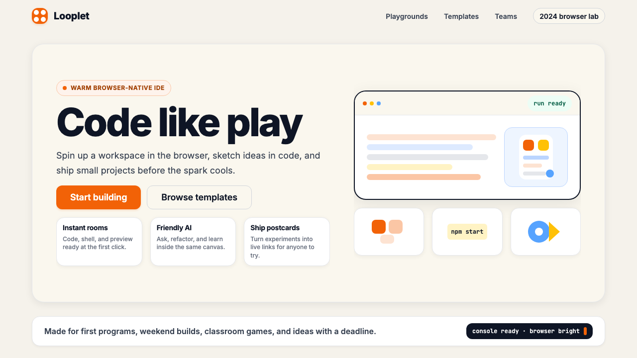
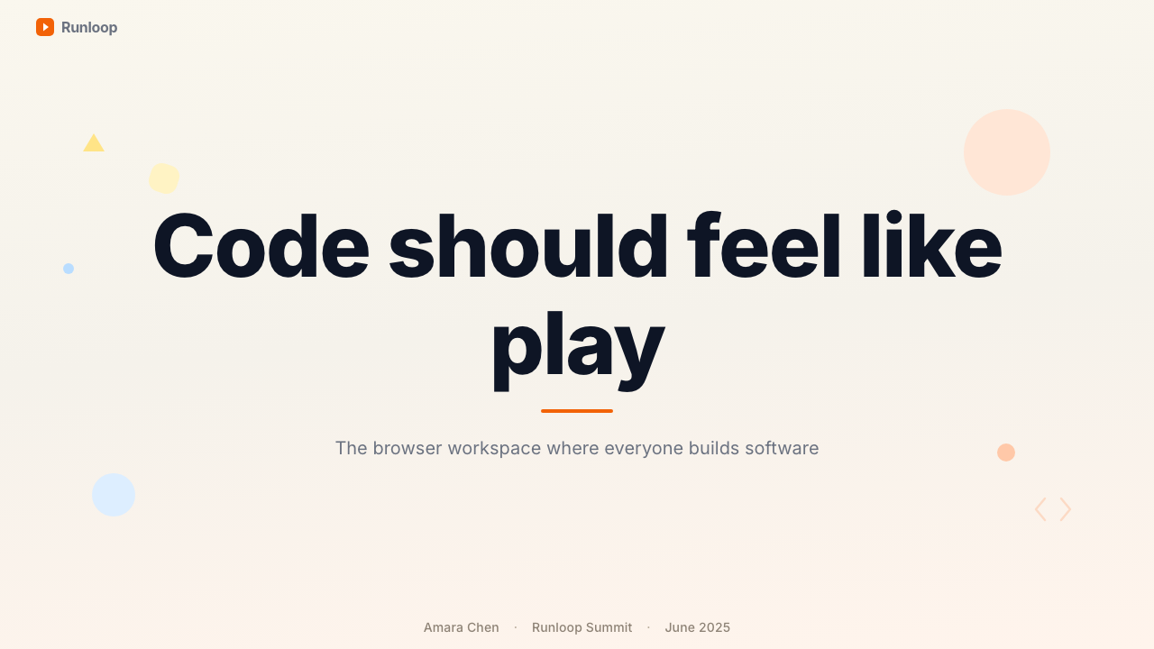
For presentation decks, the style excels on both cover and section-opener slides. A cover built in this language leads with a bold, slightly oversized headline in a heavy weight, positioned against a cream field with the coral accent used for a single word, underline, or geometric shape that gives the composition an anchor. Content slides should maintain the rounded-card metaphor — key points live in softly elevated containers rather than bullet lists, and data visualizations adopt the coral-and-cream palette for chart fills while keeping axis labels and annotations in a dark, restrained tone. The result is a deck that feels energetic and inviting, appropriate for product launches, educational platforms, and creative-industry pitches.对于演示文稿,这种风格在封面和章节开篇幻灯片上都表现出色。以这套语言构建的封面,以大胆、略微超大号的粗体标题为主,置于奶油色底面上,珊瑚强调色仅用于一个单词、下划线或几何形态,为构图提供锚点。内容幻灯片应保持圆角卡片的隐喻——关键内容存放在轻柔悬浮的容器中,而非列表项,数据可视化采用珊瑚与奶油调色板填充图表,同时保持坐标轴标签与注释的深色克制感。最终效果是一套充满活力而令人愉悦的演示文稿,适合产品发布、教育平台和创意行业提案。
For web interfaces, the Replit 2024 vocabulary is particularly effective on landing pages, pricing tables, and onboarding flows. A pricing page benefits from the coral accent on the recommended tier's call-to-action button, cream backgrounds for card bodies, and bold typographic weight differentials to separate tier names from feature lists. Dashboard interfaces should adopt the layered-depth card system, grouping related metrics into rounded panels that sit visually above the background field. Navigation can use the brand's typographic confidence — wordmarks and section labels in heavy weight — without heavy icon use.对于网页界面,Replit 2024 的视觉词汇在落地页、定价表和引导流程上尤为有效。定价页面可让珊瑚强调色用于推荐档位的行动号召按钮,卡片主体使用奶油背景,以粗体字重差异区分档位名称与功能列表。仪表板界面应采用层叠纵深卡片系统,将相关指标分组置入圆角面板,使其在视觉上悬浮于背景底面之上。导航可以充分运用品牌的字体自信——以粗字重排布文字标识与分区标签——而不过度依赖图标。
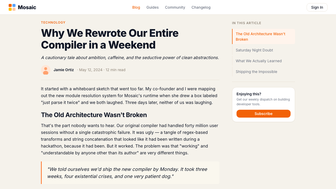
For editorial and marketing contexts, the style's illustrative warmth is its strongest asset. Marketing pages and social media graphics can lean into the geometric illustration system to communicate energy and diversity without relying solely on photography. An editorial article layout in this system would feature an expressive illustrated header, a readable body text column at a comfortable measure, and pull-quotes set in a coral-tinted rounded card that echoes the product's interface language. Email templates using this style work best with a cream background, a single coral call-to-action button, and illustration used sparingly at the header rather than throughout.对于编辑与营销场合,这套风格的插画温暖感是其最强资产。营销页面和社交媒体图形可以充分借助几何插画系统传递活力与多元感,而无需完全依赖摄影。以这套系统排版的编辑文章,应以富有表现力的插画标题图领起,以舒适行宽的正文栏保持可读性,并以珊瑚色调的圆角卡片呈现拉出引言,呼应产品界面语言。使用该风格的电子邮件模板,以奶油背景、单一珊瑚行动号召按钮为最佳,插画仅在页眉处点睛使用,而非贯穿全篇。
A common mistake when applying this style is treating the coral accent as a background color rather than an accent. When coral fills large background areas, it becomes overwhelming, and the warmth that makes it effective at small scale turns oppressive at large scale. A second frequent error is applying roundness inconsistently — if some components use generous corner radii and others use sharp corners, the friendliness signal breaks down and the design reads as unresolved rather than deliberate. The style also resists dark mode implementation without careful rethinking: simply inverting cream to dark and coral to its dark-mode equivalent tends to lose the warmth that justifies using this style in the first place.应用这种风格时最常见的错误,是把珊瑚强调色当作背景色使用而非点缀色。当珊瑚填满大面积背景区域时,它会变得令人窒息——在小尺度上使其有效的那种温暖感,在大尺度上会变为压迫感。第二个常见错误是不一致地应用圆角——若部分组件使用慷慨圆角,而其他组件保持锐利直角,友好信号便会瓦解,设计读起来是不成熟的而非刻意为之的。这种风格也抗拒在不经过仔细重新设计的情况下实现深色模式:简单地将奶油色反转为深色、珊瑚色反转为其深色模式等价色,往往会失去首先选择这种风格的那种温暖感。
Replit 2024 — FAQReplit 2024 · 常见问题
How does Replit 2024 differ from other friendly developer-tool aesthetics like Glitch or CodeSandbox?Replit 2024 与 Glitch 或 CodeSandbox 等其他友好型开发工具美学有何不同?
Each of these platforms pursued approachability but made different aesthetic choices to get there. Glitch leaned into a hand-drawn, DIY character — its fish mascot and rough-edged illustrations suggest a maker community with intentional imperfection. CodeSandbox is considerably more neutral, using a modern flat system that reads as competent and professional without strong personality. Replit 2024 occupies a middle position: it has the warmth of Glitch without the scrappiness, and the polish of CodeSandbox without the personality deficit. The coral-and-cream palette is the most distinctive specific choice, giving Replit a recognizable color identity that its competitors lack.这些平台都追求亲和力,但选择了不同的美学路径。Glitch 倾向于手绘、DIY 气质——其鱼形吉祥物与粗糙边缘插画暗示了一个有意保留不完美感的创客社区。CodeSandbox 则相当中性,使用一套现代扁平系统,读起来称职专业,却缺乏强烈个性。Replit 2024 占据中间位置:拥有 Glitch 的温暖感却不草率,拥有 CodeSandbox 的精致感却不失个性。珊瑚与奶油调色板是最具辨识度的具体选择,赋予了 Replit 其竞争对手所缺乏的可识别色彩身份。
Is this style appropriate for a B2B SaaS product, or is it too playful?这种风格适用于 B2B SaaS 产品吗,还是太过活泼?
The Replit 2024 style is most naturally at home in developer tools, education platforms, creative software, and consumer-facing tech products where personality is a differentiator. For traditional B2B SaaS — enterprise security, financial compliance tools, HR systems — the warmth and roundness can feel misaligned with the seriousness buyers expect. That said, a B2B product targeting younger technical users or positioning itself against legacy enterprise stodginess might find the style's approachability a genuine competitive advantage. The key question is whether warmth and accessibility align with the specific purchase decision being made.Replit 2024 风格最自然地适合开发者工具、教育平台、创意软件,以及个性是差异化因素的面向消费者科技产品。对于传统 B2B SaaS——企业安全、金融合规工具、人力资源系统——这种温暖感与圆润感可能与买家期待的严肃性显得格格不入。话虽如此,一款面向较年轻技术用户、或将自身定位为对抗传统企业沉闷感的 B2B 产品,或许能将这种风格的亲和力转化为真正的竞争优势。关键问题在于:温暖与易触达性是否与正在做出的具体采购决策相契合。
Can this style work well in dark mode?这种风格能在深色模式下表现良好吗?
Dark mode implementation is the system's most challenging adaptation. The warmth of the Replit 2024 identity comes substantially from the cream background — swap that for a dark ground and the primary signal of the brand shifts. A successful dark-mode variant requires finding a background tone that reads as warm despite being dark — deep charcoal with a slight warm undertone rather than a neutral or cool-leaning dark. The coral accent needs careful calibration at reduced brightness; at full saturation on a dark field it can appear garish. The roundness and illustrative style translate well to dark, since they are structural rather than color-dependent. Dark mode is possible but requires treating it as a full design exercise rather than a color inversion.深色模式是这套系统最具挑战性的适配。Replit 2024 视觉形象的温暖感很大程度上来源于奶油底面——一旦将其替换为深色底面,品牌的首要信号便发生偏移。成功的深色模式变体需要找到一种尽管深色却读起来温暖的背景基调——带有轻微暖色底调的深炭灰,而非中性或偏冷的深色。珊瑚强调色需要在降低亮度时仔细校准;在深色底面上以全饱和度呈现可能显得俗艳。圆角与插画风格对深色模式的适配性良好,因为它们是结构性的,而非依赖颜色的。深色模式是可行的,但需要将其作为完整的设计课题来对待,而非简单的颜色反转。
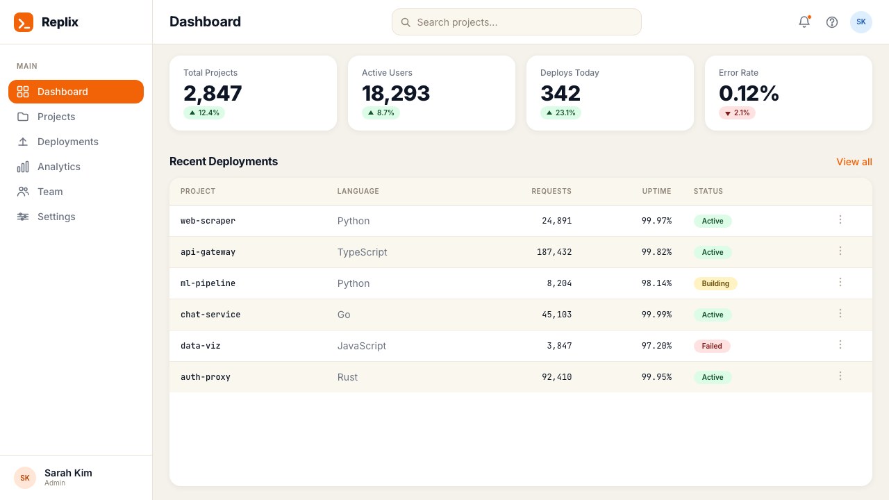
How does this style handle data-heavy interfaces like analytics dashboards?这种风格如何处理分析仪表板等数据密集型界面?
Data-heavy interfaces are where the style's layered-depth card system does its most important work. The rounded panel vocabulary creates natural groupings for metric clusters, and the cream background provides a neutral field that does not compete with the data itself for visual attention. The coral accent should be reserved for the most critical metric or the most important threshold indicator — using it sparingly in a dense data context preserves its signal value. Supporting colors in charts should be warm and desaturated relatives of the core palette rather than a full rainbow of independent hues. Typography hierarchy matters especially here: a large, bold headline figure paired with a small, quiet label reads as a unit even without a containing box.数据密集型界面是这套风格的层叠纵深卡片系统发挥最重要作用的地方。圆角面板词汇为指标集群创造了自然的分组,奶油背景提供了一个中性底面,不与数据本身争夺视觉注意力。珊瑚强调色应保留给最关键的指标或最重要的阈值指示器——在密集数据场景中克制使用,才能保持其信号价值。图表中的辅助色应是核心调色板的温暖低饱和变体,而非一整套彩虹色。字体层级在这里尤为重要:一个大而粗体的数字标题与一个小而安静的标签配对,即使没有包含框,也能作为一个整体被读取。
Does Replit 2024 suit print or physical applications, or is it fundamentally a screen style?Replit 2024 适合印刷或实体应用吗,还是它本质上是一种屏幕风格?
The style translates well to print and physical applications, though some adaptations are necessary. The cream ground works beautifully in print — on uncoated stock it gains additional warmth from the paper's natural tone. The coral accent reproduces cleanly in four-color offset or digital printing. The bold typographic weight differentials that define the hierarchy system are equally effective on paper. Where the style loses something in print is in its interactive and motion dimensions: the springy transitions, hover states, and animated empty states are purely digital. Physical merchandise — tote bags, notebooks, stickers — has successfully carried Replit's visual language by leaning into the illustration system and the strong accent color, since these are the most media-independent elements of the brand.这种风格可以良好地转化为印刷和实体应用,但需要一些适配。奶油底面在印刷中效果出色——在非涂布纸上,它能从纸张本身的自然色调中获得额外的温暖感。珊瑚强调色在四色胶印或数字印刷中能清晰再现。定义层级系统的粗体字重差异在纸面上同样有效。这种风格在印刷中失去的是其交互与动态维度:弹性过渡、悬停状态和动画空状态是纯数字的。实体周边——帆布袋、笔记本、贴纸——通过侧重插画系统和强烈强调色成功承载了 Replit 的视觉语言,因为这些是品牌中媒介无关性最强的元素。
Related design styles相关设计风格
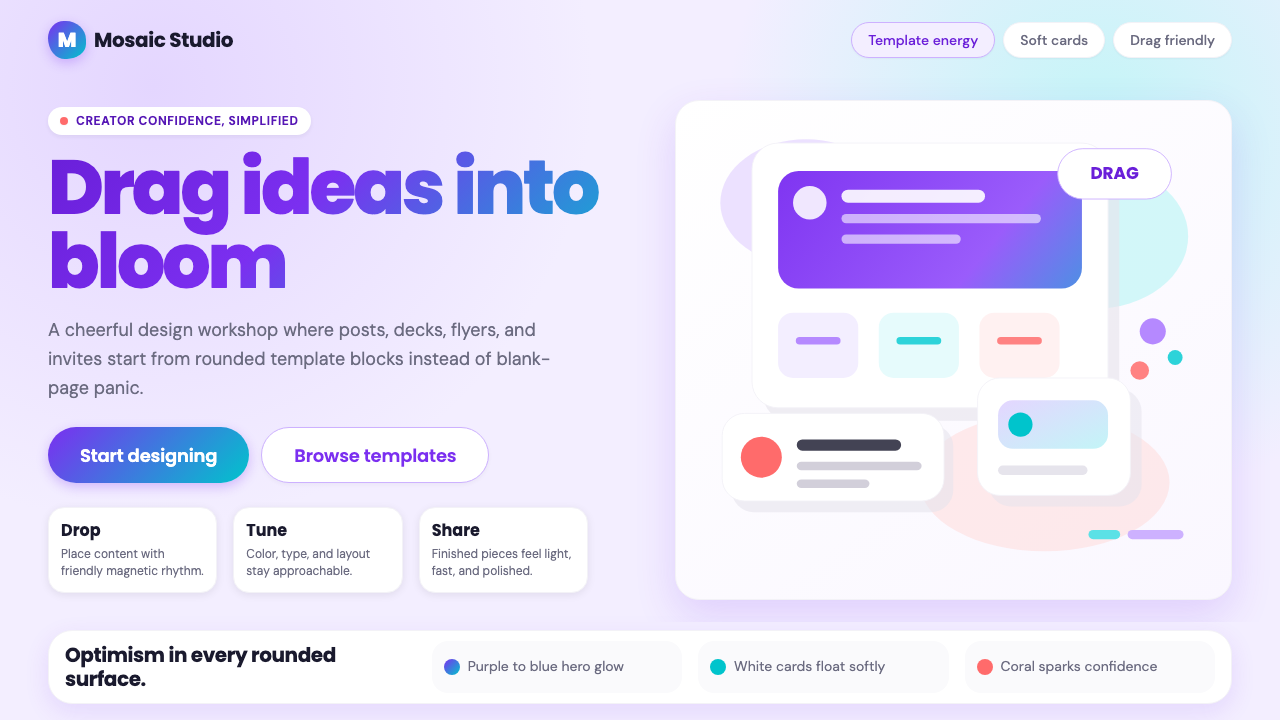 Canva 2024Confidence feels draggable. Purple-blue gradients and floating white template…信心可拖拽:紫蓝渐变与漂浮白卡,让创作变柔和。
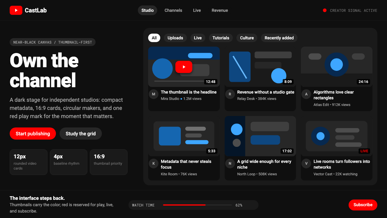 YouTube Creator EconomyThe UI disappears. Near-black Roboto grids let thumbnails shout; red only mea…界面退后:近黑Roboto网格让缩略图发声,红色只为播放。
 Adobe Creative CloudUnified, not uniform. Red anchor, white space, and saturated app tiles organi…统一而不单一:红色锚点、留白与高饱和应用方块组织整套工具。
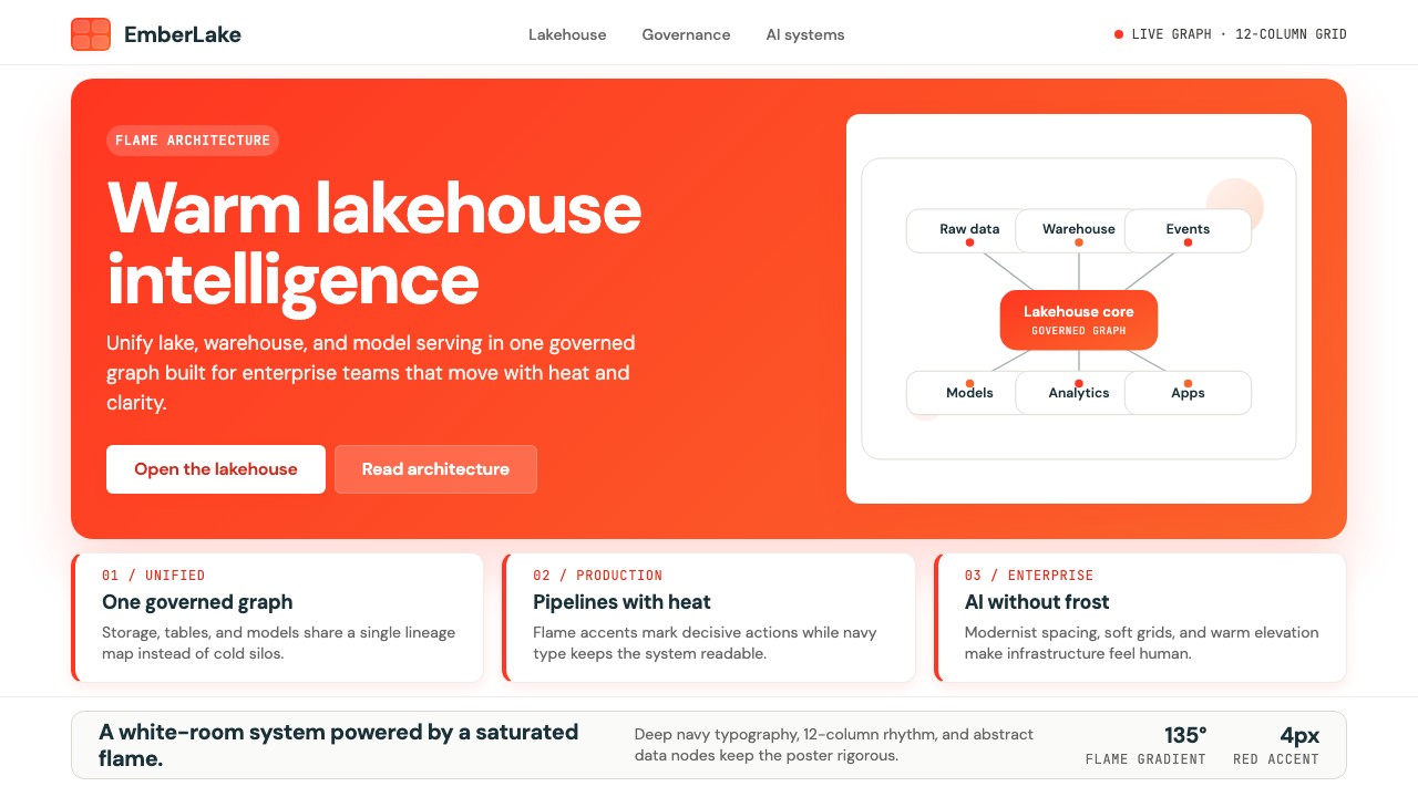 Databricks LakehouseWarm enterprise confidence. Flame red-orange gradients meet DM Sans and clean…温暖的企业信心:红橙火焰渐变配 DM Sans 与洁净数据图。
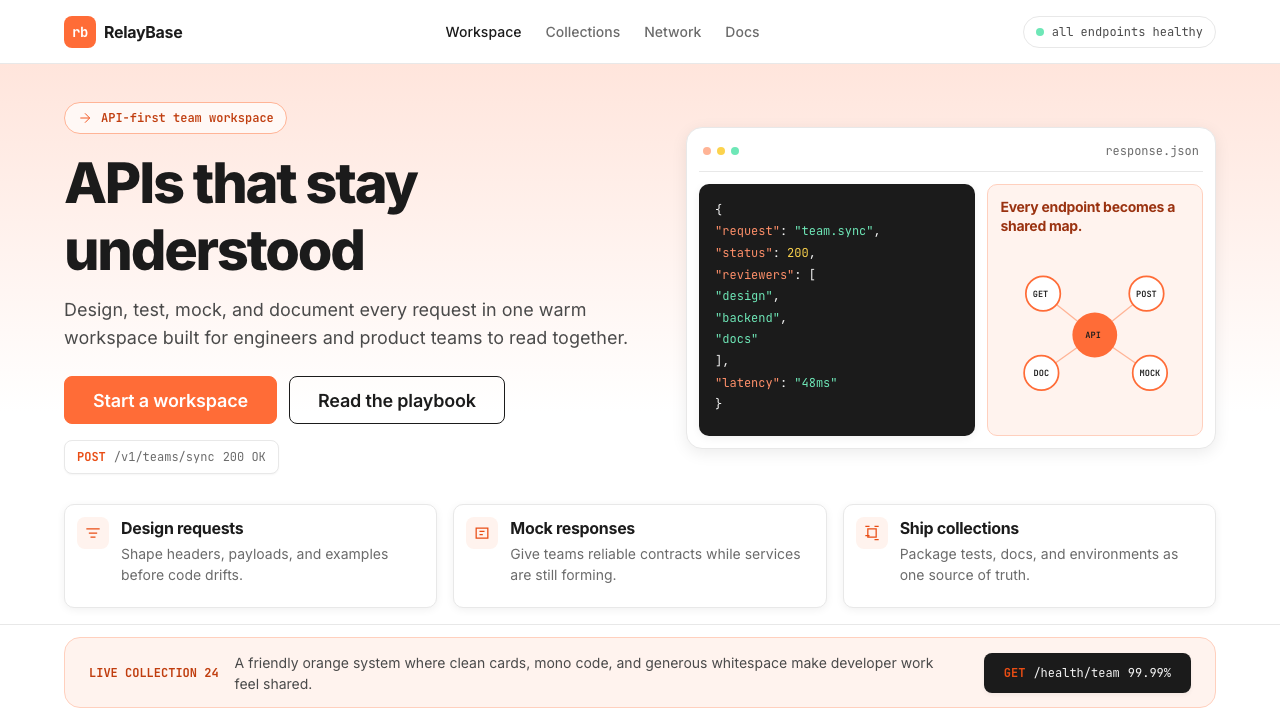 Postman 2024Warm APIs feel approachable. Orange gradients, Inter headlines, and dark mono…温暖的 API 专业感:橙色渐变、Inter 标题与深色等宽代码块。
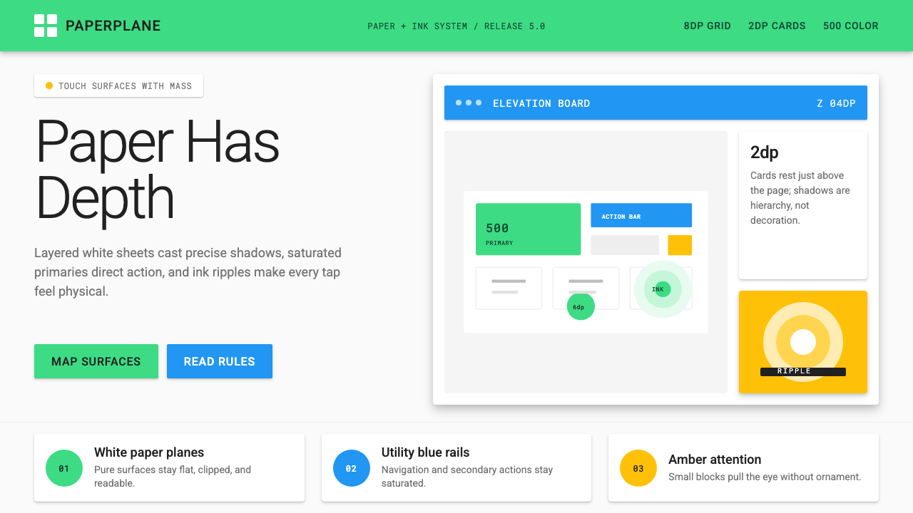 Android Lollipop (Material 1.0)Paper becomes physical. Roboto, green FABs and sharp shadows give white cards…纸张拥有物理感:Roboto、鲜绿浮动按钮与硬阴影让白卡片产生深度。