What is YouTube Creator Economy?什么是 YouTube Creator Economy?
YouTube turned the interface invisible so thumbnails could become the loudest billboards in digital history.YouTube 把界面变成透明的,让缩略图成为数字史上最响亮的广告牌。
YouTube Creator Economy in briefYouTube Creator Economy 速览
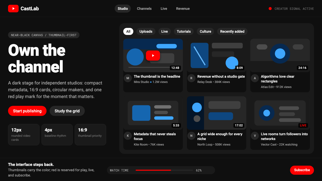
YouTube Creator Economy is the visual language that the world's largest video platform has refined over two decades: a near-black canvas, a single saturated red reserved for play and subscribe, Roboto type at every scale, and a grid of rectangles that gives every creator's thumbnail equal theatrical billing. The aesthetic is not a style applied on top of a platform — it is the platform architecture itself, made visible.YouTube 创作者经济是全球最大视频平台历经二十年打磨的视觉语言:近黑色画布、一抹专属于播放与订阅的饱和红、贯穿所有尺寸的 Roboto 字体,以及将每位创作者缩略图平等呈现的矩形网格。这套美学不是叠加在平台之上的风格——它本身就是平台架构,以可见的方式呈现出来。
The design philosophy is one of deliberate self-erasure. Every surface choice — the dark matte background, the rounded rectangular card, the circular avatar, the pill-shaped filter chip — exists to recede. The interface is a neutral stage on which creators perform. Branding is concentrated into a single icon and a channel name; everything else is subordinate to the thumbnail, which functions as a miniature poster, a movie one-sheet, and a storefront window simultaneously.设计哲学是刻意的自我隐退。每一个界面选择——深暗的哑光背景、圆角矩形卡片、圆形头像、药丸形筛选条——都为了退到幕后。界面是一个中性的舞台,创作者在上面表演。品牌识别被浓缩进一枚图标和一个频道名;其余一切都服从于缩略图——缩略图同时承担着微型海报、电影单页宣传单和橱窗展示的功能。
What makes the YouTube Creator Economy aesthetic distinctive is not any single element but the discipline of restraint applied at enormous scale. The same card system accommodates a hand-lettered cooking channel and a multi-camera news broadcast. The same red play button appears on a teenager's first upload and on a Peabody Award–winning documentary. The visual system is deliberately content-agnostic: it promises creators that the interface will stay out of their way.YouTube 创作者经济美学的独特之处,不在于某个单一元素,而在于克制在巨大规模下的一致执行。同一套卡片系统容纳手写风格的烹饪频道和多摄像机新闻直播。同一个红色播放按钮出现在某位少年的第一次上传和获得皮博迪奖的纪录片上。这套视觉系统刻意对内容保持中立:它向创作者承诺,界面会为你让路。
See the YouTube Creator Economy design system查看 YouTube Creator Economy 完整设计系统
Where does YouTube Creator Economy come from?YouTube Creator Economy 从何而来?
YouTube launched in May 2005, founded in a garage in Menlo Park by three former PayPal employees — Chad Hurley, Steve Chen, and Jawed Karim — who shared a frustration with the difficulty of sharing video online. The earliest interface wore the visual conventions of Web 2.0: rounded corner tabs in cheerful red and white, light gray backgrounds, drop shadows everywhere, and the kind of gradient-heavy buttons that characterized the mid-2000s internet. The aesthetic was friendly and approachable, designed for a moment when uploading a video at all felt like a technical achievement.YouTube 于 2005 年 5 月上线,由三位前 PayPal 员工——查德·赫利、陈士骏和贾韦德·卡里姆——在门洛帕克的一间车库创立。他们共同的痛点是在线分享视频的困难。最早的界面穿着典型的 Web 2.0 外衣:欢快的红白圆角标签、浅灰背景、无处不在的投影,以及那个时代标志性的渐变按钮。这套美学友好而平易近人,为那个单纯上传一段视频都算技术成就的时刻而设计。
Google acquired YouTube in October 2006 for 1.65 billion dollars, and the subsequent decade became one of sustained visual simplification. Susan Wojcicki, who became CEO in 2014 and guided the platform through its most explosive creator growth period, oversaw a series of redesigns that progressively stripped decoration away. As mobile became dominant and the screen became the primary delivery surface, the interface needed to work at thumbnail size on a four-inch phone screen and at full resolution on a sixty-inch television simultaneously. Skeuomorphic depth, textured backgrounds, and multi-color navigation were incompatible with that range.谷歌于 2006 年 10 月以 16.5 亿美元收购 YouTube,此后十年成为持续视觉简化的历程。苏珊·沃西基于 2014 年担任 CEO,引领平台度过创作者增长最爆炸的时期,主持了一系列逐步剥离装饰的重新设计。随着移动端占据主导、屏幕成为主要播放介质,界面需要同时在四英寸手机屏幕上以缩略图大小和在六十英寸电视上以完整分辨率良好呈现。拟物化的深度感、纹理背景和多色导航,与这种跨度完全不兼容。
The pivotal shift came around 2017 with a wholesale redesign that made dark mode available and moved the platform definitively to a card-based, near-black-or-white design system aligned with Google's Material Design language. The red play button — which had been a flexible element across earlier eras — was standardized as the singular brand expression. Rounded rectangular thumbnails, a uniform aspect ratio enforced across all uploads, and consistent circular avatars created the visual grammar that persists today. The redesign coincided with the rapid professionalization of creator culture: sponsorship deals, merchandise shelves, memberships, and SuperChats were all arriving simultaneously, and the interface needed to support a genuine creator economy, not just a video-hosting hobbyist community.关键转变发生在 2017 年前后,一次彻底的重新设计引入了深色模式,并将平台明确迁移到以卡片为基础、近黑或纯白的设计体系,与谷歌 Material Design 语言对齐。红色播放按钮——在早期版本中曾是灵活多变的元素——被标准化为唯一的品牌表达。统一圆角的矩形缩略图、对所有上传内容强制执行的统一纵横比,以及一致的圆形头像,共同构建了延续至今的视觉语法。这次重新设计恰逢创作者文化的快速职业化:赞助合作、周边商品、会员资格和超级留言同步到来,界面需要支撑一个真实的创作者经济,而不仅仅是一个视频托管爱好者社区。
By 2020 the aesthetic had fully matured into the form recognizable today. Dark mode became the default for many users; the near-black background is now the canonical YouTube experience for a significant portion of the global audience. The thumbnail — always important — became the primary creative and competitive battleground. Entire cottage industries of thumbnail design emerged, complete with their own conventions: large block type, high-contrast color fields, expressive human faces occupying the left third of the frame, and arrows or graphical emphasis directing the eye. These thumbnail conventions are not YouTube's design system, but they are inseparable from how the YouTube Creator Economy aesthetic reads in practice.到 2020 年,这套美学已完全成熟为今天可辨认的形态。深色模式成为许多用户的默认设置;近黑色背景如今是全球相当比例受众的标准 YouTube 体验。缩略图——始终重要——成为首要的创意竞争战场。整个缩略图设计的细分产业就此涌现,并形成了自己的惯例:大号粗体文字、高对比色块、占据画面左三分之一的夸张人脸表情,以及引导视线的箭头或图形强调。这些缩略图惯例不属于 YouTube 的设计系统,但它们在实践中与 YouTube 创作者经济美学的整体观感密不可分。
What defines the YouTube Creator Economy look?YouTube Creator Economy 的视觉特征是什么?
Near-Black Surface近黑色底面
The canonical YouTube dark interface uses a surface color so close to black that it reads as absolute black in dim environments, yet retains just enough warmth to avoid the harsh coldness of true black. This choice is strategic: thumbnails — which carry the full spectrum of color — appear maximally vivid against an almost-null background. The surface does not compete; it amplifies. Light-mode users see an equivalent near-white that performs the same subordinate function.YouTube 深色界面的标准底面色深至接近纯黑,在弱光环境下几乎读作绝对黑色,却保留了一丝暖意,避免了纯黑的刺眼冷硬。这个选择具有战略意义:承载完整色彩光谱的缩略图,在几近于零的背景上显得最为鲜艳。底面不竞争,它放大。浅色模式用户看到的是等效的近白色,执行同样的退后功能。
The Single Red唯一的红色
Across the entire interface, one hue carries decisive weight: a fully saturated, unmodulated red that marks the two most important actions — play and subscribe. Red appears nowhere else at this intensity. It is not used for navigation, decoration, or hover states. This discipline means the red, when it appears, carries enormous semantic load. Users do not need to read labels to understand what the red button or badge means. The color does the work.在整个界面中,只有一种色相承担决定性的分量:一抹完全饱和、纯粹不掺杂质的红色,标记两个最重要的动作——播放与订阅。红色在任何其他地方都不以这种强度出现。它不用于导航、装饰或悬停状态。这种克制意味着红色一旦出现,就承载着巨大的语义重量。用户无需阅读标签便能理解红色按钮或徽章的含义。颜色完成了工作。
The Rectangular Card Grid矩形卡片网格
Content is organized into a uniform grid of rectangular cards, each maintaining a consistent widescreen aspect ratio. The card is the atom of the YouTube layout — identical in structure whether it holds a two-minute sketch or a four-hour documentary. Rounded corners soften the geometry just enough to read as approachable without losing crispness. No card receives visual privilege over another; hierarchy is established by position and by the thumbnail itself, not by card decoration.内容被组织进统一的矩形卡片网格,每张卡片保持一致的宽屏纵横比。卡片是 YouTube 版面的原子单位——无论装载的是两分钟短剧还是四小时纪录片,结构完全相同。圆角柔化了几何形态,恰好足以读起来亲切而不失清晰。没有任何卡片在视觉上凌驾于其他卡片之上;层级由位置和缩略图本身建立,而非由卡片装饰决定。
Roboto as System VoiceRoboto 作为系统声音
A geometric sans-serif typeface — humanist enough to read naturally at body size, neutral enough to disappear at interface scale — carries every word the platform generates: channel names, video titles, view counts, timestamps, and captions. It never competes with creator-supplied typography in thumbnails. The type system uses scale and weight as its sole organizational tools: larger and heavier for titles, smaller and lighter for metadata. Color is withheld from type except for links and the single red accent.一款几何无衬线字体——人文感足以在正文尺寸自然阅读,中性感足以在界面尺度隐退——承载平台生成的每一个词:频道名、视频标题、播放量、时间戳和字幕。它从不与创作者在缩略图中设置的字体竞争。字体系统仅以尺寸和字重作为组织工具:标题更大更粗,元数据更小更轻。字体的颜色被克制保留,只用于链接和唯一的红色强调。
Circular Avatar as Identity Anchor圆形头像作为身份锚点
Every channel, every commenter, every user is represented by a cropped circular image. The circle is consistent without exception: no squares, no rounded squares, no polygons. This universality performs an important function — the circular avatar is instantly legible as a human or brand identity element regardless of the surrounding content type. It also creates a natural visual rhythm in comment threads and notification lists, where circles punctuate columns of rectangular text.每个频道、每位评论者、每个用户都由一张裁切成圆形的图像代表。圆形是统一无例外的:没有正方形,没有圆角正方形,没有多边形。这种普遍性承担着重要功能——无论周围的内容类型如何,圆形头像都能被即时读作人物或品牌身份元素。它也在评论区和通知列表中创造出自然的视觉节奏,圆形在矩形文字列中形成标点式的间隔。
Pill-Shaped Filter Chips药丸形筛选条
Navigation below the top bar uses a horizontal row of capsule-shaped chips — rounded at both ends, low contrast in default state, elevated to a filled dark or light variant when selected. These chips provide contextual filtering without the visual weight of traditional tabs or sidebar navigation. They are deliberately understated: their job is to help users narrow a vast catalog, not to assert visual presence. The pill shape echoes the rounded corners of the cards, creating visual coherence across interaction elements.顶部栏下方的导航使用横向排列的胶囊形筛选条——两端圆润,默认状态对比度低,选中后切换到填充的深色或浅色变体。这些筛选条在不增添传统标签页或侧边栏视觉重量的情况下提供情境过滤功能。它们刻意低调:使命是帮助用户缩小庞大目录的范围,而非彰显视觉存在感。药丸形状与卡片的圆角相呼应,在交互元素间创造视觉一致性。
Thumbnail as Creative Sovereignty缩略图作为创作主权
Within the rigid card grid, the thumbnail is the one zone of total creative freedom. Creators are explicitly encouraged to treat their thumbnail as a custom poster — any colors, any typography, any imagery, any compositional approach. The platform's neutral gray-and-black environment is specifically designed to not clash with any thumbnail palette. This arrangement makes the thumbnail the most visible creative decision a creator makes, and it is where the real visual energy of the platform concentrates.在严格的卡片网格内,缩略图是唯一拥有完全创作自由的区域。平台明确鼓励创作者将缩略图视为自定义海报——任意色彩、任意字体、任意图像、任意构图方式。平台的中性灰黑环境被专门设计为不与任何缩略图配色冲突。这种安排使缩略图成为创作者做出的最醒目的创意决定,也是平台真正的视觉能量集中之处。
See the YouTube Creator Economy design system查看 YouTube Creator Economy 完整设计系统
Who shaped YouTube Creator Economy?谁塑造了 YouTube Creator Economy?
Hurley was YouTube's co-founder and first CEO, and his background as the designer who styled PayPal's early visual identity shaped YouTube's initial commitment to approachable, consumer-friendly interface design. He oversaw the platform during its founding period and through the Google acquisition in 2006, establishing the core philosophy that video content — not interface chrome — should dominate the screen. His insistence on simplicity in the earliest design decisions planted the seed for what would eventually become the platform's radical self-erasure aesthetic.赫利是 YouTube 的联合创始人和首任 CEO,他曾为 PayPal 早期视觉识别设计的背景,塑造了 YouTube 最初对亲切、面向消费者界面设计的承诺。他主持平台度过创立期及 2006 年的谷歌收购,确立了视频内容——而非界面装饰——应主导屏幕的核心理念。他对最早期设计决策中简洁性的坚持,埋下了平台最终发展出彻底自我隐退美学的种子。
Wojcicki served as YouTube's CEO from 2014 to 2023, the period during which the Creator Economy aesthetic reached its mature form. She oversaw the rollout of the channel memberships, merchandise shelf, Super Chat, and YouTube Shorts features that transformed the platform from a video host into a genuine creator monetization ecosystem. Her leadership coincided with the 2017 redesign that standardized the dark interface and card system. Crucially, she also navigated the platform's relationship with its creator community during the monetization policy crises of 2017, establishing the precedent that the platform's visual and economic systems should serve creator sustainability.沃西基于 2014 年至 2023 年担任 YouTube CEO,正是在这一时期,创作者经济美学达到了成熟形态。她主持推出了频道会员资格、周边商品架、超级留言和 YouTube Shorts 等功能,将平台从视频托管商转型为真正的创作者变现生态系统。她的领导期与 2017 年标准化深色界面和卡片系统的重新设计重叠。关键的是,她还在 2017 年货币化政策危机期间处理了平台与创作者社区的关系,确立了平台视觉与经济系统应服务于创作者可持续发展的先例。
Karim uploaded the first YouTube video — an eighteen-second clip recorded at the San Diego Zoo in April 2005 — and his act of casual, low-production-value self-documentation established the aesthetic baseline that the platform's entire design philosophy would later serve. The video is remarkable precisely because it is unremarkable: no editing, natural light, ambient sound, a non-professional camera. The design system YouTube eventually built is, in a sense, the infrastructure built to honor that casual authenticity at massive scale — a neutral container for the ordinary video that turns out not to be ordinary at all.卡里姆上传了 YouTube 的第一个视频——2005 年 4 月在圣地亚哥动物园录制的一段十八秒短片——他这次随意、低制作水准的自我记录行为,奠定了平台整套设计理念日后所服务的美学基准。这段视频的非凡之处恰在于它的平凡:没有剪辑、自然光线、环境音、非专业摄像机。YouTube 最终构建的设计系统,在某种意义上,是为了在庞大规模下尊重这种随意的真实性而搭建的基础设施——一个中性容器,容纳那些看似普通、实则并不普通的视频。
Chen, as co-founder and early CTO, shaped YouTube's technical architecture during the period when its visual language was being established. His decisions about how video would be encoded, delivered, and displayed — including the standardization of the widescreen aspect ratio as the platform format — have lasting aesthetic consequences. The rectangular card's proportions are not arbitrary; they descend from the technical and editorial choice to make widescreen the default, a decision that oriented the entire visual grammar of the platform toward the cinematic.陈士骏作为联合创始人和早期 CTO,在 YouTube 视觉语言形成期间塑造了其技术架构。他关于视频编码、传输和显示方式的决策——包括将宽屏纵横比标准化为平台格式——产生了持久的美学影响。矩形卡片的比例并非任意而为;它源自将宽屏设为默认的技术与编辑选择,这一决定将平台整套视觉语法定向于电影感。
How do you use YouTube Creator Economy today?今天怎么用 YouTube Creator Economy?
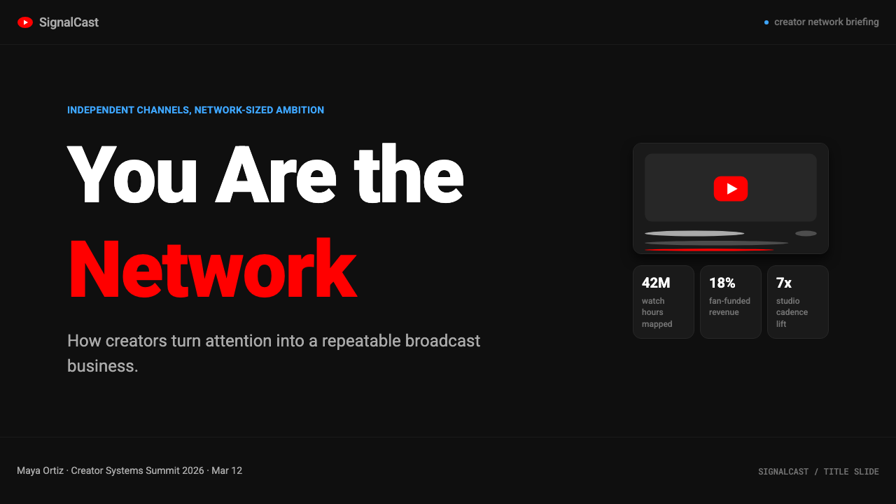
The YouTube Creator Economy aesthetic transfers naturally to presentation design because its core logic — content first, interface second — maps well onto the challenge of making slides that serve ideas rather than demonstrate software mastery. A cover slide built in this language uses a dark background that approaches black, a single large rectangular image or color block that functions as a thumbnail, and a title set in a clean geometric sans-serif at substantial scale. The red accent, if used, appears on a single call-to-action or key metric only. The result reads as intentional and platform-native without looking like a screenshot.YouTube 创作者经济美学自然地迁移到演示文稿设计中,因为它的核心逻辑——内容优先、界面靠后——与制作服务于想法而非炫耀软件技能的幻灯片的挑战高度契合。用这套语言制作的封面页使用接近纯黑的深色背景,一张大型矩形图像或色块充当缩略图,标题以简洁几何无衬线字体大尺寸呈现。红色强调色如果使用,只出现在单一行动召唤或核心指标上。结果读来既有意为之,又具备平台原生感,而不像截图。
Content slides in this style use a strict grid with generous negative space. Each slide carries one idea, stated in the title at thumbnail-reading scale, with supporting detail below in a lighter weight. Data slides benefit from the system's inherent affinity for rectangular forms: bar charts and timeline graphics feel at home in this visual language, their bars treated as content cards in their own right. Avoid decorative chart borders, gradient fills, or three-dimensional effects — the aesthetic reads flatness as sophistication.这种风格的内容页采用严格网格配合充裕的留白。每张幻灯片承载一个想法,以缩略图可读的尺寸在标题处陈述,以较轻字重的补充细节置于其下。数据页受益于这套系统天然的矩形亲和力:条形图和时间轴图形在这种视觉语言中如鱼得水,其柱条本身被当作内容卡片对待。避免装饰性图表边框、渐变填充或三维效果——这套美学将平面性读作成熟感。
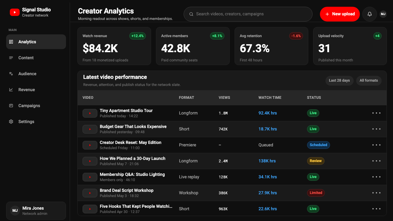
For web interfaces, the YouTube Creator Economy look is most effective on content-library and dashboard screens where a card grid is the natural organizational unit. The approach: a near-black or near-white background, a single accent color used only for primary actions, circular avatars for user representations, and pill-shaped chips for filtering. Cards should use consistent border-radius and a subtle elevation — not a heavy drop shadow but a slight tonal separation from the background. Navigation should be minimal and typographic, with the interface's structural weight concentrated in the content grid rather than framing elements.对于网页界面,YouTube 创作者经济的视觉风格在内容库和仪表板页面上最为有效,这些页面天然以卡片网格为组织单位。方法是:近黑或近白背景,单一强调色仅用于主要动作,圆形头像代表用户,药丸形筛选条用于过滤。卡片应使用统一的圆角半径和微妙的层级感——不是厚重的投影,而是与背景的轻微色调分离。导航应当极简且以字体为主,界面的结构重量集中在内容网格而非框架元素上。
In editorial and marketing contexts, this aesthetic works particularly well for creator-economy platforms, streaming services, media companies, and any brand that wants to signal both scale and individual voice. A marketing page built in this system uses full-width dark sections alternating with light ones, each anchored by a large rectangular image treated as a thumbnail. Type is scaled aggressively for hierarchy — section titles at poster scale, body text at reading scale, metadata in a lighter weight. The single saturated accent color handles all calls-to-action; secondary information uses neutral grays.在编辑和营销语境中,这套美学对创作者经济平台、流媒体服务、媒体公司,以及任何希望同时传达规模感和个人声音的品牌尤为有效。用这套系统搭建的营销页面使用深色与浅色全宽分区交替出现,每个分区由一张大矩形图像锚定,图像被当作缩略图处理。字体按层级激进缩放——章节标题达到海报尺寸,正文处于阅读尺寸,元数据使用更轻的字重。单一饱和强调色处理所有行动召唤;次要信息使用中性灰。
A common mistake when applying this aesthetic is over-designing the thumbnail equivalent — loading every card or hero image with text, arrows, facial close-ups, and color explosions simultaneously. Authentic YouTube thumbnails are actually disciplined compositions: one dominant element (usually a face or a bold type treatment), one or two supporting elements, and significant clear space. The effectiveness of the format comes from its speed of reading, not from information density. Designs that cram too many signals into the thumbnail space defeat the system's core premise.应用这套美学时最常见的错误,是过度设计缩略图等效元素——同时在每张卡片或主视觉上堆砌文字、箭头、面部特写和色彩爆炸。真实的 YouTube 缩略图实际上是有纪律的构图:一个主导元素(通常是人脸或粗体字处理)、一到两个辅助元素,以及充裕的留白空间。这种格式的有效性来自阅读速度,而非信息密度。在缩略图空间塞入过多信号的设计,会破坏这套系统的核心前提。
See the YouTube Creator Economy design system查看 YouTube Creator Economy 完整设计系统
YouTube Creator Economy — FAQYouTube Creator Economy · 常见问题
Why does YouTube use such a dark background when most productivity apps prefer light interfaces?为什么 YouTube 使用如此深色的背景,而大多数生产力应用偏好浅色界面?
The near-black background serves a specific optical function that light backgrounds cannot: it makes thumbnails appear maximally vivid. Video thumbnails often feature high-saturation colors, warm skin tones, and bright lighting — all of which pop most dramatically against a near-null dark field. A white or light gray background would compete with light-toned thumbnails and wash out their contrast. The dark surface also creates an immersive, cinema-like atmosphere appropriate for a viewing platform, reducing the visual separation between the browsing experience and the act of watching.近黑色背景提供了浅色背景无法实现的特定光学功能:使缩略图呈现最大饱和度和鲜艳度。视频缩略图通常包含高饱和色彩、温暖肤色和明亮光线——这些元素在接近于零的深色底面上对比最为戏剧化。白色或浅灰背景会与浅色调缩略图竞争,冲淡其对比度。深色底面也营造出沉浸的、类电影院的氛围,适合视频观看平台,减少了浏览体验与实际观看行为之间的视觉隔离感。
Is the YouTube visual language the same as Google's Material Design?YouTube 的视觉语言和谷歌的 Material Design 是同一回事吗?
They share ancestry but have diverged significantly. YouTube adopted Material Design's component vocabulary — elevation, card geometry, rounded corners, the type scale system — as a structural foundation in the 2017 redesign. However, YouTube's use of a near-black canvas as a primary surface, its strict single-color accent discipline, and the overriding priority given to thumbnail imagery are all specific to the creator platform context. Material Design in its standard form defaults to light surfaces and a broader palette range. The YouTube variant is a deliberate specialization: Material Design optimized for the case where the content itself is the primary visual element.两者有共同的渊源,但已明显分化。YouTube 在 2017 年的重新设计中采用了 Material Design 的组件词汇——层级感、卡片几何形态、圆角、字体缩放体系——作为结构基础。然而,YouTube 以近黑色画布为主要底面的用法、严格的单色强调纪律,以及给予缩略图图像的压倒性优先级,都是创作者平台语境所特有的。标准形态的 Material Design 默认使用浅色底面和更宽泛的色彩范围。YouTube 变体是刻意的专业化:针对内容本身是主要视觉元素这一场景优化的 Material Design。
How should I handle the thumbnail zone when applying this aesthetic to a design that has no video content?当把这套美学应用于没有视频内容的设计时,应该如何处理缩略图区域?
The thumbnail's function — a rectangular content preview that carries the full expressive weight of the item it represents — can be directly translated to any content-card context. A music streaming app can use album art in the same proportion and treatment. A news platform can use editorial photography. A software product directory can use illustrated feature graphics. The key is maintaining the rectangular format, the consistent aspect ratio across all cards, and the discipline of letting the card image carry the color energy while the surrounding interface stays neutral. When there is no image available, a bold typographic treatment with a single-color background performs the same function.缩略图的功能——一张矩形内容预览图,承载其所代表项目的全部表达重量——可以直接转译到任何内容卡片语境中。音乐流媒体应用可以按相同比例和处理方式使用专辑封面。新闻平台可以使用编辑摄影图片。软件产品目录可以使用功能插图。关键在于保持矩形格式、所有卡片的统一纵横比,以及让卡片图像承载色彩能量而周围界面保持中性的克制。当没有图像可用时,带单色背景的粗体字排版处理可以执行相同的功能。
Does this aesthetic work for B2B products, or is it too consumer-media-specific?这套美学适用于 B2B 产品吗?还是说它太偏向消费媒体?
The YouTube Creator Economy aesthetic works well for any B2B product that is content-library-shaped — internal video platforms, e-learning systems, media asset management tools, training portals, and documentation hubs with embedded video. It struggles in contexts where the primary data type is tabular or relational rather than media-card-based, where dense information grids replace card grids. The near-black background, in particular, can feel heavy in productivity contexts where users need to read large volumes of text. A lighter adaptation — retaining the card geometry, the single accent color, and the typographic discipline while moving to a near-white surface — often works better for data-intensive B2B applications while keeping the aesthetic family connection.YouTube 创作者经济美学对任何内容库形态的 B2B 产品都表现良好——内部视频平台、电子学习系统、媒体资产管理工具、培训门户,以及内嵌视频的文档中心。它在主要数据类型是表格或关系型而非媒体卡片式的场景中表现欠佳,即当密集信息网格取代卡片网格的情况下。近黑色背景在用户需要阅读大量文本的生产力场景中尤其可能显得沉重。一种更轻的变体——保留卡片几何形态、单一强调色和排版纪律,同时切换至近白色底面——对于信息密集型 B2B 应用通常效果更好,同时保持了美学上的家族联系。
How is the YouTube Creator Economy aesthetic different from Netflix's dark interface?YouTube 创作者经济美学与 Netflix 的深色界面有何不同?
Both platforms use dark backgrounds and rectangular card grids to showcase video content, but their visual philosophies reflect different content models. Netflix's aesthetic emphasizes cinematic scale — large hero images, dramatic horizontal scrolling rows, editorial curation, and a sense of premium programming. The Netflix dark interface is theatrical: it says 'you are about to watch something. YouTube's interface, by contrast, is egalitarian and participatory. The cards are smaller, more numerous, and equal in visual weight. There is no editorial hero — algorithmic recommendation and search replace it. The red accent is more prominent and more action-oriented. Where Netflix says 'lean back,' YouTube says 'you are a creator too.'两个平台都使用深色背景和矩形卡片网格展示视频内容,但视觉哲学反映了不同的内容模式。Netflix 的美学强调电影级别的规模——大型主视觉图像、戏剧性的横向滚动行列、编辑策划感,以及顶级制作的氛围。Netflix 深色界面是剧场式的:它在说「你即将观看某部作品」。YouTube 的界面则相反,是平等主义且参与性的。卡片更小、更多、视觉重量更均等。没有编辑主视觉——算法推荐和搜索取而代之。红色强调色更突出,更以行动为导向。Netflix 说「向后靠,享受」,YouTube 说「你也是创作者」。
Related design styles相关设计风格
 Replit 2024Coding feels warm. Coral buttons, cream panels, rounded code tiles make build…编程变得温暖:珊瑚按钮、奶油面板与圆角代码块让构建更好玩。
 Canva 2024Confidence feels draggable. Purple-blue gradients and floating white template…信心可拖拽:紫蓝渐变与漂浮白卡,让创作变柔和。
 Discord 2024Blurple cozy. Charcoal grounds, illustrated characters — every surface says '…刻意去企业化的语音聊天:blurple 蓝紫、深炭灰底、俏皮插画角色——每个界…
 Android Lollipop (Material 1.0)Paper becomes physical. Roboto, green FABs and sharp shadows give white cards…纸张拥有物理感:Roboto、鲜绿浮动按钮与硬阴影让白卡片产生深度。
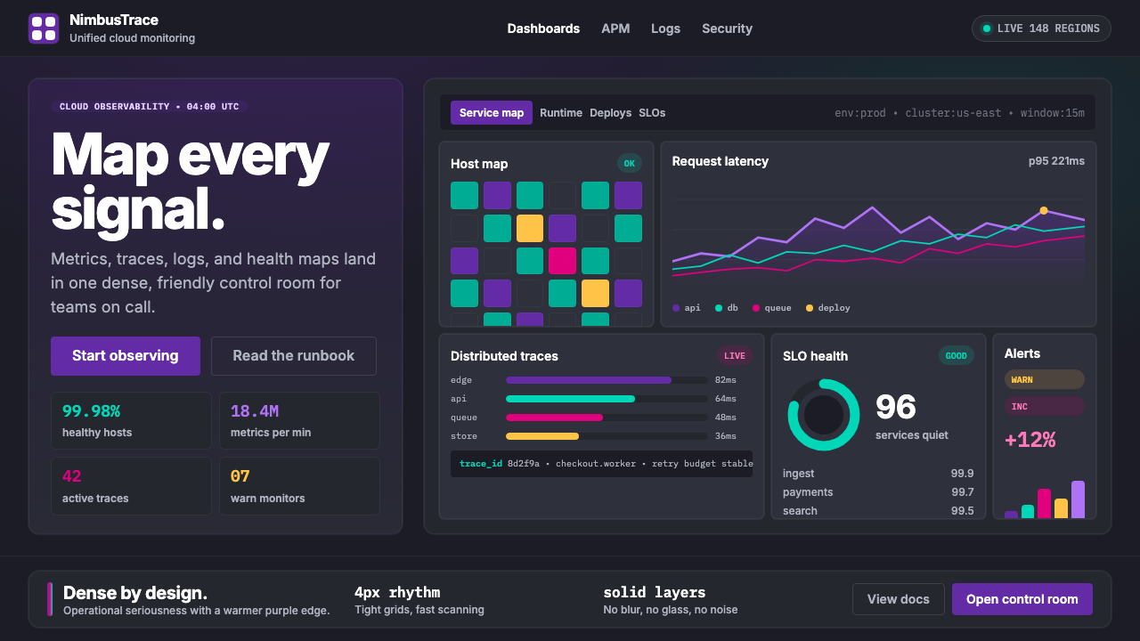 DatadogSerious telemetry, friendly pulse. Purple dark grids pack charts, badges, and…严肃监控也亲近:紫色暗网格塞满图表、徽章与追踪。
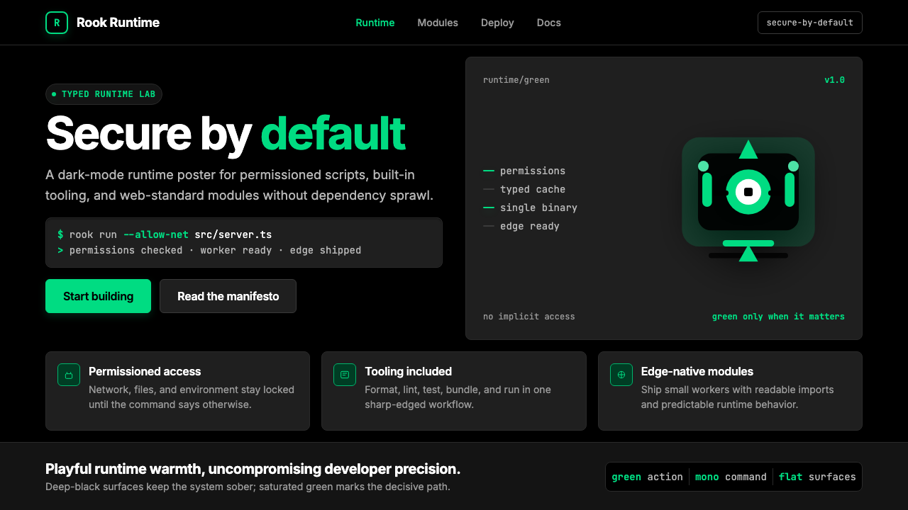 Deno Runtime-GreenWarm precision on black. Saturated green, Inter, and mono code turn security…黑底上的温暖精度:饱和绿、Inter 与等宽代码让安全成为主角。