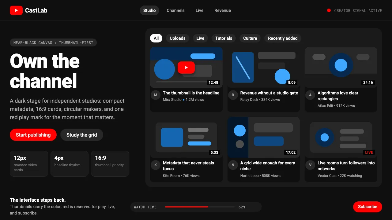
About YouTube Creator Economy
YouTube is the most-clicked red button in internet history. What began in 2005 as a scrappy red-and-white Web 2.0 site has matured into a near-black creator platform where the UI recedes so thumbnails can shout. Roboto carries every word, rectangles carry every video, and a single saturated red marks the two actions that matter: play and subscribe.
The visual language is utilitarian by design. Dark matte surfaces, 12px rounded corners, circular avatars, and pill-shaped chips form a neutral stage. The message to creators is simple — you are the broadcast network, and the interface will stay out of your way.
- Origin
- San Bruno, California, USA
- Era
- 2005 founded; red play button standardized ~2015; current dark Material design 2020–2024
- Key figures
- Chad Hurley · Steve Chen · Jawed Karim · Susan Wojcicki
- Movements
- Creator economy · User-generated content · Google Material Design · Thumbnail-driven visual culture
YouTube Creator Economy design spec
Colors
Typography
The other 11 sections — buttons, cards, spacing, motion, techniques and more — open once you unlock. Download the DESIGN.md or send it to your AI in one click. Unlock once, yours forever.
Sign up nowStyles similar to YouTube Creator Economy
Also inspired by brands & products, with a close feel.
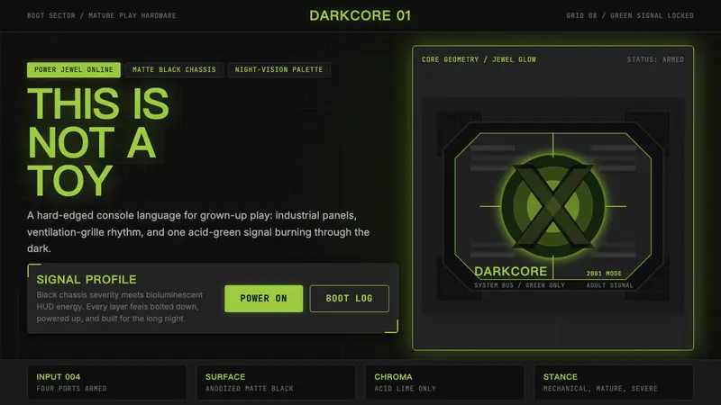 Xbox Original (2001)Not a toy. Acid green cuts matte black in a rigid grille-and-jewel hardware poster.
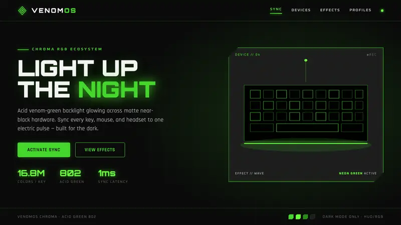 Razer Chroma GreenEsports gear at night. Acid Pantone-802 green burns on matte black via RGB glow halos, dark-only.
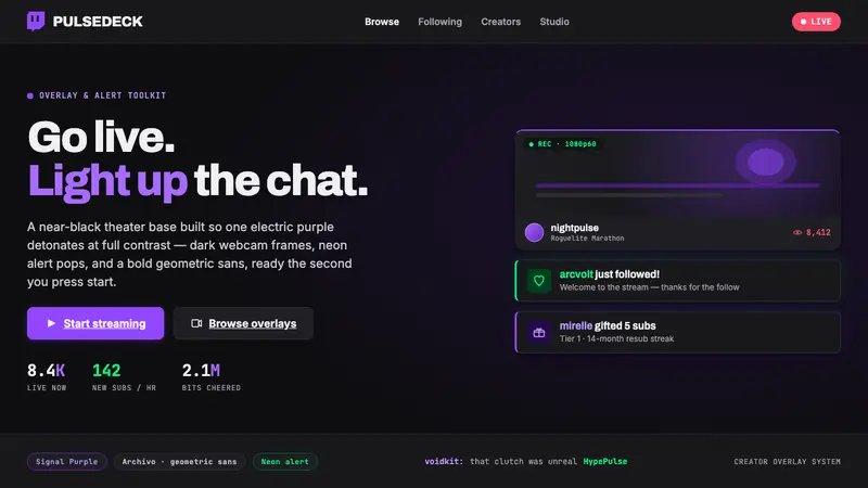 Twitch Streamer OverlayNear-black theater base, one electric purple. Dark webcam frames, neon alert pops, geometric sans.
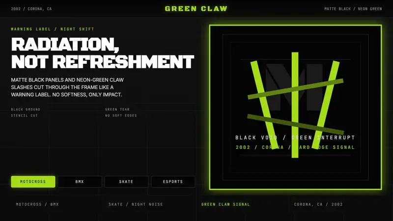 Monster Energy Claw (2002)Aggression, not refreshment. Matte black and neon-green claw slashes cut the frame.