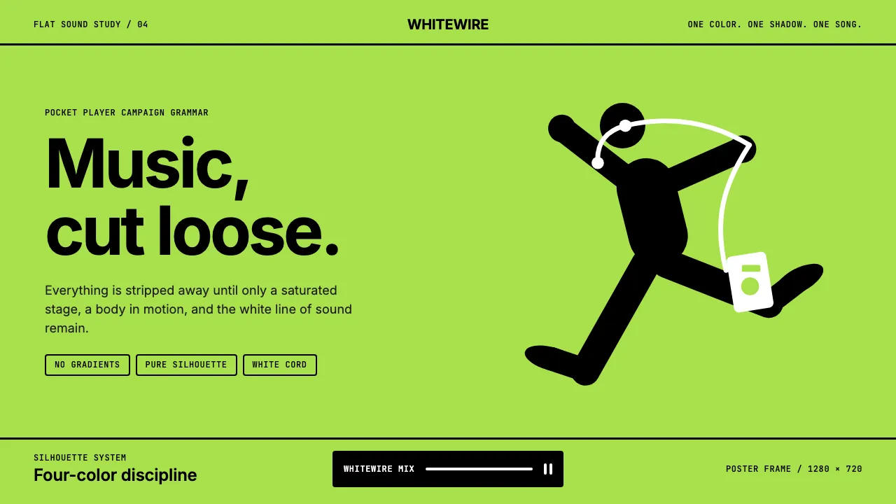
About iPod Silhouette 2004
The iPod Silhouette campaign, launched by Apple and TBWA Chiat\Day in 2003, became the defining visual language of mid-2000s consumer culture. Saturated flat backgrounds in lime, magenta, cyan, and orange served as stages for black silhouette dancers frozen in ecstatic motion, tethered to the only recognizable object: a white iPod trailing white earbuds.
This design system distills that four-color discipline into a usable interface vocabulary — high-saturation backgrounds, stark black-and-white foregrounds, zero gradients, zero textures, and typography that stays out of the way so the silhouette can dance.
- Origin
- Cupertino, CA (Apple) + Los Angeles (TBWA Chiat\Day)
- Era
- 2003 launched; campaign peak 2004–2006; legacy through 2010
- Key figures
- Steve Jobs · Lee Clow · Susan Alinsangan
- Movements
- Mid-2000s minimalist commercial art · Post-Helvetica advertising · Music-product-as-cultural-object
iPod Silhouette 2004 design spec
Colors
Typography
The other 11 sections — buttons, cards, spacing, motion, techniques and more — open once you unlock. Download the DESIGN.md or send it to your AI in one click. Unlock once, yours forever.
Sign up nowStyles similar to iPod Silhouette 2004
Also inspired by brands & products, with a close feel.
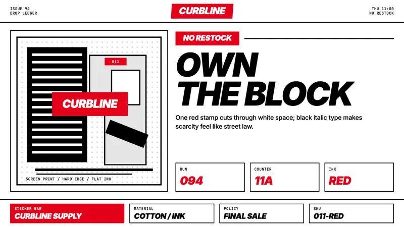 Streetwear (Supreme red)Militant minimalism. A single red box, white field, and black italic grid do the work.
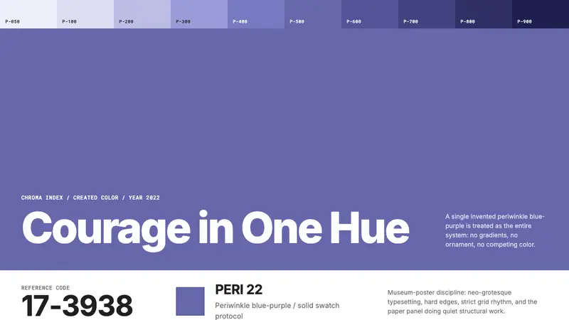 Pantone Very Peri (2022)Color becomes authority. Periwinkle field, reference codes, and white paper impose discipline.
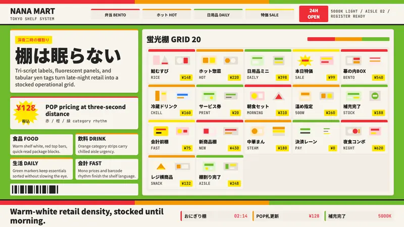 Japanese Konbini 7-ElevenAlways stocked, always bright. Green canopy, warm shelves, POP yen tags, tight bento grid.
 John DeereBuilt to outlast seasons. Forest green bands over safety yellow, stamped in uppercase grids.