What is Ghanaian Highlife?
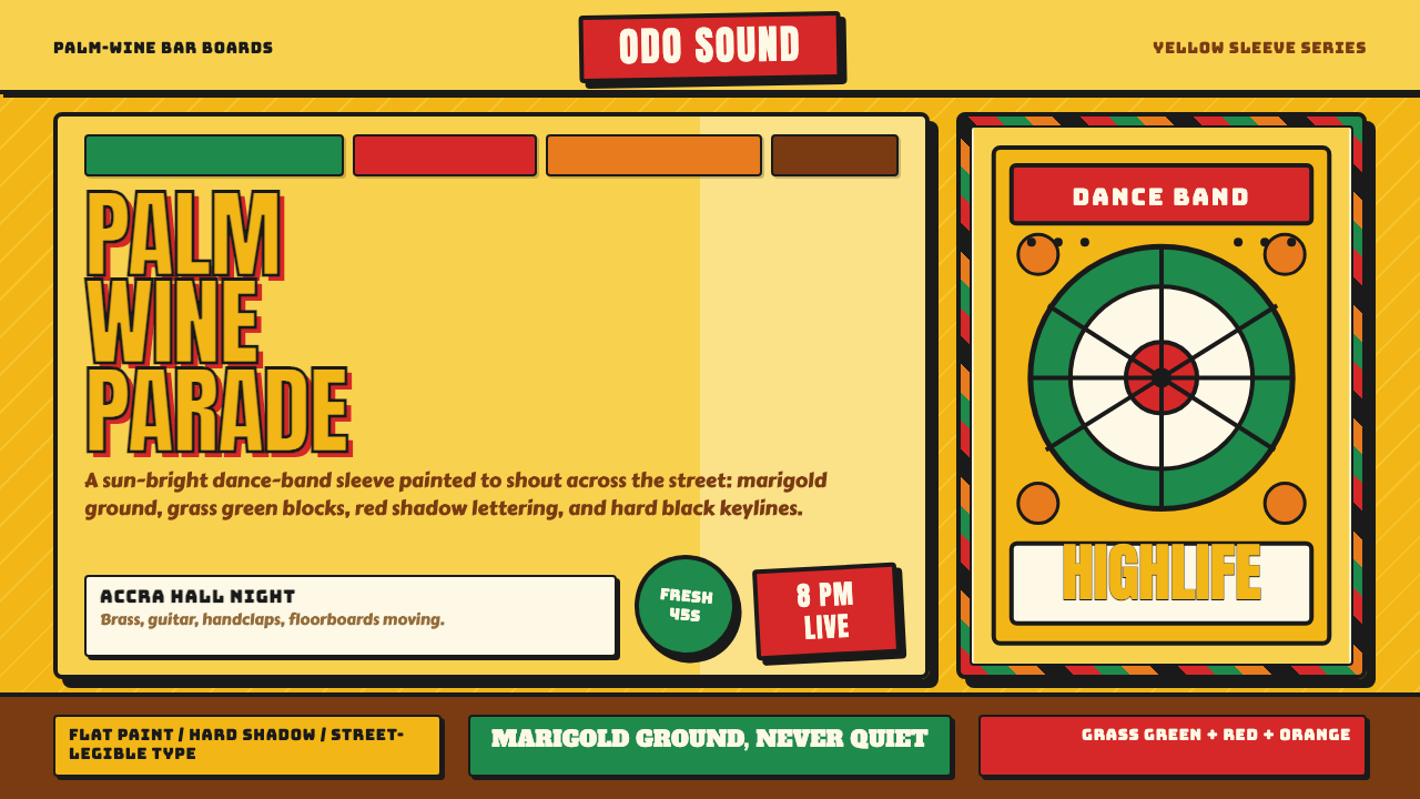
Ghanaian Highlife is music you see before you hear it — marigold-yellow signboards, hand-painted lettering, and a red-and-green palette that announces a brand-new national pop culture at full volume.
Ghanaian Highlife in brief
Ghanaian Highlife is the visual language that grew up around palm-wine bars and dance-band record sleeves in Accra and Kumasi from the late 1940s onward — a field of saturated marigold yellow carrying blocks of grass green, hot red, and orange, all pulled together by chunky, hand-inked display lettering. It is the look of a sign painted by a trained craftsman standing in front of a bar, not a look designed at a desk. That distinction shapes everything about it.
The style is inseparable from the music it named. Highlife itself was a dance-band sound — guitars and horns layered over Akan rhythms — that became the soundtrack of a newly independent Ghana. Its visual side (posters, record labels, painted signboards) had to work the same way the music did: loud, welcoming, built for a crowd rather than a connoisseur. Nothing about it is restrained, and nothing about it is apologetic.
Where a lot of mid-century commercial art disciplines itself toward uniformity — a house typeface, a locked grid, a repeatable brand mark — Highlife signboard art runs the other way. Every sign-writer had their own hand, their own way of squaring off a letter or filling a background, and that variation is part of the style's authenticity. A true Highlife composition should look like it was made by a person with a brush, in one sitting, for an audience standing right in front of it.
Where does Ghanaian Highlife come from?
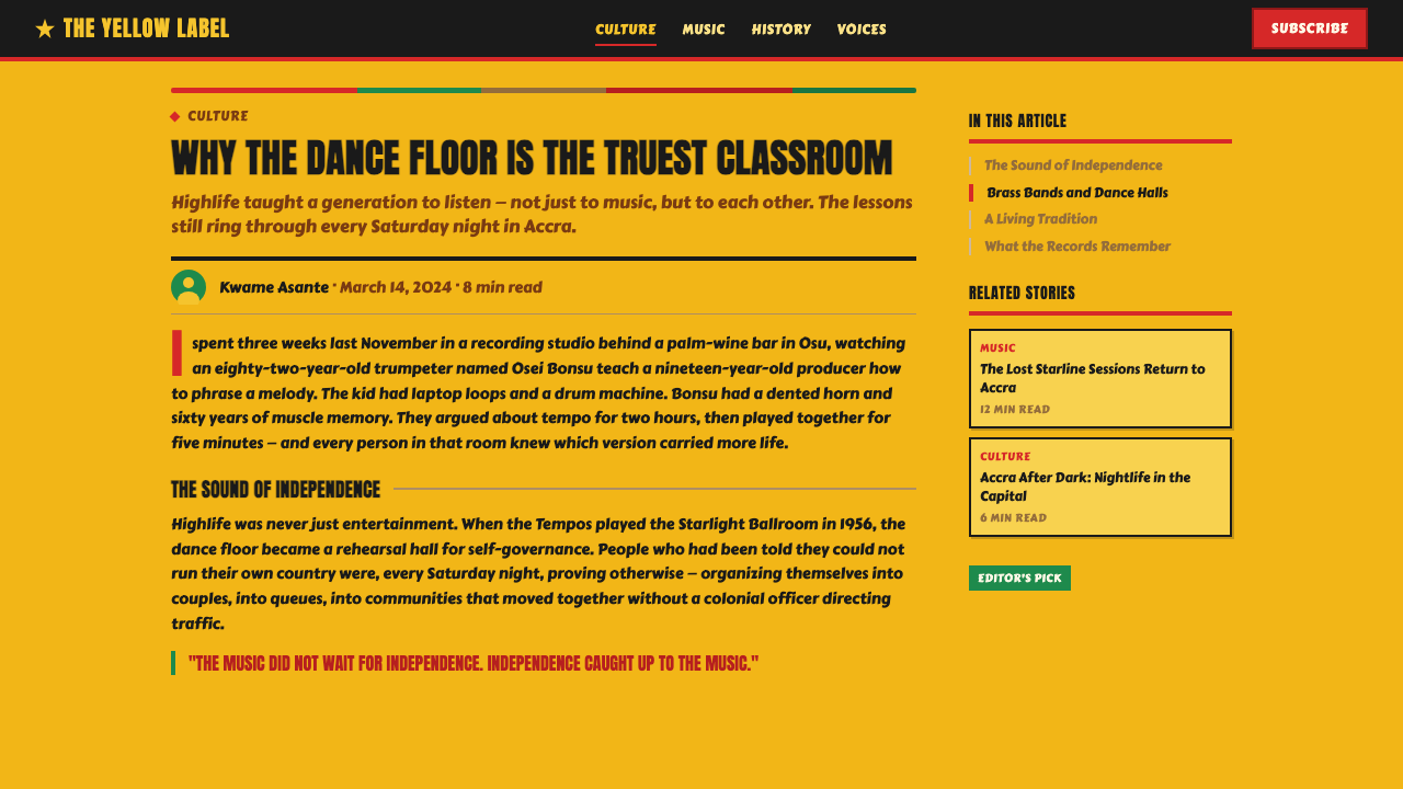
Highlife's visual culture took shape alongside the music itself, roughly from the late 1940s through the 1960s — the period bracketing Ghana's 1957 independence, the first in sub-Saharan Africa to break from colonial rule. E.T. Mensah, often called the 'King of Highlife', led his band The Tempos through this era, and their records, along with those on Decca West Africa's instantly recognizable yellow-label pressings, gave the sound (and its visual packaging) a shared identity across West Africa. A new nation needed a new pop culture, and Highlife's imagery was built to carry that feeling — proud, danceable, entirely its own rather than borrowed from a European or American template.
The signboards themselves came out of a specific craft tradition: trained sign-writers, some associated with workshops around institutions like KNUST (the Kwame Nkrumah University of Science and Technology) in Kumasi, who painted everything from barber shops to chop bars to nightclub façades by hand. This was commercial art made without the mediating tools that would later standardize commercial lettering elsewhere — no stencil kits, no house fonts, no printer's proof to check against. A sign-writer sized up the wall, mixed the paint, and built the letters directly, which is why the lettering in genuine Highlife work has such a specific, slightly uneven, entirely handmade energy.
Record sleeve art ran in parallel with the signboards and cross-pollinated with them constantly — a band's poster and a band's album cover often shared the same hand-painted portraiture and the same hot palette, because they were frequently made by the same class of working artist. Portraits of musicians were illustrated rather than photographed, faces and instruments rendered in flat, confident color rather than realistic shading, because the point was recognition and energy, not likeness.
By the time Highlife's golden era wound down in the later 1960s, its visual vocabulary had already become shorthand for a specific moment: West Africa's first flush of post-independence optimism, expressed in paint and ink rather than in political speeches. That is why the style still reads as celebratory rather than nostalgic — it was never trying to memorialize anything. It was advertising a dance happening that same night.
What defines the Ghanaian Highlife look?
Color
The signature move is a marigold-yellow ground standing in for what would elsewhere be a neutral white or cream — Highlife refuses neutrality from the very first decision. Against that yellow field sit vivid grass green, hot red, and orange in flat, saturated blocks, with black reserved for keylines and lettering. Colors are not blended or graduated; they are placed next to one another at full strength, the way a sign painter would lay down one color, let it dry, and butt the next color directly against it.
Lettering
Display lettering is hand-inked, chunky, and inventive rather than uniform — each letterform carries the personality of the sign-writer who painted it, with thick strokes, playful curves, and slight irregularities that no typeface library would reproduce. There is no single 'Highlife font'; there is a family resemblance built from shared conventions (bold weight, high contrast against the ground, generous letter spacing to read from a distance) rather than a shared master file.
Illustration and Portraiture
Musicians and dancers are rendered as hand-painted portraits, not photographs — faces built from flat color planes and confident outline rather than realistic shading or gradient modeling. The goal of a Highlife portrait is instant recognition and celebratory energy, closer to a folk-art icon than a studio photograph. Instruments (guitars, horns, drums) appear as clearly readable silhouettes, often oversized relative to the figure holding them, because they are doing the job of announcing 'this is a band poster' at a glance.
Composition
Signboards and sleeves are organized as stacked blocks rather than a fine-tuned grid: a band name in oversized lettering across the top or center, a portrait or instrument illustration filling the middle, supporting text (venue, date, label name) banked along an edge. The logic is legibility from a distance and in low light — a passerby or a dancer walking up to a bar needs to read the message in a glance, so hierarchy is achieved through scale and color contrast rather than subtle alignment.
Border and Framing
Where a border appears, it tends to be a solid keyline or a simple repeated motif rather than an ornate flourish — the framing device exists to contain the composition and separate it from its surroundings (a wall, a shop front, a stack of other record sleeves), not to add visual complexity of its own. This keeps the overall effect bold and legible instead of fussy.
Texture and Surface
Authentic Highlife work carries the visible trace of the hand and the brush — slightly uneven fill, a hard edge where two colors meet without a gradient buffer, the occasional drip or overlap where the sign-writer worked quickly. This is not a flaw to be smoothed over; it is the texture that separates a real signboard from a corporate reproduction of the style. Flatness is intentional, but perfection is not the goal — liveliness is.
Mood and Energy
Above all, the style is festive and high-contrast, built to communicate at the volume of a live band on a Saturday night. It is proudly un-corporate — nothing about it is trying to look polished, restrained, or globally neutral. Where a lot of mid-century commercial graphics were converging toward a more uniform international look, Highlife stayed loud, local, and specific, and that refusal to tone itself down is exactly what makes it still feel alive today.
Who shaped Ghanaian Highlife?
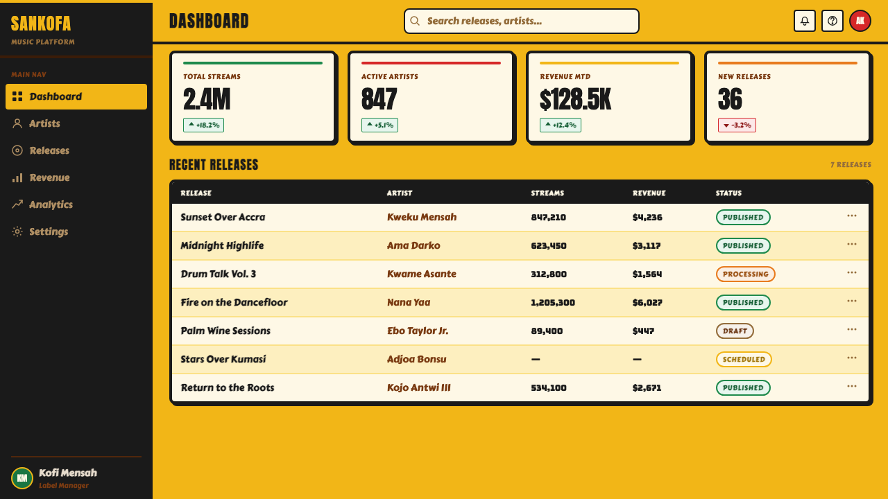
Often called the 'King of Highlife', Mensah led the genre's most influential dance band and became the sound's public face across West Africa through the 1950s and into the 1960s. The posters and record sleeves built around his name and his band helped define what a Highlife visual package was supposed to look like — bold lettering, celebratory portraiture, a sense of occasion rather than quiet promotion.
E.T. Mensah's band, and the group most closely associated with Highlife's classic dance-band era. Their touring and recording activity across West Africa helped spread a shared visual grammar for band posters and sleeves — the same conventions of hand-painted portraiture and hot color turning up on signboards and record labels wherever the band's music traveled.
The regional arm of the Decca record label, whose distinctive yellow-label pressings became one of the most recognizable pieces of Highlife-era visual identity. The label's packaging — plain, confident, built around that same marigold ground — gave the era's records a consistent look even as individual sleeve art varied from artist to artist.
A loose community of trained sign-writers associated with institutions like the Kwame Nkrumah University of Science and Technology in Kumasi, who painted the barber shops, chop bars, nightclub façades, and band posters that make up the bulk of surviving Highlife visual culture. Unlike a single named designer, this figure represents a craft tradition — a shared set of hand-lettering and portraiture conventions passed between working sign painters rather than codified in any style guide.
Not a single figure but a broader regional practice: the community of illustrators working across West Africa's post-independence record industry, who painted band portraits and cover art for a fast-moving, popular market rather than a fine-art audience. Their work established the visual conventions — flat color, confident outline, instrument-as-icon — that this style borrows directly.
How do you use Ghanaian Highlife today?
Highlife translates best into contexts that want to feel celebratory, handmade, and proudly specific rather than polished or globally neutral — the visual opposite of a minimalist corporate deck. Applying it well means leaning into the marigold ground and the hand-lettered energy rather than diluting them into a generic 'African print' look; the style has a specific palette and a specific lettering logic, and both should show up together.
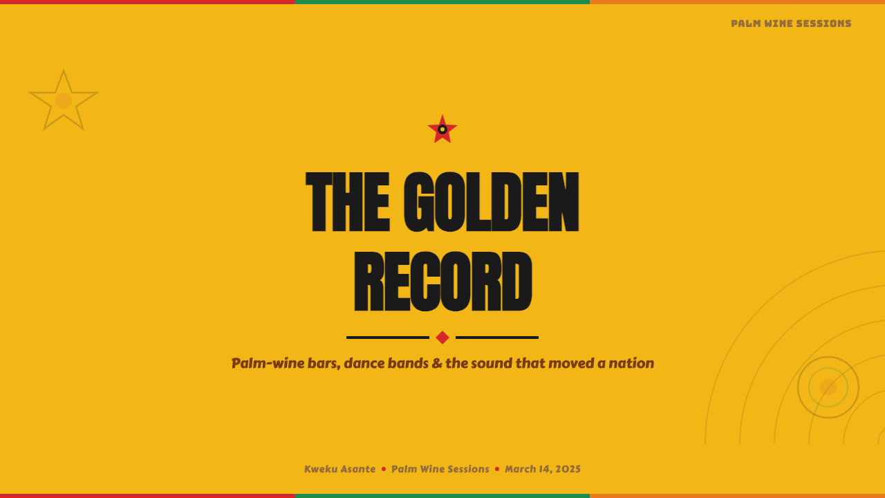
For presentation slides, Highlife makes a striking cover treatment: a marigold-yellow field, a bold hand-painted-style title, and one supporting illustrative element (an instrument silhouette, a simple portrait shape) placed the way a signboard would place its focal image. Content and data slides should hold onto the flat color-block logic — a bar chart or comparison table rendered as solid blocks of grass-green, red, and orange against the yellow ground reads as bold rather than busy, provided the lettering stays confident rather than shrinking into a conventional corporate sans.
For web UI, the style suits dashboards and pricing pages that want to feel warm and characterful rather than clinical — a pricing page can use the marigold ground for its background and reserve the green/red/orange trio for tier badges or call-to-action buttons, keeping body copy in black for readability. The risk is over-cooling the palette to make it 'usable'; Highlife should stay loud even in a dashboard, with color doing the hierarchy work a quieter system would hand to whitespace.
For editorial and marketing work, Highlife suits anything communicating festivity, music, or cultural specificity — event posters, music-adjacent brand campaigns, features on West African culture. A marketing page built in this style should behave like an oversized poster: full-bleed color blocks, one dominant hand-lettered headline, and illustrative rather than photographic imagery, since photography undercuts the hand-painted authenticity the style depends on.
The most common mistake is treating Highlife as a generic 'bright and colorful' theme and losing the two things that actually make it recognizable: the marigold-yellow ground (swapping it for white or a different bright color erases the signature move) and the hand-painted, slightly irregular lettering (swapping it for a clean geometric sans turns the whole composition corporate). A second, subtler mistake is over-polishing the illustration style into smooth vector art with gradients and soft shadows — Highlife's portraiture and iconography are meant to look flat, confident, and made by hand, not rendered.
Ghanaian Highlife — FAQ
Is Highlife the same thing as generic 'Afrobeat' or 'tribal print' design themes?
No, and treating it that way erases what makes it specific. Highlife's visual language comes from a documented mid-century commercial art tradition tied to a particular place (Ghana), a particular era (roughly the late 1940s through the 1960s), and a particular craft (hand-painted signboard and record-sleeve lettering). Generic 'tribal print' themes usually borrow decorative motifs without any of that historical or geographic specificity. Highlife should be applied with its actual signature moves — the marigold ground, the hand-inked lettering, the flat color-block portraiture — not as an interchangeable stand-in for 'African design' broadly.
Why is the background yellow instead of white or cream, the way a lot of mid-century commercial styles default to?
Because the marigold-yellow ground is the single most defining visual choice in Highlife, not a stylistic accident. Where many commercial print traditions of the same period settled on a neutral white or cream field to let the printed colors stand out, Highlife's sign-writers and record labels (Decca West Africa's yellow-label pressings especially) built the yellow itself into the identity. Swapping it for a neutral background is the fastest way to make a Highlife-inspired composition stop reading as Highlife.
How does Highlife handle typography if there's no single defined typeface?
It works through shared conventions rather than a shared master file. Genuine Highlife lettering is hand-inked by a sign-writer, so it varies from piece to piece, but it consistently shares a few traits: heavy stroke weight, high contrast against the marigold ground, playful and slightly irregular letterforms, and generous spacing built for legibility at a distance. When translating this into a modern layout, the goal is to choose or hand-letter type that carries those traits — bold, confident, a little uneven — rather than searching for one 'correct' font.
Does Highlife work in a dark-mode or dark-background layout?
Not naturally. The style's entire identity is built around a bright marigold ground carrying color blocks — inverting that to a dark background removes the single most recognizable element of the look and pushes the composition toward a different mood (moody or nocturnal rather than festive and sunlit). If a dark variant is truly needed, the safest approach is to keep the marigold yellow as the dominant accent against a near-black ground rather than dropping it out of the palette entirely, so at least one signature move survives the inversion.
What kinds of products or brands does Highlife suit, and where does it struggle?
It suits anything wanting to feel festive, warm, culturally specific, and proudly handmade — music platforms, event and nightlife branding, cultural or editorial features, products that want to feel like a celebration rather than a utility. It struggles in contexts that call for cool neutrality, high-precision data density, or a globally generic corporate tone — enterprise software, financial dashboards, or any brand trying to signal restraint and formality will find the style's loudness and hand-painted looseness working against the intended mood. As with any historically and culturally specific style, it should be applied with an understanding of where it came from, not stripped down to 'bright colors' and reused without that context.
Related design styles
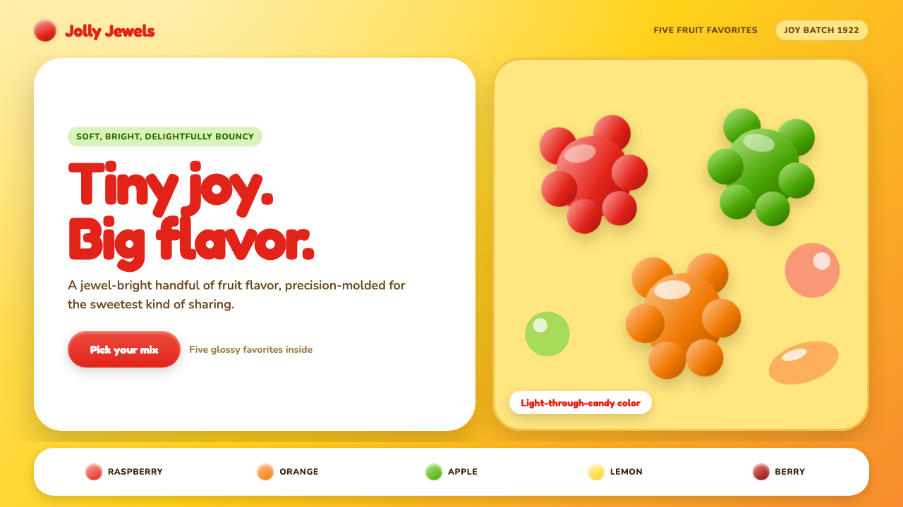 Haribo Goldbears (1922)Childhood joy, precision-molded. Glossy fruit colors tumble across a foil-gol…
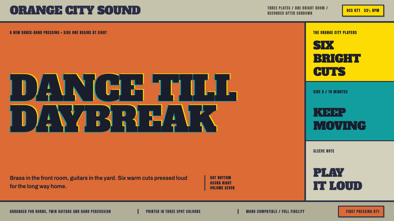 Highlife Record SleevePrint it loud. Hot orange fields and fat slab type keep the sleeve gloriously…
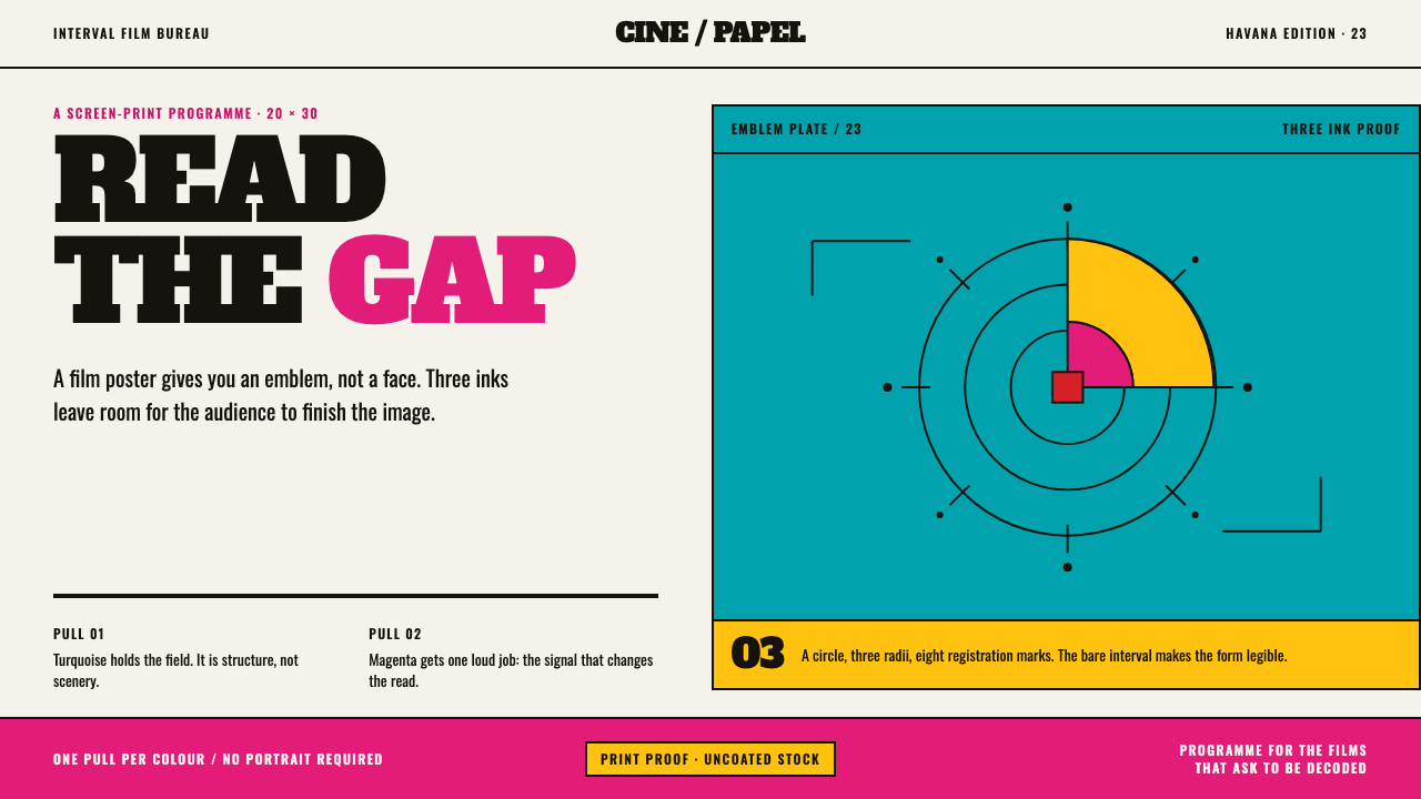 ICAIC Film PosterMetaphor wins the screen. Magenta and turquoise flat inks frame a measured em…
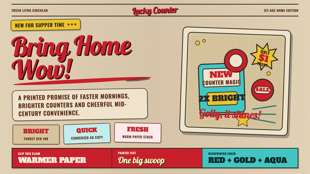 1950s Brush Script AdSells tomorrow in one swoop. Turkey red script, tan paper, starbursts, and ha…
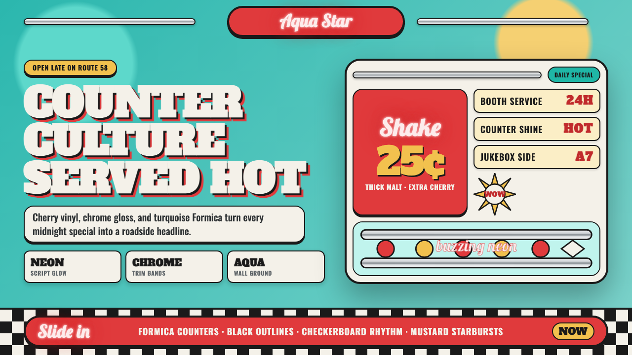 1950s Diner AquaRoadside optimism shouts. Aqua walls, cherry vinyl, chrome bands, and neon sc…
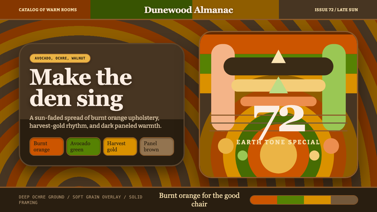 1970s Earth TonesWarm maximalism stays muddy. Bulbous slabs, avocado bands, and harvest-gold r…